Adirondack Wild, a plein air painting workshop

The porch at the Irondequoit Inn at dusk… a beautiful, relaxing place to listen to the loons on Piseco Lake.
A few years ago, my husband and son signed up for a father-son canoe trip in Speculator, NY. Because I’m always restless to paint, I rode up with them. And because I live near IrondequoitBay on Lake Ontario, I naturally booked a room at the Irondequoit Inn in Piseco, sight unseen.

That was the start of a beautiful friendship.

Canoes and kayaks near the beach at Irondequoit Inn, photo courtesy of Eric & Liz Davis.

Over my life, I’ve backpacked in the High Peaks, visited Ausable Chasm, camped along the Fulton Chain, toddled through Santa’s Workshop, been to the top of Whiteface Mountain in an overheating old Chevy station wagon, scouted for “Herkimer Diamonds,” pored over old boats at the museum at Blue Mountain Lake, hiked up to Lake Tear of the Clouds. But although I’ve painted all over the world, I had—until that trip—never painted in the Adirondacks.
Irondequoit Inn from their private island on Piseco Lake.
Cool photo, huh? Taken by Eric & Liz Davis.

Several years ago, I taught in the southwest desert. It was very interesting, and I came home having made some wonderful friends and taken some great photos, but I really got no brilliant work done.

Mill Stream, on the Irondequoit Inn grounds, photo courtesy of Eric & Liz Davis.
There were two limitations. The first is that the southwest desert doesn’t resonate with me in the same way as the northeast does, despite the fact that it is theoretically more painterly, being a land of broad vistas and warm colors. The second is that distances are so great that we spent an inordinate amount of time driving.

This year I am teaching a painting workshopin conjunction with the Irondequoit Inn’s 120th Anniversary, from September 30-October 5, which is the height of leaf season in the mountains.
My painting buddies will love the ambiance of this old-fashioned Inn, with its broad porches, antique furniture and casual charm. There is a beach, an island, and three streams on the Inn’s own property, along with three wonderful lakes within spitting distance: Piseco, Oxbow, and Lake Pleasant, meaning that no long drives need be undertaken.


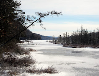
Weather closing in on Piseco Lake outlet.

The price is fantastic—$775, including lodging and meals—even our box lunches for out in the field! And because the Inn is doing the management, I am free to concentrate on what I do best—teaching painting.
Here is a link to the brochure, and a link to more images (in no particular order). My NYC painting pals should note that they can take the train to Rensselaer/Albany and rent a car from there. (Or, if you don’t drive, they should contact me and I’ll see what I can do to arrange a car pool.)
I do hope you are able to join us.

More on extreme painting

Tom Thomson in his grey canoe

I spent a few extra days in Piseco last week. It was beautiful and austere in the silent falling snow. Shivering outside while painting in my nylon waterproof jacket and latex gloves, I spent more than a little bit of time considering the rigors experienced by Tom Thomson in the backwoods.

Thomson’s training was anything but conventional. He learned lettering and design in business school in Seattle—an idea that seems impossibly weird today. In 1905, he took up a position as a senior artist at a Toronto photoengraving firm. Given the state of photogravure at the turn of the last century, one should assume that the majority of his job involved what we would now call pre-press rather than actual design.

In 1909 Thomson joined the staff of Grip Ltd., where he came under the tutelage of the firm’s chief designer, J.E.H. MacDonald. MacDonald contributed much to Thomson’s artistic development: he himself was a formally-trained artist.

The McMichael Collection exhibits early works by Thomson and the Group of Seven and they are workmanlike but prosaic—typical landscape painting and graphic design of the period.

Tom Thomson’s own business card from his days in graphic design.

The radical change in their vision is partly attributed to a visit they made in 1913 to Buffalo, where they saw an exhibit of Scandinavian Impressionist and Art Nouveau paintings that they understood could be adapted to the Canadian viewpoint.

Danish painter Ahled Maria Larsen’s “Kejserkroner” (1910). I’m sure she will appreciate being remembered thus: “Side-by-side with her role as a mother and hostess, Larsen still found time to paint…” (Her work looks more contemporary than her peers’ from this distance.)

But it also came from the land itself. In 1912, Thomson and his fellows began travelling to the Mississagi Forest Reserve and Algonquin Park, the place with which he is most closely associated.

When painting on location, Thomson used a small wooden sketch box to carry his oil paints, palette, and brushes. His painting boards (generally about 9X12) were stowed in slots fitted in the top. This sketch box was similar to the modern pochade box except that it didn’t sit on an easel. Thomson worked sitting in his canoe, or on a handy log or rock with his sketchbox set in front of him.

Paintbox belonging to Barker Fairley, a disciple of the Group of Seven. Thomson’s would have been similar, for this was a kind of paintbox used until quite recently, when quick-release pochade boxes came into vogue.

In 1913 Thomson exhibited his first major canvas, A Northern Lake, at the Ontario Society of Artists exhibition. The provincial government purchased the canvas for $250, roughly equal to $5500 in current dollars. That year, Dr. James MacCallum guaranteed Thomson’s expenses for a year, allowing him to quit his job and head back to Algonquin. His career was made.

Thomson’s home base when he visited Algonquin was a small hotel called Mowat Lodge. He would stay at the Lodge in early spring and late fall, and then move into the woods when the lake and river ice broke up. In the depth of winter, he painted in his studio shack, a converted construction shed in a back lot in Toronto. It was there he painted full-size canvases from his field sketches.

Thomson was a certified guide, fire ranger, avid fisherman, expert canoeist, woodsman and painter—in short, a backwoods renaissance man. (Ironically, he was barred from enlisting in the Great War for health reasons.)

He was also plagued by self-doubt. AY Jackson recounted that in the fall of 1914 Thomson threw his sketch box into the woods in frustration. He said that Thomson “was so shy he could hardly be induced to show his sketches.”

It was in the solitude of Algonquin’s lakes and woods that he discovered himself as a painter. The backwoods can be dangerous, and it’s also where he died.

Thomson died sometime between July 8 and July 16, 1917, when his body was found floating in Canoe Lake. Although the cause of death was recorded as accidental drowning, his demise has become one of Canada’s most enduring mysteries, involving, variously, a love affair, a fight with a German neighbor about the Great War, a drunken brawl, or suicide.

I have a canoe, a pochade box, and a fishing pole. The ice will be breaking up in a month or so… do I have a backwoods painting trip in me?

Painting in the Adirondack Wilderness


“Oxbow Lake Outlet in February melt,” oil on board, 12X16, Carol L. Douglas. It was 10º F when we left the Irondequoit Inn to prospect for sites. That gives you a real appreciation for Tom Thomson and the Group of Seven.

To landscape painters, Tom Thomson and the Group of Seven are tied to Canada’s Algonquin Provincial Park. Both represent a muscular, vigorous kind of backwoods painting. Imagine Tom Thomson (who was a backwoods guide in addition to being a painter) snowshoeing into the woods to paint a winter scene, or paddling his paint-box in by canoe right after the Spring melt.

Even cars and roads don’t significantly change the winter painting experience. You’re still using cold paint in cold weather. Here Marilyn paints the view below.

I love the Oxbow Lake outlet in all seasons, and winter is no exception. Curiously, the water flows away from the lake here, into a stream.
This week, I met Marilyn Fairman (this year’s Irondequoit Inn featured artist) in Piseco to do some winter painting. When you strip away the convenience of decent roads and cars, our experience this week was much the same as those Group of Seven painters. We donned woolen sweaters and socks and hoisted our paintboxes to the edge of a boggy inlet to paint, just as Thomson and company did nearly a century ago.

Despite my great love for the view of Oxbow Lake (above) I chose to paint downstream for the lovely winter reds, golds and greens.
Adirondack Park is as untrammelled as is Algonquin. It’s a rocky, forested, watery fastness that was too inhospitable to support pre-industrial society. It doesn’t mesh well with the modern world of cell phones, internet and automobiles, either.
And it’s vast—far vaster, in fact, than Algonquin Provincial Park.
It’s the largest park in the contiguous United States. You could shove Yellowstone, Yosemite, Grand Canyon, Glacier, and Great Smoky Mountains National Parks into it with room to spare. In fact, at 6.1 million acres (or 9,375 sq mi, or 24,281 sq km), it’s more than three times the size of Algonquin.
One of my goals was to show Marilyn some of my favorite painting haunts. Turns out, she knows as many as I do, since she lives on the southern edge of the Park.
We spent some time looking at sites along Lake Pleasant and the west branch of the Sacandaga River, which is a rather lazy river that winds through a lovely Grimpen Mire. In twenty miles, there were literally dozens of prospects that took my breath away. They range from the intimate—rocks and water and bogs—to the panoramic.

Marilyn in her winter woolies. Remember when my student Kamillah Ramos painted from this site in November? Piseco Lake looks far different when it’s ice-bound.
I’m teaching a workshop here at the end of September (details to come), which is the height of northeastern color here in the mountains (and much warmer than February). The question isn’t finding something to paint; it’s how to tamp down the excitement long enough to work. I promise you, it will be a workshop like you’ve never seen before, of woodsmoke and the wind whispering through pines, rocky scarps and soft maples flaming violet along the bogs.

Addendum:

Here is a link to the workshop information. I’d love to see you there!

Group of Seven

Study for “Northern River” by Tom Thomson

Like every other kid who grew up in Buffalo, I spent my formative years at the Albright-Knox Art Gallery. This was by no means a bad thing, seeing as the collection is housed in a fantastic building designed by EB Green and Augustus Saint-Gaudens and includes important works by a host of important 19th and 20th century artists, focusing particularly on Abstract-Expressionism (which was America’s first home-grown art movement, centered in Manhattan).

What Albright-Knox didn’t collect is every bit as interesting, because it missed two seminal movements in modern art that were happening right by its own back door. It acquired only about a dozen or so works on paper by Buffalo’s own visionary painter, Charles Burchfield. And it ignored Burchfield’s contemporaries from across the Niagara River, the now-famous Group of Seven.

The Group of Seven were, above all, acolytes in a nascent cult of Canada. They had a strongly spiritualist identification with the Great White North as the touchstone of Canadian identity—the “true north, strong and free.”

“We live on the fringe of the great North across the whole continent and its spiritual flow, its clarity, its replenishing power passes through us to the teeming people south of us.” (Lawren Harris)

“Northern River” by Tom Thomson, on his easel in his painting studio/shack; originally this was behind the Design Studio in Toronto but has been moved to the McMichaels grounds in Kleinburg, Ontario.

The Group of Seven understood the artists’ role as prophets of this spiritual identification.

“Indeed no man can roam or inhabit the Canadian North without it affecting him, and the artist, because of his constant habit of awareness and his discipline in expression, is perhaps more understanding of its moods and spirit than others are. He is thus better equipped to interpret it to others, and then, when he has become one with the spirit, to create living works in their own right, by using forms, color, rhythms and moods, to make a harmonious home for the imaginative and spiritual meanings it has evoked in him. Thus the North will give him a different outlook from men in other lands. It gives him a difference in emphasis from the bodily effect of the very coolness and clarity of its air, the feel of soil and rocks, the rhythms of its hills and the roll of its valleys, from its clear skies, great waters, endless little lakes, streams and forests, from snows and horizons of swift silver…” (Lawren Harris)

Ultimately the Group of Seven’s agenda (the celebration of the unique power of Canada) drew them in a radically different direction than the main movement of western art, which was focusing on the celebration of the emotional, rebellious, nihilistic, anarchic, and idiosyncratic “genius” of the time. The Group of Seven were trained graphic designers, which meant they were primarily communicators. Because they were propagandists for a kind of Canadian nationalism, they shied away from the inaccessibility of Modern Art. It was important to them that their public understood the message, so they used the traditional tools of art—drawing and design.

In fact, some of what they did—abandoning value, abandoning the ‘scene’, ignoring atmospherics—could never work if their color mixing and drawing were not so spot-on.

“Rooftops” by AJ Casson illustrates the exceptional drafting skills of the Group of Seven painters. Note how he convinces you that the rooftops are marching past you with his deft manipulation of traditional perspective.

In fact, I think the reason Seymour Knox ignored them is that they challenged him in two key points that would really irk a mid-century American mogul: that modernism was inherently better than tradition, and that being American was inherently better than being Canadian. But at a fifty year remove, Knox seems almost pathetically provincial, blindly following Manhattan’s style lead and ignoring what was going on around him.

I can only speak as a New Yorker, but from my vantage point, there has been no clear sense of direction in painting for the last three decades. However, one thing seems clear: representation and technique have returned to importance, and Abstract-Expressionism (although it leaves its mark) has far less influence now than at any other point in my life.

The earliest core of the Group of Seven— Tom Thomson (who was never a formal member), AY Jackson, Arthur Lismer and Frederick Varley—were painting together in Algonquin Park by 1914, at which point their work was interrupted first by the onset of the Great War, and then by the untimely death of Thomson, who was found dead in Algonquin under mysterious circumstances. The group eventually included Lawren Harris, JEH MacDonald, Frank Johnston, Franklin Carmichael, AJ Casson, Edwin Holgate, and LL Fitzgerald. Emily Carr and Clarence Gagnon were closely affiliated with them in viewpoint and technique.

“Sopwith Camel Looping” by Frank Johnston. Several of the Group of Seven painters were conscripted into the war effort. When viewing Johnston’s aerial perspectives, one must remember how rare and new flight was and the difficulty of taking reference photos at the time.

The three important collections of their work are in the National Gallery of Canada in Ottawa; McMichael Canadian Art Collection in Kleinburg, Ontario, and Art Gallery of Ontario in Toronto. All three emphasize the relationship between their field sketches (undertaken in conditions so arduous I can barely imagine them) and their studio paintings.

You can read about them here.

Then there’s that matter of inspiration

Deer in my brother’s yard, an exercise done several years ago

This Sunday, I was doodling in church when a painting dropped full-blown into my head. That isn’t common, but is always exciting. And in this case, it was fortuitous since I just finished several weeks of flailing around on the previous piece.

Where does a fully-realized idea spring from? First, a thought: in this case, a dilemma that has bedeviled me for almost a year. Then, visual input that is usually jumbling around in one’s cranium solidifies into a concept. In this case:

  1. An email sent by my pal Garrett about how big wolves really are;
  2. A painting I did several years ago as an exercise for my class on how to paint the traps between trees;
  3. A photo taken by my friend Jamie of a waterfalls near her house;
  4. William Holman Hunt’s “Our English Coasts (Strayed Sheep),” which set the light tone for the uplands.

Bold

My sketch done in church last Sunday.

When I’m painting observationally, I follow the traditional rules of alla prima painting: dark before light, big masses divided into small masses, fat over lean. When I’m painting from an interior vision, I paint indirectly, starting with a color map, and then modulating with opaque paints.

My color map.

As far as I got today. Tomorrow, I’ll start looking at real reference.

BTW, this is my current easel setup—electronic reference to the left, paper reference to the left.


What is talent?

“Bras,” oil on canvas, Kamillah Ramos, 2012. This was painted after five months of study.

Every year I seem to get one kid who draws wonderfully. Sometimes, this kid has managed to decode the rules of drawing on his own. More typically, he has studied outside of school. But however he does it, to the casual observer, he appears to have “spontaneously” learned to draw.

In turn, his teachers identify him as talented, and he is a star of his public school art program. Meanwhile, the majority of kids are vaguely encouraged toward self-expression but never challenged to learn the craft of making art. Nobody considers them particularly talented.

A drawing by this year’s star pupil, Sam Horowitz. Of course he can draw this vacuum cleanerhe’s studied not only with me but with the wonderful Sari Gaby.

As an educational model, that’s bizarre. If we taught math like that, we’d have only one kid a year who mastered calculus. If we taught English like that, we’d be a nation of illiterates.

There is no more a “genius” for art than there is one for math, and it’s a terrible disservice to both students and society to not teach the craft of drawing to all young people.

When I was in school, art instruction was undergoing a sea change. There were some teachers who still taught the technical skill of drawing, but they were being replaced by a generation who emphasized emotional intensity and ideas rather than the nuts and bolts of observation and description. I was fortunate in having superlative draftsmen as teachers, but I’m among the last generation for whom that was a given.

Almost no kids come to my private studio with any experience in observational drawing. They don’t even know there’s a difference between observational drawing and copying photographs. They have never learned the systems of perspective, measurement, and proportion that were drilled into us in an earlier time.

The painting at the top of this page was done by a high school senior. She started studying with me in August, 2011, having had no prior instruction. She is not someone who could teach herself to draw, and hence she wasn’t identified as “talented.” However, she is extremely bright and hardworking. Moreover, she has a story she’s anxious to tell. In five months time, she has gone from not being able to draw at all to being able to paint at this level: not by concentrating on self-expression but by practicing the core disciplines of drawing and painting.

I’m not worried about her future, but she isn’t going to art school because she didn’t have time to develop the chops needed to put together a mature portfolio. But what if she had been taught to draw in elementary school, as I was? How might her life be different?

And what about all the people who never have the chance to learn the skill of drawing? How many potential Manets or Velázquezes have we squandered?

“Annabel,” graphite on paper, Gwendolyn Linn

This drawing was done by an adult student. She has been hampered by her lack of drawing chops, so I taught her to measure and check angles. This is her first drawing with that skill set, and shows just how quickly one can progress with a little practical instruction.

Sketchy

In church

This is the second year I’ve bought into the Sketchbook Project and then felt my muse desert me as soon as the package arrived in the mail. It’s ironic, because I carry a sketchbook everywhere I go, a habit that started in elementary school.

My school notekeeping was a total fail from an academic standpoint—full of drawings, with notes occupying a very minor role. My current sketchbooks look exactly the same.

I now realize that drawing in school allowed me to cope with undiagnosed ADHD at a time when school was extremely regimented and bad behaviour still punishable with a ruler to the knuckles. And I received my share of thwacks for drawing in class, believe me. But as a parent and painting teacher, I encourage both my children and students to do the same thing. Unfortunately, most teachers are still opposed to it.

I know it works (as long as the information being presented is verbal and not visual). For some reason, it’s perfectly possible for the mind to listen, learn and retain a lecture while drawing something entirely unrelated.

For me, drawing takes the place of the anxious fidgeting that is part of ADHD. Educators have begun to recognize that allowing such kids to move paradoxically makes concentration easier. But they don’t generally recognize that drawing can achieve the same goal.

I bring my sketchbook to church, to appointments, on errands—in short, anywhere there’s a possibility I will cool my heels. I make no pretence to style, and don’t think about content or composition. (To do otherwise would interfere with my listening.) My goal is simply to record what I see. It’s totally process-based; I never think of the sketches as anything other than practice strokes or visual notes. Which may be why the Sketchbook Project never works for me: it can’t help but turn process into product.


(L-R) In a pinch, you can always draw your own jacket thrown over a chair; couple in church; gesture drawing of horse at Walnut Hill.


(L-R) Or, you can draw your non-dominant hand; people almost always have a few ears hanging around; patient at the neurologist’s office.


(L-R) Quick value study of a path (I could paint it from this); man in church; my son’s big foot, at the pediatrician’s office.


(L-R) I’ve pretty much mined my dentist’s office for subject matter, but there’s always the woodwork; poofy gown from a shopping excursion; man in church.

Urban painting/Queensboro Bridge

Usually, when we say “field sketch,” people think of pastorals, but the term can apply equally to urban landscapes. I went on a tear painting the Queensboro (or 59th Street) Bridge with my friend Kristin. Here are a few examples.

Construction on the Queensboro Bridge, oil on board, 12X9

Just as urban plein air painters complain about the “endless green” of the woods, pastoral painters are overwhelmed by the grey of the city. But just as there are many different greens, there are many different greys. The trick is to find them, and to find the accidental notes in either landscape.


Queensboro Bridge approach, oil on canvasboard, 16X20

How do you avoid dreary, dull greys? First, avoid using black as a base. I was taught that this was because of the large grains in carbon-based blacks, which may or may not be true. But for whatever reason, black has a way of making cool colors look muddy and warm colors look more opaque, and that’s a bad basis for greys.

Under the Queensboro Bridge, oil on canvasboard, 12X16

I normally paint foliage using a matrix of nine mixed greens plus one from a tube (chromium oxide). There are at least that many greys present in the urban landscape. I prefer to mix them not in matrices, but in threads, so that every permutation is easily available.

Some of my favorite grey threads, from left to right:

Cadmium orange and Prussian blue;

Raw sienna and Prussian blue;

Yellow ochre and quinacridone violet;

Burnt sienna and ultramarine blue.

Remember, every manufacturer’s paint handles somewhat differently, and unless you’re using RGH paint, you’re unlikely to duplicate my results exactly. But the principle is simple: just choose two colors from opposite sides of the color wheel and add white.

In addition, I think it’s very helpful to use a warm-toned canvas or canvas board.

Black Eye

Michelle’s shiner (detail)

It’s not often you get a model showing up with a black eye, and that’s irresistible to paint. (Before you get worried that she’s the victim of domestic abuse, she’s a dancer and occasionally her face gets in someone else’s way.)

A flesh tone matrix, a little more complex than what I usually use, but you get the drift

During the interregnum between open painting and figure, I usually set up my palette in a flesh-tone matrix. This is how I’m able to do a credible figure painting in three hours. Today, a number of interruptions stopped me from doing that, and I ended up doing the first hour of painting using pigments scarfed from a student’s palette. On top of that, I’m working huge for a sketch—this canvas is 48X36. So most of this is a rough underpainting, and I’ll be finishing it next week.

Michelle’s shiner, in draft form

A note about this model: she’s a wonderful, adventurous nut, who allows me to wrap her up in Saran Wrap.

Michelle as a shrink wrapped vegetable, 18X24, oil on canvas