Color Temperature, part one

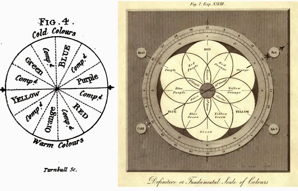
The idea of “warm” and “cool” colors was first posited by the English miniaturist and teacher Charles Hayter. The illustration is from his treatise, Perspective, published in 1813.
The way we perceive color is greatly influenced by our experience. We all know that fire is hot and ice is cold, so we perceive reddish orange as a “hot” color and blue as a “cold” color. This association is so strong that painters, photographers, interior designers and fashion designers can all use it color temperature as emotional shorthand.
This association actually flies in the face of physics. While we call colors over 5000K cool, and colors below 3000K warm, the actual physics of the matter are exactly opposite—the shorter the wavelength, the higher the temperature.
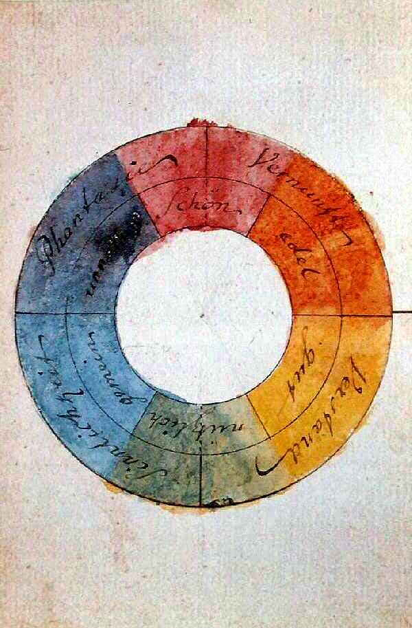
Goethe’s color wheel, 1809.
That “warm” and “cool” are subjective is demonstrated by the fact that different painters learn the hottest and coolest points differently. I understand blue-violet as the coolest color, while one of my painting students—an art teacher herself—learned blue to be the coolest tone. And look at this attemptto quantify color temperature by a Chinese-American painter; he seems to be putting aqua at the coldest point.
The first color wheel we know of was created by Johann Wolfgang von Goethe, the first of a long line of philosophers to concern themselves with the meaning of color. He wrote: “The chromatic circle… [is] arranged in a general way according to the natural order… for the colours diametrically opposed to each other in this diagram are those which reciprocally evoke each other in the eye. Thus, yellow demands violet; orange [demands] blue; purple [demands] green; and vice versa: thus… all intermediate gradations reciprocally evoke each other; the simpler colour demanding the compound, and vice versa…”
The “rose of temperaments” (1798-99) by Goethe and Friedrich Schiller, matched human occupations and character traits to colors. I don’t read German, but I swear my red couch qualifies me to be a tyrant.
So far, so awesome. Unfortunately, Goethe also included aesthetic values in his color wheel, titling them the “allegorical, symbolic, mystic use of colour.” That was an idea that developed a life of its own.

Message me if you want information about next year’s classes and workshops.

So you can’t draw a straight line, redux.

Martha’s first painting. And for those who know us too well, let me say up front that that’s not a whisky bottle.
You may remember my friend Amy telling me last summer that she couldn’t draw a straight line, and me challengingher to let me teachher. Her sister Martha was in town this week, and she asked me if she could come to my painting class on Saturday.
Like Amy, Martha has a doctorate from a prestigious American university. She also recently went back and got an MS in landmark preservation from an art school. However, the last time Martha actually took a hands-on art class was when she was a freshman at Brighton High School. (By my calculations, that must have been at least twenty years ago.)
Her sketch for the same.
Here is her drawing, and here is her painting—both done in a single three-hour class.
“This is some kind of parlor trick,” my daughter Laura told me afterward. “You take people who ‘can’t do art’ and in three hours prove to them that they can.”
Well, duh, honey. Most people believe the lie that art is magic, rather than craft. And the methodology for teachingdrawing and painting has become impossibly corrupted in modern America (with a few notable exceptions). Yes, I’m repeating myself here, but I’ll continue to do so as long as people believe the lie that they can’t draw.

If you’re interested, there is more information on my fall classes here.
Message me if you want information about next year’s workshops.

A personal aside

Selbstbildnis, mit der Hand an der Stirn (Self-portrait, hand at the forehead), etching, 1910, by Käthe Kollwitz,  

Forty-five years ago, I was at a school pool in Niagara County, New York, when my sister had a brain bleed. She died. With us were my friend S. and her mom, although at the time they seemed tangential to the tragedy that engulfed my family.

It was compounded four years later when my brother—who happened to be S.’s classmate—was killed by a drunk driver.
Sorrowful old man, pencil, black lithographic crayon, wash, white opaque watercolor, on watercolor paper, by Vincent Van Gogh, 1882
We move on. Our flock tends to be made of birds of the same coloration. And I think I’m probably an unmotivated intellectual. Why, just yesterday, I was discussing Steiner and Kandinsky and their daft color theories with three dear friends. This is fun, it’s fluff, and no more or less meaningful than talking football is for other people.
I haven’t seen S. in years, but through the miracle of Facebook, we’re in loose contact.
Last evening, my mom died. I refuse to discuss my grief with anyone, but it is substantial.
And then S. posted this video:
For the first time I understand what it meant to praise God from the depths of grief. That’s wisdom, and it’s a far greater thing than knowledge.

Message me if you want information about next year’s workshops.

Itinerant painters (2 of 2)

This version of The Peaceable Kingdom, from the mid-1840s, includes William Penn negotiating with Native Americans. He often included this in the paintings as an example of how disparate peoples could work together in peace.
Perhaps the most famous early American itinerant painter was the Quaker pastor, Edward Hicks.

Hicks was born in 1780 to Anglican parents, but his mother’s early death resulted in him being raised in a Quaker family.
An earlier iteration shows the influence of decorative painting on Hicks’ canvas work. We call him ‘primitive’ but his interest in design over realism actually seems very modern in retrospect.
At the age of 13, Hicks was apprenticed to a coach-making firm, where he learned the craft of decorative painting. He stayed there for seven years before moving on as a journeyman coach and house painter. He was accepted into the Society of Friends in 1803 and married a fellow Quaker that same year.
By 1813, Hicks was traveling as an itinerant preacher. Like St. Paul supporting his ministry with tent-making, Hicks supported his ministry with decorative painting. This, unfortunately, annoyed some of his Quaker brethren, who felt that decorative painting was at odds with Quaker principles. He gave up painting in favor of farming, but that decision was a financial disaster.
This version of The Peaceable Kingdom, from 1829-30, includes Quakers bearing banners.
Unlike St. Paul, Hicks had a growing family. Necessity forced him to resume decorative painting. He reeled off the first of many copies of The Peaceable Kingdom by 1820. Ironically, most of his canvases were not done for money, but for the edification of friends and family. In his lifetime, he was known as a preacher, and his living came from painting decorative objects.
Hicks painted an astonishing 61 iterations of The Peaceable Kingdom, which illustrates Isaiah 11:6-8:
The wolf will live with the lamb,
    the leopard will lie down with the goat,
the calf and the lion and the yearling together;
    and a little child will lead them.
The cow will feed with the bear,
    their young will lie down together,
    and the lion will eat straw like the ox.
The infant will play near the cobra’s den,
    and the young child will put its hand into the viper’s nest.
That he painted it over and over tells us much about his intention, which was to share and teach the Bible. It was a humble aspiration in opposition to his contemporary art scene (which I wrote about in a series of posts starting here).

The Cornell Farm, 1848. Hicks may not have had the classically-trained artist’s ability to render spatial depth in a landscape, but he sure did understand animals. 

Message me if you want information about next year’s workshops.

Itinerant painters (1 of 2)

Historical Monument of the American Republic, finally finished in 1888, was Field’s most famous painting. It was rejected for the Centennial Exposition, which it was painted to commemorate.
As I traveled from event to event this summer, people would ask me whether I was interested in doing this or that upcoming show. With the rise of plein air events, it would be easy to carve out a life as an itinerant painter, going from place to place all year long. I’m not planning to do it, but we have a tradition of itinerant painters in this country and its romance does kind of bewitch me.

Erastus Salisbury Field was a 19th century itinerant folk painter. Most of Field’s life was spent in western Massachusetts and the Connecticut Valley, although he did do two stints in New York City.
Woman with a Green Book (possibly Louisa Gallond Cook), 1838, was one of many itinerant portraits painted by Field before photography made this business obsolete.
By age 19, Field had displayed sufficient drawing chops to be taken as a student by Samuel F. B. Morse—yes, that Morse, who was a well-known painter and teacher besides being the inventor of the single-wire telegraph and the Morse code. Field’s few short months with Morse were the sum total of his formal education in painting. After Morse abruptly closed his teaching studio, Field returned to Massachusetts with enough technique to set up shop as an itinerant decorative painter and portrait painter.

In the 1840s, Field answered the siren call of New York again, relocating his family to Greenwich Village. After seven years, he was called back to Massachusetts to manage his ailing father’s farm.
The Garden of Eden, c. 1860, by Erastus Field.
It’s believed that Field studied the nascent art of photography in New York, but whether that’s true or not, he certainly saw the handwriting on the wall. He turned from painting portraits to painting landscapes and history and Bible scenes. His most famous work, The Historical Monument of the American Republic, is a complex metaphor for American history. He worked on it for 21 years. He was a terrifically productive painter, with about 300 works still surviving.

Field died at home on June 28, 1900 at the age of 95.

Field’s granddaughter-several-times-removed was my friend in Lewiston in the 1980s. She was also a talented and largely self-trained artist.
Message me if you want information about next year’s workshops.

The Open Road (continued)

Landscape with a Carriage and a Train, Vincent van Gogh, 1890
Yesterday, I wrote about contemporary paintings of the open road. These would be impossible without photography or the automobile, so they are very much of our time.
Prior to the Industrial Revolution, people moved around on foot, by horse, or by ship. While there were genre painters dealing with those subjects, the mechanics of life did not particularly interest artists or their patrons. The social realism (or naturalism) movement of the 19thcentury changed that. Its concern with the lives of the working class included the ways in which people travelled.
Vincent van Gogh painted Landscape with a Carriage and a Train shortly before his death, after he had left the asylum at Saint-Rémy. “Lately I’ve been working a lot and quickly; by doing so I’m trying to express the desperately swift passage of things in modern life,” he wrote.
The Third-Class Carriage, HonorĂŠ Daumier, 1864
The Third-Class Carriage by HonorĂŠ Daumier is the most well-known, and perhaps the earliest, depiction of mass transit, which has become such a fact of life in our modern existence.
Third-class railway carriages were dirty, crowded, and uncomfortable. They were filled with the lower orders. In short, they were the coach seats of their day. While the little family in the front row of Daumier’s painting are fully delineated, the figures in the back rapidly dissolve into the anonymity of the endless human crowd.
Steaming Streets by George Bellows (1908) is a harshly honest look at urban transport. No Currier and Ives romanticism here.
In our nostalgic imaginings we like to believe we would have achieved a first-class railway ticket, but the vast majority of us would have been traveling coach then, just as we do now.

Message me if you want information about next year’s workshops.

The Open Road

Evening Train, Trans Canada Highway, by Robin Weiss
I have always been interested in paintings of expressways, which is helpful when I’m driving as much as I have been since July. This week’s road follies were not intentional, being precipitated by a set of personal crises on either end of New York State. I saw a lot of Interstate 90 this week, and repeatedly.
Study for Freeway,1978, by Wayne Thiebaud
To the artist, painting is more about the play of color, shape and texture than it is about subject, but I’ve noticed that viewers don’t generally feel that way. They select paintings based on a personal, emotional, call and response.
Lost Highway, by Peter Harris
The open road is neutral, although to many of us, it’s the thing that stands in the way of getting where we’re going. In their own gangly way, our expressways are beautiful.  Like me, the Interstate Highway System itself is a prime example of mid-century modern. Authorized in 1956, the first sections were completed that same year (although in some states, including New York, previous highways were incorporated into the system).

Untitled by Rodgers Naylor
Message me if you want information about next year’s workshops.

Boy Genius

Illustration from Norman Rockwell’s second year as a professional artist. He was all of 19 years old.
Spending time in the Berkshires this week, I got to wondering what artist might be identified with this area.
Norman Rockwell is most famous for the cover illustrations he did for The Saturday Evening Post. Born in New York, he attended both the National Academy of Design and the Art Students League. By age 18, he had a published book illustration to his credit. That year he was hired as an illustrator for Boys’ Life. At 19, he was promoted to be their art editor, in which role he did his first cover illustrations.
It’s absurd to try to choose a favorite from his many illustrations for the Saturday Evening Post. Rockwell layered images rather than trying to create a full-dimension space; this is a great example of that technique.
At age 21, he submitted his first cover illustration to the Saturday Evening Post.He was published eight times total on the Post’s cover within that first year. Over his career, Rockwell did 323 original covers for the Saturday Evening Post.
Rockwell painted his most famous works, the Four Freedoms series, in 1943. It took him seven months. The series was inspired by a speech by President Roosevelt, in which he described four principles for universal rights.
When he wanted to create a fully realized space, however, he had the chops. Freedom from Want’s Puritanical white-on-white tablecloth brings the faces into focus, and they are an essay in optimism in the dark days of WWII. 
In 1953, Rockwell and his family moved to Stockbridge, Massachusetts. From 1961 until his death in 1978, Rockwell was a member of the Monday Evening Club, a men’s literary group based in Pittsfield, Massachusetts, which is where my daughter lives, and where I regularly stop on my trips back and forth to Maine.
Rockwell’s portrait of his adopted Stockbridge, MA, would do any landscape painter proud.
The early part of the 20th century is often called the Golden Age of Illustration. Why were so many fine 20thcentury illustrators able to do such fine work at such young ages? In part, there was an expectation that people in their late teens were fully formed adults, capable of bearing adult responsibilities. In part, the schools were teaching traditional drafting and drawing.
Message me if you want information about next year’s workshops.-*

So you want to learn to paint

Autumn is the best time of the year to paint en plein air in Rochester. The light is beautiful, the foliage is an ever-changing kaleidoscope, and the weather is usually more stable than in summer.
If you’re a new painting student, we’ll start by experimenting with different kinds of media, learning the fundamentals of drawing, and then concentrating on the process by which pigment goes from the tube to the canvas.
If you’re an experienced painter, we’ll develop processes for mixing clean color accurately and quickly, talk about the difference between studio painting and painting outside, and work on composition.
When the weather closes in, we segue to working in my studio, which is located at 410 Oakdale Drive, Rochester, NY 14618.
Saturday lessons begin on September 13; Tuesday lessons begin on October 7. Both classes are from 10 AM to 1 PM. Tuition is $100 a month.
While I assume most readers already know who I am, my bio can be found here. For more information, email me here.

Message me if you want information about next year’s workshops.

Reappraisal

Reed beds at the Irondequoit Inn didn’t thrill me that much when I painted it, but it turns out to have been predictive of where I’m going as a painter.
Recently, I was listening to some fellow painters talking about how to reuse canvas-boards on which they’d done unsuccessful paintings. I remarked that I almost never reuse boards, because I almost never throw things away. My studio and workshop are full of field sketches and paintings that aren’t going to be shown but aren’t going to be painted over, either. As long as I have the luxury of space, I’m going to continue this practice.
Hayfield in Paradise (private collection) was painted about a decade ago. Yes, it’s obviously by me, but my color sense, my brushwork, and my composition are all much different today.
I think most artists are poor judges of whether something they’re working on is a success. We usually think it works when it flows off the brush without too much pain. However, often the most important work we’re doing isn’t easy. Trailblazing involves hacking out a path with an ax, after all.
I had most of my inventory off my own walls this summer because it was in galleries. To fill the nailholes, I put up some small works from my slush pile. One of these pieces is hanging on the wall opposite my bed, where I see it when I wake up. I didn’t like it that much when I painted it, but after a week back home, I realize that it’s actually very good. It was jarring several years ago; it seems a lot more like me today.
I loathed this painting of the mouth of the Genesee River when I did it, and almost wiped it out. It has really grown on me over the years, and now I think it’s a really cool painting.
Another small painting—a sketch for a larger work—accidentally traveled with me to Maine this summer. Since it had nothing to do with the Maine works I was delivering, I used it to decorate my cabin. When I painted it, I thought it was both elegant and loose. However, the subdued palette has little in common with my work today.
Keuka Vineyard accidentally traveled to Maine with me. I realized after looking at it for several weeks that it’s not that connected with my work today. Nevertheless, I still like it.

You can’t really make these judgments if you obliterate everything you paint that makes you uncomfortable. That’s analogous to ruthlessly weeding out all new seedlings under the mistaken notion that they are weeds. You really can’t tell what’s in your garden until it has a chance to grow.

Message me if you want information about next year’s classes or workshops.