The weighing of souls

In which I paint the schooner Mercantile and am reminded that in God’s eyes, all men are equal.

Schooner Mercantile in drydock, by Carol L. Douglas

I awoke this morning laughing heartily at a chemistry joke. It evaporated as soon as I remembered that what chemistry I know would fit in my wash cup. People who assume I am well-educated ought to have known me in school, is all I can say.

That’s why I don’t quite understand what they’ve been doing to the masts of Heritage this week. It comes under the broad heading of “refinishing.” Each step involved being hoisted up and down the mast in a wooden basket, and there’s lots of scraping and buffing and brushing involved. If you want to feel particularly dumb, watch craftsmen at work in a discipline you don’t know.
Working on a mast of Heritage.
Meanwhile, Captains Doug Lee and John Foss are using the Little Giant crane to drop floating docks in the water. The crew of Mercantilehas busy caulking and painting, because it’s her turn up in the cradle.
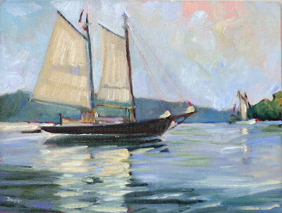
Mercantile was launched from Little Deer Isle, Maine in 1916. Until 1943, she was in the coasting trade, after which she briefly went into mackerel fishing. She is one of the earlier boats adapted to the tourist trade. She’s called a “bald-headed schooner” because she carries no topsails.
That’s Mercantile at the back of The Three Graces, by Carol L. Douglas
I’ve painted Mercantilemany times, mostly at Camden harbor. “I didn’t know she was so pretty,” exclaimed a hand after he looked at my painting. Actually, she’s beautiful, especially when her green undercoat is replaced with its glossy black topcoat.
I’m always at a loss about how to treat the flotsam that accumulates on the shipyard ground. It’s part of the scene but it can be distracting. The crew had made themselves a long trestle table with sawhorses and planks. I put it in in various places, dissatisfied each time. I moved it again this morning because it was cutting off the bottom of my composition.
Mercantile, 2016, by Carol L. Douglas
It was so warm in the morning that I wore clamdiggers instead of long pants. I always forget that the open water at Rockland makes it cooler and windier than at my house. I was glad that I had to be back at Rockport in the early afternoon, because by the time I quit painting, my teeth were chattering. 
I was meeting a young man to finish burying the power line to my commercial sign. “She tells me I’m dumb,” he said of one of his employers. I’ve heard several variations on this theme recently. As a person who was never much good at school, I find it irritating.
There are many ways in which “judge not, lest ye be judged” can be applied. If you have the good fortune to be particularly smart or talented, bear in mind that these are gifts for which you paid nothing. And remember that there are many kinds of intelligences and talents out there. You may mock that humble man today, but in a hurricane his ability to tie knots may save your life.
In God’s economy, all men truly are equal. They are not measured by their looks, talents, race, or achievements, but by the weight of their souls, as mystics from the Egyptians onward have poetically observed. Once you start seeing the world through that lens, you will be kinder to yourself and others. Today is Good Friday, the historic date of the assassination of Jesus Christ. If you take nothing else from Christian faith, remember that in God’s eyes we are all equal.
Have a blessed Easter.

Old subject, new technology

Yesterday I went all digital on a schooner. Allowing for the learning curve, this has potential.

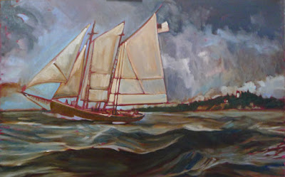
Underpainting of American Eagle passing Owl’s Head, by Carol L Douglas
I’ve toyed for a while with the idea of doing a large, Fitz Henry Lane-influenced scene of the American Eagle under sail. A large canvas of a boat in motion is not something you do en plein air, but the studies I’ve done in harbor certainly influence it.
A student recently asked me if I like painting ‘just water.’ I do, indeed, because to me there’s no such thing as ‘just water.’ There’s light, reflection, movement, the skipping of the wind, clouds, and promise. I showed him the wave study I did while cruising on the American Eagle last spring. That is the closest I get to a purely personal painting, one that has meaning for me and nobody else.
This field study of waves from last summer was the genesis of the painting above.
It was also the genesis of this larger idea. What better landform to use as a background than Owl’s Head, which sits just outside Rockland harbor, and where I paint many times every season?
When enlarging a sketch to a final composition, I generally use gridding, which I’ve explained here.  It’s laborious and time consuming. It’s also extremely accurate and allows you to execute a pretty decent grisaille on the fly, depending on how much time you want to spend.
The horizon has to be straight on a nautical painting, or else the oceans will run dry.
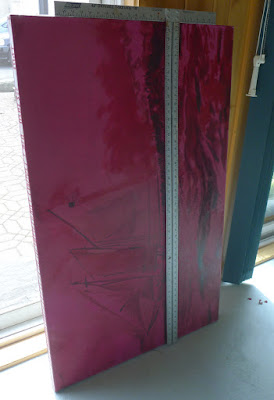
My daughter gave us a cast-off video projector last year. Yesterday I decided to experiment with it. I haven’t used projection to enlarge a sketch since the demise of 35mm slides. 
These projectors are designed to shoot an image high on a wall, so they are set up to correct for the keystone effect, which is the distortion you get when you project an image at an angle. Once I managed to undo that correction, squaring the image was relatively easy. Making it exactly the size of my canvas was harder.
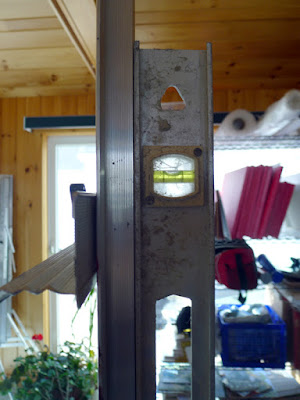
Level and square relentlessly.
I started with relentless leveling and squaring. The easel was perpendicular to the floor, the canvas leveled, the two lower corners the exact same distance to the projector. Even with all those preparations, the image was slightly canted. Fixing that took a lot of fussing.
From there, it was just a question of tracing the lines in the original sketch. However, my ability to see differences in value was vastly reduced.
I couldn’t see values but it was a neat optical effect.
Lest you think tracing is the answer to all your drawing problems, it’s still possible to make drafting errors. Note the slight sag in the bowsprit. I’ll fix that in the next iteration.
With all my fussing, I was able to finish underpainting this 30X48 canvas in a single day. There’s promise there.
It’s anemic compared to my usual gridding, but I still think it has potential.
I tell my students to use a combination of ultramarine and burnt sienna for their initial drawing, but in practice I generally use leftover paint for this step. The exact color isn’t nearly as important as the value. Yesterday, I chose an old tube of Williamsburg Brown Pink. I don’t use this brand because I find the pigment load in the blues to be too low for my style. 
That wasn’t true with this color. This morning my whole studio is swimming in a butternut-colored haze. There is brown stain everywhere—creeping along the canvas, in my brushes, on my hands, possibly in my hair.

Institutional Thuggery

If we let the United Airlines mugging go unpunished, we can kiss our democracy goodbye.
The Third of May 1808, 1814, Francisco Goya, Prado

For most of human history, citizens have, rightly, feared their governments or their neighbor’s governments. Ever since we ceded the power of defense to men on horseback, we’ve been in a battle for control. Much of the time the knights on horseback were the winners.

The 20th century was the age of the dystopian novel, because it was a century where governments repeatedly killed millions of their own and others’ citizens. My generation was educated on Brave New World, Nineteen Eighty-Four, Fahrenheit 451, Alas, Babylon, and A Clockwork Orange. These books warned us about our governments, but didn’t see the American corporation as a possible threat to our liberty and privacy.
Every morning, when I finish writing this blog, I look at Google Analytics. It tells me the age and gender of people who read my blog and website, where you live, what you’re interested in, and how long you tarry. That’s pretty low-level data mining, but it’s as much information as I want.  Others use your browsing and buying habits for more direct marketing. That, for example, is how the ads are populated in your Facebook feed and why you keep getting on more and more email lists.
Sturm (Riot), 1897, Käthe Kollwitz
Since President Dwight D. Eisenhower warned us about “unwarranted influence, whether sought or unsought, by the military–industrial complex” in his farewell address, there have been scattered warnings about the potential dangers of collusion between government and business. This week’s news story of a man being dragged off a United flight is an example of why we should worry more about this than about our government alone. A government employee (a Chicago Department of Aviation security officer) was used to drag a passenger from a plane owned by the world’s fourth-largest airline. The citizen has very few tools to resist that combination of power.
I am reminded of an incident from the end of the Roman Republic. Publius Clodius Pulcher was an aristocrat who knew that success was to be had by masquerading as one of the guys. As Tribune, he passed populist legislation that culminated in the disastrous free grain dole. He also deregulated gangs. That meant that thugs could roam Roman streets threatening anyone who opposed our man Clodius. In the end, that violence cost Clodius’ own life, but it was also the end of representational government in Rome.
Students of more modern history will remember the role played by the Sturmabteilung (SA) in destabilizing already-tottering Germany to make room for the Nazis.
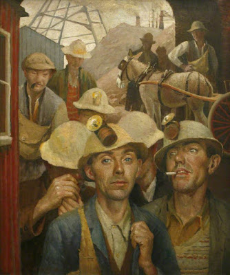
St Just Tin Miners, 1935, Harold C. Harvey , Royal Cornwall Museum
Jackbooted thugs can never be allowed to function with impunity, whether they’re acting on behalf of the government or an airline. They must be ruthlessly suppressed through the courts, in the marketplace, and in public discussion. That includes through art.

Do we, as artists, have the chops and courage to paint such scenes?  Or have we been diddling with ‘concept’ for so long that none of us can describe reality with our brushes? It’s easy to spray-paint slogans on a wall and pretend that’s art. It’s much more demanding to reproduce the faces of suffering, as did Käthe Kollwitz, Francisco Goya, and many others who came before us.

Rags and bags

She’s a long, lean dash of black in the water, but up in the cradle, the schooner J. & E. Riggin had me foxed.

The J. & E. Riggin raising her sails, by Carol L. Douglas.
For someone who likes to paint to the accompaniment of birdsong, the North End Shipyard in April can be disconcerting. A general mayhem of front-loaders, trucks, hammers, power tools and a nearby radio combine into an industrial musique concrete. I enjoy it, but it’s not to everyone’s taste.
Ed Buonvecchiojoined me at the shipyard yesterday and was an instant fan. “Look at that band saw!” he exclaimed when I took him to the office to meet Shary. “We should paint that.” Well, we should, but not right now. If we get in the way during spring fit-out, they’ll probably feed us through the band saw.
The J. &. E. Riggen in the cradle, by Carol L. Douglas
The J. & E. Riggin is in the cradle right now, and she has foxed me. Her bow is spoon-shaped, and she is very long and low to the water. However, there’s an S-curve to her hull that I didn’t understand. It turns out that she has geriatric back troubles, just like me. “Hogging” is when a wooden boat gets a semi-permanent crimp in its keel.
She doesn’t seem to let it bother her too much. She was launched 90 years ago as an oyster dredger in Delaware Bay, and she’s still mighty spry for her age. She’s one of the few schooners I’ve painted under sail, when she was cavorting around Castine last summer. I don’t know what hogging means in terms of sailing function, but it makes her silhouette a long, lean dash of black. In that way, she’s decidedly not like me.
The winch house and bow of the J. &. E Riggin, by Ed Buonvecchio.
That hogging means her bow sits lower in the cradle than the smaller American Eagle’s, which you can easily see by comparing Ed’s terrific painting of the Riggin with mine of the Eagle.
Yesterday, I was having troubles. I chose a close crop of the stern and then promptly forgot it as I got sucked into the rhythm of the cradle supports. I forgot painting rags and a trash bag. I dropped my coffee into my backpack, and then I dropped my mineral spirits into the gravel. Then I dropped my painting jelly-side-down into the dirt. Mondays. Hah.
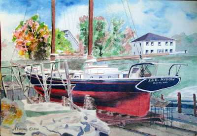
Captain Jon Finger stopped to talk to us. He’s a watercolorist. Of course, owning a schooner tends to use up all his spare time. “I do one painting a year and then I paint my boat,” he laughed. There’s such artistry involved in maintaining an elderly boat that it didn’t really surprise me to run into a captain who is also a painter.
The Riggin painted by her captain, Jon Finger.
Ed asked Captain Finger how they set the waterline when they replace large sections of planking. It turns out to be more or less a sophisticated process of estimation. Buoyancy varies based on temperature and salinity. On top of that, they are trying to draw a straight line on a curved and sinuous surface.
But waterlines are among the oldest ideas in human civilization. Systems and laws for regulating overloading of boats go back as far as Crete in 2500 BC. That’s a humbling idea on an airy, light Spring morning, when everything seems so new.

The decline and fall of liturgical music

If the church organist goes the way of the buggy whip, who’s going to remember JS Bach?

Carrying the Cross, pastel, Carol L. Douglas

I go to a modern church with a praise band, but I love traditional church hymns. There is nothing like Easter to remind you of great music like “Christ the Lord is Risen Today” and the power of church liturgy.

My children were raised in the Episcopal Church, specifically at St. Thomas’ Episcopal in Rochester, NY. They learned to sing under the tutelage of Dr. Robert Ferris, music director and organist. Rob is my age, so it shocks me to imagine that he could be contemplating retirement. The real question is, is he replaceable?
A recent story in the Baltimore Sun points out the growing shortage of pipe organists in the United States. That echoes a story in the Washington Post last year. A 2015 survey by the American Guild of Organists (AGO) shows a similar demographic picture.
Just 11% of AGO’s members were younger than 37; in fact, about 60% were nearing retirement age (58 or older). Almost the same number had played at the same religious institution for at least 31 years, with only 14% doing so for less than a decade. This pattern is true for both black and white churches and is most vivid in small communities.
Rob has a doctorate from the Eastman School of Music. For a young person facing the harsh realities of the 21st century economy, investing in such an expensive degree is hard to justify.
Gambling, Carol L. Douglas
The pipe organ is one of the oldest instruments in western music. Greek engineer Ctesibius of Alexandria is credited with inventing it in the third century BC. Since it involves both hands and feet, it’s more complex than the piano. Organ music doesn’t translate well to other keyboard instruments, since it needs an entire church nave to rumble to its profound tones.
One of my current tasks is to teachan inner-city grandmother. This week I am assigning her Bach’s St. Matthew Passion. This is one of the masterpieces of western sacred music, but it’s long and sung in German. (Since I am nice, I’m giving her a version with English subtitles, here.)
The Curtain of the Temple was Rent, Carol L. Douglas
I’ll start by telling her what a Passion is: a musical, artistic or dramatic setting of the events leading up to the Crucifixion of Christ. That’s a term that had meaning in my youth, when a majority of my fellow Northerners went to liturgicalchurches. Today, membership in those churches is falling, while membership in evangelical churches is rising. That’s a more serious and complicated question than just art, but it does mean that the art forms of the church, so lovingly cultivated over centuries, are in danger of falling away.
If Helen takes anything away from the St. Matthew Passion, it should be that Bach wasn’t just phoning it in. He felt and believed the story he was telling. That, I hope, is the nature of all great art, religious or otherwise. Can Helen see beyond the formal concert hall and imagine this music as it was first performed on Good Friday, 11 April 1727?

The problem with supply lists

I should KonMari my paint collection, not add to it. We go to workshops weighed down with too much stuff.

No, I don’t need any more watercolor pigments.
Many years ago, I took a workshop from a figure painter who specified cadmium green. I came home with an unopened tube and dropped it in a drawer. It’s still unopened.
I have great sympathy for students faced with a new supply list. In some instances, buying from them is redundant. For example, my list calls for Prussian blue, but if you already have phthalo blue, you’ve already got an excellent pigment for that color space.
It helps to understand the instructor’s reasoning. My list is based on paired primaries because I believe it allows the greatest range in color space. It occasionally changes as my painting technique evolves.  
Students usually show up with too much stuff because they don’t want to be caught without something they need. Most of what they carry, they never use. I’m feeling that urge to over-pack as I assemble the materials for Poppy Balser’s workshop in May.  Poppy, like me, is loath to send her students on spending sprees. However, it makes no sense to drive that distance and not be prepared.
And I don’t need a new mixing tray, either.
I trotted out my watercolor basket expecting to have to fill in color gaps. Actually, I should KonMarimy paints. What’s in the picture, above, is probably a quarter of the tubes in my basket. Does anyone really need five tubes of ‘opera pink’? More importantly, what is ‘opera pink,’ anyway?
Manufacturers love labeling convenience mixes with historic names. Consider Naples Yellow, used from the 18th to the 20th century. The real pigment is toxic lead antimonate. Modern paints labeled “Naples yellow” are made with a mix of modern pigments. You can make your own easily enough with white and yellow ochre.
That is the only name that really matters.
Pigments are listed on the tubes of all major paint makers in the form of Colour Index (CI) numbers. These are in tiny lettering on the side of most paint tubes. If the first letter is a “P,” that’s a pigment; if it’s an “N,” that’s a lake of a naturally-occurring substance like cochineal. The second letter tells you the general color family. The third tells you the actual pigment used.
A glance at my tube of ‘opera pink’ tells me it’s really PR122+BV10. The first is my old friend quinacridone magenta. Unfortunately, the second is a dye, rhodamine B, which bleeds and isn’t lightfast at all. I should pitch all five of those tubes.
My brushes, on the other hand, need help. New Yorkers will recognize some as being from the cheap bin at Pearl Paint.
If there is more than one CI number on the tube, you’re actually buying a hue or convenience mix. Many paint manufacturers sell hues of expensive pigments like the cadmiums and cerulean blue. They’re not consistent across brands, and they never have the handling characteristics of the more expensive paints they’re meant to imitate.
As with opera pink, even if the main pigment is lightfast, its partner may not be. Almost always, using single-pigment paint gives you the most flexibility in mixing.
There are many pigment guides on the web. Here is my favorite. Although it’s meant for watercolor, pigments are consistent across all media.

The good, the bad, and the downright ugly

Can objects acquire a vibe from the way they are used and treated? Boats have personality, and it comes from their pasts.

Thaw, by Carol L. Douglas

I woke at 3 AM redrafting the bow of the American Eagle in my sleep. I didn’t start her from a measured drawing, but after an internal fight about composition. The winch shed at the boatyard was trying to take over the painting, as it did last year (below). But the fight sapped my determination to draw methodically. I ended up going directly to paint. The results are, perhaps, less accurate and more expressive than usual, and I was working that out in my sleep.

American Eagle is my favorite boat in local waters, but I feel I’ve never really done her justice in paint. She is very graceful and bears the imprint of many loving hands. Launched in 1930 as the Andrew and Rosalie, she’s been captained since 1984 by John Foss, who is a meticulous craftsman. American Eagle comes out of the water looking better than some boats do going back in. In modern parlance, she has good juju.
Winch (American Eagle), by Carol L. Douglas. What a difference sun makes!
An example of a schooner with bad juju was the Amistad. Its case would go to the US Supreme Court and pit the sitting president against his predecessor.
By 1839, the United States and most other American governments had abolished the slave trade. Since slavery itself remained legal, however, the temptation to smuggling was strong. In the spring of 1839, 53 Sierra Leone captives—49 adults and four children—arrived at the depot of Spanish slave trader Pedro Blanco, who was one seriously bad dude. Most of the captives had been kidnapped, although some were war booty. They were part of a cargo of 500 people sent to Cuba on the purpose-built slaver, Tecora. The individuals in question were purchased as laborers for a sugar plantation near Puerto Principe.
American Eagle is a well-cared-for boat.
On the night of June 28, Amistadleft Havana, intending to run past British patrols. She was not built as a slaver; the captives were chained in its cargo hold. And they were abused. The cook, in particular, delighted in implying that they would all be killed and eaten when they reached their destination.
Led by a farmer named Joseph CinquĂŠ, the captives revolted. Using cane knives they found in the hold, they bludgeoned the cook to death and killed the captain. Two crewmembers escaped by canoe, and the cabin boy absented himself from the melee. Two others were ordered to sail the boat back to Sierra Leone.
Landlubbers, the Africans didn’t notice that the crew were sailing them north instead of east. The boat wasn’t provisioned for a long journey, and dehydration and dysentery took their toll. In all, the Amistad traveled 1400 miles before hauling up on Long Island. The surviving slaves were taken to Connecticut, which was still a slave state, and imprisoned.
From A History of the Amistad Captives, 1840. New Haven, Connecticut: E.L. and J.W. Barber, Hitchcock & Stafford, Printers.
The case was a legal morass. It appeared stacked against the Africans. The naval officers who captured the boat claimed it and the human cargo as salvage. The slavers wanted their property back, falsely testifying that the Africans had been born in Cuba and were not subject to the slave trade prohibition. The Spanish and US governments wanted the Africans returned to Cuba, where they would face death. Anticipating victory, President Van Burensent a Navy ship to hustle the Africans away before abolitionists could file an appeal.
No appeal was necessary. The Hartford court ruled in favor of the African prisoners. Our government pushed the case all the way to the Supreme Court. By then, former President John Quincy Adams had signed on as counsel to the Africans. Adams accused Van Buren of abusing his executive power. In March 1841, the Supreme Court decided in favor of the slaves, and they were free to leave—except that they had no resources. Northern abolitionists raised their fare to go home.
On November 26, 1841, the 35 surviving former slaves, accompanied by five missionaries, boarded a boat bound for Sierra Leone and freedom. The Amistad was purchased by Captain George Hawford of Newport, RI, who returned it to cargo service as the Ion. It passed out of history somewhere in the Caribbean.

Oh the places you’ll go

Cheap, plentiful, environmentally-friendly, and you can create a masterpiece with it. We should all use more charcoal.
Portrait of my friend Jane in charcoal, by Carol L. Douglas.

 Art supplies tend to be expensive, especially at the rarified corners of the business. Mother Nature, however, has given us a drawing material that is plentiful, dirt cheap, and environmentally friendly. A package of 12 sticks of Winsor & Newton vine charcoal costs just ten bucks, and a tablet of newsprintis about the same. For the cost of a pizza, you can go to the far corners of self-expression.

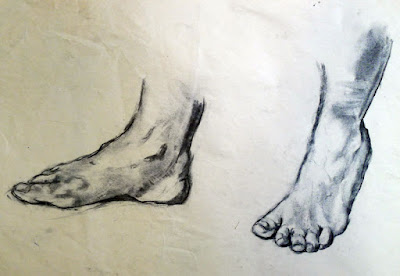
Charcoal is a great way to work out difficult drawing problems before you commit the problem to paint. Feet by Carol L. Douglas.

I use charcoal extensively in my studio: to work out new ideas, for gesture drawings, or to contemplate composition. It’s an excellent medium for experimentation. As a student yesterday remarked, “it’s not all about lines, like pencil work is.” When blended and lifted with an eraser, charcoal handles much like paint, making it the perfect preparatory medium for oil and acrylic painting. That’s why I start every new class with charcoal drawing exercises. It’s far better to learn the fundamentals of drawing and composition with something that’s not precious.

This was a preparatory sketch for a painting. By Carol L. Douglas.

I particularly like to have watercolor students do value exercises with charcoal. Value separation is a major challenge in watercolor. It helps to do it up front.

Charcoal is the cheapest medium in which one can create a masterpiece with staying power. For example, there are many works on paper by Edgar Degas done in charcoal and white pastel. He and other great masters used charcoal extensively.
Charcoal allows us to work out compositional questions. By Carol L. Douglas.
Choose a paper with a dull finish so that the charcoal can bite into the surface. Charcoal doesn’t stick well to hot-pressed, smooth papers like Bristol. It’s best on a fine-toothed, dull paper, but a rough tooth is also appropriate at times, although it raises more dust. My solution is to buy Canson’s Mi-Tientes, which has a different surface on either side, but there are many fine papers for charcoal work, including Canson Ingres, Strathmore 500 Series and Fabriano Tiziano. You shouldn’t need to use fixative to get the charcoal to adhere; if you do, try a different paper.
Compressed charcoal is powdered charcoal bound with gum or wax. It’s harder than vine or willow charcoal, meaning it can be sharpened to do very fine work. However, it’s not appropriate for using under paintings, because the binding can bleed. It doesn’t blend or erase as well. I never use it.
Seated figure, by Carol L. Douglas
Willow and vine charcoals are made of burnt grape vines or willow branches. They have no added binders, making them easier to erase. This charcoal can be used to sketch on canvas before painting in oils or acrylics; it will just vanish into the bottom layers of your work. It’s very light and makes soft, powdery lines.
“It takes a steady, careful, and patient hand to use charcoal,” an online student remarked yesterday. Only sometimes! Charcoal is an infinitely varied medium, in which one can make smooth graduations of value as well as slashing, dark strokes.

Flat-packing the landscape

Painting composition is all about ruthless editing. It’s a creative process, and it’s based on seeing.

Bill’s Yellow (with Admiration), 2005, Cornelia Foss, Houston Museum of Fine Art
Sometimes I hand out little plastic viewfinders to my students. Mine are made of Plexiglas, roughly along the lines of this one. But they are for beginners, to help them start to break down the vastness of the landscape into palatable bites. I don’t encourage reliance on viewfinders, any more than I like working from photos. Art is based on seeing.  Seeing isn’t a mechanical process; it’s a learned art.
Artwork Essential’s viewfinder is based on the Rule of Thirds. When I was in school, I was taught to divide canvases using the Golden Mean. It’s imprinted in my aesthetic, so I still see it as the most graceful compositional device.  Later, I learned about Dynamic Symmetry. All of these are good working systems, and all of them are based on mathematics.
The Golden Mean is closely related to the Fibonacci Sequence.
The human mind, in receiving mode, likes to tarry on puzzles. That’s why we use these complex mathematical systems to compose our paintings. In sending and processing mode, however, the mind ruthlessly regularizes thoughts. If you’ve ever tried to paint a screen of branches as in the Klimt painting below, you know this to be true. You must fight to keep them honest. Left to its own devices, your subconscious mind will line them up like little soldiers.
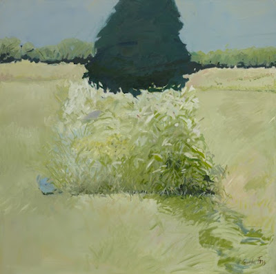
We “know” compositional rules, and then we see a painting like Cornelia Foss’ Bill’s Yellow (with Admiration) and we realize that all such rules can be set on their heads. Ms. Foss isn’t ignorant of design systems; in fact she knows them so well that she can play with them. Bill’s Yellow wouldn’t have been nearly the painting had she offset the brush and tree in a conventional way. It is monumental because she centered and overlaid them.
Beech Grove I, 1902, Gustav Klimt, New Masters Gallery, Dresden.
Compositions designed with mechanical devices are ‘safer,’ but they eliminate the space needed to make creative discoveries.  I greatly admire the work of painter Mary Byrom. Having now known her personally for several years, I know she endlessly experiments with composition and form. She isn’t getting those arresting compositions by setting up with a viewfinder; she gets them by slogging through damp marshes at twilight, and endlessly tinkering.
Early Dusk, Mary Byrom
“Plein air painting is like a test you take in class,” Brad Marshall told me. “You have to use your knowledge and finish by the end of the class period. There’s no credit for incomplete answers.
“Studio paintings are like essays. You have enough time to do your research, write and rewrite until the work is good enough to turn in.”
There’s room for both in professional painting, but for learning and growth, working from life is critical. That’s why I strongly discourage working from photos in my studio classes. Photos have already done the most important job for the painter: flat-packing the scene.
Confronted with the vastness of reality, all artists must relentlessly, ruthlessly edit what they see into a working design. With photographs, that is already done. And there’s no guarantee that it has been done well.

Come paint with me in my studio in Rockport, ME or my workshop at Acadia National Park.

Where realities collide

When video games include entire fantasy worlds, trompe-l’œil painting is obsolete. But it has delighted viewers from prehistory to now.
Andrea Pozzo’s painted ceiling in the Church of St. Ignazio, 1690. Note how the figures blur the line between the walls and the ceiling.

 All good things must come to an end, and the rise of photography spelled the decline of one of painting’s fascinating genres, trompe-l’œil painting. The phrase, which means “deceive the eye,” came into vogue in 1800. The idea itself is as old as mankind.

Pliny the Elder told a story of a throwdown between two famous painters of antiquity, Zeuxisand Parrhasius. Zeuxis’s painting of grapes was so realistic that birds flew down to peck at them.  Parrhasius then asked Zeuxis to pull back the drape concealing his painting, which revealed that the drape itself was a painted illusion. “I have deceived the birds, but Parrhasius has deceived Zeuxis,” the latter admitted. Besides implying that the artists were two pompous asses, the story hints that realism was a primary goal of Greek painting. In turn it was a primary goal of the 18th and 19th century painters who delighted in repeating Pliny’s tale.
Andrea Mantegna’s ceiling panel in the Camera degli Sposi in the Ducal Palace, Mantua, c. 1465-1474. 
Trompe-l’œil fits in the niche between fine painting and the decorative arts. It includes the lowly, unsung painters who put corbels and arches where no such architecture exists, as well as the work of known masters. We have no idea when the first trompe-l’œil was done. The rock-relief fronts at Petra are a form of trompe-l’œil, as are the mosaics at Herculaneum. So are the faux finishes you can apply with a kit from Home Depot.
The great age of faux painting was the Renaissance, when artists couldn’t stop playing with their new toy, perspective. Andrea Mantegna’s ceiling panel of the Camera degli Sposi in the Ducal Palace in Mantua uses single-point perspective and foreshortening. He has painted an oculusthrough which putti, people and a bird are looking down at the viewers.
Church interior, c. 1654, by Gerard Houckgeest
As knowledge of perspective increased, trompe-l’œil ceilings grew more complex. The goal was the same as that of the great cathedrals of the Middle Ages: to dissolve the barrier at the top of a room. Ceilings were painted as if they were continuations of the walls. Both ceiling and walls were enhanced with figures. This required a technique called perspectival anamorphosis, in which objects are distorted in such a way as to be visible only from a certain vantage point.
Hans Holbein used this technique on a famous canvas called The Ambassadors.It contains a skull that has to be seen from the extreme edge of the canvas. That was clever and difficult. Jesuit brother Andrea Pozzo used the same technique on ceilings and walls high off the floor. That was several steps past clever, since he couldn’t exactly step back and see whether his illusion was working or not. I can figure out how most things are done in painting; I cannot figure out how he managed to calculate the foreshortening required to make figures on a wall appear to be floating in space.
The Faithful Colt, 1890, by William Harnett
Trompe-l’œil had one more burst of popularity, in America at the end of the 19thcentury. Paradoxically, this coincided with the rise of a new technology that would mean the death of painterly realism: photography. But even with that, trompe-l’œil returns now and again. What are Andy Warhol’s soup cans if not an homage to the art of fooling the eye?