Monday Morning Art School: Basic principles of painting

Some painting rules are meant to be broken. But they all exist to make painting faster and easier.

Cadet, by Carol L. Douglas. That’s American Eagle in the background. That’s the boat my June workshop will be on.

 Itā€™s closing in on plein air season again. Here are some basic rules to speed up your field painting.

Buy the best materials and equipment you can afford: I was reminded of that this weekend as I struggled to get my low-end sewing machine to handle layers of tulle. If you invest in decent paints and decent brushes at the onset, youā€™ll make better progress in the long run. Youā€™re better off with a decent limited palette and two decent brushes than more stuff of lower quality. Then you can add to, instead of replace, over time.
Skinny layers in the beginning, please!
Fat over lean (oil painting only): This means applying paint with more oil-to-pigment over paint with less oil-to-pigment; in other words, use turpentine or odorless mineral spirits (OMS) judiciously in the bottom layers and painting medium in the top layer.
The more oil, the longer the binder takes to oxidize. This keeps paints brighter and more flexible. However, oil also retards drying. Using too much in underpainting, will result in a cracked and crazed surface over time.
The makers of Galkyd and Liquin say their products are designed to circumvent this rule. However, we have no track record for these alkyd-based synthetic mediums, whereas we have centuries of experience layering the traditional way.
Even if we could change it, why would we want to? Underpainting with soft, sloppy medium gives soft, sloppy results. The coverage is spotty and thin. The traditional method is tremendously variable and gives great control. It just takes a little while to learn it properly.
Can’t tell what that’s going to be? No matter; it’s the shapes that drive a painting, not the other way around.
Big shapes to little shapes: Work on the abstract pattern before you start focusing on the details.
The untrained eye looks at a scene and thinks about it piecemeal and in terms of objects: thereā€™s a flower, thereā€™s a path, thereā€™s a tree. The trained eye sees patterns and considers the objects afterward.
Is there an interesting, coherent pattern of darks and lights? Are there color temperature shifts you can use? In the early phases of a painting, you must relentlessly sacrifice detail to the good of the whole.  This is true whether the results you want are hyper-realistic or impressionistic. Composition is the key to good painting, and the pattern of lights and darks is the primary issue in composition.
Following the fat-over-lean rule, above, allows you to think about broad shapes first. In the field an underpainting done with turpentine or OMS will be mostly dry when you start the next layer. Stop frequently to make sure you havenā€™t lost your darks. If you have, restate them.
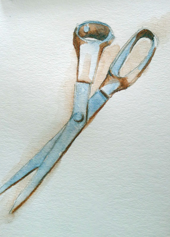
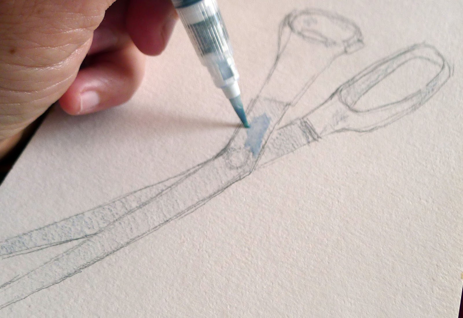
Follow the natural working characteristics of your medium: For oil painters, thatā€™s dark to light. For watercolorists, thatā€™s light to dark, because dark is impossible to eradicate. Acrylic painters can proceed any way they want, as long as theyā€™re using opaque paint.
Doing the drawing in a dark neutral follows the natural working characteristics of oil paints. By Carol L. Douglas.
In oils, itā€™s easy to paint into dark passages with a lighter color; the reverse isnā€™t true. This doesnā€™t mean oil painters donā€™t jump around after we set the darks; we can and do. In watercolor, itā€™s almost impossible to erase a dark passage, so itā€™s best to know where it belongs before you commit to it.
Donā€™t choose slow-drying or high-stain pigment to make your darks. The umbers are great because the manganese in them speeds drying. However, I donā€™t want to carry an extra tube just for this. I use a combination of burnt sienna and ultramarine.
By the way, this is a common rule of painting to break. Just be sure you have the process down before you start experimenting.
Drawn slow and painted fast by Carol L. Douglas.
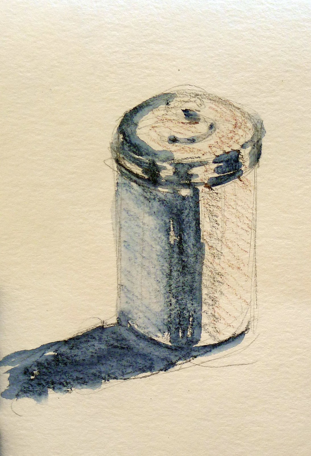
Draw slow, paint fast: This isnā€™t a classic tenet; itā€™s something my student Rhea Zweifler coined in my class years ago. Nevertheless, itā€™s a great rule.  
Taking time over your drawing allows you to be looser and more assured in your painting. Do value studies and sketches before you commit to color. Your mind needs time to think about the shapes it sees. Spend that time in the drawing phase, when ideas are easy to assess. Otherwise, you will be doing it on canvas, where your mistakes are more difficult to clean up.
Value study at Point Prim, Nova Scotia, by Carol L. Douglas.
Value studies and sketches allow you to be inventive. When youā€™ve only spent three minutes on a sketch, you donā€™t lose much by throwing it out. Drawing and value studies at the beginning actually speed you up, rather than slow you down.
It’s about time for you to consider your summer workshop plans. Join me on the American Eagle, at Acadia National Park, at Rye Art Center, or at Genesee Valley this summer.
This post was originally published in May, 2017 and has been edited and updated.

Art, engineering and gender

The same principles apply across all creative ventures. So why don’t women follow the money?

This way blindness lies…
Iā€™m in the midst of foot surgeries. As you can imagine, I got bored before I got mobile. My daughter is getting married next month, so it was a good time to do handwork for her wedding. I started with fringing shawls for the distaff side of the bridal party. I could do that with my foot elevated.
The artist is intrepid at making stuff. We simply donā€™t see lack of experience as a problem. Weā€™re often working in areas weā€™ve never been in before.
Fringing the shawls was tedious but required little actual skill.
Sewing, however, is something I can do just fine. If there was money in it, I might have been a couturier rather than a painter. From fringing, I moved on to making the ring-bearer a tartan bow-tie from the scraps of his sisterā€™s shawl. Then, since the mess was all out anyway, I started the flower-girlā€™s dress. All this has been drawing me upright. I work until my foot throbs and then stop.
The bow-tie took a little more experience.
Graceā€™s dress is meant to be a miniature of the brideā€™s dress. It has a bouffant skirt with horsehair braid on the top layers of tulle. I like this new use for an old material very much, but itā€™s hard to scale it to a two-year-old.
A two-year-old cannot go strapless, for engineering and other reasons. A train is also out of the question. And somewhere I need to incorporate a big pink bow, which the bride’s dress doesn’t have. As you can imagine, there is only so far a pattern can take you, and weā€™ve long passed that point.
Barb Whitten’s paper sneakers. A woman who can make those can make anything.
I copied the first four layers easily enough, but the top layer baffled me. I called artist Barb Whitten for help. She sculpts, so she can think in 3D. She had the layer figured out in minutes. There were eight panels, each with a 90Ā° arc, which meant the skirt encompassed 720Ā° of fabric.
I ran it past another friend, a seamstress and Civil War reenactor. ā€œYou realize I had to convert that to 19th century terms, donā€™t you?ā€ she said. The penny dropped for me. When I saw that wedding gown as a variation on a Victorian gown, the layers made sense.
In the end, it all comes down to craftsmanship.
But to scale it down and cut the pieces freehand required trigonometry. I donā€™t care if you call it math or you call it ā€œGranny drawing out a pattern on the table.ā€ Itā€™s the same thing. I guessed it, and then I calculated it, and my numbers were right to a quarter of an inch. So I cut it and sewed it.
Women have been doing this work since the dawn of time. Itā€™s not much different from carpentry. It starts with a vision, which is then sketched, measured and constructed.
Thatā€™s also how engineering works. So why are women so skittish about entering engineering as a field? Historically, women have participated in science and engineering at much lower rates than men. Thatā€™s sad, because those jobs pay well and are in demand.

Follow the money

What can we learn from contemporary animation?
Waves of Mercy and Grace, Carol L. Douglas. Would I want to wander around a world that looked like my paintings?

The global animation industry brought in about $254 billion in 2017, versus about $45 billion for the fine art industry. Unlike many other growth industries, big parts of the animation industry are located in the old developed economies, including the United States and Canada. Itā€™s a fast-growing sector, averaging about 5% per year.

If youā€™re a young person interested in a career in the arts, you will do well with a degree in computer graphics. Computer graphics designers working in the motion picture and video industries earn an average of $64,350, and thereā€™s a lot of demand for them in other industries as well. (In fact, the Federal government is the top-paying employer of computer graphics professionals.)
Keuka Lake Farm, by Carol L. Douglas
This means that animation plays a big part in developing our national aesthetic. I donā€™t play video games, but Iā€™m curious about their imagery, and I like speculating on how it will influence painting. I see this in the work of two young brothers from Syracuse, Tad and Zac Retz. Zac is a visual developer for Sony Pictures Animation. Tad is a painter. Their toolkits are very different, but the end result is often eerily similar.
Horia Dociu is a video game studio art director at ArenaNet. He identified three pillars on which all visual design rests:
  • Idea ā€“the intellectual content of your work.
  • Design ā€“ the stylistic and compositional choices you make.
  • Technique ā€“ your method of rendering.

He then went on to mention ā€˜tone,ā€™ which Iā€™m going to call ā€˜vibeā€™ because tone means something else in painting. Painters achieve their vibe through color choices and lighting, but most importantly with the subconscious things we bring to the easel. In fine art, we often think of our vibe as a natural state, but itā€™s also the easiest thing to manipulate into dreck. Thatā€™s a good reason to avoid being overly self-conscious about it.
Still, there are some fine painters out there whose work relies heavily on controlling ambiance. An example is Tarryl Gabel. She has an enthusiastic following for her misty, gentle, elegiac landscapes.
Piseco Outlet, by Carol L. Douglas
My kids sometimes play a game set in a landscape that looks like New Zealand on steroids. I enjoy watching because itā€™s a beautiful landscape, even though the actions are dorky. This raises a question that we painters never ask ourselves: given a choice, would we enjoy wandering around in a world that looked like our paintings? If not, we might have a problem with our vibe.
Dociu went on to suggest that video artists ask themselves the following questions:
  • Why am I doing this?
  • What do I want to say?
  • Who am I speaking to?
  • How can I be most expressive to reach the audience?

Rising Tide at Wadsworth Cove, by Carol L. Douglas
In the end, his talk came down to craftsmanship. It plays a big part of animation development but is given little credence in modern painting. Perhaps thatā€™s why the money flows so heavily in the direction of animation. Theyā€™re giving the people what they actually want.

Mummy Brown and other figments about pigments

Sometimes gruesome, dangerous, or ridiculous, pigments have a colorful history.
The Last Sleep of Arthur in Avalon, 1881-1888, Edward Burne-Jones, courtesy Museum of Art in Ponce Puerto Rico. This was painted before Burne-Jones had his epiphany about Mummy Brown.

Mummy Brown was a rich brown pigment, located somewhere between the umbers and siennas. Manufactured through the 19th century, it was a mixture of pitch, myrrh, and the ground-up remains of mummies, either human or cat. (Cat mummies were also imported to England for use as fertilizer; they were raised by the ancient Egyptians by the tens of thousands, killed in kittenhood, mummified and sold to pious pilgrims. They were common as dirt.)

An Egyptian mummy dealer selling his wares, c. 1870. Courtesy Harvard Art Museums/Fogg Museum

Mummy Brown was a favorite color of the Pre-Raphaelites. Edward Burne-Jonesonce invited his pal Lawrence Alma-Tademaover for lunch. ā€œMr. Tadema startled us by saying he had lately been invited to go and see a mummy that was in his colourman’s workshop before it was ground down into paint. Edward scouted the idea of the pigment having anything to do with a mummy ā€” said the name must be only borrowed to describe a particular shade of brown ā€” but when assured that it was actually compounded of real mummy, he left us at onceā€¦ā€ wrote Lady Bourne-Jones.

The story was taken up by her nephew, Rudyard Kipling. ā€œHe descended in broad daylight with a tube of ā€˜Mummy Brownā€™ in his hand, saying that he had discovered it was made of dead Pharaohs and we must bury it accordingly. So we all went out and helped ā€“ according to the rites of Mizraim and Memphis, I hope ā€“ and to this day I could drive a spade within a foot of where that tube lies.ā€
Wife of a Donator, c. 1450, Petrus Christus, courtesy National Gallery of Art, Washington. Her gown is Caput Mortuum.
Mummy Brown is not to be confused with Caput Mortuum, although the names were sometimes interchanged. Caput Mortuum was a purple form of hematite iron oxide, popular for painting the robes of saints. It was the by-product of sulfuric acid manufacture.
The pigment called Dragonā€™s Blood was supposedly a mix of dragon and elephant blood. ā€œ[Elephants] have continual warre against Dragons, which desire their blood, because it is very cold: and therefore the Dragon lying awaite as the Elephant passeth by, windeth his taile, being of exceeding length, about the hinder legs of the Elephant, and when the Elephant waxeth faint, he falleth down on the serpent, being now full of blood, and with the poise of his body breaketh him: so that his owne blood with the blood of the Elephant runneth out of him mingled together, which being colde, is congealed into that substance which the Apothecaries call Sanguis Draconis, that is Dragons blood, otherwise called Cinnabaris.ā€ (Alchemist Richard Eden)
The Burning of the Houses of Lords and Commons, 1834-35, JMW Turner, courtesy Philadelphia Museum of Art. Turner used Indian Yellow extensively.
Dragonā€™s Blood actually comes from the sap of Dracaena cinnabariand is extremely fugitive. Not that true cinnabar was anything to write home about, since it contains toxic levels of mercury. Despite that, it was once a popular cosmetic and art material.
Indian Yellow was said to be made by feeding mango leaves to malnourished cows and collecting their urine. Historian Victoria Finlay searched legal records, visited the town where the stuff was allegedly made, and interviewed elderly locals. She concluded that the story was probably a fable to gin up interest in the color.
All of this leads to the pigment Kidney Hematite. By now, youā€™re wincing. But Kidney Hematite is just an ore with a distinctive shape. Ground or sculpted, itā€™s perfectly benign.

It’s about time for you to consider your summer workshop plans. Join me on the American Eagle, at Acadia National Park, at Rye Art Center, or at Genesee Valley this summer.

Portland Museum of Art’s new admissions policy

If you’re 21 or younger, it’s free, whether youā€™re from Maine or Madrid.
Redbud Tree in Bottom Land, Red River Gorge, Kentucky, April 17 1968, 1979, Eliot Porter, dye transfer print, courtesy Portland Museum of Art. All pieces in this post are part of their permanent collection.
In my youth, the Albright-Knox Art Gallery offered free admission. If it was too rainy to go to the cemetery or the park, our parents took us to the art gallery. By the time I was aware of my surroundings, it was as familiar to me as my street was. As a teenager and young adult, I continued to visit it regularly. My keen interest in art history started there.
Two Men in a Canoe, 1895, Winslow Homer, watercolor on gray laid paper, courtesy Portland Museum of Art
Beginning tomorrow, Maineā€™s Portland Museum of Art will be free for anyone 21 or younger. (This extends the museumā€™s current policy, which is free admission to kids age 14 and younger.) If they sign up for the Susie Konkel Pass, they also will be able to attend free film screenings and receive other benefits.
Mount Katahdin from Millinocket Camp, 1895, Frederic Edwin Church, courtesy Portland Museum of Art
The age of free art galleries is mostly over, which means that parents donā€™t take their kids to visit much on rainy Saturday afternoons. There are, of course, still hold-outs: the Smithsonian, the Scottish National Gallery, the National Gallery in London, the National Gallery of Victoria, to name a few.
Many museums offer ā€˜free daysā€™ or limited kids passes. But mostly, it costs money to get in the door. Thatā€™s just one more nail in the coffin for kidsā€™ exposure to art, which has been on a downward slide since No Child Left Behind excluded art and music from the nationā€™s core curriculum.
Beaver Dam Pond, Acadia National Park, 2009, Richard Estes, courtesy Portland Museum of Art.
The stiff admission charged by large museums ($25 for MoMA and the Met, for example) distorts the museum experience. Visitors by necessity rush through and see the highlights of the collection, whizzing past the tiny gems. The farcical end of this kind of experience is the reduction of culture to a selfie with the Mona Lisa.
Susie Konkel, who paid for the Portland Museumā€™s policy expansion, is a retired teacher from Cape Elizabeth. Thatā€™s about all I can find about her on the internet, but itā€™s an unusual profile for a philanthropist. ā€œEducationā€™s always been very important to me,ā€ she told Maine Public Radio. ā€œAnd I think every childā€”not just in Maineā€”every child around the world should have the opportunity to experience the arts. And they get about 9,000 children here each year, into the museum. And this will just make it endless!ā€
Castine Harbor, 1852, Fitz Henry Lane, courtesy Portland Museum of Art
As a nation, we spend a lot of time trying to puzzle out why our popular culture seems so crude and violent. Perhaps itā€™s because weā€™ve cut off access to refinement in the form of fine art and music.
Thank you, Ms. Konkel, for trying to reverse this trend. I like to imagine cliques of teenagers stopping by the Portland Museum to catch a movie. May many, many of them take advantage of your generosity.

Monday Morning Art School: sketching with Inktense pencils

Inexpensive, portable, and way fun, you can use watercolor pencils anywhere you normally sketch.

One advantage of being a lefty is that nobody borrows your scissors.

I use Derwent Inktense pencils to draw my sketches in field paintings. On a gessoed board, you can erase with a damp cloth. When you start laying oil paint down, the watercolor drawing freezes in place. Iā€™ve been doing this for so many years, Iā€™d forgotten why I bought the pencils in the first place. That is, until Mary Byrom reminded me last week that theyā€™re great for pocket drawings and value studies.

This and a multimedia sketchbook is all you need to carry.

I buy them in packs of six in burnt sienna and ultramarine. This is a warm-and-cool combination that makes great neutrals in every medium. I use it for watercolor value studies and for my dark neutrals in oil colors. I can flip from warm to cool instantly with this mix, making it perfect for setting darks.

I always start with a pencil sketch.
The simplest (and most important) value study looks at the ways in which you can translate an image into simple black and white. At the same time as youā€™re thinking about black and white, you can also think about cool vs. warm. This is the modern, post-impressionist way of looking at value.
All light has color. An overcast sky has a color temperature of about 10,000K (blue). A room lit by candles has a color temperature of about 1,000K (orange). The most neutral light is sunlight at noon.
This photo of Mission San Jose in San Antonio starkly demonstrates the color of light. All the walls are white.
Of course, the ambient light color is also affected by the objects itā€™s bouncing off. I took the photo above in Mission San Jose in San Antonio to demonstrate this. The walls are white, but there was incandescent light above the loft. The lower part of the room was lit by daylight or in shadow. The effect was to make it appear that the room had been painted in blue and gold.
An aqua-flow brush is the easiest way to move Inktense around.
The color of shadow is always the complement of the color of the light. Of course, this is all mutated by the color of the objects being lit. A red sphere in warm light will appear crimson in the light spots and more purplish in the shadows. Thatā€™s just red mixed with orange light and blue shadows. We simplify matters by saying that if the light is cool, the shadows are warm and vice-versa.
The principle’s the same whether the light is warm or cool, as long as it is consistent and matches reality.
Inktense pencils allow you to add in color temperature as you think about value. Ignoring their actual color and modeling, I made a simple contour drawing of my sewing scissors. I set the lighter half of my value range in blue. Itā€™s simple to soften Inktense with a water-brush. Just fill it and run it over your pencil drawing. When that was done, I added my shadows in burnt sienna. You can get fairly intense darks with Inktense pencils.
Two different Inktense pencils can take you almost anywhere.
My fantasia was hardly inspired, but Iā€™ve included it to show you how much depth you can get out of Inktense pencils. You can buy two Inktense pencils, a water-flow brush and a small pad of watercolor paper for around $20. The combination is no bigger than a sketchbook and pencil.

ADDENDUM: Susan Hanna points out that Derwent doesn’t havethose color names. I should have checked first. My burnt sienna WAS a color called Venetian Red; they don’t market it as that any more. Try Red Oxide. Try Deep Blue for ultramarine. Once again, caught in the trap of romance naming for pigments.

SECOND ADDENDUM: Another reader mentions that Inktense pencils are fugitive. She prefers Caran d’Ache watercolor pencils. I’ve not tried them so can’t comment.

It’s about time for you to consider your summer workshop plans. Join me on the American Eagle, at Acadia National Park, at Rye Art Center, or at Genesee Valley this summer.

Judging watercolor sketchbooks and paintings

Grey is a beautiful color, but it doesnā€™t stand out in a crowd. Neither does weak design.
Jonathan Submarining is one of my all-time favorite paintings, but it didn’t impress jurors overmuch.

Iā€™ve promised several readers Iā€™d get back to them about my sketchbook choice for my Age of Sailworkshop. Iā€™m supplying the materials, so they must be good. I wanted to talk to Mary Byrom before I reported back. She teaches a sketchbook class in York, ME. Our technique is not the same; she works mainly in pen-and-wash; I prefer straight-up watercolor. But thereā€™s overlap, especially when the problem is keeping supplies contained for travel.

                                           
We agreed that the top sketchbook weā€™d tried was Strathmoreā€™s Series 400 watercolor journals. While I prefer ring bindings, this notebookā€™s soft backing made it possible to hold back pages with clips. Iā€™m a very wet watercolor painter, so if I can use it, nobody will have a problem.
And the winner is, the Strathmore 400 series watercolor journal and a clip.
That was the last fifteen minutes of a two-hour phone call. Most of it was spent on that eternal question: how to choose the best paintings to submit for jurying. My strategy has always been to put my top work from the prior year into a folder and look at it and whine.
Iā€™m drawn to the paintings in which I perceive a struggle. An example is Jonathan Submarining,which I painted at Castine Plein Air. This is one of my personal favorites. Poppy Balser and I had our feet in Penobscot Bay. The kids in their sailing class were rampaging about in a stiff wind. It was hard work to be accurate while capturing their excitement. Apparently, jurors did not share my enthusiasm. I didnā€™t get into many shows for which I used it.
Lobster Pound at Tenants Harbor is well-drafted and strong, but I don’t think its grey tones will work for jurying. (Courtesy the Kelpie Gallery)
All of us have emotional connection with our work. It distorts how we see things. To overcome this, I traded the final-pick task with Bobbi Heath. She reviews my submissions; I review hers.
Mary Byrom and I came up with another strategy. Next year, Iā€™ll create a folder containing my own best picks alongside paintings by artists with whom I will be competing to get in. (If you donā€™t know who these people are, you havenā€™t done your homework.) I did a snap search after our conversation. It was sobering.
Fish Beach, by Carol L. Douglas.
Itā€™s all about design and composition, which is why value sketches are such a necessary step in plein air. Aline Ordman said that a painting must compel at 300 feet, 30 feet and 3 feet. The 300-feet test is the same as the thumbnail-on-the-screen test. Depending on the popularity of the show to which youā€™re applying, the jurors may be looking at thousands of the little buggers. If your painting doesnā€™t stand out as a thumbnail, itā€™s not going to compel at any size.
Color matters, too. Grey just slumps back into my monitor. There are some paintings in my folder that are strong, but I wonā€™t be using them for future submissions. Nor will I design a composition around neutrals for an auction-based event, for the same reason. Lovely grey tones sell just fine; they just donā€™t stand out in the maelstrom.
It’s about time for you to consider your summer workshop plans. Join me on the American Eagle, at Acadia National Park, at Rye Art Center, or at Genesee Valley this summer.

Human skin tones

We come in an amazing array of colors, but they can all be mixed with the same narrow array of pigments. Why is that?

When Brazilian photographer AngĆ©lica Dass was six, her teacher told her to use the skin-tone crayon for a drawing. ā€œI looked at that pink and thought, how can I tell her this is not my skin color?ā€ That night, she prayed to wake up white, she toldNina Strochlic of National Geographic.

If you have close friendships with non-white Americans, you have heard variations on this riff. Thatā€™s particularly true if youā€™re of an age when blacks were invisible in commercial culture. When I was a kid, there were no African-American dolls in the stores, and few childrenā€™s books with black protagonists.
Iron oxide yellow, courtesy Wikimedia Commons
There is no underlying biological construct of race. The idea of separate races was the brainchild of a 19th century physician and scientist, Samuel Morton. He rejected the Creation Story in Genesis and argued, instead, that each of the five different races in the world was created as a separate species. (Remember that the next time someone tells you that believing in the Bible is somehow anti-science.)
Morton claimed that he could define the intellectual ability of a race by its skull capacity. Caucasians were, naturally, at the top of his chart. Negroes were at the bottom. His theories carried a certain amount of weight in American culture until they were shredded by the late paleontologist Stephen Jay Gould in The Mismeasure of Man.
Burnt sienna pigment, courtesy Wikimedia Commons
But back to AngĆ©lica Dass. She married a Spaniard, and she began to wonder about the question of human skin color. In 2012, she started photographing members of her and her spouseā€™s families. She then matched a strip of pixels from their noses to a Pantone color card. Humanae arose from this. It now includes 4,000 portraits from 18 different countries.
ā€œSo-o-o-o-o many colors of skin, not just black, white, red, or yellow,ā€ the reader who sent this to me commented. Thatā€™s true, but itā€™s also true that all human skin colors can be made with just a few pigments.
Thereā€™s really no such thing as white skin color, black skin color, or Asian skin color. They are mixed with the same array of paints; we just control how much white paint we add to the mix. My guide to mixing skin tones can be found here, but itā€™s also possible to mix all human skin tones with just iron oxide pigments. These range in tone from yellow through orange and red to black.
Iron oxide pigment, courtesy Wikimedia Commons
Iron is the most common element on earth, comprising almost a third of our planetā€™s total bulk. The second most-common element is oxygen. Iron oxides are chemical compounds of those two elements. They are extremely widespread in nature, appearing as rust and hemoglobin, among many other things. Humans use them in the form of iron ore, from which much of modern civilization was built. Iron oxide also gave us mankindā€™s first pigments, in the form of ochre, in use for 100,000 years. The iron oxide pigments are not only plentiful, theyā€™re very safe.
Iron oxide powder, courtesy Wikimedia Commons
Our coloration is intimately related to our planet. We are creatures of the earth, tied to the earth, and created here. Our pigmentation points not only to that, but to the universality of mankind, despite the artificial and abusive construct of skin color.
It’s about time for you to consider your summer workshop plans. Join me on the American Eagle, at Acadia National Park, at Rye Art Center, or at Genesee Valley this summer.

Everyone can be an artist

A tragic gentleman amateur gave England its first watercolors of America

Religious rite of the Secotan-Indians in North Carolina, by John White, c. 1585, courtesy of the British Museum
Iā€™ve written before about how the Cult of Genius gave society the misguided notion that art is a special gift for only a special few. Before the 18th century, drawing and painting were part of the gentlepersonā€™s toolkit.
John White is remembered as the governor of the tragic Lost Colony of Roanoke. He was also a fine painter. His field sketches spurred a mania for exploration and settlement of the New World.
Almost nothing is known about his background. He attended St. Martinā€™s Church, Ludgate, married Thomasine Cooper in 1566, and fathered at least two children. He was involved with the court of Elizabeth I, and a friend of Sir Walter Raleigh. He had the education of a gentleman.
Woman of the Secotan-Indians in North Carolina, by John White, c. 1585, courtesy of the British Museum
Raleigh sent White as artist-illustrator to the mad Sir Richard Grenville‘s first voyage to the New World. His paintings from this trip are an historical treasure. Theyā€™re our sole visual documentation of the natives of North America before European settlement.
A plan of the coast near Roanoke Colony, by John White, c. 1585, courtesy of the British Museum
Whiteā€™s paintings were a sensation in Europe. They were reproduced through engraving by Theodore de Bry and published in 1590 under the title America.
Raleigh next gave White the task of organizing a new settlement in Chesapeake Bay. White convinced more than a hundred colonists to join him, including his daughter Eleanor and son-in-law Ananias Dare. In reward, he was named the colonyā€™s governor.
An Algonquin sorcerer, by John White, c. 1585, courtesy of the British Museum
Roanoke Colony was never their goal. Their navigator simply refused to bring them north to Chesapeake Bay. His argument was that ā€œsummer was farre spent, wherefore hee would land all the planters in no other place.ā€
Grenville had left 15 men to defend his old discovery. They were all dead. The new settlers fixed up the old cabins. In their first military foray against hostile tribes, they accidentally killed friendly natives instead. Henceforth, relations with the localsā€”already fraught because of Grenvilleā€™s “intolerable pride and insatiable ambition”ā€”would steadily deteriorate. Still, things went well for a time. White became a grandfather, to the New Worldā€™ first European baby, Virginia Dare.
Curing fish over a fire, by John White, c. 1585, courtesy of the British Museum
Unfortunately, the colonists were starving. Their supply ships were expecting to find them a hundred miles to the north. White returned to England, much against his will, to fix the problem. After a harrowing sail, he arrived in Ireland in October of 1587. His timing was atrocious. The Spanish Armada threatened, and all shipping from England was embargoed
.
In early 1588 White was able to scrape together a pair of small pinnaces which were useless for military service. They were set upon by pirates and lost all their provisions. White and his crew narrowly made it back to England.
Clay pot boiling over a fire, by John White, c. 1585, courtesy of the British Museum
Finally, in March 1590, Raleigh was able to send help. They landed at Roanoke on Virginia Dareā€™s third birthday. The buildings were gone and the settlers had disappeared. The Englishmen spent months looking for them, but they were never found.
White never fully recovered. He ended up on Raleighā€™s estates in Ireland, where he brooded on the “evils and unfortunate events” at Roanoke. He never gave up hope that his daughter and granddaughter were somewhere, still alive.

It’s about time for you to consider your summer workshop plans. Join me on the American Eagle, at Acadia National Park, at Rye Art Center, or at Genesee Valley this summer.

The hardest working women in show business

To the ramparts, woman! The future of women artists rests in part with you!

My first event this spring is Santa Fe Plein Air Fiesta, so I’m getting into a New Mexico kind of mood. This pasture sketch is from my last trip there.
Last night I had a brief chat with my pal Mary Byrom. I want to go down to draw in Strawbery Banke in Portsmouth, NH. Strawbery Banke is unlike other living history museums in that it is a real neighborhood of real houses, restored where they originally stood. It dates back to 1630, when Captain Walter Neale chose the area to build a settlement. It was saved from the wrecking ball of 1950s urban renewal by historic preservationists and opened as a museum in 1965. It has unadorned simplicity and solid shapes that make you itch to draw.
Mary lives and works in southern Maine, so Portsmouth is her stomping ground. She recently did some delightful pen-and-wash sketches of Strawbery Banke. When she put them on Facebook, I asked her if sheā€™d be game to join me. ā€œI have to wait for this foot to heal,ā€ I said.
Last night she texted to see how I was doing. Iā€™m off to Damariscotta this morning to have the stitches removed and the foot released from its bandages. As of now I canā€™t do any significant walking. I donā€™t know what the doctor is going to tell me, or whether Iā€™m going to have the other foot operated on immediately. Itā€™s frustrating to watch my friend doing such lovely work from the vantage point of my couch. Iā€™m heartily sick of my couch.
The Rio Grande in New Mexico, by Carol L. Douglas
Mary told me sheā€™s teaching three classes right now. I whistled in admiration. The last time I did that was in 2008. I was ten years younger then.
That doesnā€™t sound so hard, but it is really a lot of work for the solo practitioner, who must advertise, prep, teach and clean up on her own. Every hour spent teaching means at least an hour of preparation.
Meanwhile, Maryā€™s been out doing small pen-and-wash sketches all winter. They grow steadily more wonderful. All of which points out an essential principle of painting: if you want to improve, you have to keep doing it. Thatā€™s true for beginners and itā€™s equally true for old pros like Mary.
Study at Ghost Ranch, by Carol L. Douglas
Bobbi Heath and Poppy Balser are two other women artists Iā€™m tight with. I know something about their day-to-day life. Neither of them is resting on their laurels, either. Both juggle the day-to-day business of an art career with the day-to-day business of living, while simultaneously driving themselves to improve and broaden their skills.
Iā€™ve written hereherehereherehere (and probably elsewhere as well) about the fabulous misogyny of the art world. If that ship is rightedā€”and it will beā€”it will be because women artists like Mary, Poppy, and Bobbi have worked so long and so hard to produce work. Their tireless efforts will open the door for younger women artists to be taken seriously right out of the gate.
Around the Bend, by Carol L. Douglas. New Mexico is surprisingly green in April.
Meanwhile, Iā€™m trapped on the couch with a damn dicky foot. I realize itā€™s only been two weeks, but it feels like an eternity since I last had a brush in my hand. To the ramparts, Carol! The future rests with you!
It’s about time for you to consider your summer workshop plans. Join me on the American Eagle, at Acadia National Park, at Rye Art Center, or at Genesee Valley this summer.