Yupo this!

It has all the charm of a milk jug but takes watercolor beautifully.

Marshall Point, oil on Yupo vellum. The bottom right corner was spoiled by potato chip grease.

I’ve been carrying around a package of Yupo translucent watercolor paper all summer, but lacked an opportunity to work with it in any systematic way. Yupo is billed as an acid-free, archival synthetic surface. It has the hand-feel of a milk jug, and a similar milky translucent surface. That’s because it’s made from polypropylene pellets extruded in a factory in Chesapeake, Virginia. So much for my hemp-wearing Green credibility.

The initial wash for the above. It has possibilities.

I find the surface seductive and deep, for many of the same reasons I find cold-wax medium compelling. I’ve been turning over the idea of working with it during my residency at the Joseph A. Fiore Art Center at the Maine Farmland Trust. The point of a residency is exploration, after all.

A detail of the spruces before I started cutting back in. It’s all experimentation, but I liked them better at this phase.
Before I started planning a major project, I needed to prove to myself that the product wasn’t just a gimmick. My main watercolor palette contains a mish-mosh of different paints acquired over decades. That’s not very scientific, but I do know how they behave on both hot- and cold-press watercolor paper.
Brad Marshall got surprisingly similar intensities on the Yupo (left) and cold-press (right). That, I think, is a function of the paint he was using.
Brad Marshall’s scientific control was much better; he pulled out the same Winsor & Newton pocket field kit he used on Wednesday. That’s a good solid kit; I have a similar one. However, it tends to a lighter pigment load than my tube watercolors.
Brad didn’t much like the vellum, but he’s a far more controlled painter than me. I think it works better for the Pig-Pen temperament.
Marshall Point lighthouse. There was no glazing possible in the dark passages; the water simply lifted the paint and redistributed it.
The sheet marks very easily. Next time I work with it, I’ll mount pages on drawing boards while wearing cotton gloves. Yesterday, I worked straight on the tablet with no board at all. It was windy and I found myself using my forearm and fingers to prevent fluttering. My sunscreen and skin oils created a film resist that I could lift with a paper towel and much scrubbing. The potato chip grease, however, made a far more permanent mark. I let paint pool over, but it had absolutely no tooth.
Of course, the same bad practice would mark rag paper as well, waiting to wreck the paper over time.
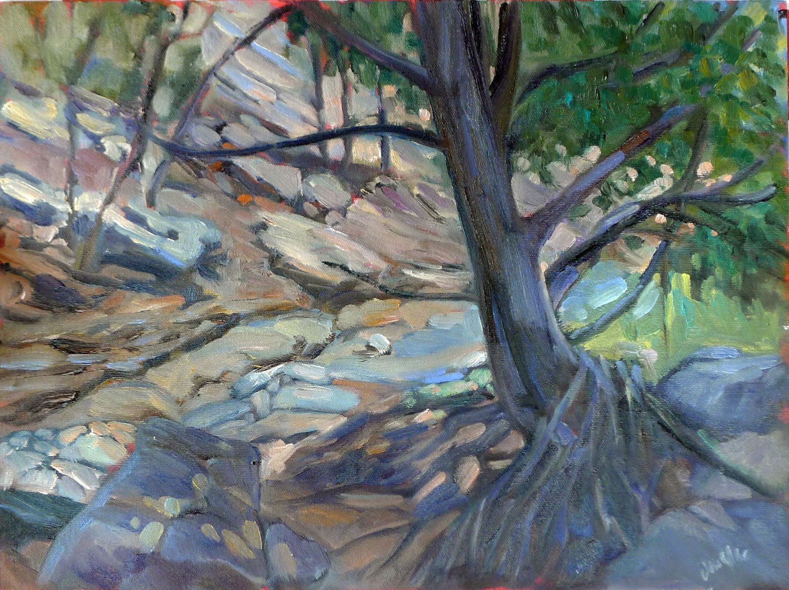
More rocks at Port Clyde. I found the separation between foreground and background difficult to control. That may mean there are no midtones possible.
Yupo’s main selling point is that you can lift paint up, solving the most significant challenge in watercolor painting. It’s fun, but I don’t think it’s any substitution for thinking out a good value structure in advance. As with all watercolor paintings, lifting affects the paints next to the paint being lifted, and the edges it leaves can be over-pigmented and gummy.
Glazing is next-to-impossible; with few exceptions, it just lifts the bottom layer back up. Glazing is such a fundamental part of watercolor technique that this changes the process altogether. Resign yourself to getting the value and hue right the first time, because you won’t be able to do the small modulations that make watercolor painting such a joy.
In some ways, the process felt like alcohol-marker drawing. At the same time, it encouraged me to finer drawing than cold-press paper ever does. The manufacturer says the paint can be fixed with Krylon Matte Finish. I’ll try that, because some method of permanent fixing is necessary before this product is useful. Putting it under glass would obscure its beautiful surface.

Don’t suck

Brad Marshall gives me some trenchant painting advice.
On the wall at Camden harbor, watercolor sketch, Carol L. Douglas.

I paint with my pal Brad Marshall about once a year—generally at Rye Art Center’s Painters on Location, and occasionally here in Maine. He’s retired from his day job as a sign-painter in New York City, and his paid gig these days is teaching watercolor on cruise ships. That’s influenced his practice. Instead of hauling his big field kit up to Maine in a minivan, he brought a small shoulder bag full of watercolor supplies in a Honda Civic.

This spring, the organizers at Parrsboro International Plein Air Festival gave each participant a hot-press watercolor block from Winsor & Newton. At 7X10, it’s the perfect size to slip into a backpack with my sketchbook, and this seemed like the perfect opportunity to try it.*
The big dark hull conundrum. I still don’t like the solution. It wasn’t until after I made the fatal brushstroke in the far water that I remembered this was hot-press paper. It, urm, doesn’t scumble well.
Since I don’t sell my watercolors, I give them less attention than they deserve. Still, I do a lot of them over the course of the year—as value sketches for bigger oil paintings, to work out composition issues, or when I just don’t have the steam to set up my full oil-painting regalia. Watercolor is a great medium for experimentation.
We painted in Camden, on a dinghy dock. All floating docks drop with the tide, but this dock is accessible by ladder instead of a ramp. It limited my time. Once it was at the point where I could no longer toss my stuff up and over onto solid ground, I was going to have a harder time climbing back up. It would be ignominious in the extreme to have to ask the harbormaster to rescue me.
But it’s all just an excuse to stick our feet in the water anyway. Photo courtesy of Kathy Jalbert.
In a tight harbor like Camden you’ll usually see big visiting boats on the nearest docks. These are too close for a good composition (unless you’re doing a boat portrait) and obscure the boats on moorings. Still, that overlapping jumble of hulls is the nature of the scene. I’ve been experimenting recently on using parts of boats, cropped tight, to suggest that jumble.
Dark hulls, close up, are not an inherently attractive composition. They make for a boring dull strip across the lower half of the paper. If there’s to be any background at all, all that darkness lands on one side and unbalances the painting. Still, it’s such a common situation, and I’d like to devise ways to deal with it.
I’m a mutterer when I paint, I’m sorry to admit. I wrestle through my ideas and problems out loud. Finally, Brad looked over at me and said, ā€œJust don’t suck.ā€ It seemed as good as any other advice, so I took it.
*I think this W/N sample block could convert me to hot press paper, if I can figure out the scumbling question. It’s a nice, flat sheet, easy to handle, and it tolerated the sea mist better than my usual Arches cold press does.

How to hold a paintbrush

Technique is one thing; the zeitgeist is another.
Dry Wash, painted earlier this year, is most indicative of where I’m going right now, but I didn’t even include it at the event where I painted it. Oops.

 Last week I showed Roger the proper way to hold a paintbrush. ā€œAt its end, like a baton,ā€ I said. ā€œNot like a pencil.ā€ I demonstrated how much more swing you get when you hold it like that.

Of course, there’s no one right way to hold a paintbrush. It’s just that every new painter thinks of it as an extension of their pencil and clutches it up near the ferrule in a three-finger choke hold, as if they’re about to work on their Palmer Method of Penmanship. That was adopted because it was hyper-regimented and would improve discipline and character. It was even believed it could reform delinquents.
Holding a brush like a pencil gives you a lot of precision but very little range. Holding it like a baton at the end gives a lot of lyrical movement and less precision. You can do both, but you’ll have much more energetic brushwork if you start off with it held farther back.
Roger’s a thoughtful guy. ā€œThis is all part of the idea of working in big, broad, patterns, rather than focusing on the details,ā€ he mused.
I don’t remember where or when I painted this, but I like it today. It’s almost impossible to judge change in real time.
Yesterday I wrote about alkyd media and glazing. I got an interesting response from Bruce Bundock, a fine acrylic painter who works as a preparator at the Frances Lehman Loeb Art Center at Vassar College. ā€œSeems to me painting is the one discipline where there is no ā€˜last word.’ It’s what works for each individual,ā€ he wrote.
Technique is one thing, the zeitgeist is another. The majority of painters since the mid-19th century have worked alla prima, directly and expressively. Glazing has no place in that system.
Painting movements are pushed along by both culture and technology. The Pre-Raphaelite Brotherhood was born in Victorian Britain. Queen Victoria’s early reign was marked by rapid industrialism and social and political upheaval. The nostalgia of its painters was reactionary, an effort to cope with overwhelming change.
Ruth, by Carol L. Douglas. Yes, I can glaze; no, I don’t like doing it.
The Impressionists were firmly grounded in technology. The vivid synthetic pigments that characterize their work were developed in the 19thcentury. They were able to paint outside extensively because of the invention of the paint tube in 1841. Emerging color theory shaped their thought.
Our own times have been rapid and anxious, which is reflected in our direct technique and in Expressionism. However, a young person would be a fool to tie himself to the last century. Nobody can predict where the spirit of the times is heading; we can only swim like mad and chart an uncertain course between fickle fashion and the past. And that is, as Bruce said, highly individual.
Alkyds may be the technological advance that ushers in a new period of indirect painting. After all, the Pre-Raphaelites were living in tumultuous times, and they glazed like mad. If you’re painting glowing, detailed interiors like William Holman Hunt’sThe Lady of Shalott, you’re definitely going to hold your fine brush like a pencil.
Wildfire, western Canada, painted during my 2016 road trip. Change isn’t always pretty.
But that’s not where we are today, and all I can do is teach my students the best technique rooted in our times. ā€œWhy didn’t you ever tell me this before?ā€ Roger asked.
ā€œI really thought I had,ā€ I said apologetically. Painting instruction is so individualized that you can easily miss something like that. ā€œBut I’m still not refunding your tuition,ā€ I added.
That was my last local (Rockport, ME) class of the summer. We start back up in October, on Tuesdays from 10-1. If you want a place in that session, email me.