Is it still plein air?

When do your touch-ups cross a line and make your work a studio painting?
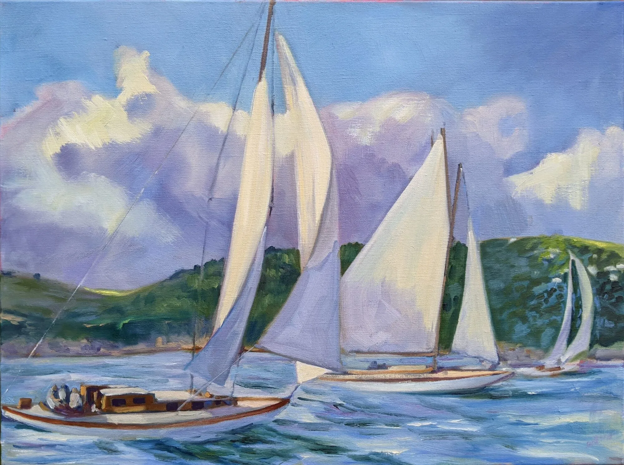
Autumn, by Carol L. Douglas
Earlier this season, a reader asked me what I do with work that doesn’t sell at plein air events. Most artists use this work to sell elsewhere. Occasionally, however, we’ll bring home stuff that’s so site-specific it has no place in our current inventory.
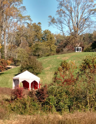
Earlier this month, I painted a Moorish tent at Winterthur. It was one of about twenty garden follies they’d set up for the season. The pink, orange and turquoise confection flapped proudly in front of a blazing panorama of trees. However, nobody else seemed as amused as me; the painting garnered nary a second look.
To make the change, I had to remove the brush marks from the folly. First, I carefully applied a small amount of mineral spirits, taking care that they didn’t run.
Yesterday, I excised the tent from the painting. I didn’t replace it with another focal point; I just let the landscape find its own structure.
It was necessary to get rid of the brushwork on the tent and the summerhouse so that they didn’t eventually appear in the surface as pentimenti. Because this painting is only a few weeks old, I was able to soften the paint with mineral spirits, and then carefully scrape down the top layer until it was flat. 
Gently, gently. You just want to take down the ridges.
It wasn’t necessary to remove all the paint, just the ridges. If you do this, be careful to confine the mineral spirits to the area you want to correct. It will soften both good and bad passages indiscriminately. And don’t press while scraping; you’ll distort the canvas.
Bye-bye, Moorish tent!
Then it was a matter of mixing some new green to fill in the area. If you aren’t careful at this point, you’ll end up repainting half your canvas trying to get the color right. You aren’t mixing a wall paint, so you’ll need to mix a few tightly-analogous colors. Then make sure you use a similar brush to the one you used originally.
This painting probably has about fifty added brushstrokes from the original. Is it still plein airfor the purposes of jurying? I used no additional reference, and the modification, although striking, was small. I think it counts, but I’m interested in what other people have to say.
Penobscot, by Carol L. Douglas
The second painting I changed was one done in Santa Fe in April. At the time, I realized that a few brushstrokes would convert this to Penobscot Bay. It has been curing too long to open the surface and flatten it. It didn’t need that, in fact. It does not have one single bit of solid paint over the old painting; every change was made by glazing. Again, there was no reference used and very little paint. However, the subject has changed completely. Is it still plein air? I don’t think so because the finished work has no basis in reality.
Sunset, by Carol L. Douglas
The third painting I included because it has had absolutely nothing done to it. I painted it with Poppy Balser on a brilliant, cold evening at Rockport harbor last month and tossed it on the pile to be finished later. Pulling it out, I realized it needs nothing. It’s bright and fresh and perfect as is.

Black and white all over

A class exercise on design, and a chemistry question I can’t answer.
Christ and the Woman Taken in Adultery, 1565, Pieter Bruegel the Elder, image courtesy of the Courtauld Institute of Art but the painting has been stolen.

Yesterday was the kind of day that drives poets mad. Just below freezing, it rained heavily, with gusts of wind. Our plein air painting class was forced into the studio.

grisaille (pronounced griz-eye) is a painting done entirely in shades of grey or another neutral color. Historically, it was used as decorative painting in imitation of sculpture. Some are what we moderns call duotones. They have subtle colors added to extend the value range. But for our class, they would be strictly in black and white.
Abstract design by Christine Covert

Painting runs along two parallel tracks. The first is design. This is why painting teachers relentlessly push students to do thumbnails and other value sketches. Value is our most important tool. Get it right, and you can be wrong about a lot of other things.

(I came to this realization late, by the way. I studied with Cornelia Foss, who tinkers endlessly with the ‘rules’ of painting. From her I got the hairbrained idea of minimizing value as a structural concept. However, this was a misinterpretation on my part. That’s a good lesson in not asking the right questions at the opportune moment.)
Grisaille by Jennifer Johnson.
The second track is color. It’s so much more interesting in some ways that it can be a distraction to the beginning painter. Mixing paints is both difficult and exciting.
Of course, value is part of color. In color space, value is the range from black to white. All successful paintings have some kind of pre-meditated value range in them. A high-key painting is one in which the contrasts are extreme. A low-key painting is one in which the range is narrower. In either case, there must be midtones too. They are also part of the design process.
Grisaille by David Blanchard.
It’s a lot easier to experiment with value when you’re not fussing about color management at the same time. One way to familiarize yourself with this idea is to paint a ten-step scale ranging from black to white. That’s not a bad exercise, but it’s boring. Instead I asked my students to do the monochromatic still life that I assigned in Monday Morning Art School last month.
Grisaille by Chris Covert.
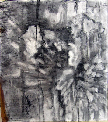
Before that, however, they did an abstraction in charcoal, based loosely on the drawing I included in yesterday’s blog. Charcoal is the most painterly of drawing tools, but this is something you can do in a sketchbook while watching TV. It is a bit intimidating for someone to ask you to do an abstract drawing, but if I call it “doodling,” you can relax and get on with it.
There are only two rules:
  • Have a full range of tones, not just a line drawing.
  • And no realistic objects belong in your drawing at all.

A question: One of my students has had a problem with red pigment from her toned boards bleeding into her final paintings. She prepared a sample board for me to test her M. Graham acrylics vs. a similar red from a very inexpensive craft paint. I tried the squares at 15 minute- and 30 minute-intervals. The M. Graham pigment bled into the white paint, but the craft paint did not. I then tried the same intervals using my own Golden-toned board. Again, there was no bleeding.
Acrylic is pigment suspended in acrylic polymer emulsion. It is supposed to be water-resistant when dried. That doesn’t mean it’s oil-resistant. I’m beyond my chemistry knowledge here, but if any readers can suggest what’s happening, I’d be very grateful.

You can’t draw a straight line, and other falsehoods

“I’m not talented” is the most pernicious lie in the world. Science is slowly disproving it.
Under a milky sky (Hare Bay, Newfoundland), Carol L. Douglas. It’s exactly what today’s sky looks like.

Like Thomas Edison, I firmly believe that “Genius is one percent inspiration, ninety-nine percent perspiration.” I have zero tolerance for the 18th century idea of the Cult of Genius or for Sigmund Freud‘s theories of poetic madness.

These ideas stripped rationality from the creation of art and the art market. They made it inevitable that art and music would be considered non-essential, meaning we could cut them from our schools. They removed the joy of making art from the everyday experiences of ordinary people. Early in our educations, some of us are labeled ‘talented’ and the rest are encouraged to do something else. That’s rigid and it limits everyone, artist and non-artist alike. 
Creativity is the one of the defining characteristics of mankind, after all, and it should flow through everything we do. That’s especially important in our post-industrial society, where making stuff—canning, farming, woodworking, sewing, etc.—is now unnecessary.
Abstraction, by Carol L. Douglas. Drawing takes many forms, and all of them are helpful to the human mind.
Science is slowly returning us to a pre-Enlightenment understanding of art as part of the toolkit of the rational man. Drawing is not just a tool to communicate; it’s a tool to classify and learn.
Sadly, educators seem to be the last ones on board with this idea. Here’s another study which says what I told my kids’ principals in vain: if you want my son to learn, let him doodle it. Don’t just try to cram it into his brain.
The researchers in this recent study figure that drawing gives your brain different ways to engage with new material—imagining it, rendering it, and looking at your visual record. All those steps encode it in your memory. I’d add one more thing—doodling is the spoonful of sugar that makes the medicine go down.
My late friend and student Gwendolyn Linn attracted a flock of kids eager to learn.
Adults can leave a work environment that discourages doodling. Kids aren’t so lucky.
Many of us were riveted by last week’s story of 40,000-year-old figurative cave drawings found in Borneo. “It now seems that two early cave art provinces arose at a similar time in remote corners of Paleolithic Eurasia: one in Europe, and one in Indonesia at the opposite end of this ice age world,” wrote co-researcher Adam Brumm.
It actually means that scientists have only found these drawings in Europe and Indonesia. Not every cave has conditions to preserve art, of course. But reason tells us that if there’s cave art in two such distant places, it was probably practiced worldwide by paleolithic man.
There’s a connection between these two stories, and it comes from my pal, artist Diane Leifheit.
Adult students getting fresh air and intellectual exercise last summer near Spruce Head. We won’t be so fortunate today; it’s raining.
“When someone says, ‘Oh I can’t draw,’ I say, ‘We have been making art for thousands of years. It is in our DNA. We just have to scratch the surface to find it,’” she said.
Next time you tell me you aren’t talented, remember that. As for drawing straight lines, I carry a straight-edge in my painting kit. Works every time.

Monday Morning Art School: How to use medium

The actual process is simple, but it has to be done right to prevent chalkiness or cracking.
The Farm at Olana, by Carol L. Douglas
“How should I treat older, unvarnished paintings that have become chalky?” a reader asked me. “And for that matter, what kind of varnish do you recommend?”
Chalky paintings are best revived with varnish. My personal preference is Winsor and Newton Artist’s Matt Varnish. It’s easily removable by a conservator, provides UV protection, and it doesn’t shine. (If you want more reflection, they make both gloss and satin finishes.) As with all varnishes, it shouldn’t be applied for a year after the painting has been finished, and it should never be used as a painting medium.
But learning to use medium properly is a better protection against chalkiness. (If you’re new to oil painting, consult my basic rules of oil painting.)
Mamaroneck River, by Carol L. Douglas, in its finished form right before it went on the auction block.
There are several families of oil painting mediums out there:
  • Traditional mediumsare made from a slow-drying oil (poppy, linseed, etc.) a resin, and a solvent, sometimes with a siccative like Cobalt Drier added to improve the drying time.
  • Alkyd mediums are made with a slow-drying oil reacted with an alcohol and an acid. They dry faster, making them suitable for multiple glaze layers, but they carry less pigment. They should never be used on top of traditional oil mediums.
  • Solvent-free mediumsdo not include any petroleum distillates. All unmixed slow-drying painting oils are inherently solvent-free, being plant-based.
  • Wax based mediums include cold wax and encaustic.

Mamaroneck River, when the second layer was done but the top layer hadn’t been started.
For field painting, I prefer a traditional medium: Grumbacher’s Oil Painting Medium II. It retards the drying time and allows me to work wet-on-wet longer. In particularly dreary conditions, I’ll use their Medium III, which has a drier. For studio work, I sometimes use their Medium II, because it dries to a matte finish. I buy this brand because I prefer a very thin medium. There are many good brands out there, and I would trust any medium made by a reputable paint house.
Grain elevators, Buffalo, by Carol L. Douglas is an example of a cold-wax medium painting. It gives tremendous latitude in effects.
Back in the last millennium, there was a popular recipe of linseed oil, turpentine, Damar varnish and a few drops of Cobalt drier. I stopped making it when I realized that so many 20th century masterpieces were degrading terribly. Chemists understand chemistry better than painters do.
The drawing layer is always done with solvent, whether in the studio or in the field. That’s Sandy Quang, back when she was my studio assistant.
Neither medium nor solvent is a substitute for good, open paint. If you’re poking a skin off your paint and extending it with solvent, it’s time to clean your palette and get new paints out.
The actual process for using medium in alla prima painting is simple: fat over lean. Your first layer—where you’re drawing the picture on the canvas, called the underpainting—is cut with a small amount of solvent only. Use too much and you’ll have muck above. Your middle layer should be as close to pure paint as you can get, applied thinly. Your top layer should be paint with a small amount of medium, and here’s where you can get as impasto as you want.
Clip this and paste it in your pochade box until it’s a habit.
Medium doesn’t belong in the bottom layers of a painting. The more oil in a layer, the longer the binder takes to oxidize. This keeps paints brighter and more flexible. However, oil also retards drying. Using too much in underpainting will result in a cracked and crazed surface over time.
Use too much medium and you’ll have a soup that dries to a plasticky finish. Use too little, and the paint will drag as you paint and cloud as it dries. I generally just touch the tip of my brush to the medium before mixing it into a brushstroke’s worth of paint.
This traditional method is tremendously variable and gives great control. Practice it.

We called them heroes

It’s the 100thanniversary of Armistice Day and the 80th anniversary of Kristallnacht this weekend.
Olympic with Returned Soldiers, 1919, Arthur Lismer, courtesy Canadian War Museum
I knew a World War I veteran. George Vanderhoek was elderly when I met him in 1980; he was a gentle, fatherly influence when I was in my first ‘grown up’ job.  I feel now as if my memories of him reach into the mists of time. It saddens me.
Sunday marks the 100th anniversary of Armistice Day. This was the end of the “The War That Will End War,” as H.G. Wells mistakenly called it. Ironically, tonight is the 80th anniversary of Kristallnacht, showing just how vain a hope peace can be.
Study for Sappers at Work: A Canadian Tunnelling Company, Hill 60, St Eloi, 1918, David Bomberg, courtesy Imperial War Museum
There have been some horrible times to be alive in human history. The period from 1918 to 1948 ranks among the worst for Europeans and Russians. It was an age of massive dislocation, death, war, and genocide. Asia eventually followed Europe’s lead in the next generation, with Mao Zedong and Pol Pot killing off their countrymen. In the modern era we’ve witnessed repeated African genocides. It’s enough to make you weep.
Charge of Flowerdew’s Squadron, 1918, Alfred Munnings, courtesy Canadian War Museum
Can I draw any conclusions from this seemingly endless wave of terror? None other than that humans, in an unredeemed state, are capable of unimaginable cruelty. That knowledge is always tempered with the understanding that, at the same time, there are people of great compassion who intervene even when the fight isn’t their own. We called them heroes back then.
The Resurrection of the Soldiers, 1927–1932, Sir Stanley Spencer, courtesy Sandham Memorial Chapel
We entered the Great War late, because it wasn’t our fight. The Commonwealth countries, tied to Great Britain, were in it from the beginning. But in either case, soldiers were volunteering to fix a problem that had nothing to do with them or their country. 
Prudence Heward, of whom I wrote this week, was one of many artists who dropped their brushes and went to the aid of Britain. A.Y. Jackson, Lawren Harris and Fred Varley came from Canada; Arthur Streeton from Australia. Of course, many British artists served as well, including Stanley Spencer, David Bomberg and Alfred Munnings. And American poet Joyce Kilmer was killed at the Second Battle of the Marne.
Mount St Quentin, 1918, Arthur Streeton, courtesy Melbourne Museum
Some of these artists were attached as war illustrators (as Winslow Homer had done in our own Civil War). Some just picked up a musket and joined up. Their calling in art was subservient to their calling as human beings.
WW1 was the last of a particularly heinous kind of war, the kind where rulers used their citizenry in an elaborate game of chess. It was replaced by something worse. “After the ‘war to end war’, they seem to have been in Paris at making the ‘Peace to end Peace’,” wrote British staff officer Archibald Wavell in a sadly prescient comment.
Houses of Ypres, 1917, A. Y. Jackson, courtesy Canadian War Museum
Years ago, my Australian cousin Mary taught me to make Anzac biscuits. These cookies were made for the Australian and New Zealand Army Corps during the Great War, because they would survive the long journey around the globe. I could spend this centenary of Armistice Day thinking futile thoughts, or I can bake a batch of Anzacs and remember the heroism of men and women from around the globe. That, after all, is the second great lesson of the twentieth century.

Let me invite you to my friend Sue’s party

Home from my last trip, I find the scene suddenly shifted to holiday joy
By Julie Haskell. Courtesy of the Kelpie Gallery.
Sue Baines of the Kelpie Gallery is having a party on Saturday afternoon, 3-6. She makes the best hors d’ouevres in the world, and she’s a dab hand with coffee. I, obviously, plan to be there. If you’re in mid-coast Maine, you should go too.
I occasionally feel a frisson of guilt when I invite my pals to Sue’s events, because they really are more party than opening. I should probably offer to help. But she’s so darn talented in the kitchen, anything I did would stick out like a sore thumb. Still, she encourages me to invite you, and I’d like to see you.
By Gwen Sylvester, courtesy of the Kelpie Gallery.
Don’t expect a hard sell. Sue isn’t like that. She doesn’t have to be. Her gallery is filled with absolutely wonderful work, beautifully curated in a light, airy space. I’m not saying that just because she represents me.
By John Bowdren, courtesy of the Kelpie Gallery.
I know she sets up this event so all price points are represented. But that doesn’t mean the less-expensive pieces are any less beautiful. You can come away with a Christmas gift that’s handmade, local, and meaningful at a price that won’t break the bank. Or, if you’d rather break the bank, she can point you to some fantastic paintings.
By Kay Sullivan, courtesy of the Kelpie Gallery.
Speaking of seasonal shifts, the great wooden boat fleet is shrink-wrapped at Camden and Rockport. You can finally find parking spaces at the harbor. Sadly, it also means Camden Falls Gallery will soon be closing for their winter hiatus. They’ve had a stellar collection of marine paintings this season, and you’d be remiss in not stopping by one more time before Howard and Margaret Gallagher set sail for the south. If you see Sandy Quang there, say hi. She’s my goddaughter.

DĂŠjĂ  vu, by Jill Valliere. Courtesy of the Kelpie Gallery 

Last, but certainly not least, my next session of plein air classes starts in Rockport next Tuesday. No, I’m not insane; the weather has been fine and the scenes achingly beautiful this autumn. This class runs every Tuesday through December 18, from 10 to 1, and the fee is $200. It’s where the cognoscenti of mid-coast Maine meet, so be there or be square.

Challenge to the ideal of femininity

Canadian painter Prudence Heward was an audacious post-Impressionist, and so much more.
Rollande, 1929, Prudence Heward, courtesy National Gallery of Canada.

When I first saw the painting above, I laughed aloud. I was painting badly, my nose dripping horribly. Young Rollandeperfectly echoed my mood. Kudos to the aficionado who texted it to me.

Rollande’s discontent is epitomized by her pink work apron. It is the initial focus of the painting and must have been loathsome to a girl with ambition. She stands, hands on hips, separated by a fence from the Quebec farm that is her lot in life. Even her posture is confrontational. She may be staring directly at us in the Modernist mode, but hers is no happy face. It’s almost as if we are part of the problem.
Compare her face to Bronzino’s Portrait of a Young Man, c. 1530, and you sense where Prudence Heward is heading. Bronzino’s anonymous poet can stare with unsmiling hauteur and we understand that he is the cock of the walk. But women—especially low-status women—are supposed to be cheerful.
Sisters of Rural Quebec, 1930, Prudence Heward, courtesy Art Gallery of Windsor
Rollande also modelled for Heward’s Sisters of Rural Quebec, 1930. The younger girl is her sister, Pierrette. The composition is a brilliant, complex slash of diagonal and vertical lines. It serves to further isolate the sisters, both from each other and from us. Not only are their faces stark and emotional, but note the sunflower at the bottom left corner. It’s in darkness, a mute testimony to their ‘real’ life on the farm.
Apple Tree (Study for Portrait of Ellen), c. 1935, Prudence Heward, courtesy National Gallery of Canada.
“I think that of all the arts in Canada painting shows more vitality and has a stronger Canadian feeling,” Heward wrote in 1942. At that time, Canadian painting had reached a brilliant maturity, separate from its American and British siblings. It was uniquely reflective of the country, its circumstances, its ethos and its pride.
Anna, c. 1927, Prudence Heward, courtesy National Gallery of Canada. She looks as if she’s fallen in the snow.
Prudence Heward was primarily known as a figure painter, although I’ve included a few of her landscapes as well. She was not limited by traditional QuĂŠbĂŠcois expectations herself. Rather, she was born in Montreal to a large, affluent family who supported her artistic inclinations.
During World War I she served with the Red Cross in England. Returning to Canada, she resumed painting, joining the modernist Beaver Hall Hill Group. Her first exposition was in 1924; her first solo show in 1932.
Farmhouse and Car, c. 1933, Prudence Heward, courtesy National Gallery of Canada.
In 1925, she went to Paris on scholarship, studying at the AcadĂŠmie Colarossi. Her work was profoundly influenced by the monumentality and color sensitivity of Paul CĂŠzanne, Henri Matisseand Henri Rousseau.
In Paris, she met her lifelong friend, Isabel McLaughlin. Together, they returned to Paris in 1929 and took sketching classes at the Scandinavian Academy. Heward traveled with McLaughlin and other artist friends throughout her life. They visited the Heward summer home near Brockville on the Saint Lawrence, northern Ontario, the Laurentians and Bermuda. In 1933, Prudence Heward co-founded the Canadian Group of Painters, the successor group to the Group of Seven
The Immigrants, Prudence Heward, 1929, private collection, Toronto
A serious car accident in 1939 was the beginning of the end of her career. She continued to paint until 1945, when her health problems forced her to give up her brush. Primary was her worsening asthma. She was seeking treatment for it in Los Angeles when she died in 1947 at the age of fifty. It was an unfortunate, untimely loss for Canadian painting.

Hoaxes, frauds, and ancient artifacts?

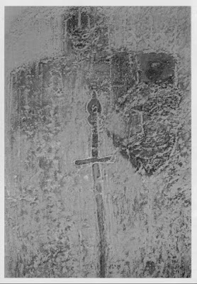
An ancient Scottish Templar lies in state in eastern Massachusetts.
Who needs to go to Britain to see a knight lying in state on his coffin lid?
Yesterday I stopped to paint in the marshes of Westford, Massachusetts with my pal Bobbi Heath. This is low country with oaks, spruces and pines, and the foliage this week is a perfect blend of russets, golds and cool greens.
My husband was flying to Boston from a week potting around England with two of our kids. I’d skipped the trip for Plein Air Brandywine Valley. I’ve seen enough knights reposing on their coffin lids that I wasn’t concerned.
A rubbing of the Westford boulder. It may be slightly enhanced. Courtesy of the Clan Sinclair Association (USA)
We would paint until dusk and I’d collect Doug at the airport on the way home. Of course, that wasn’t what happened. Bobbi is still hobbling from her Lisfranc fracture. What started as a spattering mist developed into the cold, full-throated pissing of a late autumn rain. That’s pneumonia weather.
So, we did what artists love even better than painting: driving around looking at stuff we might paint sometime. And then Bobbi casually mentioned the Westford Knight. We have a fine St. George battling a dragon here in Maine, and I figured it was something like that.
The best photo I could get of the boulder on a dark and stormy night.
Instead, it was a large hunk of granite under a Plexiglas cover, with something unmistakably carved into its surface. Carbon dating it would be impossible, since that only works with organic material. But granite is hard, and it couldn’t have been carved without tempered steel implements. That makes the rock either a hoax like Piltdown man, or a genuine relic of pre-Columbian exploration in the New World.
The rock was first mentioned in print in 1873. At the time, it was attributed to Native Americans. By the middle of the twentieth century, it had been identified as a medieval knight complete with sword and shield.
A rubbing of the Westford Boat Rock. Courtesy of the Clan Sinclair Association (USA)
This was in part due to the influence of TC Lethbridge, English archaeologist, parapsychologist, explorer, and all-around crank—in short, just the sort of man we should have over to dinner. Lethbridge, while classically trained, came to believe that the archaeological establishment wouldn’t countenance any thinking outside the usual academic platitudes.
Lethbridge was consulted about the Westford carving, and he suggested that it represented a 14th century hand-and-a-half wheel pommel sword.
Enter the Clan Sinclair Association (USA). They believe their ancestor, Henry I Sinclair, Earl of Orkney, discovered the New World around the year 1400. Sinclair apparently landed in Nova Scotia and then potted down the coast to Massachusetts, where he wandered inland.
My last evening at Plein Air Brandywine Valley. Courtesy of Bruce McMillan.
They believe that the rock commemorates a fallen member of Sinclair’s party, Sir James Gunn, a Knight Templar. Historians counter that the Order of the Knights Templar had been publicly disbanded ninety years earlier. This presents no particular historical challenge to readers of dime-store fiction. We know that Knights Templar popped up everywhere for hundreds of years after they were banned.
There’s also a matching oval-shaped boulder in Westford’s library. It has a sailing ship and an arrow carved into its surface. “Archaeological evidence indicates this was probably carved at the same time as the Westford Knight carving,” the Sinclairs wrote. There is, of course, no archaeological evidence anywhere, because of that pesky carbon-dating problem.
There are relics all over the northeast that defy categorization, including the Spirit Pond runestones found in Phippsburg, Maine. We have proof that Vikings visited the New World. Are all these old stones fakes, or are some of them real artifacts?

Monday Morning Art School: a simple exercise in composition

Diagonals keep us interested because they’re harder for us to “solve”.
The Artist’s Studio in an Afternoon Fog, 1894, Winslow Homer. Courtesy of Memorial Art Gallery.
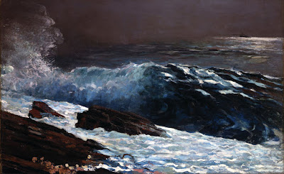
Winslow Homer’s most successful compositional motif was the long diagonal. He used it with great success from the beginning of his career right through to his mature Maine seascapes. Diagonals are particularly important in the latter, since they tie rock and sea together in a monolithic whole.
But diagonals are tricky, as I found last week. The Brandywine hillsides are lovely, but they’re not what I’m used to. They kept turning out stumpier than I wanted. Today’s exercise is designed to help us see the subtlety of the diagonal line.
The basic structure of The Artist’s Studio in an Afternoon Fog, above. Use tracing paper to do this step.
Diagonals are more dramatic than vertical or horizontal lines. They draw us through the picture, tie disparate elements together, and create depth and perspective. They don’t need to be articulated; this is a good place for the lost and found edge. A diagonal can be implied by a value shift within a larger object.
Our minds like diagonals for the same reason we like space divisions like the Golden Ratio: they keep our interest because they’re harder for us to “solve”.
Experiment with different values within the painting’s structure.

Today’s exercise is one you can do with a printer and tracing paper. Unfortunately, I have neither, being still on the road, so I’ve approximated it in Photoshop. First, find a suitable Homer painting, one where the diagonal drives the composition. I’ve used an old friend: The Artist’s Studio in an Afternoon Fog, 1894. This painting is at home at the Memorial Art Gallery in Rochester, where I’ve studied it many times.
Sunlight on the Coast, 1890, Winslow Homer. Courtesy Toledo Museum of Art.
You can use this painting or another. All I require is that the broad sweep of motion be on the diagonal. I’ve included a few other possibilities as well.
Next, I want you to print a copy of the painting and trace its major shapes. When you’re done, you should have something that looks approximately like the outline above.
The Fox Hunt, 1893, Winslow Homer. Courtesy Pennsylvania Academy of the Fine Arts.
The last step is to experiment with different value systems inside Homer’s basic structure. He was working from reality, but you have no such limit. When you’re finished with this, what do you observe about the values he used versus the ones you’ve tried?
  
If you sketched in the smaller dashes with high contrast, those passages should drive your eye as much as the big shapes do.

Painting at Winterthur

In the end, we each need only as many chairs as we have friends.
Folly, by Carol L. Douglas. 24X18

Plein Air Brandywine Valley is unusual in that the sales part is three days long. Usually, we paint at these events and then there’s a short auction or sale. Boom, we’re done and go home. This long sale period harks back to my days at art fairs, where we each had a tent and stood around wishing we’d brought our bocce kit.

But at least we don’t have to set our displays up. Tonight at seven we’ll appear at Winterthur, faces washed and the grime cleaned out from under our fingernails, to meet the public.
In case you think I was making things up, here is the Moorish tent folly and summerhouse from my painting. 
Winterthur bills itself as “an American country estate.” It’s a classic, aping the great landed estates of Europe. Primarily distinguished by its size, it has 175 rooms and 1600 acres (in its current, downsized, form). It has some fantastic specimen trees, all grown to luxurious maturity.
Whipping along its lanes in a chauffeured golf cart, I am reminded of an aphorism spuriously credited to one of the Barons Rothschild: “No garden, no matter how small, should have less than a hundred-acre woodlot.”
Home Farm, by Carol L. Douglas. This may not be the real home farm to this estate, but it’s one of many that du Pont collected and preserved to create Winterthur.
Winterthur was the life’s work of Henry Francis Du Pont. His father—also a Henry—graduated first in his class from West Point and served in the Senate. His grandfather—another Henry—was head of the du Pont conglomerate during the Civil War. A steadfast supporter of Lincoln, he held pro-slavery Delaware in the Union and refused to sell gunpowder to the south. His great-grandfather was, of course, the legendary E. I. du Pont.
That family genius seemed to bypass young Henry Francis. He was a horticulturist and collector of early American furniture and decorative arts. “I know that I am stupid,” he wrote his father while at school at Groton. He frequently described himself as “a farmer.” His father encouraged his interest in the breeding of Frisian cattle, thinking it more useful than buying a yacht.
I framed work on Bruce McMillan‘s car, since the Prius hood isn’t designed to set things on and the interior was too messy.
In the absence of commercial zeal, young Henry became an expert on American furnishings and interiors, gradually turning his home into a museum of American art and antiques. Many rooms were rescued from historic structures. The collection spans two centuries, from 1640 to 1840, and also includes a preposterously large library on the subject.
Painting along the Brandywine. Photo courtesy of Bruce McMillan.
I’m always melancholy when visiting these historic homes. They’re where unimaginable wealth meets limited imagination. I’m glad Henry Francis du Pont preserved this collection of farms (especially considering the growth in Delaware in recent decades). I’m happy, too, that he salvaged these historic interiors for future generations. But, in the end, we each need only as many chairs as we have friends.