My students make me proud

Lemme show you some pictures…

Linda DeLorey, from a class assignment on painting snow.

I’m turning into one of those old ladies who carries photos around in her phone and shows them to total strangers. However, they’re not pictures of my kids or grandkids (or even the dog). Instead, they’re my students’ paintings. I’m very proud of them.

Amy Thomsen, from a class assignment on painting trees.

People are embracing distance learning, even in the evening after a long day of work. I don’t know if that’s because of the continuing reach of COVID, because it’s winter, or because the limits of geography are lifted.

David Broerman, from a class assignment on painting snow.

It’s turning out to be as much a group of friends as my summer plein air classes. On Monday night, talk turned to baking, a long digression that ended with Mark going to his refrigerator for his sourdough starter. My Tuesday class includes sisters who live across the country from each other. It’s all far warmer and personal than I ever imagined.

Mark Gale, from a class assignment on color substitution.
Lorraine Nichols, from a class assignment on color substitution.

I’ve written extensively about learning how to teach with Zoom. If there’s been a gift from 2020, it’s getting me over the hurdle of video. I used to loathe being on camera; now I don’t even notice it. There’s been lots of trial and error and I’ve upgraded my cameras and monitor. That was worthwhile. With the proper equipment the video barrier seems to evaporate.

Lori Capron Galan, from a class assignment on reflections.

I have Mary Byrom to thank; she’s the one who coached and cajoled me past my resistance. That’s why I pay the favor forward to other teachers when I can.

Carol Durkee, from a class assignment on color substitution.

Beth Carr, from a class assignment on color substitution.

Zoom has made me a better teacher. Instead of teaching reactively, I’ve been forced to be far more proactive in designing lessons. Teaching without geographical boundaries means I’m getting serious students. They’re working extremely hard, and every one of them is improving.

Sharyn Brusie, from a class assignment on reflections.

That’s resulted in a long syllabus that will be the basis of a book, should I ever sit long enough to get some writing done (my New Year resolution.) 

Janice Vierke, from a class assignment on reflections.

We have a Facebook group where my students share recent paintings. I’ve nabbed some for you; I think they speak for themselves. There isn’t enough room in this blog to feature all of them, so I’ll catch up with the rest of them later. In return, I promise to not corner you at the grocery store and show you pictures of my grandkids, cute as they are.

Carrie O’Brien, from a class assignment on reflections.

Patty Mabie, from a class assignment.
Kathy Mannix has sold two paintings since starting my classes earlier this year. Amazing.

Mary Silver lives in the Texas hill country, where snow is generally just a happy dream.

Your brush is not a pencil

Mark-making can be loose and gestural or very controlled. It’s personal, but it’s also something you can learn.

Dining Room in the Country, 1913, Pierre Bonnard, courtesy Minneapolis Institute of Art. Bonnard used small brush strokes, intense colors, and close values.

In this week’s painting classes we worked on mark-making and brushwork. This is, on one hand, the most personal of painting issues. It’s also (especially in watercolor) highly technical. Much of what is called ‘style’ comes down to what brushes we choose and what marks we make with them.

Modern viewers are immediately captivated by bravura brushwork; it’s a sign of self-confidence and competence. It comes from lots of practice.

Wheatfield with Crows, 1890, Vincent van Gogh, courtesy Van Gogh Museum, Amsterdam. The motion in the painting is created by his brush strokes.

First, let’s talk about how not to do it:

  • Unless you’re doing close detail, don’t hold your brush like a pencil. It’s a baton, and holding it to the back of the center-point (away from the ferrule) gives you more lyrical motion. Your grip can still be controlled by your thumb, you can hold it loosely, or even clutch it in your fist. The important thing is to let your arm and shoulder drive the movement of the brush, rather than just your wrist and hand. The farther back you hold the brush, the more scope of movement. To loosen up, blast some music and pretend you’re the conductor and that brush is your baton.
  • Don’t dab. By this I mean a pouncing/stabbing motion with the tip of your brush. It’s amateurish in oils, anemic in acrylics, and hell on your brushes.
  • Don’t use brush strokes that go in all one direction. Learn to apply paint in the round. This is a rule that can be broken, but make sure you’re doing so intentionally, not just because you don’t know how to paint in every direction.

Self Portrait with Beret and Turned Up Collar, 1659, Rembrandt van Rijn, courtesy National Gallery of Art, Washington, DC. Pay close attention to the economy of the brushwork in the hair, and the expressive, unfinished brushwork in the face. In this way, Rembrandt was able to create a powerful focus.

There are many painters whose brushwork I admire, but there’s little point in trying to copy them in my own work. Brushwork is as personal as handwriting. It’s where the artist expresses—or suppresses—his feelings. There’s value in attempting to copy passages by great painters, and I suggest you do so with the samples I’ve attached to this blog. But don’t try to paint like Sargent or Van Gogh or Rembrandt; use what you learn to create your own mature style.

Waterlilies, c. 1915, Claude Monet, courtesy Neue Pinakothek, Munich. Monet makes no attempt to hide his drawing in this painting. The brushstrokes are wet-over-dry.

The best, most immediate, brushwork lies on a foundation of careful planning. Continuous modification, glazing, changing color, etc., makes for diffident marks. For the same reason, if you’re happy with the color and form of what you’ve laid down, refrain from ‘touching it up.”

Use your brushwork to highlight the focal points in your painting. Sharp, clean, contrasting marks draw the eye, where soft, flowing, lyrical passages encourage us to move through. Let there be dry-brush texture and unfinished passages in your painting.

Lady Agnew of Lochnaw, 1892, John Singer Sargent, courtesy Scottish National Gallery, Edinburgh. Note that the transparent sleeves are not produced by glazing, but with direct, long brushstrokes.

Above all, don’t bury your line. Much of the power of Edgar Degas’ mature work comes from his powerful drawing; he was the most accurate draftsman of his age, and he let that stand prominently in his work.

Monday Morning Art School: different strokes

The best way to learn about your brushes is to experiment.Your brushwork contributes immeasurably to the quality of your painting. Don’t dab or be diffident; plan your strategy and then execute it with boldness.

A spalter or mottler is a most useful watercolor brush.

On Friday, I gave you a guide to buying brushes. What are you going to do with these brushes now?

OIL and ACRYLIC

In the following illustrations, I’ve tried to keep the amount of solvent the same (except with the fan brush).

Above is a sable flat brush by Rosemary & Company. It can put down a very smooth surface and offers a lot of control, but it doesn’t carry the quantity of paint that an equivalent bristle brush will. I save sable for glazing or blending.

This is a hog bristle flat brush. The paint it lays down is both rougher and more impasto than the sable.

Flat brushes make an immediate, energetic mark. They’re excellent for fast, powerful surface work, long sweeping strokes, and blocking in shapes.

Used on their sides, they also make great lines, far more evenly than a small round can do.

Two rounds of very different sizes. A round is a more lyrical brush than a flat, and is a classic tool for painterly surface marks. It can be used to make lines that vary from thin to thick. A pointed round is used for fine detail. Bristle rounds tend to lose their points very quickly, however.

The great advantage of a filbert is the variety of brushstrokes you can get from one brush. This is great for single strokes that taper, such as in water reflections. Its rounded edges are good for blending. Set on its side, it makes nearly as good a line as a flat.

A bright is a less-flexible version of a flat. It’s great for short, powerful strokes or situations where you want a lot of control.

A fan brush probably has no place in a plein air kit, but I carry one anyway. I use it for blending, as on the left, although some people like using it to make whacked out marks as on the right. The problem is, it can carry very little paint, so its marks tend to be either gooey, as above, or very abrupt.

In my studio, I just use a clapped out soft-haired brush to blend.

Many plein air painters also carry liners and riggers, which are useful in paintings that are built up smoothly. I don’t paint that way, so I seldom use them. Another brush that is good for detailed work is an angled brush. I don’t have one of them, either. You can do almost any work you can envision with just the brushes I’ve shown you above.

WATERCOLOR

Watercolor brushes are softer than oil-painting brushes. The most expensive are natural bristles, and the difference is usually worth paying for. Natural bristles combine strength with suppleness and hold more paint than synthetics. Unlike oil-painting brushes, your watercolor brushes should last a lifetime, so buy the best you can afford.

In general, watercolor brushes drop more pigment the more vertically they’re held. You can use this to move from a filled area to a broken one in one brush stroke. In all the following examples except for the mop, I’ve held the brush both ways. A good general rule is to carry the vertical brush slowly and in a controlled manner; pull a horizontal brush more rapidly to get the least amount of paint contact with the paper.

Made with the spalter brush at the very top of the page.

The brush I used for the photo montage at the top of the page is a 2″ flat synthetic mottler or spalter brush. I like this shape for both oils and watercolor. It’s a relatively inexpensive brush that gives a beautiful wash. It’s useful for covering large areas quickly, but with precise edges.

A flat gives you good even washes. Used on its side, it can give you a controlled line.
A bright is a shorter version of a flat. More punch with less pigment.

Flats and brights give you nice flat washes, but can be used to make expressive lines as well. Brights have more control and carry less paint, just as they do in oil painting. Turn them on their sides to make a controlled line. Twisting the brush while painting gives an infinite variety of shapes. So too does varying the ratio of paint and water.

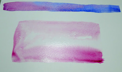
You can’t do either of these things in any other medium.

Because of the way watercolor bleeds, its brushes can be used in ways not possible in any other medium–a long blend of different pigments, or by painting a shape in clear water and then dropping pigment into it.

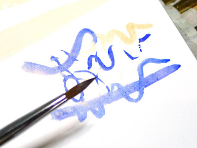
Round brushes give more lyrical lines than flats do.

I don’t normally carry riggers with me in either watercolor or oils. (They’re meant to paint perfect lines, and my world-view apparently doesn’t have many perfect lines in it.) Most of my line work is done with rounds. They do not give as much control on long lines, but they are very expressive.

A mop brush gives a perfect wash, but it does so much more as well.

Squirrel mops are the most uniform wash brush you can use. It’s virtually impossible to make them skip, so use them where a lovely flat wash is a goal. But a good mop can also point, hold vast amounts of paint and sweep across the paper in style.

I think Guillo the dog ate my sea sponge.

Natural sea sponges are multi-purpose painting brushes. Use them to apply or remove paint. They can be as subtle or bold as you wish.

The brushes you really need

You don’t need to spend a fortune to paint.

Channel Marker, 9X12, oil on canvas, available.

OILS and ACRYLICS

Expensive brushes are not the place to throw money for the beginning oil or acrylic painter—good quality paints are far more important. Still, brushes do change how the paint sits, and you need proper tools.

For alla prima painting in oils, you want long-handled hog-bristle brushes. They are less expensive than softer hairs like sable. I like Princeton 9700 series and Robert Simmons Signet hog bristle brushes.

Princeton also makes synthetic brushes that are good value for money—the 6300 series. Anything softer really isn’t appropriate for alla primapainting in oils. Acrylic paints will tolerate a little more flexibility, but avoid anything labeled for both watercolor and acrylic—they’re too soft. Princeton has a good chart of fiber stiffness, here.

Home Port, oil on canvas, available.

An assortment of rounds and filberts, a few large flats and an optional fan brush should suffice. More than a handful is overkill. Most workhorse alla prima painting happens between sizes #6 and #12, with a few smaller brushes for detail work, and larger brushes for bigger canvases.

If you like painting itsy-bitsy lines, invest in a rigger and a #1 round. I get more mileage out of spalter brushes, which are large, inexpensive flats for covering lots of area fast. I also keep a few soft sable brushes for glazing and blending.

Parrsboro Sunrise, 11X14, oil on canvasboard, available.

Bristle brushes tend to form a flag (a v-shaped split) at the end over time. If the brush is made properly, with good interlocking bristles, it will have a natural resistance to fraying. However, oil and acrylic brushes can’t tolerate letting paint dry into them, or being left standing on their bristles in solvent. You can wash brushes with Murphy’s Oil Soap, saddle soap (nice), specialty brush soaps, Fels Naptha, or even shampoo or detergent in a crunch. The important thing is that you do it promptly, before your paint has a chance to set up.

First, remove the solids by swishing them around in solvent. Then, put soap on a rag and work it into the bristles from the ferrule down to the bristles’ end. Be sure you’re washing the inside bristles, not just the surface. Repeat until the suds run clean. Shake excess water out, shape the brush slightly with your hand, and let it air dry.

Sometimes it rains, oil on canvasboard, available.

WATERCOLOR

Brushes are far more important in watercolor. I like Rosemary & Co. but they are very expensive. I recommend Princeton Neptune brushes for new painters. A ½” flat, a 1” wash brush, a #6 quill and a #8 round will get you started. If you’re going to invest in a mop, squirrel is better than synthetic. A set of short synthetic flats (or mottlers, as they’re sometimes called) in ¾”, 1” and 1½” will round out your collection.

Riggers and liners are tiny brushes for making very fine lines. They’re more useful in watercolor than they are in oils, in my experience. I buy the cheapest ones I can find because I’m always wrecking their points.

Lastly, you should have a scrubberto take out mistakes. You can buy them purpose-built, or you can just use an old hog-bristle brush.

Never leave your brushes standing in water, even as you work. Cleaning watercolor brushes is far easier than cleaning oil brushes. Hold them under the tap and let the pigment wash off with the flow of the water. I have never washed my brushes with soap, but if you find your synthetic brushes have stained, you can use a small amount of bar soap on them. Squeeze the water out and reshape the heads. That’s all there is to it.

Why don’t I teach private lessons?

You only hear what you are ready to hear. That takes time.

Bracken Fern, oil on canvas, available through Maine Farmland Trust Gallery.

I get frequent requests for private instruction. After all, if group lessons are helpful, wouldn’t private lessons be even better? Absolutely not.

I’ve taken harpsichord, voice and piano lessons. There are many similarities between studying music and painting. In either discipline, instruction time actually plays a small part in the student’s development. Most learning happens during practice, as the student masters what he or she has been shown.

On the other hand, there are significant differences. Painting class is not nearly as noisy, for one thing, so we teachers don’t have to try to sort out each player from the cacophony. We don’t demonstrate the minutiae of fingering or sound production, or concentrate on every note, phrase and fingering. There are aspects of music-making that are intensely detailed and physical. Painting in general avoids that.

Blueberry barrens, Clary Hill, oil on canvas, available through Maine Farmland Trust Gallery.

Instead, a good painting class is an ensemble of well-matched peers. They build on each other’s questions, suggestions, successes and failures. They ask questions that are pertinent to everyone. They borrow ideas from each other. My students often have insights that elude me, and I trust them enough to occasionally say, “I don’t know the answer.” I’ve frequently said I learn as much from my students as they do from me.

I have students who drift in and out of my classes and workshops over years. That’s a good thing; it means they’ve taken ownership of their own learning process. Last summer, one of them asked, “Where do I go when I’m done studying with you?”

The truth, to be brutally honest, is: nowhere. And everywhere.

Blueberry barrens, Clary Hill, watercolor, available through Maine Farmland Trust Gallery.

There are people who flit from teacher to teacher, workshop to workshop. They’re looking for a silver bullet that will circumvent the learning process for them. What they don’t realize is that most painting teachers are saying—more or less—exactly the same thing. The ones who aren’t, are selling a gimmick.

Nothing about painting is particularly revolutionary. The basic process is thousands of years old. Yes, it’s been refined, and a good teacher ought to be able to elucidate how it’s changed and why. But paint still gets attached to paper and canvas in a specific way.

Sea Fog, oil on canvas, available through Folly Cove Fine Art.

There are degrees of competence in painting teachers. If your teacher can’t articulate his process or doesn’t know color theory or art history, consider finding someone else. But beyond that, what we’re teaching is pretty similar. It ought to be.

That doesn’t mean it’s easy, or that you can take lessons for a year and nail it. For most of us, learning to paint at a high level of competence takes years. The lessons are deceptively simple. The teacher lays out the same information over and over, but the student is only capable of hearing what he’s ready to hear.

Good teachers repeat things—often—and watch and listen to see who’s getting it and who isn’t. Suddenly, there’s an insight somewhere in the room. When that moment happens, it’s an epiphany for everyone in the class. Everyone leaps forward; everyone benefits. No individual lesson can give you that.

Monday Morning Art School: scaling up a painting

It may seem time-consuming, but with big paintings it saves a lot of work in the long run.

My watercolor sketch. It’s gridded on a piece of plexiglass laid over the drawing.

On Friday I wrote about losing my painting reference and going to great lengths to find substitutes. The human mind being so fickle, writing that post made me suddenly realize what and where my original reference was. I came downstairs to my studio convinced that I would wipe out the interloping boats and go back to my original drawing.
I drew the mast positions in with charcoal and a straight-edge before starting to paint. That way their angle will match my sketch.

However, when I looked at the canvas again, I realized it wasn’t that bad. Different from my original intent, certainly, but not bad. I walked the dog and pondered. By the time I was home again, I’d determined that I should just paint both iterations. It was possible to differentiate them enough to make two different works out of them, both speaking to the flying sensation of sailing.

That meant gridding up a second version. This time I decided to go with the original aspect ratio of the sketch, rather than cropping it. I liked the yawl I’d truncated the first time around.

Straight lines, curves–it doesn’t matter. Just find the point at which they intersect the grid, mark those points, and work from there. I usually do this in monochrome but since I was working from a watercolor sketch, I just massed color.

I have a projector, but I find that gridding is more accurate and takes less time. Knowing how to do it is imperative for large projects, but it can be surprisingly useful in small paintings, too. Whenever you have trouble going from your thumbnail to the canvas, gridding is your go-to answer.

Boats v.2, laid out 24X36 in just a few hours. Later today I can actually paint them.

I realize many artists are math-phobic, but there are times when a bit of arithmetic can save you a world of pain.

First, work out whether the aspect ratio of your sketch is the same as the canvas. This is the proportional relationship between height and width. Sometimes this is very obvious, such as a 9X12 sketch being the same aspect ratio as an 18X24 canvas. But sometimes, you’re starting with a peculiar little sketch drawn on the back of an envelope. You can use a trick you learned back in elementary school.

Remember learning that 1/2 was the same as 2/4? We want to force our sketch into a similar equivalent ratio with our canvas.

Let’s assume that you’ve cropped your sketch to be 8” across. You want to know how tall your crop should be to match your canvas.

Write out the ratios of height to width as above.

To make them equivalent, you cross-multiply the two fixed numbers, and divide by the other fixed number, as below:

Use your common sense here. If it doesn’t look like they should be equal, you probably made a mistake. And you can work from a known height as easily as from a known width; it doesn’t matter if the variable is on the top or the bottom, the principle is the same.

The next step is to grid both the canvas and sketch equally. In my painting above, my grid was an inch square on the sketch and 4″ square on the canvas, but as long as you end up with the same number of squares on both, the actual measurements don’t matter. You can just keep dividing the squares until you get a grid that’s small enough to be useful. For a small painting, that could be as simple as quartering the sketch and the canvas. I use a T-square and charcoal, and I’m not crazy about the lines being perfect; I adjust constantly as I go.

The last step is to transfer the little drawing, square by square to the larger canvas. I generally do this in a dark neutral of burnt sienna and ultramarine. On Friday, however, since I’d already done a grisaille and a watercolor sketch of the subject, I just transferred large blocks of color. It may seem time-consuming, but with big paintings it saves a lot of work in the long run.

Some days I hate learning experiences

Painting boats is a great metaphor for life. The wind in your sails is the easy part. It’s the rigging that’s ticklish.

Breaking storm, 48X30, oil on canvas, available through Folly Cove Fine Art.

There are 47,000 photos on this laptop, another 41,000 on our server, and thousands more on my phone. (There is, of course, significant overlap). They’re in folders titled by seasons or events—except for images of paintings, which I store by the year they were completed. The problem is that I’m more likely to remember the curve of a taffrail than where or when I saw it.

Last autumn I did a watercolor sketch for a boat painting. I got as far as laying it out on canvas and then got derailed. I just got back to it this week and I had no recollection of what reference photo (if any) I’d used. There’s a low-res collage called Boats on my thumb drive. That’s a terrible name, since I have almost 400 other pictures with similar names. I looked at them all. No luck.

Sunset Sail, oil on canvas, available through Folly Cove Fine Art.

The shore in my sketch looks like the Camden Hills. Did I use a photo from the Camden Classics Cup regatta? Howard Gallagherand the late Lee Boynton and I once watched the start from Howard’s boat, but if I have any photos I no longer know where they are.

Let this be a lesson to me and everyone else—when you decide to paint from a photo, put it somewhere you can find it later.

I searched online and found a delightful Cornish sloop and a couple of beautiful Camden Class daysailors. I roughed them in and sat back to look. I’d just realized the scale was all wrong when Ann Trainor Domingue stopped by.

“Does it matter?” she asked. If you know Annie’s work (which is terrific) you’ll understand why she questioned that. But to me it mattered.

I can paint the sails of most fore-and-aft rigged vessels in my sleep. They feel as natural as the wind to me. But when it comes to attaching them to a hull, I must be careful. Placing the cabins, the masts, and the sheets properly is ticklish.

It’s a great metaphor for life. The wind is the easy part.

The trouble with combining reference photos of boats is that the wind, the light, the angle and the scale all must be roughly the same. For my painting to work, the different boats’ sails can’t exactly mimic each other. However, boats running in the same wind tend to be trimmed the same way. I debated how much license I wanted to take.

I ran this past my pal Bobbi Heath, who not only paints boats, but also sails. She, in turn, ran it past her husband. He thought my gaff-rigged cutter might plausibly be jibing at the same time as the sloop was running downwind.

“We may be overthinking this,” Bobbi added. I wasn’t worried; Bobbi and I do some of our best work while overthinking things. Still, I was unhappy. My painting had developed a patina of historical drama, and that wasn’t what I wanted at all. I was trying to paint sheer larkiness.

Rising Tide at Wadsworth Cove, 12×16, oil on canvasboard by Carol L. Douglas. Stimulus sale price, $675 (regularly $895 unframed)

Last February, Ann Domingue and I planned a workshop called Uncovering Your Mark, which was a guided exercise to help artists get to the heart of their own work. She planned to teach it in my studio here in Maine in June. With the pandemic, she offered it online as a Zoom class.

I had expected to learn something about how I might change my work. Instead, I realized I was painting exactly what I’m supposed to be painting right now. She couldn’t have given me a greater gift.

Stormy Weather, 16X20, oil on canvas by Carol L. Douglas. Stimulus sale price $1000 (regularly $1400 unframed)

The brilliant thing about art is that neither Ann’s approach nor mine is ‘right’. We’re each saying different things in our paintings, speaking to different audiences. I wouldn’t have it any other way.

Thinking about that, something clicked and I remembered where the photo that inspired my sketch was filed—under Eggemoggin Reach Regatta. The human mind is inscrutable, isn’t it?

If I don’t have the exact boats, I certainly have the right wind. Today I can scrape out my flailings and paint it properly. At times, art can be a cruel taskmaster, but if you’re patient you will get there.

Five ways to spend your stimulus check

It’s meant to be an economic stimulus, not life-support.

The Dooryard, 11X14, oil, by Carol L. Douglas. Stimulus sale price, $550 (regularly $735 unframed)

Whether or not you wanted it, the government recently put $600 (or more, or less) in your checking account. It’s meant to stimulate the American economy, but I’m not sure how much is helped by our usual purchasing patterns. After all, much of what we buy at big box stores is made overseas. Assuming you don’t need the money to pay the rent, how can you spend it to benefit your neighbors as well as you?

Invest in your health. Sadly, $600 won’t buy a tummy-tuck, but it will pay for exercise classes or a gym membership. It could also buy physical therapy for that persistent pain, or a round of preventative dental cleanings. How about good winter gear from Maine’s own LL Bean so you can exercise comfortably in the winter? The person who said “there’s no bad weather, just bad gear” is an idiot, but warm boots do help. 

Fallow Field, 12X16, oil, by Carol L. Douglas. Stimulus sale price, $675 (regularly $895 unframed)

Don’t forget mental health. I’m from New York, where all the best people have had therapy. It’s not cheap, but it can exorcise the demons that keep tripping you up.

We’re all suffering from disconnection these days. More data on your phone plan or a fiber-optic internet service provider can mean better connections with others. If your technology can’t keep up with modern communications, update them.

Jack Pine, 8X10, oil, by Carol L. Douglas. Stimulus sale price, $315 (regularly $420 unframed)

Buy art. I’m not talking just paintings here, although that’s a great idea. Instead of replacing the next item on your list with something utilitarian, why not buy something beautiful instead? Consider handmade jewelry, hand-dyed textiles, or a handcrafted table instead of yet another particle-board whatsit from a big box store. (As a dedicated green, I’m a firm believer in good used furniture.)

This is not just about making work for a starving artisan, or even about indulging yourself. If carefully selected, art can yield better long-term gains than the stock market. Not only will you enjoy handling and seeing the object every day, your heirs may thank you after you’re gone.

A caution—there’s a world of difference between ‘collectibles’ and art objects. If you don’t understand the difference, find a competent gallerist to help you.

Winch, 12X16, oil, by Carol L. Douglas. Stimulus sale price, $675 (regularly $895 unframed)

Learn something new (take a workshop or class). There’s been an explosion in on-line learning because of COVID. Why not use your spare time to learn to sing, do Pilates, or paint? You can find classes on almost anything. (Sadly, my own Zoom painting classes are currently waitlisted.)

Or, sign up for a workshop in the summer. I’ve got four on the docket for next year—Sea & Sky at Schoodic, Pecos, and two watercolor workshops aboard schooner American Eagle.

If you’d rather figure it out yourself, acquire the tools you need. One of my painting students has been buying router bits; he’s teaching himself to make frames. Get a guitar or a good used piano and make some music.

And there are always books, which were the original door to shared knowledge.

The Whole Enchilada, 12X16, oil, by Carol L. Douglas. Stimulus sale price, $675 (regularly $895 unframed)

Buy a tree. I’m a pretty cheap person, so my idea of planting a tree has always been to dig up a sapling, transplant it, and wait for it to grow. The older I get, of course, the less practical that approach is.

All of us could use more beauty in this world, and our local garden center is a great place to find it. I’m seriously thinking of yanking those overgrown, dormant shrubs this winter and replacing them with something pretty in pink.

Donate to a charity. There is always need right in our own communities, especially in this pandemic year. Mainers can consider Maine Community Foundation. In Rochester, I like Gerhardt Neighborhood Outreach Center. I’m sure there’s an organization in your town that could use help.

Monday Morning Art School: how to draw a tree

Trees have limbs, so it’s no surprise that you draw them much like you do the human figure.

Old barnyard tree, by Carol L. Douglas. 6X8, oil on canvas.

All drawing starts with careful observation. Start by observing the branching structure and overall shape of your tree. Opposite branching means that side branches, twigs and leaf stems grow directly across from each other from a main trunk. These include maple, ash, dogwood and buckeye. Alternate branching is much more common. It’s where side branches, leaves and twigs do not grow opposite each other, but grow in either a spiral pattern or an alternating one. The oak family are alternate branchers; stems grow out in a spiral pattern with no two branches coming from the same node. This creates the oak tree’s distinctive silhouette.

Every variety of tree has a distinctive shape.

It’s very easy to fall into the trap of making trees two-dimensional cutouts, with branches extending to the left and right. In fact, branches extend in all directions, including straight at you. How do you render this with authority?

Wire-frame drawing of the basic shape of my White Oak.

Don’t try to sort all that complexity out in one shot. Rather, start with the major structure. Just as with the human figure, I start with a wire-frame drawing. In the case of trees, I start by reducing the trunk and branches into a series of tubes in space.

Check those negative spaces!

As you finish each major branch, check to be sure the negative space between the branches is accurate.

If you’ve done this phase correctly, you might notice that these simplified branches are almost human in movement and shape. This should be no surprise; we’re all part of the same creation.

That’s the basis of your line drawing.

Connect the tubes with flowing lines to create your tree’s wooden structure. Don’t obliterate the circles too fast; they will be your guides to setting shadows.

Time to set the shadows.

Identify the light source—is it coming from the left or the right? Once you’ve identified the light source, set the shadows.

The foliage doesn’t need to be fully articulated, just suggested.

Add foliage as masses of dark. If you want to articulate the individual leaves more carefully, you can do so, but be selective. Too much detail will obliterate the charm of your tree.

Presto, it’s a White Oak!

Refine the shadows and you’re done.