Plein air painting on the cheap

If you’re trying painting for the first time, it makes sense to use less-expensive equipment and supplies. Here are corners you can cut.

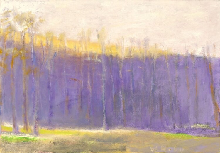
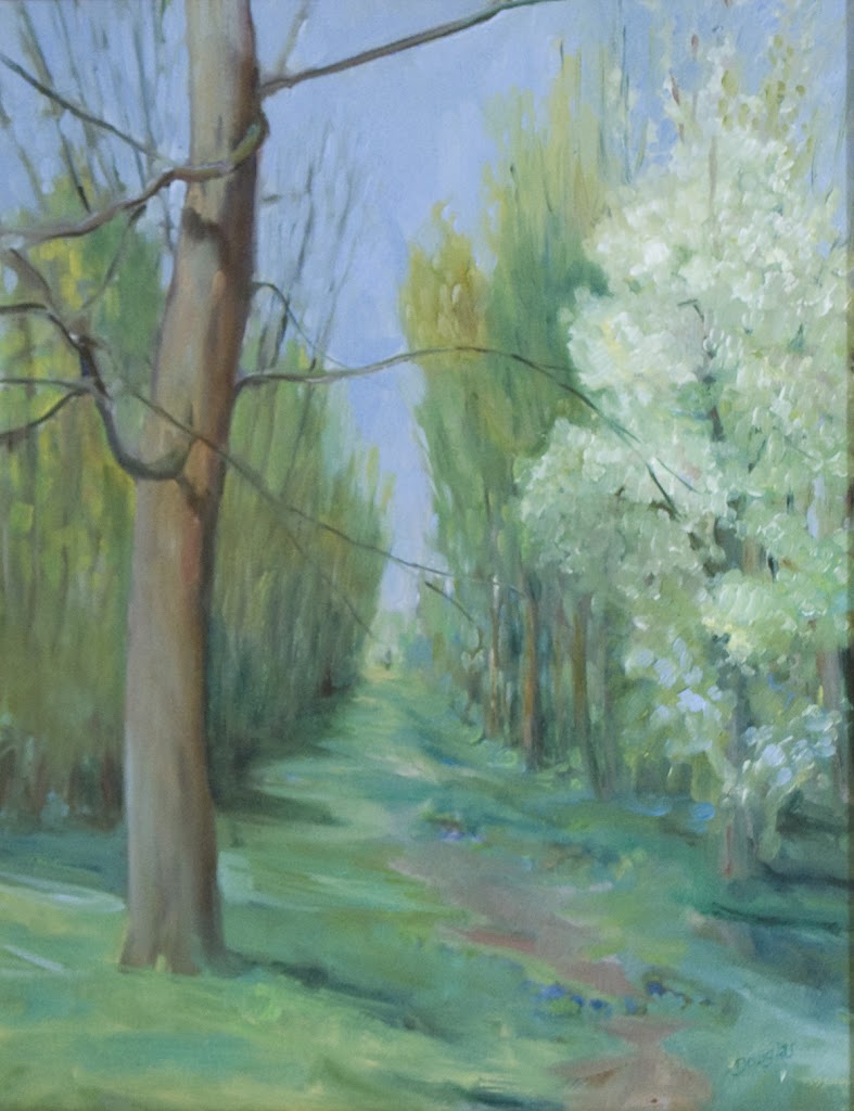
Early Spring on Beech Hill, 12X16, oil on canvas, $1449 framed includes shipping to continental US.

In 2018, when I first wrote about plein air painting on the cheap, this pine tripod easel cost $7.99. It’s ‘on sale’ for $14.99 now, a whopping 53% price increase in four years. That’s precisely why, if you’re interested in trying plein air painting for the first time, you should probably think about ways to do so on the cheap.

That’s the same easel I learned on in high school. I still have it today, tucked into the corner of my studio. It’s rickety, awkward—and it works. It was a standard style field easel until the invention of pochade boxes that screw onto tripods. My father painted his whole life with a similar, home-made model.

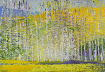
Bridle path, 11X14, $1087 framed includes shipping to continental US.

This easel, however, requires some sort of table. My thrifty friend Catherine uses an old TV table, but there are lighter versions now available.

I wrote recently about pochade boxes for every budget. Dollar Tree’s 9X13 baking pan has only gone up to $1.25, so you can still make the cheapest possible palette for $2.50, plus duct tape. What I neglected to mention in that post was the possibility of buying a used pochade box. Some of my best art tools were purchased second-hand. But you must have the time to be patient.

If you’re handy, you can make one like I did. Or, there’s the classic cigar-box pochade.

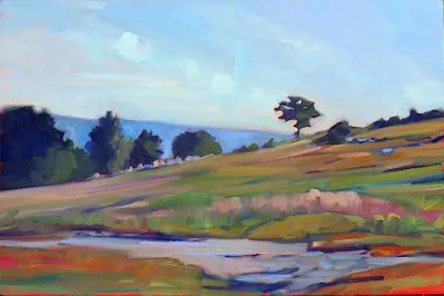
Best Buds, 11X14, $1087 framed, includes shipping to continental US.

One of the great advantages of watercolor is that it doesn’t require any easel. Many studio oil painters sketch in watercolor in the field. A Winsor & Newton Cotman field set and a watercolor journal are a cheap, lightweight introduction to wilderness painting. That’s essentially what Thomas Moran carried on the Hayden Expedition to Yellowstone in 1871. He’s known as an oil painter, but his watercolors have an important place in art history.

In every media, the difference between professional and student grade paints and pastels is the amount of pigment and the quality of the binders. In some cases, more expensive pigments will be copied with hues. A hue mimics the color of a single-pigment paint with less-expensive materials. For example, “cerulean blue hue” is often a combination of zinc white and phthalo blue.

A better solution is to avoid pricier pigments in the first place. In earth colors, there’s almost no difference between the student brand and the professional brand. The difference shows up in paints like the cadmiums, where the pigment itself is expensive. There are modern substitutes that do the job equally well at a lower cost.

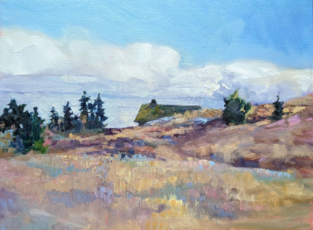
Blueberry Barrens, 24X36, $3985 includes shipping in continental US.

There are decent student-grade brands out there in all media:

Oils: Gamblin 1980 and Winsor & Newton Winton.

Acrylics: Winsor & Newton Galeria and Liquitex.

Watercolors: Winsor & Newton Cotman or Grumbacher Academy.

Pastel: Alphacolor Soft Pastels

If you decide you love plein air painting, you can replace these student-grade colors with professional-grade paints over time.

Brushes don’t have to break the bank either. Even though I have a slew of fine watercolor brushes, I still reach for my Princeton Neptunes. Oil and acrylic are trickier since cheap brushes sometimes drop bristles in your work. Princeton also makes good, inexpensive oil/acrylic brushes, especially their 5200 and 5400 series. If you want a synthetic brush, make sure it imitates hog bristles, not sable. A softer brush isn’t meant for alla prima painting.

It’s plein air season again. Check out my workshops, here.

Monday Morning Art School: what we can learn from Wolf Kahn

Color is the dominant theme of our age.

Autumn trees, undated, Wolf Kahn, from a commercial lithograph

Wolf Kahnwas a mid-century American landscape painter who was influenced significantly by Abstract-Expressionismand Color Fieldpainting. The fog on Deer Isle, Maine led to an epiphany about color: “I began to let the color come through on my canvases,” he wrote. “My pastels were always intense, and finally my painting caught up with them.”

Brilliant Green Trees, 1997, Wolf Kahn, courtesy Walter Wickiser Gallery

Kahn’s canvases are deceptively simple. What can we learn from them?

Color is the dominant theme of our age

That was beginning to be true in the 1960s when Kahn was coming into his own, but we now live in the full maturity of color. We are surrounded by a surfeit of chromatic intensity. Imagery has always been influenced by what’s around us, and today that’s our cell phones, monitors, and televisions. Printing technology is far better than it was even thirty years ago, so the photos in our books are clearer and brighter than ever. Paint and pigment technology have undergone similar improvement, which is why we’re seeing houses with navy blue vinyl siding—they’ve managed to make a dark blue that doesn’t fade.

Will this trend last forever? For all I know, there will be an equal and opposite reaction into monochrome. But for the moment, we’re living in an age of intense color, and if you are painting in our times, you’d best know how to use color.

That includes understanding and using modern organic pigments.

Midsummer, 1993, Pastel, Wolf Kahn, courtesy Walter Wickiser Gallery

The ‘real’ hue is irrelevant if the value is right

Kahn is famous for substituting impossible colors into the landscape: orange scrub, fuchsia woods and purple hills. One of his favorite techniques is to make the trunks of saplings the exact same value as the background, but the complementary color. The brain reads this as the screen of trees.

Stripped down to their essential form, objects are still recognizable to the human brain

Our minds are programmed to read images from the faintest stimuli, which is why we see faces in the steam on our shower door. This tendency to perceive meaningful images in ambiguous visual patterns is called pareidolia

This is not a purely human response, either. Occasionally, one of my hiking trails will be blocked off with a sawhorse festooned with signs. Until he’s close enough to investigate them, my dog finds these shapes very threatening. He’s seeing a vaguely-animal shape.

Our human pareidolia is the same response. We’re programmed to investigate visual stimulus that looks sort of familiar. Kahn and other abstract artists are exploiting this.

That’s an aspect of modern art that is likely to stay with us, as it’s built on our fundamental brain architecture. If we want to paint within our times, we need to stop spelling everything out.

Reluctant Green, 2001, Wolf Kahn, courtesy Walter Wickiser Gallery

It’s all an interplay of warm and cool

While Kahn’s selection of substitutionary colors might seem random, he is careful about color temperature. Where he wants objects to recede, they’re cool. Where he wants them to pull, they’re warm. Again, he’s playing with our brains and eyes and how they’re designed to perceive color.

Bright Center, 2015, Wolf Kahn, courtesy Addison-Ripley Fine Art

Chromatic intensity matters

In most instances in Kahn’s work, one hue leads. That color is given the greatest chromatic intensity. In others, two colors are balanced in chromatic intensity, but one leads by virtue of being warmer. None of this is accidental. Kahn was acutely aware of chroma and its importance.

We painting teachers bang on and on about value, and it’s certainly fundamental. However, color temperature and chromaare also important.