Romance or reality?

Be honest or sanitize the view? What’s actually there can be a hard sell.

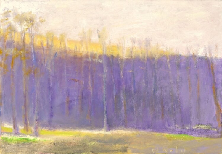
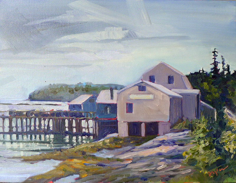
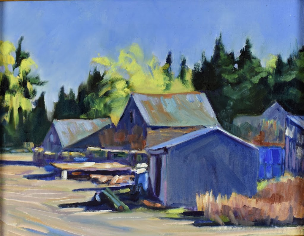
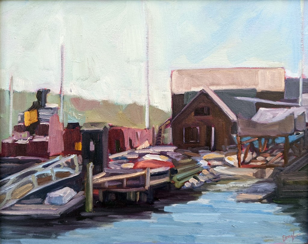
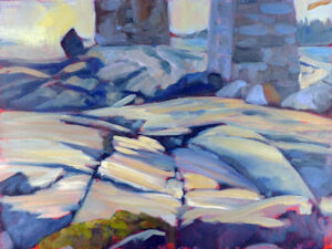
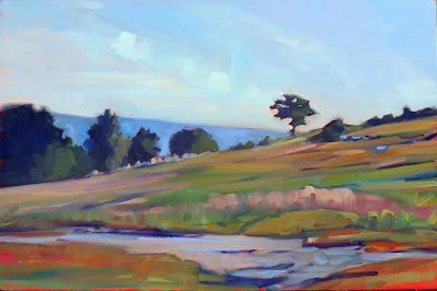
Lobster Pound at Tenants Harbor, Carol L. Douglas, available.

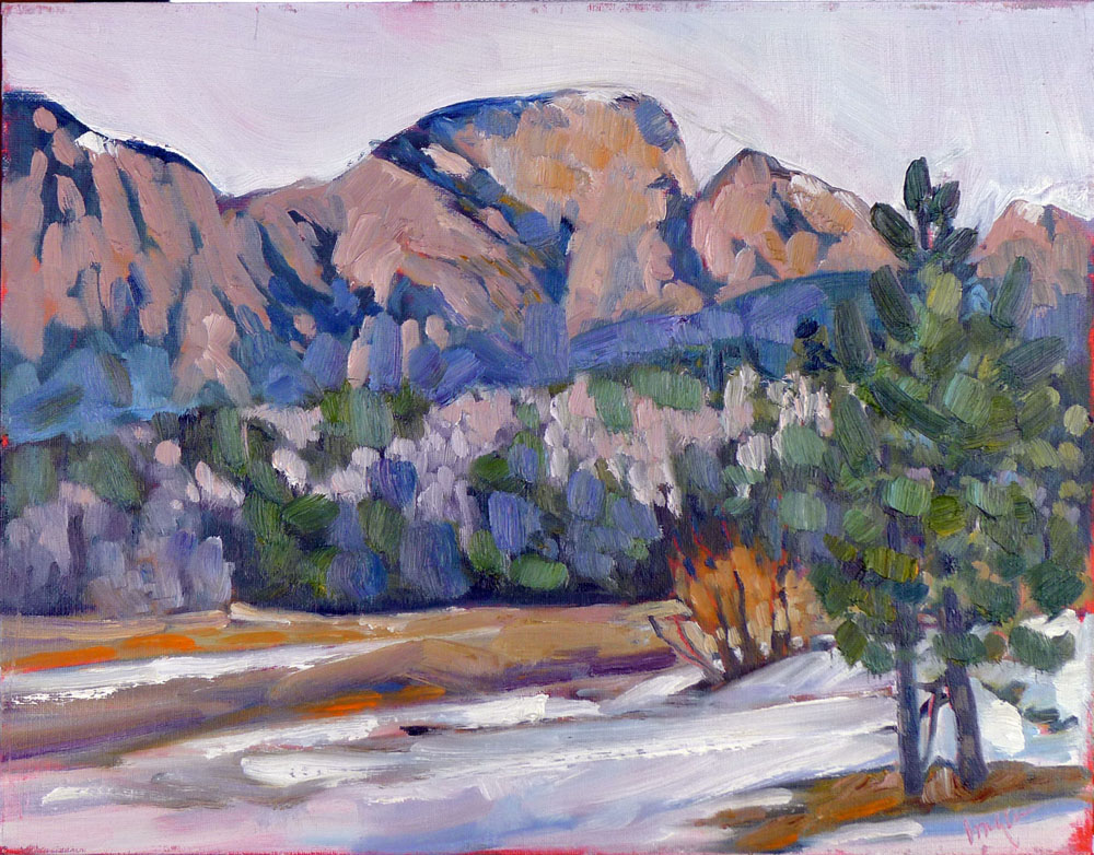
I painted the above, of a lobster pound at Tenants Harbor, ME, just a few years ago. These days, a backhoe is clearing the property. This is no paeon to a lost way of life, because lobstering is a healthy $1 billion business in Maine (although it is currently is threatened by Federal regulation). It’s just an observation that things change. Paintings can be a way of marking what was once there.

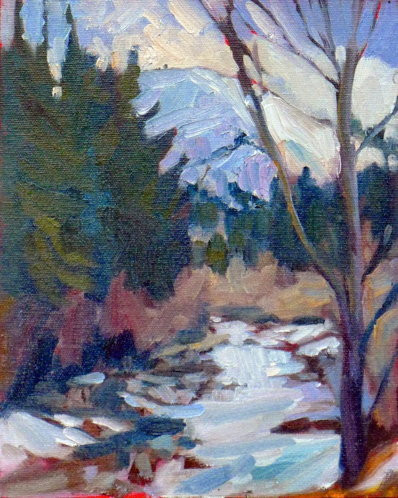
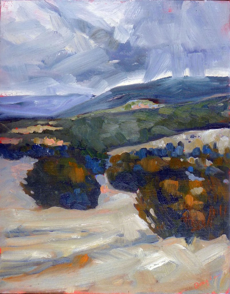
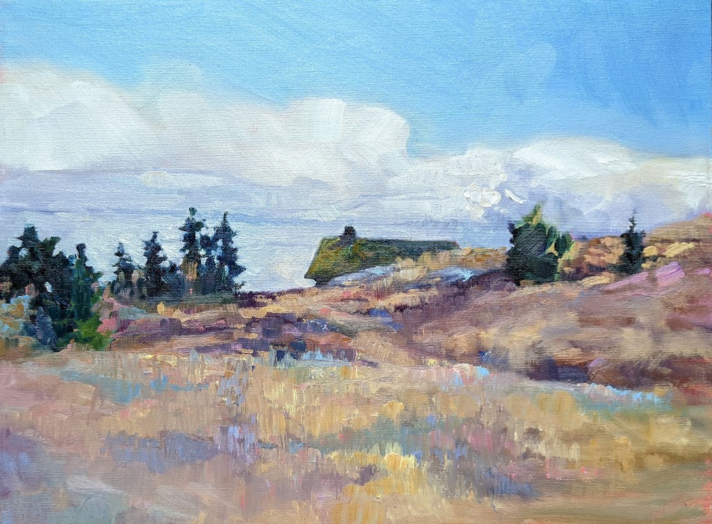
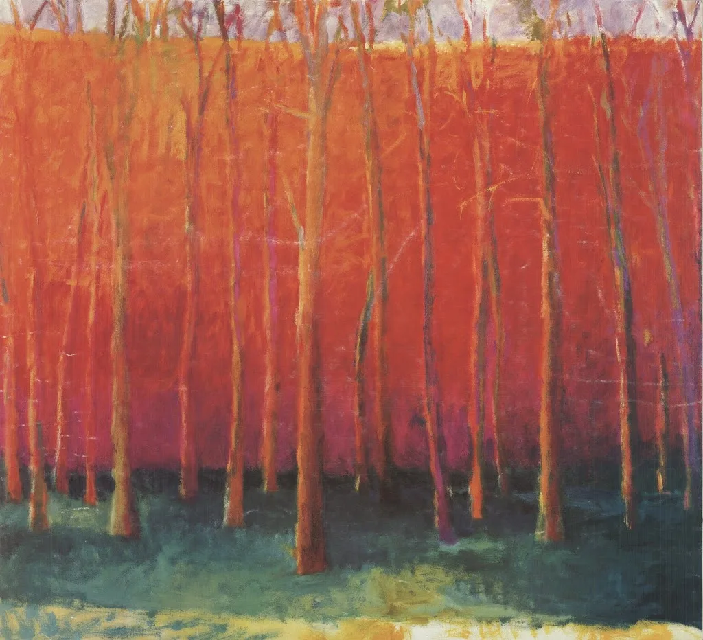
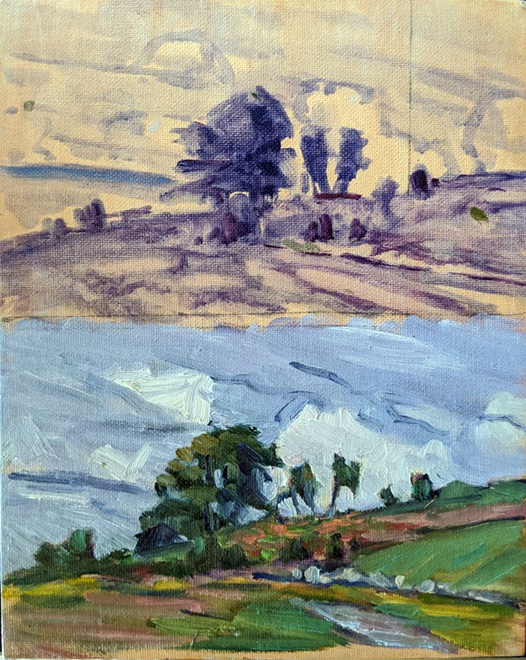
But that’s only if we’re honest. Years ago, I painted the upper falls at Letchworth (below). There has been an old steel railroad bridge above it for as long as I can remember. I wanted to minimize it as much as possible, as I thought it was an ugly, ominous intrusion into the landscape. Still, it needed to be there. It was as much a part of the place as the rocks and water.

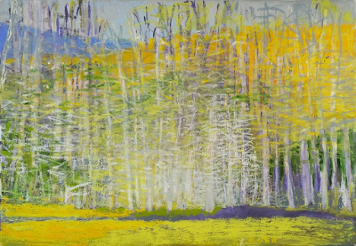
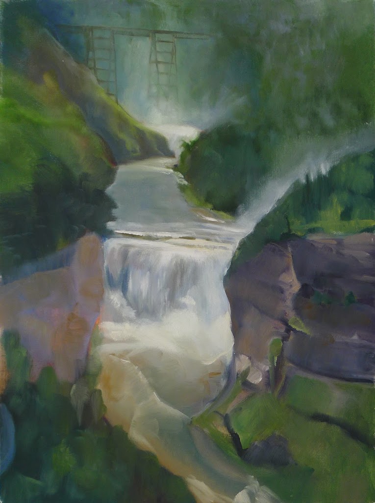
Upper Falls at Letchworth, Carol L. Douglas, private collection

In 2017, the bridge was replaced with a newer, squatter, safer model. Last year, a visitor from New York saw my painting. “That’s the old railroad bridge!” he enthused. What I thought was annoying was, to him, a part of history.

Landscape artists—myself included—have a tendency to minimize the effect of people in the landscape and to paint what is already obsolete or rustic. We paint lobster boats but delete the shiny white cruise ships in the harbor. We delete cars, in part because they’re difficult to draw, and in part because they’re ubiquitous.

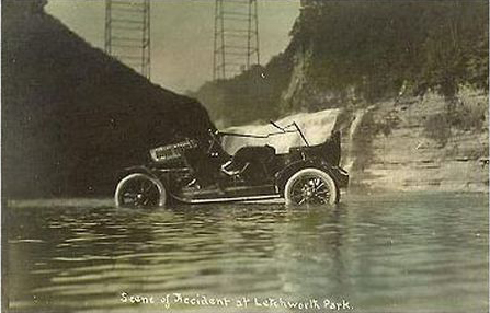
A 1917 postcard of a car accident below the Upper Falls, showing the railroad bridge. Eleven people were in that car when it tumbled off the gorge wall. Two died.

This has always been the case. Artists have the same ideas about what’s beautiful as the rest of humanity. There are exceptions, of course. Childe Hassam used carriages and cars as motifs in his paintings. George Bellows nearly rubs our face in the humanity of the early 20th century. But for the most part, landscape artists paint a romanticized, sanitized version of reality.

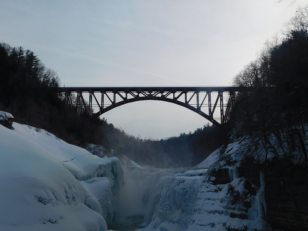
The new bridge changes the view forever.

In earlier times, that meant the horse manure and mud were removed from the street and steam engines and coal didn’t deposit soot everywhere. Today we excise power lines, fire hydrants, bus stops and plastic kids’ toys.

Why? Mostly, I think, because our audience demands it. Landscape art is in many ways an escape from reality. It is a reflection of what we as a society want, not what is.

Consider Daniel Greene’sseries on the New York subway. Yes, we get a sense of its subterranean light, utilitarian architecture and fabulous tile walls. However, he omits the filth, dripping water, ubiquitous crazy people, and the overall crush of humanity. These are portraits of the subways as some future archeologist might see them, not as they really are.

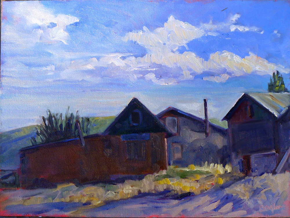
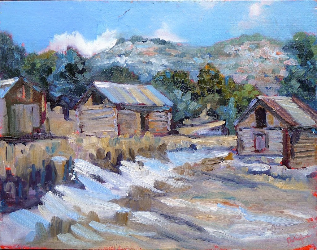
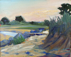
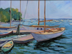
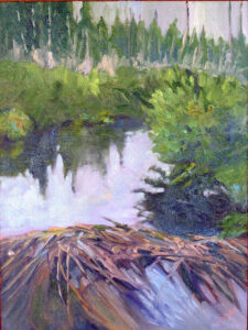
Fishing shacks at Owls Head, Carol L. Douglas, available.

Would these have been better paintings had he included reality? I think so, but they might not have sold so well.

Attention to prosaic reality is not without its risks. There are exceptions of course, like Rackstraw Downes or Linden Frederick, but mostly it doesn’t pay. Buyers aren’t that keen on truth-telling.

I used to do an annual event with a painter who has a wonderful heart for working-class life. Year after year, he turned out well-designed paintings of local landmarks in all their utilitarian beauty. They languished at auction compared to highly romanticized views of sea and woods in gilt frames. Yet, by any critical standard in painting, they were superior paintings. There’s a lesson in that, and it’s not a pretty one.

Monday Morning Art School: paint with precision

We’re all proponents of loose-is-more, but there are times when you have to be able to hit it right.

Cremorne Pastoral, 1895, Arthur Streeton, courtesy Art Gallery of New South Wales. There are few details, but the ones that are, are very accurately painted.

Detail and precision are not in style right now. “The artist should fear to become the slave of detail,” wrote Albert Pinkham Ryder. “They should strive to express their thought and not the surface of it. What avails a storm cloud accurate in form and color if the storm is not therein?” We’re all proponents of this loose-is-more theory of painting.

However, this is a current trope, and not an artistic truth. There are contemporary figure and still life painters who focus on detail, and artists practicing modern trompe l’oeil. Even in plein air, there are fine painters who eschew looseness for careful attention to detail. Richard Sneary, Jay Brooks and Patrick McPhee come to mind.

The Girl with the Wine Glass, c. 1659, Johannes Vermeer, courtesy Herzog Anton Ulrich Museum. We’re so focused on the clarity of Vermeer’s vision that we barely notice how empty the room is.

Many people get caught up in the details before they get the big shapes right. That’s overwhelming. Before you ever get to the point of painting in blades of grass, the rhythm of light and dark must be researched and articulated properly. How do you do that? The same way as with an alla prima finish—through sketch and underpainting.

Even the exuberant Dutch Golden Ageartists left things to the imagination. We’re so busy looking at all the stuff they crammed into their canvases that we sometimes don’t notice what they’ve left out. Not every detail deserves the same attention.

Banquet of the Amsterdam Civic Guard in Celebration of the Peace of MĂźnster, 1648, Bartholomeus van der Helst. Courtesy Amsterdam Museum

Great painters distill the visual noise, and then concentrate on the important parts. Consider the problems facing Bartholomeus van der Helst in his monumental commission, Banquet of the Amsterdam Civic Guard in Celebration of the Peace of Münster, above. It’s a portrait of 24 august gentlemen and one lady. (And wouldn’t you love to know why she was included?) None of the subjects would have been happy to be represented with a few Impressionistic brush strokes. There were symbols that needed to be included—pikestaff, drum, silver drinking horn and the paper on the side of the drum. In addition, the men were garbed in their very best frippery, and they meant to show that off.

Van der Helst pared away at the composition with ruthless efficiency. The background is muted. He let black hats and black garb sink wherever he could. Thank goodness for the fashion of ruffs and white linen collars—they allow the faces to stand out. The remaining textiles are held in a rigid pattern of gold, blue, and red. The color harmony is, in large part, holding the picture together.

It’s unlikely that an artist will ever paint a monumental commission like this again. It’s more likely that we’ll add a few details to a much looser painting. These details can fool the eye into thinking there’s more there than is actually present.

Out Back, Peter Yesis, courtesy of the artist.

Peter Yesis is the best painter of flowers I know. In my mind’s eye, I see his paintings as detailed, but they’re actually very restrained. The focal points draw our eyes, allowing our minds to fill in the other areas. This engages our imagination, which is far more potent than anything on the canvas.

I wrote last week about pareidolia, our ability to see meaningful images in ambiguous visual patterns. Humans find this much more compelling than having things spelled out for them.

We’ve been using that technique since the Impressionists to engage viewers. But to do it, you need to be able to occasionally lay down a tight, accurate line.

Painting precisely is a matter of slowing down and exerting greater direct control over your brush. Smaller brushes can help, but a light hand is most important. (Most of us are slightly tremulous, and smaller brushes can result in shakier lines.) There’s no way to get there but to practice your fine motor control.

Nothing lasts forever

Wildfire is threatening an area I know and love. It’s a reminder that nothing lasts forever, even the trees and hills.

Hermit’s Peak from El Porvenir, Carol L. Douglas, oil on archival canvasboard, available.

I’ve spent an inordinate amount of time recently watching the wildfire at Hermit’s Peak in New Mexico. “Much of the fire’s growth is in thick, heavy timber and steep, rugged terrain,” writes officialdom. That is, if anything, an understatement. I’ve painted in El Porvenir with my buddy Jane Chapin. The area is desolate.

As sad as the current fire destruction is, it’s where the fire is heading that concerns me. It’s been burning slowly toward the villages of Upper and Lower Colonias and county road B44A. The Pecos River basin is just a few miles from the fire’s edge.

Upper Reaches of the Pecos River, Carol L. Douglas, oil on archival canvasboard, available.

This is where my Gateway to the Pecos Wilderness workshop is centered, and I’ve come to know and love this tiny slice of Creation. It’s deeply wooded, high, fresh and mountainous.

Of course, I’m worried about Jane, who is in the evacuation ‘set’ zone. However, Jane’s the person who extracted us all from Patagonia after lockdown. There’s nobody I’d rather be in a crisis with.

Old farmhouse in Pecos, NM, Carol L. Douglas, oil on archival canvasboard, available. This is one of the historic structures in the evacuation ‘set’ area.

The fire started as a prescribed burn lit on a windy April day. It’s now burned out of control for five weeks and shows no sign of imminent containment.

The terrain is extremely inaccessible. “It has more roads on the east side of the ridge but the Pecos Wilderness side is forest roads. They’re often a challenge even for a 4-wheel-drive truck,” Jane told me. “They are steep, full of big rocks, tight switchbacks and big drop-offs, and there’s no turning around.” 

Dry Wash, Carol L. Douglas, oil on archival canvasboard, available.

It was the area beyond Lower Colonias where Jane and I scratched the tar out of her truck trying to back away from a steep drop. There’s no need to go off-roading for adventure; the roads themselves are terrifying.

“We now have over 1900 firefighters on this fire, most of whom are unfamiliar with the area and are sleeping on the ground in tents in fire camps,” Jane said. That’s hard work, complicated by the natural fauna of the area: bears, bobcats and mountain lions will be on the move, along with whatever horses, dogs and cattle may be caught within the fire line. Lest you think that’s an exaggerated risk, a soldier was killed at Joint Base Elmendorf-Richardson in Anchorage, AK on Tuesday by a grizzly sow protecting her cubs. Where civilization and nature collide, stressed animals sometimes behave erratically.

Snow at Higher Elevations (downdraft), Carol L. Douglas, oil on archival canvasboard, available.

This week, we’re reading about mansions burning in Southern California, but those people have the resources to rebuild. In contrast, San Miguel County, NM, is poor. A quarter of the population live below the poverty line. That makes them voiceless in modern society. They’re unlikely to be able to challenge the Forest Service about the wisdom of ‘controlled’ burns, and this is the second time in seven years where a prescribed burn has gotten loose in this area.

Log barns, Carol L. Douglas, oil on archival canvasboard, available. This historic farmyard is in the evacuation ‘set’ area.

But that’s all politics. What saddens me, deeply, is the potential destruction of a place I love. As Jane said, it seems somehow wrong to pray that the wind shifts and takes the fire to the east. If her home is saved, someone else’s will be destroyed. Instead, I pray for rain.

Nothing lasts forever, even the seemingly immortal forests and hills. That makes it even more imperative to get out and look at them—and paint them if you will—while you can.

What I don’t know

Painting is a solitary journey, but there are times when you need the help of others.

Main Street, Owl’s Head, 16X20, oil on archival canvasboard.

I’ve fussed and worried about migrating this blog to my website for close to a year now. Blogger has discontinued its subscription widget, which makes maintaining readership almost impossible. I started on WordPress, moved over here in 2007, went to the Bangor Daily News for a few years and then came back. With those moves, I just wrote off my prior content and moved on. But this blog has become too deep to do that. It’s essentially, the repository of every Great Thought I’ve ever had about painting.

Belfast Harbor, 14X18, oil on archival canvasboard, framed, $1594.

Every few weeks I’ve spent a morning trying to work out the problem. I’ve watched YouTube tutorials, read expert advice, and gotten nowhere.

I’m not computer-illiterate. Twenty-five years ago, I was a semester short of a degree in programming when my husband suggested that I take up painting full time. “The world is full of programmers,” he said, “but it needs more artists.” I’m not sure he was right, but I can, mostly, fix my own computer problems.

Last week, I folded. I called my software developer daughter and laid out the problem. By the time we ask for help, we’re usually pretty angry with ourselves. All our self-doubts come to the fore.

“First of all,” my daughter said, “you’re not stupid. This stuff is hard.” I was terribly proud of her at that moment. Whatever intellectual gifts she has, they’re dwarfed by the fact that she’s kind.

Marshall Point, 9X12, oil on archival canvasboard.

She then told me what I should have realized all along: I need to hire a professional. I contacted the woman who monetized my website for me, and she’s working on it now.

(Note that all the programming in this story is being done by women. Female programmers account for just 5% of the field worldwide, so that tickles me pink.)

I have felt that same frustration in painting. After my epiphany 25 years ago, I started taking painting classes, in Rochester and at the Art Students League in New York. Some of those classes were enormously useful—with Cornelia Foss, for example—and some were less so. I’m acutely aware of the feeling of frustration when faced with a painting problem I can’t figure out.

Much of that frustration could be avoided if someone would lay out the process clearly and concisely. That’s what Foss did for me, bringing me into the 21st century in her own crusty way. It’s what I try to do for my students. Painting is a technical exercise, so it should be addressed primarily in technical terms.

Beach Erosion, 8X10, oil on archival canvasboard.

Last week, I was being bedeviled by a watercolor question. Mick McAndrews answered it for me. He sounded eerily like my daughter—what I was trying to do was hard. Sometimes, just knowing that is important, because it takes out the background chorus of negative thoughts.

Every few months I’ll ask my pal Eric Jacobsen how he makes mauve, a color he uses to fantastic effect in landscapes. Apparently, I don’t like the answer, because I immediately forget what he tells me. That’s a different problem: simple willful ignorance.

Painting is a solitary journey, but there are times when you need the help of others. How much advice varies based on your personality and level of experience, but it’s foolish to go it alone. Sometimes, taking a class or workshop is the best investment you’ll ever make.

Monday Morning Art School: avoid the Velvet Elvis

How do you paint the sunset without it looking like kitsch?

Sunset Sail, oil on canvas, Carol L. Douglas, available.

In class last week, a student said she’d painted the shadow areas of a sunset painting grey. “I wanted to avoid the Velvet Elvis look,” she said.

As with so many things in mid-century America, the popularity of velvet paintings in the 1970s was the result of one person’s mad ingenuity. Doyle Harden created a block-long factory in Ciudad JuĂĄrez, Mexico to mass-produce velvet paintings for the American market. “I never met many people who would even admit they would have them in their homes,” Harden said. “But I’ve sold more than $100 million worth of velvets, and to me it’s beautiful art.”

A mid-century velvet sunset painting.

(If you do have one, there’s a thriving secondary market on ebay. You may be able to recoup what Grandma paid for it.)

Black velvet painting, in fact, may be the reason that black paint fell out of favor at the end of the 20th century. What distinguishes black velvet painting is the inky blackness of the dark passages, created by the fabric itself. It’s a by-word for kitsch, and that’s what my student wanted to avoid.

But black is, in fact, what’s left optically in contrast to the sunset. Objects in relief in front of a sunset will read as dark neutrals or, at best, as inky indigo blue.

Grand Canyon at sunrise, Carol L. Douglas, available. One issue with extremely dark paintings is that they’re tough to photograph.

There will, however, be an aura of the sun’s light. It may be directly around the orb, as in the photo above, or it may reflect across a valley, as in my painting of the Grand Canyon at sunrise. Either way, everything in relief is not unremittingly black.

There will likely be shades of grey within that darkness. Here you can gain some relief by adding blues or even purples.

American Eagle at sunset, taken during my September Age of Sail workshop last year.

We have two kinds of color receptors in our eyes—rods and cones. Rods work better at night, but are less receptive to the red end of the spectrum. This is the Purkinje effect, and it leaves us perceiving things as deep blue—right before we lose any sense of color at all.

Some objects are partially illuminated by the sunset light streaming through them. The flag of American Eagle, above, is an extreme example, but there are others, including glass and water.

Watercolor sketch of sunset, Carol L. Douglas, NFS.

In addition, we can see some color in objects that are close to us. That’s because there’s still reflected light bouncing around us. However, a lot of that is remembered or implied color. For example, in the photo of American Eagle, we ‘see’ the name of the boat as gold, but sampling it in the photo tells you that it’s really a very desaturated greyish brown. A little color goes a long way in these dark passages.

But that’s optical perception, and on top of that you have to add emotional response. I ‘knew’ there were greens and reds in the Grand Canyon; I could just see the ghostly outlines of trees. Adding them into that stew of darkness was not a problem as long as I kept the value universally dark.

In watercolor, the problem is exacerbated by the fact that deep darkness is not always watercolor’s best look. One option is to run head-on into the darkness, as Bruce McMillan did here, to great effect.

The Scarlet Sunset, c. 1830-40, watercolor and gouache, JMW Turner, courtesy the Tate.

Still, sunsets are overwhelmingly the province of oil painters, because of that darkness issue. The exception to the rule is Joseph Mallord William Turner, who painted them many times in watercolor and gouache. His solution is to lighten the dark passages considerably, letting them fade into inconsequence.

A little Dada goes a long way

No wonder people don’t take art seriously as a profession.

Vilanova’s raincoat, hanging next to an exhibit about Picasso. Hanging it next to a large monochrome picture was great design… by the curator.

An art heist in Paris has the art world laughing at old people once again. A 72-year-old, ‘elderly’ woman mistook an art piece hanging on the wall for an abandoned jacket. Frugal, she took it home and then to a tailor to have the sleeves shortened.

A few days later, she returned to MusĂŠe Picasso, only to be immediately arrested.

The artist, Oriol Vilanova, expressed mild surprise that the museum’s security was that lax. They countered that they’d already spoken to him about the risks of hanging a jacket on a nail, and he’d refused to tighten it down. The idea, he pointed out, was that visitors should be free to rifle through the pockets and leaf through the postcards within.

The perp has widely been described as ‘elderly’. That is too often a synonym for ‘clueless’ in these stories. In fact, I suspect she was on Vilanova’s secret payroll, since she catapulted his work into a one-day wonder.

The piece has traveled to other venues since 2017. If the coat is hung next to a Picasso, for example, the pockets are stuffed with postcards of other Picasso paintings. On its own, it’s a fairly thin idea.

La Parisien, which originally reported it, said that this woman had converted the work to a mise en abyme.

mise en abyme is an image within an image, often repeating indefinitely. With the advent of computer science, we’ve started to call that recursion, as it resembles something that happens in software and mathematics.

Las Meninas, 1656-57, Diego VelĂĄzquez, courtesy of the Prado

But a mise en abyme doesn’t have to be a straight-up copy; it can be a reference, as in Diego Velázquez’ Las Meninas, where the artist frames his subjects in the context of having a portrait painted.

This 17th century painting looks for all the world like a snapshot. It’s a portrait of the five-year-old old Infanta Margaret Theresa, who is, in turn, surrounded by her personal coterie of attendants, dogs and dwarves. VelĂĄzquez himself is in the picture, as are the hazy images of the king and queen in the mirror in the background.

It is daring, inventive, complex, weird and mysterious. It’s fascinated viewers for almost four hundred years. In comparison, I wouldn’t be fascinated by Vilanova’s recursion for fifteen minutes.

Raincoat hanging over forsythia, 2022, Bruce McMillan, courtesy of the artist. I like it better than the original piece, since it subtly references the issue of our day, the war in Ukraine.

Bruce McMillan, who first pointed out this story to me, asked:

Art installation
on a rainy day
of an artist’s raincoat

hanging over the
flowers the artist
paints where art was to be,

or with unseen eyes
not to be, that was
the silent art question.

I’m afraid I have to come down firmly on the ‘blind’ side. The question Vilanova raises about art reproduction is sophomoric.

A mise en abyme from 20th century commercial art.

There is much in contemporary art that I like, but equally much that I resent. We’re enduring a time of relentless tearing down of western values. That includes the values we have traditionally revered in art: intellect, craftsmanship, beauty.

Western civilization has made us the fattest, happiest, most-literate society in the history of mankind. Even our poorest citizens are wealthier than most of the world. We haven’t endured warfare in our own country since 1865. Our kids have never known true economic privation.

These times are, historically speaking, an anomoly. They’re also an incredible blessing, but as Joni Mitchell once sang, “you don’t know what you’ve got ‘til it’s gone.”

Bananas taped to walls? Raincoats stuffed with postcards? They make a mockery of the importance of art, with little serious thought behind them. A little Dada goes a long way, and we’ve endured a century of it so far. No wonder people don’t take art seriously as a profession. 

Plein air painting on the cheap

If you’re trying painting for the first time, it makes sense to use less-expensive equipment and supplies. Here are corners you can cut.

Early Spring on Beech Hill, 12X16, oil on canvas, $1449 framed includes shipping to continental US.

In 2018, when I first wrote about plein air painting on the cheap, this pine tripod easel cost $7.99. It’s ‘on sale’ for $14.99 now, a whopping 53% price increase in four years. That’s precisely why, if you’re interested in trying plein air painting for the first time, you should probably think about ways to do so on the cheap.

That’s the same easel I learned on in high school. I still have it today, tucked into the corner of my studio. It’s rickety, awkward—and it works. It was a standard style field easel until the invention of pochade boxes that screw onto tripods. My father painted his whole life with a similar, home-made model.

Bridle path, 11X14, $1087 framed includes shipping to continental US.

This easel, however, requires some sort of table. My thrifty friend Catherine uses an old TV table, but there are lighter versions now available.

I wrote recently about pochade boxes for every budget. Dollar Tree’s 9X13 baking pan has only gone up to $1.25, so you can still make the cheapest possible palette for $2.50, plus duct tape. What I neglected to mention in that post was the possibility of buying a used pochade box. Some of my best art tools were purchased second-hand. But you must have the time to be patient.

If you’re handy, you can make one like I did. Or, there’s the classic cigar-box pochade.

Best Buds, 11X14, $1087 framed, includes shipping to continental US.

One of the great advantages of watercolor is that it doesn’t require any easel. Many studio oil painters sketch in watercolor in the field. A Winsor & Newton Cotman field set and a watercolor journal are a cheap, lightweight introduction to wilderness painting. That’s essentially what Thomas Moran carried on the Hayden Expedition to Yellowstone in 1871. He’s known as an oil painter, but his watercolors have an important place in art history.

In every media, the difference between professional and student grade paints and pastels is the amount of pigment and the quality of the binders. In some cases, more expensive pigments will be copied with hues. A hue mimics the color of a single-pigment paint with less-expensive materials. For example, “cerulean blue hue” is often a combination of zinc white and phthalo blue.

A better solution is to avoid pricier pigments in the first place. In earth colors, there’s almost no difference between the student brand and the professional brand. The difference shows up in paints like the cadmiums, where the pigment itself is expensive. There are modern substitutes that do the job equally well at a lower cost.

Blueberry Barrens, 24X36, $3985 includes shipping in continental US.

There are decent student-grade brands out there in all media:

Oils: Gamblin 1980 and Winsor & Newton Winton.

Acrylics: Winsor & Newton Galeria and Liquitex.

Watercolors: Winsor & Newton Cotman or Grumbacher Academy.

Pastel: Alphacolor Soft Pastels

If you decide you love plein air painting, you can replace these student-grade colors with professional-grade paints over time.

Brushes don’t have to break the bank either. Even though I have a slew of fine watercolor brushes, I still reach for my Princeton Neptunes. Oil and acrylic are trickier since cheap brushes sometimes drop bristles in your work. Princeton also makes good, inexpensive oil/acrylic brushes, especially their 5200 and 5400 series. If you want a synthetic brush, make sure it imitates hog bristles, not sable. A softer brush isn’t meant for alla prima painting.

It’s plein air season again. Check out my workshops, here.

Monday Morning Art School: what we can learn from Wolf Kahn

Color is the dominant theme of our age.

Autumn trees, undated, Wolf Kahn, from a commercial lithograph

Wolf Kahnwas a mid-century American landscape painter who was influenced significantly by Abstract-Expressionismand Color Fieldpainting. The fog on Deer Isle, Maine led to an epiphany about color: “I began to let the color come through on my canvases,” he wrote. “My pastels were always intense, and finally my painting caught up with them.”

Brilliant Green Trees, 1997, Wolf Kahn, courtesy Walter Wickiser Gallery

Kahn’s canvases are deceptively simple. What can we learn from them?

Color is the dominant theme of our age

That was beginning to be true in the 1960s when Kahn was coming into his own, but we now live in the full maturity of color. We are surrounded by a surfeit of chromatic intensity. Imagery has always been influenced by what’s around us, and today that’s our cell phones, monitors, and televisions. Printing technology is far better than it was even thirty years ago, so the photos in our books are clearer and brighter than ever. Paint and pigment technology have undergone similar improvement, which is why we’re seeing houses with navy blue vinyl siding—they’ve managed to make a dark blue that doesn’t fade.

Will this trend last forever? For all I know, there will be an equal and opposite reaction into monochrome. But for the moment, we’re living in an age of intense color, and if you are painting in our times, you’d best know how to use color.

That includes understanding and using modern organic pigments.

Midsummer, 1993, Pastel, Wolf Kahn, courtesy Walter Wickiser Gallery

The ‘real’ hue is irrelevant if the value is right

Kahn is famous for substituting impossible colors into the landscape: orange scrub, fuchsia woods and purple hills. One of his favorite techniques is to make the trunks of saplings the exact same value as the background, but the complementary color. The brain reads this as the screen of trees.

Stripped down to their essential form, objects are still recognizable to the human brain

Our minds are programmed to read images from the faintest stimuli, which is why we see faces in the steam on our shower door. This tendency to perceive meaningful images in ambiguous visual patterns is called pareidolia

This is not a purely human response, either. Occasionally, one of my hiking trails will be blocked off with a sawhorse festooned with signs. Until he’s close enough to investigate them, my dog finds these shapes very threatening. He’s seeing a vaguely-animal shape.

Our human pareidolia is the same response. We’re programmed to investigate visual stimulus that looks sort of familiar. Kahn and other abstract artists are exploiting this.

That’s an aspect of modern art that is likely to stay with us, as it’s built on our fundamental brain architecture. If we want to paint within our times, we need to stop spelling everything out.

Reluctant Green, 2001, Wolf Kahn, courtesy Walter Wickiser Gallery

It’s all an interplay of warm and cool

While Kahn’s selection of substitutionary colors might seem random, he is careful about color temperature. Where he wants objects to recede, they’re cool. Where he wants them to pull, they’re warm. Again, he’s playing with our brains and eyes and how they’re designed to perceive color.

Bright Center, 2015, Wolf Kahn, courtesy Addison-Ripley Fine Art

Chromatic intensity matters

In most instances in Kahn’s work, one hue leads. That color is given the greatest chromatic intensity. In others, two colors are balanced in chromatic intensity, but one leads by virtue of being warmer. None of this is accidental. Kahn was acutely aware of chroma and its importance.

We painting teachers bang on and on about value, and it’s certainly fundamental. However, color temperature and chromaare also important.

Why grisaille?

Your painting should be a carefully judged pas de deuxbetween reality and your own vision. That’s best worked out before you start adding a million different color variables.

There are days when I just want to think compositionally, without any reality or detail cluttering up my mind. Monochrome is the best way I know to do this.

I have a student who has started painting in monochrome as he learns to master color. It’s a great idea; I might insist on it, except it would result in revolution. People love ‘color’ but fail to see that value is color’s anchor. However one expresses darks, their pattern is what drives a painting. It’s best seen in monochrome, before you add in hues.

By removing the hue question, Mark is doing the equivalent of practicing one hand of his difficult piano sonata at a time. It’s a time-honored technique because it works.

Christ and the Woman Taken in Adultery, 1565, Pieter Bruegel the Elder, courtesy the Courtauld Gallery

A grisaille (pronounced ‘griz-EYE’) is a painting done entirely in shades of grey or another neutral. It can take the form of an underpainting or can be a finished painting in itself. It’s not generally done in lieu of a pencil sketch or notan, but rather as a discrete step in the process of planning a painting.

It is possible to start a painting with just hash-marks on the canvas. Some excellent painters do this; however, for the beginner, that’s the circus trapeze without a net.

Historically, grisaille has been used for finished works of art. This was particularly true in decorative painting, where grisaille might serve as a sort of trompe l’oeilfor sculptural relief. Paint, even in the hands of a master, is cheaper than marble.

Christ and the Woman Taken in Adultery, above, was a personal painting owned by Pieter Bruegel the Elder and his descendants. It’s tiny, roughly 9X12. Its character and intimacy are enhanced by being in monochrome. In that way, it has the feel of a fine drawing.

Odalisque in Grisaille, Jean-Auguste-Dominique Ingres and his workshop, 1823-24, courtesy Metropolitan Museum of Art

Sometimes popular paintings were copied in monochrome to simplify life for engravers. Jean-Auguste-Dominique Ingres’ copy of his La Grande Odalisque, above, is one such example. There lies a lesson for students: if engravers, who are skilled artisans in their own right, find it difficult to track value, how much harder is it for new painters?

Mostly, grisaille has been done as underpainting. Until the Impressionists, with a few exceptions, painting was done in what is called ‘indirect painting.’ Paint was applied in thin layers, or glazes. The underpainting was laid down in a thinned form, usually (but not always) in monochrome. This layer also served to tone the canvas. After it dried, subsequent thin washes of color were worked over the top. The underpainting was allowed to mingle with the glaze colors. It’s a powerful technique, but not as lyrical or free as alla prima painting.

A small underpainting grisaille example I made for my students.

Alla prima doesn’t really require any underpainting, but it’s an act of incredible courage to just start daubing on a blank canvas. Few artists are that brave—or foolhardy, depending on how you look at it. So, we tend to do exactly the same thing as our predecessors—a thin wash of paint, usually in grisaille, that tells us where stuff is supposed to go. Of course, we must learn to judge that first wash to a nicety. Too stiff, and the underpainting is too thick. Too goopy, and everything above it turns to soup.

If the composition reads well at this value-study phase, the painting is almost always going to work, providing you stick with your plan. If it doesn’t, you’re unlikely to salvage it.

All value judgments are subjective. There’s no reliable way to measure the value of a color. The camera is as subjective as the human eye. Your painting should be a carefully judged pas de deux between reality and your own vision. That’s best worked out before you start adding a million different variables in the form of hues.

Chromophobia

Until you start playing and experimenting, you won’t really own your own color pathway.

Bobbi Heath once posited to me that painters learn to manage color in three phases:

  • They make everything grey;
  • They vastly overshoot the chroma;
  • They finally learn a pleasing color sensibility.

 â€œIs it even possible to overshoot the chroma?” I riposted, because I’m apparently stuck in the second phase. I was joking, of course. In being a high-chroma painter, I’m operating within my own time and place in history. High chroma is part of our current landscape painting style.

Beautiful Dream, 12X16, oil on archival canvasboard, available.

(For those of you new to the discussion, chroma is one of three aspects of color, which you can read about here. It means how intense the color is. Grey is low-chroma; fuchsia is high-chroma.)

Bobbi had it right, of course. Painters start in a world of soft greys because grey is safe. They need to blow through that safety net to master all aspects of color.

The problem is exacerbated when the painter lives in an area with grey skies. I spent 21 years in Rochester, NY, where the weather is controlled by tempestuous Lake Ontario. Those damp, overcast skies were great for gardening and my skin, but they mean indirect light. That, in turn, can lead to gloomier color and less separation between lights and darks. Beautiful, but dull in a painting—unless you take a page from the Luministplaybook and straight-up lie. Before you can do that, you have to be able to see it.

Giving birth to a brighter color palette can be painful. Brilliant color looks garish at first, often because our first experiments at high-chroma painting are garish. The question of color harmony is more important when our painting isn’t subdued by a leavening wash of grey. With chroma elevated, we can no longer ignore when color combinations don’t work.

Bracken Fern, 9×12, oil on archival canvasboard, available.

You can’t get to that phase of development until you let go of the crutch of neutrality. This is one area where a teacher or mentor can be a great help. “Leave it,” we say. “Set it aside and look at it again in two weeks.” Actually, it would be more helpful to set it aside and paint twenty or thirty paintings in this new high-chroma space until you start to see how it hangs together.

Yes, you’ll make some awful paintings. It’s a necessary phase of growth. “No mistakes, no success. Know mistakes, know success,” my buddy Ivan Ramostold me yesterday. That’s never truer than with color. I can lecture all year about color interaction but there are millions of ways to lay colors down next to each other. Until you start playing and experimenting, you won’t really own your own color pathway.

Quebec Brook, 12X16, oil on archival canvasboard, available.

I encourage my students to have tintson their palette because they help keep color clean. These premixes can save a lot of time and prevent a whole lot of dullness.

None of this is to say there isn’t room for neutrals in painting. Of course, there is, and the third phase of color management is to add those neutrals back in. (I’m still waiting.) But let’s not jump the gun here; neutrals are in some ways the apotheosis of color, a counterpoint to chroma. They come last in our color-sensibility development.