Monday Morning Art School: get to that color fast

To paint with assurance, you need to be able to mix colors effortlessly. These tips will help you get there.

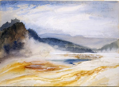
Peppers, by me. Cool light, warm shadows.

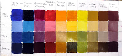
Start with an organized palette. I paint with my pigments moving from blues on the left through reds and yellows, followed by the three earth pigments to the far right. White is at the bottom. My particular system isn’t what’s important. But always put paints in some kind of logical order and in the same spot.

These basic rules make mixing easier:

  • Never try to paint with hardened paints;
  • Squeeze out enough paint;
  • Put out every color, regardless of what you think you’ll need. Every painting should have a broad range of colors in it, regardless of the subject;
  • Put out more of each color when you use it up, not when you think you’ll need it again;
  • Start mixing each color with the closest match on your palette, and adjust from there;
  • Add small amounts of paint as you adjust the mixture.
Jamie Williams Grossman‘s lovely painting and palette in the Hudson Valley style, showing color strings. Photo courtesy of the artist.
A color string is a set of premixed paints, usually modulated with white or another light color. Artists sometimes mix a series of these starting from each base color. In the Hudson Valley, you’ll sometimes see artists working from vertical palette boxes containing a slew of these premixed colors.

I use a simpler variation of that idea. I make mid-tone tints of each pigment. Different pigments may look the same when squeezed out of the tube, but there the similarity ends. Knowing how a pigment works when tinted with white is critical. Moreover, these tints become the backbone of a bright finished painting. 

A matrix is a color string in 3-D.

In watercolor, the equivalent is tonal steps, or how the pigment acts in different dilutions. You can’t premix them, but you should understand them.

Before you lift a brush, premix three colors for each major object:

  • A light tone, the color of the lightest side of the object;
  • A mid-tone, which is the local color of the object;
  • A dark tone, which is the deepest color.

These should be fairly close in value. For the extremes, you’ll use your global shadow and highlight colors.

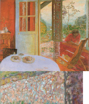
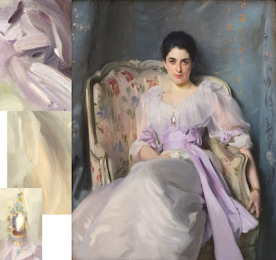
In the example at top of the page, the light is cool—you can tell by looking at the tray. There is a warm dark shadow, a ‘true’ mid-tone, and a cool light color for each pepper. The tray is black. Since the shadows are warm, they’re a reddish black. They were made by tempering burnt sienna with ultramarine blue. The highlights are pale blue.

Start by getting the value right first. That’s usually the most difficult part. You can’t raise the chroma of a paint, so if you get it too neutral, set it aside and start again. If it’s too intense, mix in a bit of its complement.

My palette, diagrammed by Victoria Brzustowicz. I generally don’t use red in landscape painting.

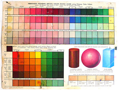
Black has a role in painting, but it’s not in making grey. If you need grey, make one by mixing two complements. Greys are never totally neutral in real life; they always have overtones of color. Start by figuring out what that is. Then start from that color, and add its complement until you hit the perfect neutral note.

Once you’ve mixed your color ‘puddles’, look at them as a whole. How do they go together? Which do you want to emphasize?

Keuka Lake, by Carol L. Douglas. Available.

I use a green matrix for painting foliage. Otherwise, greens can be oppressively monochromatic in high summer. Remember those tints I had you mix? You can use them to modulate these greens into hundreds of different shades. Just use blues and violet tints to drive the greens back in space, and yellows and oranges to bring them forward.

By thinking through color relationships before you start painting, you can keep them consistent and unified. As time goes by, you’ll learn to do this intuitively. However, when I muck up a painting, it’s almost always because I haven’t really thought the light and color structure through.

This was originally posted in 2020.

The universal nature of children’s art

We can smile at a little Russian boy who lived almost 800 years ago, and think of how he reminds us of ourselves at that age.

Drawing by Onfim of Novgorod, c. 1260. All illustrations courtesy of Wikipedia.

Onfimwas a little boy who lived in the area of Novgorod in the 13th century. What became of him is a mystery, but we know that in 1260, at the age of 6, he dutifully did his homework, and then decorated it with doodles.

Onfim scratched his texts into soft birch bark, which was preserved in the clay soil of the region. These birch bark sheets are called beresty, and there are nearly a thousand of them, dating from 1050 to 1500 AD. The vast majority of them are commercial transactions, legal documents, and Bible verses, but a few give us a glimpse into more ephemeral aspects of medieval Slavonic culture.

In this fragment, Onfim started off copying a Bible verse but got distracted.

Onfim—like little children everywhere—loved to draw. If you’ve ever spent time with a child of six, you’ll be impressed by two things in Onfim’s scant oeuvre. First, Onfim was almost exactly as literate as a similar child in modern American culture, dutifully writing out his alphabet and simple rote sentences. Second, his drawings are classic, not just in style, but in content. Little boys love action scenes, and Onfim was no exception.

Onfim was drawing in what psychologists call the schematic stage of art development, which is, I presume, how they have estimated his age. He had developed a ‘person’ symbol that was easily recognizable, with a head, trunk and limbs, albeit in very rough proportion. Living in the Middle Ages, he also had a ‘horse’ symbol, just as a modern child might include a ‘car’ symbol. As with many children, he played fast and loose with details, including the number of fingers on his people. For kids, these aren’t important facts.

Gramata 200, by Onfim.

Gramata 200’s text is an alphabet and Onfim’s name. In the drawing there’s a horse, a weapon, and a defeated enemy. It’s a fantastical drawing of a battle scene. Psychologists say that children of this age can’t think abstractly. However, it’s obvious that they have a great fantasy life.

Gramata 203, by Onfim.

Gramata 203 also includes a figure on horseback, with either absurdly wavy hair or something else we don’t understand, and another figure standing. The text reads, “Lord, help your servant Onfim.” That’s a conventional medieval statement that may or may not have anything to do with the drawing.

My experience raising kids tells me that their minds don’t generally require much of a connection. Onfim’s teacher may have assigned the text, and then wandered away to do something else, leaving the lad to deface his bark paper. “Oh, Onfim,” his mother may have sighed. “I can’t keep you in beresty. How do you expect to grow up to be a successful trader like your father if you’re constantly doodling on your papers?”

Gramata 199, by Onfim. The reverse is just his schoolwork.

In Gramata 199, the horse announces, “I am a beast.” Our young artist has added a dedication, “Greetings from Onfim to Daniel.” Were the boys passing notes, or was Onfim just dreaming about getting outside to play with his pal? We’ll never know.

What we can take from Onfim’s doodling is the universal nature of children’s art. The stages children grow through as they mature are integral, rather than learned behavior. Put a pencil in a toddler’s hand and he will scribble with it. Put a pencil in a young boy’s hand today, and he will draw people and cars, or, if he’s raised with them, guns. Children draw what’s in the fantasy space in their heads. While there are cultural overtones to their choices, the fundamentals are constant.

Drawing is a child’s first recorded communication; writing comes later and ultimately supersedes it. Why is that? I suspect that for most children, the transition from fantasy to realism is hard work. But in that first precious burst of artistic expression, we recognize our universal humanity. We can smile at a little Russian boy who lived almost 800 years ago, and think of how he reminds us of ourselves at that age.

Monday Morning Art School: why copy a masterpiece?

Think of it as getting a painting lesson from the masters.

Great Springs of the Firehole River, by Thomas Moran, 1871, is one of the paintings my students will be copying this week. Courtesy National Park Service.

If you visit art museums regularly, you may have seen students set up to copy masterpieces. Or, you’ve seen copies made by great artists of other artists’ work. What were they trying to accomplish?

Vincent van Gogh admitted himself to the Saint-Paul asylum in May, 1889. He painted around 150 canvases there, including the iconic The Starry Night. He also made about thirty copies of masterworks of others.

“I started making them inadvertently and now find that I can learn from them and that they give me a kind of comfort,” he wrote. “My brush then moves through my fingers like a bow over the strings of a violin – completely for my pleasure.”

The Champion Single Sculls (Max Schmitt in a Single Scull), by Thomas Eakins, 1871, is one of the paintings my students will be copying this week. Courtesy Metropolitan Museum.

Copying masterworks is a time-honored way of learning, both in western traditions and in others. Transmission by Copying is one of the six principles of Chinese painting laid down by the Chinese art historian Xie He in 550 AD.

“Nobody is born with a style or a voice. We don’t come out of the womb knowing who we are. In the beginning, we learn by pretending to be our heroes. We learn by copying,” wrote Austin Kleon.

The Pine Tree at Saint Tropez, by Paul Signac, 1909, is one of the paintings my students will be copying this week. Courtesy Pushkin Museum.

Copying is a way to study and evaluate a painting that’s far more immersive than simple looking. It enables us to understand another artist’s process. It forces us to consider what we find admirable in art in general. And it teaches us brushwork.

Most importantly, it sets aside our own need to tell a story. That liberates us from the frustration of our own limitations. We can concentrate on composition and color instead of being fully engaged in the problem-solving of unique subject matter.

It makes sense to copy works you admire. If you’re drawn to the paintings of the Canadian Group of Seven, don’t copy a Titian. You’re going to be paying a lot of attention to the painting you copy. It should be something you really love.

Today, we have a technical advantage over Van Gogh, locked up as he was. We can easily retrieve high-quality images from the internet. Many museums even have scalable images on their websites.

You must be able to see the brushwork to fully immerse yourself into the work. (Of course, if you’re copying a linear painter like Bronzino, there may not be much visible brushwork to copy.)

Woman with a Parasol, Turned to the Left, by Claude Monet, 1886, is one of the paintings my students will be copying this week. Courtesy MusĂŠe d’Orsay.

What you can’t see on the internet is the dimensionality of the painting, its impasto, so that is one area where you’ll have to interpolate.

“I was surprised at how small the Mona Lisa is,” is a common sentiment about one of the world’s most-copied paintings. It’s important to know how large the work you’re copying is, even if your copy is going to be very small. The brushes appropriate to a massive painting are not appropriate to a miniature, and that will affect your interpretation.

Mona Lisa shows that paintings can undergo significant changes through restoration, fading, or the appearance of pentimenti. She once had eyebrows and eyelashes and was lighter in color; all those changes have occurred in the 500 years since Leonardo set down his brush. That doesn’t mean we can’t learn from copying her, but it’s something we should be aware of.

Snowdrifts and shadows

A world without shadows is disconcerting; objects seem to float in space. Shadows give objects form and ground them.

My son Dwight Perot took this photo of the Wyoming night sky last year at this time. It’s almost like this winter jaunt down US 90 is getting to be a habit.

It’s a balmy -2° F as I type this on Thursday afternoon in Blue Earth, Minnesota. These are temperatures we don’t typically encounter in the northeast, where our idea of deep cold is somewhat warmer. But it is, as they say, a dry cold. It’s miserable.

The Prius is ticking along quite beautifully, although we seem to have lost the front valance and lower grill somewhere in that snowstorm in Ohio. It was a typical winter storm, dumping about a foot of powder in Chicago, but it was preceded by a warm front which made wicked ice. That effectively encased the car, necessitating a quick windshield-wiper swap today. A few minutes without our gloves on, trying to manhandle the frozen clips loose, and our fingers were frozen.

The trucks follow each other into the median like lemmings. I rapidly lost count of the wrecks along the Indiana Toll Road. It was just the same last year.

“There’s nothing to paint in the Midwest,” is a lament I sometimes hear, and one I adamantly disagree with. The sky is so spacious and the earth so flat that all spatial relationships are upended.

In the tropics, the summer solstice sun sits directly overhead at noon for just two days a year. The only American state that experiences this is Hawaii; the rest of us are too far north. A world without shadows is disconcerting; objects seem to float in space. Shadows give objects form and ground them.

Here in the north, the drifting snow drops down along the roadside, creating a curling ribbon of blue shadow that plays against the golden light of the sun. I’m not here to paint, but if I were, I’d stop and paint that.

The ice storm shredded what was left of Dwight’s windshield wipers, necessitating a quick change.

There are solitary farms set within copses of trees, and power lines marching resolutely toward the horizon. A windsock is frozen in the last storm’s position.

The snow isn’t deep. Its surface is marbleized like sand dunes. That makes sense because they’re both sculpted by wind. But unrelated natural forms also mimic each other. The map of a river tributary system bears, for example, a striking resemblance to a tree. Why is that? Chance? Mathematics? Intelligent design?

Windmills are part of the prairie landscape.

The grain elevators of Minnesota are mostly metal, unlike the frame elevators of the Canadian prairie just to our north. The prairie states and provinces developed with the same cultural, economic and environmental influences, so why did wooden elevators persist in Canada and not here? Are human beings that much more idiosyncratic than nature?

West of Illinois, rest stops become more austere. You no longer run a gauntlet of goods and services to reach the washrooms. But at the Missouri River in South Dakota, there’s a surprise: art and a small display about the Lewis and Clark Expedition.

At the Camp Pleasant rest stop above the Missouri River.

I-90 is the longest and coldest east-west road in the national interstate system. It was started in 1958 and not completed until 1978. It’s been part of my life for as long as I can remember, because the New York and Massachusetts sections are older than me. I know the section from Boston to Buffalo intimately, and that from Buffalo to Chicago quite well. I’ve driven the western section to Wyoming, but not often. The piece from Idaho to Washington is a mystery to me.

After yesterday’s storm, the sky is utterly clear. It would make for perfect night-sky photography, and both Dwight and I have cameras with us. However, we didn’t shoot any pictures. It was too miserably cold out there.

One last road trip in the Eco-Warrior

I’m off on a harebrained excursion to nowhere in particular.

On this trip, I put four easels, three painting kits, one pastel kit, three chairs, three umbrellas, luggage for three people for eight days, a solo art show, three computers, and three passengers in the Prius.

When your adult child says, “do you want to go on a harebrained excursion to nowhere in particular, immediately, and damn the torpedoes, full speed ahead,” you should say yes. That child will soon be entangled in family and mortgages and too busy to be silly.

But if you ask yourself, where does he get these ideas, you already know the answer.

Blizzards? This car has known a few.

I like nothing better than long drives to far-off places, in the company of people I love. That’s how I ended up trekking 10,000 miles across Canada with my daughter Mary, and in a Land Rover tooling around the Hebrides with my family. It’s not why I ended up driving across Patagonia with Jane Chapin, but the net result was the same.

As you’re reading this, I’m gliding west in my youngest kid’s car, heading for Yellowstone. As with that fateful drive with Mary, I’m in a very tired car. In this case it’s the same 2005 Prius I drove for 16 years, now in his custody. That gives me a certain amount of confidence, because I know the car intimately. I’ve driven it in all kinds of places a low-slung hybrid sedan shouldn’t go–through tidal streams and down muddy back roads. Last week it was in the Adirondacks and had an unfortunate incident with a snowbank. My son reports that it shook itself off and continued on.

It was days like this that earned the Prius the nickname, ‘eco-warrior.’

“We could take my truck,” I ventured, but that met with a resolute no. The Prius is about to go over 300,000 miles, and my kid knows I want to celebrate that. Perhaps we’ll stop and buy the old dear a cupcake.

This car was one of the first 30,000 second-generation Priuses sold in the United States. I calculated that if gasoline stayed above $1.85 a gallon and I drove it 100,000 miles, I’d pay for the difference between it and a compact gas-engine car. It turned out to be a great wager. This model was designed and built meticulously to prove to American buyers that Toyota’s hybrid technology was reliable. It’s been remarkably trouble-free.

The back roads of Maine finally convinced me I needed a truck.

I always thought that I’d drive it to 300,000 miles myself, but my life changed. I moved to Maine, where I’m often on rough roads or, worse, no roads. The Prius is an urban and highway car. When Dwight needed a car, I bought a full-size truck, and he bought the Prius from me.

Unlike most young men’s first cars, this one came with welfare checks from the former owner. “Did you change the oil?” “That ‘check-engine’ light is serious; don’t ignore it.” “How are your tires?”

Roadside painting, using a large red canvas for a safety cone. Now I have a truck and a real safety cone.

With a car that old, you have to be prepared for trouble along the road. Mary’s Suzuki Gran Vitara should have been euthanized in Alaska, but we nursed it across Canada. We always knew that if worse came to worst, we could have it towed away and rent a vehicle to get home. The Prius is in much better shape, but it pays to be prepared.

And, yes, I’m bringing a sketchbook and watercolors, but I really hope to use my non-driving time writing and working on my website. Oh, and talking to the kid.

Monday Morning Art School: the color of light

In winter, we’re in warm light from sunup to sunset, because the sun never really climbs very high in the sky. That’s our payoff for putting up with this weather.

Three photos of the golden hour, courtesy of Jennifer Johnson

The golden hour is that period after dawn and before sunset when the light is warm and the shadows are long and blue. The farther north you go, the longer the golden hour lasts. In winter in the northern United States, we’re in warm light from sunup to sunset, because the sun never really climbs very high in the sky. That’s our payoff for putting up with this weather.

Most of us prefer to paint that winter light from the comfort of our studio, but cameras lie. That’s the same black glove, below; the image on the left is with a cellphone camera and the one on the right is with a DSLR. In attempting to correct exposure, the cellphone is interpreting that black as purple.

Two photos of a black glove, courtesy Dwight Perot

So too does your eye-brain connection see things interpretively. You may see the same blue shadows in the three photographs at top, but I’ve sampled them and they’re not the same at all. In fact, they’re not even blue, but rather three variations of a soft blueish-grey. Your mind is interpolating what it knows to be true, which is that those shadows are cool. In this case it’s better to trust your mind than the hard ‘facts’ of camera and laptop.

Looking for Shellfish, JoaquĂ­n Sorolla, 1905. A warm light comes from our side of the figure, but there are warm shadows—the result of local color reflection from the rock. Likewise the bottom half of the torso reflects strong cool tones from the water and anchors the boy into the sea.

What we call light is really the narrow band of electromagnetic waves that our retinas can perceive. This narrow band is comprised of the colors of the rainbow, or what we sometimes call ROY G BIV. (There really isn’t an indigo; it’s there so that Roy has a pronounceable surname.) Each of Roy’s color names corresponds to a specific wavelength. For example, blue is about 475 nm; red is about 650 nm.

When the whole visible light spectrum strikes your eye at the same time, you perceive white. This is not a color in itself, but the admixture of a bunch of colors. In the real world, this is never a pure mix. The atmosphere bends light just like a prism does, so what you see is always tinted. The light might be gold and peach at sunset and cool at midday. Impurities in the atmosphere also give us the energetic indigo-violet of the far distant hills.

Valencian Fishwives, JoaquĂ­n Sorolla, 1903. Here the light is cool and the shadows are warmer.

The farther away something is, the more likely dust has filtered out the longer wavelengths, i.e., the warm colors. That’s why your plein airpainting teacher keeps telling you that the reds drop out first, then the yellows, leaving you with blue.

Just as all the colors together form white light, the absence of light is total blackness. But unless you’re in a cave or darkroom, that’s a theoretical construct. There’s always reflected light bouncing around in the shadows, and that light gives the shadows its color. It’s never black and it’s unlikely to be grey, either.

Return from Fishing, JoaquĂ­n Sorolla, 1894. The light is warm, the shadows are cool, and the places where the light is going through the sails are warmer still, since they’re filtered by the off-white fabric.

If the color of the light is warm, the color of the shadows is almost always going to be cool, and vice-versa. Knowing this and identifying the color of the light and shadow is the first step to a good landscape painting.

The exception to this is an object in filtered light. Its shadows and lighter passages will be variations of the same color temperature. This is how we instinctively know that something we’re seeing is under an awning, for example.

Catalonia: the Tuna Catch, from Visions of Spain, JoaquĂ­n Sorolla, 1919. In this case, most of the painting is in shadow, and what light there is, is filtered through the yellow awning. It is the distortion of the light-dark color scheme that tells us viewers that we are in an enclosed space.

Study the Spanish painter JoaquĂ­n Sorolla to understand the color of light. He was a master at painting white fabric in a variety of circumstances, and comparing the light passages to the shadow passages will tell you much about managing the color of light in your painting.

It was the best of tomes, it was the worst of tomes

I’m flailing around in the undergrowth in this new-to-me medium.

In Control (Grace and her Unicorn), oil on canvas, 24X30, is heading to Rye Arts Center for the month of March.

Last fall, I made the commitment that I’d spend a day a week this winter writing a painting book. That should be easy; after all, I’ve been blogging on the subject since 2007 on this platform (and still earlier on WordPress). I’ve almost as much experience as a writer as I have as a painter. Writing is an ‘unconsciously competent’ skill for me, or so I thought.

I have an outline and a plan. That’s the writerly equivalent of a value sketch, right? If I continue with the model of painting, I should then rough out each chapter (my underpainting, in big shapes), and then do a final pass for details.

Saran Wrap Cynic, 24X20, is heading to Rye Arts Center for the month of March

I’m not finding it works that way. I keep forgetting where I am, so I stop to reread what I already have. I then get sucked into editing. But if I forge ahead without checking my place, I inevitably repeat myself.

I need illustrations, especially of the exercises, so I stop to paint them. That’s probably a mistake, but I’m unsure of myself, blundering ahead.

I’m not clear on how long this book should be. I’ve gotten about 9500 words so far, and you, dear student, have just learned how to transfer your sketch to canvas. Arthur Wesley Dow wrote an exhaustive painting book, but I don’t think that will work for modern readers. We like looking at pictures.

Pinkie, pastel, 6X8, is heading to Rye Arts Center for the month of March.

After major surgery eight years ago, I amused myself during my recovery by writing a novel. I had no trouble leaving the hero on the edge of a precipice, taking a nap, and then jumping back to his rescue. Perhaps it was because I was temporarily benched with few other distractions.

I realized that writing just one day a week gives me too much time to forget what I’ve done. I’ve ramped that up to two days a week—just temporarily, mind you, until I find my groove. That’s definitely helped, but it wipes out any time I have for actual painting. Teaching currently occupies the better part of two days. Marketing owns another.

Ten years ago, I’d have felt terrible about that, as if I was a poseur—someone who talks the talk but doesn’t walk the walk. Right now, I’m treating it like a necessary evil, and taking my joy in painting the examples for the book.

The paintings are nestled all snug in their beds…

But, if after this predicted Nor’easterpasses, one of my buddies texts me and says, “Carol, let’s go paint snow,” I’m outta here in a flash.

This week, curator Kicki Storm and I worked out the layout for my upcoming show at the Rye Art Center. The paintings are packed and waiting in the middle of my studio. The trailer is ready to roll. I’m chuffed to see these paintings heading down to a larger audience. If you’re on my mailing list, I’ll be sending you out the video tomorrow. If not, why not? Email me here, and I’ll fix that.

Resisting learning

Every one of us knows, in our heart of hearts, that we’re geniuses. If only we didn’t have the distractions of life, we could be brilliant at [insert discipline here].

Yesterday, my student Terrie told our Zoom class about something she’d read in a composition book. “Wow, the things I could learn if I actually read the books on my shelves instead of just looking at the pictures,” I joked, because I have the same book too.

It turns out that she was describing the ‘conscious competence’ learning model. It posits the following phases in learning a new skill:

Unconscious incompetence—the student doesn’t know what they don’t know;

Conscious incompetence—the student has figured out that they don’t know, and is making the mistakes necessary to learn;

Conscious competence—the student has figured out how to do it, but the steps require a lot of concentration;

Unconscious competence—the skill is second nature.

Fogbank, 14X18, oil on archival canvasboard, available

Every painting teacher has had the experience of the student who responds to every suggestion or criticism with ‘yes, but.” I was once that student myself, so it’s fairly easy for me to overlook, although it does take up valuable class time.

However, over twenty years of teaching, I’ve learned that if they don’t drop that attitude, they’ll take one session and then not come back. They’ve built up a protective wall around their self-image. Challenging that is too uncomfortable.

Little Village, 6X8, oil on archival canvasboard, available

Every one of us knows, in our heart of hearts, that we’re geniuses. If only we didn’t have the distractions of life, we could be brilliant at [insert discipline here]. However, it’s one thing to doodle, but another thing to drop the excuses and really challenge ourselves. All our shortcomings are revealed.

Going from dreamer to practitioner is an immensely humbling experience. That’s why—I think—so many truly-skilled artists are actually very modest people.

The instruction-resistant student can still make progress. One can teach oneself to paint with videos and books. However, that attitude is an impediment to learning, so they’ll linger in the phase of unconscious incompetence much longer than is necessary. I think I spent twenty years there, myself.

Fog over Whiteface Mountain, 11X14, oil on archival canvasboard, available

Mercifully, most of my students start somewhere in the second phase—they’re completely aware of how little they know, and how much they have to learn.

Yesterday I watched Jennifer paint a lovely red carnation in a bud vase. When she started my classes, she was doing delicate botanicals in watercolor; now she’s doing energetic, well-composed paintings across three media. She can prowl around all kinds of subjects with authority.

She’s one of my students who are in the third phase. She knows the steps and she’s refining her technique. I’m really there to stop these students from wandering off into the scrub and losing their way.

And then they’ll graduate to the last phase. These are the students I don’t mind losing, because I’m watching them fade out of my classes and into the world of their own mastery.

Monday Morning Art School: brushwork

Mark-making can be loose and gestural or very controlled. It’s personal, but it’s also something you can learn.

Dining Room in the Country, 1913, Pierre Bonnard, courtesy Minneapolis Institute of Art. Bonnard used small brush strokes, intense colors, and close values.

Brushwork is, on one hand, the most personal of painting subjects. It’s also (especially in watercolor) highly technical. Much of what is called ‘style’ comes down to what brushes we choose and what marks we make with them. I wrote about that here.

Modern viewers are immediately captivated by bravura brushwork; it’s a sign of self-confidence and competence. It comes from lots of practice. It also must rest on a firm foundation of proper color mixing and drafting. Flailing around to fix something negates the freshness and decisiveness of good brushwork.

Wheatfield with Crows, 1890, Vincent van Gogh, courtesy Van Gogh Museum, Amsterdam. The motion in the painting is created by his brush strokes.

The best, most immediate, brushwork lies on a foundation of careful planning. Continuous modification, glazing, changing color, etc., make for diffident marks.

Let’s talk about how not to do it:

  • Unless you’re doing close detail, don’t hold your brush like a pencil. It’s a baton, and holding it to the back of the center-point (away from the ferrule) gives you more lyrical motion. Your grip can still be controlled by your thumb, you can hold it loosely, or even clutch it in your fist. The important thing is to let your arm and shoulder drive the movement of the brush, rather than just your wrist and hand. The farther back you hold the brush, the more scope of movement. To loosen up, blast some music and pretend you’re the conductor and that brush is your baton.
  • Don’t dab. By this I mean a pouncing/stabbing motion with the tip of your brush. It’s amateurish in oils, anemic in acrylics, and hell on your brushes.
  • Don’t use brush strokes that go in all one direction. Learn to apply paint in the round. This is a rule that can be broken, but make sure you’re doing so intentionally, not just because you don’t know how to paint in every direction.
  • Don’t bury your line. Much of the power of Edgar Degas’ mature work comes from his powerful drawing; he was the most accurate draftsman of his age, and he let that stand prominently in his work.

Self Portrait with Beret and Turned Up Collar, 1659, Rembrandt van Rijn, courtesy National Gallery of Art, Washington, DC. Pay close attention to the economy of the brushwork in the hair, and the expressive, unfinished brushwork in the face. In this way, Rembrandt was able to create a powerful focus.

There are many painters whose brushwork I admire, but there’s little point in trying to copy them in my own work. Brushwork is as personal as handwriting. It’s where the artist expresses—or suppresses—his feelings. There’s value in attempting to copy passages by great painters, and I suggest you do so with the samples I’ve attached to this blog. But don’t try to paint like Sargent or Van Gogh or Rembrandt; use what you learn to create your own mature style.

Waterlilies, c. 1915, Claude Monet, courtesy Neue Pinakothek, Munich. Monet makes no attempt to hide his drawing in this painting. The brushstrokes are wet-over-dry.

Style is the difference between our internal vision and what we’re capable of. We often don’t like our own brushwork when we lay it down; I think that’s because it’s too personal. Don’t continuously massage your brushstrokes hoping to make them more stylish. If the passage is accurate in color, line and precision, move on. You may come back to realize it’s wonderful.

Lady Agnew of Lochnaw, 1892, John Singer Sargent, courtesy Scottish National Gallery, Edinburgh. Note that the transparent sleeves are not produced by glazing, but with direct, long brushstrokes.

Use your brushwork to highlight the focal points in your painting. Sharp, clean, contrasting marks draw the eye, where soft, flowing, lyrical passages encourage us to move through. Let there be dry-brush texture and unfinished passages in your painting.

A paean to black paint

Avoiding black keeps you from some of the most elegant colors available in painting.

Vineyard, 30X40, oil on canvas, available. Black can make a whole array of beautiful greens.

One of the absurdities of 20th century art education was the injunction to ‘never use black.’ That limits artists from some of the most elegant colors available in painting. The argument is supposedly based on Claude Monet’s palette; he never used black and you shouldn’t either. Like the so-called Zorn Palette, that’s a stew of half-truth and myth. Most artists’ palettes shift over time.

Asked in 1905 what colors he used, Monet said: â€œThe point is to know how to use the colors, the choice of which is, when all’s said and done, a matter of habit. Anyway, I use flake white, cadmium yellow, vermilion, deep madder, cobalt blue, emerald green, and that’s all.” But earlier in his career, he certainly used a wider palette, including black.

The Servant, 36X40, available. Black is invaluable in creating skin tones.

The argument went that Impressionists avoided black because it doesn’t exist in nature. Black certainly does exist in nature: in basalt, in deep shadows, and in the subtle undertones in animals and people.

Moreover, it was argued, the painterly effects created by managing warm and cool hues are richer and brighter than those created by manipulating tones and shades. They’re more brilliant, certainly, because adding black (or white) always reduces chroma. But part of painting is the dance between high chroma and neutrals.

Anyway, Monet’s buddy and fellow founder of Impressionism Édouard Manet used black paint by the bucketful.

Monet said a mouthful in that quote, however, and it wasn’t the list of colors (most of which would not be great choices in the 21stcentury). Most of us choose paint colors purely out of habit. We become familiar with them and develop deep loyalty to them. That’s smart, as long as we choose wisely to start with.

But then the painter often gets into the bad habit of only mixing colors in a certain way. And that, in the tail end of the 20thcentury, meant never using black.

Obviously, you should never make grey by mixing black and white, because it’s lifeless. But there are many subtle colors available only through black admixture.

Black admixture chart of my palette. You should make one too.

In painting:

  • Tint is a mixture of a color with white;
  • Tone is a mixture of a pigment with grey (black plus white);
  • Shade is a mixture of a pigment with black.

What we consider acceptable in color-mixing is style-driven, just like everything else. For example, see the Permanent Pigments Practical Color Mixing Guide of 1954, below. It’s all about making shades and tints. That’s a hint about why mid-century paintings looked so grey, and probably why the pendulum then swung so far in the other direction. A little shading goes a long way.

Yes, it’s a mess. It’s been kicking around various paint boxes in my family since 1954.

This antipathy to carbon-based blacks resulted in Gamblin’s introduction of chromatic black, which is a convenience mix and thus a waste of money. Like all ‘hues’ It simply doesn’t mix true.

This product was a response to market demand. It’s very hard to paint without some black on your palette, and the real stuff was banned by the cognoscenti. But when I was in school (she says with a geriatric cackle) chromatic black was something we were taught to mix. That’s a valuable exercise in complements. Buying it premixed in a tube circumvents the point.