Inside the blue line

Iā€™ll be teaching in the Adirondacks on August 13-14. Be there or be square.

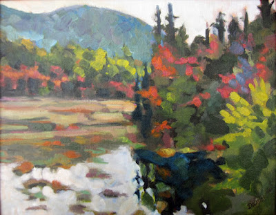
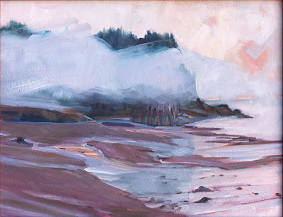
Spruces and Pines in a Boreal Bog, painted at the Paul Smith’s VIC and long since gone to a private collector.

I cut my teeth teaching workshops in the Adirondack wilderness, so itā€™s with great pleasure that Iā€™ll be doing that again, August 13-14, at Paul Smiths College in the High Peaks region. (For more information see hereor contact Jane Davis.) 

My Acadiaworkshop is sold out, so this is your only opportunity to study plein airwith me here in the northeast. It’s part of the Adirondack Plein Air Festival, but you do not have to be a participant in the festival to take the workshop. 

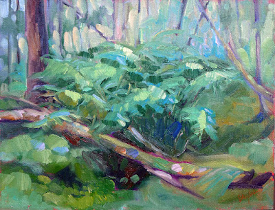
Bracken fern, also painted at Paul Smith’s VIC. 9X12, oil on archival canvasboard, $869 in a plein air frame.

(Of course, I have other workshops that still have openingsā€”see my websitefor the full listing.)

New Yorkers are justly proud of the Adirondack Park. It covers most of the Adirondack Mountain massif and is the largest park in the Lower 48. Unlike most state parks, about half of the land is privately-owned, with state land wrapped around towns, villages and businesses.

Iā€™ve been visiting the Adirondacks since I was a baby, and have painted, hiked, canoed and driven countless hours within it. But nobody can know the whole park intimately. Itā€™s just too vast.

There are 6.1 million acres with more than 10,000 lakes and 30,000 miles of rivers and streams. There are boreal bogs and old growth forests, mountain peaks and roaring rivers. Iā€™ve visited (and painted in) many wild places, and have found none wilder or more beautiful.

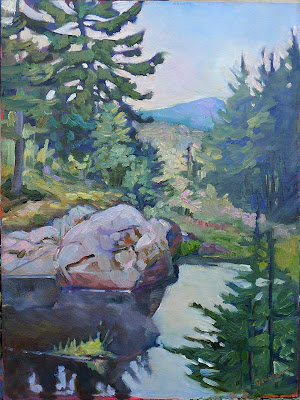
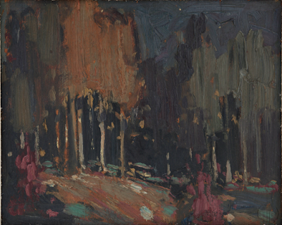
The Dugs, painted in the Adirondacks near Speculator, NY. 9X12, oil on archival canvasboard, $869 in a plein air frame.

As parks go, itā€™s pretty old. In 1885 the state legislature designated lands there and in the Catskills to be forever wild. This would come to be called ā€˜inside the blue lineā€™. Those land protections were preserved in the state constitution in 1894. In contrast, the National Park System wasnā€™t formed until 1916.

There are about 130,000 full-time residents within the park and another 7-10 million visitors every year. That puts tremendous pressure on the land, but the relationship between residents, visitors, wilderness and government somehow holds together.

Because the park has so much private land within its borders, there are accommodations for every budget. You can stay at the newly-restored Hotel Saranac, or you can go back-country camping at a state-owned campsite. (The popular camping sites sell out fast, so donā€™t dither.)

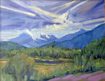
Whiteface makes its own weather, 9X12, oil on archival canvasboard, $869 in a plein air frame. Whiteface Mountain is one of the 46 High Peaks of the Adirondacks.

My workshop will be held at the Visitors Interpretive Center (VIC) at Paul Smithā€™s College, which is located in the hamlet of Paul Smiths, NY. Town and college are named after Apollos (Paul) Smith, who started as a humble Vermont fishing guide and ended up an entrepreneur.

The VIC is an assortment of Adirondack habitats. Thereā€™s a large pond, running streams, a boreal bog, and lots of woodlands. Mountain peaks rise in the distance. Luxurious for a backwoods workshop, there are bathrooms with running water.

This teaching gig comes with the responsibility of being juror of awards for the Adirondack Plein Air Festival. Sandra Hildreth is the grande dame of Adirondack painting and the founder of the festival. She wanted a juror who was plugged into the ethos of wilderness and plein airpainting in general. These are two things Iā€™m passionate about.

But my intimacy with the venue is also a potential downsideā€”I know many of the painters who participate. Could I be objective? After a point, there are just too many of my acquaintances involved for me to favor anyone. I think Iā€™ll be fine.

Monday Morning Art School: deadlines

Sometimes itā€™s not fun. Sometimes itā€™s almost painfully stressful. What do you do then?

Home Farm, oil on canvas, 20X24, Carol L. Douglas

At my first plein air competition, I was a nervous wreck. ā€œCome on, Carol,ā€ my exasperated friend said. ā€œGet a grip! You know how to do this.ā€ At that moment, that wasnā€™t exactly true; Iā€™d forgotten everything I ever knew about paint.

For some of us, commissions result in painterā€™s block. For others, plein air competitions are painfully stressful. Occasionally, Iā€™ll have a student who freezes in my workshops. I used to suffer terrible performance anxiety, which is why Iā€™m a painter and not a musician. As Iā€™ve gotten older, Iā€™ve found ways to cope. These strategies are also applicable to life in general.

Jack Pine, 10X8, oil on archival canvasboard, Carol L. Douglas

The first of these is to have a plan. It may seem counterintuitive to go into a painting with a process mapped out, but in fact thatā€™s what you have to do to complete any project within an allotted time. Not having a plan is the luxury of the dilletante.

When I flew to Edinburgh to paint a portrait in 2018, I had a deadline imposed by my plane tickets. I planned how long I had for the charcoal drawings, how long for the underpainting, and how long to finish the top coat. When I did Quick-Draws for plein air competitions, I knew I must finish the drawing and underpainting in the first hour in order to finish the top layers in the allotted time.

You might think that a flow plan is inhibiting, but itā€™s exactly the opposite. I learned this many years ago while painting a portrait commission for my late friend Dean. It was a surprise birthday gift for his wife. That meant a precise deadline, which he never let me forget. As I worked, I found the tight schedule liberating. I couldnā€™t perseverate and noodle endlessly on passages. That, in turn, meant freer, better brushwork.

Evening in the garden, 9X12, oil on archival canvasboard, Carol L. Douglas

Playwright Robert More was finishing a comedy when I last saw him. ā€œI can rewrite this ending eight times, and the last one wonā€™t necessarily be better,ā€ he told me. ā€œIā€™ll just end up with eight different versions.ā€

Having a set protocol is invaluable for quelling nerves. In addition to providing consistent results, it focuses your mental energy on the doing, rather than on worry.

Once youā€™ve established a painting process, practice it repeatedlyā€”not concentrating on the results, but on mastering the process. Being absolutely prepared is the best cure for performance anxiety. This is the great benefit of painting-a-day schemes; theyā€™re not about producing great artwork, but about getting a hammerlock on your process.

As you go on, stop thinking about all the ways you can screw up the painting. Instead, think only about the phase youā€™re in. If something goes wrong, donā€™t berate yourself. Above all, ignore the voices in your head that tell you youā€™re no good. Theyā€™re wrong. Instead, ask yourself where in your process you made a wrong turn.

Main Street, Owl’s Head, oil on linenboard, 16X20, Carol L. Douglas

In other words, develop enough self-awareness that you can monitor your own progress. When Iā€™m nervous, I develop a tic of constantly rinsing my brush. Thatā€™s a mud-making mistake in any medium. Because I know I do it, I can stop it before itā€™s out of handā€”and ask myself whatā€™s gotten me upset.

Even in pressurized painting situations, take time to eat decently and get some exercise. Exercise lifts the mood and reduces anxiety.

Above all, donā€™t waste time worrying about whether the client will like the work, or whether youā€™ll make a sale or win a prize. Focusing on the results, rather than the process, can effectively kill a painting.

This is a rewrite of a post that first appeared in 2019.

The glamorous life of an artist

Itā€™s easy to forget Iā€™m a painter when Iā€™m up to my elbows in minutiae, but it has to be done. Still, so does painting or Iā€™ve lost my raison d’etre.

Clary Hill Blueberry Barrens, Carol L. Douglas. This is one of the pieces I’ve decided (provisionally) should go to New York. Until I change my mind again, that is.

Iā€™ve taken to carrying my to-do list around on my phone. This is probably good organizationally, but it burns a hole in my pocket. As is the way with to-do lists, it never gets any shorter. The advantage of lists on paper is that theyā€™re easier to lose.

I had a visitor in my studio at the first of the year. ā€œIā€™m drowning in admin,ā€ I told her, as an explanation for the disorder. Sheā€™s a successful businesswoman and was, frankly, incredulous. ā€œAdmin what?ā€ she asked. After all, Iā€™m an artist. Everyone knows art isnā€™t about business.

At least they’re neat. That’s not always true.

In fact, itā€™s totally about business. Thatā€™s something you need to know if youā€™re contemplating crossing from amateur and professional status. Itā€™s about taxes and inventory and planning shows a year or more in advance. Itā€™s very easy to fall into a trap where your painting occupies less and less of your time, while you become more of an entrepreneur. If you want to make a living as an artist, the business of art has to be front-and-center in your consciousness.

I talked to Ken DeWaardon Wednesday. He was booting around Port Clyde looking at stuff (an important part of the plein air painterā€™s job, and best done with a cup of gas-station coffee in hand). I was torn. It was heavily overcast and pissing snow. On the other hand, talking to him was the closest Iā€™d gotten to a brush all week.

There’s a queen-sized bed under all that stuff. By the time I was done, I had paintings stacked in all three bedrooms and the bathroom.

I was pulling every single painting out of my storage closets, choosing inventory for an upcoming show at the Rye Art Center in New York. It doesnā€™t open until March, but a good solo or duo show requires a lot of advance preparation. The paintingsā€”which are hugeā€”have come down to my studio, where their frames will get a beady-eyed examination before theyā€™re wrapped for shipping.

Tom and Peggy Root have a show at Ringling College, called Parallel Visions: The Paintings of Tom + Peggy Root. ā€œI told the art handlers that if somewhere in Georgia they are overtaken by a car with flashing lights, it just means I’ve changed my mind again about another painting,ā€ said Tom. That indecision is a powerful impulse.

Once art gets to a certain point, ā€˜goodā€™ or ā€˜badā€™ or ā€˜brilliantā€™ is irrelevant. The real question is whether they support the narrative. Then there is the question of how the work will hang together. Paintings have to get along with their neighbors.

Meanwhile, the fiscal year has ended. People ask me why I do my own taxes. I counter that the tax preparation is the easy part (and I have Laura Turner to answer all my esoteric questions). Itā€™s the record keeping that kills me. Today my 2019 records go up in the attic, to be replaced by pristine 2022 folders. Itā€™s easy, but it takes time.

Sometimes all you have time for is a quick watercolor doodle, but that’s better than nothing.

Itā€™s easy to forget Iā€™m a painter when Iā€™m up to my elbows in minutiae, but it has to be done. Still, so does painting or Iā€™ve lost my raison d’etre.

After I talked to Ken, I gave myself a good shake and went into my studio, where I spent 15 minutes with my watercolors, doing a quick-and dirty-sketch for 45 Day Triple Watercolor Challenge. Thatā€™s a Facebook group my students started last year to get us out of the doldrums. If I donā€™t need it right now, who does?

May you live in interesting times

History runs in fits and starts. So does your artistic development.

Breaking Storm, Carol L. Douglas

ā€œScotch and soda, jigger of ginā€¦ā€ crooned my husband early one morning as we trekked over Beech Hill. Thatā€™s a Kingston Trio song from 1958. It set Doug to musing that music changed a lot more in the three decades from 1960 to 1990 than it did from 1990 to the present.

Thatā€™s how history works. Itā€™s linear, but it runs in fits and starts. There are long periods of stasis and then periods of rapid change.

The decade I was born in gave us portable coolers, the polio vaccine and birth control pills. It also gave us the integrated circuit. That, of course, changed the world.

In recent decades weā€™ve been coasting, building incrementally on the gains of the Computer Age. Then, bam! COVID. Change often comes as a complete surprise. Itā€™s also often messy, difficult and painful.

Coast Guard Inspection, Carol L. Douglas

The years 1346ā€“51 brought the Black Death to Europe. That in turn brought the end of centuries under the feudal system. Similarly, the Chinese Cultural Revolution was a decade of brutal paroxysm that finally obliterated the rigid feudal system of old China. As bitter and awful as the two 20thcentury world wars were, they ushered in modern society. Few of the unwitting participants in these cataclysms enjoyed them, but all of us who follow have benefitted.

Thatā€™s true of artistic change as well. It can be, frankly, disheartening. Weā€™re potting along painting in the usual way, feeling like weā€™re turning out good work, and suddenly something shifts. Everything we paint seems horrible to us.

Wreck of the SS Ethie, Carol L. Douglas

This is an inevitable rest-stop along any creative journey. Itā€™s important, because it signifies growth. You have three possible paths out:

  • Scuttle back to what you were doing before;
  • Quit and do something else for a while;
  • Find ways to quiet that awful voice in your head.

Obviously, I recommend the third path, but the other two are very common (and self-limiting) reactions. How can you avoid them?

Remind yourself of a basic fact: you havenā€™t suddenly forgotten how to paint. Dissonance is part of growth. Even experiments that fail are valuable; theyā€™re an essential part of the painting process.

Stop wiping out the canvases you donā€™t like. Sometimes a painting is uncomfortable to look at because itā€™s pointing the way forward. It can seem like an awkward outlier when you do it. Five years later, you realize it was a bellwether and the best thing you painted that year. Youā€™ll blunt your development if you wipe out everything that makes you uncomfortable.

Donā€™t seek validation through your friendsā€™ opinions. Theyā€™re unlikely to see the potential in an ungainly effort. In fact, group-norming of any kind can be deadly to change. This is no time to be assessing whether something is ā€˜goodā€™ or ā€˜badā€™ā€”itā€™s time to simply produce a lot of work.

Beautiful Dream, Carol L. Douglas

Discomfort with change can sometimes result in paralysis. If that’s you, try falling back on strict exercises that force you to stop thinking about results and start thinking about process. Thatā€™s where ā€œpainting a dayā€ exercises are invaluable. If you donā€™t feel like joining a formal one, make one up for yourself.

Monday Morning Art School: the nocturne

Forget the fairy-lights; a good nocturne follows the same rules as any good painting.

Hunter’s Supper, c. 1909, Frederic Remington, courtesy National Cowboy and Western Heritage Museum
Nocturne is a term appropriated by James Abbott McNeill Whistler from music. Whistler used it to title works that evoked the sensation of nighttime or twilight. It didnā€™t mean just any painting done at night. The difference was whether the absence of light plays a role in the paintingā€™s construction and meaning.

Prior to the Industrial Revolution, the night was a more powerful force than it is today. Itā€™s no surprise that nocturnes have always had a place in art. Giottoā€™s The Kiss of Judas (c. 1304) is an early example. By the 15thcentury it was a tradition to set the Nativity and Annunciation to the Shepherds as night scenes, pitting the Light of the World against darkness for dramatic effect.

Nocturne in Black and Gold ā€“ The Falling Rocket, 1874, James Abbott McNeill Whistler, courtesy Detroit Institute of Art

The 17th century brought us chiaroscuro, tenebrism and three great interpreters of darkness: Rembrandt van Rijn, Georges de La Tour, and Caravaggio. In modern terms, most of their paintings arenā€™t considered nocturnes, because theyā€™re set indoors. But they are nocturnes in spirit. Darkness is palpable and part of the message; it sits in counterpoint to the main theme.

It wasnā€™t until landscape painting came into its own that we started to see the development of true nocturnes under Whistlerā€™s definition. Ironically, artificial light played a big part in this; it made it possible to paint at night.

Nocturnes are particularly associated with Tonalism, which eschewed the bright colors of Impressionism and Post-Impressionismin favor of neutral colors, diffused light, and soft outlines, all of which naturally suggest low-light situations.

Frederic Remington did about 70 paintings which we might properly call nocturnes before his premature death at age 48. He was very scientific and technical in his approach, which is no surprise for an artist who started as an illustrator.

Nocturne, c. 1914, Tom Thomson, courtesy Art Gallery of Windsor

Remington’s nocturnes are filled with color and light. Their composition is complex, often involving a foreground figure in silhouette, setting off the light source. He experimented with electric lighting and flash photography to make his paintings. Thatā€™s ironic in that theyā€™re an elegy for the rapidly-disappearing pre-technological way of life. If youā€™re interested in the nocturne, the National Galleryā€™s The Color of Night is an excellent reference book.

Study Remingtonā€™s compositions; theyā€™re energetic and well-realized. Too many nocturnes rest on the time-worn device of reflected light. These can be part of a great painting but they wonā€™t carry the whole construction. A good nocturne follows the same rules as any good painting: it rests on a solid composition, it has an integrated color scheme, and its brushwork engages the viewer. If you donā€™t have those three things, go back to the drawing board.

Painting nocturnes en plein air requires a light. I have a cheap battery-operated book light; other artists use head lamps. The level of illumination should be kept as low as possible so that you donā€™t blind yourself to what youā€™re seeing.

Nocturne, c. 1885, watercolor, John La Farge, courtesy Metropolitan Museum of Art

Plein air nocturnes are especially difficult in watercolor. Night air is damp, so paper doesnā€™t dry well (or at all). Watercolor is simply not designed for large masses of opaque darkness. Sometimes artists use ink instead of watercolor in the darkest passages; Iā€™ve tried it and find it deadens the painting. In general, Iā€™d suggest the watercolor artist start by drawing and move over to paint in the studio.

However, the above painting by John LaFarge suggests a workaround. He uses a medium blue in the place of black, and the viewerā€™s mind makes the substitution. Itā€™s transparent enough that it would dry in the night air. A nocturne need not always be about the dead of night; it can be of twilight and dawn, too.

Regular readers know that Iā€™m no longer taking beginning students, except in my boat workshops. Bobbi Heath is offering classes to new students in oils, and Cassie Sano has started her first session with watercolor (to rave reviews, I might add)

Bobbiā€™s classes are pre-recorded so students can go at their own pace. I am intimately familiar with her teaching style and material and know that you will be ready to paint with me when youā€™ve finished her program.

You can learn more here.

Granite State Gallery: New Hampshire Art and Artists through the Years will look at the history of New Hampshireā€™s native painters and visitors. Itā€™s tonight at 6 PM, which means I canā€™t watch it live, so I sure hope they record it.

Ruthless pruning

If I had more time, I would have written a shorter essay.

Coast Guard Inspection, 6X8, oil on canvasboard.

The above witticism has been attributed to many people because itā€™s a universal truth. President Woodrow Wilson put it thus: ā€œIf it is a ten-minute speech it takes me all of two weeks to prepare it; if it is a half-hour speech it takes me a week; if I can talk as long as I want to it requires no preparation at all. I am ready now.ā€

On Wednesday, I wrote and designed an ad with exactly 24 words of new copy; it took five hours. Then I made a short promotional video. I spent 12 hours to make two minutes of finished video.

This wonā€™t surprise anyone in the creative fields. Editing is an important skill in any creative endeavor.

Blueberry Barrens, Clary Hill, 24X36, oil on canvas.

When I started blogging experts recommended that a blog post be kept to a thousand words. Today, I try to keep it around 500-600 words. There are many things that interest me, but if they donā€™t support the main trunk of the narrative, theyā€™re ruthlessly scrubbed out.

This has changed my writing style, just as ruthless editing has changed my painting style. There are things I used to be able to do with pen or brush that I can no longer do. Losing some skills is the price we pay for pursuing mastery of others.

Iā€™d like to blame simplification on our sleek modern sensibilities, but the quote at the head of this page dates from at least 1657. It was written (more wordily) by the French mathematician and philosopher Blaise Pascal. For centuries, writers have aimed for spare simplicity.

Main Street, Owl’s Head, 16X20, oil on gessoboard.

There are, of course, actions and reactions in public taste. Following hard on the heels of Pascalā€™s geometry came the French Rococo, with painters like Giovanni Battista Tiepolo, Antoine Watteau and FranƧois Boucher creating absurdly exuberant paintings. But rococo had a limited run; within a few decades, tastes swung back to the neoclassical.

Thereā€™s a limit, apparently, to the frenzy the human mind can tolerate. At the same time, there are paintings that seem empty to us. Dutch Golden Age church interiors come to mind, as do most of the experiments of 20th century op art. There isnā€™t enough there to hold our interest. Editing is a delicate balance.

Iā€™ve written before on the question of simplification in painting, most recently here. Itā€™s not a question of taking things out for the sake of simplicity, but of ruthlessly paring away what doesnā€™t matter. That makes room for whatā€™s important. Thatā€™s not necessarily content; it could be rhythm, texture, color or line.

The Late Bus, 8X6, oil on archival canvasboard.

ā€œWhen in doubt, take it outā€ is another pithy aphorism that can also apply to painting. Iā€™ve spent vast amounts of time trying to squeeze an idea into a painting or essay only to realize it was superfluous from the get-go.

In painting, the best time to do these edits is before you pick up a brush. Paper and charcoal (or pencil) are cheap and forgiving. Andrew Wyeth was a careful planner; his preparatory sketches are worth studying. Just as an outline is invaluable for the writer, a sketch is invaluable to the painter.

Paintings almost never benefit from last-minute additions or changes to the composition. These decisions need to be taken early on. Jan van Eyck may have moved feet and hands and added the little dog to the Arnolfini portrait, but he did so in the underpainting. The essential composition was worked out long before he got to the end.

All the plein air events, at your fingertips

Thinking about competitive plein air painting? Hereā€™s a useful tool.

Beach Erosion, 8X10, oil on canvasboard, $652 framed, available through Ocean Park Association.

I met Chrissy Pahucki at a plein air event. She was standing in line with one of her children waiting to have her canvases stamped. Chrissyā€™s branding came naturallyā€”she always had a kid trailing along. I once asked a show organizer how many years weā€™d been doing his event. ā€œYou can tell how long itā€™s been by how much Ben has shot up in height,ā€ he answered.

All three Pahucki kids are grown now and Chrissyā€™s still doing the plein air circuit. In her spare time, sheā€™s a full-time, award-winning middle school art teacher in Goshen, NY. About a decade ago, she created a website to direct-sell paintings called the Plein Air Store, and she still maintains it.

Quebec Brook, 12X16, oil on canvasboard, $1449 framed.

She also made this spreadsheet for applying to events. Itā€™s a useful tool because it lays out application, notification and event dates in tabular form. That means a busy person doesnā€™t have to hunt through reams of material looking for a show. Unlike a magazine, itā€™s searchable. And itā€™s free. Thank you, Chrissy.

The plein air circuit is where I first met Mary Byrom, Bobbi Heath, Poppy Balser, and many other talented, hard-working and like-minded women. Like Chrissy, theyā€™ve become valued friends. These events are much like the rodeo circuit; the same artists show up at them over and over. Artists compete with each other for prizes and sales, but at the same time, theyā€™re supportive and friendly. Thatā€™s a good life lesson right there.

Plein air events teach you to search out beauty. There is something otherworldly about grey, soaking weather that you donā€™t realize if you only go out when itā€™s fine. The painting Sometimes It Rains, below, was painted during a complete washout at Ocean Park, ME. I tucked myself into the vestibule at the Temple and painted down Royal Street. Ed Buonvecchio set up right behind me and painted me with my little red wagon. Sometimes It Rains turned out to be one of my favorite paintings. Edā€™s painting sold, although why anyone would want me on their wall remains a mystery to me.

Fog Bank off Partridge Island, 14X18, oil on canvasboard, $1594 framed.

Sometimes thereā€™s very little to work with. I once did an event in a coastal resort comprised of boxy modern houses shoved cheek-by-jowl along a strand. We were forced to find something beautiful, and the only way forward was to search shapes for a transformative angle or trick of the light. ā€œYou can make a good painting out of anythingā€ is a good painting lesson and an even better life lesson.

Plein air events teach us to finish work. That last bit used to be my undoing. I once perseverated for years over a commission, to the point where it became a standing joke among my students. ā€œIs that thing still there?ā€ theyā€™d ask as they trooped into my studio week after week.

Sometimes It Rains, 9X12, oil on archival canvasboard, $869 framed.

But plein air events allow for no such noodling. Thereā€™s an immutable deadline. You hand in work whether you think its done or not. A buyer or judge loves it for its unrefined energy. The adage that we spend 90% of our time doing 10% of the work is true in painting. Itā€™s also true that we sometimes spend 90% of our time overworking that 10%.

Plein air painting is, simply, the most important art movement of our time. If youā€™re interested in it, I encourage you to dip your toe into the competitive process. Start with a regional show near you and see how it goes. Chrissyā€™s table is a good way to start.

Monday Morning Art School: more interesting greens

We take a snapshot of a dancing, glowing landscape and what we end up with is a wall of dull green. We need to insinuate that original energy back into our picture.

Bracken Fern, 9X12, oil on canvasboard, available, Carol L. Douglas

Michael Wilcox published a watercolor pigment guide called Blue and Yellow Donā€™t Make Green. (Donā€™t buy it unless you can get it for a few dollars; its information is widely available on the internet, including here.)

Of course blue and yellow make green, but there are many routes to the same destination. I ask my students to avoid greens out of the tube, because theyā€™re a sure-fired way of ending up with a monochromatic ā€˜wall of greenā€™.

Apple Tree with Swing, 16X20, oil on canvasboard, Carol L. Douglas

Instead, I ask them to mix their greens using a matrix. Iā€™ve written about this many times, so Iā€™m not going to repeat the concept, except to say that itā€™s critically important to avoid the soul-sucking deadness of greens out of a tube.

Impressionism changed the way we look at and mix color. From the beginning of painting, artists understood that to warm a color up, you add a warmer tone, and to cool a color down, you add a cooler tone. If that neutralizes the color, so be it. Thatā€™s in fact what happens in real life with real light.

The Impressionists started to treat color as a wheel. If you wanted a warmer, lighter green, you mixed it not with Naples yellow* but with its cadmium yellow neighbor. If you wanted a cooler, darker green, you mixed it with it not with black but with its Prussian blue neighbor.

Better yet, you didnā€™t mix them at all, but laid gold next to green to warm it up, and laid blue next to green to cool it down. These tiny, discrete spots of color are averaged by the human eye into a coherent image. A blizzard of brushstrokes and color resolves into a discernable truth.

Spring Greens, 8X10, oil on canvasboard, Carol L. Douglas

If you look carefully at human skin, you realize itā€™s not ā€˜skin-toneā€™ but is quite varied. There are areas tinged with blue, yellow, purple, and red. Without that, a person would look dead. The same is true of foliage. There are moments in which the color leans toward khaki, yellow, teal, violet and orange. They are what give life to greens.

Unfortunately, these color shifts are subtle and almost never caught in the snapshots we use as reference photos. We talk about ā€˜photographic proofā€™ as if it is an absolute, although by now we all know that photos are terrible liars.

For guiding a painting, photos have their limits. They distort distance and spatial relationships. Modern point-and-shoot cameras (especially cell phones) blow contrast and chroma up, because thatā€™s what buyers like. In exchange, subtle value and hue shifts disappear.

We take a snapshot of a dancing, glowing landscape and what we end up with is a wall of dull green. Does that mean we canā€™t ever paint from photos? Of course not (although youā€™ll never really master the intricacies of natural color if you donā€™t go outside). It means we have to insinuate that energy back into the picture, and the tool we have to do that with is color.

The Impressionists taught us that we can do that by extending the range of color in an object. I can give you many examples of artists who did that, starting with Claude Monet and Vincent van Gogh. Spend a few hours analyzing their paintings in terms of color range.

I made a series of four photoshopped trees, above, to illustrate the concept. The first one is the normal way we might paint trees. With each step, Iā€™ve added color range to the tree, until the final version has every position in the color wheel.

The guiding principle is the color of light. Iā€™ve kept (for the most part) cool colors in the shadows and warm colors in the highlights. When you first try this, it will seem artificial and possibly absurd, but persevere. Itā€™s the key to dynamic greens.

*Todayā€™s Naples yellow is a mix and almost as deadening to a painting as sap green.