Note: I first posted this in April but managed to lose all the illustrations. Embarrassing for someone who prides herself on her computer literacy. I recently realized I was overworking the thing, and ought to just follow the software instead of trying to bend it to my will.
 During Wednesday’s class I demonstrated a method of indirect painting where one starts with a monochromatic grisaille and then paints into it. I had so much fun with the demo that I decided to finish it, working with the monochromatic underpainting while still wet. (In true indirect painting, the grisaille is allowed to dry completely and then color is glazed into it in transparent layers. What I am doing is more properly called scumbling.)
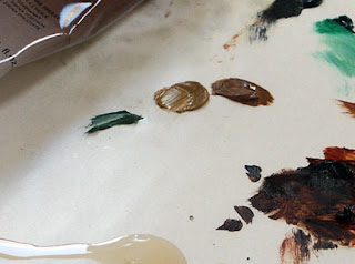
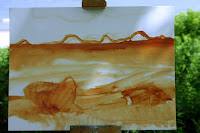
I am working on a 5X7 RayMar linen art board (so these images are actually quite small). I start with a mix of two earth pigments, Burnt Sienna and Burnt Umber, thinned with Turpenoid.
The advantages of cartooning in paint instead of drawing are numerous: you can wipe out what you don’t like, you’re inclined to work in masses instead of lines, your sketch is temperamentally closer to the final painting, and you concentrate more on your painting than your drawing skills. Rubens drew in paint, as did Rembrandt.
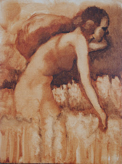
Those who were in Wednesday’s class know that my first sketch had two figures. But when I returned to it on Thursday, I could no longer remember where I was going with it, so I wiped it out. I decided (for no particular reason) to paint “Ruth amid the corn” for my subject.
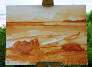
 While the first drawing was a sensitive rendering, it is a static composition, completely in profile. So I wiped it out and redrew it. The second draft is a rather brutish woman, but I liked the pose.
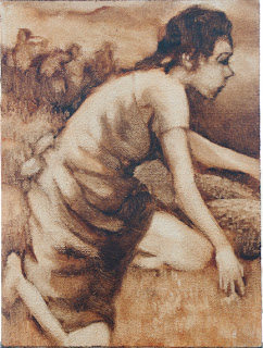
 At this point I began to consider what I wished to say about Ruth. In the Bible story, she is starving, but remains beautiful enough to attract Boaz. She is an alien, but her story culminates in her being the great-grandmother of King David. She is both a poor woman and the ancestor of a King. The other women working in the field are separated from Ruth but aware of her. (The Book of Ruth can be read here.) I developed this stage by adding layers of paint and wiping it away where necessary. These layers were not completely dry as I was working over them, in contrast to a true grisaille, but I was able to add additional pigment without disturbing the lower layers. The goal at this point was to clearly develop the values (darks and lights) and begin to add texture. As I was not working with any reference (either a model or photos), the figure and face are unfortunately somewhat stylized.
 I chose a transparent palette with mainly 20th century pigments: chromatic black, phthalo emerald, hansa yellow, Indian yellow, napthol red, quinacridone violet, ultramarine and phthalo blue. I chose this palette based on personal preference, because it certainly isn’t historically correct. Since the 20th century pigments were developed for direct painting, the end result is kind of quirky.
I glazed Ruth’s dress in blue as befits the ancester of a King (see representations of the Virgin). When the color was added, I noted a number of drafting errors—in the arm, in the basket, and in the placement of the eye. I could have corrected these in the transparency but didn’t feel like scrubbing them out on such a small canvas. Instead, I will correct them with opaque paint.
 At this point I added two whites to my palette: zinc (for glazing) and titanium (for opaques). Zinc white tends to be warmer and more brittle than titanium white, which is extremely cool. It is important to begin using medium at this stage.
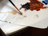
I began to experience the limitations of my brushes. I have been direct painting for so long that I no longer have sable or synthetic brushes. The hog bristle brushes I have are adequate but leave brushmarks unless you overwork the surface. I also have no tiny brushes, and I am working on a very small surface. Oh, well.
As I began adding white, I was also modeling chromatically. By underpainting in a warm tone, I have set up the painting so the light areas must be cool and the shadows warm. In these blues, I used a combination of violet and phthalo in the highlights, phthalo blue and emerald in the shadows, and ultramarine in the midtones.
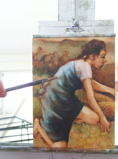
I became aware of an annoying composition problem in the lower right corner, where the leg slices off a triangle. I could solve this by reducing the contrast and chroma in that corner, or by changing my drawing. I don’t like the bare leg that much anyway; it might contribute to a sense of motion, but is nonsensical for Biblical-era women’s dress.
I began to add the white to the flesh tones, which only emphasized the difficulties in the lower right corner. Note that scumbling the transparent (zinc) white over the wet transparent earth tones in the blouse results in warm and interesting shadows.
 I realized I need to add some opaque colors in order to develop the skin tones and background. I choose yellow ochre, chromium oxide green, and raw sienna (modern earth pigments are more opaque than the historic ones). It’s a little picture, so I put out small amounts of paint.
The flesh is rather flat (I’m blaming my brushes), and my drafting errors have become more obvious. Note that I don’t strive for transparency in the skin tones at all. Rembrandt had a delightful way of painting solid faces into figures which were essentially transparencies (here, for example). I love it, even if I am not particularly good at it.
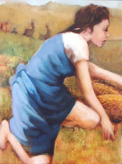
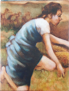
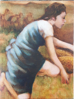
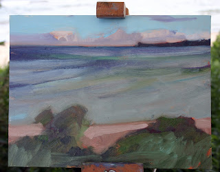
I decided to reduce the size of the figures in the background, and integrated a pale sky into the painting. Note that I was constantly refining the figure, the draperies, and the face with every iteration. In addition, I was reducing the contrast in the blue drape.
 It was time to rid myself of that pesky leg. (I could have fixed the drafting, but that wasn’t the leg’s primary problem; its position was the issue.) Note that I used chromatic modeling on the white skirt even though the russet tones weren’t pulled up from the underpainting. Also, I was steadily reducing the contrast in the blue drapes while increasing the chromatic range.
One issue with using 20th century pigments was becoming apparent. Many of them (the phthalos in particular) are high-stain colors. With little provocation they will bleed or track into neighboring sections of the painting. The painter must take extra care to manage this.
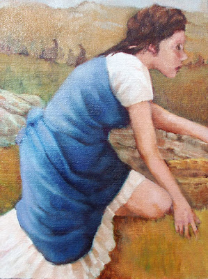
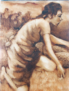
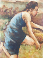
But—gack!—that eye! I’ve put up with it in the wrong place long enough. I had great fun introducing a stone wall and ruffles on the white skirt. It’s become somewhat more opaque than I intended but there are still passages which are transparent. Have developed the background figures as far as I want to… I think.
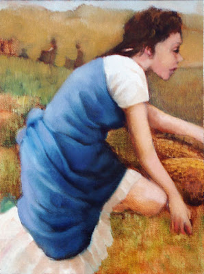
In that I have to teach tomorrow, I will let it dry thoroughly and then look at it again. There are shadows which need resetting, but perhaps I will take my friend Toby’s advice and work this up as a larger painting.
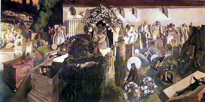
Just for fun, here are some other renderings of Ruth.
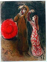 Marc Chagall, The Meeting of Ruth and Boaz
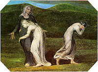
William Blake, Naomi entreating Ruth and Orpah
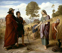 Julius Schnorr von Carolsfeld, Ruth im Feld des Boaz


