Nothing new under the sun

Leonardo da Vinci’s Vitruvian Man was based on book III of De Architectura. Vitruvius said the human figure was the principal source of proportion for the classical orders of architecture.
The art of hydraulic cement was lost after the fall of the Roman Empire and not rediscovered until 1756, but if people had just read their Vitruvius, the recipes were in there all along.

Sandy Quang (who is writing her Master’s thesis) prefers her Vitruvius aloud so I’ve listened to quite a bit of his De architectura in recent months. He’s such a lucid writer that I have no trouble following it while driving. What’s amazing is how much of what he describes hasn’t changed in almost 2100 years.

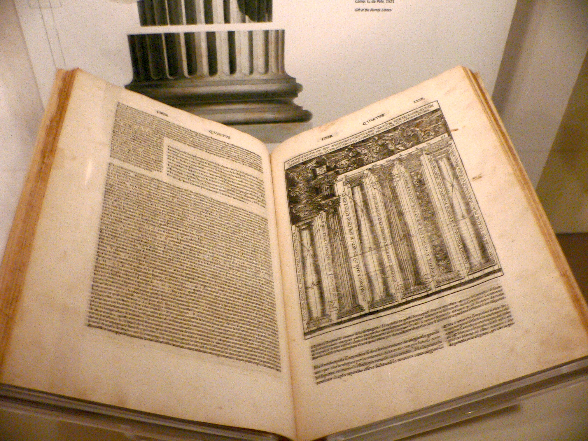
1521 edition of De architectura, translated and illustrated by Cesare Cesariano
Very little is known about Vitruvius’ life. He was born about 80–70 BC and died sometime after 15 BC. He was some kind of praefect, but whether that was in the army or civilian life is not clear. He was mentioned by Pliny the Elder and Frontinus, but even his cognomen (surname) and first names are uncertain.
What an amazing mind Vitruvius had! He not only wrote; he practiced his craft. As an army engineer he specialized in the construction of ballista and artillery. He described the building methods of foreign tribes throughout the Roman Empire, from which it can be inferred that his service was broad. And somehow, he had the time to write this ten-volume treatise on architecture, which is the only surviving classical text on the subject.

Triumph of Neptune standing on a chariot pulled by two ichthyocentaurs, Barthos and Aphrosthird century AD. It was built as per Vitruvius’ instructions, and if you were inclined to make one today, you’d use essentially the same technique. (The fundamental absurdity of ichthyocentaurs is not an architecture question, so Vitruvius would have had no advice about whether or not to include them.)
Ancient Roman architects had a broader remit than our modern equivalents, being responsible for engineering, urban planning, materials, HVAC, acoustics, plumbing, and a whole host of other sub-specialties. De Architectura attempts to break down this massive field and describe it in simple, comprehensible terms.
Sandy has read to me from the books on materials and pavements and decorative plasterwork (which relate to her particular interest in Roman mosaics). Having done my share of construction and plastering, I’m pretty familiar with how we use those materials today. Other than adjustments for climate, it’s shocking how little has changed.
An ancient Roman concrete vault in Rome, from the Basilica of Maxentius and Constantine, c. 312 AD. Can we possibly improve on concrete structures that lasted two millennia?
We don’t seem to produce such brilliant generalists in the modern era. I wonder why that is? You can read De architectura here.
Let me know if you’re interested in painting with me in Maine in 2014 or Rochester at any time. Click here for more information on my Maine workshops!

Animated books from antiquity

Fore-edge painting of Diana sitting with a handmaid by a lake, c. 1817, Boston Public Library. You can see a video of the book here.
Yesterday, my friend John Nicholson sent me this lovely link to gifs of fore-edge painting of books.“I am truly amazed by the love lavished on books before the paperback epidemic,” he wrote.
That made me smile, because my only experience with fore-edge painting was defacing the paperback texts we were issued in high school. Being a perennially bad student, I amused myself with a crude kind of fore-edge animation where you could make an animal or man run across the pages. This took no skill whatsoever, but it was tedious, so it helped to have someone droning on in the background.
Martin Frost was a contemporary British fore-edge painter. You can see his gallery here.
Gifs and videos are, paradoxically, the best way to experience fore-edge painting if you’re not lucky enough to hold the book in your hands. These books were intended to be interactive.

There are early examples of fore-edge painting that date back as early as the 10th century, but these were simple designs meant to identify books. As daft as it seems, it appears that readers shelved their books with the spine facing in, so the fore-edge painting served the same purpose as spine lettering today. Anyone who ever wrote their name along the fore-edge of a textbook to prevent it being stolen understands the principle. By the 14th century, these spine paintings had formalized into heraldic designs. The sixteenth-century engraver Cesare Vecellio (a cousin of Titian) is credited with raising the level of fore-edge paintings to fine art.

Watership Down, special limited edition of 250 copies. This fore-edge painting was one of ten done in 1976 by Don Noble, from online catalogue by Abe Books.
Until this time, fore-edge paintings were direct: they were painted on the flat bound edge of a book, intended to be seen when the book was closed. In the 17th century, an English bookbinder, Samuel Mearne, developed the hidden fore-edge painting. The flat surface is gilt; a painting is produced on the very closest edges of the page, so that when the book is fanned, the picture appears. The English raised this book form to its greatest height toward the end of the 18th century, but fore-edge painting is an art-form that is alive and well in the current age. Among these are the occasional animated fore-edged painting; the high-brow cousin of my high school game.

Let me know if you’re interested in painting with me in Maine in 2014 or Rochester at any time. Click 
here for more information on my Maine workshops!

Out on a limb

Rye Fields, 1878, Ivan Shishkin
Yesterday, a reader wrote in response to my Winslow Homer post, “I find rocks difficult, too, and trees. Trees are my nemesis.” Made me smile because I was drawing a combination of rocks and trees at the time.
I will soon show you a cute parlor trick that will simplify drawing trees. But until then, approach them the same way you do the human body, as a sinuous torso with expressive, outstretched limbs.
After the Rain: Etude of the Forest, 1881, Ivan Shishkin
Although my trick will simplify getting the overall shapes right, there is no substitute for careful observation. The Russian Peredvizhniki painter Ivan Shishkin, like many of his fellow-countrymen, specialized in trees, and he seemed to draw them as frequently as paint them. That meticulous attention to drawing studies is something he shared with America’s great artist of trees, Andrew Wyeth.
Drawing of oaks by Ivan Shishkin, 1857
My goal in this sketch was not to perfectly realize a real-world tree, but to devise a pattern of branches for a painting of a tree fallen across a river that has created a logjam. This has been the most difficult sketch to date, since I did two radically different layouts for it and have waffled between them.

My sketch of a tree fallen across a river. The root ball needs to be bigger, but I will fix that in the painting.
 I’ve done eight sketches since the beginning of January, of which six are usable. I have two others completed earlier. On Monday, I will paint again for the first time since my surgery. I can’t wait.


Let me know if you’re interested in painting with me in Maine in 2014 or Rochester at any time. Click 
here for more information on my Maine workshops!

The Lure of the Sea

Sunlight on the Coast, 1890, Winslow Homer
I have been pushing myself to do a little more each day since my surgery, and yesterday I hit the wall—a persistent stitch in my side put paid to doing any more work. But at least I finished one sketch of a breaking wave.
Whenever I consider painting surf, I start by thinking about Winslow Homer’s great Maine paintings.  Homer knew the value of a diagonal in a painting, and he used it repeatedly, always to great effect.
Rochesterians know The Artist’s Studio in an Afternoon Fog, 1894, by Winslow Homer, because it is owned by the Memorial Art Gallery. I was pleased as punch to see it have pride of place in the Portland Museum of Art’s Weatherbeaten show.
WinslowHomer is providing inspiration of another sort to me these days. I’ve been debating whether I’m capable of picking up sticks and starting again in Maine at my advanced age. Yet Homer was almost 50 when he moved permanently to Prouts Neck, ME.
It was here he produced his most famous maritime paintings. These paintings established his reputation “as the most original and one of the strongest of American painters.” (New York Evening Post) He could never have made that great push had he not chosen to live a hermit-like existence in Maine.
It’s so easy to weaken the diagonal in a sketch, and I did so here. Will fix it on the next permutation.
One bit of advice of his I’ve never been able to fathom was this: “Leave rocks for your old age—they’re easy.” I’ve never found it to be true, especially the scrambling-over-rocks part.
The rocks in my sketch are from my imagination, but the reference photo of the boys was taken in S. Gippsland, Australia, during a picnic with my cousin and his boys.
A tidal pool on the Southern Ocean, off the coast of S. Gippsland. The sea is a universally beautiful thing.
In photos, the Southern Ocean off Victoria and the North Atlantic off Maine can look very similar, filled as they are with tidal pools, vast rock formations, and myriad shellfish. In life, they are very different. The Southern Ocean is warm, aquamarine, and has fairy penguins. The North Atlantic is cold, grey, and full of gulls. But both are magical.
Let me know if you’re interested in painting with me in Maine in 2014 or Rochester at any time. Click here for more information on my Maine workshops!

Aurora Borealis

Aurora Borealis, 1865, Frederic Edwin Church
Strange, fiery forms uprise
On the wide arch, and take the throngful shape
Of warriors gathering to the strife on high,—
A dreadful marching of infernal shapes,
Beings of fire with plumes of bloody red,
With banners flapping o’er their crowded ranks,
And long swords quivering up against the sky!
(John Greenleaf Whittier)
The Northern Lights, or Aurora Borealis, are caused by the collision of charged solar plasma with Earth’s magnetic field. The arc of darkness in Church’s painting, above, is not something I’ve ever seen here along Lake Ontario, but Church was painting from a a sketch and description from Arctic explorer Isaac Hayes. Apparently, the arc is caused by alignment to magnetic north.

You can tell the information was secondhand, because the color shifts in the Northern Lights are in reality layered one on top of another like rainbow jello. Church—a keen observer of nature—would not have made such an elemental error. 

The wormy shapes in Church’s painting appear in no photograph I’ve ever seen of the Northern Lights, but they somehow convey the dancing motion better than any still photo does.
By the time Church painted his Aurora Borealis, scientists understood the displays to be connected to solar activity. However, that was new knowledge at the time of the American Civiil War. On September 1-2, 1859, the largest solar flare ever recorded caused visible Northern Lights as far south as the Caribbean. Another large solar flare, visible into Virginia, occurred on December 23, 1864. Even a rational people could be forgiven for seeing portents in these events.

Our Banner in the Sky, 1861, Frederic Edwin Church
Linking the Aurora Borealis and war and destruction is as old as the written word. Pliny the Elder wrote of it as a “flame of bloody appearance… which falls down upon the earth.” A spectacular Aurora Borealis that appeared in London in 1716 was linked to Jacobite rebellion in Scotland.
My sketch of the northern lights in Maine.
Today I sketched the Aurora Borealis over Owl’s Head Lighthouse. Although I have seen the Aurora Borealis many times, I must rely on photo reference for the lights themselves, for I now live in a city where light pollution obscures the Northern Lights. I’m taking artistic license in pointing my scene to the north, but only a native will realize that.

Let me know if you’re interested in painting with me in Maine in 2014 or Rochester at any time. Click here for more information on my Maine workshops!

Artistic license

The Veteran in a New Field, 1865, Winslow Homer
I’m preparing a drawing of a wheat field with hail damage. I started by considering the greatest wheat field painting I know. Winslow Homer’s The Veteran in a New Field is surely one of the iconic paintings of American history.
Homer painted this in the summer of 1865, immediately following the end of the Civil War and  President Abraham Lincoln’s assassination. We understand the farmer to be a Union veteran by his jacket and canteen at the lower right. Holding his scythe, he is at once the Grim Reaper and the man returned to civilian life. He grieves, and yet he has returned to life. There has been no greater work ever painted on the wages of war.
My sketch for a wheat field with hail damage. Homer’s painting tells us me that it doesn’t need to be complicated; in fact, I’m not sure a painting of a wheat field can be complicated.
You learn something every time you look at a painting. Surely no wheat has ever reached the height of that in this painting. Even Timothy-grass, the tallest component of hay, seldom reaches these heights in the Northeast, but the golden color of the stalks tells us this is no hay-field.
Another favorite field painting: Jules Bastien-LePage’s Haymaking (Les Foins), 1877. The look of blank exhaustion in their faces is recognizable to anyone who has worked hours under a hot summer sun.
And I was just worrying because in my next sketch I’m pointing something that faces east decidedly to the north. Well, if Homer can get away with wheat that tall, perhaps I can reconfigure the Maine coastline.
Let me know if you’re interested in painting with me in Maine in 2014 or Rochester at any time. Click here for more information on my Maine workshops!

Let’s all raise a glass!

Tom and Catherine Bullinger will open The Victor Brewery to the public this Thursday.
Catherine Bullinger was the first person who ever signed up to take painting lessons with me. She still takes them today. She has an MBA and a very responsible corporate job, so when she told us that her dream job was to be a barmaid, we laughed. It turns out she was serious.
Tom is using locally-sourced grains and hops wherever possible. These hops were grown in Victor. I’m looking forward to painting the hop-fields next summer.
This Thursday, her husband Tom will officially open The Victor Brewery at 6606 State Route 96 in Victor, NY. Tom is one of those creative types who defy easy labels. He is a programmer but his passion is building things. He built his own kayaks and dining room set, and they’re exquisite. Then he moved on to building the brewing system, kettles, sanitizers, coolers, and furnishings for this brewery.
Tom made the brewing system and all the furnishings, including this bar and tapboard. I made the paintings of the upper and middle falls at Letchworth behind it. I imagine he’ll be working on the finishing touches right up to Thursday’s opening.
As Brewmaster, he builds the beer, too. The whole system is elegant, efficient, and computer-driven. “That’s the brains of the operation,” he said, pointing to his laptop sitting on a chair in the corner.
I bet when Catherine dreamed of tending bar, she never thought about devising systems of washing and disinfecting glasses. Almost unbelievably, Tom did not learn to blow glass and make his own barware.
I see no reason to waste calories on any food or drink that isn’t top-shelf. Since Tom made the beer for my daughter’s wedding rehearsal, I’ve had a chance to sample rather quite a bit of it, and I think it’s fantastic. I don’t know the language of beer, but let me describe it in my own terms: it’s effervescent and distinctive without being overwhelming, and it tastes fresh and alive.
Because of my recent surgery, I can’t lift. So I was forced to sit and quaff beer while Tom and my husband hung this show for me. Pity.
So when Tom and Catherine asked me to hang a landscape show for the Brewery’s opening, I was tremendously chuffed. I’d had to cancel a show in Maine in December because of my surgery, but Tom and my husband offered to do the heavy lifting while I sat at a table and drank beer.
I should have stayed and helped Catherine steam t-shirts.
Much of the work I’m showing is of local subjects like Keuka, the Erie Canal, Seabreeze, and the mouth of the Genesee. Others are of summery, beer-drinking kinds of places. It will be there through Victor Brewery’s grand opening in March; I hope you get a chance to stop by and raise a glass to it and maybe take home a growler as well. Hours are Thursday and Friday, 4-7 pm, and Saturday, 1-6. For more information, call (585)902-8166 or email [email protected].
The Victor Brewery is located at 6606 State Route 96 in Victor, NY and opens this coming Thursday.

Let me know if you’re interested in painting with me in Maine in 2014 or Rochester at any time. Click here for more information on my Maine workshops!

Awkward Family Portraits

Portraits of HRH Queen Elizabeth (2010), HRH Prince Charles (1998) and HRH Prince Philip (1998). Rupert Alexander managed to make them look like three troubled executives from a not-too-reputable family business.
Much hay was made over the remarkable resemblance of Paul Emsley’s Kate, Duchess of Cambridgeto the Breck Girls, but it is by no means the worst of this generation of royal portraits.

Kate, Duchess of Cambridge, 2013, by Paul Emsley

There is a wealth of brilliant portraiture of British monarchs from Owain Glyndŵr on.The current regime has been painted as frequently as any royal family, but the results are generally mediocre.

Queen Elizabeth II, 2001 was apparently more about Lucian Freud’s inner man than the Queen’s. Or at least about his Five O’Clock Shadow.
Anthony Van Dyke expressed Charles I’s sovereignty through his natural mastery of both the gentlemanly and kingly virtues. Hans Holbein the Younger used luxurious clothing, posture and symbols to assert the kingship of Henry VIII. The modern portrait artist eschews props, and seeks to say something about the inner man. But when the inner man is subservient to the public man (as in the case of monarchy), that idea seems to fail.

Portrait of William and Harry in the dress uniform of the Household Cavalry by Nicky Philipps, 2009, strikes the right balance between their public image and their formal roles. 
There are a few exceptions to this. Portrait of William and Harry in the dress uniform of the Household Cavalry by Nicky Philipps strikes the right balance between the princes’ formal roles and their public images. It is casual and yet respectful, and it will further the narrative of the Handsome Young Princes long after they are middle-aged men.

Duke of Edinburgh, 2002, by Richard Stone.

Richard Stone’s Duke of Edinburgh hearkens back to earlier virtues in its iconic pose and unapologetic chest full of medals. Jeff Stultiens’ immense portrait of the queen gives her the dignity of rank.

Her Majesty Queen Elizabeth II for Oriel College, Oxford, 2003, by Jeff Stultiens
But the best portrait among them is amateur, gawky and surprisingly lovely: it’s by the Duke of Edinburgh and depicts the Queen reading the paper at the breakfast table. She is neither part of her surroundings nor overwhelmed by them; she is just doing her job. Of all her portraits, it’s the only one in which she looks comfortable in her own skin.

Her Majesty the Queen at Breakfast, 1957, Prince Philip, Duke of Edinburgh
Let me know if you’re interested in painting with me in Maine in 2014 or Rochester at any time. Click here for more information on my Maine workshops!

Paintings from Mother Russia

Silence, 1890, Nikolay Nikanorovich Dubovskoy
If we think about Russian artists at all, we tend to remember 20th century expatriates like Wassily Kandinsky and Marc Chagall. But before the Russian Empire collapsed in civil war in 1917, it had a fine tradition of landscape painting. 
Trees in the Snow, 1908, Nikolay Nikanorovich Dubovskoy
My late student, Gwendolyn Linn, was a fan of these classical Russian landscape painters. From her I learned about Ilya Repin, Arkhip Kuindzhi, Isaac Levitan, Ivan Shishkin, Vasily Vereshchagin, and others. Many of these painters were members of the Peredvizhniki (or Wanderers or Itinerants in English). Formed in rebellion to the rigid Academic standards of the day, the group eventually became the status quo.
Yesterday I got a text from a student reminding me of one of the Peredvizhniki painters, Nikolay Nikanorovich Dubovskoy. Dubovskoy was born into a family of Don Cossacks in Novocherkassk in 1859. He studied from 1877 to 1881 at the Imperial Academy of Arts in St. Petersburg. In 1911, he was appointed a professor there.
The Waterfall Imatra, 1893, Nikolay Nikanorovich Dubovskoy
Dubovskoy died in 1918, a pivotal year in Russian history. It was the end of four years of World War and near the start of five years of civil war. The population of St. Petersburg was in free-fall: it dropped from 2.3 million in 1917 to 722,000 by the end of 1920. By the beginning of 1918 German troops were so close to the city that the Bolshevik government abandoned it. One shudders to imagine the life (and death) of a middle-aged artist when all the former luxuries had been condemned and reality was a struggle to find scarce food and fuel.
First Snow, 1910, Nikolay Nikanorovich Dubovskoy
But when the Peredvizhniki  painters were in their heyday, that was all still in the distant future. They mined the myths of Mother Russia, so their work is a blend of genre, history and nationalist painting. It can be mawkishly sentimental, but just as often is profound and arresting in its singular beauty.
Let me know if you’re interested in painting with me in Maine in 2014 or Rochester at any time. Click here for more information on my Maine workshops!

Third time’s a charm

My sketch for painting of lye tailings in Rockport, ME.
After attempting this twice and failing dismally both times, I decided to back off and look at a painting that’s currently on the easel of my friend Brad Marshall. This unfinished painting  uses a tremendous diagonal to set the stage for a scene of Lake Maggiore in the Italian Alps.
Why Brad’s painting? It’s excellent, first off. But I was just looking at it, and it was on my mind. 
My first step was an art-student approach—I printed a copy of Brad’s painting-in-progress and sketched a fair copy of  it so I could understand why my diagonal kept bisecting my canvas. That made my problem clear: the water needed to be rendered as a midtone, not a dark (no matter that Goose River is peaty and brown), and the whole shebang needed better foundation garments. In other words, it was sagging too low in the picture.

The next challenge is to make this accumulation of rusting barrel hoops, lye tailings, and new growth into something beautiful. Well, if it fails, it fails.
Also, I threw my graphite sticks across the room and went back to my #2 mechanical pencil. My prior sketches were too high-contrast to be workable. Sometimes you can get just too sophisticated for your own good.
Easy peasy from there. But the sad reality is, I’m only good for two hours of work a day, maximum, right now. Very frustrating for the Energizer Bunny, but this too shall pass.

Let me know if you’re interested in painting with me in Maine in 2014 or Rochester at any time. Click here for more information on my Maine workshops!