Messing around

“The light changed,” is a ridiculous complaint anywhere, but nowhere more so than on the sea.
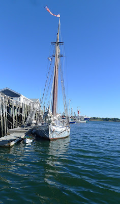
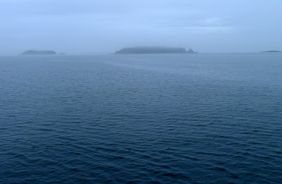
Somewhere in Eggemoggin Reach, as the rain cleared off. (All images by and reserved by Carol L. Douglas)
My intent in going out on the American Eaglewasn’t to paint. I planned to relax, talk to new people, listen to Captain John Foss’ hoary jokes, and read. At the last minute, I slipped my watercolors in my duffel bag and made it a busman’s holiday. Not only did I have a good time, so did several other people who tried out my paints.
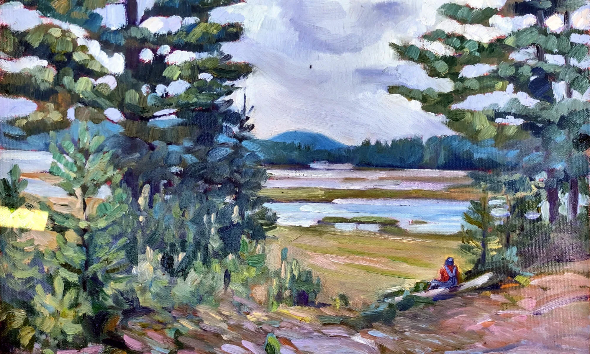
An oil painting from the deck, during last summer’s venture.
Last June I painted in oils from this boat. I had fun but was an obstacle to the crew and captain. Even my small easel took up too much space along the main cabin. I was constantly grabbing it to prevent it flying into the sea. American Eagle is a highly-polished, much-loved vessel. I worried that I would accidentally stain her deck with some brilliant pigment that would forever rankle the captain.
Dinghy in Bass Harbor.
Watercolor simplified things. It meant I could work on a board on my lap, it’s a smaller kit, and it’s faster. My mistakes would wash away.
The passing ocean scene provides limited composition options. You can put the horizon high, low or in the middle. Short of the occasional porpoise, grey seal, or lobster boat, there isn’t much happening to break it. That hard, unbroken line is, in some ways, the essence of the subject. I had to learn to love it.
Browns Head Lighthouse.
I used sea-water, which is something I learned from Poppy Balser. It causes the paint to granulate slightly as it dries, similarly to sprinkling salt on select passages. I had a bucket and therefore all the salt water I needed. I did wash my brushes in fresh water at night, to preserve the ferrules.
I tend to splash things around with great abandon however I paint. These usual slovenly habits got in my way on this trip. The bright sun was deceptive. On the ocean, in the middle of October, my paper took a very long time to dry. I filled the time as best I could by messing around. Still I occasionally misjudged my surfaces.
Exiting Stonington.
The sea is ultimately a reduction to two elements: water and air. Even out of sight of land, the view is different in every direction. The sky changes and the water changes. To paint this is anything but simple. In moments the sea can go from molten silver to deepest green, and you can do nothing but follow obediently along. “The light changed,” is a ridiculous complaint anywhere, but nowhere more so than on the sea.
Looking home toward Beech Hill.
On our last day out, Captain John Foss turned over the wheel to Sam Sikkema, who captains the Picton Castle out of Lunenburg, NS, in her trans-Atlantic training trips. I was sketching Beech Hill at the time and a new friend, Lee Auchincloss of Navigator Publishing, was painting the Camden Hills.
Sam let out the old Eagle’s stays. Suddenly, the rail was low and my subject obscured. But I’m hardly complaining. It was a fleet finish to a beautiful week. Now, it’s back to work for all of us.

Monday Morning Art School: Reflections

Time for art class. Get out your pencils and get started.

Reflections off American Eagle in Stonington, watercolor, by Carol L. Douglas
Artists often trip up on the stochastic processes: things that have a general pattern but can’t be predicted precisely. We tend to either ignore the pattern altogether or overstate it into rigid regularity. These are everywhere in nature: in the distribution of leaves on trees, wildflowers in fields, the cleaving of rocks, and the behavior of water.
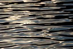
The surface of water is one of the most fascinating and difficult things to paint. It can be utterly still, or random and choppy, or it can create orderly patterns of surface ripples or waves. When it hits an obstacle like a ledge or the shore, its surface behavior is dictated by what’s underneath. In a rainstorm, fresh water floats on the surface of salt water, adding another pattern.
I like to sketch what the surface of water is doing. This changes quickly, so it helps to do this in a fast-working medium like pencil or watercolor. I did the above sketch while anchored off Stonington last week, but you don’t need an ocean for this exercise. There’s standing water almost everywhere: in ponds, lakes, or streams.
Light reflects identically but opposite. That’s immutable. What changes with water is the shape of the surface.
Reflection involves two rays – an incoming (incident) ray and an outgoing (reflected) ray. Physics tells us that the angles are identical but on opposite sides of a tangent. This is immutable. It’s why reflections that do not run in a generally-straight line down to the viewer are always wrong.
If water were perfectly still and perfectly reflective, its surface would be a mirror. Two factors prevent that. First, some rays of light are absorbed, and not reflected. This is true in both directions. Some of the light from the sky is absorbed. At the same time, we can see some of the color (or objects) under the water. Furthermore, the surface is never flat; it’s wavy or worse, just like a fun-house mirror.
The surface of the water at the Isaac H. Evans’ berth in Rockland.
In most cases, a sea wave’s surface is also windblown and irregular. That makes its surface infinitely varied. Rays are reflected at many different angles, radically disrupting the image. This gives the surface of the sea or its spray a solid or matte appearance.
Where we see directly into water, it’s the least reflective. That can either mean looking straight down or into the face of the wave. These surfaces are most likely green or brown in tone, depending on what’s underneath. The tops of the waves reflect the sky, but the sky isn’t the same color in all directions. Other surfaces reflect what’s in the distance—moonlight, other boats, structures, trees. Often these last reflections take the form of rings.
In relatively still water, reflections are irregularly elliptical.
In relatively still water, reflections are generally elliptical, although those ellipses may join in long strings or have vibration interference depending on the surface breeze. As the water becomes less still, water generally sorts itself into waves with identifiable patterns.
Waves can range from very tiny ripples to towering structures nearly a hundred feet tall. Most of us see waves as they approach the shore. There their behavior changes radically. They tend to pile up as the water gets shallower, effectively growing taller and slowing down. As they break, all predictability ends. The spray from a breaking wave can and does go anywhere.
The light stream is fresh water on top of salt water during a rainstorm.
Your assignment, then, is to find a body of standing water somewhere near you, and draw or paint the reflections. Don’t worry about the setting; we are only concerned with the behavior of the waves you are seeing.

Going sailing

Life during the Age of Sail was often “solitary, poor, nasty, brutish, and short.”

Safety Check, Carol L. Douglas, courtesy Camden Falls Gallery
I dithered about whether I was going to go sailing this week. My asthma has been kicking up and it seemed unfair to Captain John Foss to have to decide whether to feed me to the fishies.
On Friday night, I went down to the harbor to watch the harvest moon rise. The lobster fleet nodded gently on a whisper of sea air. I found myself able to breathe. If the Captain doesn’t make me do all the work, I should be fine. I’ve got a new inhaler, so off I go.
Breaking Storm, Carol L. Douglas, courtesy Camden Falls Gallery
I’ve painted American Eagle many times. She’s got beautiful lines and has been lovingly restored. She’s a youngster compared to much of the Maine schooner fleet, having been built in 1930 in Gloucester, MA. Because she was originally outfitted with an auxiliary engine, she’s an oddity: the sole survivor of the transition between sail and engine in fishing vessels.
She was called Andrew and Rosalie when she was a working fishing boat. Her schooner rig was removed around 1945 and she was converted to a trawler. She must have been an awful mess with no sails, an elevated pilothouse perched on the quarterdeck, winches, booms and reels for trawling on the forward deck. I could drive down the hill and ask the Captain (who was responsible for her restoration) for a picture. I poked around the internet instead. No luck, but I found this sad story, dated January 12, 1937:
Setting blocks (American Eagle and Heritage), Carol L. Douglas, courtesy Camden Falls Gallery
“A loose knob on the pilot house door of the local auxiliary sch. Andrew and Rosalie, Capt. George Goodwin, spelled death for Albert ‘Boxie’ Blagdon, 38 years, single, native of Newfoundland, at 6 o’clock this morning on Middle Bank, 12 miles southeast of Eastern point, when Blagdon lost his balance and drowned in the sight of his shipmates.  The craft arrived here at 8.30 o’clock this morning, with the flag flying half-mast, to report the affair.  Blagdon had no known local relatives, and lived aboard the ship when in port.
“The vessel left here Sunday, single dory trawling, and had secured 10,000 pounds of groundfish on Middle bank, until the breeze that swept the waters this morning prevented the crew of 15 men from fishing.  Capt. Goodwin decided to come closer into shore for harbor, and wait for the breeze to die down.  He had ordered halfhours tricks at the wheel and Blagdon had just completed his 6 o’clock, being relieved by Edward Armstrong.
Winch (American Eagle), Carol L. Douglas, courtesy Camden Falls Gallery
“Armstrong on taking the wheel, asked Blagdon to hook the door.  The latter did so, and then took hold of the knob of the door to steady himself as he began to walk down the narrow way between the starboard rail and the house.  His foot is believed to have caught on ice on the deck, and as he held more tightly on the knob to keep his feet, the knob pulled out and sent Blagdon hurling over the rail into the icy waters.  The last the crew saw of him was his boots disappearing into the ocean.  He was weighted down with oilskins, heavy underclothes, and heavy leather boots, which coupled with the temperature of the water, probably prevented him from saving himself from drowning. Capt. Goodwin immediately ordered a dory overboard, but an hour’s search failed to reveal where Blagdon had drowned, or any trace of his body.
“The unfortunate man had been one of the vessel’s crew since the middle of last November and was regarded as an able fisherman and a willing worker.  He had followed the sea from his childhood, and came here as a young man to sail out of Gloucester.  The sch. Andrew and Rosalie will leave port again tonight to complete her fishing trip.”
American Eagle in Drydock, Carol L. Douglas, courtesy Camden Falls Gallery
I can sometimes get nostalgic for the Age of Sail, but stories like that remind me that, as with so many other things from our past, the life of a fisherman was often “solitary, poor, nasty, brutish, and short.”
If I fall in, the Captain will probably retrieve me. To do otherwise would result in a mess of paperwork. Either way, my blog goes dark this week. I don’t do that often, but phone service is dicey on Penobscot Bay.

I’ll see you on Friday.
Color deceives

Next time you look at that ‘great deal’ of a shirt, realize that while it may look fashionably blue, it might run red.
Plate from Interaction of Color by Josef Albers (Yale University Press)

 In order to use color effectively, it is necessary to recognize that color deceives continually. (Josef Albers)

Josef Alberswas a ground-breaking art educator, and he meant this in its most literal sense. He returned to the idea over and over, saying things like, “The concern of the artist is with the discrepancy between physical fact and psychological effect,” or “Every perception of colour is an illusion.”
Albers’ exercises from Interaction of Color still have much to offer. For its 50th anniversary, Yale University Press offered an app of the exercises from the book. Buy the book and use paint chips instead. Our retinal sensitivity runs into millions of different colors. Monitors aren’t nearly as sensitive, and they work on a different principle of color than printing or paints (additive rather than subtractive).
Plate from Interaction of Color by Josef Albers (Yale University Press)
Albers’ quote can be applied almost anywhere. Consider applying it to race relations. I’m not ‘white,’ any more than my friend Helen is ‘black.’ But we live in a world where color names are shorthand for our social stations, often wrong.
I found myself thinking about Alber’s dictum after reading excerptsfrom the Anti-Fashion Manifesto of trend forecaster Lidewij Edelkoort.
“How can a product that needs to be sown, grown, harvested, combed, spun, knitted, cut and stitched, finished, printed, labelled, packaged and transported cost a couple of Euros? On the hunt for cheaper deals, volume companies, but also some luxury brands, have trusted the making of their wages to underpaid workers living in dire conditions. What’s more, these prices imply the clothes are to be thrown away, discarded like a condom before being loved and savoured, teaching young consumers that fashion has no value.”
Plate from Interaction of Color by Josef Albers (Yale University Press)
We keep slaves like our 19th century ancestors did. We’ve just moved them to the other side of the world. Ironically and sadly, many of those slaves still work in the cotton fields.
“Children, especially girls, are employed by farmers in order to cut costs, as they are paid well below the minimum wage and the wages paid to adult workers,” reported the International Labor Rights Forum of India.
“The child workers are often in a state of debt bondage since their employers pay an advance to the children’s parents and then they must work to meet the amount paid. The children generally work at least nine hours a day, but during the winter, they often work up to 12 hours a day.”
Homage to the Square, 1965, Josef Albers
According to the Australian Walk Free Foundation, in 2016 there were 46 million people enslaved worldwide. Two-thirds are in Southeast Asia, which is where much of our cheap clothing is made.
The garment industry has a history of labor abuses, going back to the Napoleonic Wars. That doesn’t excuse our involvement.
We can’t avoid foreign-made goods. It’s difficult to determine what’s made by slave labor, since it infiltrates the high-end market as well as discount stores. Why not “buy a few remarkable things and wear the heck out of them,” as designer Jane Bartlettsuggested?
Next time you look at that ‘great deal’ of a shirt, realize that while it may look fashionably blue, it might run blood-red. As Josef Albers told us half a century ago, color deceives.

Brother against brother

Many of those Confederate War Monuments were made by flinty Yankees from Connecticut.

Three versions of the same Union Soldier from J. L. Mott Iron Works, courtesy of Carol A. Grissom from the Journal of American Institute for Conservation.

Every town in New England, seemingly, has its Civil War monument, an infantryman staring over the town square. There are 150 of them in Maine alone.

The one in Castine is made of granite from the Hallowell Granite Company. It was paid for by subscription in 1887, costing a total of $1525. This company also did the one in Camden, which cost $1400 in 1899. Lewiston’s cost the princely sum of $5000. It was cast in bronze from a model by Franklin Simmons, who also sculpted Portland’s memorial. Waterville’s is a mass-produced copy of Martin Milmore‘s “Citizen Soldier” and cost $2700 in 1876.
Saco’s is identical to that of Mercer, Pennsylvania. The pair were made by the WH Mullins Co., which would later go on to greatness manufacturing the mid-century Youngstown Kitchen Cabinet line. Saco’s memorial cost $2600 in 1907.
Simmons and Milmore were both prominent sculptors. I’m not criticizing their artistry, but they did catch a financial wave in the monument business.
Monroe, ME’s Civil War monument, courtesy State of Maine.
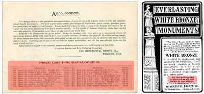
Then there’s the town of Monroe in Waldo County. Its memorial came from the Monumental Bronze Company of Bridgeport, Connecticut. This was a company of true Yankee businessmen, who designed and built a cheap, modular Civil War monument that could be up and grieving before your neighboring town even got its subscription organized.
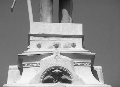
Starting in the 1870s, inexpensive cemetery monuments began to be made of zinc. They were marketed as being more durable than stone. Many of these, in fact, remain in surprisingly good condition.
Next time someone tells you they don’t make things like they used to, point out this crooked plinth on the Civil War soldier in Monroe ME. Photo courtesy Carol A. Grissom.
The Monumental Bronze Company of Bridgeport, Connecticut (subsidiaries in Des Moines, Iowa; Detroit, Michigan; Chicago, Illinois, and Canada) was a leader in this industry. They had a patented technique for a matte finish that imitated stone. These markers were sold as “white bronze” and included thousands of markers, off-the shelf statues of the virtues Faith, Hope or Charity to weep over your tomb, and the ubiquitous Civil War soldier.
They were not by any means the only company casting Civil War monuments. J. W. Fiske & Company of New York, the nation’s largest purveyor of decorative cast iron, also entered the lucrative Civil War monument trade. But they sold exclusively in the North.
Advertisement for one-size-fits-all Civil War monuments.
Monumental Bronze entered the Southern market, as impoverished as it was. In the late 1800’s, they sold two versions of the Civil War soldier infantryman. Their faces, uniforms and posture were identical. The only difference was that the Union model had US on the belt buckle, while the Confederate model sported CS.
There are about 2500 of these in the former Union States and 500 in the former Confederacy. Since white bronze appears blueish-grey, they could be taken for either the blue or grey uniforms of the combatants. Their appeal to the South was simple: they cost $450 for a life-size version or $750 for the 8.5’ version, versus the thousands of dollars that custom-made granite markers cost.
I’ll leave it to othersto theorize on the subversive nature of these monuments. To some, they seem like a candle to the Lost Cause of the Confederacy. To me, their standardized features say a lot about the conflict, which pitted brother against brother, friend against friend.
Memorial to Robert Gould Shaw and the Massachusetts Fifty-Fourth Regiment, 1884, Augustus Saint-Gauden, courtesy Wikipedia.
Boston is home to the best of Civil War memorials—the Memorial to Robert Gould Shaw and the Massachusetts Fifty-Fourth Regiment by Augustus Saint-Gauden. The Massachusetts 54th was the first African-American regiment fielded in the Civil War. Saint-Gauden’s memorial is a brilliant tribute, but you don’t have to look very far to find racist attitudes in it, too. I don’t think it’s going anywhere, but does it lose its meaning if its adversaries have been melted down for scrap medal?

Seeing the wrong boat

I missed the obvious, but my student was more observant.
Becca & Meagan iced in at Rockport Harbor in 2015.

My class was drawing at Rockport Harbor yesterday. A red lobster boat was pulled up along the dock near Rockport Marine. There’s been a red lobster boat in Rockport harbor for as long as I can remember. I paid it little mind, even when a student said she didn’t like the red hull paired with a green waterline, which is not how I remember it being painted.

Since that boat has a mooring in the harbor, I figured it was only at the dock for a few moments. I cautioned my students not choose it as their subject, but, instead, to focus on the dinghies at their feet.
Of course, the dinghy they chose left not half an hour after they started drawing. The red lobster boat stayed in place all morning. It wasn’t until I got home that I realized that it isn’t the boat I assumed. That was the Becca & Meagan. This is its replacement, the Hemingway, and it was built by Rockport fisherman Kenny Dodge. If you like boats, you should read this wonderful piece from the PenBay Pilot. It’s Dodge’s own design, built of wood from his home and blending features from Nova Scotia and Maine lobster boats. It’s a behemoth: 47 feet long, almost 15 feet in the beam.
Hemingway at the dock.
Which is why I should have looked closer when my student was having trouble drawing it. She had already pointed out the waterline was different, and she was telling me it was like nothing she’d seen before. I was looking right at it, and still I didn’t notice that it wasn’t, in fact, Becca & Meagan.
This is her second summer with me and she’s made good, resolute progress. Yesterday, something clicked with her.
Carefully measured drawing by my student.
Boats, in general, are hard to draw, which is why so many artists avoid them. You can’t get away with a general swirl of activity, as you can with a farm field or a marsh. You must measure, measure, measure, and when you’re done, you end up adjusting all those measurements another time.
Yesterday, S. measured like a pro, and observed better than a pro. She corrected herself and me repeatedly. By doing that, she got a good representation of the dinghy at her feet and of the lobster boat in the distance. They’re not refined, nuanced, shaded drawings, but they have the most important principle down: the parts line up according to their real-world counterparts. A lot of experienced painters can’t seem to do that.
Carefully measured drawing by my student.
Becca & Meaganis a beautiful boat of traditional Maine design. I’ve seen it so often I’ve stopped really looking. Shame on me. I missed the obvious, but my student was more observant.

Perception and self-perception

Artists have a toolkit by which to objectively gauge the world. It’s our drawing skill.

From Richard Scott’s Sketching: From Square One to Trafalgar Square.
Early in Richard Scott’s excellent* Sketching: From Square One to Trafalgar Square, he asks readers to sketch the simple shape above.
Go ahead, do it. I’ll wait.
Scott points out that we tend to look at an object only long enough to identify it. Once we see it as “a rectangle,” we stop observing. We know what it is, and we draw what we know. Few people move on to the realization that its height is twice its width.
Scott then illustrates some shapes students might draw. “They are almost correct, but not entirely correct,” he notes. They are rectangles, but they are not this rectangle.
From Richard Scott’s Sketching: From Square One to Trafalgar Square.
The tools of drawing are observation, measurement, interpretation and reiteration. These are dispassionate, non-emotive skills, but they are the underpinning of all great art.
This weekend I heard a story that qualifies as a Great American Tragedy. Most people would call its protagonist a very successful man. He holds an advanced degree from one of America’s finest universities. He’s a VP at a large, successful company. However, he’s not a VP in the executive suite he covets. He bemoans that a choice made as a young man “ruined” his career.
You and I would look at this guy and see a skyscraper, a tall rectangle many times its width. He sees a stunted version of that rectangle. Just as we project what we already know on the rectangle we’re supposed to be drawing, we also project our preconceived ideas on people, including ourselves.
A great place to see this is in presidential politics, where we all project our fears and aspirations on whomever holds the seat at the time.
I mentionedrecently that artists usually don’t like their own, autobiographical brushwork. That’s why we rush to cover it up with stylishness (in contrast to style). Our self-criticism can easily spill over to self-loathing, as it has in the case of the man above.
Armor from the Metropolitan Museum of Art, by Carol L. Douglas. Drawing gives you great tools for social interaction.
Most of us go through life with the strong sense that we’re potting along in our Ford Fiestas, being passed left and right by people in Cadillacs. That’s true of even very successful people. It’s particularly true in the arts. There are no absolute benchmarks of success as in other fields. Criticism and approbation are subjective and often don’t stand the test of time.
We have an image of “success” imprinted in our mind. It’s fast, meteoric, and—most importantly—we don’t have it. I once knew an artist who’d had a very splashy entry into the art world in her early twenties. By the time she was in her fifties, she was substitute teaching and very poor. She was still passionately interested in art but produced almost none. Part of what bound her up was her early success. It set a bar she could no longer reach.
We artists have a toolkit we can use to avoid that trap. It’s the rationality that we learn through drawing. Measure, observe, reiterate, interpret, and you will be able to see more clearly than most.
*I mentioned this book earlier, but now that I have it, I can wholeheartedly recommend it.

Reentering the work world

Sometimes you need a hair of the dog what bit you.

Sunset near Clark Island, by Carol L. Douglas

There are very few people I would invite over when my house isn’t clean. Bobbi Heath is one of them. She kindly brought dinner. My cough has lingered and I was downright crabby. I wasn’t sure reality was any place I wanted to be dragged back to. She ignored all that, and I’m far better for it.

The best place for rolling ocean breakers near me is in St. George, which is south of Penobscot and its canopy of islands. The tide was rising, throwing up a good screen of spray. I had about three hours where it would be in roughly the same position as it rose, paused and started to drop again.
That gave me time to approach the business of painting in a gingerly way. I did a fast watercolor sketch, which seemed like less of a commitment. The surf and the wind died as the tide turned.
Off Marshall Point, watercolor, by Carol L. Douglas
When a wave’s height reaches a point of instability, it breaks. Part of its energy is converted to turbulence, which we see as foam. How this happens varies depending on what’s hidden below the water’s surface. If the ocean floor slopes gradually up, the wave steepens until the top becomes unstable. Whitewater spills down the face of the wave. This results in long, slow breakers.
We don’t have a gradual seafloor in Maine. Here, breakers trip and collapse over ledges and sandbars. These breakers are fast and violent, releasing their energy much more quickly than a gentle spilling wave.
Being close to the Bay of Fundy, we also have a relatively high tide. That means a lot can change in an hour. At high tide, there was nothing for my particular waves to get excited about. They ended their careers in a gentle roll onto the rocks. Still, that’s as interesting as the collision of breakers, and so I painted that in oils.
Rolling, not breaking, by Carol L. Douglas
I was most interested in the light conditions, anyway. I like a strong, raking sidelight, which autumn provides here in the north. Bobbi introduced me to a new term for this: contre-jour. That’s just old-fashioned backlighting in party clothes. I found it, almost in excess.
Already, the sun makes no effort to reach the top of the vault of heaven, dragging itself around the sky’s perimeter like an old man. It sparkles like a jewel on the water and it darn near blinds the painter. Still, every old farmhouse shone like an architectural jewel, and every plant and tree was picked out in beautiful gold. It’s the most beautiful time of the year in the northeast.
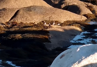
I’m no birder, and I don’t recognize these fellows. They’re about the size of songbirds.
We each did a second painting, down the road in quiet South Thomaston. There was little company except flying things—some gulls, some wee water birds, and several pounds of mosquitoes per square yard.
Sooner than I expected, it was evening and my truncated workweek was done. On Saturday, I had coffee with New Brunswick artists Alan and Helen Spinney. On Sunday, I clambered around a steep piece of hillside in Belfast. Today I feel almost normal. Thanks, Bobbi.