fbpx

What does it mean to be a successful artist?

To make progress, we must experience the doldrums as well as the exhilaration of creativity.
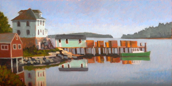
This sketch of the Ellwanger Estate in Rochester went from being something I hated to being a favorite painting.
One of my artist friends is struggling right now. Her current work feels stale to her, but when she pushes the boundaries, she is uncomfortable. She worries that the results feel like ā€œtoo, too much.ā€ Like most of us, she is looking for that sweet spot that combines marketability with room to grow and challenge herself.
Another artist friend wonders how to tell if you’re a successful artist. She proposed that you are a success if you bring joy to someone. I pointed out that a lot of people have some really awful art hanging on their walls. It apparently makes them happy. Bringing joy, then, may be setting the bar too low.
I spent one memorable spring consistently overshooting the colors. I wasn’t happy then. I am now.
In other career paths, success is measured by dollars. In art, financial success is dependent on things other than artistic mastery, like connections, marketing skills, organization, and financial resources. Many great painters have labored in poverty and obscurity through most or all of their careers. Artistic success, then, must first be defined in artistic, not financial, terms. The problem is that the goal is constantly shifting.
As artists, we struggle to achieve some effect or transmit an idea. This struggle can be quite lengthy, lasting weeks or months. When we succeed, we can churn out art, seemingly effortlessly. During that short golden period, work is fun and exciting. We feel like we’ve finally ā€˜got it’.
I worked on site on Lower Falls at Letchworth for the better part of a season. That meant hiking to the bottom of the gorge with my painting kit. It was no fun.
Sadly, this is a fleeting thing.
Soon another question or problem surfaces. We realize a deficiency, or we need to explore a different subject. The searching and questing starts again. Work feels halting, incompetent, and difficult.
There are times when it seems like I’ve never held a brush before. I’m awkward, unpolished, and incapable. No, I’m not suffering from amnesia. If I’m doing my job right, I haven’tdone this before, because part of what we artists do—or ought to do—is explore uncharted areas. Luckily, I’m a process-driven, rather than results-driven person. Otherwise, I’d lose my mind.
The struggle at the Lower Falls meant that painting its mate, Upper Falls at Letchworth, was easy.
Some of the pieces that felt most awkward at the time actually turned out to be road-markers for the forward journey. That’s why I’m never keen on scrubbing out ā€˜failures’ after a painting session. I just can’t tell what a painting means when I’m working on it.
Embracing a cycle of success and struggle is the heart of the artistic process. To make progress, we must allow ourselves to experience the doldrums as well as the exhilaration of the creative process.
The Long Road Home is another work that had to be dragged out of my fingertips.
When someone is at the bottom of one of these cycles, I recommend they read (or reread) the classic Art & Fear by David Bayles and Ted Orland. They address the pertinent issues of habit, persistence and routine. If nothing else, the book reminds us that we’re not alone in this struggle.

Roadside Route 1

How important are signs? Just say ā€œRed’s Eatsā€ or ā€œMoody’s Dinerā€ to a summer visitor and then sit back and listen.

Driving to Belfast yesterday, I mused, as I often do, on the many Mom-and-Pop businesses along the way. They’re as much a part of the Maine landscape as the rocks and the lobster boats. Their signs are idiosyncratic, old-fashioned and different than in most tourist destinations. Without them, Route 1 would be much less interesting.

Signage, in its most utilitarian form, instructs us. Beyond that, it is a social art form. It decorates, it identifies, and it communicates ideas to passers-by.
ā€œYour house has a name!ā€ my Scottish friend Martha exclaimed when she visited me last summer. Middle-class Americans don’t generally name their houses. Britons do. But our sign has been there since long before we bought this place. It is called Richards Hill after the first owner, from when the surrounding area was farmland. It wasn’t my place to take its nameplate down, even though I have a different business sign at the street.
In fact, many buildings along Route 1 have multiple signs from different periods. These are like layers in an archeological dig. There’s a motel in Lincolnville with a dull 1990s-era street sign. But its office sign is perfect mid-century neon.
In my town (Rockport) business signs must be small, not internally lighted, and conform to a setback. That isn’t true everywhere on Route 1, but it does contribute to the aesthetic of hand-painted, hand-carved signs that prevails here.
Neon, which was introduced in the 1920s and reached its peak in the 1940s, is used sparingly. It’s not permitted in Rockport, but in general it’s expensive, and the tubes break.
Part of the reason signage here is so charming is that Mainers are basically frugal. They don’t change what ain’t broke. Signs last a long time if maintained.
The other part is that big-box stores, by and large, have little presence here. There are some, but they’re not ubiquitous and despoiling, as they are in so many places. The absence of their large, lighted signs is refreshing.
Signs tell us a lot about the people within the businesses they advertise. There are antique shops on Route 1 that are barely more than a rotating flea market. Others are quite elegant, and their signage is more tasteful.
Signs also reflect personality and background. Here in Maine, they tend toward the ā€˜colonial’, which speaks both to their mid-century vintage and the predominant WASP culture.
How important are signs? Just say ā€œRed’s Eatsā€ or ā€œMoody’s Dinerā€ to a summer visitor and then listen as they start bubbling over. Signs are part of a place’s cultural heritage and its community memory. They are landmarks, sometimes more important than the buildings they mark. They’re individual, clever, and evocative. That’s art, folks.

How to choose a view

Writers are told to write about what they know. What should artists depict?
The Red Truck, by Carol L. Douglas
Yesterday I stopped to sit for a few minutes on a stone wall in Rockport. In my solitude, I noticed the beautiful asymmetry of the house across the street. Its white clapboard and modest door were framed by dark spruces and a dandelion-studded lawn.
Most people zip down this street with no more than a passing glance at the historic homes and the harbor below. Yet there are many quietly memorable moments: a brook burbling over granite, ancient gnarled beeches, sunlight glancing off cedar shakes. The only way to see them is to get out of the car and walk.

ā€œYes, well, views are very nice, Hastings. But they should be painted for us so that we can study them in the warmth and comfort of our own homes. That is why we pay the artist for exposing himself to these conditions on our behalf.ā€ (Poirot: The Adventure Of The Clapham Cook)

Drying Sails, by Carol L. Douglas.

 ā€œHow and why do you choose the views you paint?ā€ a reader asked. The answer depends, in part, on why I’m painting. If I’m in a plein air event or on the road, the views I choose will tend to be more iconic. Here in mid-coast Maine, I have the luxury of intimacy.

Anything can be the subject of a painting. That doesn’t mean content is unimportant. I paint what matters to me: boats, rocks, water, skies, earth and trees. This was never a conscious choice, but the impulse is so strong that it drove me from Western New York to Maine.
Keuka Lake, by Carol L. Douglas
I don’t think you can force this choice. Most artists experiment with subject matter before finding their mĆ©tier. Piet Mondrian’s windmills and Vincent Van Gogh’s dark peasant studies are two examples.
Composition must drive any painting. In Rochester last week, a student showed me her first design, of a row of peonies marching at a diagonal across her page. I suggested she move 90° to catch the slight S-curve in the row. The difference was staggering.
Castine Lunch Break, by Carol L. Douglas
Closely tied to this is the question of light. Sunlight is the major organizing principle in landscape painting, but we can’t always order it up. In today’s drear, I’m going to suggest to my plein air class that we concentrate on close-ups rather than vistas. The architecture of objects can partly cover for the absence of light.
ā€œThere are no lines in nature, only areas of colour, one against another,ā€ Edouard Manet said. The northeast is overwhelmingly cool in color: blue or grey skies against similar seas and green foliage. I look for color patterns within that, particularly those with a flash of warmth: the orange line in the seaweed, the pink of granite, a yellow glint in the sky. After light, color patterns are paramount.
Dinghy, Camden Harbor, by Carol L. Douglas
I also think about meaning. This is old-fashioned, but I don’t see the point of painting if my work says nothing. I hope that my paintings speak about the relationship of man to his environment, about the enduring qualities of the earth, and about simple joy.
Rocks at the American Yacht Club,by Carol L. Douglas.
Addendum: if you’re a landscape photographer, you might be interested in this contest sponsored by Machias Savings Bank.

New name, same vision

Penobscot East Resource Center has changed its name to Maine Center for Coastal Fisheries. It’s still the same great group.

High Tide, Scott Island, by Carol L. Douglas
Artists are besieged by requests for auction items. I’ve written before about how you should contribute if you support the organization’s goals, but not because you think it will give you a tax deduction.
One organization I endorse is the Maine Center for Coastal Fisheries (MCCF) in Stonington. This non-profit is dedicated to maintaining sustainable fishing off the Maine coast forever. They think this should be a three-pronged approach:
  • Ā·         Preserve our diverse ecosystem;
  • Ā·         Assure continued access to fishing;
  • Ā·         Maintain profitability for community-scale fishermen.

Much of the charm of the Maine coast comes from the fishing industry: the lobster fleets bobbing merrily in small harbors and coves, colorful traps stacked on wharves or fashioned into Christmas trees in the holiday season.
Stonington Green, by Bobbi Heath
The tourist industry is closely entwined with the fishing industry. So is the landscape-painting industry. That’s especially true for people like me, who paint a lot of boats.
For that reason, I’ve contributed painted buoys to MCCF’s auction for several years. My personal favorites were the Mermaid Madonna and the Lobster That Ate New York, although the lupineand fishones probably netted the group more money.
Stonington Public Landing, by Carol L. Douglas (courtesy the Kelpie Gallery)
Last year, Bobbi Heathjoined me in contributing a buoy. This year, we’re both contributing again. Happily, the organization has opened the auction up to include conventional paintings. I found painting on a cylinder to be devilishly difficult.
On Friday, I delivered a painting done off Stonington, entitled High Tide, Scott Island. I did this off the deck of American Eagle last summer. It was an idyllic day, and I hope my happiness at being on the water is apparent.
I also delivered Bobbi’s painting, Stonington Green. Administrative Director Bobbi Billings recognized the house as belonging to someone she knew. That kind of validation always tickles me, and I wish Bobbi Heath had been there to hear it.
The auction will be held on August 7 at the Opera House in Stonington. For more information, contact MCCF here.
Stonington waterfront (unfinished) by Carol L. Douglas
Friday was one of those days where every curve in the road elicits a gasp of delight at the wonder and glory of spring. Stonington is absurdly beautiful, but it’s also two hours from my studio. I’m lucky to get up there once or twice a summer. That has a bad effect on painting, because the pressure to choose the ā€˜right’ scene is immense.
I set up on the deck of MCCF’s office. It provides an iconic view of Stonington, with its repeating mansard roofs. I gave myself a strict deadline, after which I would have to be on my way. There’s a lot of drawing in the painting, and I have to adjust a roofline, but I very nearly made it.
Friday’s rainbow off Lincolnville.
I finished in complete solitude in the limpid light of late afternoon, the tide having filled the basin that lies before the town. In the distance, I could hear a foghorn bleating. The Maine coast produces erratic weather and distorts sound, so I had no idea where it might be raining. I packed my gear and reluctantly headed west. I wasn’t much past Orland when this Spring’s ever-present rain hit my windshield in earnest.

How to avoid getting scammed

Is this art buyer legitimate or pulling an internet swindle? I asked the hive for help.
I sold this painting to an online contact. Since then, she’s become a valued friend.

There are two schools of thought among artists: those who embrace on-line selling and those who don’t. I’m strongly in the bricks-and-mortar camp, but I do occasionally sell paintings to people who see my work online.

I’m usually happy to oblige and in most cases, it works just fine.
People who regularly sell work from their websites usually accept payment through third parties like PayPal. That insures that they get their money. It gets dicey when someone wants to pay by check.
This week, I’ve been communicating with a buyer who is setting off a low-level vibration in my fraud detector. I checked a number of sources for advice. Here’s their consensus:
Check references
That’s difficult with an online contact, but I Googled him and came up with nothing. As a control, I ran the name of one of my students, my late aunt, and a sister-in-law who doesn’t use a computer. I found all of them.
This painting of the Delaware Water Gap sold to someone who saw it on my blog. There were no problems in the transaction.
Always use a trusted middle man
The fees we pay to systems like galleries (online or real-world), eBay, PayPal and credit card companies are there in part to cover the risks involved in commerce.
If it looks too good to be true, it probably is.
Artists are particularly vulnerable because we are emotionally involved with our product. It’s hard to be objective about when a response is normal and reasonable, and when it isn’t.
I’ve noticed serious buyers generally have a specific painting or subject in mind when they contact me directly. Scammers have no real interest in the content, and don’t tend to ask incisive questions.
Don’t be overeager.
This is hard advice for the impecunious artist to follow, but scams work because their victims’ excitement blinds them to the deal’s faults.
Low Bridge (Erie Canal) 40X30, is probably only going to sell online, since I no longer have any gallery representation in New York.
Never accept personal checks and only accept checks for the exact amount.
I sometimes insist on a cashier’s or certified check drawn on an American bank, in the exact amount. This isn’t a guarantee that the check won’t be counterfeited, sadly, but they do clear faster than personal checks. I never give out my bank information for a wire transfer.
You mustn’t ship the painting until the check clears, no matter how much urgency the client expresses.
Does the money pass the sniff test?
We’ve all heard of the Nigerian money scamand its many daughters. Nearly all online scams start with an unusual financing request from the buyer, often including an overpayment.
The same is probably true of this little study of the Queensboro Bridge approach. It’s a good painting, but it’s not going to sell in a Maine gallery.
Avoid buyers with too many stories. 
This is a red flag for me in the conversation I’m currently having. He might be a ā€œChatty Cathy,ā€ or he might be trying to muddy the waters. But the sob story, in all its wonderful permutations, is the oldest scam around.
As Frank Scafidi, public affairs director of the National Insurance Crime Bureau told USA Today, ā€œSlow down, ask questions and don’t become emotionally involved in the sale.ā€
Trust your gut. ā€œIf it feels awkward, stop all contact,ā€ expert Linda Criddle told AARP.
Be wary of overseas buyers. 
This is tricky for me, since I have sold paintings to people around the globe. However, it’s harder to verify payments across national borders.

Hydrate or die

Plein air painters may not often break a sweat, but we’re exposed to the same environmental stresses as athletes.
Niagara Falls, pastel, Carol L. Douglas.
Yesterday, I wrote that when my painting goes south, I ask myself basic questions about my process and the ergonomics of painting. Then I proceeded to ignore my own advice. I felt terrible all day, fighting a headache and fatigue. At 2 PM I took aspirin with a cup of coffee and tucked myself in my bed for a few moments to wait for them to work. At dinnertime, I awoke with a start when my friend Barb hallooed from my kitchen.  I’d missed an appointment and wasted an afternoon.
I wasn’t particularly overtired; I was thirsty. Proper hydration is as much a priority for plein airpainters and long-distance travelers as it is for athletes. Although the results of drinking insufficient water are less spectacular for us, they’re no less real.

Headwaters of the Hudson, oil on canvas, Carol L. Douglas.
I often bring my water bottle with me, only to use it as a wind-weight on my easel or for wetting paints. Why am I so resistant to drinking in the field?
The problem isn’t the opportunity to drink fluids; it’s the opportunity to expel them. Even if you’re accustomed to peeing in the woods, it isn’t always possible. Le pipi rustique is simply more difficult for women than it is for men, and I subconsciously avoid it.
As a teacher, I’m mindful about not putting my students in situations where there aren’t bathrooms. As a painter, I’m more willing to go off the beaten path.
Curve on Goosefare Brook, 8X6, Carol L. Douglas.
The same is true with being on the road. Beverage options are limited to coffee, water, or sodas. Rest stops are few and far between, and stopping takes time. Fast food, should you be unlucky enough to have to eat it, is loaded with sodium. While one could prepare food and beverages at home, it’s a third level of packing, on top of equipment and clothing. I never seem to have the time to do it.
It’s true that the benefits of water have been oversoldin recent years. Still, water is important, and we suffer when we don’t drink it. Our bodies are about 60% water. It plays a role in every major system. Cells that don’t maintain the proper electrolyte balance shrivel, resulting in muscle fatigue. Water helps our kidneys excrete toxins and keeps our bowels happy. It lubricates our joints and regulates our body temperature. It helps transport nutrients.
Kaaterskill Falls, by Carol L. Douglas.
Plein air painters may not often break a sweat, but we’re exposed to the same environmental stresses as athletes: heat, cold, and wind. Hiking with our kits, setting up, and tearing down are physically demanding. If we’re not hydrated, we can’t perform at our highest level.
So I’m resolved—once again—to drink more fluids, even when it’s difficult. Now, if anyone has suggestions on how to succeed at that, I’d love to hear them.

An addendum: I had an eye exam this afternoon, and I suffer from a common ailment called epithelial basement membrane dystrophy. That’s a fancy way of saying “dry eyes,” and it just underscores the need to drink more water.

The many virtues of value studies

They can help you fix a bad painting or avoid painting one in the first place. They can be inventive, abstract, stress-free and fun.
Value study of my pieris japonica.

I knew I would have a small class the day after the long weekend; I didn’t expect it would be just Roger. It would also have to be indoors because the weather forecast was for cool air and rain.

Private lessons don’t allow time for the student to practice what I’ve taught. Nobody can remember more than a few things at once without applying their new skills. Having an instructor hovering while you’re practicing can be overwhelming. But Roger is a good mid-level painter and this seemed like an opportunity to work one-on-one on value studies with him.
What I’d intended us to do was straight up value studies of an intentionally-boring scene, but we strayed.
I set up a monochromatic still life that I would never really paint: a wooden basket on a wooden tray, with wooden tools and blocks scattered around it. Any interest came from the pattern of shadows and light. We sat down with some umber paint and a handful of small cards and did a few studies of the scene.
Roger asked me what had gone wrong with a plein air painting he’d started in April. That was another day of changeable weather. The eastern sky had glowed pale yellow across Rockport harbor just before it dumped icy rain on us. The odd colors stuck with him.
My interpretation of the painting more or less as Roger painted it.
When a painting is failing, I ask myself some basic questions: Is my composition good? Are my paints fresh? Am I physically uncomfortable? Are my brushes hardened into sticks? Has the subject changed beyond recognition?
I thought Roger had abandoned his initial value drawing, weakening his composition. When that happens, we need to go back and restate the darks. In fact, this is a necessary step in almost every oil painting, but it’s particularly important when you can’t remember what attracted you to the scene in the first place. It helps to have your thumbnail study on hand.
How I thought he could improve the scene.
We didn’t, so I painted a quick copy of what he had on his canvas, and then a suggestion of how I might fix it. I’ve never done a value study after the fact, but it proved helpful. I need to remember that when I’m flailing around at a plein air event.
Meanwhile, the fickle sky had turned a deep cornflower blue. There was nary a hint of the promised rain. There are too many ticks right now to stand in tall grass and paint, so we moved our operation to my patio, and did studies of the light playing on the roof of my shed. That pointed out one of the great values of preliminary studies: they save you from wasting a lot of time on bad ideas. Bleech.
My shed. Boring.
My pieris japonica, on the other hand, is a leggy, ailing shrub that nonetheless looks good against the woods. Our studies of that turned out much better.
Lastly, I showed Roger my favorite game with value studies: making abstractions and then applying real objects to them. This is akin to finding faces in the steam on your shower walls. I create a loose monochrome abstraction that I like, and then mate reality to it. I’ve demonstrated the process here, with the final result here.
An abstraction that could become a figurative painting.
His assignment—and yours too, if you accept it—is to create a monochromatic abstraction and then use it as the basis for a representational painting.

Plan 2014: the law of unintended consequences

People who built on the Lake Ontario flood plain were foolish, but they were also the victims of government planning.

Flood damage at Six-Mile Creek, Niagara County, NY.

ā€œWe should just bomb the dam,ā€ one disgruntled local told me. We haven’t been at war with Canada in 202 years. Still, this spring Lake Ontario came close to doing what foreign forces haven’t done since 1813: breaching the fortifications at Fort Niagara.

Lake Ontario is bordered by marshy ponds. That’s one indication that its natural levels are highly variable. Long escarpments indicate the limits of a much bigger body of water.  When the last ice age ended, this whole area was below sea level. It is still rebounding at a rate of about 12 inches per century. This makes the lakebed gradually tilt southward, creating worse shoreline erosion on the American side than the Canadian.
Flood damage at Six-Mile Creek, Niagara County, NY.
But people are short-sighted. None of this has stopped building on the gravel spits that lie between the ponds and the lake itself.
Plan 2014is a new water-regulation plan approved by the Canadian and American government. It went into effect in January, 2017. That, unfortunately, aligned with an unusually soggy spring in the St. Lawrence watershed.
Flood damage at Six-Mile Creek, Niagara County, NY.
The Moses-Saunders hydropower dam is the plug that blocks the Great Lakes. It’s controlled by the International Joint Commission. In theory, Plan 2014 allowed the water level to go two inches higher than the previous maximum. In practice, what was left was an historic high water level that couldn’t be released. To do so would exacerbate flooding in Quebec.
Terry L. has a modest camp in a trailer park at Six Mile Creek in the town of Youngstown, NY. It may not seem like much, but if you’re a working-class person from Niagara Falls, it’s paradise on a hot summer day. Her family has been summering here for more than sixty years.

Flood damage at Six-Mile Creek, Niagara County, NY.

She took me to see it on Sunday. Four of the trailers were gone, moved before they washed away. Several of the others are in water up to their skirting. Decks hang askew over the water, patios are gone. Terry’s dock was thrown up on the ground near her picnic table, which in turn has been buried in a pile of cobblestones more than a foot deep. The beach, so inviting in the summertime, is underwater.
I very rarely see water I don’t want to wade in, but Lake Ontario, in her current cranky, white-capped mood, warned me off.
Flood damage at Six-Mile Creek, Niagara County, NY.
Compared to million-dollar houses elsewhere, this trailer park sustained minor damage, but this is not the French Riviera. It will be a struggle for these senior citizens to fix what’s broken.
Niagara County is running a big gas-powered pump to try to lower the pond levels. Since the barrier between lake and pond has been breached, this is a finger in a collapsing dam. Still, municipalities are doing it up and down the lakeshore.
I thought you told me this would be good for the fish.
Letting Lake Ontario ebb and flow naturally is a great idea. Naturalists say it will stabilize fish and migratory bird populations. The plan, however, ignores the real-world cost to maintain homes, streets, and water treatment facilities built after the dam was finished in 1958.
I have limited sympathy for those who build pricey homes on flood plains. However, here they’re also the victims of a rule change.
It continues to rain in the St. Lawrence watershed..
The International Joint Commission says that the high water levels have stabilized and should start to recede as the spring rains stop. Meanwhile, as I left Buffalo for points east, it was pouring yet again.

Midnight Ambler

Charles Burchfield wasn’t necessarily manic-depressive; he perfectly reflected his time and place.

Night of the Equinox, 1917-1955, watercolor, brush and ink, gouache, and charcoal on paper , Charles Burchfield (Smithsonian Museum). ā€œOne of the most exciting weather events of the whole year. What we called the spring equinoctial storm. It seemed as if terrific forces were abroad in the land,ā€ wrote Burchfield.

At home I watch the passage of time through the night sky. On the road, that’s often confused. I’m in my hometown of Buffalo, NY for the holiday weekend. The sky glows all night long. My insomnia is in sympathy with the place. This is, after all, a city where last call is at 4 AM, a remnant of the days when the mills roared 24-7.

The only Buffalo artist to enter the pantheon of the greats was Charles Ephraim Burchfield, born in 1893 in Ashtabula Harbor, Ohio. Burchfield attended the Cleveland School of Art. In 1916, he received a scholarship to the National Academy of Design in New York. He quit after just one day.
Ice Glare, 1933, watercolor, charcoal, and graphite on paper, Charles Burchfield (Whitney Museum of American Art)
He came to Buffalo in 1921 to take a job with M. H. Birge & Sons. His painting influenced his wallpaper design work, and his work at Birge influenced his later paintings. The sinuous, twisting shapes of Burchfield’s electric trees are strongly reminiscent of the patterns of Art Nouveau home furnishings. ā€œDesign was my especial field in which I excelled,ā€ he wrote.  He was particularly attracted to Art Nouveau illustrators and Japanese and Chinese painting styles. This prepared the way for his later career.
Birge enabled him to marry and have a family, but in turn created a financial trap. Eight years and five kids later, he was suffering from ulcers. Anxiety was a state that seemed to dog him whenever he was in a nine-to-five job, whether at Birge, in the Army or as an art teacher.
The Coming of Spring, 1917-1943, watercolor, Charles Burchfield (The Metropolitan Museum of Art). This is an allegorical painting but it bears a strong resemblance to nearby Shale Creek Preserve.
ā€œI’d rather be poor and hungry than be a widow,ā€ he recollected his wife Bertha telling him. Still, painting was a good economic choice. Burchfield successfully weathered the Great Depression as a full-time painter.
Burchfield created realistic work during this period, work that associated him with his friend Edward Hopper or with the American Regionalistmovement of the period. However, he was, more than anything else, a visionary painter.
Dandelion Seed Heads and the Moon, 1961-1965, watercolor, gouache, charcoal, and sgraffito (Burchfield Penney Art Center).
That included painting en plein air. Ice Glare (1933) was painted at the corner of Clinton and Lord Streets. Today, that intersection is now almost completely depopulated by urban flight.

Burchfield started with preparatory sketches, gridding them onto his paper for his final painting. He worked almost exclusively in dry brush in watercolor and gouache. He believed that watercolor works on paper could be as resistant to fading as oil paintings if stored and displayed properly.

Much has been interpreted about Burchfield’s mental state from his paintings. Was he manic-depressive or did he mirror the sights, sound and stimulus of the Jazz Age?
Song of the Telegraph(1917-1952, watercolor, private collection), is a sound painting of the Jazz Age.
Burchfield lived from 1925 to his death in 1967 in the tiny hamlet of Gardenville, which has been swallowed up by the suburb of West Seneca. He’s honored there with a nature center. Maybe if it ever stops raining, I’ll go walk there this weekend.
We slept under a Hudson’s Bay blanket last night. This is a great, hairy woolen thing suited for Arctic nights. That might seem odd to people in other parts of the country, but it’s still cold here. The unknown critic who once described Burchfield as ā€œEdward Hopper on a rainy dayā€ didn’t know Buffalo. It wasn’t that Burchfield was a depressive; it was all about where he lived.

Basic principles of oil painting

Some painting rules are meant to be broken, but there are some absolutes that just make your painting better and easier.

Catherine Bullinger’s tree. I like the delicacy of the branches and the dappled light on the grass.

Yesterday I taught a one-day class in Rochester’s Highland Park. It’s hard to distill the rules of painting into a three-hour class, but here they are:

Fat over lean: This means applying paint with more oil-to-pigment over paint with less oil-to-pigment; in other words, use turpentine or odorless mineral spirits (OMS) judiciously in the bottom layers and painting medium in the top layer.
Ann Limbeck caught a lovely curve in the bed of tree peonies.
The more oil, the longer the binder takes to oxidize. This keeps paints brighter and more flexible. However, oil also retards drying. Using too much in underpainting, will result in a cracked and crazed surface over time.
The makers of Galkydand Liquin say their products are designed to circumvent this rule. However, we have no track record for these alkyd-based synthetic mediums, whereas we have centuries of experience layering the traditional way.
Even if we could change it, why would we want to? Underpainting with soft, sloppy medium gives soft, sloppy results. The coverage is spotty and thin. The traditional method is tremendously variable and gives great control. It just takes a little while to learn it properly.
Nicole Reddington pushed the design elements and created a myriad of greens.
Big shapes to little shapes: Work on the abstract pattern before you start focusing on the details.
The untrained eye looks at a scene and thinks about it piecemeal and in terms of objects: there’s a flower, there’s a path, there’s a tree. The trained eye sees patterns and considers the objects afterward.
Is there an interesting, coherent pattern of darks and lights? Are there color temperature shifts you can use? In the early phases of a painting, you must relentlessly sacrifice detail to the good of the whole.  This is true whether the results you want are hyper-realistic or impressionistic. Composition is the key to good painting, and the pattern of lights and darks is the primary issue in composition.
Kirt Lapham allowed me to really push him out of his comfort zone, with excellent results.
Following the fat-over-lean rule, above, allows you to think about broad shapes first. In the field an underpainting done with turpentine or OMS will be mostly dry when you start the next layer. Stop frequently to make sure you haven’t lost your darks. If you have, restate them.
Dark to light:This is only important for oil painters. Acrylic painters can proceed any way they want, as long as they’re using opaque paint. And, of course, watercolor works (generally) in the opposite direction.
In oils, it’s easy to paint into dark passages with a lighter color; the reverse is not true. This doesn’t mean oil painters don’t jump around after we set the darks; we can and do.
Cris Metcalf accepted the challenge of painting white-on-white.
Don’t choose slow-drying or high-stain pigment to make your darks. The umbers are great because the manganese in them speeds drying. However, I don’t want to carry an extra tube just for this. I use a combination of burnt sienna and ultramarine.
Draw slow, paint fast: This isn’t a classic tenet; it’s something my student Rhea Zweifler coined in my class years ago. Nevertheless, it’s a great rule.  
Kathy Mannix created a broad chromatic range with a small selection of pigments.
Taking time over your drawing allows you to be looser and more assured in your painting. Do value studies and sketches before you commit to color. Your mind needs time to think about the shapes it sees. Spend that time in the drawing phase, when ideas are easy to assess. Otherwise, you will be doing it on canvas, where your mistakes are more difficult to clean up.

Don Fischman finished this Fantasia at home.
Value studies and sketches allow you to be inventive. When you’ve only spent three minutes on a sketch, you don’t lose much by throwing it out. Drawing and value studies at the beginning actually speed you up, rather than slow you down.
Note; I’m sorry I didn’t get photos of all the work, which was excellent. I can either take pictures or teach, but not both!