fbpx

Open source art history

An easy, interesting, free site for learning art history, available to everyone.

All art survey courses start with the Venus of Willendorf (courtesy of Naturhistorisches Museum)


A reader asked how she could learn more about art history. My normal answer would be to go to the library and take out a copy of Janson’s History of Art. But she can’t do that.

A while ago, another reader sent me this listing of free art-history courses online. Most of them are narrowly-focused, making them more interesting to the enthusiast than to the beginner. But the list led me to SmartHistory. It has a detailed set of syllabuses that takes you through the development of western art, from the Venus of Willendorf to Pop Art. (Those of you looking for an analysis of the last fifty years will have to wait.)
And go to this (Chartres cathedral c. 1220)

These are:
A syllabus is an outline for a course, a description of where you’ll go and how you’ll get there. You get them the first day of class, put them in the front of your binder and refer back to them when you’ve forgotten something. SmartHistory’s are interactive, so they end up driving your learning. You walk through them step-by-step, just as you’d go to lectures at university. I sampled several lessons and found them complete, interesting, and thorough. And there are graded quizzes.
And then to this study of a horse by Leonardo da Vinci (courtesy of ‌Royal Library, Windsor Castle)

SmartHistory started in 2005 as an audio guide series for use at the Metropolitan Museum of Art and the Museum of Modern Art, and as a resource for college students. It has now published 1500 videos and essays on art and cultural history. While these include the art of Africa, the Americas, Asia, and Oceania, they’ve not yet written syllabuses for non-western art.
“Publishers are adding multimedia to their textbooks, but unfortunately they are doing so in proprietary, password-protected adjunct websites. These are weak because they maintain an old model of closed and protected content,” they wrote on their webpage.
And then to Impressionism, represented here by Monet’s Impression, soleil levant, 1872 (MusĂ©e Marmottan Monet)

That, to me, gets to the heart of the matter. Individuals and institutions may own individual paintings, but nobody owns our history or our heritage. Doling it out at $25 for a ticket to the Met or $100 for an access code to a textbook is contrary to our goal of building an educated, thinking society with common values. A person who follows these syllabuses meticulously is going to learn everything they’d study in a college survey course in art history.
And end up somewhere around Roy Lichtenstein’s Drowning Girl, 1963 (Museum of Modern Art, New York).
Smarthistory launched its first custom-designed website in 2007. Between 2011-2015, it was supported by Khan Academy and remains its official partner for art history. And this is the first I’ve heard of it. Somedays I feel like the last one to the party.

Fall from Grace: the wreck of Damien Hirst

Damien Hirst finally makes something recognizable as art, and the chattering classes hate it.

From Treasures from the Wreck of the Unbelievable by Damien Hirst. All images lifted from the internet without attribution because, hey, it’s 2018 and that’s how we roll now.
One of my former students now works in the workshop of a famous artist. This artist does not create his own work. His ideas are executed by a staff of artisans. He has a factory in Manhattan, a workshop in New Jersey, and hires specialists elsewhere as needed. He pays his artists about twice the minimum wage, and has a cadre of middle-managers and designers. He himself has no technical skills. “I’m the idea person,” he has said. His most expensive work sold in the aftermarket for just under $60 million, but you can buy copies on Etsy for $35. The work is so banal as to be uncopyrightable.
The artist’s workshop was standard practice for European artists from the Middle Ages until the 19th century. Sometimes these were family based, which is why we had women painters like Artemisia Gentileschi—she studied with her father and was better than the boys.
From Treasures from the Wreck of the Unbelievable by Damien Hirst.
But these workshops were guild-regulated, and had a strict quid pro quo: young apprentices worked in exchange for their room, board and training. Consider the early career of Raphael: he was taken into the workshop of Umbrian master Pietro Perugino at a very young age, perhaps as young as eight. By 17, he was qualified to hang out his own shingle as a master painter.
The modern workshop, however, is not designed as a teaching mechanism; it’s a factory for expensive, branded artwork.
Damien Hirst was the most prominent member of the group known as Young British Artists (YBA) These were the bad boys of British Art in the late 1980s. All attended Goldsmiths, all were discovered by Charles Saatchi. Hirst had a rocky start, barely getting into art school at all.
Hirst became famous for a formaldehyde-preserved shark called The Physical Impossibility of Death in the Mind of Someone Living, which sold for something greater than $8 million. Like the artist I mentioned above, Hirst is sometimes accused of plagiarism. The shark, for example, may have ‘quoted’ the window display of a Shoreditch electrical supply shop. Once again, the problem is that the ideas are too banal to be owned.
From Treasures from the Wreck of the Unbelievable by Damien Hirst. 
With the new millennium has come reassessment. Hirst’s prices have slumped. He has responded with a comeback show, Treasures from the Wreck of the Unbelievable, sprawling across two museums in Venice. It is an enormous fantasy based on the supposed discovery of a sunken ship. It includes its own movie.
It’s been panned by the cognoscenti. “Insipid,” wroteTiernan Morgan. “[U]ndoubtedly one of the worst exhibitions of contemporary art staged in the past decade,” wroteAndrew Russeth. “[A] spectacular, bloated folly, an enormity that may prove the shipwreck of Hirst’s career,” wroteAlistair Sooke. Hirst has been accused of plagiarizing the sunken artwork of Jason deCaires Taylor, which, considering the history of the YBA, is downright laughable.
This former darling of the British art world obviously cheesed someone off.
From Treasures from the Wreck of the Unbelievable by Damien Hirst.
Unlike those reviewers, I don’t get a free trip to Venice to see the show in situ, so I looked at pictures online. That’s no way to experience art, but to me, it seemed audacious, witty, absurd and well-crafted (albeit by someone other than Hirst). In short, it was all the things Hirst never succeeded at when he was famous and feted.
While I was pondering his fall from grace, I was preparing for a studio visit of my own, the net to be calculated in hundreds, rather than millions, of dollars. I emptied the trash and cleaned the toilet, and the juxtaposition made me smile.

Monday Morning Art School—drawing from the inside out.

There are times when you have to dance backwards in 2-inch heels. Or at least do the equivalent in pencil. Here’s how.

My soap dish and towel. These are very small drawings, by the way—about three inches across.

If you’ve been reading this blog for a while, you know I stress working from big shapes to little shapes.  We start with generalizations and move to detail. This is such a fundamental rule of drawing that it seems almost inviolable.

Yet there are times where the reverse can work brilliantly. There are artists—Albert Handell, for example—who work from their focal point outward. It’s a good trick to have in your kit. Practicing it occasionally helps you see composition differently.
Don’t hate me for the state of that soap dish. At least I wash my hands!
Your assignment this week is to draw a small still life, starting from whatever detail first catches your eye. I used my grimy soap dish. For me, the most attractive thing was the elliptical shadow thrown by the bar of soap, so I started there.
The soap and its shadow. That would soon change.
When is a still life not a still life? When it’s a-travelin’, man. The soap and brush were still wet. As the towel settled down into its pose of casual insouciance, it deflated somewhat. All the pieces moved, imperceptibly at first, and then faster. The soap and brush slithered across the table and on to the floor. This happened three times before I got them to sit and stay.
Finding the arcs of the soap dish around the soap.
One of the advantages of drawing the what interests you first is that it helps you avoid losing your subject. This is particularly important if you draw people on the subway, or lobster boats in harbor. Both will leave on their schedule, not yours.
Fit the dish shapes around the soap like puzzle pieces. Note that the brush has mysteriously flipped over.
If you were drawing this big-to-small, you would start with the ellipse of the dish and its placement on the bigger shape of the towel. You would then break the dish down into its parts. Reversing that, I started with the bar of soap and its shadow. I then built the dish around those objects. To do that, I figured out how they fit around my brush and soap, like pieces of a puzzle, paying careful attention to the so-called negative shapes that resulted.
Brush and soap in their bowl.
(Remember that what you see in the photo isn’t what I saw in real life. Photos distort reality.)
After that, it’s just a question of continuing the process outward. At the end you’ll want to spend a few moments integrating everything and setting a few final, strong lines to hold the composition together.
Growing a shadow.
Where might I use this technique? If there’s one object that’s the focus of my piece, like a beautiful tree, I might start by positioning it elegantly on my canvas and working around it. I sometimes draw hanging coats from small-to-big, since it can be difficult to get the parts to flow together. I always work small-to-big when the object of my attentions is in danger of moving along soon. 
I developed the drapery from the inside out, as well, like little puzzle pieces.
This is a technique applicable to drawing, for the most part. The only time I do it when painting is when my subject is a boat and I’m concerned it will soon be off to sea. Oil paintings can’t be cropped as easily as watercolor or pastel. Making an error of placement at the beginning is a difficult mistake to work around. In oils, it makes the most sense to do a careful drawing and tuck it away against the possibility of losing your subject.
This technique works well for drapery. This is someone’s jacket, draped over a chair.
I’m teaching four workshops this summer, in Rochester and Rye, New York, on the Schooner American Eagle, and at Acadia National Park. For more information on any of these, email me here, or check my website.  

Instagram, the internet, and the painter

Instagram is changing how buyers respond. Should it also change how artists paint?

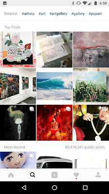
Hashtag #pleinair. By the time you read this, the top nine will be something different.

I haven’t painted in square format in a long time. The stark symmetry of the square can be lovely, but it can also be static. Recently, however, one of my daughters suggested that I start up again. “You should try painting for Instagram,” she said.

Instagram images started at 612px by 612px but have grown to 1080px by 1080px. (On your laptop or tablet, the images are scaled back down to 612px.) You can nab a few more pixels by posting portrait-format images. This made it easier for marketers to cross-post to Facebook. As someone who uses Facebook/Instagram marketing, I appreciate that.
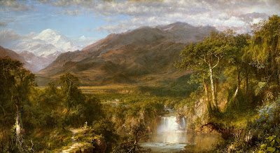
While 1080px is incredible resolution from a wee little phone app, it’s not going to reproduce the subtleties of a masterpiece like Frederic Church’s Heart of the Andes. It skews art to the graphic-design side. What’s important isn’t how the work reads on a wall; what’s important is what it looks like on a phone. There’s nothing inherently wrong with that, but it does tend to leave subtler painting back at the Met.
Hashtag #landscape is overwhelmingly photographic and mystical.
The Instagram artist’s goal is to end up where newspapermen used to call “above the fold,” meaning on the upper half of the front page. That translates to being among the top images in a wildly popular category like #art. You’re not going to get there without great images. But you also need to discipline yourself to act like a trained monkey at times, to do things like randomly “like” posts by your followers, over and over and over.
The artist/gallerist has to wrap his mind around the fact that Instagram isn’t a way to flog paintings, it’s a medium in itself. It favors the bold and simple. Composition and color are key. Instagram users like video. And they aren’t librarians: even in a category like #pleinair, the top posts don’t necessarily have anything to do with painting.
Hashtag #artist. Is that a Vampire Facial in the middle?
Instagram flows both ways, of course. There are artists whose work is about the interaction of people and technology, like Jeanette Hayes. There are many more of us who’ve integrated Instagram and Google into our reference material. That makes the search engine roughly analogous to the camera in the 20th century. Instead of creating our own reference images, modern artists appropriate them from others. Yeah, I know that’s illegal and unethical, but appropriation is one of the major movements in modern art.
Then there’s the issue of what’s acceptable. “There is also a notorious censorship issue on the app that prevents real artistic freedom,” said Instagram darling Brad Phillips. “Sure, the official stance is that you can post pretty much whatever you want but sexual images (ones that do not violate Instagram’s terms around nudity) are often flagged and deleted.” That predates Instagram, of course.
Hashtag #art. If they print it, it must be true.
All this is puts great pressure on the artist, particularly one trained in the 20th century, when there were very different ideals about craftsmanship and the meaning of art. I’m ambivalent about Instagram, but I ought to get past that. Should I change how I paint? I’m not sure I want to. Should I change how I photograph and present my work? Absolutely. 

Has the internet revolutionized your career?

Twitter, Instagram and Facebook have replaced print marketing, but how we use them remains the same.
Full Stop is one of my favorites from 2016. But will a juror like it as much as I do?
This is the time of year when plein air artists apply to shows. It’s not easy to look at the year’s output and try to guess which three paintings will most impress jurors. But at least it doesn’t involve slides. (For you young readers, those were 35 mm photo transparencies stuck in little plastic frames.)
In the old days, artists took (or, more likely, had a trained professional take) three bracketed exposures of each of their pieces with a film camera. Slide film’s exposure can’t be fixed in the developing process, and it was important that it be right. We repeated that a second time, because we wanted to be sure of our work. That meant that a 36-exposure roll netted exactly six unique images.  
Apple Tree with Swing was painted for Castine Plein Air.
The film was then sent off to a developing service. When the slides came back, we looked them over on a light table. The keepers were sent back out to be duplicated. All applications—which went off by mail—included a stamped, self-addressed envelope to return those precious slides.
The process was expensive and time-consuming. Whenever I see a $50 online entry fee, I think back to those days and smile.
Yesterday, Keith Linwood Stover of the Cyber Art Show asked, “Would you say that the internet (including social media) has revolutionized your art career?” It has certainly changed my work, but in many ways, the work itself remains exactly the same.
Flood tide has to be one of this season’s contenders because, well, boats.
Take marketing. I’ve just spent three days doing an overhaul of my spring marketing efforts. Meanwhile the paint for a project I’m excited about is jelling on my palette. Is that so different? Not really. I remember attending a seminar back in 1980, where we learned that we’d have to spend about half our time on marketing. We’re not doing it with physical portfolios anymore, but we’re still doing the exact same thing.
There’s no real fundamental difference between advertising in a magazine and advertising on social media. It all costs a lot of money.
Drying Towels was painted at Ocean Park.
Instagram occupies a similar niche to the art festival as a way to court new fans. The only people who miss doing art festivals are those who’ve never spent time in a hot, humid sales tent or unloaded a van full of unsold merchandise at the end of a terrible run. On the other hand, Instagram requires just as much work.
Plein air events themselves are a modern phenomenon. They started thirty years ago with Plein Air Painters of America, founded in California by Denise Burns. This group held annual paint-outs followed by a show. The format has been copied by countless other groups and events worldwide.
The point of these events is their immediacy, and their growth has been entwined with that of social media. Most well-run events use Twitter, Instagram, and Facebook to keep fans up-to-date on where and what we’re painting. Some maintain an online map telling fans our whereabouts.
How do artists know about these events and their relative prestige? We follow them on the internet, of course. In fact, the whole modern plein air revival is so intertwined with the internet that it’s impossible to separate the two.

The Met raises its rates for out-of-state visitors

The trouble with high admission fees to museums is that artists can’t afford them.

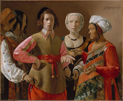
The Fortune Teller, 1630, Georges de La Tour, courtesy Metropolitan Museum of Art

The most loosely-held secret in the city of New York was that the admission fee of $25 to the Metropolitan Museum of Art was “suggested.” Visitors could, in fact, pay whatever they wanted. That policy will end on March 1, when out-of-state visitors will be required to fork over the full amount. (Schoolkids from neighboring Connecticut and New Jersey will be exempt.)

There won’t be separate lines for visiting and local residents—at least for now. “We can always make the rules more strict,” Daniel Weiss, the Met’s CEO, told the New York Times, “but I’m hoping we don’t have to.”
The Met sees an average of seven million visitors a year. Of these, only 17% pay the full fee. That’s down from 2004, when 63% paid the whole thing. A highly-publicized lawsuit, brought by two Czech tourists and a disgruntled tourist, brought the museum’s admission policy into the public eye in 2016. They claimed the museum was bamboozling patrons into thinking the admission was mandatory. The people at the desk were—I think—trained to scowl bitterly whenever someone’s ‘suggested’ donation was less than the full amount.

Heart of the Andes, 1859, Frederic Edwin Church, courtesy Metropolitan Museum of Art

If you’re old enough, you remember when the Met was free (before 1971).

Currently the Met takes in about $43 million a year. That’s expected to increase to $49 million, or by $6 million per year. In other words, in ten years or so, the new policy will bring in a little less than the $65 million David Koch spent to build the new fountains at the building’s façade.
Of course, those numbers are a guess, since nobody currently counts who’s from New York and who’s from Maine.

Boaters, 1874, Édouard Manet, courtesy Metropolitan Museum of Art

The Met is in financial trouble right now. The City of New York owns its building and provides $26 million a year in funding support. That amount has been static or falling in recent years. To close the gap, the Met is considering selling its executive co-op at 993 Fifth Avenue. That’s currently occupied by the former director, Thomas Campbell, who resigned eleven months ago and hasn’t yet been replaced. Nobody can say for sure how much that sale would net, but it’s likely to be in the tens of millions.

Then there’s the Met Breuer, a satellite museum of contemporary art, in the former Whitney Museum. That opened in 2016 as part of the Met’s $600 million renovation plan. The lease costs the Met $17 million a year.

Garden at Sainte-Adresse, 1867, Claude Monet, courtesy Metropolitan Museum of Art

Protecting the cultural resources of western civilization adds up, especially when it’s done in a white-glove manner. I love the Met; it’s one of the world’s cultural jewels. I’ll go see the Michelangelo drawings before they close, and I’ll pony up their $25 fee to do so. But I’ll no longer be stopping by to draw on a rainy day, and I’ll visit less often.

Most working artists are not wealthy, but they need access to great art to learn about their craft. For us, the Museum of Modern Art (MoMA) has a far friendlier scheme. There you can pay $35 a year for a membership, if you can prove (with a postcard or other literature) that you’re a currently working artist. 

Why I don’t do daily painting challenges

Just as plein air teaches you to paint fast and loose, studio painting teaches you to paint deeper.
Not every day of that year was cold. Pastel, by Carol L. Douglas.

When I finally decided to master plein air painting, I made the commitment to paint outdoors every day for one year, regardless of weather. That didn’t include Sundays, so it added up to 313 canvases painted in every kind of weather. For some reason, the worst days are the most memorable: the wind howling off the water at Ontario Beach Park, my oil paint freezing into stodge in a vineyard, or my car battery dying on a lonely country road. That was before cell phones, so I took a long, cold trudge to a nearby farmhouse to ask for a jump.

I’m sure there were many more pleasant days during that year, but they’re not stuck in my memory. Outdoor painters, like other adventurers, love to collect war stories.
The most memorable thing about this painting is that my car battery died from the cold. Oil, by Carol L. Douglas.
That year was an essay in mastery. I learned to paint in a more direct way. I mastered the three- to six-hour painting. And I developed the discipline of working through the “I don’t feel like it” moments.
Since then, I’ve done some similar, shorter challenges. I devised them for myself to answer specific problems. For example, when I realized that I misunderstood tree structure, I painted a tree every day. And when I was hampered by circumstances from doing large paintings, I did one-hour still lives each day.
This is the season of new beginnings. For some of us, that will include painting-a-day challenges. If you’ve never done one, I encourage you to try it.
This fast sketch is a personal favorite. It hangs in my home. Oil, by Carol L. Douglas.
I won’t be joining you. Been there, done that.
Daily paintings come at the cost of finishing larger canvases, which also have their place in one’s artistic development. We tend to shy away from approaching the last-minute business of finishing. That means asking, intentionally, how refined we want the ending to be. Until you bring a painting or two to that stage of high polish, you’re suffering a case of arrested development.
There’s a trope that drives me nuts: “Not one more brushstroke! You’re done!” We’ve gotten so used to the fast painting that we sometimes forget how to develop slow ones. Not stepping beyond that arbitrary finish-line retards our development. At some point, we need to be able to tell deeper stories than are possible in a field sketch.
And then there were days that were just golden. Pastel, by Carol L. Douglas.
Just as plein airteaches you how to work fast and loose, studio painting teaches you how to go deeper. I like nothing better than haring off to a new place with my paints. But there are times when I need to work slowly.
One of the joys of living in the far north is that the calendar tells you when that’s appropriate. When the wind is howling and the snow blowing, I know it’s time to focus on studio painting. Mother Nature says so.
A note to New York muralists: Believe in Syracuse is offering a $20,000 stipend to paint a mural on a West End building. For more information, see here.

Monday Morning Art School: Mastering values

Value is the engine that drives composition. Here’s a great exercise to help you get it right.

Four value studies of my boots. From top left: flat light, side light, fill light, back light. There’s a diagram below.
I learned to paint in New York, where the sun don’t shine. I’m good with flat lighting; I still struggle with the often-dazzling light of coastal Maine. That’s one of the reasons I encourage doing value studies before pulling out all the stops in a plein air setting.
Value means the lightness or darkness of a color. There are two other attributes of color: hue (where it sits on the color wheel) and chroma (its saturation or intensity). The human eye perceives value first, so artists rightly concentrate on it.
This week, I’m pulling out an old exercise. I didn’t think it up; it has been handed down from teacher to student since the tenebrists.
The boots themselves, from top left: flat light, side light, fill light, back light.
I want you to do four different value studies of the same object. Choose an object appropriate for your drawing experience and the amount of time you have, as long as it’s not too regular or spherical. An avocado, coffee mug, or an apple will do. I used my boots. We’ve been very close friends over the past three weeks, but they were more time-consuming than was strictly necessary.
The first drawing you’ll do (top left) should be in ambient light in your studio or room, preferably during the day. The lighting should be flat, the contrast minimal. Then, add a spotlight to your process. Any table lamp minus its shade will do. Start with the light behind your right shoulder. In the third drawing, move it so that it is lighting your object directly from the side. In the fourth, bring it around as far as you can to back-light the object. (You’ll blind yourself if it’s shining directly in your eyes.)
Limit your drawing to three levels of grey and black. I used Prismacolor neutral grey markers because that’s what I use in my classes and workshops. You can use pencils, charcoal or pre-mixed paint. Just discipline yourself to keep your exercise strictly to three values.
Your starting line drawing should be no more complicated than this.
Start with a simple line drawing in your sketchbook, as I did with figure 1. Then divide this into light-medium-dark areas. Fill them in appropriately and see what you get.
Obviously, there is a gradual range from absolute dark to light in a real-world scene. How you break that into light-medium-dark is subjective. You will not see the jumps at the same place I saw the jumps. Experiment! And don’t worry about creating finished artwork—I didn’t. This is a process-driven exercise. It should result in a flurry of paper rather than a masterpiece.
You will lose lines, which are what we think of as defining shapes. That’s one of the major points of this exercise. Edges have their place, but their place isn’t everywhere.
Our lighting scheme. #1 was done with ambient room (flat) light, #2 with a fill light, #3 with a side light, and #4 was back lit.
What our minds read is, “boot sitting on a table (which your mother told you not to do).” What we actually see is a series of values, in which the back corners of those boots meld into darkness and the fronts stick out and reflect light. It’s in following the values and ignoring the lines that we begin to create an artistic vision.
This is not meant to replace the pencil sketch, which is invaluable in understanding an object. Rather, it’s an extra step in planning a painting. Working in masses of values helps you to:
  • Use the full range of values; 
  • Simplify shapes;
  • See in abstract compositional terms; 
  • Focus on the movement of the eye through the painting;
  • Create more depth.

Remember, there’s a Facebook page for Monday Morning Art School. I’d love to see your finished exercises there! 

Painting bombogenesis

We went from idealizing the arctic to seeing it as a metaphor for mortality. What changed?

Bombogenesis, by Carol L. Douglas
Cameras lie about blizzards. It’s hard to shoot a picture of falling snow through glass, because the glass is usually covered with snow. Even when one goes outdoors, the freeze-frame nature of photography tends to lighten the apparent fury of the storm. What the person sees is a dimly lit maelstrom. What the camera records is lighter, higher in contrast, and less ferocious.
Yesterday I tried several times in vain to photograph the storm. Finally, I decided to paint a quick study out my studio window. It’s a lie, as much as my camera was telling lies. There isn’t as much contrast in the trees. They’re really a hazy shape in uniform grey, the only difference being that the spruces read cool and the maple trunks slightly warmer. But I think I caught the blurriness.
Same view, sunnier day, by Carol L. Douglas
It’s still dark as I write this, but what I imagine I’ll find after bombogenesis has ended is a series of snow ridges between my house and garage. That is in some ways a better image of the raw power of wind-driven snow. Poke them with a shovel and you’ll find they are not soft and fluffy at all. That’s why I used them for Winter Lambing. I’ve shown you the painting many times; below is the reference photograph, taken at the intersection of Routes 31 and 98 in Orleans County, New York.
Reference photo for Winter Lambing.
The French Impressionists painted hundreds of images of snow, or effets de neige. They may have been influenced by a series of cold winters in France. Among the best are Claude Monet’s The Magpie and Van Gogh’s The Parsonage Garden at Nuenen in the Snow. The Canadian Group of Sevenbelieved the Great White North was the seat of Canada’s power, so they frequently painted snow. Lawren Harris’ early Winter Woods, is an example of their idealism.
The art world of the 19th and 20th centuries was fascinated by light in all its forms. There’s no better reflector than snow. But even before that, going right back to Pieter Bruegel the Elder, snow was a powerful symbol in western art. Caspar David Friedrich, for example, used it to represent mortality.
Doe drinking in the woods, by Carol L. Douglas
As arctic exploration increased with settlement in the Americas, the arctic became the focus of our obsession with snow. The search for the Northwest Passage drove American exploration for several hundred years. It is a treacherous and inaccessible region, and thus a spark to the imagination. Painters like Frederic Edwin Church and William Bradford went shipboard to create a visual image of the arctic. Writers like Mary Shelley, Samuel Taylor Coleridge, and Edgar Allen Poe memorialized it in fiction.
“There are no tales of risk and enterprise in which we English, men, women, and children, old and young, rich and poor, become interested so completely, as in the tales that come from the North Pole,” opined journalist Henry Morley in 1853.
Light snow above the Arctic Circle, by Carol L. Douglas.
But this was a fiction of a vast, empty, benign, landscape. The loss of the Franklin Expeditionsobered artists and writers alike. Sir John Franklin and his 129 men left England aboard two ships in May of 1845, intending to traverse the Northwest Passage. When they weren’t heard from by 1848, search parties (a total of twenty altogether) were sent out after them. Over the following three decades of searching, a morbid, sordid tale emerged. Both ships had been trapped and ground up by sea ice. The crew was poisoned from the lead solder in their ration tins. Sick, lost and cold, they ultimately resorted to cannibalism. All 129 men were lost. After that, representations of the arctic began to acknowledge the danger of bitter cold and ice.

Dreams deferred and taken up again

There’s no reason to beat yourself up for not finishing. You will either find joy in it again, or move on to something else.

Hedgerow in Paradise, by Carol L. Douglas
“Did you ever have a dream or goal, and then let go of it, and try to pick it up again later?” a reader asked. She hasn’t been feeling well, so I take the question as a sign that her health is better.
My first cancer, in 2000, required daily radiation, ten months of chemotherapy, three surgeries and a blood transfusion. Every day was devoted to hospitals, treatment and recovery. I didn’t think; I just did what my doctors told me to do. When I was finally done, I asked my oncologist what came next. “Go live your life,” he said.
The trouble was, it didn’t feel like I had a life anymore. I hadn’t worked in almost a year. My kids and husband were managing. Running, which had been so important to me, was impossible. I was, for the only time in my life, profoundly depressed and anxious.
Prayer Warrior, by Carol L. Douglas
My answer was to seek out a therapist. “All the best people do it,” my friend consoled me. Therapy is likened to peeling an onion, because it is the process of getting past the original complaint and figuring out the deeper issues. I hated it, but it was worth all the time I spent.
A period in the desert can be useful in figuring out what’s important. I saw a former student recently. “I’m just not feeling it,” he’d told me. He’d had the impulse to take up painting and been very good at it. Work got in the way. He didn’t feel like taking it back up.
Cold light, by Carol L. Douglas
And that’s okay. Our callings in life are difficult to discern. In art there is no â€˜right’ career path. Experimenting, learning, and moving on is part of the process of discovery.  It should never be characterized as failure, no matter what the voices from your childhood tell you.
Years ago, I had a prayer canvas. Each day when I started working, I would pray for people and write their names on the canvas in paint as I prayed. Unfortunately, it started to look like art. It got turned into the painting above.
It ought to have been simple enough to replace, but I never did. This week I finally fished through my collection of failed paintings for another canvas for that purpose. In doing so, I came across an unfinished nocturne I started with my students in last year’s Sea & Sky workshop.
The very unfinished nocturne that grounded the study above.
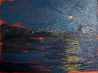
I have what realtors optimistically call a “seasonal water view.” That means we can see the ocean during the winter. I’ve watched the moon rise over the water for the last three nights. The light it cast was cool, almost green.
I’ve got a nocturne on my easel that’s exciting, but the color structure is wrong. That little nocturne I found in my discards ended up being an experiment in color for this big painting. I think I’ve got it. And I’ve got another idea for a painting as well. Both came from starting again on something deferred. They were totally different, but somehow related.