fbpx

Paying attention to clouds

What combinations of clouds are present? How frequently do they repeat? Where are they forming? Are they growing tighter or looser? Where is the light coming from?

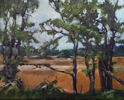
They wrested their living from the sea (Advocate Harbour), by Carol L. Douglas

Yesterday, I gave a lesson on perspective in clouds. It’s also important to understand the variety of clouds in the sky.

When you’re on the edge of something big, like a mountain range or an ocean, the clouds often scramble themselves into strange and magnificent patterns trying to adjust to the updraft of odd air. Erie PA and the Tug Hill Plateau have bewitching skies because they’re drafting on a Great Lake. (That’s also why they get so much snow.)
Clouds are classified by their shape, the altitude they form at, and their opacity. All are important to the painter.
Various cloud types, 2005, by Christopher M. Klaus at w:en:Argonne National Laboratory
Cumulus clouds are the big, generous puffy clouds we love to paint. The ones that form pillows tend to be low in the atmosphere; the smaller ones are higher up. Cumulus clouds have flat bottoms and puffy tops. As a rule, the bigger the clouds, the more there is cooking, convection-wise.
Cumulus clouds can join up to create massive cloud sheets. These stratocumulusclouds are different from stratus clouds in that they’re warped, buckled, and rolled. Where they drift over land, the extremes of weather are reduced. That makes them both good and bad news in the Great Lakes regions: they keep the weather temperate, but they also create lots of dull weather.
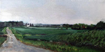
Cobequid Bay farm, by Carol L. Douglas
Cumulinimbus clouds are the prima donnas of the cloud world, the towering giants we like to call “thunderheads.” They’re so big, they cross levels of the atmosphere. They’re a good news, bad news sight. They’re dramatic and fascinating to paint, but they also mean you may get dumped on, or worse, soon.
Stratus clouds are flat sheets of grey that can form at any altitude. At ground level, they’re fog. As they get higher in the atmosphere, they assume different names, along with better lighting and color: cirrostratus (high-level), altostratus (mid-level), and nimbostratus (multi-level), but they’re all really the same thing. Here in the east we often get high-level sheets of stratus cloud above cumulus clouds. When I see them, I always try to include them in my paintings, for the differences in color and form are appealing.
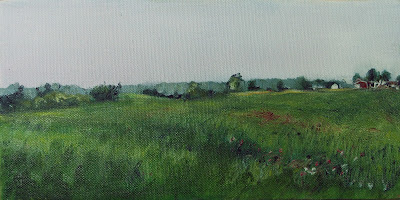
Cape Blomidon makes its own cloud, by Carol L. Douglas
Cirrus clouds are the most interesting and difficult to paint convincingly. These are the clouds sometimes called “mare’s tails.” They are generally translucent, and look like long, detached, strings or filaments in the sky. They can develop around thunderheads as dependencies. They are often seen above other cloud formations, doing their own thing in the sky.
Watch the sky over time. What combinations of clouds are present? How frequently do clouds repeat? Where are they forming? Are they growing tighter or looser? Where is the light coming from? Paying attention will add to the depth and character of your skies.

It’s about time for you to consider your summer workshop plans. Join me on the American Eagle, at Acadia National Park, at Rye Art Center, or at Genesee Valley this summer.

Monday Morning Art School: drawing clouds

Clouds are objects with volume, obeying the rules of perspective.

Whiteface makes its own weather, by Carol L. Douglas
Clouds are not flat. The same perspective rules that apply to objects on the ground also apply to objects in the air. We are sometimes misled about that because clouds that appear to be almost overhead are, in fact, a long distance away.
I’ve alluded before to two-point perspective. I’ve never gotten too specific because it’s a great theoretical concept but a lousy way to draw. Today I’ll explain it.
A two-point perspective grid. You don’t need to draw all those rays, just the horizon line and the two vanishing points.

Draw a horizontal line somewhere near the middle of your paper. This horizon line represents the height of your eyeballs. Put dots on the far left and far right ends of this line. These are your vanishing points.

A cube drawn with perspective rays. It’s that simple.

All objects in your drawing must be fitted to rays coming from those points. A cube is the simplest form of this. Start with a vertical line; that’s the front corner of your block. It can be anywhere on your picture. Bound it by extending ray lines back to the vanishing points. Make your first block transparent, just so you can see how the rays cross in the back. This is the fundamental building block of perspective drawing, and everything else derives from it. You can add architectural flourishes using the rules I gave for drawing windows and doors that fit.

All objects can be rendered from that basic cube.

I’ve included a simple landscape perspective here, omitting some of the backside lines for the sake of clarity. (I apologize for the computer drawing; I’m recovering from surgery and it’s hard to draw with my foot up.)

As a practical tool, two-point perspective breaks down quickly. In reality, those vanishing points are infinitely distant from you. But it’s hard to align a ruler to an infinitely-distant point, so we draw finite points at the edges of our paper. They throw the whole drawing into a fake exaggeration of perspective. That’s why I started with a grid where the vanishing points were off the paper. It doesn’t fix the problem, but it makes it less obvious.
Staircase in two-point perspective, 1995, Luciano Testoni
The example above is from Wikipedia’s article on perspective. It’s a masterful drawing, but it isn’t true two-point perspective, because he tosses in several additional points. There is also three-point perspective, which gives us an ant’s view of things, and four-point perspective, which gives a fish-eye distortion reminiscent of mid-century comic book art. And there are even more complex perspective schemes. At that point, you’ve left fine art and entered technical drawing.
Still, two-point perspective is useful for understanding clouds. Clouds follow the rules of perspective, being smaller, flatter and less distinct the farther they are from the viewer. The difference is that the vanishing point is at the bottom of the object, rather than the top as it is with terrestrial objects.
Basic shapes of clouds using the same perspective grid.
Cumulus clouds have flat bases and fluffy tops, and they tend to run in patterns across the sky. I’ve rendered them as slabs, using the same basic perspective rules as I would for a house. If I wasn’t elevating my foot, I’d have finished this by twisting and changing their shapes in my imaginary bounding boxes.
Mackerel sky forming over the Hudson, by Carol L. Douglas
A flight of cumulus clouds or a mackerel sky will be at a consistent altitude. That means their bottoms are on the same plane. However, there can be more than one cloud formation mucking around up there. That’s particularly true where there’s a big, scenic object like the ocean or a mountain in your vista. These have a way of interfering with the orderly patterns of clouds.
I don’t expect you to go outside and draw clouds using a perspective grid. This is for experimenting at home before you go outside. Then you’ll be more likely to see clouds marching across the sky in volume, rather than as puffy white shapes pasted on the surface of your painting.
It’s about time for you to consider your summer workshop plans. Join me on the American Eagle, at Acadia National Park, at Rye Art Center, or at Genesee Valley this summer.

How to plein air paint on the cheap(er)

If you’re trying painting for the first time, it makes sense to use less-expensive equipment and supplies. Here are corners you can cut.

Above Lake Champlain, by Carol L. Douglas
My friend Catherine is thrifty. When she took up plein air painting, she did it with softwood tripod easel—which you can get at Michaels this week for $7.99—and a TV table. She set a good example for those who want to try plein airpainting without breaking the bank.
The worst beginner error is to buy super-cheap paints and brushes. There are good student-grade brands out there in all media:

Cath setting up to paint with her inexpensive easel. Its limitations are fewer than you’d expect.
The difference between professional and student grade paints and pastels is the amount of pigment and the quality of the binders. In some cases, more expensive pigments will be copied with “hues.” Cadmiums and cerulean blue are often mimicked; check the label to see what you’re getting. A hue mimics (badly) the color of a single-pigment paint with less-expensive materials. For example, “cerulean blue hue” is often a combination of zinc white and phthalo blue.
A better solution is to avoid pricier pigments in the first place. There are modern pigments that do the job equally well at a lower cost. That’s what I aim for in my supply lists for oils, watercolor, acrylics, and pastels. (They’re directed to the serious amateur/professional, so the paint brands are not student grade.)
An expensive kit that I no longer use. It’s just too heavy.
I started painting on the same kind of tripod easel that Catherine bought. I still have mine. My father used a handmade version of the same easel for his whole life. It was the standard for outdoor painting in the mid-20thcentury.
I’d rather you bought one of them than a French easel. These are heavy, inefficient, and often badly-made. I gave mine away years ago. Pochade boxes are the most versatile field easels, but they’re expensive. If you’re handy, you can make one like I did. Or, there’s the classic cigar-box pochade.
The best value for money in a better easel is Mabef’s Universal Tripod Field Easel and its big brother, the Giant Field Easel. I’ve had one for decades. Even with a cracked leg, it still gamely stands up.
Mabef’s Universal Tripod Easel can be used with oils or watercolors, and is flexible enough to fit in small spaces.
Brushes don’t have to break the bank either. Even though I have a slew of fine watercolor brushes, I still often reach for my Princeton Neptunes. Oil and acrylic are trickier since cheap brushes sometimes drop bristles in your work. Jerry’s Creative Mark are fine, and Princeton also makes good, inexpensive oil/acrylic brushes, especially their 5200and 5400series. If you want a synthetic brush, make sure it imitates hog bristles, not sable. A softer brush isn’t meant for direct painting.

How Winslow Homer transformed himself

Before he became Maine’s greatest painter, he needed to shed his sentimentality. He did that in part by taking up watercolor.

Five boys at the Shore, Gloucester, 1880, Winslow Homer

After working as an illustrator during the Civil War, Winslow Homer concentrated on two distinct oeuvres: postwar healing and homely, nostalgic paintings of American innocence. These were well-received by the public but not universally respected.

“We frankly confess that we detest his subjects… he has chosen the least pictorial range of scenery and civilization; he has resolutely treated them as if they were pictorial… and, to reward his audacity, he has incontestably succeeded,” said writer Henry James. Winslow Homer’s work in the late 1860s and ‘70s was done in paint, but it was still illustration. When he depicted children as symbols of the nation’s lost innocence, he was playing on a common, well-worn theme of the time.
To be fair, Homer was a young man, and he hadn’t had the advantage of an extensive art education. He was just 29 when the Civil War ended. Snap-the-Whip was finished when he was 36 years old. It was about this time that he was able to give up illustration to focus on painting. It was also around this time that he took up watercolor seriously.
Three Fisher Girls, Tynemouth, 1881, Winslow Homer, courtesy National Gallery of Art, Washington DC
By the middle of the 19th century, the influence of critic John Ruskin led to an interest in watercolor as a serious medium. The American Society of Painters in Watercolor, later to be the American Watercolor Society, was founded in 1866. In 1873, this group mounted an exhibition of nearly 600 paintings at the National Academy of Design.
Homer was living in New York at the time and almost certainly saw this show. It’s also probable that he was already familiar with watercolor painting. It was a genteel medium, widely used by ladies and children, but not respectable enough for galleries.
In 1873, Homer left for Gloucester, where he made his first professional watercolors. That summer he sketched and painted children playing on the waterfront. They clam, row, pick berries, play on cliffs and stare longingly out to sea. These paintings were a continuation of his interest in the lost innocence of America.
The Boatman, 1891, Winslow Homer, courtesy Brooklyn Museum
What was different was how he applied the paint. He drew in graphite, and then painted over his drawing. He didn’t wet his paper, which was common practice at the time. This made for a less-detailed, more sparkling finish. Critics were mixed about the results. Some admired the rawness; others hated it. “A child with an ink bottle could not have done worse,” wrote one.
By the end of that decade, Homer had come to two points in his personal life which would mark his mature work—a tendency to reclusiveness and a fascination with the sea. But before he could become Maine’s quintessential painter, he needed to shed his obsession with the American myth.
Casting, Number Two, 1894, Winslow Homer, courtesy National Gallery of Art, Washington DC
He spent 1881 and 1882 in the English coastal village of Cullercoats, where he focused on the men and women who made their living from the sea. His palette muted; his painting became more universal. And he made much of this transition in watercolor.
He had, by changing up both his medium and his locale, made himself a painter of an elemental truth—the relationship of man and the sea.
Between 1873 and 1905 Homer made nearly seven hundred watercolors, transforming the medium and his artistic achievement as a whole. “You will see,” he said, “in the future I will live by my watercolors.”

If I were younger

I’d join an archeological expedition searching for Old Norse sites in the New World.
The beach at L’Anse aux Meadows. Can you imagine landing a Norse longboat through those rocks? (Photo by Carol L. Douglas)

I do a lot of scrambling around on rocks. Over the past few years that’s become increasingly difficult. Yesterday, I had a cheilectomy on my right great toe. It’s going to be followed by the same procedure on the left foot, although whether I can squeeze that in before my first event of the season—Santa Fe Plein Air Fiestaon April 28—remains to be seen.

Hallux rigidus is not necessarily caused by old age; it can be the result of overuse injury. Me and Shaquille O’Neal, all the way.
Apparently, you can’t just saw off a piece of bone without discomfort. It hurts like hell this morning, so I will do what my doctor ordered, which is to rest and keep it elevated. This is an opportunity to catch up on my reading, starting with some Old Norse news.
Recreated settlement at L’Anse aux Meadows. (Photo by Carol L. Douglas)
Last week, Birgitta Wallace, a senior archaeologist with Parks Canada, told Live Science that she has a pretty good idea where the fabled Viking settlement of Hóp (Vinland) was located. She’s narrowed it down to an area of eastern New Brunswick, bounded by Miramichi and Chaleur Bay.
A straight line drawn between these points is about sixty miles long. A long peninsula extends out between them into the Gulf of St. Lawrence, making her guess an area of several hundred miles of remote coastline. Compared to other estimates, that’s quite specific—archaeologists have placed Hóp as far south as the Hudson River.
The large circle is where Birgitta Wallace believes Hóp is located.  The small circle is the location of L’Anse aux Meadows.
The only verified Norse site in the New World, L’Anse aux Meadows, was discovered based on just such an educated guess.
According to the Icelandic Saga of Erik the Red, Thorfinn Karlsefni and his company found Helluland (Baffin Island), Markland(somewhere in Labrador), Kjalarnes promonatory, the Wonderstrands(possibly Labrador), Straumfjörð(location unknown) and, finally, Hóp. This last was a bountiful place, where no snow fell during winter. Not Maine, clearly.
The inhospitable landscape of northern Newfoundland. (Photo by Carol L. Douglas)
Historians had long believed that the Old Norse name Vinland meant that the settlement contained wild grapes. That meant that Hóp had to be south of New Hampshire because, with few exceptions, wild grapes don’t grow any farther north.
Norwegian explorer Helge Ingstad and his wife, archaeologist Anne Stine Ingstad, doubted that theory. They believed the name meant ‘land of meadows.’ Based on Eric the Red’s descriptions, they narrowed down their area of search to the northern arm of Newfoundland. In 1960, they started asking the locals if there were any old Indian sites in the area.
One of the foundations excavated by the Ingstads. (Photo by Carol L. Douglas)
In 1960, local George Decker led them to a group of mounds near the village. Residents had called this “the old Indian camp.” These grass-covered bumps turned out to be the remains of eight Norse houses, dating from 1000 AD and definitively connecting the site to the Icelandic Sagas.
Wallace is back to thinking about grapes. Chaleur Bay means “bay of torrid weather.” It’s warm compared to Maine. Grapes do grow wild there. Wallace thinks that region contains everything described as being at the legendary Hóp: wild grapes, salmon, barrier sandbars and natives who used animal-hide canoes.
Based on the Ingstads’ experience, Wallace should, by all means, scout around the bay. And if she’s successful, it will give me something to read about when I get my other foot operated on.

Welcome, Spring!

I’m welcoming spring by having foot surgery. Honestly, sitting still might feel good!


Spring cleaning, by Carol L. Douglas

The vernal equinox is here: Today, both the Northern and Southern Hemispheres get equal amounts of daylight. For those of us in the Northern Hemisphere, this is the official start of spring.  Daylight hours will lengthen until the summer solstice on June 21.

Winter days are shorter the farther north you go, until somewhere around the Arctic circle they taper off altogether. Summer days are correspondingly longer. The difference between mid-coast Maine and New York City is about a half an hour of extra daylight. Long northern summer evenings are a palpable and beautiful phenomenon. (This, by the way, is why our Age of Sail workshop is scheduled for June 10-14. Captain John Foss figured that he would give my painters the longest possible days on the water.)
Rockport harbor in early spring, by Carol L. Douglas
But back to the equinox: I arrived home a little before 1 AM on Monday, to find sizable snowdrifts lining my driveway. My studio doors are buried; if you stop by this week, you’d better ring the house bell instead. And we’re not done yet; there’s plowable snow on the forecast for tomorrow. It’s 8° F. as I write this.
Still, there are signs of spring everywhere, for those who are observant. My windows are looking grubby under the harsh spring sun, motivating me to start cleaning. As we seesaw between cold, cold nights and above-freezing days, the trees are pumping sap. My son-in-law’s maples have been tapped for the better part of a month. The willows are coloring yellow; the red osier shines against the snow. Under the bright sun, the snow is subliming back into the atmosphere without melting.
Migrating geese, by Carol L. Douglas
As I drove through Montezuma Swamp on Sunday afternoon, Canada Geese were circling in great flocks, while other migratory birds rested on the water. (These are the virtuous migratory geese, as distinguished from their urban cousins, who’ve found they can make a year-round living on mowed lawns.)
It would be a great time to go out and paint. But I’m off to have a cheilectomyon my right foot this morning. If all goes well, I’ll have the left foot operated on before the painting season starts in earnest. This is maintenance work. Arthritis of the feet is a wear-and-tear problem.
Adirondack spring, by Carol L. Douglas
That means a few weeks off my feet. This is kind of boring, but it has to be done during the off-season. After traveling 3000 miles through fifteen states over the last two weeks, I’m kind of looking forward to sitting in one spot, watching the grass slowly emerge from the snow. I might even read a book.

Monday Morning Art School: How to scale up a small sketch

When working big, start with a smaller sketch and grid it up. It’s easy.

A large canvas transferred from a 9X12 sketch.
The largest I generally work is 60X60. This is too large to draw directly, as I can’t get far enough away to see the whole thing as I’m drawing. When I’m working this big, I always do a smaller sketch in oil or cartoon in graphite first. Then I scale it up. This prevents proportion distortion.
I have a projector, but I find that gridding is more accurate and takes less time.
I realize many artists are math-phobic, but there are times when an small bit of arithmetic can save  you a lot of work. I’ll try to make this painless.
The first step is to work out whether the aspect ratio of your sketch is the same as the canvas. This is the proportional relationship between height and width.
Usually I grid in Photoshop because it’s faster and I can just delete the lines with a keystroke. But you can grid just as well with a pencil on your sketch.
Sometimes this is very obvious, such as a 9X12 sketch being the same aspect ratio as an 18X24 canvas. But sometimes, you’re starting with a peculiar little sketch drawn on the back of an envelope. You can use a trick you learned back in elementary school.
Remember learning that 1/2 was the same as 2/4? We want to force our sketch into a similar equivalent ratio with our canvas.
Let’s assume that you’ve cropped your sketch to be 8” across. You want to know how tall your crop should be to match your canvas.
Write out the ratios of height to width as above.
To make them equivalent, you cross-multiply the two fixed numbers, and divide by the other fixed number, as below:
Use your common sense here. If it doesn’t look like they should be equal, you probably made a mistake. And you can work from a known height as easily as from a known width; it doesn’t matter if the variable is on the top or the bottom, the principle is the same.
The next step is to grid both the canvas and sketch. You could spend a lot of time calculating the distances, but I prefer to just divide it in even amounts in each direction. I use a T-square and charcoal, and I’m not crazy about the lines being perfect; I adjust constantly as I go.
The last step is to transfer the little drawing, square by square to the larger canvas. I generally do this with loose paint, in raw umber. It’s time-consuming, but with big paintings it saves a lot of work in the long run.
(This was originally published on January 31, 2014 and was revised and updated for this post.)

The Bourbon Trail

Our national identity is to be found in diners and city parks, cypress swamps and little towns, local church services, at Home Depot, on city streets and lonely country roads.

I may have the wrong footwear for Buffalo…
As much as I like overseas travel, I’ve never felt the urge to teach in another country. Landscape painting conveys a deeper shade of intimacy that I simply don’t feel when visiting other places. I enjoy them, but I don’t love them in the same way as I love the US and Canada.
I took this trip to pave the way for a workshop in the Deep South. Why didn’t I just head to the more familiar eastern seaboard states? I’m familiar enough with them that a road trip wasn’t necessary. The central south has been calling to me for a long time, although I’m still not sure what it’s saying.
I usually approach Kentucky from the north. It seems very southern compared to Ohio. This time, driving up from Mississippi, it seemed northern, its drawl flattened out to a midwestern twang. Either way, its identity is confused. This is where the great antislavery novel, Uncle Tom’s Cabin, was set. When Eliza struggled across the frozen Ohio River, she was literally leaping from slavery to freedom.
One-lane road, central Kentucky.
And yet, nowhere was ‘brother against brother’ truer than in Kentucky. The state tried to sit out the Civil war, but its self-declared neutrality was ignored by both sides. Eventually, it cast its lot with the Union. But southern sympathies were strong, and a group of citizens formed a shadow government that joined the Confederacy.
I came to love Kentucky when I did art festival in Louisville. Now I take every opportunity to shun-pike through this state. It has beautiful farms, lovely steep hollows and hills, and the biggest known cave system in the world. But I was being a serious driver yesterday, intending to get from Bowling Green to Buffalo, NY in one shot. That meant sticking to the Interstate system like a burr on a saddle-blanket.
Dogwood and distillery.
Maybe it was the knowledge that there was snow ahead, but I couldn’t resist veering down the Bluegrass Parkway. This runs east to Kentucky horse country. These are the most manicured farms in America, and the horses—even the ones free to graze near the road—are beasts of singular beauty. The spring grass is in, and the horses were gamboling in the sun.
Before I got that far, I saw a sign for Kentucky’s Bourbon Trail. That eventually put me on a series of one-lane roads. The blind corners, cropped hedges and small-town distilleries reminded me of the Isle of Skye.
Most of us, when we say we’ve ‘been to’ a place, mean we’ve driven through on the Interstate or we’ve flown in, gone downtown, eaten at trendy restaurants and seen a few tourist sites. You really don’t learn much about your country like that. Our common ground is to be found on the old Federal routes, at diners and city parks, in cypress swamps and little towns, at local church services, or talking to the guy at Home Depot. We should all do more of that.

This line of country

Google maps makes it possible to play cat-and-mouse in your car.
Parke County, Indiana, from an earlier midwest painting trip.
Most of my kids have Google maps location sharing set up. This feature tells you where a cell phone is. If I had younger kids, I’d insist on it. However, my children are all adults. I don’t have them tied to my apron strings; it was something my husband was tinkering with and we never turned it off.
It’s very useful, especially when someone loses their cell phone. “Mary,” I can say from across the country, “it’s at your house.”
Chapel of Faith, by Carol L. Douglas
I met my eldest and her family in Mobile, Alabama. Since then we’ve been traveling in parallel. They amuse themselves with tourist activities while I paint, and we meet up afterwards.
Location sharing has limitations. It updates periodically, not instantaneously. You can set a route to the last destination the phone was in, but you can’t track the other phone in real time. It will be less fun when they fix that.
Parke County, Indiana, from an earlier midwest painting trip.
My kids were poking along the gulf coast while I was in Langan Park with fellow painter Cat Pope. Rather than call them to meet up, I decided to track them. It was an exhilarating game, for they were moving as fast as I was. Time after time, I pounced, only to come up with thin air—they’d moved on. Finally, they entered a cul-de-sac. “Ah!” I said. “I can cut them off at the entrance.” But, alas, another car pulled up behind me, preventing my neat maneuver.
A warning, though: you’re driving a real machine, not an imaginary video-game car. Pull off to the side of the road to use Google maps, just as you should when doing anything not driving-related.
My son-in-law likes to drive at night. They headed north while I got a hotel room in Mississippi. I’m a poor sleeper. I noted they’d stopped for a while at a rest stop in Tennessee. In the morning, they were at the Corvette Museum in Bowling Green, KY.
Wabash Bottom Lands, by Carol L. Douglas
Rather than retrace my steps through Virginia, I decided to head north after them.
They’d stopped at a lonely country intersection south of Birmingham, Alabama for gas, about 40 miles from where I’d been in Marion last week. There were two service stations. The first was devoid of life, except for a big ol’ junkyard dog. Arthur lost his favorite cap running back to his truck.
At the second station, there appeared to be a party in progress. There were trucks everywhere, but nobody was buying gas. Nobody seemed to notice him. “They were like zombies,” Arthur told me. He decided to go back to the first station. The dog was gone and the pumps were on, but the station was as ghostly and abandoned as ever.
As he headed back to the interstate, he saw something in the road. “That’s my hat!” he exclaimed. It was full of bitemarks. He left it right where it was.

Goodbye, New Orleans

I had to leave you because of the beignets. We were developing one of those Southern Gothic relationships where they were trying to kill me.

Live oak branches, by Carol L. Douglas

I have to wear a fitted dress on Saturday, so I’ve been scrupulously careful of my diet on this trip. Even in New Orleans, it wasn’t terribly hard, until the very last day.

Left to my own devices, I could have ignored the siren call of beignets, but other people kept handing them to me fresh from the deep-fryer. They were impossible to resist. When I realized I’d eaten three of them in one day, I struck camp and headed out of town
“You should go to the county fair more often,” my son-in-law told me. Beignets may ‘just’ be fried dough, but they taste somehow better here.
A fast sketch to understand the live oak’s branching pattern, which is chaotic.
I spent the morning painting the branches of live oaks at Audubon Zoo, which is in another beautiful old city park. Here the trees don’t have Spanish moss. Unlike City Park, Audubon Parkhas no meandering creek. According to a local, Spanish moss prefers to be near water.
Most trees spread their branches in some kind of regular pattern, including the white and red oaks of the north. Not so with their southern cousin. The live oak’s branching pattern defies visual organization. It’s as sinuous and baroque as everything else down here. Eventually, the branches end up dipping right back down to the earth.
My friend’s former home on Arabella Street.
I drove down Arabella Street to take a photo for a friend. She once lived in a lovely small house here and was curious to see what it looked like today. I’d say it was spruce and pristine and gentrified, although they’ve taken down her porch swing. A Whole Foods now occupies the site of the derelict bus station from her day.
The streets in New Orleans are atrocious. On Magazine Street, I narrowly missed a giant pothole that was deeper than my wheel is tall. A local had helpfully made a big sign on a cardboard box: “F’ing Huge Pothole!”
Spanish moss in City Park.
That afternoon, I went for a long walk through City Park to stretch my legs. There’s so much more to paint in this city, including the shotgun houses and Creole cottages. Next time I paint here, I’m staying for a week. Now, however, I have to be in Buffalo on Saturday. It’s time to put my sneakers back on and head north. I hear there are four-foot drifts in my driveway.
One of my tasks for this trip is to try out sketchbooks for my Age of Sail workshop. (Materials are included.) I like the paper in this Strathmore one, but the binding is making me a little crazy.
On my way out of town, I stopped at a Winn-Dixie in Slidell, Louisiana. There I bought carrot sticks and hummus. Oh, and some beignet mix for when I get home, just in case.