fbpx

Sustainable art

An artist, an engineer, and a paint company are working together to repair acid mine damage in southeast Ohio. 
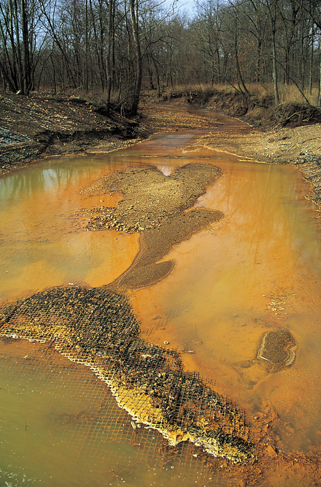
Photo of acid mine runoff at Truetown by John Sabraw.
Environmentally-ethical choices can be very difficult for the artist. The toxicity of paint rests not in its binders, but in its pigments. Copper, cobalt, cadmium, and lead are the worst. It’s impossible to avoid them completely, but the danger isn’t really to you, it’s to the poor schmoe who has to mine or make them. Most pigments are no longer milled in the US, even when your paint is made here. It’s one of the hidden costs of globalization—we’re better at not polluting America because we just do it elsewhere.
Despite our better environmental record of late, we have some dreadful pollution pits remaining in America. Southeastern Ohio has a long history of coal mining, and it’s unfortunately still visible today, in iron-rich, contaminated runoff from abandoned mines. These coal mines contain the mineral pyrite, which reacts with water and air to form sulfuric acid and iron. This makes the water highly acidic and orange. Of course, this waste doesn’t just stay in downstream creeks and rivers, smothering plant life and animals. It contaminates drinking water as well.
Iron hydroxide precipitate in a Missouri stream receiving acid drainage from surface coal mining, photo courtesy D. Hardesty, USGS Columbia Environmental Research Center.
Lower-volume acidic runoff is remediated with a limestone leach bed. Metals are separated and trapped in the bed, and clean water returns to the stream. But there are some sites that are just too massive for this; some release 800 to 1,000 gallons of contaminated water per minute, according to Sunday Creek watershed coordinator Michelle Shively.
From Chroma, by John Sabraw, photo courtesy of the artist.
Enter two professors from Ohio University: Guy Reifler, civil engineering professor, and John Sabraw, art professor. Instead of trapping and disposing of the iron oxide, they thought, why not dry it and make paint pigment out of it? In 2018, they created a Kickstartercampaign to fund a test program. It raised $33,138. Now they’re proposing to build a full-scale plant that would treat the entire million-gallon-a-day acid runoff from the mine at Truetown in Athens County, Ohio.
It makes perfect sense to reclaim iron oxide that’s been left around by miners; iron oxide was the first pigment; it’s lightfast, safe, cheap and plentiful.
But to process that much water presupposes a market for 5000 pounds of iron-oxide pigment a day. The initial pigment experiments were done by Professor Sabraw; the professors then approached paint-maker Gamblin. It was a good choice; Gamblin has a lengthy interest in environmental sustainability. Among other things, each year they take the pigment powder trapped by the factory’s air cleaner and makes a special batch of paint called Torrit Grey, which they distribute free to their customers.
Gamblin took some of Truetown’s pigment and created three colors with it. They’re shortly going to introduce these in a kit called the Reclaimed Earth Colors set, which will retail at $39.99. They will donate 20% of these revenues back to the Truetown project.
Unfortunately, acid water doesn’t just leach iron out of old mines; it can also bring manganese, cadmium, zinc, copper, arsenic and aluminum along with it. I did wonder how well these less-salubrious minerals have been sorted out of the new pigment. And then I stopped and asked myself whether any mined pigment is pure. Probably not.
It’s a good idea, and one I’m happy to support. However, while Carol Jaeger at Salt Bay Art Supplyin Damariscotta is the source of this information, I haven’t seen these paints on any shelves yet. As soon as they are, I hope they sell.

Figurative does not mean figure

Where do you fall on the continuum from representation to abstraction?

I Saw the Figure 5 in Gold, 1928, Charles Demuth, courtesy the Metropolitan Museum of Art

English (my daughter never tires of telling me) is a descriptive, rather than proscriptive, language. Words mean whatever most people agree that they mean. That’s why English is so endlessly adaptable—why, for example, we can suddenly accept the ungrammatical ‘their’ as a replacement for ‘his’ or ‘her’ without making a Federal case of it. English sees a need and answers it, and its users follow along.

There is one neologism I resist, however, and that’s the substitution of the word figurative for figure. As descriptions of art, they are not equivalent. Figure painting means painting the human form. Figurative paintingmeans realism.

Rider, Attic red-figured cup, middle of 5th century BC, courtesy of Luynes Collection

Figurative is an old word in English, and comes to us from French. It has always had overtones of metaphor and meaning. It’s slightly different from figure, which has multiple meanings in English. Figurecan mean a shape, the human body; a number, or a symbol. Think of the term figure eight and you begin to understand the complexity of the word.

Figurative art, or figurativism, however, is simple: it means representational art. The term was coined when abstraction came along, to describe abstraction’s opposite number. A painting of your car is as figurative as a painting of your spouse.

Nocturne in Black and Gold: The Falling Rocket, 1874, James Abbott McNeill Whistler, courtesy Detroit Institute of Arts 

What is the difference between figurative and abstract art? It’s not easy to draw a line. There have always been elements of abstraction in figurative art. This is why ancient art often surprises us with its modernity.

Even hyperrealism is a form of abstraction. It’s seemingly impossible for humans to represent nature exactly as it appears. Imperfect beings, we insist on putting our own spin on everything.
Likewise, there are often figures in abstract art, and much abstraction derives from observed figures in nature. The abstract geometry of Piet Mondrian, for example, resonates with us because we’ve observed such geometry in nature.

Premier Disque, c. 1912-13, Robert Delaunay, private collection

The ‘figure’ in Charles Demuth’s I Saw the Figure 5 in Gold is both a number and a symbol. And it’s both abstract and realistic. It was painted in homage to his friend William Carlos Williams’ poem, The Great Figure:

Among the rain
and lights
I saw the figure 5
in gold
on a red
firetruck
moving
tense
unheeded
to gong clangs
siren howls
and wheels rumbling
through the dark city.

Monday Morning Art School: the color of Spring (part 1)

It’s time to assemble the proper pigments to paint beautiful greens this spring.
Fog over Whiteface Mountain, by Carol L. Douglas.
If March didn’t exactly come in like a lamb this year, it at least came in like a sheep. Don’t be fooled. Some of our most brutal winter storms have been known to happen in March. Walking to church, I pondered the depleted state of our woodpile. I wasn’t the only person thinking on these lines. My pal Naomi told me she was going home to move wood “while the ground is still frozen.”
That doesn’t mean that color is not peeping through here and there. The days are growing longer. We may see snowdrops and winter aconite appearing along granite foundations this week. Back in western New York, two witch hazels ought to be blooming, planted by me.
Spring arrives in a host of rich colors, and we’ll discuss that next week. But we must start with the predominant color, which is green. In my own yard, the green moss on the stone wall and my shed roof are the only visible cues that the season is changing. They tell me that growth and warmth are happening under the surface.
Beaver Dam on Quebec Brook, by Carol L. Douglas
Michael Wilcox published a famous watercolor pigment guide called Blue and Yellow Don’t Make Green. Most of what it tells you can now be found on the internet, but it’s where I first got the idea to add back the banned black.
His point was that there are many routes to the same destination, and that to really mix colors, you need to understand what pigments you’re using, not work from trade names for colors. Consider sap green, for example—a staple of many plein air painters’ toolkit. It’s really a convenience mix made of a phthalo blue and some kind of yellow. The same is true of Hooker’s Green.
Mixed greens, in oils.
The single-pigment (‘true’) greens available are chromium oxide green, viridian, and cobalt green. Chromium oxide green is a lovely, heavy, natural green. Unfortunately, it outweighs everything it’s mixed with. Viridian and cobalt green are lovely, but expensive. Beware viridian hue—it’s just another phthalo in disguise. Any other greens you buy in a tube are just variations of those pigments, or convenience mixes.
To make a whole range of beautiful greens, make sure you have the following pigments in your toolkit. Since they’re all-around useful colors, they make a lot more sense than carrying several greens.

  • Black
  • Ultramarine blue
  • Prussian (or phthalo) blue
  • Hansa (or Cadmium lemon) yellow light
  • Diarylide (“Indian”) yellow
  • Yellow ochre

The rookie error of landscape painting is to make all your greens using the same basic color, modulating lighter or darker for highlights and shadows. You’ll have much more life in your trees if you know all the different ways you can get to leafy green. 

Chart courtesy of Victoria Brzustowicz
In fact, the best way to navigate the colors of foliage is to avoid greens out of a tube altogether. A system of paired primaries gives you more options, avoiding the acidity of phthalo, the weight of chromium oxide green, or the soul-sucking darkness of sap green.
In my experience, bad paint mixing causes paintings to go wrong faster than anything else. Constantly over-daubing to modulate the paint color distorts the original drawing and makes a grey mush. If you’re confident of the color, you can apply it fast and accurately.
Green modulation swatches by student Jennifer Johnson.
I make my greens on a matrix, which I’ve shown you both mixed and on a chart. After mixing greens according to the chart, you can then experiment with modulating your resulting greens with tints (meaning a mix of white and a color). The specific tints are unimportant, but the most useful one for landscape is a mix of white, ultramarine and quinacridone violet, making a pale lavender. It is great for atmospheric perspective.
Note that blue/black pigments are much stronger than the yellows. You need about half the amount of blue or black as you do yellow.

Women in the wild

Women are the majority of plein air painters, but some are afraid to be outside working alone.
The Alaska Range, by Carol L. Douglas
Louise-JosĂ©phine Sarazin de Belmont was a landscape painter who traveled around Italy painting ‘views’ at a time when nice women were expected to be chaperoned in public. She made a tidy income for herself in the process. She’s one of two female artists represented in the National Gallery’s True to Nature: Open-Air Painting in Europe, 1780–1870, which runs until May. 
The other is Rosa Bonheur, who is best known for her animal paintings (including The Horse Fair). Bonheur was a one-off, refusing to be pigeonholed by society. She dressed in men’s clothing and openly lived with women. She didn’t want to be male; instead, she felt that trousers and short hair gave her an advantage when handling large animals.
Clouds over Teslin Lake, the Yukon, by Carol L. Douglas
We have an idea that 19th-century society was extremely repressed, but Bonheur was its most famous woman painter. Among those who admired her work was Queen Victoria. Bonheur, like Sarazin de Belmont, was an astute businesswoman, able to earn enough by age 37 to buy herself the Chateau de By.
Mary Cassatt and Berthe Morisot are the best-known 19th century painters today; why weren’t they as popular then? In part, they suffered from their restricted subject matter.
Western Ontario forest, by Carol L. Douglas
“Morisot isn’t going out with all of her paint tools, like everybody else, and setting up along the river and painting all day,” said curator Mary Morton in this thoughtful essay by Karen Chernick. “That’s absolutely because of the limitations of her gender and her class. She’s a nice upper middle-class French woman, and it’s just not seemly. In the end, her most accomplished pictures tend to be things she can do indoors.”
It’s something I’ve been thinking about recently, after reading a plaintive letter from a woman afraid to paint alone outdoors. “Can you give me tips for safety?” she asked.
Cobequid Bay Farm, Hants County, Nova Scotia, by Carol L. Douglas
Since the plein air painting scene is predominantly female, many women have made the adjustment to working alone. I’ve camped and painted alone through the Atlantic states and for 10,000 miles through Alaska and Canada with my daughter. I’ve been unnerved by tourists acting idiotically, but I’ve never been bothered by human predators.
But perhaps I’m not harassed because I’m so old, this blogger suggests. I don’t think so; I’ve been doing it for a long time. And I’m not the only woman interested in painting on the road. Deborah Frey McAllister created the International Sisterhood of the Traveling Paints on Facebook. Debby calls herself a ‘free range artist.’
Hermit’s Peak, El Porviner, NM, by Carol L. Douglas
It’s possible to run into trouble anywhere. In my experience, there are stranger people in town parks than in national forests. The worst thing that’s ever happened to me was being warned away from drug deals. But be alert and aware of your surroundings. 
The subject is something I’ll address when I speak to the Knox County Art Society on tips for the traveling painter. That’s Tuesday, March 10, at 7 PM in the Marianne W. Smith Gallery at the Lord Camden Inn, 24 Main Street, Camden. The talk is open to the public; the suggested donation is $5.

Paint in beautiful Pecos, New Mexico, September 13-18, 2020

New Mexico’s a vastly different landscape, yet has the same long views and limpid light that so captivate me about Maine.

Dry Wash, by Carol L. Douglas

It takes a lot to get me to teach anywhere but Maine these days. But there’s another place I love to paint. I haven’t taught in New Mexico in more than a decade, and it’s time to go back.

The village of Pecos, NM lies along the Pecos River, which flows out of the Santa Fe National Forest. Nearby, Pecos National Historical ParkGlorieta Pass, and Pecos Benedictine Monastery provide superb mountain views. Ranches and small adobe settlements dot the landscape. This is a landscape of colorful skies, hoodoos, dry washes, pine wildernesses, horses, and pickup trucks. Yet it’s within commuting distance of Santa Fe, so accommodations, necessities and world-class galleries are just a short drive away.
Horses at a ranch in Pecos, NM. Photo courtesy Jane Chapin.
I first painted in the Pecos area during a plein airevent in 2018. I was supposed to range all over the state, but I loved Pecos so much I stayed right there. Then I came back the following winter. I’ve explored the ridges and canyons, the river valley, horse pastures, fallow bottomlands, and I think I have a great itinerary planned for you.

Old farmyard, Pecos, NM, by Carol L. Douglas. If I were going to buy a second home, this would be it.

I’m delighted to offer this opportunity in conjunction with the brand-new Pecos Art Center (about which I’ll be telling you more soon). This organization was founded to bring arts and culture to the local community. Each workshop instructor is asked to present a program for local school students before or after their workshop. This augments local art education and gives back to the local community. “In Pecos, we believe we live in a unique and authentic place and want to give something back to the community who has welcomed us to paint there,” said organizer Jane Chapin. “We want to preserve its character while leaving a footprint of opportunities for the next generation.”

Adobe and beautiful mountains. Photo courtesy Jane Chapin.
This workshop is aimed at helping painters refine their personal technique in plein air. All media are welcome: watercolor, pastel, oils and acrylics. This is an intensive class, with morning and afternoon on-site painting sessions and lunch-time demos. Classes are kept small so every student gets the attention they deserve.
My friend Jimmy Stewart critiquing my painting along the river bottom. Photo courtesy Jane Chapin.
Opportunities for accommodations are varied. There are seasonal rentals in the area, or commute up from Santa Fe if you want a more urban setting.
The workshop fee is $600. That includes five days of highly-personalized instruction and a social gathering on Sunday evening, where you’ll meet your classmates. Email me here for more information.
Snow at higher elevations (downdraft), by Carol L. Douglas
Carol Douglas has 20 years’ experience teaching students of all levels in watercolor, oils, acrylics and pastels. “Some teachers are good artists, and some artists are good teachers, but it is rare to find a good artist who is also a good teacher. Carol is one of them. She will teach you the fundamentals you need to know, which a lot of teachers gloss over without explanation, but she also takes you to the next level, wherever you are on the learning curve.” (David Blanchard)

Monday Morning Art School: why these specific paints?

All real-world limited palettes have gaps in them. Paired primaries work best.

The Athabasca River, by Carol L. Douglas
Savvy folk in the far north often reserve their peregrinations until March. That way, winter’s back is broken by the time they arrive back home. I knew that meant my current painting class would be scattering to the four winds soon. I had a neat little map of lessons laid out for them before they left town. Then my new grandson arrived early, and they didn’t get them in order. I’ll try to correct that here.
The three primary colors we learned in primary school are red, yellow and blue. Forget about any other color space you’ve learned about; they’re not relevant to painting.

Above are the three primary colors in subtractive color. This is the color space in which painters work, and it predates modern color theory. These three colors are the foundational building blocks on which all other colors are made.


Mention this to your nearest teenager, and he’s likely to pepper you with comments about other color systems. Ignore him. This is the color system in which pigments work.
Mix the primary colors in the first illustration with their neighbors and you end up with the secondary colors. A secondary color is always across the color wheel from a primary color.
Back in elementary school, we learned that if you mix a primary color with one adjacent to it, you get the secondary colors:
  • Green (blue and yellow)
  • Orange (yellow and red)
  • Purple (red and blue).

Importantly, a secondary color is always across the color wheel from a primary color. When you want to dull down (reduce the chroma) a color in a hurry, the fastest way to do it is to mix it with whatever’s sitting across the color wheel.
All blues are not created equal: the wavelengths of common painting blues, from Multispectral Imaging of Paintings in the Infrared to Detect and Map Blue Pigments, by John K. Delaney, Elizabeth Walmsley, Barbara H. Berrie, and Colin F. Fletcher, Scientific Examination of Art: Modern Techniques in Conservation and Analysis, the National Academies Press, 2005
All limited palettes are based on a simple red-blue-yellow color scheme. Unfortunately, in the real world, there are no pure paint pigments. They’re either warm or too cool, or they have overtones that muddy them up in certain mixes. This means that all real-world limited palettes have gaps in them, places you just can’t get to with the available pigments.
In practical terms, this can be useful to the beginning artist, as limited-palette paintings always feel integrated. That’s because they hit a limited range of notes. For the beginner, that avoids discordance, but it also means that he or she will never learn how to mix through the whole color universe.
The colors on my palette are a variation of primary colors. It’s the same principle, but there’s a warm and cool version of each of them.
This is why I use paired primaries on my palette. I have a warm and a cool blue, warm and cool red, and warm and cool yellow. This allows me to go almost anywhere on the color wheel without sacrificing chroma.
Why, then, do I have four more tones: yellow ochre, raw sienna and burnt sienna, and black? You don’t need these colors, actually; you can mix to get to any of these points. I use these iron-oxide pigments because they’re cheap and they make great modulators in places where white is inappropriate.
This allows you to go anywhere you want on the color wheel without sacrificing chroma (intensity).
All the colors on my color wheel are modern synthetic pigments (with the exception of the cadmium orange, which is a 19th century organic pigment). Conversely, the iron-oxide pigments are the most ancient pigments known to man. We know they’re not fugitive. Engraved ochre has been found that dates from around 75,000 years ago.

Born in blood

Landscape tells us about our existence, our relationships with each other, and ultimately our relationship with God.

Deadwood, 36X48, oil on canvas, Carol L. Douglas
God+Man

Carol L. Douglas Studio
394 Commercial Street
Rockport, ME 04856
Saturday, February 29, 2020
2 to 5 PM

Painting is a solitary business, which gives you plenty of time to think. At the same time, it’s a form of communication, so it ought to attract people with something to say. That creates a constant pull between seeing and saying, making and showing.
I do as much of my painting as I can outdoors. That inevitably gives me time to think about what the view in front of me means. Landscape tells us about our existence, our relationships with each other, and ultimately our relationship with God. This visible record is subtle, but once you start to notice it, you realize it’s everywhere.
The work in this display was made for an invitational show at the Davison Gallery at Roberts Wesleyan College. It was conceived as a faith statement. This isn’t too much of a reach. God is obviously there in every tree, cloud and sunset. Man is nearly as ubiquitous.
All flesh is as grass, 36X48, oil on canvas, Carol L. Douglas
This was just before I moved to Maine for good. I was working summers here teaching and painting. In mid-October, I went home to Rochester to paint the work for this show. What wasn’t on my schedule was a second cancer diagnosis.
I made my canvases during the four-week recovery period between surgeries. As always, I drenched the canvases with Naphthol Red. This is an excellent undertone for landscape, and my students will recognize it as standard practice for my plein air painting. However, the effect of all that red on those looming large canvases was making me slightly queasy.
Something wasn’t quite right. I was bleeding internally, and in early February I hemorrhaged. This same thing had happened during my cancer treatment in 2000; in both cases, blood loss laid me low in a way my treatment never did.
I ultimately realized there was a connection between this health crisis and the paintings, which were proceeding by starts and fits. Over the summer, I had sketched each canvas out in smaller form. It was supposed to be a simple matter of gridding them up and painting big, but I was having trouble getting them done in the allotted time. In the end, I let the canvas show through, because they were literally born in blood.
Beauty instead of ashes, 36X48, oil on canvas, Carol L. Douglas
Included in this show are several scenes familiar to midcoast Maine viewers, including northern lights over Owls Head and the lime tailings at Rockport.
By the Civil War, midcoast Maine was producing more than a million casks of lime a year. The evidence of this industry is still all over our communities, including in the lime tailings along the Goose River. Although this lime is benign, it is a symbol of greater damage elsewhere. Environmental damage is not just a metaphor for sin; it’s a form of sin itself. The damage take a long time to heal.
The opening is on Saturday, February 29, from 4 to 6 PM, at my studio, 394 Commercial Street, Rockport. The public is invited.

Uncovering your mark and more

Two opportunities to learn in mid-coast Maine
Meeting Up, by Ann Trainor Domingue, acrylic on canvas
Baby Joshua and his mom are doing great, so I can concentrate on work again. There are several things I should have told you about and missed with the excitement of the last two weeks. Here are two very important ones.
I’m bringing Ann Trainor Domingue to teach a day-long workshop in my studio because she does something that seems magical to me, and I want to know how. Ann paints lyrical, mysterious, narrative paintings, seemingly drawn from within her own psyche. “I love the same things you do about New England. I just reflect on them in a different light,” she says. Annie’s developed a series of exercises to loosen up our thinking, and they will be good for everyone, no matter what their style.
Here’s Annie!

Uncovering Your Mark, with Ann Trainor Domingue

Sat June 6th, 10-4
Carol L. Douglas Studio
394 Commercial Street, Rockport, ME 04856
Cost $95 per person.
Confused by too many options? Feel uninspired? Need help to get back to your artmaking? Uncovering Your Mark workshop could be just what you need to find your way!
Discover personally meaningful imagery and ideas through a fun guided exploration of things you love. Bring clarity and focus to help make sense as you implement fresh ideas for this phase of your lifelong art journey.
Think quietly about what kinds of things energize you. Sort and combine insights to form something new that feels more authentic by finding your mark.
Take time to work on loose sketches to explore these exciting new ideas and directions to help you stay on your path.

This workshop is a hands-on class aimed at artists of all levels. The first part of the class is a process of guided inquiry. Then, students will apply their self-discoveries through small scale sketching exercises and preliminary color play. It’s strictly limited to twelve students so you’ll get lots of attention. Every style is welcome.
Ann Trainor Domingue is a graduate of Rhode Island College with a BA Studio degree in painting. Her career has included working in adver­tising, as a teacher and as a painter. She is represented in public collections and galleries nationwide.
Download a flyer here or a registration form here.

Tin-foil hat, by Carol L. Douglas. You don’t have to learn about painting reflections by looking at a vase!
Next session of weekly classes in my Rockport studio starts next week.
Some people wonder what we paint when the winter weather drives our class indoors. I build still lives, but they aren’t typical. For example, yesterday’s creation was a clash of greens including pine boughs, gift bags, wine bottles and more. The idea was to learn to mix and use a medley of greens without using any green out of a tube. That’s excellent preparation for spring, which really is just around the corner.
Marie told me, “I always come in and see a still life and think, ‘ugh’, but then I get into it and it’s great.” I’m not interested in still-life as a genre either, but I think painting from life is critically important, so I make an effort to make them unusual and interesting.
Back it up (hard drive and bubble wrap), by Carol L. Douglas
Working in my studio gives us a great opportunity to focus on color theory and technique. We have more time to concentrate on mixing colors and brushwork than we do in the field, where the demands of the scene takes over.
Our next mid-coast Maine painting session will meet on Tuesday mornings, from 10-1. The dates are:
February 25
March 3
March 10 (followed by a two-week break while I hare off to Argentina)
March 31
April 7
April 14
Peppers, by Carol L. Douglas
Painters are encouraged to broaden their skills in drawing, brushwork and color. Your own individual style will be nurtured. We’ll learn how to paint boldly, with fresh, clean color, to build commanding compositions, and to use hue, value and line to draw the eye through our paintings.
Watercolor, oils, pastels and acrylics are welcome. Because it’s a small group, I can work with painters of all levels. The fee is $200 for the six-week session, and we meet at 394 Commercial Street in Rockport.

Monday Morning Art School: softly, softly

The edge is where everything is happening. There are many ways to control it.
Brad Marshall’s painting of coral in Maui (unfinished).

Edges are where one shape ends and another starts. This might mean a border between two things, or it might be a fold or shadow within an object. Either way, there are many ways to approach edges. One way to control the line is the lost and found edge.  Softness is another.

My friend Brad Marshall is working on a painting of a coral reef right now, and it’s a stellar example of keeping it soft. He graciously allowed me to use his work here.
Brad Marshall’s color block-in. He’s soft right from the start.
We’ve talked a lot about the importance of line in painting. Sharp edges with high contrast draw your attention. But to be effective, they require other passages where edges aren’t as crisp. In the case of this reef, Brad was seeking a special optical effect of being underwater, where things are blurry and greenish-blue.  
Looking at the screen on which you’re reading this, you’ll note items in the periphery of your vision. The screen is in focus, but the items on the edges are blurred. This is how our eyes work—we have a highly developed cone of vision, and some peripheral vision to keep us oriented. You can take that same principle into your painting, to direct the eye into looking at what you want it to notice.
“Painted midground coral (except for that little one in the crevice. Keeping edges on soft. A little lighter and darker to push it forward from the background,” said Brad.
Brad started his painting softly because of the subject. But it’s also important because the coral at the bottom of the canvas has the potential to be the strongest draw. It’s lighter in color, and it’s closer to the viewer. But Brad, being a pro, isn’t going to be suckered into that rookie mistake. By keeping the painting very soft at the beginning, he is able to control where and what he concentrates on.
This is a studio painting being built in layers. That gives Brad ample time to work with thin paint handled wet-on-wet. In addition to his brushwork, he developed softness by carefully controlling value and hue shifts. Even in his central motifs he started with an underlying natural blur.
“Here is a close-up detail. I wanted to give it a soft-focus look.”
In oil painting, soft edges can be made by dragging a brush from one color to another, or painting directly into another color. Oil paints are absolute champs at blending and softening. So too is watercolor: washes and wet paper will assure you that edges stay soft until you want them to be defined.
Gouache and acrylic (correctly applied and not just mimicking watercolor) are not nearly as useful for blending. However, you can achieve the same effect of softened edges by employing optical blending.
In fact, since the 19th century, many oil painters (myself included) have generally eschewed the broad range of blending that oil paints offer. We’ve been influenced by Impressionism. We use flat blocks of closely analogous color to get the effect of blending without the brushwork.
Cliff Rock, Appledore, 1903, Childe Hassam, courtesy Indianapolis Museum of Art
Consider the Childe Hassam painting, above. He used optical blending to create the effect of blurriness that Brad is getting with brushwork. Note that the top of the rock outcrop is the same value as the sea. Your eye doesn’t notice the edge any more than it would have had he blended the edges with a brush.
Hassam used a staggering array of brushwork in his painting to create a variety of edges. However, none of it was done with traditional blending. Looked at closely, each color is distinct from its fellows.

Painters of the middle class

There’s no shame in painting what people love, as long as you do it well.
Two chattering housewives, 1655, Nicolaes Maes, courtesy Dordrechts Museum
If I weren’t in Buffalo, I could fly to see Nicolaes Maes: Dutch Master of the Golden Age, opening on February 22 at the National Gallery in London. (London and Los Angeles are roughly equidistant from my house, so that’s not as daft as it seems.)
The Dutch Golden Age (the 17th century, roughly) was when trade brought prosperity to the Netherlands. That, in turn, fostered a flowering of scientific thought, military might and culture. The conditions that made this possible were the nation’s recent liberation from Spanish rule, a solid Protestant work ethic, and the development of a new kind of business: the corporation.
The Dutch East India Company was founded in 1602. It was the first multinational corporation and it was created by exchanging shares on the first modern stock exchange. This may seem humdrum to us, but at a time when for most of the world wealth and poverty were inherited conditions, it allowed for the creation of thriving merchant and middle classes.
The Eavesdropper, 1657, Nicolaes Maes, courtesy Dordrechts Museum
Until the Dutch Golden Age, great art was commissioned by extremely wealthy people, who essentially dictated the tastes of the times. Suddenly, middle class people were buying art. This radically changed what artists painted.
The Dutch Reformed church and Dutch nationalism informed the aesthetic of Golden Age painting. Catholic Baroque was out; simplicity and Calvinist austerity were in. Dutch art concentrated on reality and ordinary life at all levels of society. The focus on realism is why the period is sometimes called Dutch Realism.
Always that realism was invested with meaning. Significant in this worldview was a rapid growth in landscape painting, particularly as it represented unique Dutch values and scenes. A windmill on a flat plain or a boat at sea may seem like tropes today, but they were symbols of heroism to the audience of the time.
The Dutch painted lavish still lives that seem overly full and overripe to modern eyes. They were simultaneously objects of beauty, symbols of abundance, and full of symbolic meaning. Among these are floral vanitas paintings, done with scientific accuracy while warning us of our ultimate destiny.
The Virtuous Woman, c. 1656, Nicolaes Maes, courtesy Wallace Collection
Genre painting underwent a renaissance, because home and hearth were as important to these middle-class buyers as they were irrelevant to princes elsewhere. Nicolaes Maes was among the most important of these genre painters. After studying with Rembrandt for five years, he hung out his shingle, first in Dordrecht and then in Amsterdam. Like so many artists, he didn’t specialize in the beginning, painting whatever was necessary to make a living. After about 1660 he focused on lucrative portrait paintings. It was a good strategy, because he died a very wealthy man.
The contemporary American artist has two broad market paths open to him. The first is to produce conceptual art that is meaningful to high-flyers in New York. The second is to produce work that appeals to middle-class buyers. If the latter is your target audience you can learn a lot by studying the careers and subjects of Maes and his peers.
There are those who sneer at plein air painting even as it develops into the largest modern movement in painting. But the critical message of the Dutch Golden Age is that there’s no shame in painting what people love, as long as you do it well.