It may seem like a fine brush is better, but that’s not true in wet-on-wet painting.
 |
|
The Halve Maen passing Hudson Highlands, by Carol L. Douglas
|
One of the things painting teachers repeat over and over is, “use a bigger brush.” Students think they have better control with a smaller brush, but in many cases, the reverse is true. Smaller brushes hold less paint, and they waggle more when we tremble. To draw a juicy line, a brush has to be big enough to hold enough pigment.
It’s relatively easy to lay fine lines down in thin paint, either water-based or when glazing with oils. It’s not so easy in alla prima oil painting. The style tends to be looser and rougher. A fine line added with a rigger can lie on the surface looking silly, or it can melt into the lower layers and look like a grey streak of mush.
 |
|
Working backwards allows you to make clean edges without being overly fussy.
|
One solution is to paint edges and lines in the underpainting, and then overlap the color in the top layers to meet the edges. This allows you to create a line that’s razor thin without looking fussy.
Of course, if you’re painting big to small, you don’t have lines or detail in the underpainting. They’re not important in the big-shape phase. You need a technique to remove the excess paint before you draw. For large corrections, I take off excess paint with a palette knife. For lines, I use a wipe-out tool. I had a very old one made by Loew-Cornell that I lost last summer. I replaced it with a Kemper wipe-out tool, and it works perfectly well. These tools are also great for signing wet canvases.
 |
|
Start by getting rid of excess paint.
|
You must get rid of excess paint before you can paint your initial shape. You can’t draw into soup. Once you’ve prepared the surface, lay the line in first, before the surrounding background. This sometimes means a line of light-colored paint is laid in before its dark surround. Don’t worry that you’ve broken the dark-to-light rule. This rule is about overall composition, not the final details of a painting.
 |
|
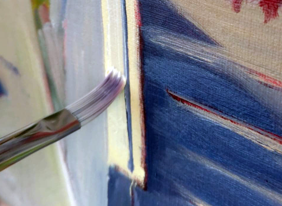
It’s easier to paint a line with a flat on its side than with a small round.
|
The side of a flat brush works better than a small round for straight lines. Flats are more stable and tend to track in the right direction. Or, use a palette knife or the edge of a credit card here. Go ahead and use a ruler if you need to, making sure to keep it from dragging the paint.
Your line should be made of fairly thin paint, with just enough medium to carry it smoothly. Too much oil and it will melt into its surround.
 |
|
Then push the background color right up against the line.
|
Next paint the surrounding area, pushing up against the line with the background color. Use enough paint and be bold. It’s best to do this edging in a single stroke, but that takes practice. However, as a general rule, the more you touch the surface, the muddier the edges will get.
 |
| American Eagle in Dry Dock, by Carol L. Douglas |
In my examples, I use two different brushes. The fine flat, made by Rosemary & Co., is very precise, but as with all synthetic fibers, it doesn’t carry much paint. The bright is old and clunkier, but it carries enough paint for a good, finished line. It may seem like finer is better, but that’s actually not true. What’s most important is getting enough paint on the canvas in one pass, evenly, so that your line doesn’t look anemic. With alla prima painting, hog bristles are almost always better.