Monday Morning Art School: color harmony

Color harmony is not just a question of placing or finding objects that look good together; it means using those colors within your painting to build a great composition.

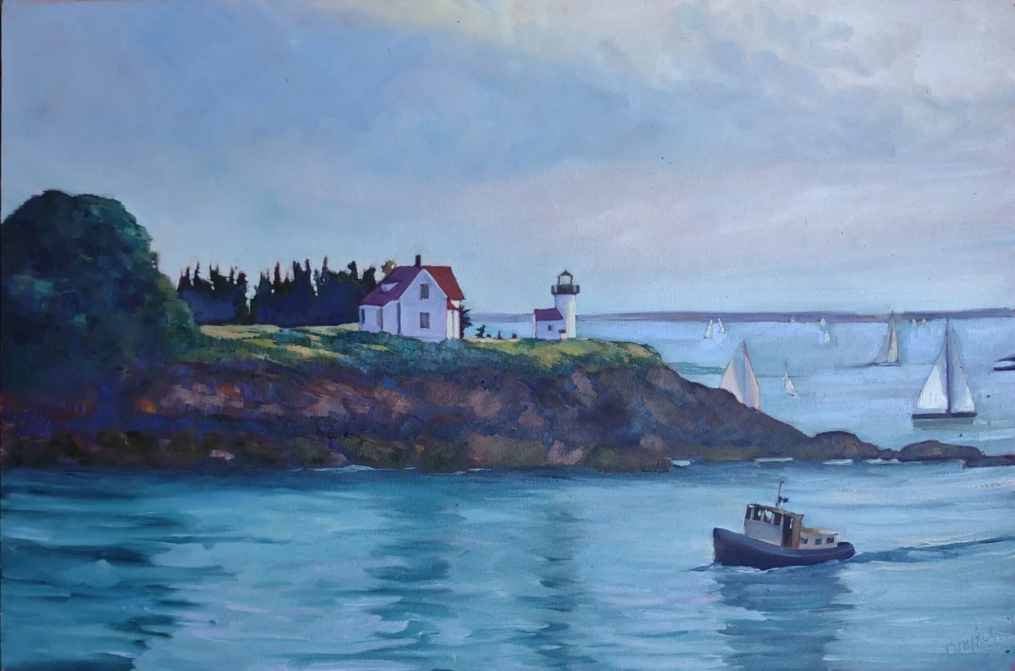
Rachel Carson Wildlife Refuge, by Carol L. Douglas

Nearly all beginning painters focus primarily on matching local color. That’s an important skill, but it is just a bare beginning. To make paintings sing, one must think carefully about color schemes. Sometimes a subject can achieve color harmony naturally, but most of the time we need to think through our color choices and placement.

In painting, local color means the natural color of an object, unmodified by lighting. Leafy trees are green, for example. But there are circumstances where they can appear black (at sunset, for example), golden or even orange. There are other circumstances in which, for compositional purposes, it is better to paint them blue or lavender. The rookie error is to persist in what we know—that trees are green—instead of what we see or would be more visually appealing.

Self portrait, by Tom Root. Courtesy of the artist.

Colin Page is a master of color harmony; I encourage you to study his work. Above is another excellent example, a recent self-portrait by artist and teacher Tom Root. He’s a fabulous portrait painter; I’d take a workshop from him.

I could go on and on about the virtues of this painting, which are legion. For now, I’ll talk about his color use.

Isolated colors from Tom Root’s painting, above.

The background and shirt are tied together in a tight arrangement of blues and greens. The face and jacket, meanwhile, are equally tightly-grouped. Photoshop allows me to check the inverse of any color. The blue-greens and flesh tones are almost exact complements, making this a classic complementary color scheme. These complements are arranged in a pleasing, slightly asymmetrical triangle. Tom’s drawing, in a blue-violet, stands outside this color scheme, giving it great impact.

Monochrome reduction of the painting above.

Tom uses hue as much as value to model. (If you need a refresher on what this means, see here.) That gives his painting a solid contemporary feel. But that doesn’t mean he uses no value. In fact, if you look at the monochrome reduction of the painting, you’ll see a beautiful sweep of darks from the bottom left to the upper right. That creates contrast to drive our eye to the most important part of his painting: the face.

I didn’t ask Tom how he arrived at this color scheme; by the time you’re at his level of expertise it’s intuitive anyway. But it doesn’t start off that way. To master color harmonies, you must spend a great deal of time thinking about color and practicing it.

All color schemes rest in the standard 12-color wheel that’s been kicking around for centuries. I’m a fan of the Quiller Wheel because it’s based on paint pigments, but you can just as easily make your own. That gives you the advantage of understanding the paints you’re actually using. (Many store-bought wheels are overloaded with useless information, making them more trouble than they’re worth.)

Tinfoil hat, by Carol L. Douglas. The color scheme shouldn’t be primarily about the objects, but about how you use the colors in your painting.

Here’s a link that gives you a complete description of the classic color harmonies, but let’s review them here:

Complementary

These are colors that lie opposite each other on the color wheel. The most famous example is Christmas’ red and green.

Analogous

Analogous color schemes use colors that lie next to each other on the color wheel. Using analogous colors can make what might be a garish scene (a sunset, for example) more serene.

Peppers, by Carol L. Douglas. Every once in a while I paint something very realistic, just to remind myself that I know how.

Equilateral Triad

This uses colors that are evenly spaced on the color wheel. The most well-known example is the primary combination of red-blue-yellow.

Harmonic triads

This variation counts 3-4-5 in either direction on the color wheel. Start with a key color, and count from there. This is a sophisticated variation on the equilateral triad.

Split-Complementary

This is a variation of complementary colors. It either substitutes for the complement or includes the complement’s adjacent hues.

Double complements

The rectangle or tetradic color scheme uses four colors arranged into two complementary pairs. The colors can be in a rectangle or in a square.

As nice as that information is, color cannot be learned from reading, but only through trial and error. Your assignment this week is to set up a small still life in one of these color schemes and paint it, paying careful attention to how the lighting unifies the scene.  Remember, it’s not just a question of placing objects in a pleasing array; it’s a question of using colors within your painting to make a great composition.

This post originally appeared on May, 4 2020.
Monday Morning Art School: color harmony

Color harmony is not just a question of placing or finding objects that look good together; it means using those colors within your painting to build a great composition.

Rachel Carson Wildlife Refuge, by Carol L. Douglas
Nearly all beginning painters focus primarily on matching local color. That’s an important skill, but it is just a bare beginning. To make paintings sing, one must think carefully about color schemes. Sometimes a subject can achieve color harmony naturally, but most of the time we need to think through our color choices and placement.
In painting, local color means the natural color of an object, unmodified by lighting. Leafy trees are green, for example. But there are circumstances where they can appear black (at sunset, for example), golden or even orange. There are other circumstances in which, for compositional purposes, it is better to paint them blue or lavender. The rookie error is to persist in what we know—that trees are green—instead of what we see or would be more visually appealing.
Self portrait, by Tom Root. Courtesy of the artist.
Colin Pageis a master of color harmony; I encourage you to study his work. Above is another excellent example, a recent self-portrait by artist and teacher Tom Root. He’s a fabulous portrait painter; I’d take a workshop from him, if we ever get to take workshops again.

I could go on and on about the virtues of this painting, which are legion. For now, I’ll talk about his color use.

Isolated colors from Tom Root’s painting, above.
The background and shirt are tied together in a tight arrangement of blues and greens. The face and jacket, meanwhile, are equally tightly-grouped. Photoshop allows me to check the inverse of any color. The blue-greens and flesh tones are almost exact complements, making this a classic complementary color scheme. These complements are arranged in a pleasing, slightly asymmetrical triangle. Tom’s drawing, in a blue-violet, stands outside this color scheme, giving it great impact.
Monochrome reduction of Tom Root’s painting above.
Tom uses hue as much as value to model. (If you need a refresher on what this means, see here.) That gives his painting a solid contemporary feel. But that doesn’t mean he uses no value. In fact, if you look at the monochrome reduction of the painting, you’ll see a beautiful sweep of darks from the bottom left to the upper right. That creates contrast to drive our eye to the most important part of his painting: the face.
I didn’t ask Tom how he arrived at this color scheme; By the time you’re at his level of expertise it’s intuitive. But it doesn’t start off that way. To master color harmonies, you must spend a great deal of time thinking about color and practicing it.
All color schemes rest in the standard 12-color wheel that’s been kicking around for centuries. I’m a fan of the Quiller Wheel because it’s based on paint pigments, but you can just as easily make your own. That gives you the advantage of understanding the paints you’re actually using. (Many store-bought wheels are overloaded with useless information, making them more trouble than they’re worth.)
Tinfoil hat, by Carol L. Douglas. Remember, the color scheme shouldn’t be primarily about the objects, but about how you use the colors in your painting.
Here’s a linkthat gives you a complete description of the classic color harmonies, but let’s review them here:
Complementary
These are colors that lie opposite each other on the color wheel. The most famous example is Christmas’ red and green.
Analogous
Analogous color schemes use colors that lie next to each other on the color wheel. Using analogous colors can make what might be a garish scene (a sunset, for example) more serene.
Peppers, by Carol L. Douglas. Every once in a while I paint something very realistic, just to remind myself that I know how.
Equilateral Triad
This uses colors that are evenly spaced on the color wheel. The most well-known example is the primary combination of red-blue-yellow.

Harmonic triads

This variation counts 3-4-5 in either direction on the color wheel. Start with a key color, and count from there. This is a sophisticated variation on the equilateral triad.

Split-Complementary

This is a variation of complementary colors. It either substitutes for the complement or includes the complement’s adjacent hues.

Double complements

The rectangle or tetradic color scheme uses four colors arranged into two complementary pairs. The colors can be in a rectangle or in a square.
As nice as that information is, color cannot be learned from reading, but only through trial and error. Your assignment this week is to set up a small still life in one of these color schemes and paint it, paying careful attention to how the lighting unifies the scene.  Remember, it’s not just a question of placing objects in a pleasing array; it’s a question of using colors within your painting to make a great composition.