In praise of large paintings

It’s a mistake to think of our large canvases as drugs on the market. They’re often the most important work we do.

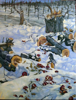
Winter Lambing, 36X48, oil on canvas, $6231 framed.

Björn Runquist told me about the perambulations of a large work, 72” high, as we hung paintings at Bangor Savings Bank yesterday. It takes time to sell a major painting, so it’s no surprise that his canvas is more well-traveled than some of my friends. Like actors, these big works ‘rest’between gigs. They can take up almost as much house-room as a twenty-something between jobs.

My out-of-work canvases live in the closets of our guest room. That’s an improvement, because until this house, we didn’t have a guest room; we just had lots of bedrooms for our numerous children. Then, my inventory was stored behind a false wall in my room. It was the antithesis of House Beautiful, and it irritated me every time I saw it. My husband studied aesthetics as undergraduate, but it never bothered him. Go figure.

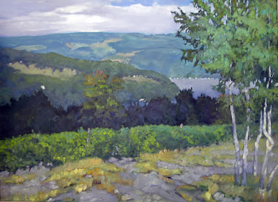
Vineyard, 30X40, oil on canvas, $5072 framed.

There are many large canvases in my storage, because I love to paint big: God + Man, which I did originally for a solo show at Roberts Wesleyan College, and a whole slew of nudes that were censored at Rochester Institute of Technology. The latter will be going to the Rye Arts Center in New York in March, for a duo show with sculptor Anne De Villemejane.

We artists love to paint big, but it’s easier to sell smaller paintings. They fit better on people’s walls, and they cost less money. Still, it’s a mistake to think of these large canvases as a drug on the market. Because they require such careful thought, they’re often the most important work we do. It makes sense to think of them as an asset that should be carefully rationed into the marketplace, rather than as large, bulky objects we trip over, that we’re only too happy to sell to the first comer.

Breaking Storm, 30X48, is available through the Camden Public Library this month.

Surplus art is our lot in life. For example, Ken DeWaard counted up the unfinished work in his studio at the end of the summer and announced he had something like 145 unfinished canvases in his studio. I haven’t counted mine, but it’s something similar; we’re like musicians in that we must constantly practice. We might finish or paint over them; we ruthlessly cull them before we show them, or we’d never have room for them all.

Between changing out the show at Camden Library and hanging paintings at the bank, I have moved a lot of paintings from place to place. It’s an excellent opportunity to bring the nudes out for an airing, as they need to be cleaned and rewrapped before they travel down to New York. “I hope you sell a lot of them!” my friend Marjean exclaimed. She’s speaking from the housewife’s standpoint here; she’d really like to see that closet better-organized.

All Flesh is as Grass, 30X48, oil on canvas, $6231 framed.

I’m just thrilled to have an opportunity to show those paintings again. The lot of women worldwide wasn’t great when I painted them, and it hasn’t gotten any better. 

Meanwhile, I’ll be at Camden Public Library tomorrow from 1 to 3, for a reception for Fantastic Places and Magical Realms. The work ranges in size from 6X8 to 30X48, so there’s something suitable for every space and budget. Stop by and I’ll give you your Christmas treat.

Three artists, one view

It’s not what you paint, it’s how you paint it.

Asters by Björn Runquist, 12X24. Courtesy of the artist.

Last week, I got a text from Björn Runquist that read “Asters!” and included a photo of the roadside along Maine 131 in Thomaston. I was out on American Eagle teaching, so I couldn’t rush over there. On Monday, Ken DeWaard and I went chasing after Björn’s view. Route 131 is narrow, heavily traveled, and has a wicked ditch, making parking and set-up difficult. That meant all three of us painted from the same place, at the same angle. Björn’s painting is beautifully finished; Ken’s and mine are still incomplete.

It’s common enough for us to paint in the same place, but rare that we would choose the same frame. Within that, different things attracted us. Björn concentrated on the broad sweep and the punctuation of greens. Ken was interested in the big sky. For me, the asters were right at eye-level, so I painted a forest of purple.

Ken DeWaards asters, 18×24, courtesy of the artist.

Bearing in mind that they’re at different stages of completion, are any of these paintings ‘better’ than the others? Subjected to formal analysis, they all finish strong. They’re properly drafted, have good composition, clear focal points, and use color competently. None are boring.

Therein lies the juror’s conundrum. Their ‘quality’ rests on how you, the viewer, respond emotionally to them. In that, they’re radically different. Ken, Björn and I are roughly the same age, have the same social background, and use the same alla prima technique. I’m not going to psychoanalyze my peers, let alone myself, but we each bring different sensibilities to our paintings.

My asters, 12×16.

That’s why painting matters, of course. It’s also one of the many paradoxes of art. Most consumers respond to paintings based on subject matter—for instance, they look at boat paintings because boats mean something to them. The objectivity of time renders the subject less important, and the artist’s inner life becomes paramount. Vincent van Gogh is not an Immortal because the art-loving public has an abiding love for Arles. Heck, most of us have never been there.

Last week, I told you about an exercise where my students have to paint a scene chosen by committee. (Joe Anna Arnett called me an ‘evil genius’ for this lesson, and it’s the greatest compliment I’ve ever received.) The subject matters, yes, but what you bring to it ultimately overrides content. Never worry about a peer painting the same thing as you—he simply can’t.

A footnote: please check out Peter Yesis’ wonderful flower paintings. He’s willing to take on those flowers petal-by-petal, something the rest of us never dare do.

Monday Morning Art School: simplifying values

Thinking about the landscape as a series of planes will help you create depth in your painting. 
Ice Bound Locks, John F. Carlson, courtesy Vose Galleries

When Eric Jacobsen told us that he was teaching the theory of angles and consequent values in his recent workshop, I was baffled by the big words. “What’s that when it’s at home?” I asked him. Ken DeWaard was equally confused, responding in a torrent of emojis.

“C’mon, guys, it’s John F. Carlson 101!” Eric exclaimed. Björn Runquist immediately checked, and announced that there was nothing about any angles on page 101. (Actually, it’s in chapter 3; I checked.)

It’s no wonder that Eric’s no longer returning our calls.

Sylvan Labyrinth, John F. Carlson, courtesy of Virginia Museum of Fine Arts

All kidding aside, Carlson’s Guide to Landscape Painting is a classic. His theory, although it has a high-flown title, is actually quite intelligible to even the meanest intellects (and you know who you are, guys).

“Every good picture is fundamentally an arrangement of three or four large masses,” Carlson began. That’s as good an organizing principle as any in art. Value is what makes form visible, so we should see, translate, simplify and organize form into value masses.

Carlson wrote that any landscape would contain four groups of values bouncing off three major planes:

  • The horizontal ground plane;
  • The angle plane represented by mountain slopes or rooftops;
  • The upright plane, which is perpendicular to the ground plane, such as trees.

In the middle of the day—our most common circumstance for painting—the value structure would be as follows:

  • The sky is our light source. It should be the highest value in our painting.
  • The ground plane gets the most light bouncing off it, so it should be the next-lightest plane.
  • The angle planes such as rooftops or mountain slopes, are the next lightest planes.
  • The upright objects in our painting, such as trees, walls or people, should be the darkest value element.

Snow Lyric, John F. Carlson, courtesy of The Athenaeum

That doesn’t mean that the shapes are crudely simplified, as a glance at Carlson’s own paintings confirms. The shapes can be beautiful, elegant, complex, and lyrical without too much value overlap.

Thinking about the landscape as a series of planes will help you create depth in your painting. However, it can be tricky to see the landscape as a series of planes rather than objects. It can be helpful to keep each value group completely separate, with no overlap of values, but, in reality, there will always be overlap.

Your assignment is to find a photo among your own snapshots and reduce it to a series of four values. Then paint it.

As you try to integrate this idea into your painting, exaggerate the separation of planes.

Of course, there are many circumstances where this doesn’t hold true—where the sky is leaden and darker than a snow plane, or when the fading evening light is hitting the vertical plane rather than the ground. But understanding it will help you paint the exceptions in a more arresting way.

Making hay while the sun shines

It’s funny how often we psych ourselves into or out of failure.

Spring Break, 10X10, oil on canvasboard, $645 unframed, 25% off this week.

Memorial Day marks the start of the summer season here in Maine, when we throttle up into high gear for a short but productive summer season. For me that means getting up even earlier—at five—to hike over Beech Hill and attend to my ablutions. Getting moving that early in the morning gives me a few hours to paint en plein air before I’m back at 394 Commercial Street to tend my own gallery space (from noon to six).

Most mornings I paint with some combination of Ken DeWaardEric Jacobsen, and Björn Runquist. In March I told you how whiny we can be about choosing a subject. That indecision melted along with the snow. Now the question seems to be how fast can we paint. Yesterday we chased lilacs—Ken in Camden, Bjᜂrn in Clark Island, and Eric and me in Rockport. I would never have painted lilacs without their prodding, and I’m glad I did.

Abandoned farmyard, 11X14, oil on birch, $869 unframed, 25% off this week.

“I haven’t a clue how to paint flowers,” I said, because complaining is an important part of starting a painting. Then I remembered that lilacs are really just small trees with purple appendages. I understand trees, so all the mystery vanished.

It’s funny how often we psych ourselves into or out of failure. When someone asks me, “how do you paint such-and-such?” I’m at a loss to explain. Objects are objects and we paint them all the same way—we look, see, and interpret. That includes people, by the way. But there are some subjects I’d rather not touch myself. I would have gone to the harbor without Ken, Bjᜂrn and Eric prodding me to do something seasonal.

Three Chimneys, 11X14, oil on birch, $869 unframed, 25% off this week.

I’m actually an experienced plantswoman, but gardens are one of the few landscape subjects that don’t stir me. Domesticated plants are too civilized for my tastes. Syringa vulgaris—the common lilac—is different. For eleven months of the year, it’s an ungainly, overgrown shrub, with a not-too-pretty growth habit. Lilacs easily escape cultivation and can be found on hedgerows and in wasteland. There’s nothing ungainly about them when they’re in flower—they put their hearts into that heady display. I had five different varieties in my tiny yard in Rochester, and I’ve got cuttings rooting on my windowsill right now.

Neither of these lilac paintings are ‘true’ in the sense that they’re a photographic representation of place. There’s no farmyard beyond the break in Spring Break, and that shrub doesn’t grow in the field below Abandoned Farmyard. In both cases, I took significant editorial liberties in pursuit of a less-boring composition. But both are true in the sense that they represent what Maine really looks like.

Lupines, 9X12, oil on canvasboard.

As is typical for Memorial Day weekend, it was rainy and cold here in the northeast. My husband went camping near Ticonderoga, NY. I stayed home to man my outdoor gallery, which mostly meant raising and lowering the coverings depending on which way the wind was pushing the rain. It was a lousy weekend for selling paintings, so I amused myself by doing some long-overdue planting in my own yard. The temperature dropped into the 40s, and I burned the last of our firewood. But I had it easy; it snowed in the Green Mountains of Vermont, just a few miles from where my husband shivered in his tent. And, of course, as soon as the world returned to its desks, it warmed right back up.

The trouble with Paradise

Choosing a subject can be difficult when you live in the most beautiful place in the world.

American Eagle in Drydock, 12X16, oil on canvasboard, by Carol L. Douglas. Available.

This winter I’ve been painting with Ken DeWaard, Eric Jacobsen, and Björn Runquist. None of us were born in Maine; we all choose to live here: for the fabulous light, unspoiled little villages, boats, and the rockbound coast. We all love to paint outdoors. So how does a typical morning conversation go?

“Got any ideas?”

“I dunno
 don’t have a plan. How windy is it, anyway?”

“Miserable. My dog blew over.”

“Well, how about the creek?”

“Snow’s too deep. Next week. Is that where you’re headed?”

“I was thinking about it. Unless you can think of someplace better.”

Coast Guard Inspection, 6X8, oil on canvasboard, by Carol L. Douglas, available.

This can go on for a silly amount of time. The problem is, we’re spoiled for choice. If we lived somewhere else, we’d head out to that place’s one beauty spot and be happy.

Nevertheless, we did manage to agree on a spot in Spruce Head. It was crisp and brilliant, and there are enough subjects in that one small curve of coast to last us for a whole painting season. Of course, that doesn’t mean we won’t have the same loopy conversation next week.

Changing Tides, 16X12, oil on canvas, by Lori Capron Galan.

On Wednesday I wrote about an exercise in my class, where I asked my students to start with abstraction. Lori Capron Galan did it wrong, but it turned out weird and wonderful: she turned her canvas and reference 90° and painted the whole thing sideways.

That took her to the same place I was trying to get my students—to divorce themselves from slavish fidelity to reality, and to start thinking about shapes, colors and movement instead of simple pictorial representation.

The resulting painting, above, is so inspiring that I intend to try it myself soon.

Breaking Storm, by Carol L. Douglas, 24X36, available from Folly Cove Fine Art.

This Tuesday, Captain John Foss of schooner American Eagle will appear on Captains’ Quarters, a Zoom presentation of the Sail Power and Steam Museum. The captain is a witty and smart fellow, and sailing with him is always a lark. (That’s the boat on which I teach my twice-a-year watercolor workshops.)

I wanted to email people who might want to tune in—those who’ve sailed with him, ought to sail with him, love wooden boats, etc. Then I realized it was most of the people I know.

That’s Tuesday, March 23, 2021, from 6:30 to 7:30. More information is here. To go directly to the registration, click here.
​
Launched in June of 1930 in Gloucester, MA, American Eagle was originally named Andrew and Rosalie and was the last of the Gloucester fishing schooners.  Renamed American Eagle by a new owner in 1941, she fished until 1983, when she was purchased by her current owner and captain, John Foss.  She arrived in Rockland in 1984 where Foss led her multi-year restoration at the North End Shipyard.  She was relaunched in 1986 and began her new career, carrying passengers along the coast of Maine.