The nuts and bolts of social media: content

Want to write a successful art blog? Be brief, punchy, disciplined and focused.

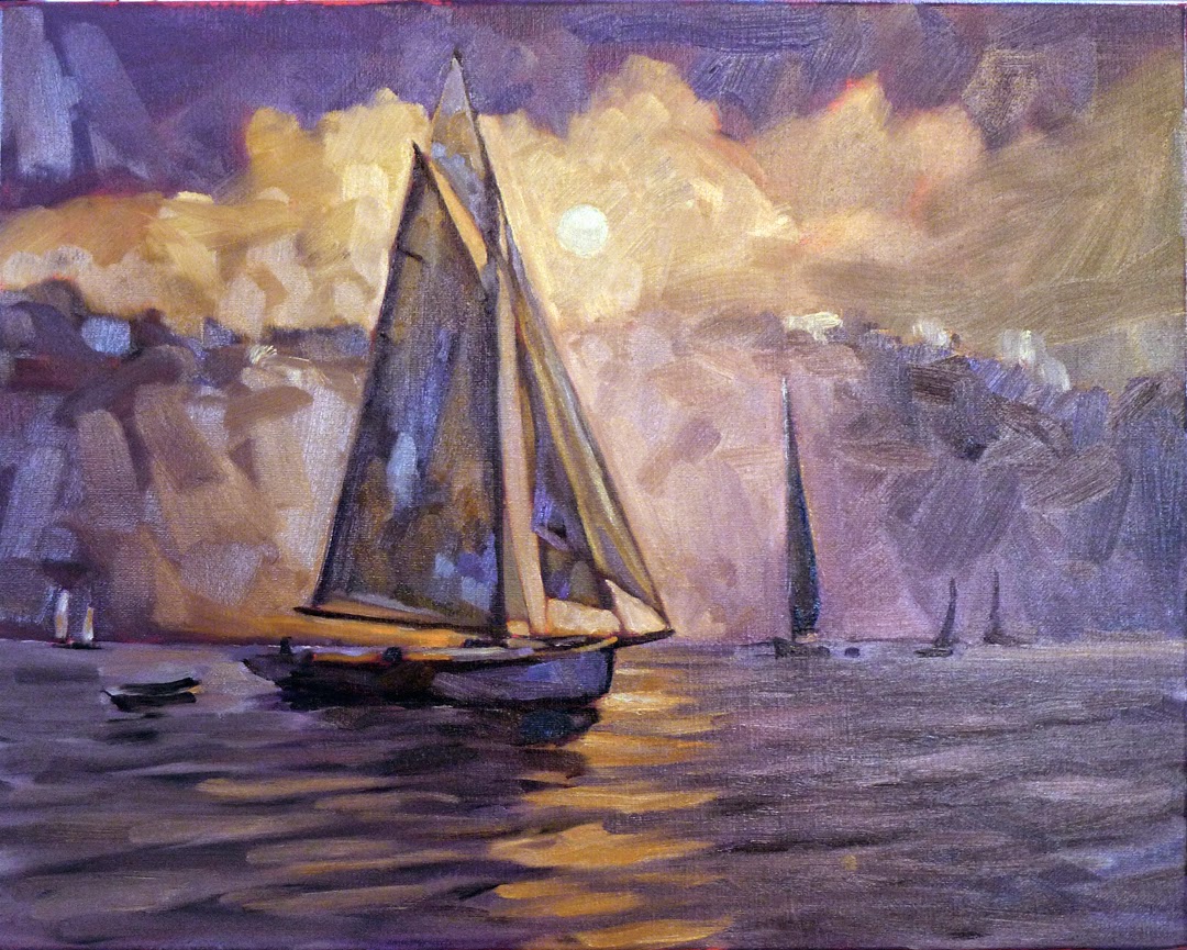
Barnum Brook, by Carol L. Douglas. (Private collection) Your blog is primarily to promote your brand, so use your own photos when you can.

I used to post whenever I had a new painting or brilliant thought. That’s how most artists post, and it doesn’t work. To succeed, you must commit to writing on a regular basis. Twice a week is the bare minimum. I now blog five days a week, excluding major holidays.

When I tell people this, they sometimes object:
  • I can’t write fast enough to do that;
  • I don’t want the internet taking over my life;
  • That sounds like too much work.

This blog takes me 90 minutes a day. I do it before I get out of bed. Unless I’m doing bookkeeping or marketing, I seldom open my laptop again for the rest of the day.
I can only do that because I keep a list of future topics on my laptop. I almost always go to bed at night knowing what the subject will be the next day.
A blog post should tell a story. Consider this postabout Crista Pisano’s dead battery. Not much happened in absolute terms, but it ended up being a powerful story about women helping each other.
If you’re literate, you can blog. But some people hate to write. They should consider Instagram instead. My Instagram feed is the back story to my paintings. I use it to post the funny or charming things that happen on the way to a painting.
Be brief. Today more than half my readers read my blog on their phones, rather than on a computer. Brevity and punch are more important than ever before. If you have a lot to say on a subject, as I do here, write it over multiple days.
The most important part of the post is the headline and the tagline that follows it. I write these after the post is finished. Use important keywords here, because this is what search engines will see.
I try to cover the basics of a story as taught by my high-school journalism teacher: who, what, why, where, when and how. But other elements of ‘good’ writing go by the wayside—there’s no introductory paragraph and no closing paragraph.
After I’ve written my post, I edit viciously to bring it in under 600 words.
You’re using your blog to promote your own brand. This is a great opportunity to use your own photos. Even so, if your work is in a gallery, be sure to link to it in the caption.
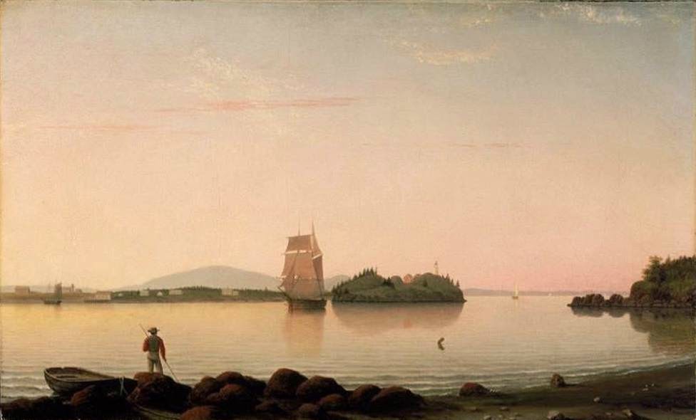
Below Ottawa House, by Carol L. Douglas, courtesy Kelpie Gallery.
If you’re using another person’s photo, obtain their consent in advance and credit them for the picture. Do not, under any circumstances, use uncredited images from the internet. That violates copyright law.
You can use work in the public domain, including artwork owned by museums who make that work available to the public. However, even if a painting is exempt from copyright law, the photo of the painting may be owned by someone. Wikipedia gives instructions for crediting pictures. In the case of a museum, credit the organization.
The Fair Use exemption allows reproduction to comment upon, criticize, or parody a copyrighted work. I use photos of others’ work under this exemption when I write about art history or contemporary art. Go carefully; Jeff Koons has gotten in trouble repeatedly for stomping on others’ copyright. Consult an intellectual-property lawyer if you have questions.
Several people at Maine International Conference on the Arts (MICA) asked me for more detailed information on marketing on social media. This is part two of a series on the subject. 


Part three: Getting readers

Feel free to comment or ask me questions, below.

Hand over fist

Unfinished, by Carol L Douglas, 16X20, oil on canvas. (The color is distorted because it was dark when I shot this.)
Over the past three years, I have become enamored of the luminist paintings of Fitz Henry Lane. That doesn’t mean I want to paint like him, but I love the space and light in his paintings. I started this boat painting with him in mind, but I did not look at his work. I wanted his technique to suffuse my understanding, rather than push me toward painting like him.
If I’m unsure about the composition, I compare it to this grid I learned in a workshop taught by Steven Assael. 
Sailboats are elegant, and they glide like living creature across the sea. I generally paint them at dock because it is extremely difficult to paint them en plein airin motion, (although I did give it a try at Rye in 2013).
My underpainting. The sky is a complete fabrication. I need to recapture some of the bluntness of this when I finish the painting.
 Last summer, Howard Gallagher of Camden Falls Gallery took Lee Boyntonand me out to see the start of the Eggemoggin Reach Regatta . (It’s a great gallery owner who cares that much for his painters.) It made me passionately want to paint boats in motion.
My reference photo, taken at the start of the Eggemoggin Reach Regatta.
On Monday, I wrote about consistencyand how your style is ultimately your brand. A reader asked how one can experiment, grow and change while still being consistent. Artists know that the creative process never ends; you wrestle through one technical problem only to be faced by another.
Ironically, that was the precise problem I found myself facing. I went back to first principles. I drew and drew the boat until I was confident about its proportions. Since I was unsure of how to divide the space, I used a grid taught by Steven Assael.
Boston Harbor was painted by Fitz Henry Lane around 1850. 
The end result taps into Lane’s luminism, but is by no means a slavish copy. It is both consistent with my work and yet it explores new material. It’s not finished, but it is a good start.

Let me know if you’re interested in painting with me in Maine in 2015 or Rochester at any time. Click here for more information on my Maine workshops! Download a brochure here.

Paint what you love

Daddy’s little helper, oil on Belgian linen, 14X18, by Carol L. Douglas
When I’ve laid off painting for a while, I “play scales” to limber up. Usually that’s in the form of a still life, but yesterday I decided to paint my grandson, Jake. Jake is three months old, and painting babies is decidedly out of my comfort zone. But if you want to be energized as an artist, paint what you love.
Yesterday’s post about consistency sparked a lively discussion on Facebook. Cindy Zaglin said, “I’ve been told people should be able to look at a group of work and know it’s yours (or someone else’s.) But I like the freedom of experimenting and sometimes a piece will not look like my other work. I wonder how to marry ‘brand’ and experimentation.”
As always, I start with an oil grisaille. The gridding is because I needed to doublecheck the proportions of that massive head. Even so, in the final rendering, I couldn’t believe it, and I narrowed his head slightly (and incorrectly).
Cindy doesn’t have to worry; her work is iconic and highly recognizable. She has wide latitude in subject because her style is rock solid. That doesn’t mean she hasn’t grown and changed in the decade I’ve known her. The important thing is that those changes were incremental, not a frenzied trying on of different techniques.
If you can put into concrete terms what is unique about your paint handling, then you probably don’t have a style, but an affectation. In other words, “I always leave big patches of raw canvas showing,” would be an affectation, whereas, “I start off intending to be super careful but inevitably a fury takes over and I’m left with this mess” is probably more of a mature style.
No matter what I am painting, I approach it the same way. Same primer, same brushes, same underpainting, same pigments, same medium. For this reason, my portrait of Jake is stylistically linked to my paintings of sailboats at Camden Harbor, even though the subjects are worlds apart. And of course, this painting is slyly political, as so many of my paintings are. (I like the quaint idea of fathers married to babies’ mothers.)
After the gridding, I filled in masses, and from there worked in more detail. In short, the usual, regardless of the subject.
“Brand is both an identifier and a trap,” said Jane Bartlett. “I’ve seen celebrated artists who are trapped by what they have created and become known by, especially painters. The audience they built leaves the moment significant changes are made either in subject matter or paint application. It’s as though they are starting over. The loss of audience drives them back to what they had been doing and often to boredom.”
I think of that as the Hello Kitty-ism of art. Tom Otterness’ The Creation Myth, at Rochester’s Memorial Art Gallery, is a case in point. It’s interchangeable with all his other public works. There are, sadly, too many visual artists who have commodified themselves in this way. They may as well be stamping out engine blocks at Ford.

Let me know if you’re interested in painting with me in Maine in 2015 or Rochester at any time. Click here for more information on my Maine workshops! Download a brochure here.

Use your power for good

The Canadian National War Memorial (also known as The Response), was originally built as a WWI memorial. It was designed by British sculptor Vernon March but modified in 1982 and 2000. It is a stunning evocation of wars throughout time.

Because the National Gallery of Canada has one of the world’s largest collections of Group of Seven paintings, I’ve made pilgrimage to Ottawa. It’s a lovely city—beautiful architecture, relaxed pace, and in a gem of a landscape. I was so impressed with it, in fact, that I asked my husband why we didn’t move there. Alas, Canada is not a belligerent nation, so it wasn’t likely he was going to get a job there in the military-industrial complex.
From a lifetime of living on the border, I believe a Canadian is far more likely to talk you to death than shoot you. Canada is safe, kind, dull, and neighborly. That—and hockey—is its brand.
Peace and Liberty stand at the top of the Memorial
When I was writing my essayabout Death of Klinghoffer yesterday, it occurred to me that what the Metropolitan Opera of New York was doing was rebranding itself as edgy and relevant, and in a morally dubious way.  And now that I’m seeing everything through the lens of branding, I wonder about the two homegrown terrorists who attacked Canadian soldiers this week.

The WWI figures on the National War Memorial.
I’ve been thinking in these terms because one of my painting students (and pals) is branding guru Brad VanAuken. We often talk about branding in painting class, and I find it fascinating.
Memorials to all wars were added in 1982.
Yesterday’s Ottawa jihadist has been identified as 32-year-old Michael Zehaf-Bibeau, French Canadian by birth and a recent convert to Islam. He was apparently a “high risk traveller” and had his passport seized to prevent his joining Islamic terrorists overseas. What’s shocking is that Martin Couture Rouleau, who earlier this week mowed down and killed two Canadian soldiers in Saint-Jean-sur-Richelieu, Quebec, was also a disaffected French-Canadian who rebranded himself as an Islamic terrorist.
Memorials to all wars were added in 1982.
 Their personal rebranding efforts are a form of performance art—a fatal form, since you die before you get applause. It only works because Islam itself has succeeded in rebranding itself as a romantic, meaningful alternative for the young male loner. All it takes is a keffiyeh and a gun.
Meanwhile, what does this do to Brand Canada? Canada comes late to most social ills, but it generally gets there, as the stories of Paul Bernardo and Karla Homolka and the École Polytechnique massacre remind us. And then it returns to its innocence, being our good neighbor to the north.
The Tomb of the Unknown Soldier, where Cpl. Nathan Cirillo was gunned down, was added to the National War Memorial in 2000.

Message me if you want information about the coming year’s classes and workshops.