Painting in strange places

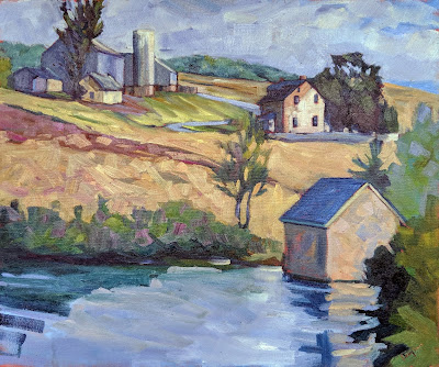
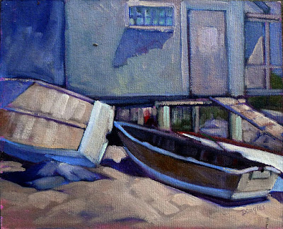
Boats, mountains, glaciers—I like painting off the beaten path.

I don’t worry about much, but setting up the coffee this morning I was stopped by the sound of running water near the sink. It was rainwater coursing down the window in great gouts. Not a domestic problem, but it’s a hard start for the inaugural Camden on Canvas, which has brought top-tier artists to paint in our little burg.

Camden on Canvas is the pet project of Colin Page, and it’s a fundraiser for the Camden Public Library. Colin’s got bigger worries this morning than where he himself will paint. Anyway, he could paint Camden harbor blindfolded and with a sling on his good arm—after all, it’s his home harbor. As for the rest of us, we’re professionals, and we have two days to finish our paintings.

I’ll be heading down to Camden a little later this morning and setting up on the docks on the harbormaster’s side. I’ll work on a harbor painting today, but tomorrow my real adventure starts. I’m climbing to the top of Bald Mountain early in the morning and painting the vista of Camden from a high peak. Any fool can drive up Mt. Battie and paint from the parking area at the summit, but it makes a mediocre picture, having no foreground. Bald Mountain is a 2.6-mile round-trip hike of moderate difficulty (although it will be slippery after all this rain).

View from Bald Mountain.

If you plan to go up there to watch me paint, bring your own chair. I’m not carrying one up for you. You don’t have to work that hard, however; last time I checked, the signal on Bald Mountain was great. I’ll live-broadcast my painting on Facebook. It’s hard to predict an exact time, but expect me to start early, while the sun is still low in the east. I’ll update times on my Facebook page.

Speaking of video, my friend and student Terri Lea Smith made this wonderful video of schooner American Eagleduring our June workshop. If you’ve ever wondered why I have a crush on this particular boat, her film should answer that question. Boats, mountains, glaciers—I like painting off the beaten path.

On that note, students interested in my Pecos workshop might be happy to learn that Our Lady of Guadalupe Abbeyhas added camping spots to their accommodations. It’s a stunning location along the Pecos River and very convenient to all our painting sites. If you’re interested, I’d call them—quickly—at 505-757-6415. And then let me know, too.
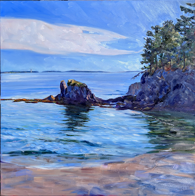
My 2020 painting for Cape Elizabeth’s Paint for Preservation.

Cape Elizabeth’s Paint for Preservation is August 13-15. We’re assigned sites to paint, and these came this week. I’ll be at Trundy Point, which is a massive rock jutting out into the ocean. It’s got surf, beach roses, scree, and beautiful rocks.

I’ll only be there on Saturday, as I’m finishing my workshop in Schoodic that Friday. That occasional problem of unavoidable schedule conflicts is another reason they give us two days to paint at these events. As you can imagine, I’m praying for no rain.
Monday Morning Art School: color harmony

Color harmony is not just a question of placing or finding objects that look good together; it means using those colors within your painting to build a great composition.

Rachel Carson Wildlife Refuge, by Carol L. Douglas

Nearly all beginning painters focus primarily on matching local color. That’s an important skill, but it is just a bare beginning. To make paintings sing, one must think carefully about color schemes. Sometimes a subject can achieve color harmony naturally, but most of the time we need to think through our color choices and placement.

In painting, local color means the natural color of an object, unmodified by lighting. Leafy trees are green, for example. But there are circumstances where they can appear black (at sunset, for example), golden or even orange. There are other circumstances in which, for compositional purposes, it is better to paint them blue or lavender. The rookie error is to persist in what we know—that trees are green—instead of what we see or would be more visually appealing.

Self portrait, by Tom Root. Courtesy of the artist.

Colin Page is a master of color harmony; I encourage you to study his work. Above is another excellent example, a recent self-portrait by artist and teacher Tom Root. He’s a fabulous portrait painter; I’d take a workshop from him.

I could go on and on about the virtues of this painting, which are legion. For now, I’ll talk about his color use.

Isolated colors from Tom Root’s painting, above.

The background and shirt are tied together in a tight arrangement of blues and greens. The face and jacket, meanwhile, are equally tightly-grouped. Photoshop allows me to check the inverse of any color. The blue-greens and flesh tones are almost exact complements, making this a classic complementary color scheme. These complements are arranged in a pleasing, slightly asymmetrical triangle. Tom’s drawing, in a blue-violet, stands outside this color scheme, giving it great impact.

Monochrome reduction of the painting above.

Tom uses hue as much as value to model. (If you need a refresher on what this means, see here.) That gives his painting a solid contemporary feel. But that doesn’t mean he uses no value. In fact, if you look at the monochrome reduction of the painting, you’ll see a beautiful sweep of darks from the bottom left to the upper right. That creates contrast to drive our eye to the most important part of his painting: the face.

I didn’t ask Tom how he arrived at this color scheme; by the time you’re at his level of expertise it’s intuitive anyway. But it doesn’t start off that way. To master color harmonies, you must spend a great deal of time thinking about color and practicing it.

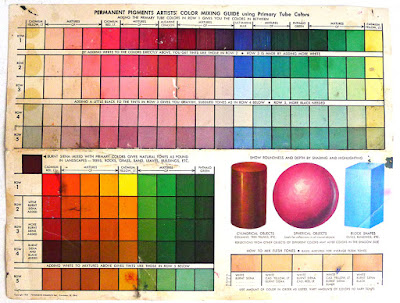
All color schemes rest in the standard 12-color wheel that’s been kicking around for centuries. I’m a fan of the Quiller Wheel because it’s based on paint pigments, but you can just as easily make your own. That gives you the advantage of understanding the paints you’re actually using. (Many store-bought wheels are overloaded with useless information, making them more trouble than they’re worth.)

Tinfoil hat, by Carol L. Douglas. The color scheme shouldn’t be primarily about the objects, but about how you use the colors in your painting.

Here’s a link that gives you a complete description of the classic color harmonies, but let’s review them here:

Complementary

These are colors that lie opposite each other on the color wheel. The most famous example is Christmas’ red and green.

Analogous

Analogous color schemes use colors that lie next to each other on the color wheel. Using analogous colors can make what might be a garish scene (a sunset, for example) more serene.

Peppers, by Carol L. Douglas. Every once in a while I paint something very realistic, just to remind myself that I know how.

Equilateral Triad

This uses colors that are evenly spaced on the color wheel. The most well-known example is the primary combination of red-blue-yellow.

Harmonic triads

This variation counts 3-4-5 in either direction on the color wheel. Start with a key color, and count from there. This is a sophisticated variation on the equilateral triad.

Split-Complementary

This is a variation of complementary colors. It either substitutes for the complement or includes the complement’s adjacent hues.

Double complements

The rectangle or tetradic color scheme uses four colors arranged into two complementary pairs. The colors can be in a rectangle or in a square.

As nice as that information is, color cannot be learned from reading, but only through trial and error. Your assignment this week is to set up a small still life in one of these color schemes and paint it, paying careful attention to how the lighting unifies the scene.  Remember, it’s not just a question of placing objects in a pleasing array; it’s a question of using colors within your painting to make a great composition.

This post originally appeared on May, 4 2020.

Monday Morning Art School: how to create a compelling still life

If you want to be a good painter, it’s critical that you learn to paint from life rather than from photos.

Baby Monkey, oil on canvas, by Carol L. Douglas

The liturgical year has two periods called Ordinary Time. In fact, we’re entering summer Ordinary Time today, since Pentecost was yesterday.

I have taken to thinking of the-time-before-coronavirus as Ordinary Time. My classes would be moving out of the studio now into field painting. That option is now closed, so I’m asking students to create still lives in their own studios.

If you want to be a good painter, it’s critical that you learn to paint from life rather than from photos. Still lives are an essential tool for that. “Still life is the touchstone of painting,” said Édouard Manet, who believed that you could say everything that needed to be said in a painting of fruit or flowers. He spent his last years paralyzed, so he painted brilliant still lives from his couch.

Butter, oil on canvas, by Carol L. Douglas

Composition

A compelling still life set-up has all the same elements as a compelling finished painting: unity, rhythm, movement and a focal point. Colin Page’s still lives combine modern color and paint handling with the exuberant excess of Dutch Golden Age paintings. As chaotic as they appear at first glance, he’s consciously directing your eye through his paintings. Your first assignment for today is to look at his still lives and ask:

1.      Where are the diagonals?

2.      Where are the dark punctuation points?

3.      Where are the reds and oranges?

There are lines that are spelled out and lines that are implied. Note how many triangles Colin makes with object placement.

New hard drive, oil on canvas, by Carol L. Douglas

Content

A still life is an opportunity to be witty, incisive, or topical. If you’re having trouble thinking of ideas, browse through this list. Or meditate on what most interests you today. For example, I might enjoy a still life based on my new grandson’s baby gear, which is all around my house right now.

Color

“Remember that a painting—before being a battle horse, a nude woman or an anecdote of some sort—is essentially a flat surface covered with colors, put together in a certain order,” said painter Maurice Denis. While gathering the objects for your still life, be thoughtful in developing a sense of color—not just hue (which is easy) but in value and chroma. That doesn’t mean “matching” different items, but playing them against each other.

Light and shadow

Even more important than the colors of the objects is the color of light and shadow that will unify your painting. Natural light will give you the broadest spectrum, but it’s not always possible. Look carefully at the light you’re using—if it’s an LED it will be a lot cooler than an incandescent bulb, which sheds an almost-orange light. If you can’t figure out what color the light is, check the color of the shadows.

Think carefully about shadow placement. It’s what will unify your composition.

Happy New Year, oil on canvas, by Carol L. Douglas

Viewpoint

You can set your composition up on the floor and look down on it, or you can put it at eye level. Looking down gives you the best opportunity for diagonals and converging lines. A composition at your eye level starts with a grid of stately horizontal and vertical lines, which makes it feel lofty and separate.  Most still lives are painted at the same angle as we see things on tables in the real world. That gives the opportunity for both diagonals and verticals.

How will you frame the subject?

The ‘negative space’ around the objects is as important as the objects themselves. Consider these shapes before you start painting. Outlining them with a pencil on your thumbnail is a useful way of analyzing them.

Your homework

Choose five ‘carefully curated’ objects (or more, if you’re ambitious) and create a series of still lives from them in different arrangements. Record them in thumbnail sketches as you go. If you’re lucky enough to have a Lazy Susan, you can set your still life up on it and rotate it to get a sense of how objects can look different from different angles.

Monday Morning Art School: color harmony

Color harmony is not just a question of placing or finding objects that look good together; it means using those colors within your painting to build a great composition.

Rachel Carson Wildlife Refuge, by Carol L. Douglas
Nearly all beginning painters focus primarily on matching local color. That’s an important skill, but it is just a bare beginning. To make paintings sing, one must think carefully about color schemes. Sometimes a subject can achieve color harmony naturally, but most of the time we need to think through our color choices and placement.
In painting, local color means the natural color of an object, unmodified by lighting. Leafy trees are green, for example. But there are circumstances where they can appear black (at sunset, for example), golden or even orange. There are other circumstances in which, for compositional purposes, it is better to paint them blue or lavender. The rookie error is to persist in what we know—that trees are green—instead of what we see or would be more visually appealing.
Self portrait, by Tom Root. Courtesy of the artist.
Colin Pageis a master of color harmony; I encourage you to study his work. Above is another excellent example, a recent self-portrait by artist and teacher Tom Root. He’s a fabulous portrait painter; I’d take a workshop from him, if we ever get to take workshops again.

I could go on and on about the virtues of this painting, which are legion. For now, I’ll talk about his color use.

Isolated colors from Tom Root’s painting, above.
The background and shirt are tied together in a tight arrangement of blues and greens. The face and jacket, meanwhile, are equally tightly-grouped. Photoshop allows me to check the inverse of any color. The blue-greens and flesh tones are almost exact complements, making this a classic complementary color scheme. These complements are arranged in a pleasing, slightly asymmetrical triangle. Tom’s drawing, in a blue-violet, stands outside this color scheme, giving it great impact.
Monochrome reduction of Tom Root’s painting above.
Tom uses hue as much as value to model. (If you need a refresher on what this means, see here.) That gives his painting a solid contemporary feel. But that doesn’t mean he uses no value. In fact, if you look at the monochrome reduction of the painting, you’ll see a beautiful sweep of darks from the bottom left to the upper right. That creates contrast to drive our eye to the most important part of his painting: the face.
I didn’t ask Tom how he arrived at this color scheme; By the time you’re at his level of expertise it’s intuitive. But it doesn’t start off that way. To master color harmonies, you must spend a great deal of time thinking about color and practicing it.
All color schemes rest in the standard 12-color wheel that’s been kicking around for centuries. I’m a fan of the Quiller Wheel because it’s based on paint pigments, but you can just as easily make your own. That gives you the advantage of understanding the paints you’re actually using. (Many store-bought wheels are overloaded with useless information, making them more trouble than they’re worth.)
Tinfoil hat, by Carol L. Douglas. Remember, the color scheme shouldn’t be primarily about the objects, but about how you use the colors in your painting.
Here’s a linkthat gives you a complete description of the classic color harmonies, but let’s review them here:
Complementary
These are colors that lie opposite each other on the color wheel. The most famous example is Christmas’ red and green.
Analogous
Analogous color schemes use colors that lie next to each other on the color wheel. Using analogous colors can make what might be a garish scene (a sunset, for example) more serene.
Peppers, by Carol L. Douglas. Every once in a while I paint something very realistic, just to remind myself that I know how.
Equilateral Triad
This uses colors that are evenly spaced on the color wheel. The most well-known example is the primary combination of red-blue-yellow.

Harmonic triads

This variation counts 3-4-5 in either direction on the color wheel. Start with a key color, and count from there. This is a sophisticated variation on the equilateral triad.

Split-Complementary

This is a variation of complementary colors. It either substitutes for the complement or includes the complement’s adjacent hues.

Double complements

The rectangle or tetradic color scheme uses four colors arranged into two complementary pairs. The colors can be in a rectangle or in a square.
As nice as that information is, color cannot be learned from reading, but only through trial and error. Your assignment this week is to set up a small still life in one of these color schemes and paint it, paying careful attention to how the lighting unifies the scene.  Remember, it’s not just a question of placing objects in a pleasing array; it’s a question of using colors within your painting to make a great composition.

The intensity of color

Travel always reminds me of regional differences in color. 
Reed beds, by Carol L. Douglas, 9×12, oil on canvasboard

There were five Maine painters at Plein Air Brandywine Valley this year. One thing that was obvious was that our work was, overall, higher in chroma than that of the mid-Atlantic painters around us. Generalizations always lie, of course. For example, pastellist Tara Will is from down thataway, and she’s nothing if not eye-popping brilliant.

But a brief survey of well-known painters of the Maine coast—people like Henry Isaacs, Connie Hayes, Colin Page, Jill HoyEric Hopkins, etc.—show a painting culture interested more in color and light than in fidelity to fact. Compare that to the paintings recently completed for the Hudson Valley Plein Air Festival. With the exception of Maine’s own Olena Babek, these painters are from eastern New York and Pennsylvania. Their work is less saturated and generally warmer in tone than the work here in Maine.
Fog over mountain, by Carol L. Douglas, oil on canvasboard (available)
We Mainers have no hammerlock on high chroma. Go out to Santa Fe and paint with the folks from Plein Air Painters of New Mexico. They’re working in their own palette. It’s as intense as ours, but pushes the reds, ochres and blue-violets.
To a large degree, geography shapes our color choices. The light in Maine and New Mexico is harsher than that of the mid-Atlantic states, where skies often have high, filtered clouds. These create softer light.
A little (8×10) fantasia I finished in my studio on Tuesday (available)
Maine has more artists than you can shake a stick at, and many of us are ‘from away.’ Yesterday I was at a meeting and couldn’t help but notice the Long Island accent of one of my fellow artists. “Where are you from?” I asked. It turned out that all but one of us in the room were expatriated New Yorkers. Some have been here a very long time; others, like me, are recent transplants.
When I first moved to Maine, I was asked whether I’d moved because of the light. That’s certainly part of it. The Great Lakes regions of New York are actually temperate rainforests, they get so much precipitation. That means dark winters and many cloudy days. But that was only part of my decision. Maine art has a culture of color, and it appealed to me.
Midsummer, by Carol L. Douglas, 24×30, oil on canvas, available
Regional schools develop through example and imitation, and that’s a natural, healthy human interaction. But what should you do when you find yourself painting at cross-purposes to the people around you? I did that for a long time, and it was difficult. The misfit artist is under subtle pressure to change his style to match prevailing fashion. He doesn’t get the sales or the gallery space, and he starts to wonder what’s wrong with him.
The answer, of course, is that there’s absolutely nothing wrong with someone following his internal muse. The internet is a wonderful tool for getting out and finding one’s own tribe, but it doesn’t hold a candle to traveling in person. Go, take workshops, make friends in other communities, and validate your vision.

A week of channeling other painters

In the end my paintings ended up mostly like me.
Home farm, by Carol L. Douglas
On Monday, I wrote about my WWCD experience, where I tried to channel Colin Page but ended up painting like a Fauve. I continued similar experiments all week, channeling different masters each day. In fact, the ‘What Would So-and-So’ riff was embedded so deeply that I made up one based on Kirk Larson: “WWKD? Never turn down a free bottle of water.”
Yesterday’s painting started off as riff on Paul Gauguin, whose Yellow Christ hangs in the Albright-Knox Art Gallery in my hometown of Buffalo. That made it a seminal influence on my young brain.
Swiss Chard and red umbrella, by Carol L. Douglas
I might have started with his color palette, but by the time I finished, the painting was pretty clearly my own. Perhaps that’s because brushwork and spatial design are more deeply embedded than color, which is relatively easy to manipulate. Or, it may be that I was concentrating on color first.
Why did I set out to do this? I had a conversation with Ken DeWaard this summer about trends in painting, particularly about high-key painting and whether an old dog like me can learn new tricks. (Since Ken just took the top prize at Cape Ann Plein Air, he doesn’t need to think about it.) I’ve been teaching about color harmonies, which put it in my mind. Also, it was a way to amp up my energy to finish the season well.
Marshaltown Inn, by Carol L. Douglas
But other than that, I had no great intellectual pretensions; it was a whim and I followed it. That’s one of the joys of being an artist; you don’t have to clear your brainstorm with a committee.
It was a valuable exercise, one that I’m going to subject my students to at the first opportunity. But it takes months for the results of a class or workshop to insinuate themselves into one’s painting style (which is one reason that people who only paint in class seldom make great progress). I won’t be able to tell you how it benefitted me until much later.
The Radnor Hunt, by Carol L.Douglas
Meanwhile, we’re done painting for Plein Air Brandywine Valley, and have a free morning before the opening reception. There are five painters here from Maine, and four of us are heading up to the Navy Shipyard in Philadelphia to paint boats. After that, we’ll get into the serious business of selling, but it’s our reward for working so hard.

Monday Morning Art School: paint like a fauve

When the light is bad, give yourself a jolt of color.
Hardwood, by Carol L. Douglas, 6X8, oil on canvasboard 
Driving from Boston to Philadelphia, the sky was full of light, fleecy cirrus clouds. Bobbi Heathand I watched them happily. We were due to start painting at Plein Air Brandywine Valleyat 3:30 in the afternoon. While I love the wooded, rolling hills of Brandywine country, it’s not my natural subject. But I know that a good sky drives everything, and we seemed set to have a great sky.
Unfortunately, by the time we arrived, the clouds had solidified into a solid, grumbling, low mass of grey. The site we were painting on—a sloping, treed lot—wasn’t helped by the lack of sunlight. My go-to answer in impossible situations is to think of how other, greater artists have handled the same situation. (That’s another good reason to know art history.)
It’s hard to get excited about this light.
I could have channeled Andrew Wyeth and romanced a figure into that bleakness, but that would have taken it outside the realm of observational plein air. Plus, we were limited to a 6×8 canvas. And I have no interest in luminismor tonalism, although they may be the right answer for you.
I saw Colin Page briefly at his opening last week. That sparked the question, “What Would Colin Do?” The answer—as well as I can understand another painter—would be to amp the color relationships up, systematically and logically. Of course, Colin does this fluidly and gracefully, because this is the visual space in which he lives.
Salt Marsh, by Carol L. Douglas
Last week, I posted on color harmonies. Two of my students did color harmony paintings last week, both very successfully. I might as well put my own instruction to the test, I thought. I chose a split-complement scheme of gold against green-violet-blue. In truth, the scheme flipped a bit as I went, becoming less systematic, but that was fine too.
Soft Wood, by Carol L. Douglas, oil on canvasboard. This was a rain soaked day.
This kind of painting is the reverse of adding color to a subject under dull light. Soft Wood, above, was painted in a rollicking rainstorm from a farm porch. It’s a more typical way of adding color to a dull scene, and there’s nothing inherently wrong with it. In fact, it relies on the same understanding of color harmonies.
Autumn trees in Durand Park, Carol L. Douglas, oil on canvasboard. A similar color sketch from long, long ago.
When I finished yesterday’s painting, I said it looked like a bad Van Gogh. It’s probably more Fauvist. Post-Impressionistfor sure, and that’s not a bad color space for a plein air painter to wallow for a while. Once I’ve started down this rabbit hole, I’m staying here for the nonce. It’s dawning pink and blue here in Delaware, so who knows where the light will go?
Why do I go down these paths, when I already have a style that sells? Why does any artist do that? We’re always striving to get better. Artists are driven to paint because they’re essentially thinkers. When we stop thinking, we stop really painting.

How do we respond to slowing sales?

Overall, the shows I’ve done this summer have been flat, so it’s time to rethink my strategy.

Home Port, by Carol L. Douglas, available through Camden Falls Gallery.
Where is the art market going? This is a question I ask myself every year at this time. It’s more important this year than ever, since my same-event sales have been flat.
I had an interesting conversation with artist Kirk McBride, after an event I’ve been doing for six years seemed to let all the air out of its tires. “I think there are too many plein air festivals,” he said. He may be right. They’re in every town, and the smaller markets can’t support them year after year. That doesn’t mean the model is bad; it means the market needs adjustment.

(An important caveat: an individual show can buck all market trends, and there may be regional differences in how your own shows are going. It requires a lot of input to decipher what’s happening, which is why I’m asking for your comments below.)

But here are some sobering facts from Artsy, collected in 2019:
Adjusted for inflation, the global art market shrank over the last decade. It totaled $67.4 billion in 2018, up from $62 billion in 2008. However, these are nominal figures, not adjusted for inflation. Do that, and we see a market that’s shrunk from $74 billion to $67.4 billion.
To compare, global luxury goods grew healthily. In adjusted dollars, they went from $222 billion to $334 billion in the same time period. In some ways, a Hermùs bag is more useful to a person who already has everything. It’s portable, easy to change, and you can store a revolving collection in the space that a painting takes up.
Midsummer, by Carol L. Douglas, currently on hold.
Over that same decade, the global economy roared, with global domestic product increasing from 3.3% to 5.4%, according to the IMF. That means art sales should have risen. Instead, just the costs of doing business—rent, materials, and time—increased.
I live in a boom market for galleries. Mid-coast Maine—led by Rockland—has been an amazing success. Nationwide, we’re seeing galleries surviving better than small businesses in general. However, we aren’t seeing a lot of new galleries opening. Colin Page’s new gallery in Camden is one of the wonderful exceptions.
I looked into buying an existing gallery earlier this year and walked away. I still might do something similar, but it won’t involve expensive real estate or labor costs. I’m not passionate about selling art, just making it, and that’s not enough to carry a business.
Ottawa House, by Carol L. Douglas, currently on hold.
There’s been a significant change in the model of selling art. We’re no more immune to globalization or to the internet than any other industry. It’s time to face facts: while our educational institutions threw away technique starting in the 1960s, it was always being taught in Asia. Those painters have as much access to the on-line market as do we, and their aesthetic may be closer to what’s wanted today.
“Auction houses are going begging for people to buy antiques and art,” Andrew Lattimore told me last week. “Kids don’t want their parent’s stuff. They want ‘experiences.’”
He’s right, and that impacts artists who sell to the merely well-to-do (vs. the biggest money players, who are buying an entirely different kind of art). The average United States millionaire is 62 years old. Just 1% of millionaires are under the age of 35, and 38% of millionaires are 65 and older. That means that the people with the cash to buy important paintings are of an age to be getting rid of stuff, and their kids don’t want it. Ouch.
Beaver Dam on Quebec Brook, by Carol L. Douglas, available through 

Gallery of the White Plains County Center

Then there are the ethnic patterns of wealth in America. Asian-Americans are the wealthiest Americans, led by people from the Indian sub-continent. Many of these very wealthy Americans are first- or second-generation citizens, so their aesthetic is more attuned to Asia than to traditional American painting.
Is this the death knell for painters like me? Hardly. We need to act as would any other industry in a time of flux. We adapt or die. That means rethinking pricing and reevaluating our sales channels. Perhaps it means a major strategic change in selling.
I’m very interested in your thoughts on the subject. What kind of market did you experience in 2019? What are your experiences with marketing on the internet? Where do you think we should go from here?

It’s too soon to wipe that painting out!

We’re our own worst critics. A little time and you might realize that painting has flashes of brilliance.

Adirondack Spring, 11×14 in a cherry frame, will be available through a fundraiser for the Gerhardt Neighborhood Outreach Center on October 17. This is a mission that provides medical care, job training, after school care and more to the residents of North Rochester, and one I’m delighted to support. If you’re interested in my work and in supporting a great city mission, contact Annie Canon.
As I set down my brush after a long painting session, I have one of two reactions. It’s either, “meh,” or “that’s pretty bad.” All I can see at that moment are the ways in which the painting has fallen short of my inner vision. I don’t see the things that are going right, like audacious composition, new ideas, or bravura brushwork.
I’ve been at this long enough to ignore that reaction. I no longer question whether the work is good or bad. I just ask myself if it’s finished.
Yesterday, Ken DeWaardspoke to the Knox County Art Society (KCAS). He said that he takes plein airwork back to his studio and leans it face-in against the wall for a few days. Only after the struggle has faded from memory does he turn it back around. Then he can dispassionately analyze what it needs.
Fog Bank, by Carol L. Douglas.
The worst self-doubt happens when you’re in a plein airevent and your work is overlooked by buyers and judges. It’s very easy to think you’re painting terribly. This happened to me this year with Fog Bank. I was unimpressed with it, since it’s largely atmosphere and no composition. Three months later, I like the painting more than anything else I did at that event. My goal was to show the movement of a North Atlantic fog, and I think it worked. That nobody else was thrilled by it is immaterial.
I had a similar reaction to another painting in 2017, They wrest their living from the sea. At the time, I thought the whole thing was too fussy and overworked. But set against my intention, the painting is a success. I wanted to contrast the tiny houses of Advocate Harbour with the vast landscape in which its people fish and farm. There are times when skies arefussy and detailed. Sometimes we have to square up to that and paint them realistically, instead of stylizing.
They wrest their living from the sea, by Carol L. Douglas
My old friend Marilyn often wiped out paintings she didn’t like. “Another board saved!” she would say. I don’t do that. Even failed paintings tell me something about my process.
Sometimes a painting is uncomfortable to look at because it’s pointing the way forward. It can seem like an awkward outlier when you do it. Five years later, you realize it was a bellwether and the best thing you painted that year. You’ll blunt your development if you wipe out everything that makes you uncomfortable.
In students, this discomfort with change can result in paralysis. They fuss and get nothing done in class. If that’s you, try falling back on strict exercises that force you to stop thinking in terms of results and start thinking in terms of process. (I’ll get into these on Friday.)
Grand Bahama Palms, by Carol L. Douglas
The last painting in this post is one I did on Grand Bahama in 2017. There is never any guarantee that a moment of beauty will be there when you return. This young palm is in one of the hardest-hit parts of the island, and I imagine it was drowned and broken. If the painting survived, I hope it reminds the owners of the former glory of their patch of land, and is a promise that beauty will return soon.

The lies we tell ourselves about painting

Some have a germ of truth; some are out and out wrong.

Île d’OrlĂ©ans waterfront farm, by Carol L. Douglas. ‘Immediate’ shouldn’t mean half-baked.
Don’t overwork it:This is the most common bromide I hear. I hate it. It encourages painters to stop prematurely, and to not work out the latent potential or problems in the work.
It’s far better to go too far and need to fix your mistakes than never understand your limits or see where you might end up. “Don’t overwork it” is a great way to permanently stunt your growth as a painter.
Replace it with this: “If you can paint it once, you can paint it 1000 times.” It liberates you to scrape out, redraw, paint over, scribe across your surface and otherwise really explore your medium. And it’s actually true.
Cirrus clouds at Olana, by Carol L. Douglas. I couldn’t have painted this had I not learned how to marry edges.
That’s your style: When I was a painting student, I had a teacher tell me that heavy lines were my ‘style’. They weren’t; I just hadn’t learned how to marry, blur or emphasize edges. These are technical skills, and to master them I had to move on to the Art Students League and teachers who understood the difference between technique and style.
Ultimately, we all end up with identifiable styles, but they should be un-self-conscious, the result of putting paint down many, many times. Anything that we do to avoid learning proper technique is not a style, it’s a failure.
Blues player Shakin Smith once told me that his style was the gap between his inner vision and his capacity to render it. That made me stop worrying about style at all.
Vineyard, by Carol L. Douglas, courtesy of Kelpie Gallery. The dominant greens in this painting are based on ivory black.
Don’t use black: “Monet didn’t use black, and you shouldn’t, either!” That’s true, but only after 1886, when Monet (apparently) adopted a limited palette. On the other hand, his palette included emerald green, which was copper-acetoarsenite, the killer pigment of the 19th century. There are limits to aping the masters of the past.
Monet made chromatic blacks, which are mixtures of hues that approximate black. Every artist should learn how to make neutrals, and not rely on buying Gamblin’s premix. But there are places where black is useful. One is in mixing greens. Another is in mixing skin tones. Contemporary painting is all about the tints (mixing with white) but ignores shades (mixing with black) and tones (mixing with black and white).
Back in the day, art students learned not just tints, but shades and tones.
Pros use more paint:Beginning artists generally don’t use enough paint, so it’s useful to tell them to increase the amount of paint. However, there are some great painters out there who work very thin—Colin Pageis an excellent example. The problem is in getting to that point. It’s a mastery born of years of experience. To get there you need—annoyingly—to start with more paint.
Fish Beach, by Carol L. Douglas.
If it’s not beautiful, you’re doing something wrong: Seeking beauty instead of truth is a great way to make static paintings. Paintings go through many ugly phases before they’re finished, and sublimating their ragged edges is a great way to drain all the juice out of your painting.

I’ve got one more workshop available this summer. Join me for Sea and Sky at Schoodic, August 5-10. We’re strictly limited to twelve, but there are still seats open.