What I don’t know

Painting is a solitary journey, but there are times when you need the help of others.

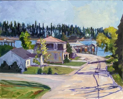
Main Street, Owl’s Head, 16X20, oil on archival canvasboard.

I’ve fussed and worried about migrating this blog to my website for close to a year now. Blogger has discontinued its subscription widget, which makes maintaining readership almost impossible. I started on WordPress, moved over here in 2007, went to the Bangor Daily News for a few years and then came back. With those moves, I just wrote off my prior content and moved on. But this blog has become too deep to do that. It’s essentially, the repository of every Great Thought I’ve ever had about painting.

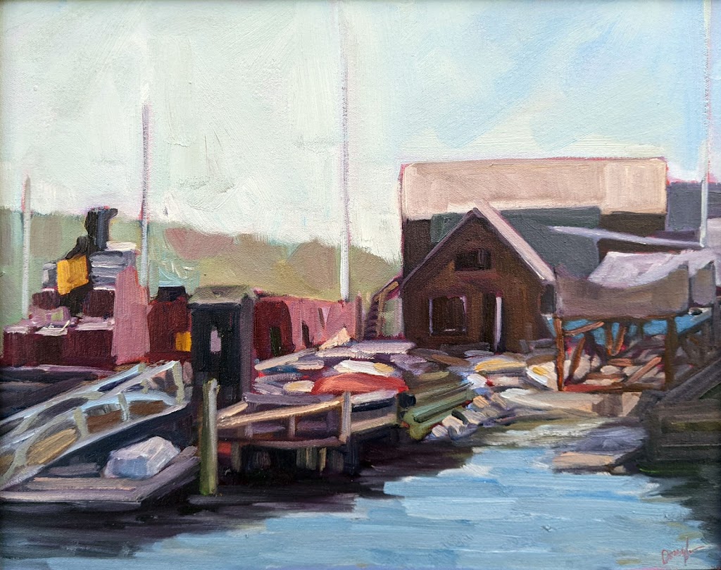
Belfast Harbor, 14X18, oil on archival canvasboard, framed, $1594.

Every few weeks I’ve spent a morning trying to work out the problem. I’ve watched YouTube tutorials, read expert advice, and gotten nowhere.

I’m not computer-illiterate. Twenty-five years ago, I was a semester short of a degree in programming when my husband suggested that I take up painting full time. “The world is full of programmers,” he said, “but it needs more artists.” I’m not sure he was right, but I can, mostly, fix my own computer problems.

Last week, I folded. I called my software developer daughter and laid out the problem. By the time we ask for help, we’re usually pretty angry with ourselves. All our self-doubts come to the fore.

“First of all,” my daughter said, “you’re not stupid. This stuff is hard.” I was terribly proud of her at that moment. Whatever intellectual gifts she has, they’re dwarfed by the fact that she’s kind.

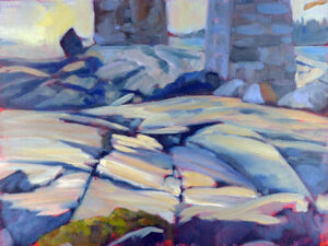
Marshall Point, 9X12, oil on archival canvasboard.

She then told me what I should have realized all along: I need to hire a professional. I contacted the woman who monetized my website for me, and she’s working on it now.

(Note that all the programming in this story is being done by women. Female programmers account for just 5% of the field worldwide, so that tickles me pink.)

I have felt that same frustration in painting. After my epiphany 25 years ago, I started taking painting classes, in Rochester and at the Art Students League in New York. Some of those classes were enormously useful—with Cornelia Foss, for example—and some were less so. I’m acutely aware of the feeling of frustration when faced with a painting problem I can’t figure out.

Much of that frustration could be avoided if someone would lay out the process clearly and concisely. That’s what Foss did for me, bringing me into the 21st century in her own crusty way. It’s what I try to do for my students. Painting is a technical exercise, so it should be addressed primarily in technical terms.

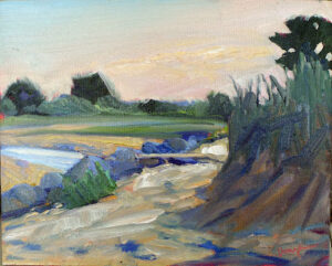
Beach Erosion, 8X10, oil on archival canvasboard.

Last week, I was being bedeviled by a watercolor question. Mick McAndrews answered it for me. He sounded eerily like my daughter—what I was trying to do was hard. Sometimes, just knowing that is important, because it takes out the background chorus of negative thoughts.

Every few months I’ll ask my pal Eric Jacobsen how he makes mauve, a color he uses to fantastic effect in landscapes. Apparently, I don’t like the answer, because I immediately forget what he tells me. That’s a different problem: simple willful ignorance.

Painting is a solitary journey, but there are times when you need the help of others. How much advice varies based on your personality and level of experience, but it’s foolish to go it alone. Sometimes, taking a class or workshop is the best investment you’ll ever make.

Are you a tortoise or a hare?

The person for whom drawing comes easily may not end up being the best draftsman.

Shoes, by Carol L. Douglas. Oil on canvasboard, available.

One of my students is a retired violinist. We were musing on the question of technique last week. “Practice doesn’t make perfect,” she said. “Perfect practice makes perfect.” An aspiring violinist can spend hours dragging a bow across strings, but if someone hasn’t told him about rosin, the resulting caterwauling will be awful.

As a hater of school and generally bad student (I never could sit still) I was probably more self-taught than I was educated. But, to be honest, there’s still very little ‘self’ in my education. My father taught me to draw and paint when I was a child. I then revised my technique at the Art Students League in New York. Whenever I come up against a technical barrier I can’t get over, I find someone who has solved that problem and I study their technique, either by taking a workshop from them or reverse-engineering one of their paintings.

Baby monkey, by Carol L. Douglas. Oil on canvasboard, available.

This past week, I promised my Zoom students the most difficult class they’d ever work through. (You can read it on my blog here.) I also assured them that, if they were patient and mastered what I was teaching, they would immediately be much better artists. That’s because most painters trip up in the drawing phase. Angles and measurements are the root of all drawing.

When people say someone is ‘talented’, they usually mean that person can draw well. But that’s not an innate skill; it’s learned, even by those of us for whom it seems almost intuitive. There will be some of us who can push our skills to become NASCAR drivers, but the majority of us can learn to draw as fluently as we can drive.

Saran wrap and stuffed toy, by Carol L. Douglas. Oil on canvasboard, available.

I’m someone for whom drawing comes easily. It’s taken me a long time to realize that can actually be an impediment to real skill. Because people like me can see spatial relationships quickly, without having to think through them, we don’t always take the time to measure. That’s great, except when our intuition fails us—and it will. The human mind is stubbornly attached to regularity. Left to its own devices, my brain will shorten long distances, generalize the shapes of trees, and otherwise cut corners. Artists who rely on their intuitive drawing skills will never understand why all their rocks look the same and their trees have no character.

Meanwhile, our tortoises struggle to draw an ellipse, and find the business of measuring difficult. Still, they persevere and practice. They draw through their daily lunch break, taking fifteen minutes a day to measure and depict the most prosaic things—a box of tissues, their keys. Suddenly—aha!—the idea of angles as a tool of measurement makes sense. They suddenly understand that the same technique they used to measure their car keys can also be used to mark off the rivulets and turns of a river valley, or a mountain range. It takes them longer to get to the stage where they can draw anything, but—unlike our intuitive draftsman—they learn to draw those things accurately.

Happy New Year, by Carol L. Douglas. Oil on canvasboard, available.

Cornelia Fossonce told me that her painting teacher made her draw a matchbox one hundred times. Today, she is able to play with paint handling and composition precisely because her drawing is so perfect.

I have to admit that I didn’t like that lesson when Cornelia handed it out, but I’ve come to appreciate it. If you want to be a better artist, sublimate your inner hare. Be a bit more of a tortoise. Take the time to learn to draw accurately, and your painting will improve immeasurably.

Black and white all over

A class exercise on design, and a chemistry question I can’t answer.
Christ and the Woman Taken in Adultery, 1565, Pieter Bruegel the Elder, image courtesy of the Courtauld Institute of Art but the painting has been stolen.

Yesterday was the kind of day that drives poets mad. Just below freezing, it rained heavily, with gusts of wind. Our plein air painting class was forced into the studio.

grisaille (pronounced griz-eye) is a painting done entirely in shades of grey or another neutral color. Historically, it was used as decorative painting in imitation of sculpture. Some are what we moderns call duotones. They have subtle colors added to extend the value range. But for our class, they would be strictly in black and white.
Abstract design by Christine Covert

Painting runs along two parallel tracks. The first is design. This is why painting teachers relentlessly push students to do thumbnails and other value sketches. Value is our most important tool. Get it right, and you can be wrong about a lot of other things.

(I came to this realization late, by the way. I studied with Cornelia Foss, who tinkers endlessly with the ‘rules’ of painting. From her I got the hairbrained idea of minimizing value as a structural concept. However, this was a misinterpretation on my part. That’s a good lesson in not asking the right questions at the opportune moment.)
Grisaille by Jennifer Johnson.
The second track is color. It’s so much more interesting in some ways that it can be a distraction to the beginning painter. Mixing paints is both difficult and exciting.
Of course, value is part of color. In color space, value is the range from black to white. All successful paintings have some kind of pre-meditated value range in them. A high-key painting is one in which the contrasts are extreme. A low-key painting is one in which the range is narrower. In either case, there must be midtones too. They are also part of the design process.
Grisaille by David Blanchard.
It’s a lot easier to experiment with value when you’re not fussing about color management at the same time. One way to familiarize yourself with this idea is to paint a ten-step scale ranging from black to white. That’s not a bad exercise, but it’s boring. Instead I asked my students to do the monochromatic still life that I assigned in Monday Morning Art School last month.
Grisaille by Chris Covert.
Before that, however, they did an abstraction in charcoal, based loosely on the drawing I included in yesterday’s blog. Charcoal is the most painterly of drawing tools, but this is something you can do in a sketchbook while watching TV. It is a bit intimidating for someone to ask you to do an abstract drawing, but if I call it “doodling,” you can relax and get on with it.
There are only two rules:
  • Have a full range of tones, not just a line drawing.
  • And no realistic objects belong in your drawing at all.

A question: One of my students has had a problem with red pigment from her toned boards bleeding into her final paintings. She prepared a sample board for me to test her M. Graham acrylics vs. a similar red from a very inexpensive craft paint. I tried the squares at 15 minute- and 30 minute-intervals. The M. Graham pigment bled into the white paint, but the craft paint did not. I then tried the same intervals using my own Golden-toned board. Again, there was no bleeding.
Acrylic is pigment suspended in acrylic polymer emulsion. It is supposed to be water-resistant when dried. That doesn’t mean it’s oil-resistant. I’m beyond my chemistry knowledge here, but if any readers can suggest what’s happening, I’d be very grateful.

A love affair that’s ended

New York City is no longer the center of the known world for me. How did that happen?
Queensboro Bridge Approach, by Carol L. Douglas

My dream job, when I was young, was to be a cabbie in New York. That had nothing to do with going fast, and everything to do with being aggressive, and in being able to squeeze myself and my car through knot-holes.

I told this to Cornelia Foss one time, as we were scooting north along Madison Avenue. She shuddered. Now I realize that’s because she was older and wiser. (I wish I could take another class from her. At 86, she continues to break new ground as a painter.)
Today I live in a state where the locals, by and large, drive the speed limit and are polite. You’ll never get anywhere here in Maine by driving aggressively. Jump the queue and there will just be another slow-moving vehicle ahead.
Under the Queensboro Bridge, by Carol L. Douglas
This was a strange concept in driving, but I learned to embrace it. Now I roll down my windows and enter that quiet state of pokiness that drives the visitors crazy.
Last time I drove to Queens to meet my pal Brad Marshall, I found myself really irritated with New York drivers. That same exuberance that once goaded me to pass on the right, to joyously sound my horn for no reason, to budge into the box at intersections—it all just annoyed me. We had somewhere to go, and Brad offered to drive. Rare for me, I happily agreed.
In my youth, I said that I would stop going to New York if the vista crossing the George Washington Bridge failed to move me. I saw it a lot in my younger days. I commuted from Rochester to take classes at the Art Students League. I had a crash pad with my friend Peter, on the Upper West Side. We would take classes all day and then I would drive home to Rochester. Rinse and repeat. If I die young, it will be with the consolation that I lived my life very fast.
Underpass, by Carol L. Douglas
I voided that test by moving east. I no longer use the GW to get into the city. Instead, I come down through Massachusetts and Connecticut. There’s no astonishment along that route.
The first sign I was growing cynical about New York came a few years ago, when I met a Southerner for a weekend. She remarked, in passing, at how filthy the city is. That’s one of those things, like your aunt’s fascinating chin hair, that everyone sees but doesn’t mention. But once she commented on it, I began to see detritus everywhere.
I used to love to paint in the city. Now I understand that was the granite calling to me. Much of New York, Washington and Chicago are built of Maine granite. Somehow, I enjoy it more in its natural state.
Staples Street, by Carol L. Douglas
This morning I’m heading back down to Westchester County for Rye’s Painters on Location. Brad’s floating around in the North Atlantic somewhere, but he loaned me his flat. I’m on my own for both painting and driving. Luckily, Painters on Location is always a blast, and I’ll see lots of other friends there.
I still admire New York City, but I’ve met other art scenes that match my personality better. I’ll visit for a blockbuster show, or to see friends. But, as for it being the center of the known world, those days are, sadly, gone for me.

Flat-packing the landscape

Painting composition is all about ruthless editing. It’s a creative process, and it’s based on seeing.

Bill’s Yellow (with Admiration), 2005, Cornelia Foss, Houston Museum of Fine Art
Sometimes I hand out little plastic viewfinders to my students. Mine are made of Plexiglas, roughly along the lines of this one. But they are for beginners, to help them start to break down the vastness of the landscape into palatable bites. I don’t encourage reliance on viewfinders, any more than I like working from photos. Art is based on seeing.  Seeing isn’t a mechanical process; it’s a learned art.
Artwork Essential’s viewfinder is based on the Rule of Thirds. When I was in school, I was taught to divide canvases using the Golden Mean. It’s imprinted in my aesthetic, so I still see it as the most graceful compositional device.  Later, I learned about Dynamic Symmetry. All of these are good working systems, and all of them are based on mathematics.
The Golden Mean is closely related to the Fibonacci Sequence.
The human mind, in receiving mode, likes to tarry on puzzles. That’s why we use these complex mathematical systems to compose our paintings. In sending and processing mode, however, the mind ruthlessly regularizes thoughts. If you’ve ever tried to paint a screen of branches as in the Klimt painting below, you know this to be true. You must fight to keep them honest. Left to its own devices, your subconscious mind will line them up like little soldiers.
We “know” compositional rules, and then we see a painting like Cornelia Foss’ Bill’s Yellow (with Admiration) and we realize that all such rules can be set on their heads. Ms. Foss isn’t ignorant of design systems; in fact she knows them so well that she can play with them. Bill’s Yellow wouldn’t have been nearly the painting had she offset the brush and tree in a conventional way. It is monumental because she centered and overlaid them.
Beech Grove I, 1902, Gustav Klimt, New Masters Gallery, Dresden.
Compositions designed with mechanical devices are ‘safer,’ but they eliminate the space needed to make creative discoveries.  I greatly admire the work of painter Mary Byrom. Having now known her personally for several years, I know she endlessly experiments with composition and form. She isn’t getting those arresting compositions by setting up with a viewfinder; she gets them by slogging through damp marshes at twilight, and endlessly tinkering.
Early Dusk, Mary Byrom
“Plein air painting is like a test you take in class,” Brad Marshall told me. “You have to use your knowledge and finish by the end of the class period. There’s no credit for incomplete answers.
“Studio paintings are like essays. You have enough time to do your research, write and rewrite until the work is good enough to turn in.”
There’s room for both in professional painting, but for learning and growth, working from life is critical. That’s why I strongly discourage working from photos in my studio classes. Photos have already done the most important job for the painter: flat-packing the scene.
Confronted with the vastness of reality, all artists must relentlessly, ruthlessly edit what they see into a working design. With photographs, that is already done. And there’s no guarantee that it has been done well.

Come paint with me in my studio in Rockport, ME or my workshop at Acadia National Park.

It’s not me, it’s the light

"Dyce Head Light," by Carol L. Douglas

“Dyce Head Light,” by Carol L. Douglas
In the past year, many people have talked to me about how my paintings have changed. This week I have a visitor from near Ithaca, NY. She’s a painter, so she’s visually observant. She talked about her impressions driving up the coast.
“While the leaves are gorgeous in New York right now, the light and clouds are different here,” she mused. “And the colors are different. We don’t get the clarity of light in New York. There is too much haze.” She went on to describe the light spilling through the clouds as the sun set, the warm golds of the reeds and marshes set against the blue-purples in the shadows and the slate gray of the clouds. It was a lovely word-sketch and it got me thinking.
"Nunda Autumn Day," by Carol L. Douglas

“Nunda Autumn Day” (pastel), was painted before I moved to Maine.
There is nothing wrong with the filtered light of the mid-Atlantic region; it’s why my skin is so flawless going into old age. But there is less contrast in the landscape. Consider the work of Cornelia Foss, with whom I studied and greatly respect as a painter. She is the person who has had the greatest influence on me in terms of thinking about color. Her landscapes are absolutely accurate for Long Island, but they would be flat here in Maine.
"Behind the schoolhouse" was painted as a storm moved in on Monhegan, but the light is still stronger than it would have been in New York (painting by Carol L. Douglas)

“Behind the schoolhouse” was painted as a storm moved in on Monhegan, but the light is still stronger than it would have been in New York (painting by Carol L. Douglas)
I’ve been vaguely aware that I’m focusing more on value in my paintings these days, but I haven’t thought much about why that is. While talking to my guest, I realized it’s just a response to the high-key light of Maine.
"Keuka Lake" is an example of a lovely milky New York sky.

“Keuka Lake” is an example of a lovely milky New York sky.
I’m not really doing anything differently; I’m painting something different. It would be a sign of failure if my Maine looked like my New York, wouldn’t it?

What painting means, indirectly

I can’t imagine why running here makes us think about aesthetics. Since I’ll never paint from a photo, you can enjoy the reflections and shadows now.
Mary and I are running on the canal bank, discussing opening and delayed adverbs and adjectives. (I think middle school teachers invented them to torture students.) She gives an example: “Gracefully, Carol runs along the canal.” (Heh.)
I stop and stare at her—any excuse for a break. “Why would anyone teach a kid to write in such an antiquated manner?”
Mary’s a writer, and she’s in love with words. “It might be useful,” she protests. “Chiaroscuro might be obsolete, but there must be times you use it.”
I shudder involuntarily. “Never. It would never work with direct painting.”
This is from Gamblin’s very fine explanation of indirect painting, which you can find here. The monochromatic phase of an indirect painting is basically a value study.
Mary knows that as long as I’m talking about painting I keep running, so she asks me the difference between direct and indirect painting, and how Rembrandt and other classical painters built up their work. Huffing only slightly, I tell her that the artist started with an imprimatura, an earth tone base, and built up successive layers of transparent warm glazes. These were allowed to show through as dark tones in the final work. Opacity was added on the top, as light tones which glowed against the darks.
In the second phase, the artist has added lights, which are also opaques.
The Impressionists essentially invented an entirely new system of painting—direct painting—where a painting is done in opaque layers rather than built up from transparency. This radical technological shift was possible because modern chemistry was developing so many new pigments.
The finished work allows the imprimatura to show through (although in this example, the artist has muddied the darks and let it show through in the midtones).
 I tell her a bit of my own story: I learned to paint indirectly and was doing it until I went to the Art Students League to study. There, Cornelia Foss told me, “If this were 1950, I’d say ‘brava,’ but it’s not.” Tough words, but the best painting advice I ever got.
“But why is that?” Mary asks. “What about direct painting made it right for the 20th century?”
I speculate: indirect painting is more conducive to well-reasoned, planned paintings of academic or religious themes; direct painting is conducive to emotion expression. This puts it in sync with the overstimulated, nervous, energetic pulse of modern life.
“It’s kind of like the difference between a home-cooked and a restaurant meal,” Mary says.
I stop and stare again. Really, at times Mary boggles my mind.
“A home-cooked meal takes a long time to prepare. It is often, literally, a love offering,” she explains. “A restaurant meal—even the best of them—is quicker, and is more an expression of what the chef can do.”
Somehow, that goes right to the heart of the matter. Until the end of the 18th century, painters were looking outward—as missionaries of faith and social justice, or as teachers of classical myth and history. We may think those subjects are dated, but they show that the artist was primarily concerned with his audience. After the rise of the Cult of Genius, the artist’s personal vision became paramount.

So I think Mary’s metaphor is apt: indirect painting was a love offering, and direct painting is all about me.
Every day I do one task to prepare for my June workshop in Rockland, ME. Today’s was cleaning the Prius. Meanwhile, what are you doing to get ready for it? August and September are sold out for my workshop at Lakewatch Manor in Rockland, ME… and the other sessions are selling fast.  Join us in June, July and October, but please hurry! Check here for more information. 

Woman as vegetable, draped in Saran-Wrap

My first successful nude in a naturalistic style, as a student in Cornelia Foss’ class. Foss intentionally arranged the model to make her insecurity apparent. I draw much better now, but I still like this painting.

I received an email yesterday asking, “What do you mean your house is full of paintings of ‘women commodified, bent, begging, enslaved, wrapped in plastic, suspended, dancing, resting, exhausted…’?”
Well, really, why the heck not?
Most studios do figure with artfully arranged spot lights, arranging the figure in some variation of an Odalisque. In some ways, this is easier on the beginning artist, but I haven’t liked it since Cornelia Fossturned me on to natural-light, naturally-posed figure when I studied with her at the Art Students League.*
After all, if the figure is supposed to tell us something about our humanity, what can we learn from woman-as-sexual object, happily twisted into an archetype of the female ideal?
 

Odalisque by Jules Joseph Lefebvre,1874. This same pose is being duplicated in studios across America even as we speak.

The Odalisque is also a portrait of commodification, but its primary purpose is titillation. Consider this portrait of Marie-Louise O’Murphy de Boisfaily by Francois Boucher:

Louise O’Murphy by Francois Boucher, c. 1752

If the model looks absurdly young, that’s because she was 15. By that age, she’d been passed around between Casanova and King Louis XV of France for two years. She went on to a long and illustrious career as a courtesan and wife, but, really, who wants to glorify that career path?
*Two other objections: artificial light narrows the chromatic range of human skin. Gone are the lovely greys, blues, and greens, the subtle interplay of warm and cool on the skin. Instead, there are two colors—highlights and shadows. Every subtlety is blown away by that demanding light. Furthermore, the pattern of shadows is pre-determined. You might as well paint from a photo.

There are still spots open in our mid-coast Maine plein air workshops! Check here for more information.

The Quality of Light

“Michelle in incandescent light,” 36X24, oil on canvas.
(Photo credit, Brad Van Auken)

Last week I went to a figure group which used incandescent spots and Odalisque poses. Here I never set up with either, and haven’t since I studied with Cornelia Foss. When I returned to my studio after my trip, I was wondering whether I was missing anything, so yesterday I decided to set up with a spotlight.

Students like spotlights because at the beginning painting with them seems easier. Most of the major color and value decisions are made before one ever picks up a brush. There are only two fundamental colors to worry about—the color of the light and the color of the shadow, since all of the natural, accidental, reflected tones are blown away by the color of the spot.
The problem is that one can go a certain distance quickly, but then can go no farther. I painted the above in three hours. It was impossible to find any real color range. Gone were the delicate blues and greys and olives of Michelle’s skin; she was rather like one of those Thomas Kinkade lighthousesthat are apparently on fire from within. To be honest, I cheated with the warm midtones—they didn’t even exist. As I said to Michelle, “I am painting what I want to be true, not what is actually here.”
With incandescent spots, the pattern of darks and lights is spelled out by the lighting itself, and one need not work for it. That seems easier at the beginning, but it makes new discovery next to impossible. This is especially true in all the variations of the Odalisque pose.
Make no mistake: the history of the Odalisque is erotic. The word comes from the Turkish ‘odaliq’, or chambermaid, which in the west was understood to mean a harem concubine, and to refer to the whole sensualized artistic genre in which the model lies on her side on display. (If you doubt this, just do a Google search of Odalisque and imagine the models writhing.)
The art world has historically been deeply misogynistic. Art has been made by some very competent women— Artemisia Gentileschi, Berthe Morisot, Mary Cassatt, Judith Leijster, Käthe Kollwitz, Gabriele Münter, and so many others—but art is generally made by men and purchased by men. The Odalisque is sexual objectification, but a higher-rent version of it than the porn available on the internet. Sometimes it is done brilliantly, but it’s certainly nothing I’m interested in perpetrating (and I wonder sometimes why so many women are acolytes at the feet of its proponents).
For the next three weeks we will be working on one long pose, and I have set high-school student MB the task of creating the pose, having assigned her five artists to study: Goya, Manet, Degas, Modigliani, and Freud. That will give us nine hours to paint in this pose, and that’s an opportunity not to be missed. I should note that the times are slightly changed to accommodate MB’s schedule.
Friday, December 7, 2012: 3-6 PM
Thursday, December 13, 2012: 3-6 PM
Friday, December 21, 2012: 3-6 PM