Modern nocturnes document only the contrast between bright lights and the void. There are so many other cool things that go bump in the night.
 |
|
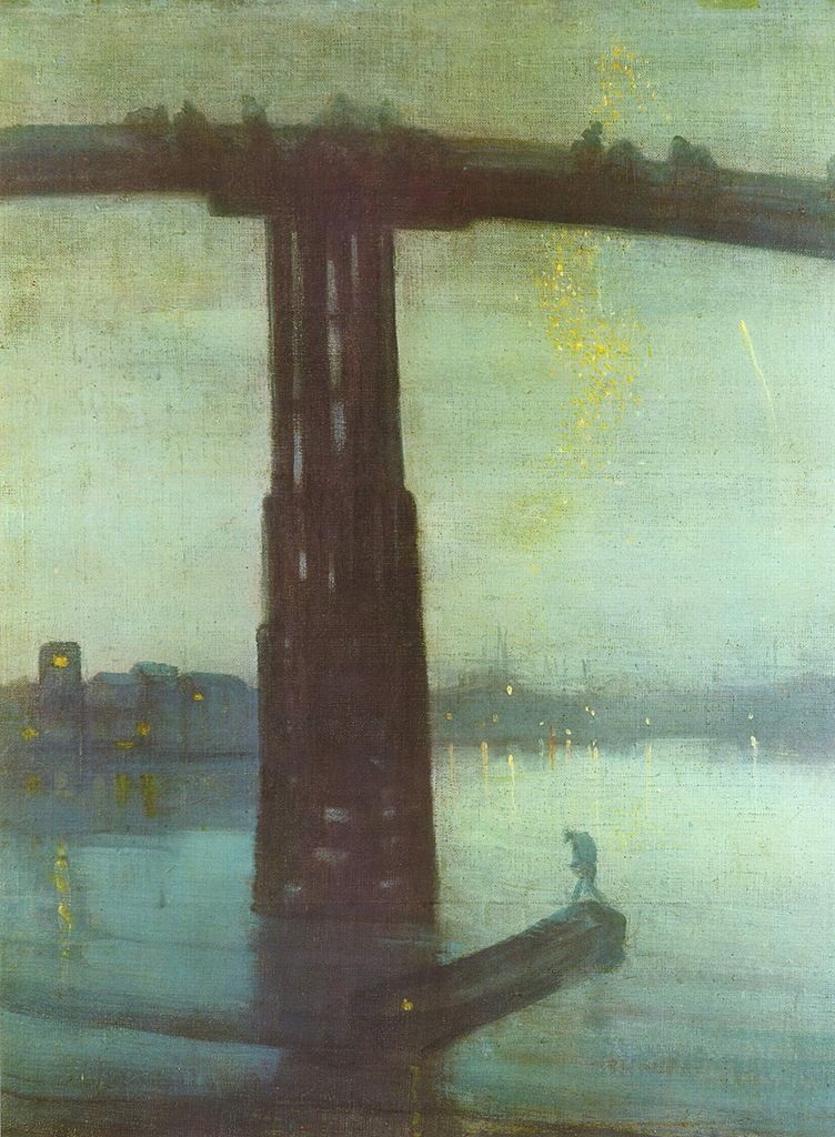
Nocturne in Blue and Gold: Old Battersea Bridge, c. 1872-1875, James Abbott McNeill Whistler
|
Yesterday, a student was describing a late-evening sky she had seen, with the objects bathed in an unusual warm light. “I’m sick of nocturnes always being done in Prussian blue fading to black,” she complained. Since she has an MA in art history and works in a gallery, she’s not talking through her hat.
“We always paint nocturnes wearing headlamps,” said another student. “The human eye takes about 25 minutes to fully adapt from bright sunlight to complete darkness, and the headlamp continuously interrupts that. Cameras lie, too, about what darkness looks like.”
 |
|
The Polish Rider, 1655, Rembrandt van Rijn
|
She had just explained the technical problem with painting nocturnes in a nutshell. They are driven by our current technology—headlamps and easel lights—just as the high contrast of Frederic Remington’s nocturnes were driven by camera technology of his day. Headlamps and easel lights exaggerate the contrast between dark and light because they’re constantly stimulating our eyes to stay in a photopic(daylight) state.
 |
|
Winter, Midnight, 1894, Childe Hassam
|
Human night vision is limited to discriminating between different values of black and white, and the resolution and contrast are poorer. But there are many steps between light and true darkness, and most nocturnes are in fact painted using mesopicvision, which we use when we’re faced with a combination of lighting.
 |
|
Moonlight, Ralph Albert Blakelock
|
When we transition from day to night, our eyes create photopigments in the cones and rods to increase sensitivity. The adaptation period is different for rod and cone cells. Cone cells can do this in about ten minutes of darkness, but rods require between 30-45 minutes. There are, of course, differences in how fast each of us can make the adaptation. Old age, as with so many other things, slows us down.
 |
|
Snow in New York, 1902, Robert Henri
|
The transition from dark to light happens much more quickly. It takes about five minutes for the eyes to bleach out the photopigments they created to see in the dark.
 |
|
The Call for Help, Frederic Remington
|
Humans are color-blind in true low-light situations. However, at twilight, when most nocturnes were painted, we suffer from something called the Purkinje shift. During the daytime, people are most sensitive to light that is greenish-yellow. At night, people are more sensitive to greenish-blue light.
 |
|
The Tornado, 1835, Thomas Cole
|
The rods in our eyes (which are more light-sensitive and thus more important in low-light situations) respond best to green-blue light. The cones in the retina, which respond to colors, don’t work well in lower-light situations. As the light gets lower, our ability to see reds falls off.
 |
|
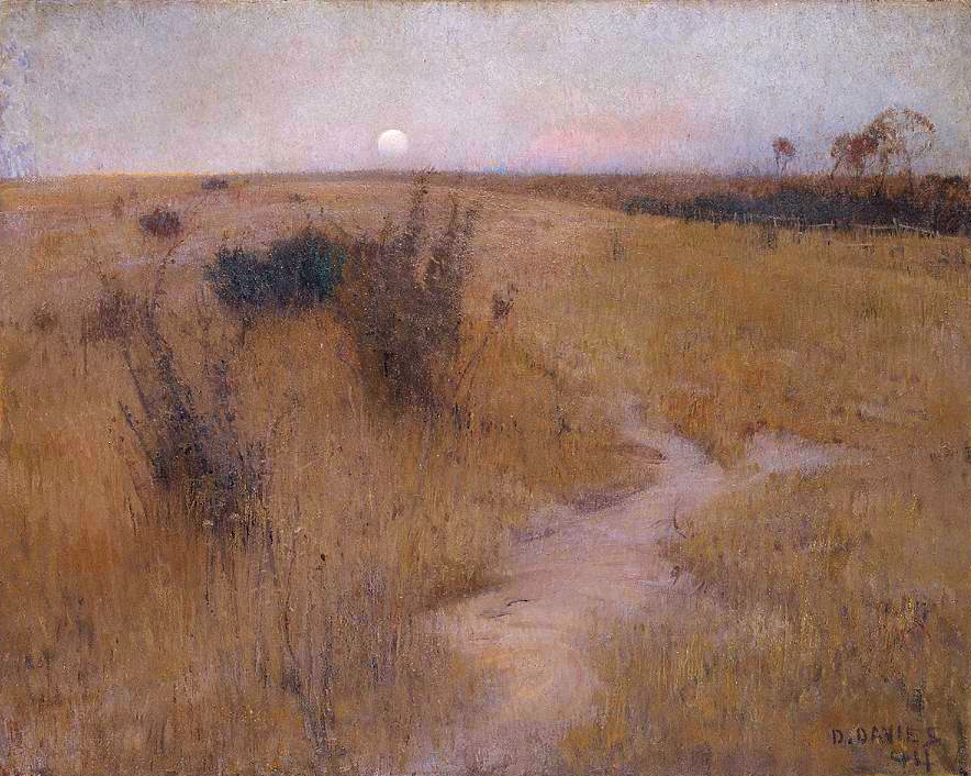
Moonrise, 1894, David Davies
|
Scientists and tinkerers have long understood that red lights don’t trigger our eyes into photopic vision. That’s why they’re used in control rooms or the nocturnal animal displays at the zoo.
 |
|
Starry Night Over the Rhône, 1888, Vincent Van Gogh
|
Historically, nocturnes were about solitude, or sometimes, bad behavior. In our jazzed, electric world, they’re more likely to focus on lighting and energy. The modern nocturne is always a description of civilization overtaking nature. It is a brightly-lit subject set against an empty field of blackness. By definition, that’s urban, and it contrasts our desires against our fears. The best modern nocturnes create a place to go to escape encroaching darkness. I’d say there’s more to that than just how our eyes work, but our vision certainly plays a part.
Nocturnes are very popular right now, both with painters and with buyers. I don’t paint them often, because I’m not a night person, but several of my friends do, and do it well.
 |
|
Hiawatha, 1870, Thomas Eakins
|
Today’s post is absurdly larded with illustrations, but I wanted to show you the many ways in which people painted nocturnes before we had headlamps.