Monday Morning Art School: drapery

Drawing drapery isn’t a dated skill; it’s as fundamental to the t-shirts and skinny jeans we wear today as it was to the gowns, kirtles, jerkins, doublets and linen chemises of the 16th century.

Drapery study, Albrecht DĂŒrer, undated.

I spent a lot of time painting the human figure at the Art Students League, but I never studied drapery, unless you count the drapes that might be behind a model or still-life. That’s typical, but unhelpful. In the real world, artists are far more likely to draw the clothed figure than the nude.

“The masters must be copied over and over again,” wrote Edgar Degas, “and it is only after proving yourself a good copyist that you should reasonably be permitted to draw a radish from nature.” In that spirit, I’ve illustrated this post with a series of drapery studies by the Renaissance master Albrecht DĂŒrer. I suggest you copy them not on paper, but in creating a drape—and then draw from your draped copy.

Drapery study, Albrecht DĂŒrer, 1506.

The t-shirts and skinny jeans we wear today are worlds apart from the gowns, kirtles, jerkins, doublets and linen chemises of the 16th century. Modern clothing is more formless and forgiving than ever. But the principles, regardless of the fabric, remain the same.

Wherever fabric is held down or comes into contact with the underlying support, it creates a pivot point. That point is a hub from which folds radiate. That’s easiest to see if you hold a towel in your hand and let it drape. Where you’ve pinched it is the hub from which all folds originate. If you hold the same towel in both hands and let it drape, you’ll see the collision of folds from two pivot points.

Drapery study, Albrecht DĂŒrer, undated.

In clothing, there are often several points of contact, creating several different hubs. Across the back of a shirt, our two shoulder blades strain the cloth in opposition to each other. In jeans, our knees, ankles, derrieres and hipbones are all in contact with the fabric. Even in tight jeans, there will be folds, albeit subtle. Wherever the figure presses against the fabric, it makes a hub for folds.

A person and his clothing tend to move and act as one. Not only does our clothing conform to our bodies in the moment, it carries the memories of past movement. Think of the knees of your favorite jeans. That’s one reason it feels strange to borrow another person’s clothes, and why we develop old favorites we’re loath to get rid of.
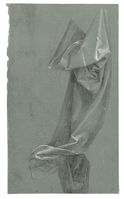
This is my favorite of Albrecht DĂŒrer’s drapery studies. Undated.

To draw folds accurately, you need to see them as having shape and volume. It’s useful to see each fold as having three surfaces: a top and two sides. The valley between folds is the base from which the folds arise. You may not always see both sides, because one might be folded back, but they’re always there.

It may be difficult to puzzle out whether you’re seeing the top or sides of a fold. The answer is really immaterial, as long as you’re drawing the fold as a three-dimensional object. Folds are infinitely variable, and sometimes the top will take the form of a sharp crease, or a side will disappear for a while. Even when that happens, bear in mind that you’re drawing a three-dimensional object. Folds are never simple lines drawn over the surface of fabric.

Like the rills on a hillside, folds have a way of transmogrifying into other shapes. They twist and turn and merge into other folds, or vanish entirely. It’s helpful to block out drapery as a whole before you start drawing. Just as if you were drawing a hillside, start by measuring the big shapes and checking angles.

In your first pass, don’t worry about subtleties of shading. Think of your this phase as a plan from which you’ll draw or paint. In other words, make it clear, concise, and accurate.

When you’ve finished, you can test the accuracy of your drawing by dropping a contour line across it. Imagine a bug crawling in a straight line from one side to another. Trace that line with your pencil. When your imaginary bug hits a fold, he’ll crawl into it and out the other side. If you get to a point where you can’t figure out where your bug should go, you’ve made a drawing error or been unclear. Go back and resolve that.
Monday Morning Art School: contre-jour

Contre-jour is a great effect for figure and landscape painting, but you can practice it in still life.

TĂȘte-Ă -tĂȘte, by Carol L. Douglas, long since gone to its new home.

Contre-jour is French for ‘against daylight’ and it simply means a back-lit subject. The viewer is looking towards the light. When the sun is low, contre-jour results in silhouetting, as with a sunset. However, when the light source is high but still behind the subject, contre-jour can create wonderful rim lighting with prismatic color effects. Contra-jour minimizes details, increases contrast, and emphasizes simple shapes. It casts shadows forward, and these shadows are often as interesting as the subject itself.

The human eye has a much better response to wide ranges in lighting than does a camera lens. Our eyes adjust constantly to shifts in lighting, and our brains interpret this data on the fly. If, say, we’re in Rosslyn Chapel attempting to spy out the Green Man in the murky light above our heads, we have no trouble also seeing the well-lighted docent who’s giving the tour. It’s only in extreme lighting shifts that the eye and brain need time to catch up.

Sunset sail, by Carol L. Douglas, available through Folly Cove Fine Art. A sunset is an extreme example of contre-jour painting.

A camera (at least to date) hasn’t got this flexibility. Photos tend to be too dark in the dark passages or too light in the light passages. That’s not just an aesthetic problem; they simply don’t record data in those places, so there’s no fixing the problem in Photoshop.

That’s why it’s important to practice contre-jour in real life, not from photos. A photograph sets the relative light levels, and you’ll have a hard time overriding what you see, even if you’ve taken multiple exposures.

La repasseuse Ă  contre-jour, 1874-1878, Edgar Degas, courtesy Wikimedia Commons

Ironically, that same inflexibility sometimes makes cameras better for recording images in silhouette, like sunsets. The camera doesn’t try to insert information that isn’t there. The most common error in painting sunsets is putting color in the foreground. That’s the brain telling the artist, “trees are green,” when all the visual evidence is to the contrary.

Contre-jour is a wonderful technique in figure painting, as it creates an aura of privacy and anonymity. I’ve included one example by Edgar Degas, but he used it repeatedly, creating a sense of dignity for his laborers, ballerinas, and bathing women. Contre-jour is also very effective in landscape painting, but if you can’t get out to paint en plein air right now, practice it with still life.

To paint contre-jour effectively, one must carefully attend to color. Take the time to check values and record them in the form of a sketch, because contra-jour lighting effects change more quickly than spotlighted scenes. That’s particularly true in the structure, shape, and density of shadows.

Belfast harbor, 14×18, Carol L. Douglas, $1275 unframed.

Value is obviously important, but so too are the subtle shifts in hue and chroma that tell you an object is in shadow. Except for extreme silhouette, backlit subjects are never uniformly dark. They catch rim light and reflected light.

Almost all scenes will include some translucent or transparent objects like flowers, glassware, and fabric. These let light through, and when placed in front of a dark background, they stand out. Your contra-jour still life can look very different in daylight than it does at night, so it might take some adjusting.

Don’t underestimate the power of shadows; they’re often the best part of a contra-jour scene. They can transform the often-neglected bottom of your canvas from predictable to riotous. For example, try shining a light through a vase of flowers and note the lovely shadows dancing across your table.

Monday Morning Art School: the silhouette

Want to paint like John Singer Sargent? Start by learning to draw like him.

Singer with a Glove, 1878, pastel, Edgar Degas, courtesy Fogg Museum

In Edgar Degas’ Singer with a Glove, above, the model’s hand has no volumetric form. There is almost no shading in that hand, merely a silhouette. Yet our minds can immediately decode the image. We understand it because of its context and the accuracy of its drafting. It’s a silhouette of a hand, and it illustrates an important point in painting. The accuracy of drawing matters.

In this painting—so remarkable in many ways—there is, in fact, a carefully-plotted harmony of silhouettes. There are the dark outlines of her cuff and bodice, the inverted triangle of her torso, and the long stripes of color in the background. In fact, very little of this painting relies on modeling; most of it is a series of shapes. Volume is secondary to that dazzling array of shapes and color.

The Valpinçon Bather, 1808, Jean-Auguste-Dominique Ingres, courtesy the Louvre

I used this painting as an example because it’s overwhelmingly obvious. However, in the context of painting, silhouette does not mean a solid shape of black. It means the major shape(s) within a painting. In Ingres’ The Valpinçon Bather, above, the body is the silhouette—solid and tangible. You could almost cut it out with scissors and paste it in a book.

To lead with silhouette, the artist must get the line as perfect as possible from the beginning. That means drawing a proper line, with all its jots and tittles. Want to paint like John Singer Sargent? Start by learning to draw like him.

W. B. Yeats, charcoal on paper, 1908, John Singer Sargent, Private collection.

The two ideas—volume and silhouette—are the fundamental elements of painting. The silhouette is simply the outer contour of the modeled shape. If you draw it perfectly, you can suggest the form with minimal modelling. But it’s through modeling that the form becomes expressive and we have a sense of reality.

In general, artists choose to emphasize either volume or silhouette, but they both exist in most paintings. You can see that co-existence quite clearly in Bruegel’s Peasant Wedding, below. It’s a positive cornucopia of dazzling shapes. Still, the faces are fully formed and evocative, and the figures have volume.

The Peasant Wedding, 1566-69, Pieter Bruegel the Elder, courtesy Kunsthistorisches Museum

It’s tempting to think of silhouette as intellectual and volume as intuitive, because in practical painting, that’s often how they progress. We work from big shapes down to little shapes (‘modeling’) and as we progress, we’re drawing more and more from our non-intellectual reserves.

This post was drawn from a long Facebook discussion between artist Tom Root and his friends. Thanks, Tom!

Monday Morning Art School: let’s talk about line

The motive line in a painting is the most powerful design tool you have at your disposal.
Lions painted in the Chauvet-Pont-d’Arc Cave, c. 30,000-28,000 BC. This is a replica; the cave is sealed from human visitation. 
If you had to isolate the fundamental element of art, across all media and forms of expression, it would be the humble line. By definition, a line is a connection between two points. In math, that’s an ideal, but in art, the line is a visceral reality. Lines can be broken or continuous, violent or serene, implied or obvious. But if you haven’t got a line, you probably don’t have much in the way of art.
Lines are also implicit, in their abstract form, in performing arts like dance and music.
In the drawing stage of a painting, I try to isolate the major line from which my compositions hang. This is the motive line, although it could also be called the kinetic line. It’s the motive force that drives the energy of the painting. It is frequently interrupted, as in the lost-and-found edge. But:
  • It is tied to the major area of focus;
  • It divides two areas of different values, creating a high-contrast edge;
  • It’s complex and carefully-drawn.

“The only stable thing is movement,” said Jean Tinguely, the sculpture who pioneered Kinetic Art. It is true in nature, and it has been true in art history since the Greeks, for whom contrapposto (counterpoise) represented a moment in motion (as I wrote earlier this month).
We think of Impressionism as a color movement, but it was also a great shift in how paintings were composed. Motion is suggested through a lack of equilibrium. Horses and people are off-balance in a way that suggests they must move to catch their balance.
Before the Race, 1882–84, Edgar Degas, oil on panel, courtesy The Walters Art Museum, Baltimore
That extends to the very balance of the paintings themselves. Consider Before the Race, by Edgar Degas, above. The strongest line in the painting is not the horizon, but the bottom edge of the horses. The complex up-and-down eddies of the horses’ legs breaks and softens as it moves to the right. The painting wouldn’t be nearly as compelling without that amazing see-saw of action.
The Artist’s Studio in an Afternoon Fog, 1894, Winslow Homer, courtesy Memorial Art Gallery, Rochester, NY
In Winslow Homer’s The Artist’s Studio in an Afternoon Fog, a line describes structure against sky. But the real motive force is created by the strong diagonal just below it, in counterpoint to the white froth of the sea. In fact, there is nothing to this painting but line. Drawing it is a good exercise in discovering the subtlety of powerful lines. Notice the subtle convergences; they are a hallmark of Homer paintings that give his work its incredible thrust.
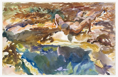
Man and Pool, Florida, 1917, John Singer Sargent, courtesy Metropolitan Museum of Art
The motive line can be subtle as well. The value structure in John Singer Sargent’s watercolor, Man and Pool, Florida is choppy, to depict a brightly-lit ground. Still, the figure makes a diagonal leading down to the spot of light and contrasting, cool water. To support this, Sargent subtly scribed the outline of the leg in blue.
Your homework—should you choose to accept it—is to find and note the motive lines in nature, architecture, photos and paintings. They may be curved, straight, rough, smooth, intersecting, broken or complete. Each time you identify the strong linear element that holds together a scene, ask yourself what it might be like without that.

Monday Morning Art School: saving a so-so painting

You like it, but there’s something just not exactly right. Or you’re not sure you like it at all.

Miss La La at the Cirque Fernando, 1879, Edgar Degas National Gallery, London. How does pattern and repetition hold this painting together?
Last week I went through a collection of paintings belonging to another artist. “Pull out the ones that I should burn,” she said. There were almost none in that category. In fact, most of them were quite lovely.
Of the ones that weren’t, most were promising starts that either fizzled or were never finished. “You can fix this very easily,” I kept saying. Of about 75 small paintings she brought, only a very few were consigned to the burn pile. Most of them needed a simple fix: a passage lightened, an edge softened, or a focal point developed. All she needed was to have those pointed out.
The next day, my student Dave went through my slush pile during a break. It’s huge; it has hundreds of paintings in it. “I love this,” he kept saying. “Why don’t you like this?”
Crucifixion of St. Peter, 1600, Caravaggio, Cerasi Chapel, Church of Santa Maria del Popolo, Rome. In chiaroscuro, value creates volume. How did Caravaggio drive us back through space in this painting?
I don’t not like them, I told him; I just don’t feel like selling them. I almost never wipe out work that’s not finished or not what I’d envisioned. They go on shelves in my studio. Occasionally, I will sell these paintings for rock-bottom prices, but mostly they’re there for my edification. Occasionally, I’ll notice something I really like and pull it out and study it, both for what’s working and what isn’t working.
Everyone has problem paintings. Often, I discover a year or two later that what I thought was a problem was actually a roadmap. It was a precursor to where I was headed as a painter. In some cases, all these paintings need is varnish to bring up the color and they sing. Or, they may need revision.
Michael tramples Satan, 1636, Guido Reni, Santa Maria della Concezione church, Rome. How does line drive you through this painting?
Last week, I wrote about the five basic elements of painting design. The best way to rescue a so-so painting is to subject it to formal analysis. That doesn’t mean you have to write a dissertation about it. It means you consider your painting in terms of each of these design elements. Are you using line, shape, space, color and texture to guide the viewer through the space you’ve created? Have you emphasized important passages and subordinated others? Is there repetition, pattern and rhythm in the piece?
A painting that doesn’t work almost always fails in several of these areas. You are as qualified as anyone to analyze your paintings based on these objective standards. There’s a great advantage in learning to do this: you will never be led astray be a stupid critique again. (I once ruined a wonderful painting by following bad advice, made worse because I’d paid for it.)
Le Wagon de troisiĂšme classe (The third-class carriage), 1864, HonorĂ© Daumier, Metropolitan Museum of Art. This has nothing to do with the subject of this post; it’s just how I feel when flying.
We recently did this exercise in my Rockport painting class. In my experience, amateurs fixate on mark-making to the exclusion of far more important qualities in painting. They’re so worried about their handwriting that they fail to see the bigger picture. My students walked away from this exercise with the objective knowledge that they were doing better than they thought. I think you will, too.
I would have illustrated this with some of my flubs, but I’m traveling today without access to my server. I’m off to Pecos, NM, to paint snow.

Les trois grandes dames of Impressionism

Three great women painters who navigated tricky social rules before there was modern feminism.
The Boating Party, 1893-94, Mary Cassatt, courtesy National Gallery

Today we look at the intimate mother-child paintings of Mary Cassatt and pigeonhole her as a woman artist, or, worse, ‘sentimental’. She would have disliked either description. She thought of herself as a New Woman, and her paintings were depictions of that ideal. Although she never married or had children, she viewed motherhood as a high calling.


Cassatt was riding a wave of feminism that swept America during the 1840s, when universities began opening their doors to women and all-women schools, most notably the Seven Sisterscolleges, were formed.
Reading Le Figaro, 1878, Mary Cassatt, private collection. The model is the artist’s mother, an educated and well-read woman who had a profound influence on the artist.
The New Woman was popularized by the heroines of Henry James. She controlled her own life, purse and thoughts. Mary Cassatt was not stridently political in the 20th century sense, but she depicted women and their work in a whole new way. There would be none of the bathtub voyeurism painted by her close friend and sometimes-collaborator, Edgar Degas. In short, she was a feminist and most of her fellow Impressionists were not.
Cassatt was described by critic and art historian Gustave Geffroy  as one of “les trois grandes dames” of Impressionism. The other two were Marie Bracquemond and Berthe Morisot. Each chose to negotiate the difficult territory of career and family in different ways.
Under the Lamp, 1877, Marie Bracquemond, courtesy Galleries Maurice Sternberg, Chicago
Marie Bracquemond was the daughter of an unhappy, arranged marriage. Her sea-captain father died shortly after her birth, and her widowed mother and stepfather were ramblers, giving her an unsettled childhood. Yet she was a prodigy. As a teenager, she began studying in a local atelier. A painting of hers was accepted into the Salon when she was just 17. She studied for a time under Jean-Auguste-Dominique Ingres, who didn’t think much of women painters.
At 29, she married fellow artist FĂ©lix Bracquemond. They’d had a passionate two-year affair, but Marie should have listened to her mother, who hated the fellow.
According to their son, FĂ©lix was resentful and critical of his wife’s painting, particularly when she began to explore Impressionism. By 1890, she was so discouraged that she gave up professional painting altogether. Despite her fragile health, she lived to 76, only outlasting her husband by two years.
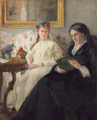
The Mother and Sister of the Artist, 1869-70, Berthe Morisot, courtesy National Gallery
Just as Cassatt had a deep friendship with Degas, Berthe Morisot was an intimate of painter Édouard Manet; in fact, she married his brother. EugĂšne Manet could not have been more different from FĂ©lix Bracquemond. Also a painter, EugĂšne never achieved much of a reputation, instead devoting himself to promoting his wife’s career.
Berthe Morisot was the granddaughter of Jean-HonorĂ© Fragonard and was born into an affluent bourgeois family. Because she was very self-critical, it is difficult to trace her development and training with any certainty. She met Édouard Manet, in 1868, and married EugĂšne in 1874.
She first showed with her fellow Impressionists in 1874. Le Figaro critic Albert Wolff wrote that the Impressionists consisted of “five or six lunatics — among them a woman — a group of unfortunate creatures.” Morisot, he added, had a “feminine grace [that] is maintained amid the outpourings of a delirious mind.”
By the time her daughter was born in 1878, Morisot was a mature artist who was showing and selling regularly. Morisot died when Julie was just 16. She had contracted pneumonia while nursing her precious child back to health.

Am I done yet?

“Don’t overwork it” is terrible advice. Even the freshest of Impressionists reworked paintings.
Vase of Flowers, started 1882, Claude Monet

Yesterday I wrote about scientific research into color perception and how that affected painting at the end of the 20th century. Another major change of the same period had to do with what constituted a finished painting.

For earlier generations, a painting was complete when it had a slick surface with plenty of detail. The mechanics of painting were carefully hidden underneath the bling of the finish layer. Part of the ideal was that the viewer should have no idea about the sheer hard graft involved in painting. Unfinished paintings had no place in collections and were often destroyed on an artist’s death.
Late 19th century painters inserted the process of painting into the finished work. They used thick impasto, left parts of their canvas bare, and kept outlines and drawing marks visible. That made the painting a temporal record of development as much as a snapshot of a moment. These ideas continue into the modern period (perhaps in some cases to overripeness).
Edmondo and Therese Morbilli, started 1866, Edgar Degas
But were they ever that straightforward? Recently, researchers Kimberly Jones and Ann Hoenigswald analyzedEdgar Degas’ portrait of Edmondo and ThĂ©rĂšse Morbilli at the National Gallery of Art in Washington. They were trying to determine what “finished” meant to Degas.
Degas was a compulsive tweaker of his paintings, sometimes repainting them even after they’d been shown and sold. Many of his paintings appear to be unfinished, but are they? Jones and Hoenigswald discovered that this Morbilli portrait (he painted the couple more than once) was extensively reworked over a period of decades. Passages that appear to be open ground were, in fact, painted over sections with finished detail. The researchers’ conclusion was that, even though they could lay the order of his process bare, they could not determine his intentions.
The myth is that Impressionists recorded things quickly, easily and confidently. Claude Monet’s Vase of Flowers appears to be a finished painting, but in his correspondence, he mentioned his dissatisfaction with it. Analysis shows that he repeatedly returned to it, scraping paint off or painting over dried sections. It sat in his studio for forty years, occasionally being reworked, until he signed it in the 1920s. Did he truly think it was finished, or was he, in his eighties, just sick of working on it?
Route tournante Ă  La Roche-Guyon (A Turn in the Road at La Roche-Guyon), 1885, Paul CĂ©zanne. When part of the aesthetic is to show the bare bones of process, how can anyone but the artist say a painting is done?
Part of the shift in what constituted ‘finished’ might have been driven by economics. During the Renaissance, most work was done to commission. An artist didn’t have the luxury to continuously fiddle with his work.
But part of this is also attitude, and it’s worth thinking about in terms of our own work. Camille Picasso famously said, ‘To finish a work is to kill it.’ The modern interpretation of this is the overused injunction to “not overwork” a painting. This is a corruption of the process-baring aesthetic, and usually terrible advice. If you don’t hit your limit, you’ll never learn how to negotiate past or around it. Jones and Hoenigswald’s analysis shows us that, for Degas, it was possible to bring a painting back from the brink repeatedly.

When part of the aesthetic is process—as it is now—only the artist can definitely say that a painting is finished.

How we arrive at completion is another matter. I prefer a less-detailed surface myself. I often get there by painting over, painting out, and scraping out fussy passages, and, yes, paintings sit around my studio for a long time sometimes. It’s nice to see these techniques validated by art historians.

Oh the places you’ll go

Cheap, plentiful, environmentally-friendly, and you can create a masterpiece with it. We should all use more charcoal.
Portrait of my friend Jane in charcoal, by Carol L. Douglas.

 Art supplies tend to be expensive, especially at the rarified corners of the business. Mother Nature, however, has given us a drawing material that is plentiful, dirt cheap, and environmentally friendly. A package of 12 sticks of Winsor & Newton vine charcoal costs just ten bucks, and a tablet of newsprintis about the same. For the cost of a pizza, you can go to the far corners of self-expression.

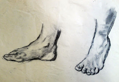
Charcoal is a great way to work out difficult drawing problems before you commit the problem to paint. Feet by Carol L. Douglas.

I use charcoal extensively in my studio: to work out new ideas, for gesture drawings, or to contemplate composition. It’s an excellent medium for experimentation. As a student yesterday remarked, “it’s not all about lines, like pencil work is.” When blended and lifted with an eraser, charcoal handles much like paint, making it the perfect preparatory medium for oil and acrylic painting. That’s why I start every new class with charcoal drawing exercises. It’s far better to learn the fundamentals of drawing and composition with something that’s not precious.

This was a preparatory sketch for a painting. By Carol L. Douglas.

I particularly like to have watercolor students do value exercises with charcoal. Value separation is a major challenge in watercolor. It helps to do it up front.

Charcoal is the cheapest medium in which one can create a masterpiece with staying power. For example, there are many works on paper by Edgar Degas done in charcoal and white pastel. He and other great masters used charcoal extensively.
Charcoal allows us to work out compositional questions. By Carol L. Douglas.
Choose a paper with a dull finish so that the charcoal can bite into the surface. Charcoal doesn’t stick well to hot-pressed, smooth papers like Bristol. It’s best on a fine-toothed, dull paper, but a rough tooth is also appropriate at times, although it raises more dust. My solution is to buy Canson’s Mi-Tientes, which has a different surface on either side, but there are many fine papers for charcoal work, including Canson Ingres, Strathmore 500 Series and Fabriano Tiziano. You shouldn’t need to use fixative to get the charcoal to adhere; if you do, try a different paper.
Compressed charcoal is powdered charcoal bound with gum or wax. It’s harder than vine or willow charcoal, meaning it can be sharpened to do very fine work. However, it’s not appropriate for using under paintings, because the binding can bleed. It doesn’t blend or erase as well. I never use it.
Seated figure, by Carol L. Douglas
Willow and vine charcoals are made of burnt grape vines or willow branches. They have no added binders, making them easier to erase. This charcoal can be used to sketch on canvas before painting in oils or acrylics; it will just vanish into the bottom layers of your work. It’s very light and makes soft, powdery lines.
“It takes a steady, careful, and patient hand to use charcoal,” an online student remarked yesterday. Only sometimes! Charcoal is an infinitely varied medium, in which one can make smooth graduations of value as well as slashing, dark strokes.

Changing visions

At the Milliner’s Shop, Edgar Degas, between 1905 and 1910.
Stanford opthamologist Michael Marmor has written two books on eye disease and famous artists. He focuses on Edgar Degas and Claude Monet and raises the question of whether their declining eyesight materially changed their painting.
Degas suffered retinal disease as he aged and Monet had cataracts. (While cataracts are easily repaired in the 21st century, retinal disease is a trickier process.)
Woman with Loose Red Hair, Edgar Degas, undated
Marmor used Photoshop to blur and reduce saturation in some of the artists’ later work to give some sense of what they might have seen.
“These simulations may lead one to question whether the artists intended these late works to look exactly as they do,” said Marmor, who concluded that “these artists weren’t painting in this manner totally for artistic reasons.”
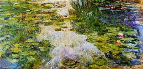
Water Lilies, Claude Monet, painted between 1917-19, when his cataract process was well underway.
No artists achieve exactlywhat their mind’s eye lays out for them. The difference between intention and execution is the artifact the world understands as “style.” And no artist paints as he or she does totally for artistic reasons. The Impressionists, in particular, were painting in a period of rapid technological change. New pigments, the invention of the paint tube (leading to plein air painting), gaslight, chemical dyes which literally changed the way the world looked, industrial air pollution and a host of other innovations affected their painting.
“Contemporaries of both have noted that their late works were strangely coarse or garish and seemed out of character to the finer works that these artists had produced over the years,” Marmor wrote.
The Rose Walk, Giverny, Claude Monet, painted from 1920–22, when his cataracts were overripe.
Of course many artists throw over the traces in their old age. It’s the “I don’t give a #$%” phase, where all the aspirations and conventions which have guided one’s work over decades suddenly become tiresome and one just sublimates oneself in the paint. May I live long enough to experience it myself.

Let me know if you’re interested in painting with me on the Schoodic Peninsula in beautiful Acadia National Park in 2015 or Rochester at any time. Click here for more information on my Maine workshops! Download a brochure here.