The power of the Great White North

In the solitary splendor of Canada, these painters found energy, possibility, and a national identity.
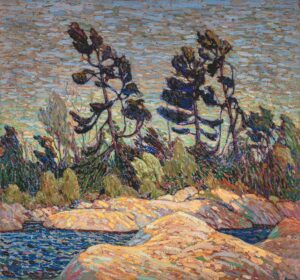
Byng Inlet, Georgian Bay, 1914–1915, Tom Thomson, courtesy McMichael Collection

Here in Maine, we import our weather from Canada. In fact, we share a lot with our Canadian neighbors, including black spruces, granite, and the spodosol soils that are good for growing potatoes, blueberries, evergreens, and not much else.

Maine has a contemporary painting style that’s driven by this sense of place. It’s curiously unrelated to our most famous summer painter, Andrew Wyeth. Instead, it derives from an earlier generation of painters, including Rockwell Kent and Edward Hopper.  Maine is just too sunny and wild to sustain Wyeth’s quiet melancholy.
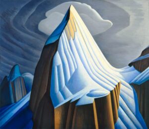
Mt. Lefroy, 1930, Lawren S. Harris, courtesy McMichael Collection

This combination of influences and landscape gives us some curious parallels to our Canadian neighbors, the Group of Sevenpainters. This group consisted of Franklin CarmichaelLawren Harris, AY Jackson, Frank Johnston, Arthur Lismer, JEH MacDonald, and Frederick Varley. Later, AJ Casson, Edwin Holgate and LeMoine FitzGerald joined them.
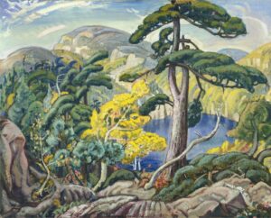
Bright Land, 1938, Arthur Lismer, courtesy McMichael Collection

Although he died before the official formation of the group, Tom Thomson was a profound influence on them. Emily Carrwas never an official member as she lived in Vancouver, but she was influenced by them. Lawren Harris, in particular, was a support. “You are one of us,” he told her.
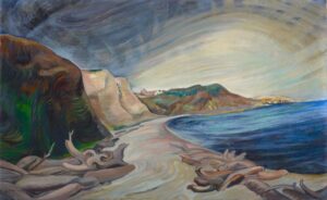
Shoreline, 1936, Emily Carr, courtesy McMichael Collection

Harris was one of the driving forces behind the Group of Seven, and the most able to articulate their mission. He was a very malleable painter. He went from impressionism to art nouveau realism to complete abstraction in a matter of two decades. His break with realism occurred in the early 1930s, after he visited and painted in the Arctic.

Harris believed in the arctic as a living force: “We are on the fringe of the great North and its living whiteness, its loneliness and replenishment, its resignations and release, tis call and answer, its cleansing rhythms. It seems that the top of the continent is a source of spiritual flow that will ever shed clarity into the growing race of America.”
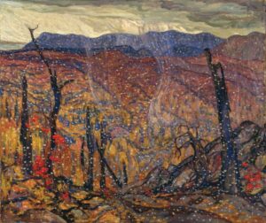
First Snow, Algoma, 1919/1920, AY Jackson, courtesy McMichael Collection

The Group of Seven painted this ethos. In the solitary splendor of Canada, they found energy, possibility, and a national identity. That’s an idea that has become politicized in recent years. Indigenous people have argued that these areas were always inhabited. The depiction of emptiness was a de facto endorsement of the pernicious policy of terra nullius.

But for artists trained in Europe, many of whom saw duty in WWI, Canada was desolate. As AY Jackson wrote, “After painting in Europe where everything was mellowed by time and human associations, I found it a problem to paint a country in outward appearance pretty much as it had been when Champlain passed through its thousands of rock islands three hundred years before.”
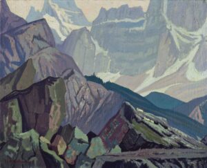
Goat Range, Rocky Mountains, 1932, JEH MacDonald, courtesy McMichael Collection

I’ve painted through every Canadian province and Yukon Territory. (Nunavut and Northwest Territories remain on my bucket list.) To my American eyes, Canada is empty, and that’s its attraction. Canada is unique in having so much wilderness, untouched, in the modern world. That Great White North, which reaches down and embraces the country in an iron grip every winter, is wilderness’ fierce protector.

Everything the Group of Seven painted derives from that unique understanding of wilderness and its value. Maine artists work from the same wellspring of inspiration, so it’s no wonder that our paintings look similar to our Canadian neighbors’.
Consistency is the hobgoblin of little minds

Yes, inconsistency is immature, but that doesn’t make it a bad thing.

Rocks and Sea, 1916-19, Edward Hopper, courtesy Whitney Museum of American Art

The other day, Bruce McMillan sent out a blog post asking readers to identify an artist. (He kindly mailed me the images, which illustrate this post.) I’m pretty good at art history, especially 20th century American landscape painting, but I could not peg the painter. The drafting style was Wyeth-strong, the composition late Winslow Homer, the paint handling, California Impressionist, the lighting, Rockwell Kent. The overall impact wavered enough that I figured he’d slipped in a few ringers from other artists just to see if we were paying attention.

Sea and Rocky Shore, 1916-19, Edward Hopper, courtesy Whitney Museum of American Art

Instead, he had quoted that preeminent painter of gritty American realism, one every self-respecting painter should be able to identify at fifty paces—Edward Hopper. Man, did I feel foolish.

Harbor Shore, Rockland, 1926, Edward Hopper, courtesy Blanton Museum of Art

Of course, most of these paintings were done before he ‘became’ the Hopper who painted Nighthawks, but surely a painter of his caliber should have some consistency? Actually, not. Many great painters have produced work with wildly different brushwork, drafting and intention over their careers. That’s obvious with modernists like Pablo Picasso, but it’s equally true of masters from antiquity such as Caravaggio.

Sketch of Portland, ME, by Edward Hopper

“A foolish consistency is the hobgoblin of little minds, adored by little statesmen and philosophers and divines,” wrote Ralph Waldo Emerson. It’s a quote that should be printed and tacked into every art box, because striving for consistency is a trap.

Cove at Ogunquit, 1914, Edward Hopper, courtesy Whitney Museum of American Art

Critics sometimes say that inconsistency is a mark of immaturity—and it should be, because new painters are playful and experimental. That’s a good thing, and something that the rest of us should emulate. We tend to lose our inventiveness as we grow more accomplished. But the greatest painters are not afraid to move beyond what others perceive as good art.

Rocks and Cove, 1929, watercolor, Edward Hopper, courtesy Whitney Museum of American Art

A lot of treacle has been churned out on the subject of style, including by me. Of course, style is very important in art. The problem is, it’s impossible to teach or control. Style is influenced by your place in history, your aesthetics, what you study and think about, your working process, and—ultimately—your soul.

Rocks and Waves, 1916-19, Edward Hopper, courtesy Whitney Museum of American Art

Style should not be confused with mannerisms. Mannerisms are on the surface; style is internal. An example of a mannerism is palette-knife painting—you can put it on and take it off at will. But if you look at a brilliant palette-knife painter like Cynthia Rosen, you realize there’s far more to her style than the implement she’s using to apply paint. If she started painting with brushes tomorrow, that wouldn’t affect her way of seeing, her use of light, or her color sense.

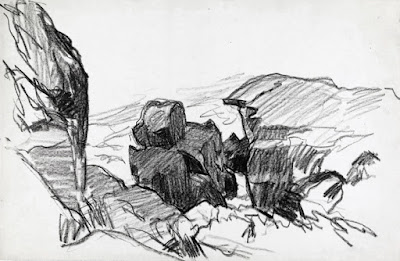
Sketch of Pulpit Rock, Monhegan, by Edward Hopper

Conscious attempts to develop a style inevitably result in limitation. The artist puts himself into a box from which he cannot escape. The tragic career of the late Thomas Kinkade is an extreme example. The man was not without talent; who knows what he might have painted had he not locked himself into the ghastly pastorals that made his fortune? He died rich but miserable, at age 54 of acute alcohol poisoning, exacerbated by Valium.

Why should my students have all the fun?

What to do when you don’t know what to do.
Underpainting. The schooner is just a placeholder. I vowed to not paint nonsense from my head anymore. That lasted about ten minutes.  
This week, my painting class worked on skies. Not the one outside, which was crabby, but the ones in their imaginations. It was a small class, which sometimes allows time for my mind to wander.
I idly swooped some bright orange lines across a large, dull canvas I’ve been noodling to death. “That helps!” Jennifer Johnson said. The lines were ridiculous, but they pointed to a solution to my problem: the night has no color.
If you look at Winslow Homer’s Sleigh Ride or Edward Hopper’s Room for Tourists, you’ll see that they get around that problem by simply lying about what can be seen in the dark. I admire that, but I haven’t figured out yet how to do it convincingly. This canvas is the battleground on which I fight with myself over it.
Dawn sail out of Camden, so unfinished and a terrible photograph.
When class ended, I left the orange lines, intending to come back later. Before I knew it, it was bedtime.
One of our kids is studying fundraising. “The antidote to fear is a plan,” she said. “One of the biggest challenges in life is deciding what to do when you don’t know what to do.” I decided to mix some colors I want to see in this painting and then figure out where to add them. I had the orange-to-red already on my palette, so I mixed some reds-to-purples and let it rip.
How can I toss these colors in a nocturne?
I spent much of the day painting dreck and then scraping it out. But I think, in the end, I figured something out. The orange is still there, in all its original places, but subdued and modulated. When I get home from Scotland, this phase will be thoroughly dry. I’ll finish the water, tighten up the edges of the sails, and add the rigging. Then it will be done, for good or ill.
Canvases that never resolve are torture, but fertile ground for self-discovery. It’s taken time to understand what isn’t working chromatically, but it’s a lesson I’ll carry with me forever.
“Spare me from painting with no reference,” I muttered. But what to do with all those garish sunrise colors on my palette? Why, underpaint something new, of course. That will be dry when I get home too, and I can start to build another fantastical schooner painting. My resolution to avoid painting from my head lasted about ten minutes.
Fuel dock, by Carol L. Douglas
I was on a roll of sorts, so I picked up the plein air piece I hated last week. A few brush strokes and I’d lightened the wall’s reflection in the water and added a fictitious highlight to the boat. Would it still qualify as plein airfor purposes of judging? I think so, but no matter; it’s not good enough. But it’s less horrible than I thought.
I’m not going to paint the island tanker Capt Ray O’Neillagain any time soon, I vowed. It’s the second time I’ve tried and come up short. That resolution is probably as good as the one about painting without reference.
Sleeping model, by Carol L. Douglas
All too soon, it was time for life drawing, where I focused on a portrait of our sleeping model. This is familiar territory for me, so it went just fine. Now I can head to Scotland feeling as if my finer drawing skills have been buffed up.

Nocturnes, fear and longing

Now the outsider is us, alone in the dark, excluded from whatever is going on in that beautiful spot of light.

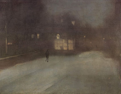
Nocturne in Grey and Gold: Chelsea Snow, 1896, James McNeill Whistler, courtesy Fogg Art Museum

Last week my husband was studying a beautiful nocturne by the Taos painter Oscar E. Berninghaus. The dim light is a soft greenish-blue, and he wondered why. Berninghaus didn’t have the advantage of ‘knowing’ what the night sky looks like through color photography. That gave him the liberty to paint what he felt and saw.

The human eye can’t make the adjustment between gloom and brilliance very fast. Because of this, modern photography and lighting have changed how we paint nocturnes, as I wrote here. The change is technological but it also reflects our changing worldview. Nocturnes are about fear and longing as much as they are about design.
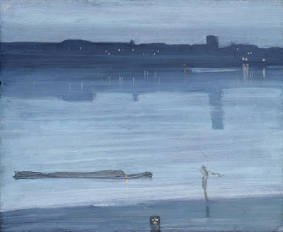
Nocturne: Blue and Silver: Chelsea, 1871, James McNeill Whistler, courtesy Tate Museum
Night-painting evolved into its own discipline in the 19thcentury, about the same time as the first gas lights were invented. This corresponds to the Industrial Revolution and urbanization in Europe and America. Suddenly, people were out of their beds and working and playing until all hours.
James McNeill Whistler, more than anyone else, made the nocturne an important subject for painting. His nocturnes are reticent, diffuse and spare. They resolutely refuse to tell any stories. “I care nothing for the past, present, or future of the black figure, placed there because the black was wanted at that spot,” he said of Nocturne in Grey and Gold: Chelsea Snow.
Whistler is credited for ushering in modern art with these nocturnes. “By using the word ‘nocturne’ I wished to indicate an artistic interest alone, divesting the picture of any outside anecdotal interest which might have been otherwise attached to it. A nocturne is an arrangement of line, form and colour first,” he wrote.
Apache Scouts Listening, 1908, Frederic Remington, courtesy National Gallery of Art
His peer in nocturne painting was Frederic Remington. He didn’t particularly like Whistler’s arty-farty attitude to painting, or his nocturnes. “Whistler’s talk was light as air and the bottom of a cook stove was like his painting,” he wrote in his diary. Remington, trained as an illustrator, was primarily a storyteller.
He painted his nocturnes late in his short life, as he tried to find a transitional path between illustration and fine painting. The dark, wavering light of night provided a relief from excessive observation. “Cut down and out—do your hardest work outside the picture and let your audience take away something to think about—to imagine,” he wrote in 1903.
The End of the Day, c.1904, Frederic Remington, courtesy Frederic Remington Art Museum
What was ‘outside the picture’ was often the most important element. Consider Apache Scouts Listening (1908). There’s a fantastic diagonal composition that draws us to the wavering black tree line in the distance. Shadows are cast by unseen trees in the foreground. The crouching scouts listen to some sound we can’t hear, as does the trooper. Even the horses are on edge.
Whistler and Remington had even less photographic color reference than did Berninghaus. That’s why their night skies are so fascinating—they could be any color or texture. The contrast is low, and the unlit night sky is brighter and more varied than we see today.
Rooms for Tourists, 1945, Edward Hopper, courtesy Yale University
Set their nocturnes against those of later artists like Edward Hopper or contemporary painter Linden Frederick. Their skies are inky blue or black, thrown into utter darkness by the ever-present electric lights.
Likewise, the narrative has been completely set on its head. Now, what’s ‘outside the picture’ is us. We’re alone in the dark, excluded from whatever human activity is going on inside.

In praise of lighthouses

Lighthouses are neither kitschy nor camp; they’re hardworking symbols of our maritime history.
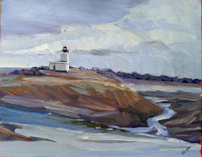
Lonely Lighthouse (Parrsboro, NS), Carol L. Douglas
This morning I am painting at Fort Williams State Park as part of Cape Elizabeth Land Trust’s 11th Annual Paint for Preservation. (Our locations are assigned; you can see a maphere.) This is the location of one of Maine’s most famous lighthouses, the beautiful Portland Head Light. It was first lit in 1791.
But I’ll be looking in the other direction. The Portland Head Light is unchanged from when Edward Hopper painted it in 1927. However, it would be difficult to set up in his vantage point now, since the park road runs over it. The lighthouse has been painted many, many times, and photographed even more often. I’d be hard-pressed to find anything new to say about it.
Not a cloud in the sky (Owl’s Head Keeper’s House), Carol L. Douglas
Maine’s lighthouses have been painted so often, they have become in some ways a painting clichĂŠ. This is why critics sometimes sneer at lighthouse (along with lobster-boat) paintings. More fools they.
Our coastal history is both authentic and humble. There is evidence that people were building boats in Crete 130,000 years ago. Long before there were settled ports, people lit bonfires to guide mariners home. It didn’t take long before these were raised onto platforms. From there, the fixed tower was adopted.
Dyce Head in the early morning light, Carol L. Douglas
By the time Alexander the Greatcame along, lighthouses were an established navigational aid. Ptolemy II Philadelphus built the Pharos of Alexandriasometime around the third century BC. It was the biggest and most famous lighthouse in antiquity. It lasted through seventeen centuries and several major earthquakes. In 1480, Sultan Al-Ashraf Sayf ad-Din Qa’it Bay tore down the remains and used the rubble to build a fort on the site. The Pharos was about 350 feet tall, whereas the Portland Head Light is 101 feet.
The oldest lighthouse still standing is the Tower of Herculesin Galicia, Spain. At 187 feet, it too stands taller than the Portland Head Light. Its exact date of construction is unknown, but it was known to be standing by the 2nd century AD, either built or rebuilt under the Emperor Trajan.
Owl’s Head Light, Carol L. Douglas
Like so much ancient technology, lighthouse construction went into hiatus with the fall of the Roman empire. The modern lighthouse era began in the eighteenth century with the development of international sea trading. The more boats there were on the water, the more horrific losses were suffered from shipwreck.
Advances in structural engineering made it possible to put lighthouses on surf-scoured rocks and even underwater ledges. The Bell Rock Lighthouse, balancing on a reef off the coast of Scotland, was built with such precision that its masonry hasn’t been replaced since it was completed in 1810. It was painted beautifully by J.M.W Turner in 1819.
Cape Spear Road, Carol L. Douglas. That’s not one, but two, lighthouses.
The lighthouse keepers are long gone; their work has moved from oil lamps to remote operation by the Coast Guard. But they continue to serve a vital purpose on the seas.
Lighthouses come in a variety of shapes, from squat little caisson lights which look like sparkplugs, to tall, tapered towers, to the boxy little midcentury lighthouses of Nova Scotia. They’re often on remote, austere headlands, surrounded by pounding surf, lonely spruces, and great tumbles of rock.
How can anyone resist painting them?

$2 billion in art distributed for free

The Corcoran’s demise is a sad reminder that many cultural institutions in America skitter on the brink of insolvency.

Simplon Pass, 1911, John Singer Sargent, has gone to the National Gallery.

In 2014, the board of trustees for the Corcoran Gallery of Art in Washington, DC, announced that they were closing that venerable institution and offering its assets—for free—to other agencies to manage. That meant its school, its Beaux Arts building, and its collection would all be given away. The assets were staggering, somewhere around $2 billion, and somehow the money machine would be kept out of the process.
This week the deal became final, with the Corcoran board announcingthe dispensation of the final 11,000 artworks. (The National Gallery had first dibs and took about 40% of the collection.) The art school, the building, and about 800 works go to George Washington University. Much of the rest of the collection is headed to the American University Museum, with the Smithsonian American Art Museum and other institutions rounding out the list. The art will stay in Washington, in the public view.
Niagara, 1857, by Frederic Edwin Church, has gone to the National Gallery.
The Corcoran was one of America’s oldest art museums, founded to house the private collection of a 19th century financier, William Wilson Corcoran. Doing nothing by half-measures, Corcoran hired James Renwick, designer of St. Patrick’s Cathedral in New York and the Smithsonian ‘Castle’ in Washington, to build his museum.
Corcoran made his fortune on war bonds and retired to a life of philanthropy by 1854. His good works were legion. They included the land and chapel for Oak Hill Cemetery, a benevolent fund for the poor of Georgetown, innumerable gifts to universities, and securing Mount Vernonfor the nation. He was also a southern sympathizer who left for Paris at the outbreak of war.
Forty-two Kids, 1907, George Bellows, has gone to the National Gallery.
Corcoran was also an early patron of American art. He counted painters Albert Bierstadt, Frederic Edwin Church, Thomas Doughty, and George Innessamong his friends. The Corcoran was established in 1869. Its School of Art was founded in 1878.
Fast forward a century and Corcoran’s vision was showing signs of financial strain. “When news broke that Board was considering selling the building, it felt like every conversation I had placed the beginning of the Museum’s decline to an earlier and earlier point,” wrote Blair Murphy. “One D.C. artist I spoke with argued that the Museum had never recovered from declining to purchase the collection of the shuttered Washington Gallery of Modern Art. That was in 1968.”
Ground swell, 1939, Edward Hopper, has gone to the National Gallery.
In 1989, the gallery agreed to host Robert Mapplethorpe’s The Perfect Moment. Worse, it cancelled the show when trustees and supporters voiced opposition. A change in leadership staved off bankruptcy temporarily. But history conspired against the institution. Rerouted traffic after 9/11 made it harder to get to. In 2005, the museum was unable to raise funds for a highly-touted addition by Frank Gehry. The financial crisis of 2008 hit cultural institutions hard. Giving to the Corcoran fell off sharply.
The Last of the Buffalo, 1888, Albert Bierstadt, has gone to the National Gallery.
Washington is a city of free, government-subsidized museums. The Corcoran was neither. By the end, in 2014, the admission fee was $10. Why pay that when there are so many other options that cost nothing?
The Corcoran’s demise is a sad reminder that many cultural institutions in America skitter on the brink of insolvency. What do we do about that?

The self-righteous art critic, he’s everywhere

Did Wyeth appropriate Christina Olson’s suffering for money? Only a really young person would ask such a question.

Christina’s World, 1948, Andrew Wyeth, courtesy Museum of Modern Art.

On his centenary year, I suppose I should join the throng and comment on Andrew Wyeth. There is little new to say. An indubitably great painter, he had the courage to embrace realism at a time when it was devalued. His body of work speaks for itself.

Then I read essays like this and think some rebuttal is necessary. Zachary Small is too young and too self-righteous by half. He understands neither the artist’s relationship to the model nor mid-century American culture.
Christina’s Worldis an abstract painting masquerading as a narrative. It could have as easily been titled Three Objects on a Yellow Field.At 31, the artist was not yet famous, but he was subject to great expectations. He had been tutored at home by his world-famous father, NC Wyeth. They rubbed elbows with other luminaries of their day.
His training and instincts pointed him to realism. Nevertheless, the art world was in open rebellion against representational painting.
Trodden Weed, 1951, Andrew Wyeth, courtesy here. Three years later, it addressed the same formal questions as Christina’s World, but is a much more self-revelatory painting.
Most of us would have melted in that kind of crucible. Wyeth, instead, created this enigmatic masterpiece. This is, of course, magical realism, not realism, a direct riff on his dad’s storytelling. Not only did he beautify Christina Olson, he radically redrew the Olson House.
In modern parlance, Zachary Small objects to Wyeth’s ‘appropriation’ of Christina’s story of courage and disability. On Wyeth’s behalf, I claim a sort of fair-use exemption. That’s what artists have always done—taken particular pathos and raised it to be a universal statement.
In 1948, the United States was on the front edge of the biggest outbreak of poliomyelitis in its history. In 1952 alone, nearly 60,000 kids were infected with the virus. Thousands were paralyzed; more than 3000 died. Wealth was no insulator. There was no vaccine and no cure. Kids went into iron lungs and parents prayed.
Historians now believe that Christine Olson didn’t have polio, but rather Charcot–Marie–Tooth disease. That’s irrelevant. It wasn’t Wyeth’s understanding, and it wasn’t the American understanding in 1948. Wyeth was painting the polio epidemic.
I like to take students to the Farnsworth Museum to see whatever Wyeth sketches and drawings they have on display. They spell out Andrew Wyeth’s meticulous method. I find him, posthumously, to be a great teacher of painting.
Lovers, 1981, Andrew Wyeth, courtesy here.
But as to his finished paintings, I’m always deeply conflicted. They’re technically perfect, but hidden, reserved, and cool. As with Edward Hopper, Andrew Wyeth painted our isolation. Surrounded by hype, activity and people, twenty-first century man still lives a solitary existence.
Hopper told this story through buildings. Wyeth told it through faces and the human form. His paintings throw up masks I can’t get past. I find that most moving, and terrifying at the same time.

How do people stay awake to paint nocturnes?

At their best, nocturnes strip away all extraneous detail, leaving us with powerful impressions and nothing more.
Nocturne in Gray and Gold, Westminster Bridge, c. 1871-1874, James Abbott McNeill Whistler. Courtesy Glasgow Museums.

I’m preparing for my workshop at Schoodic Institute, which starts on August 6. There will be a full moon on August 7. According to the Farmer’s Almanac, this is known as the “Sturgeon Moon” because Native Americans fished for these big brutes at that time. Why they wanted sturgeon in the first place is not explained. Perhaps they fed it to their enemies.

If the weather cooperates, we’ll be painting a nocturne one night that week. We haven’t had that opportunity for several years. The jack pines and thundering surf should make excellent foils for the moon over the water.
The Artist’s Studio in an Afternoon Fog, 1894, Winslow Homer, courtesy Memorial Art Gallery of Rochester
As delicious as this sounds—and I’m quite looking forward to it—it’s also the most worrisome part of the workshop for me. I’m the antithesis of a night owl. By 8:30 PM I’m yawning uncontrollably. Luckily for me the moonrise is going to be at 7:49 PM. I ought to manage a few brushstrokes before I’m fast asleep.
It’s a pity, because I love nocturnes. They’re mysterious, edgy, moody. In fact, I’m working on one right now—on the easel in my studio, where I can look at it in the full light of day.
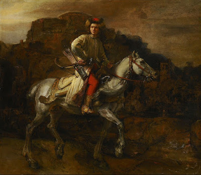
The Polish Rider, c. 1655, Rembrandt van Rijn, courtesy Frick Collection.
“Nocturne” started out as a musical term; it was introduced to painting by James Abbott McNeill Whistler. His nocturnes are reductions to value studies and focus on composition.
Whistler did not invent night painting. It’s integral to chiaroscuro, meaning that it was used by everyone from Caravaggioon. Rembrandt famously used it in The Night Watch, (1642).
Moonlight Wolf c. 1909, Frederic Remington, courtesy Addison Gallery of American Art.
Frederic Remington started his career as an illustrator, gradually moving to fine painting and sculpture. Around 1900 he started a series of paintings focusing on the color of the night. By his death in 1909, he had painted more than seventy nocturnes. They are filled with color, but they also shroud his illustrative temperament in mystery.
One of my favorite paintings of Maine, Rooms for Tourists by Edward Hopper, wasn’t painted in Maine at all. It’s 142 Bradford Street, Provincetown, MA. While it exists today, it’s awfully swank compared to its 1945 incarnation.
Rooms for Tourists, 1945, Edward Hopper. Courtesy Yale University Art Gallery. 
At the time he painted it, it was a private residence. By cloaking it in darkness, Hopper could strip away all extraneous details, leaving only a coastal boarding house.
The Artist’s Studio in an Afternoon Fog (1894) features Winslow Homer’s trademark diagonal composition, but is pared down to its essential form. We must imagine the rocks, sea, and the color of fog.
Moonrise, 1894, David Davies, courtesy National Gallery of Victoria, Melbourne
Historically, nocturnes were about solitude. In our jazzed, electric world, they’re more likely to focus on lighting and energy. Contemporary painter Anthony Watkins is particularly good at nocturnes. He painted a brace of them at Ocean Park and sold them all in a whirl. I love them; I just can’t see how he can stay up all night painting.

Midnight Ambler

Charles Burchfield wasn’t necessarily manic-depressive; he perfectly reflected his time and place.

Night of the Equinox, 1917-1955, watercolor, brush and ink, gouache, and charcoal on paper , Charles Burchfield (Smithsonian Museum). “One of the most exciting weather events of the whole year. What we called the spring equinoctial storm. It seemed as if terrific forces were abroad in the land,” wrote Burchfield.

At home I watch the passage of time through the night sky. On the road, that’s often confused. I’m in my hometown of Buffalo, NY for the holiday weekend. The sky glows all night long. My insomnia is in sympathy with the place. This is, after all, a city where last call is at 4 AM, a remnant of the days when the mills roared 24-7.

The only Buffalo artist to enter the pantheon of the greats was Charles Ephraim Burchfield, born in 1893 in Ashtabula Harbor, Ohio. Burchfield attended the Cleveland School of Art. In 1916, he received a scholarship to the National Academy of Design in New York. He quit after just one day.
Ice Glare, 1933, watercolor, charcoal, and graphite on paper, Charles Burchfield (Whitney Museum of American Art)
He came to Buffalo in 1921 to take a job with M. H. Birge & Sons. His painting influenced his wallpaper design work, and his work at Birge influenced his later paintings. The sinuous, twisting shapes of Burchfield’s electric trees are strongly reminiscent of the patterns of Art Nouveau home furnishings. “Design was my especial field in which I excelled,” he wrote.  He was particularly attracted to Art Nouveau illustrators and Japanese and Chinese painting styles. This prepared the way for his later career.
Birge enabled him to marry and have a family, but in turn created a financial trap. Eight years and five kids later, he was suffering from ulcers. Anxiety was a state that seemed to dog him whenever he was in a nine-to-five job, whether at Birge, in the Army or as an art teacher.
The Coming of Spring, 1917-1943, watercolor, Charles Burchfield (The Metropolitan Museum of Art). This is an allegorical painting but it bears a strong resemblance to nearby Shale Creek Preserve.
“I’d rather be poor and hungry than be a widow,” he recollected his wife Bertha telling him. Still, painting was a good economic choice. Burchfield successfully weathered the Great Depression as a full-time painter.
Burchfield created realistic work during this period, work that associated him with his friend Edward Hopper or with the American Regionalistmovement of the period. However, he was, more than anything else, a visionary painter.
Dandelion Seed Heads and the Moon, 1961-1965, watercolor, gouache, charcoal, and sgraffito (Burchfield Penney Art Center).
That included painting en plein air. Ice Glare (1933) was painted at the corner of Clinton and Lord Streets. Today, that intersection is now almost completely depopulated by urban flight.

Burchfield started with preparatory sketches, gridding them onto his paper for his final painting. He worked almost exclusively in dry brush in watercolor and gouache. He believed that watercolor works on paper could be as resistant to fading as oil paintings if stored and displayed properly.

Much has been interpreted about Burchfield’s mental state from his paintings. Was he manic-depressive or did he mirror the sights, sound and stimulus of the Jazz Age?
Song of the Telegraph(1917-1952, watercolor, private collection), is a sound painting of the Jazz Age.
Burchfield lived from 1925 to his death in 1967 in the tiny hamlet of Gardenville, which has been swallowed up by the suburb of West Seneca. He’s honored there with a nature center. Maybe if it ever stops raining, I’ll go walk there this weekend.
We slept under a Hudson’s Bay blanket last night. This is a great, hairy woolen thing suited for Arctic nights. That might seem odd to people in other parts of the country, but it’s still cold here. The unknown critic who once described Burchfield as “Edward Hopper on a rainy day” didn’t know Buffalo. It wasn’t that Burchfield was a depressive; it was all about where he lived.

American history through British eyes

Death on the Ridge Road, 1935 by Grant Wood. Williams College Museum of Art

Occasionally a painting gets stuck in my head. Such is the case with Death on the Ridge Road, by Grant Wood, above. Viewers in 1935 understood this painting as something painfully probable in rural driving: innocent passengers careening happily toward their imminent deaths. One could see it as a metaphor for life, since we’re all in that state of happy ignorance. We are, however, in a new era, and current conventional wisdom is that it is a metaphor for Woods’ own privately tortured sexuality.

That’s a contemporary American viewpoint, however, and it’s unlikely to hold up. Death on the Ridge Road is currently in London, in America after the Fall: Paintings in the 1930s, at the Royal Academy of Arts in London. If I find any spare change, I’m going to see it before it closes. It’s not that I can’t or haven’t seen these paintings here in their native home. I’d like to see them interpreted through British eyes.
Erosion No. 2 – Mother Earth Laid Bare, 1936, Alexandre Hogue, Philbrook Museum
The Telegraph called this show “a pungent mix of American horror stories,” but there’s more than a bit of Schadenfreude there. We Americans don’t necessarily think of urbanization, industrialization, or any of the other themes of the Great Depression as horror stories. They are the stories of our parents and grandparents, repeated down through the generations.
Nor were they the end of an idyllic past, as the title implies. We had been riven by Civil War two generations earlier; we had suffered through rocketing financial depressions before. Ours was a society that was constantly in flux.
It was, however, a “decade like no other,” as the Royal Academy describes it. The impulses in art were varied and many. Painting wandered down many different by-ways, from the regionalism of Wood to the Symbolism of Philip Evergood, the Precisionism of Charles Demuth and Charles Sheeler, the folk expressionism of William H. Johnson and the modernism of Georgia O’Keeffe. It was a ferment that we can only begin to sort out in retrospect, and it happened in literature and music along with painting.
Gas, 1940, Edward Hopper, MoMa
“He’s putting the pump back, he’s staring into the dial, he’s falling apart: who knows? The garage stands empty, its light sinister as the dusk descending over the woods, presaging a thousand movies. The rural past meets the industrial future in this vision of a lone American lost out there in the spreading vastness,” wrote the Guardian about Edward Hopper’s Gas.
I, through my American eyes, see the homely Northeast in that painting. It’s the Maine of my childhood, moving from Mom-and-Pop gas bars to whatever it is today. 
Meanwhile, in 1940, when Hopper painted it, Britain was enduring the Blitz. It seemed as if defeat at the hands of Luftwaffe was inevitable. A British public has to see the night sky in Gas as intensely personal. It’s more about them than us.