Monday Morning Art School: How to develop an oil field sketch

A fast, simple way to do a quick, finished field study.

Megunticook River, Camden, by Carol L. Douglas

 A few weeks ago I mentioned that I use Inktense pencils to mark out my paintings on canvas. This is a technique borrowed from my pal Kristin Zimmermann.

Value study in charcoal.

My first step is always a value study. Whether I do this with charcoal, greyscale markers, or pencil is immaterial—if the value structure doesn’t work, the painting won’t work. After writing my post about value studies with Inktense pencils, I realized I could just as easily use the Inktense pencils and water to do my value study on paper as well as the transfer. That removes one more extraneous item from my backpack.

Inktense pencil transfer.

Next, I draw the picture on my canvas with the watercolor pencil. This is never simply a question of transferring my rough value sketch, nor is it a finished drawing into which I paint. What I do is a carefully-measured map of the future painting. I find this particularly useful when painting architecture, where measurement matters a great deal.

Using a watercolor pencil allows me to erase to my heart’s content with water, but when I finally start painting in oil the drawing is locked into the bottom layer.
Big shapes, blocked in.
From this point, I block in the big shapes, paying attention to preserving the values of my sketch, and working (generally) from dark to light. This is especially important if you plan to take more than a few hours to do a painting, because it allows you to paint through significant changes in lighting.
I say “big shapes,” but while I focus on these, I do not obliterate all the drawing I did earlier.
I’d originally set this painting up without the framing walls on either side of the river. It was on reaching this degree of blocking that I realized that I wanted the wall on the left back in. Putting it in over wet paint (without a drawing) resulted in it being somewhat vague compared to the rest of the painting, but I don’t think that’s necessarily a bad thing.
Ironically, looking back at it five years later, I think the composition was better without the tight framing. That just points to how subjective these decisions are.
It’s about time for you to consider your summer workshop plans. Join me on the American Eagle, at Acadia National Park, at Rye Art Center, or at Genesee Valley this summer.

Utopia among the carnivorous plants

Floating sedges at the Irondequoit Inn, 20X16, oil on canvasboard.
I love boreal bogs. There’s a terrific one at Quoddy Head in Lubec and there’s Corea Heath which we’ll be visiting in August. New York’s Adirondacks are chock-full of them, including Barnum Bog at Paul Smith’s VIC.
A bog is a nutrient-poor acidic wetland dominated by sphagnum mosses, sedges, and shrubs and evergreen trees rooted in deep peat. This is in contrast to a marsh, which is dominated by grasses, rushes or reeds, and often sits at the edge of open water. Swamps are forested wetlands containing slow-moving to stagnant waters; they too are usually attached to open water.
Weather Moving In At Barnum Bog, 12X9, oil on canvasboard.
All of these have their attractions, but none is as lovely as a bog. It is a feast of color even when the rest of the landscape is uniformly green.
Bogs are built on a base of sphagnum, which is a genus of about 120 different plants commonly lumped together as peat moss. Sphagnum and sedges sometimes make floating  mats along the edges of open water; I’ve painted these mats in Piseco many times. It’s tricky to gauge their color, which runs from purple at the base to green and orange in the foliage.
The Dugs in Autumn, 11X14, oil on canvasboard.
Sundews and pitcher plants are hardy, long-lived perennial plants that have found a niche chowing down insects. They rise straight above the sphagnum with flower heads in snappy red, green and purple. Dwarf cranberry and Labrador tea shrubs form low mounds. Poking out through this mess are stunted evergreens attempting to get a foothold on the peat cushion. And usually there’s a vast semicircle of pines framing the scene, and perhaps a mountain rising in the distance. Bogs are a painter’s paradise, often ignored for flashier scenes.
Autumn Sedges, 6X8, oil on canvasboard.
Let me know if you’re interested in painting with me on the Schoodic Peninsula in beautiful Acadia National Park in 2015 or Rochester at any time. Click here for more information on my Maine workshops! Download a brochure here.

The Er-i-e was a risin’

The Gasport lift bridge, 6X8, oil on canvasboard.
People frequently ask me if I ever work from photographs. Of course, since the winters in Rochester are long and cold. However, I almost never paint things from photographs that I haven’t investigated thoroughly in the field. Photographs really don’t interest me as a painting source.
Erie Canal at Gasport, 6X8, oil on canvasboard.
Photographs, of course, lie (or they wouldn’t be an art form). They change proportions, light, and color. Working from my own sketches gives me more reliable information about the atmospheric conditions, the angles, and—most importantly—the relative weight of things.
Erie Canal Bridge, 11X14, oil on canvasboard.
I spent yesterday flipping through and organizing field sketches in advance of Friday’s un-sale, and I noticed the many preparatory sketches I made for my painting, Low Bridge (Erie Canal at Gasport).

Erie Canal bridge, 6X8, oil on canvas
I was driving back and forth to Gasport at least once a week at the time. It was easy enough to keep my kit in my car and pull it out somewhere to paint for an hour. To me, these sketches are almost more interesting than the final painting (which I like very much). Their immediacy is what plein air painting is all about.
Towpath, 6X8, oil on canvasboard
I can almost always tell you something about the day on which I painted a plein air field sketch—who I was with, what the weather did, what odd thing happened—but I can almost never tell you things like that about studio paintings. (The exception, of course, being figure sessions.)
These field sketches are included in my Black Friday un-sale (details here).
The finished painting, Low Bridge (Erie Canal at Gasport) 40X30, Carol L. Douglas

I will be teaching in Acadia National Park next August. Message me if you want information about the coming year’s classes or this workshop.

John Constable, master of plein air

Reverse of Branch Hill Pond, Hampstead, oil on canvas by John Constable, about.1821-22. Recently discovered during relining at the Victoria and Albert Museum, London.
As everyone knows, the Barbizon and Impressionist painters invented plein air painting—except, of course, that they didn’t.
An Italian trip had long been a requisite of study for the best European painters. They went to study the masters of the Italian Renaissance, but also to draw and paint the artifacts of Imperial Rome littering the Italian landscape.
Among the values acquired in these southern trips was the idea that color was as important as line. This freed painters from a strict drawing-values-color methodology, which in turn got them out of the studio and into the fresh air. By the eighteenth century, oil sketching was widespread throughout Europe. There is a long list of painters who worked outdoors long before the practice was dignified with a name.
Seascape Study with Rain Cloud, John Constable, 1827. Don’t you wish you’d painted that?
One of the finest was John Constable. Recently the Victoria & Albert Museum announced the discovery of a Constable sketch in the lining of his Branch Hill Pond: Hampstead. The latter painting was being cleaned and relined in anticipation of a blockbuster Constable show scheduled for next fall.
Given that the V&A already owned an impressive collection of Constable sketches, I’m saving my pennies to go. (These sketches are published in John Constable: Oil Sketches from the Victoria and Albert Museum.)
Hampstead Stormy Sky,1814, John Constable
Constable worked en plein air from his youth forward. His sketches are as free and fresh as those of any 21st century master, which should humble those of us for whom freshness is the only virtue in painting.
Most of his field brushwork is thin and dry, with a few points of impasto in the foliage or sky. (These spots are frequently flattened in his surviving canvases; Constable, like the rest of us, stacked his field canvases while wet.) He worked on tinted grounds ranging from brown to reddish-brown to pink. He allowed that color to show through as part of his work, and carried that technique into his studio paintings.
Weymouth Bay, with Jordan Hill, 1816, John Constable.
Constable used these sketches for color references, to record cloud formations and their patterns of light and shade, and to record the details of different species of trees. He often noted the location, the date and time, and the wind conditions on the back of his canvas. From this we know that many of these sketches were completed very quickly, often in the space of an hour.
Stonehenge, 1835, John Constable. Watercolor on paper.
At the end of his career, Constable abandoned oil sketching for watercolor, due in part to the privations of age and in part from an appreciation of watercolor’s spontaneity. Constable’s late studio paintings were criticized for “scattering his lights about in a manner that deprives it of repose, and renders it almost painful for the eye to look upon.” (Wilton) That increased reliance on white in his oils may have been related to his increased use of watercolor as a sketch medium. But it also put him squarely on-trend with what would follow, something his critics missed entirely.


Let me know if you’re interested in painting with me in Maine in 2014 or Rochester at any time. Click here for more information on my Maine workshops!

Another Roadside Attraction

Sketch of a commercial building somewhere in Binghamton, NY, done from a diner window. Sadly, I could never find it again, and they had really good pie.

Yesterday I was flipping through a used-up sketchbook, and came across this little watercolor done many years ago. It’s another roadside scene en route to New York City; however, this one wasn’t memorized across the steering wheel.
I spent several years driving back and forth to the Art Students League from Rochester. I had a little bolt-hole near the Cathedral of St. John the Divine and a Ford Windstar wagon. (Gas was cheaper then.) I drove that route through snowstorms, ice, and flooding , which in the Susquehanna River watershed is the most terrifying of driving conditions. When I was too bleary to drive, I would pull off in a rest stop and sleep in the back of my van.
One early Spring evening, the Windstar died with a colossal bang in that no-man’s-land between Binghamton, NY and Scranton, PA. The tow-truck driver set me down at a diner where I sat with my sketchbook and pondered the situation. All’s well that ends well: I got a cheap hotel room, sold the carcass to the tow-truck operator for $600, and went to New Jersey to test drive one of them new-fangled Priuses.

The trip to Maine is more interesting driving than the Rochester-Manhattan loop. If you’re interested in joining us for a fantastic time in mid-Coast Maine this summer, check here for more information. There’s still room in my workshops.

Memories of Maine…

When I was in Maine I was interviewed by a reported from the PenBay Pilot… and here is the story. I’ll be teaching workshops in this area next summer; I can’t wait to get back!

Blessings of a non-pictorial nature

Let’s get the sketch out of the way, first. No, it’s not very good, but that
is small potatoes compared to the experience of painting it.
It’s embarrassing to admit, but prior to this weekend I’d never spent any time in Corn Hill, which contains Rochester’s best-preserved collection of 19th century houses. I’ve driven through it, but to look at it, photograph it, or paint it—no, I’d never done that. So on Friday and Saturday, I spent a little time in lovely Lunsford Park.

Lunsford Park was laid out in 1837. It is surrounded by architectural gems, including a block of brick row houses, the Greek Revival home of canal engineer Col. Henry Cody, and a magnificent Second Empire rectory. There are two churches on the Circle as well: Immaculate Conception Catholic Church (1864) and the ruins of a lovely Medina sandstone gothic facade.

The sandstone stripe marks the
end of the old, start of the new.
This ruin is what everyone assumes they know about the history of the American church. A proud Richardsonian Romanesque-style Methodist Church, its membership had declined to unsustainable lows by 1969. The departing Methodists gave the building to an AME (African Methodist Episcopal) congregation. It then suffered several suspicious fires, the last (in August, 1971) being the disaster that did it in. The AME congregation followed the example of its Methodist predecessors and  withered away. They built a plain and functional sanctuary behind the surviving sandstone walls. Then they left too. Now it houses something called the End Time Deliverance Miracle Ministry, which has no internet presence and as far as I can see isn’t part of any denomination.

It seemed like there was nobody there: it appeared to be a squat barn of building (albeit very neat) with a hopeful name on a sheet of plywood above the door. A bit out of place in the lovely stillness of Lunsford Park, but it’s only a few blocks from Plymouth Avenue, and next door to it is an empty lot where a former city school stood.

I like churches and I like their buildings. I wandered around the circle for a while, looking for a subject to paint, but I kept coming back to this pile of stone. I looked at the memorial plaque to Dr. Charles Lunsford (1891-1985, Rochester’s first black physician), scuffed my feet through the falling chestnuts, took a few arty shots of the gazebo, and talked about our kids with a man sitting on a park bench, who—it turns out—is a member of End Time Deliverance.

He told me he was taking a cigarette break from handing out free clothes.  For the first time, I noticed the steady stream of people coming and going from a back door, toting full black plastic garbage bags over their shoulders. He told me he remembered the fires, and that he’d played in the old church as a kid (a rather poignant story I heard several times that afternoon).

In my more sophisticated moments, I understand that painting ruins is (in our day and age) a trope to be avoided at all costs. But there’s something about the wrecked face of this church that I love. It reminds me of my childhood church, Delaware Avenue Baptist Church. The ivy glowed green, orange and red against the violet sandstone walls, and pigeons called across the autumn afternoon. I know better, but I was seduced.

I set up on the hatchback of my Prius so I could look straight up at the tower. This is a foreshortened view and, frankly, I did a pretty poor job of drafting. But perhaps that’s because I spent almost the whole afternoon talking. As I mentioned, men were handing out clothing and coffee to the neighbors. A little boy was there with his Daddy, working on repairs. The praise band finished practicing. The sound guy finished adjusting the sound. Teen girls finished their dance practice. The ladies of the church were off somewhere else witnessing, but when they finished, several of them stopped by. (“I still gotta check on them,” one of them told me, and as a blue-haired church lady myself, I totally understand that.)

One man spent quite a long time telling me about the church’s outreach, which includes summer picnics for the neighbors. At one point the conversation moved to race and faith. “I don’t see why it matters,” a man told me. “Black, white—we’re all one church.” And then he invited me to join them on Sunday (which I would have done, except that my husband was playing in a praise band elsewhere). 

How many times have I driven around Buffalo’s East Side and lamented the death of the old churches that once proudly hosted German or Polish Catholic congregations? Under that surface decay, are they doing more of God’s work than ever? Conversely, how many of the beautifully-maintained faux-Tudor churches in the suburbs and countryside are dying from inside?

I would love to return and paint this church’s portrait, because it’s a portrait of an elemental truth: it’s not just that appearances can be deceiving—they almost certainly are deceiving. But to be honest, I don’t have a clue how I’d start to depict the beating heart inside this old ruin. Any suggestions?

Immaculate Conception isn’t unscathed either;
its steeple was hit by lightning and ruined.

Oh, my! What should I buy?

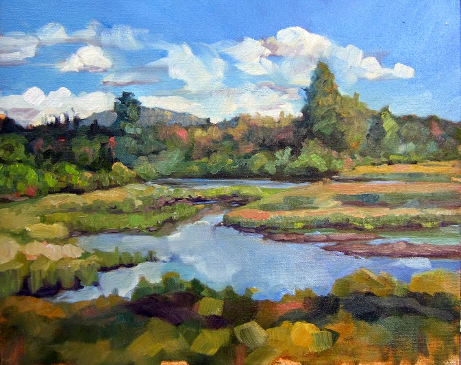
My basic palette in my pochade box. 

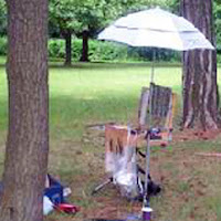
I am happy to share my plein air supply lists with both my own students and others:

·         Watercolor supply list.
·         Oil painting supply list.
·         Pastel supply list.
I have friends who are tremendously efficient plein air packers. I freely admit I’m not up to their standard, but I do paint outdoors a lot, and successfully. Consider these lists not as gospels, but as starting points.
There is no one “best” palette for plein air (or any other kind of) painting. There are so many pigments available today that the artist is faced with—literally—millions of possible combinations. The medium you’re using, your own taste in color , what you want in opacity and drying time all affect your final choices.
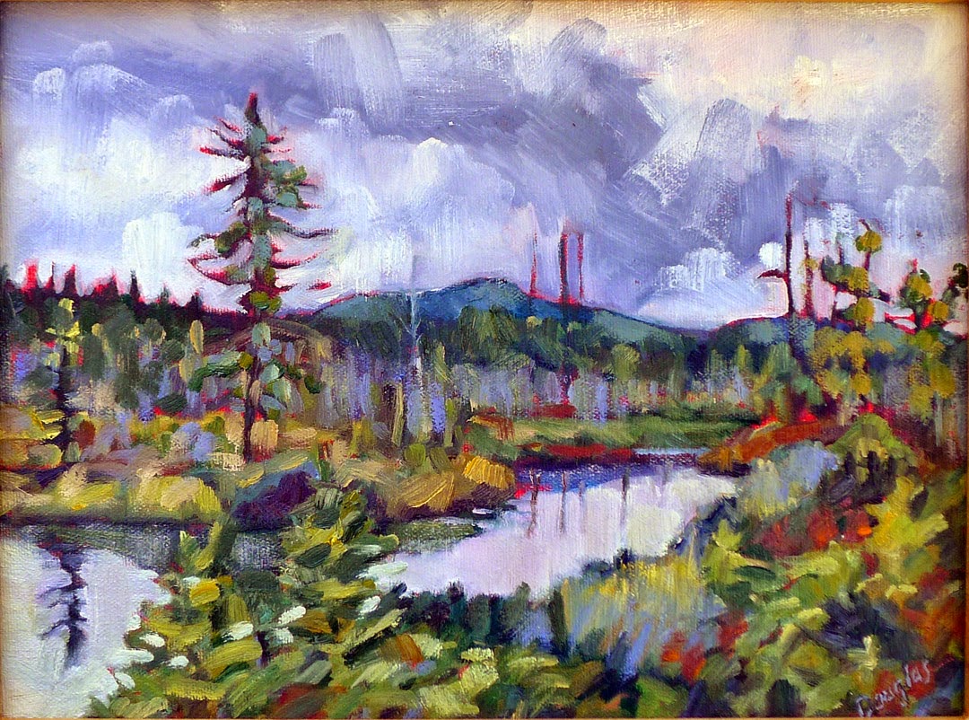
And the exact same paints being used for figure painting.
A little knowledge of pigment development is helpful in whittling down selections. The newer the pigment, the more intense and more durable it will be. A palette of earth tones might have a hard time coping with the addition of dioxazine purple or phthalo blue, whereas a vivid 20th century palette will fail to notice a delicate Renaissance lake color.
This is not to say that you should choose only an “Old-Masters” or an “Impressionist” palette—my own palette has paints from every period. But you can avoid a lot of waste by avoiding obvious mismatches.
The earths and earliest synthesized colors:

The oldest pigments are the earth pigments: the ochres, siennas, umbers and carbon blacks. These have been in use more than 15,000 years. They are as solid and everlasting as dirt. Over time artists have been tremendously wily about expanding their narrow range.
The Egyptians created the first chemical pigment, Egyptian Blue, around 5000 years ago. They also pioneered the use of minerals as pigments with malachite, azurite and cinnabar, and devised a method of fixing dyes to solids (“lake making”) which is still in use today. The Chinese created vermilion and the Romans gave us lead white.
Renaissance alchemists must have been more focused on turning lead into gold, because although they made a few refinements to paints, they left the fundamental kit unchanged.
The industrial revolution:

The Industrial Revolution brought us a pigment revolution. Just a few examples are:
Cobalt Blue – 1802
Cerulean Blue – 1805
French Ultramarine – 1828
Zinc White – 1834
Cadmium Yellow – 1846  
Aureolin – 1862
Alizarin Crimson – 1868
Without the explosion of brilliant color in the 19thcentury, there could have been no Impressionism, no modern art.
Modern pigments:

The third tier of pigments are the highest-stain, most durable of colors, developed mainly for industry: “Hansa” yellows, titanium white, synthetic iron oxides (the “Mars” colors) phthalocyanines, quinacridones, perylenes, and pyrrols. Some have replaced 19thcentury colors that have proven to be fugitive (such as quinacridone violet to make “permanent” alizarin crimson). Some have an uneasy place on the palette because of their extremely high stain, such as phthalo blue.
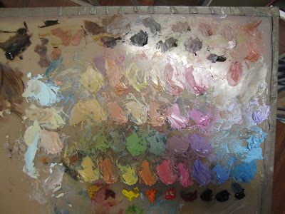
My basic field kit.
References: “Bright Earth: Art and the Invention of Color,” by Phillip Ball. It is certainly the most fun book about color ever printed.

Gamblin Artist Colors has optional palettes here. (What is true for oils is generally true for acrylics.)
The most comprehensive guide to watercolor pigments I know of is here.
And my favorite resource for pastels is here.

The nature of Nature

“Keuka Lake Vineyard,” oil on canvasboard, 9X12

This year I am teaching plein air painting in two venues. I believe that all aspiring painters should study plein air. Why?
Character: The strength of plein air painting lies in its relationship to reality, but that is also its greatest weakness. Slavish homage to what one sees is a dangerous trap, even more deadly than the same tendency in figure or still-life painting.
Our appreciation of place is not entirely visual: it also encompasses sound and smell and spatial awareness. There are certain experiences in nature—such as standing in the sand on an elliptical shoreline—that are tremendously appealing in real life, but which make for weak paintings. A literal rendering of them is worse than banal: it lies about the character of the place.
The challenge for the plein air painter is to portray the place in a way that gives a sense of the non-visual cues—the warmth of the wind, drumming of the waves, crickets in dry grass. Either the non-representational aspects of painting become more dominant, or you fail. This happens in ways that figure or still-life never force you to consider.
Composition: We know intellectually that paintings built upon a strong, simple schematic project more powerfully than those pieced together from innumerable details. Nature, however, is essentially an infinite layering of innumerable details. With landscape painting, there is no solution but to fall back on the basic tools of composition: thumbnails, value studies, and shape studies. Painting students who rely on their instructors’ model poses or still lives will never learn to compose the way a plein air student—picking and choosing from the environment’s complexities—will learn to compose.
Communication: Painting is pointless if it is devoid of any emotional or intellectual content. Despite that, it is surprisingly easy to “phone it in” at times, especially in the controlled environment of the studio. We’ve all done it. But everyone has an emotional relationship of some kind with nature, and it is impossible to avoid expressing that.
“Piseco Outlet,” oil on canvasboard, 9X12

Upcoming classes

The two venues I’m teaching in are convenient for both the local student who wants to study in Rochester and the out-of-town student who wants to take a single, intensive class:

  1. Weekly classes in the Rochester area, every Wednesday from 5:30-8:30 PM, meeting in some of the loveliest parts of Monroe County, from the pier at Charlotte to High Falls to Genesee Valley and more. The tuition is $100 a month. Email me herefor more information.
  2. “Adirondack Wild,” a plein air painting workshop at the Irondequoit Inn in Piseco from September 30 to October 5, 2012. The Adirondack preserve is the biggest, wildest park in the Lower 48, and at $775 all-inclusive (room and board) for five days and nights, this is the deal of the century. Download a brochure here.

It’s not easy being green

“Jamie’s waterfall,” 12X16, oil on canvasboard. Painted in two hours flat, and after
packing my car and driving six hours. Only possible because I was working with a color matrix.
We are at that moment when the greens of the northeast suddenly become massive, heavy, and sometimes overbearing to new painters. We love summer, we want to share how delicious it is… and then we hit the wall of green.
Sue Bailey Leo’s version
of my green matrix.
I paint with color matrices wherever possible because they speed the process up, and the more one can get out of one’s own way, the better things go. In the case of foliage, a matrix allows one to separate the different green tones in a painting.
I don’t generally paint with a green pigment on my palette (with the occasional exception of chromium oxide green because it’s the exact shade and weight of summer foliage in the northeast). Instead, I mix them:

This matrix is, top to bottom: black, ultramarine blue.
Left to right: Cad. lemon yellow (or Hansa yellow, depending on my mood), Indian yellow hue (or gamboge hue), yellow ochre.
That gives you nine yellows ranging from high-chroma to subdued, blue to almost orange. In addition, you can tweak each color to either side by adding more of one or the other component, and you can also tint each tone by adding white.
The same matrix, mixed and with the addition of a row of cad. orange in the “yellows”.
Sometimes I shake it up by adding a row of cadmium orange tints, as above.

I’ve taught with this matrix for years and can attest that it helps beginning painters escape the deadly weight of greens, fast. 
Sue Bailey Leo’s first trip out this season. Note
 how effectively she was able to separate the greens.
And here is me, painting in a creek this week. Never happier than when wet, cold, and totally into the process.
Painting in the creek in front of Jamie’s waterfall, at dusk. I loves my Keens!