Don’t knock it until you try it

Baby Jake, tiny sketch by me while he slept in my lap.

There is a meme panning ugly Renaissance babies. Every time it pops up, I’m reminded that the posters have most likely never painted a baby from life.

Most of my successful artist pals are childless. This makes perfect sense in the modern world, for fine arts is a career path that requires long hours for little remuneration, and that often requires travel or living in a child-hostile place like NYC. This means that children and motherhood are generally not subjects for serious modern painting, except in portraiture.

I’ve done two baby portraits, and both were done from photos. Babies wiggle, they have unreliable schedules, and when they’re not sleeping, they’re often hungry or upset about something inscrutable.

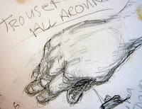
Tiny gesture drawing of baby Jake. His center of gravity is certainly his bottom, although that head weighs a lot, too.
This weekend I had my infant grandson with me. I’d hoped to paint him during my class, but there were too many students. After class, he and I sat down to rest, and he fell asleep on my lap. I was able to fish a tiny (3.5X5”) sketchbook off the coffee table with my spare hand, and do the attached sketches.

A fast sketch of Jake’s wonderful face before he twisted away again. It’s really hard to get the baby head’s proportions right.
When we do gesture drawings in class I tell my students to look for the “axis of power” in the figure—the place from which the subject’s motion is springing. Usually that’s the pelvis; less frequently, it’s the shoulders. In the case of a young infant, I believe that’s usually his rump. He is learning to control his limbs, he pushes himself up with his legs and then collapses, and when he settles down against you, you inevitably end up patting his bottom.

Tiny gesture drawing of baby Jake as he wiggled himself to sleep.
There have been very few painters who focused on children. Mary Cassatt—who was unmarried and childless—was one; Kathe Kollwitz—who had childcare so she could concentrate on her career—was another. It’s a pity that we dismiss a subject that’s of such primal importance, for all of us at one time or another have been babies or parents.
Let me know if you’re interested in painting with me in Maine in 2015 or Rochester at any time. Click here for more information on my Maine workshops! Download a brochure here.


Do as I say, not as I do

Winter coats thrown over chairs are the sketch artist’s dream.
I advocate drawing anywhere you’re required to sit quietly: the subway, doctors’ offices, and especially in church. (‘Idle hands are the devil’s workshop.’) I have stacks of sketchbooks filled with drawings of unsuspecting people, but I’ve noticed recently that my drawing is falling off both in quality and quantity.
Part of this, I’m afraid, is because I got a smart phone at the beginning of summer. It’s too easy to pick it up when I have a few idle moments. But as dissolute as I am, I would never hang out on Facebook in church.
I’ve been letting my kids choose where we sit. Their inner WASP leads them unerringly to the back row. When church is lightly attended that’s not a problem; I can still see well enough to draw. But when it’s crowded (as it usually is) all I see is the hair in front of me. Unless the wearer has spectacular cornrows, that’s of limited appeal.
Even I get tired of always drawing people from the back.

But this week I was saved by the season. It was 40° F. when we left for church and our fellow worshippers were bundled up in coats. Our church being humble, there is no narthex, so winter clothing ends up thrown over chairs. And fabric tossed willy-nilly is the sketch artist’s dream.
Message me if you want information about next year’s classes and workshops.

Paleo painting

Healthy and high in fiber: paleo painting! (By little ol’ me, of course.)

Frankly the paleo food movement seems a little arbitrary to me: vegetables and fruits are ducky; grains and legumes are not, even though all four exist both in the wild and in big agriculture. (I’d examine this more closely, but I’m afraid someone might actually attempt to explain it to me.)
My writer pal tells me that paleo cooking is huge right now, so in the interest of shameless self-promotion I’m founding a paleo painting movement. This is perhaps easier than paleo fashion (which might include anything prior to, say, 2006), or paleo cosmetics, which would require kohl (dangerous) and Spirits of Saturn (deadly).
So what would constitute paleo painting? Anything done on a cave wall would be fantastic but hard to transport, let alone duplicate on the inevitable umbrellas sold in museum gift shops. The earth pigments—ochre, sienna and umber—would be appropriate and useful, and they have the additional advantage of lightfastness. Ultramarine blue would be fine, too, as long as it was ground-up lapis lazuli and not a synthetic proximate.
Of course, we would have to dump the odorless mineral spirits (a petroleum product) and return to turpentine, which is a distillation of pine resin. And the only white we will have on our palette is lead white, since it’s been mined for thousands of years.
I decided to rehearse this today with the original paleo painting material: charcoal. It is harmless, cheap, and easy to find. However, I objected to peeling the decorative birches in my front yard to make paper, so used plain old newsprint.

I think I’m going back to modern pigments for field painting. If you’re interested in joining me for a fantastic time in mid-Coast Maine this summer, check here for more information.

Talking about polygamy with Michelle

The Servant, 36X40, oil on canvas

This week I fasted with my pals from Americans Against the Abuses of Polygamy. Our fast took the form of unrelieved beans and water, because sources inside the FLDShave said that this is what the kids of that community are living on. The children are doing religious penance for their leader’s continued stay in a Texas prison cell, courtesy of his conviction on two felony counts of child sexual assault.
Talking about Polygamy with Michelle,
oil sketch on canvas, 24X30
By Friday, I was in a mental fog that made painting difficult. So when Michelle arrived for our semiweekly work session, I was quite ready to say “Sod it; let’s just talk.” So we did, and I painted.
People often assume my objection to polygamy is religiously-based, but in fact it’s primarily a feminist position. Polygamy is antithetical to women’s rights; for that matter, it’s antithetical to human rights. There’s never been a healthy democracy that has allowed it, and the benighted societies which have practiced it have also exhibited a sad tendency to tyranny and to dispose of their surplus males by sending them off to fight endless wars.
It seems to me that, worldwide, women’s rights have achieved a sort of high-water mark and are now sliding backward. Gender-selectiveabortion means that many women never even take first breaths. Child marriage imperils their youth. And something like a third of the world’s population live in countries where polygamyis legal.
Of course, we live in a nation of apologists who insist that my attitude is some sort of cultural imperialism, but I like living in a nation where women have the same civil and economic rights as do men, and that’s the future I want for my children.
An oil sketch from 2003 on this subject. I still like it.
These are easy enough issues to write about, but how does one paint them? I’ve spent more than ten years working on a series of paintings about abuse. They’re interesting; they may even be good, but on some level I understand that they’re also finished. So it made sense to just sit and talk Friday, and wonder where we will go next.

Of sidekicks and teenagers who sleep in class

He’s fifteen… I asked him.

I had the good fortune to have lunch yesterday with two of my former sidekicks, Marilyn Feinberg and Matthew Menzies. A good sidekick is a beautiful thing, and these two are among the best. In some ways, they’re polar opposites: she is a middle-aged intellectual; he is a rather rowdy teenage boy. 
I love teen boys’ oversized puppy paws.
Matt went straight from our lunch to speak—as a grown-up, second-year RISD student—to Brighton High School’s AP art class. I was pleased but not surprised to hear that he emphasized drawing, for Matt drew in all his classes. In a nutshell, this is why he’s such a fine draftsman today, and it’s a pity that his school now discourages students from doing so.

This one I know is fifteen. He’s mine.

I frequently draw in church, because it helps me to concentrate on the sermon. In recent weeks a group of teenagers has caught my eye—the teenagers who “concentrate with their eyes closed.”

Along with drawing in class, looking as if you’re sleeping is absolutely verboten in high school (evidently, the students are all expected to look as if they’re on a Synchronized Learning Team). In church, however, the congregation isn’t a captive audience, and our preachers work to retain interest, so lounging, drawing, and other out-of-the-ordinary behavior is tolerated.
Really too far away for me to see their faces in detail. 
Having taught Sunday school as well as watched teenagers in church over the course of many years, I’m convinced the kids are actually hearing more than most adults credit them with, since they always seem to perk up when it gets interesting. Anyway, the proof is when teenagers continue to come to church as young adults. That indicates that their teacher was someone who worked to earn their attention and respect. 

Not a child at all, and a totally different setting:
a bailiff at Monroe County Hall of Justice.
But there was something boyish in his oversized solidity.

You might think drawing a sleeping kid would be easier than most surreptitious figure drawing, but these kids actually wiggle as much as their attentive neighbors (another clue that they aren’t really sound asleep). I usually have about five minutes, tops, before my subject moves, and I plan accordingly. No great detail—if I get the gesture and measurement right, I’m happy.

The Quality of Light

“Michelle in incandescent light,” 36X24, oil on canvas.
(Photo credit, Brad Van Auken)

Last week I went to a figure group which used incandescent spots and Odalisque poses. Here I never set up with either, and haven’t since I studied with Cornelia Foss. When I returned to my studio after my trip, I was wondering whether I was missing anything, so yesterday I decided to set up with a spotlight.

Students like spotlights because at the beginning painting with them seems easier. Most of the major color and value decisions are made before one ever picks up a brush. There are only two fundamental colors to worry about—the color of the light and the color of the shadow, since all of the natural, accidental, reflected tones are blown away by the color of the spot.
The problem is that one can go a certain distance quickly, but then can go no farther. I painted the above in three hours. It was impossible to find any real color range. Gone were the delicate blues and greys and olives of Michelle’s skin; she was rather like one of those Thomas Kinkade lighthousesthat are apparently on fire from within. To be honest, I cheated with the warm midtones—they didn’t even exist. As I said to Michelle, “I am painting what I want to be true, not what is actually here.”
With incandescent spots, the pattern of darks and lights is spelled out by the lighting itself, and one need not work for it. That seems easier at the beginning, but it makes new discovery next to impossible. This is especially true in all the variations of the Odalisque pose.
Make no mistake: the history of the Odalisque is erotic. The word comes from the Turkish ‘odaliq’, or chambermaid, which in the west was understood to mean a harem concubine, and to refer to the whole sensualized artistic genre in which the model lies on her side on display. (If you doubt this, just do a Google search of Odalisque and imagine the models writhing.)
The art world has historically been deeply misogynistic. Art has been made by some very competent women— Artemisia Gentileschi, Berthe Morisot, Mary Cassatt, Judith Leijster, Käthe Kollwitz, Gabriele Münter, and so many others—but art is generally made by men and purchased by men. The Odalisque is sexual objectification, but a higher-rent version of it than the porn available on the internet. Sometimes it is done brilliantly, but it’s certainly nothing I’m interested in perpetrating (and I wonder sometimes why so many women are acolytes at the feet of its proponents).
For the next three weeks we will be working on one long pose, and I have set high-school student MB the task of creating the pose, having assigned her five artists to study: Goya, Manet, Degas, Modigliani, and Freud. That will give us nine hours to paint in this pose, and that’s an opportunity not to be missed. I should note that the times are slightly changed to accommodate MB’s schedule.
Friday, December 7, 2012: 3-6 PM
Thursday, December 13, 2012: 3-6 PM
Friday, December 21, 2012: 3-6 PM

Oh, the glamorous life of an artist

Carol L. Douglas: Nudes and Other Work
Gallery Salon and Spa, 
780 University Avenue, Rochester
Opening Saturday, September 1, 2012
6 PM-10 PM

Isn’t this a happy vision? A whole bunch of paintings varnished and drying. I wish I had a spot for them in the shade, but will put them away before I go out this afternoon to teach.

I’m prepping work for a show this week, at Gallery Salon and Spa. My neighbor stopped by yesterday, when I was covered in sawdust. She said, “Boy, the life of an artist is really glamorous, isn’t it?”
A few weeks ago, Erika Sorbello-Schramm stopped by my house and selected work for the show. This is the most interesting part of the process for me, since curators seldom see my work the way I do. We agreed that this show would include some of the nudes I’ve been working on for the past several years, which meant they needed varnishing and framing.
And frames for same, awaiting their paintings.
To look its best, an oil painting should be finished with a conservation-grade varnish after it’s had a year or so for the paint to fully cure and oxidize. The goals are protection and reversibility (because we start with the presumption that we’ve created a masterpiece which will need future conservation work).
Clamped with double ratchet tie-downs.
Like every artist I know, I’m a tinkerer. So I cut Winsor-Newton’s matte conservation varnish with a small amount of their gloss varnish, giving me a slightly satin finish. I warm the matte varnish in hot water so the beeswax in it dissolves… easy on a hot August day.
Ratchet gives precise tightening.
I love making frames. Light frames hold together easily with glue; heavier frames sometimes need reinforcement. I have long coveted a biscuit joiner, and went out last week to buy one. However, a clerk at the local woodworking store talked me out of it, encouraging me to buy a pricey drill jig instead. He showed me a video of it being used to join miters, and my resistance was overcome.  However, my intuition was correct; the bit skips on hardwood mitered corners.
It’s very easy to ding the corners.
I did meet a new glue at my local hardware store, and it may obviate the need for a mechanical joiner. It’s Titebond Molding and Trim Glue. It stays “open” long enough that one can reposition the joins without panicking, but it only needs to be clamped for about half an hour (is fully dry after 24 hours). That makes mass-producing frames much easier.
The glue.
I have about four different corner-clamp systems, but I ended up using ratchet tie-downs for this because of the size of the frames. Honestly, they work as well as anything, and cost about a fraction of what corner clamps usually run.
Tomorrow I’ll insert the paintings into their frames and package them for delivery. And then package myself for the glamorous life of an artist.

Oh, my! What should I buy?

My basic palette in my pochade box. 

I am happy to share my plein air supply lists with both my own students and others:

¡         Watercolor supply list.
¡         Oil painting supply list.
¡         Pastel supply list.
I have friends who are tremendously efficient plein air packers. I freely admit I’m not up to their standard, but I do paint outdoors a lot, and successfully. Consider these lists not as gospels, but as starting points.
There is no one “best” palette for plein air (or any other kind of) painting. There are so many pigments available today that the artist is faced with—literally—millions of possible combinations. The medium you’re using, your own taste in color , what you want in opacity and drying time all affect your final choices.
And the exact same paints being used for figure painting.
A little knowledge of pigment development is helpful in whittling down selections. The newer the pigment, the more intense and more durable it will be. A palette of earth tones might have a hard time coping with the addition of dioxazine purple or phthalo blue, whereas a vivid 20th century palette will fail to notice a delicate Renaissance lake color.
This is not to say that you should choose only an “Old-Masters” or an “Impressionist” palette—my own palette has paints from every period. But you can avoid a lot of waste by avoiding obvious mismatches.
The earths and earliest synthesized colors:

The oldest pigments are the earth pigments: the ochres, siennas, umbers and carbon blacks. These have been in use more than 15,000 years. They are as solid and everlasting as dirt. Over time artists have been tremendously wily about expanding their narrow range.
The Egyptians created the first chemical pigment, Egyptian Blue, around 5000 years ago. They also pioneered the use of minerals as pigments with malachite, azurite and cinnabar, and devised a method of fixing dyes to solids (“lake making”) which is still in use today. The Chinese created vermilion and the Romans gave us lead white.
Renaissance alchemists must have been more focused on turning lead into gold, because although they made a few refinements to paints, they left the fundamental kit unchanged.
The industrial revolution:

The Industrial Revolution brought us a pigment revolution. Just a few examples are:
Cobalt Blue – 1802
Cerulean Blue – 1805
French Ultramarine – 1828
Zinc White – 1834
Cadmium Yellow – 1846  
Aureolin – 1862
Alizarin Crimson – 1868
Without the explosion of brilliant color in the 19thcentury, there could have been no Impressionism, no modern art.
Modern pigments:

The third tier of pigments are the highest-stain, most durable of colors, developed mainly for industry: “Hansa” yellows, titanium white, synthetic iron oxides (the “Mars” colors) phthalocyanines, quinacridones, perylenes, and pyrrols. Some have replaced 19thcentury colors that have proven to be fugitive (such as quinacridone violet to make “permanent” alizarin crimson). Some have an uneasy place on the palette because of their extremely high stain, such as phthalo blue.
My basic field kit.
References: “Bright Earth: Art and the Invention of Color,” by Phillip Ball. It is certainly the most fun book about color ever printed.

Gamblin Artist Colors has optional palettes here. (What is true for oils is generally true for acrylics.)
The most comprehensive guide to watercolor pigments I know of is here.
And my favorite resource for pastels is here.

Flailing around

“Spring fever”(figure sketch, oil on canvas, 24X30)
Inevitably, someone will ask me, “How long did that painting take you?” This is a question I dread, as it is unanswerable.

This figure sketch was done last Saturday and took me about four hours of actual painting time—three hours with the model, and one hour to rough in a background. But that’s misleading.

I have painted this model for years. My studio is full of paintings of her—good, bad and indifferent. To some degree, every one of them was practice for this painting, just as this painting is practice for ones that will follow. Some were trips down dead ends. Some are works that stand up in their own right.

At this point, the model and I know each other pretty well. When she’s under the weather, my canvas shows it. And when she’s full of beans (far more often than not) it shows that too.  Painting the same model or a small cadre of models allows the artist to learn the subject and produce work that’s perhaps not as superficial as might otherwise happen. (The same is true of painting the same locale repeatedly.)

Occasionally, a student will complain about this repetition, but I feel pretty secure in saying that they have my permission to complain after they nail it perfectly. Since I never do, I don’t expect any of them to be calling my bluff any time soon.

The Saturday before last was one of those days of—as my friend Brad Marshall so aptly describes it—“flailing around.” But in that bad day of painting (and I’ve embarrassed myself by showing you just how bad it gets) was the germ of the following week’s better (albeit hardly perfect) painting.

I’m distracted: it’s income tax time, and my oldest child is being married in four weeks. On top of that, it has been an enchantingly warm spring and I can’t help but think about being outdoors right now. Neither could  the model, evidently. During a break I looked up to catch her staring out the window—and that was, in fact, the pose I was looking for. (More frequently than not, the pose I want to paint is one taken by the model when she’s not consciously posing.)

Headed for the slops pile: the prior week’s figure attempt. Promise you won’t let it get around.
So this prior painting will go in the slops pile, where I will allow it to ferment until I am absolutely certain there is nothing left to be mined from it, at which point I’ll slash it and get rid of it. Because for every painting that is decent, there is one or more that are… not failures, exactly, but stops on the way. My friend Marilyn Fairman, who is more fiscally conservative and scrapes down paintings she doesn’t like, calls those moments “saving the canvas,” as in, “I drove over to Piseco and saved a canvas today.” (She says it’s far better than leaving it to suffer.)

We all recognize those misfires as essential to producing the work we really want to make. As my pal Mary (a writer) says, “I’m typing along, and I’ve got an awning and a flowerpot and whatever else I can throw in there; it’s really bad, it’s schlock, but I keep typing and then suddenly, if I persevere, something comes together.”

The important thing is to get past the idea that “this work is good; ergo I’m a good artist.” A good painter is simply one who persists at painting.

Sketchy

In church

This is the second year I’ve bought into the Sketchbook Project and then felt my muse desert me as soon as the package arrived in the mail. It’s ironic, because I carry a sketchbook everywhere I go, a habit that started in elementary school.

My school notekeeping was a total fail from an academic standpoint—full of drawings, with notes occupying a very minor role. My current sketchbooks look exactly the same.

I now realize that drawing in school allowed me to cope with undiagnosed ADHD at a time when school was extremely regimented and bad behaviour still punishable with a ruler to the knuckles. And I received my share of thwacks for drawing in class, believe me. But as a parent and painting teacher, I encourage both my children and students to do the same thing. Unfortunately, most teachers are still opposed to it.

I know it works (as long as the information being presented is verbal and not visual). For some reason, it’s perfectly possible for the mind to listen, learn and retain a lecture while drawing something entirely unrelated.

For me, drawing takes the place of the anxious fidgeting that is part of ADHD. Educators have begun to recognize that allowing such kids to move paradoxically makes concentration easier. But they don’t generally recognize that drawing can achieve the same goal.

I bring my sketchbook to church, to appointments, on errands—in short, anywhere there’s a possibility I will cool my heels. I make no pretence to style, and don’t think about content or composition. (To do otherwise would interfere with my listening.) My goal is simply to record what I see. It’s totally process-based; I never think of the sketches as anything other than practice strokes or visual notes. Which may be why the Sketchbook Project never works for me: it can’t help but turn process into product.


(L-R) In a pinch, you can always draw your own jacket thrown over a chair; couple in church; gesture drawing of horse at Walnut Hill.


(L-R) Or, you can draw your non-dominant hand; people almost always have a few ears hanging around; patient at the neurologist’s office.


(L-R) Quick value study of a path (I could paint it from this); man in church; my son’s big foot, at the pediatrician’s office.


(L-R) I’ve pretty much mined my dentist’s office for subject matter, but there’s always the woodwork; poofy gown from a shopping excursion; man in church.