The artist’s job is to invite the viewer into his world. That doesn’t happen by accident.
 |
|
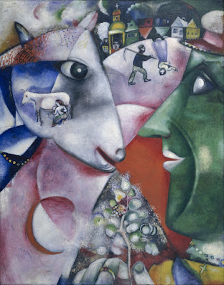
I and the Village, 1911, Marc Chagall, courtesy MOMA. In this painting, line is a dominant design element, articulating the relationship between man, beast and place. However, proportion (relative size of the objects) is playing a part as well.
|
Line
In math, a line is straight, has no thickness and extends in both directions through space. Sometimes that’s what we mean by a line in art—for example, a horizon line.
More typically in art, a line is just a path through space. Wherever you have an edge, you also have a line. However, lines also refer to mark-making, so in that sense they can be fat, thin, punctuated, tapering, diffident, bold or whispering.
Diagonals and curves seem to keep us more engaged than unbroken verticals, as they’re more difficult for the eye to ‘solve.’
 |
|
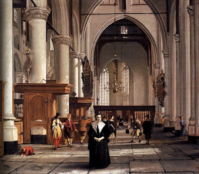
Interior of the Laurenskerk in Rotterdam, 1664-66, Cornelis de Man, courtesy Mauritshuis. The illusion of three-dimensional form is created with perspective and value. |
Shape and form
Shape and form define objects in space. Shapes have two dimensions–height and width–and are bounded by lines. Forms are three-dimensional. The artist’s dilemma is to give the illusion of three-dimensional form in a two-dimensional painting.
 |
|
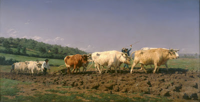
Ploughing in the Nivernais, 1849, Rosa Bonheur, courtesy Musée d’Orsay. The vast sky and field create as much narrative as do the team of oxen.
|
Space
Space in the real world is three-dimensional. In art, the term refers to a sense of depth, or the artist’s use of the area within the picture plane. The illusion of three-dimensional space is created with perspective drawing, atmospherics, relative proportion (size), positioning, and defining volume through modeling.
Sometimes we refer to negative and positive space, which means the division between the primary object(s) and what we perceive as the background. Positive and negative space were a very big deal in much twentieth-century design, which often used the vast emptiness of the page as a counterweight to the primary object.
 |
|
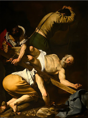
The Crucifixion of Saint Peter, 1601, Caravaggio, courtesy Cerasi Chapel. Chiaroscuro relies primarily on value to drive the eye.
|
Color
Color has three essential characteristics:
- Hue—where it falls on the color wheel (red, blue, etc.),
- Chroma—how brilliant or dull it is,
- Value—how light or dark it is.
Color is also described as ‘warm’ or ‘cool,’ but these are useful artistic conventions and not measurable as fact.
Historically, value did much of the heavy lifting in painting, and it remains the most important characteristic in your painting. The Impressionists began using hue and chroma to define volume, and that is essentially how most alla prima painters work today.
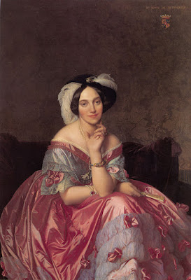 |
| Portrait of the Baronness James de Rothschild, 1848, by Jean-Auguste-Dominique Ingres, private collection. We see satin, lace, tulle, feathers and jewels primarily due to Ingres’ exquisite control of reflected light. |
Texture
Texture refers to the surface quality of an object. Paintings have implied texture, conveyed by color, line and brushwork. They also have real texture in the form of smooth or impasto surfaces.
 |
|
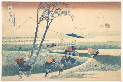
Ejiri in Suruga Province, 1830, Katsushika Hokusai, courtesy Metropolitan Museum of Art. Great winds have blown away the clouds on Mount Fuji, and they’re also blowing the travelers and their packs around. This movement is echoed and amplified by the brushstrokes. |
Movement
Movement can be either suggested or depicted—as in the wind in the painting above—or implied by brushwork. Most paintings have a major thrust of energy, which I call its motive line.
Your assignment is to take one of your own paintings and subject it to formal analysis. Consider each of these elements of design in turn. How are you using them? How could you use them better?
(This post originally appeared in July, 2020.)


