
The first rule of composition is, “don’t be boring.”
 |
| Step one of Maggie Daigles Alien Mango Tree Progression, as she called this exercise. She drew 90° from this, and flipped it because she liked this view better. |
Composition is an enormous subject, rather like the Chinese language, and it is hard to shoehorn into a single class or blog post.
The first step is to unlearn what we think we know. We’ve all been corrected and criticized with petty compositional ‘rules’. Heck, I preach petty rules myself. But most of them are, to some degree, questions of fashion. All are breakable—once you understand why they were formulated in the first place.
 |
| Step two of Maggie’s process; she saw the large shape at left as a rock but didn’t like it. |
Consider the rule that tells students to not center their subject, or to follow the Golden Ratio or the rule of thirds in space division. The point is to be interesting, but it would be far more sensible to ask yourself: “What’s the best way to include everything that needs to be in my painting, and nothing more?”
The mathematical approach is dogmatic, rigid and boring; asking yourself the compositional question provokes thought. In freeing ourselves from those rules, we might just realize that symmetry can be visually powerful, especially in an age that rejects it.
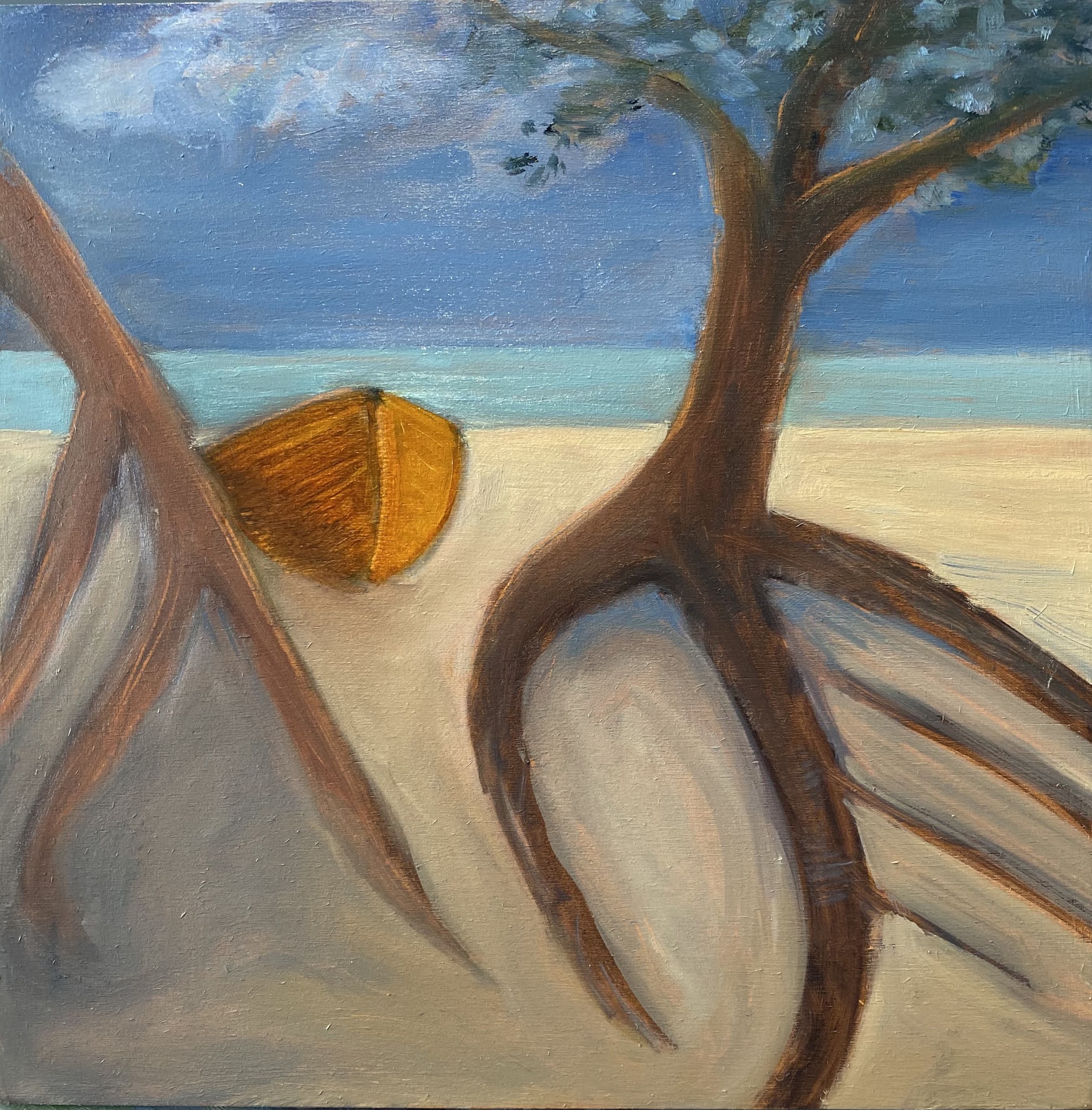 |
| Maggie’s finished painting. Since I have no idea what a mango tree looks like, I can’t judge its realism, but I can say it’s much more interesting than your typical painting of a beach. |
I teach realistic painting, but that’s no reason to disregard abstraction. I’ve written before about my admiration for the color-field painter Clyfford Still. I learn a lot from his paintings because they’re all about composition, with no pesky details thrown in.
In class this week, I resurrected an old exercise I haven’t used in at least a decade (and never on Zoom). I asked my students to create monochrome abstractions and then turn them into realistic paintings. The details of that realistic framework didn’t matter, but I chose the beach as our subject. That’s because the beach is an amorphous concept. It can be anything you want it to be. The clouds, the surf, the dunes, the rocks, and even the sun are all manipulable. Put them anywhere you want.
 |
| Paula Tefft did the same exercise in watercolor. |
If you doubt that’s true, look at the mature work of Winslow Homer through a very blurry lens. He’s nominally painting the coast of Maine but what he’s really doing is experimenting with the play and placement of light and dark, particularly the relationship between diagonals.
Reality should not be the artist’s guiding light. Nor should another painter. What separates you from the masses of other aspiring painters is what comes from within—the entirety of your experience and learning up to the point at which you pick up a brush.
 |
| Paula’s finished beach scene. |
“Students of painting should devote more energy to educating themselves about their own idiosyncrasies and less energy on trying to find that perfect paintbrush, brand of paint, canvas etc. that will make them be able to paint like ‘so and so’,” Kyle Buckland wrote recently. “You can paint a compelling design with mud on a stick if you know what you want to do.”
The only absolute compositional rule I believe in is, “don’t be boring” (although heaven knows I break it enough). Of course, I can make some practical suggestions to help you avoid lack of excitement, but if your design isn’t thrilling to you, it won’t be to anyone else, either. That requires digging in, and that’s best done in the design phase, not when you’re being bothered by the pesky details of reality.


