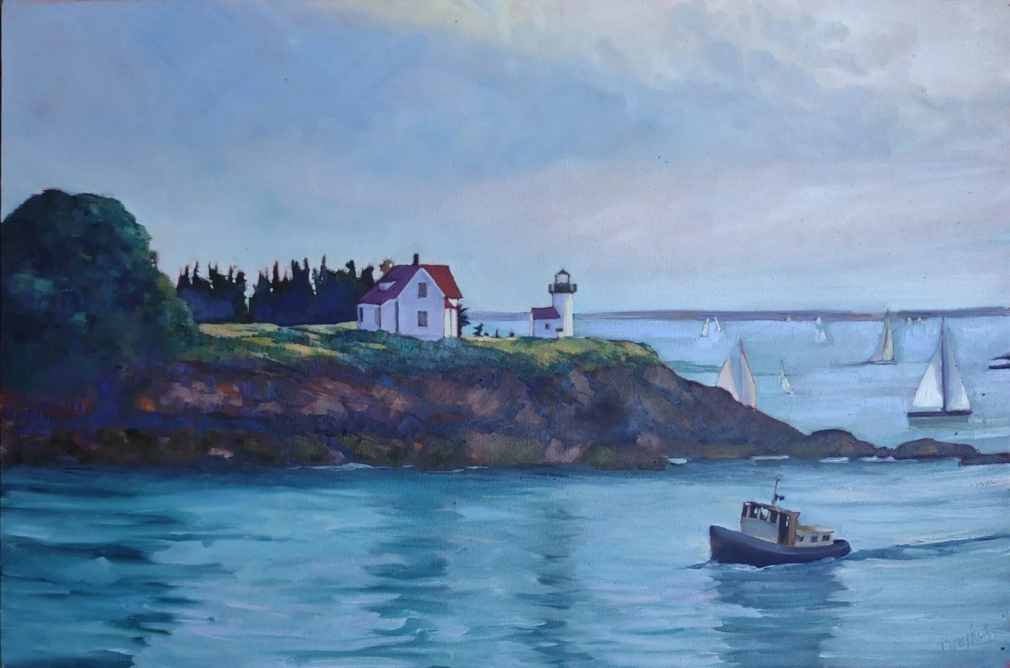
Toning makes a difference in how you see lights and darks.
| Bracken fern, by Carol L. Douglas. Available through Maine Farmland Trust, Portland, ME. |
Imprimatura is the initial stain of pigment painted on a gesso ground. In indirect painting, this color is left open where possible, reflecting back up through the paint layers and creating a cohesive tonal structure.
We don’t paint indirectly in the field, so why do we still tone canvases? Toning is invaluable in the initial stages of work. Not only will a white canvas blind you on a sunny day, it changes how you perceive darks and lights. The tendency when painting on a white board is to start your darks too dark. A toned canvas helps the painter establish a pleasing value structure. We touched on this in our Monday Morning Art School lesson based on Josef Albers.
 |
|
I use a clapped-out oil-painting brush, but a 2″ wall brush works just fine and is cheaper. |
Traditionally, artists chose a warm earth tone like a sienna or ochre, diluted it half-and-half with turpentine, applied it on the canvas with an old brush, and then wiped the residue off with a rag. This is still the best way to tone, since it leaves a layer porous enough to grab the gesso, but in a light, sparkling manner.
With oil-primed canvas and boards, you absolutely must tone that way. While oil paint can be applied over acrylic, acrylic must never be applied over oils. It delaminates. There are some fine painting boards with oil primer, and it’s easy to confuse them with the more common acrylic-primed boards. Read the labels.
If you’re painting in acrylics, you must use acrylic primer and you cannot use an oil-primed board.
|
A more traditional toning color, and a frankly bad application. I can say that; I did it. |
There is no reason that oil painters can’t also tone acrylic panels with oils, however. It will give you a slightly smoother painting surface, and it’s a good use for leftover paint. However, to save time, we often tone acrylic-gesso boards with acrylic, treating the tone as an extension of the ground rather than as the first layer of the painting.*
Alla prima painters often let the board show through in some passages. What color you want to show depends on your own taste, so I recommend experimenting. Traditionally, painters used earth tones—the ochres, umbers and siennas. I prefer 20th century pigments, so I’ve tried red, lavender, orange, yellow, and blue. I think our predecessors had it right: warmer tones work better.
 |
| Birch board is sealed, not toned, allowing the wood color to shine through. |
I toned with naphthol red for several decades. I got that idea from Steven Assael, who probably got it from someone else. It’s a good counterpoint to green and blue, the dominant colors of our northeastern environment. It’s energetic, which I aspire to be, and it makes me immediately think in terms of all the accidental colors in the environment.
However, I’ve been experimenting with painting on plain birch panels for the past two seasons. These come naturally-toned, as long as one uses a clear sealant. That points out the basic character of imprimatura—the hue doesn’t matter nearly as much as the value does.
 |
| Safety check, by Carol L. Douglas. Available. |
Toning makes a terrific mess. Cover your work surfaces. Smooth application isn’t a priority. If you’re toning with acrylics, you don’t want to wipe out the excess so much as mix it to the proper consistency at the beginning, paint it on, and let it dry. In either case, don’t over-coat your canvas; you still want the luminosity of the board to show through.
Acrylic paint manufacturers say you shouldn’t dilute acrylic paint more than 50-50. That’s true even at the toning level. If it’s breaking down into droplets, it’s got too much water in it.
*I recently had a student underpainting in acrylics. I investigated this myself a long time ago and abandoned it for two reasons. The first is that it requires two full paint kits in the field. More importantly, the underpainting becomes part of the ground, rather than the painting. If these are separated for some reason (like relining), there goes the bottom layers of the painting. Far better to just learn to apply the underpainting properly in oils.


