When buying paint, it’s all about that base.
 |
| My second-favorite kind of painting. |
I’m in the western Berkshires painting the interior walls in my oldest kid’s new house. She’s 28 and it’s her first house, and she’s very excited. So am I; like many artists, my idea of a good vacation is to paint walls. (Ceilings, not so much, but you must take the good with the bad.)
In artists’ oils, I like RGH paints. This is a small company based in Albany, NY. The owner, Rolf Haerem, has been making paints since 1989, and is a painter himself. In acrylics, I prefer Golden. Today, Golden is a large national brand. However, it also started as a small New York business, the brainchild of retired paint-maker Sam Golden, in New Berlin, Chenango County. In oil painting mediums, I like Grumbacher, which was founded in New York City in 1902. It’s now owned by Chartpak, based in Northhampton, MA. In brushes, I like Robert Simmons Signet.
None of these brands are sacred in themselves. They’re just my preferences, developed over decades of painting. They work with my technique. On Monday, I wrote that I’d used a gel medium in an emergency, and it messed with my style. Still, other painters love it. It depends on what you’re striving for.
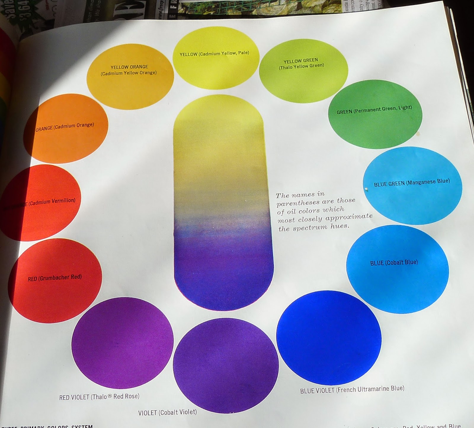
Nevertheless, there’s a theme running through my choices. They’re professional grade materials. I, too, was once an impecunious student buying student-grade materials, so I understand economy. But at some point, artists need to buy the right stuff, or they’ll never get the right results.
 |
| The new homeowner, surrounded by her paint chips. |
In wall paints, I also have strong preferences. I’ve been painting with Benjamin Moore for decades. I know I can drop a bead of color alongside wooden moldings without taping or endless massaging, and I can generally get full coverage in a single coat. As with oil paints, wall paints are made with various combinations of pigments, binder and filler. It’s important to find one you like.
Here in the wilds of the New York-Massachusetts border, it’s been a problem to find it. And my budget-masters kvetch at the sticker price. Yesterday I capitulated for expediency’s sake, and used a brand sold by a large big-box retailer. I immediately regretted it. It clumped in the roller, and it didn’t slide easily off my brush.
When I first arrived on Sunday, I drove up to see my son-in-law digging a trench, sweaty and hot in the September warmth. He and my daughter are the same age as my husband and I were when we built our own first house. It was also a modular, also on a wooded rural hillside, and we also did all the sitework and finishing ourselves.
I was happy to watch the lad dig. One of the consolations of getting old is that you never need to pound another copper ground rod into rocky soil if you don’t want to. Some jobs are best enjoyed through the rose-colored glasses of nostalgia.