fbpx

What is truth?

There’s more to truth than observable facts, and it’s your job to talk about that.
Last day of golden light, by Carol L. Douglas, oil on canvasboard

On Monday, Ken DeWaardand I went out to catch the last of the autumn gold before yesterday’s drenching rain. We met at a beautiful old farm in Hope, owned by an elderly lady who gave us some hollyhock seeds in the bargain.

There were two structures that interested me—a fine old Maine cape, and a white frame building glowing violet with a young maple blazing yellow in front of it. “You choose first,” we told each other. This is often the hardest—and always the most important—part of field painting. In the end, I chose the farmhouse and he chose the maple, and I proceeded to complain for the rest of the morning.

The scene I painted.
I know that narrative is very old-fashioned, but it has its place in grounding plein air paintings. The farmyard’s story was obvious. But with the building and tree, either the tractor would need to be included to explain the log pile, or some major narrative fudging would need to happen. That was out; the scene was inherently too delicately-balanced to muck with.
I believe in truth in painting as well as in life. But what does that mean? To a scientist, truth is what can be established through the scientific method. That viewpoint (itself not objective) has permeated our culture. It is, however, a very narrow definition. It leaves out aesthetics, ethics and the associative thinking that the human brain is so good at.
Snow on the forecast, by Carol L. Douglas
Today, we all know that Galileo was right, but by the scientifically-known facts of his time, he was wrong. In fact, part of what Cardinal Bellarmineargued was that heliocentrism shouldn’t be taught unless it could be proved.  What infuriates us moderns is the idea that the Inquisition could muzzle science, and we’re right to feel that way. But that’s based on an unprovable ethical argument: the idea that science should operate independently of church or state.
If you were to walk to the post office with me this morning, you probably wouldn’t notice the power lines. You’d see the elegant houses, grand old trees, and raking light across the harbor. That’s because we see with our hearts, and we focus on some things to the exclusion of others. When we’re very young and first investigating realism, we think we should include every detail. As we get older, we’re more attracted by that emotional truth, which has little to do with the objective truth.
The scene I was riffing off.
Yesterday, I managed to sneak in a tiny painting of the building that Ken originally painted. I was demonstrating limited palette. That’s another subject where truth is too complex to be boiled down to easy inanities. In theory, you can get to any color using just red, blue, yellow and white paint. But the chroma and clarity of those mixes depends on the pigments you use and the medium you’re working in.
It’s not that the paints transmogrify, it’s that each different pigment and base has different undertones. These mix well in some directions, but cancel each other out in other mixes. If you doubt me, try to make a classic chromatic black (cadmium yellow, cadmium red, ultramarine blue) with acrylics. You’ll get something that looks like you picked it up on your shoe.

The color of the sky

Is the sky blue? That’s in the eye of the beholder.

Midsummer, by Carol L. Douglas
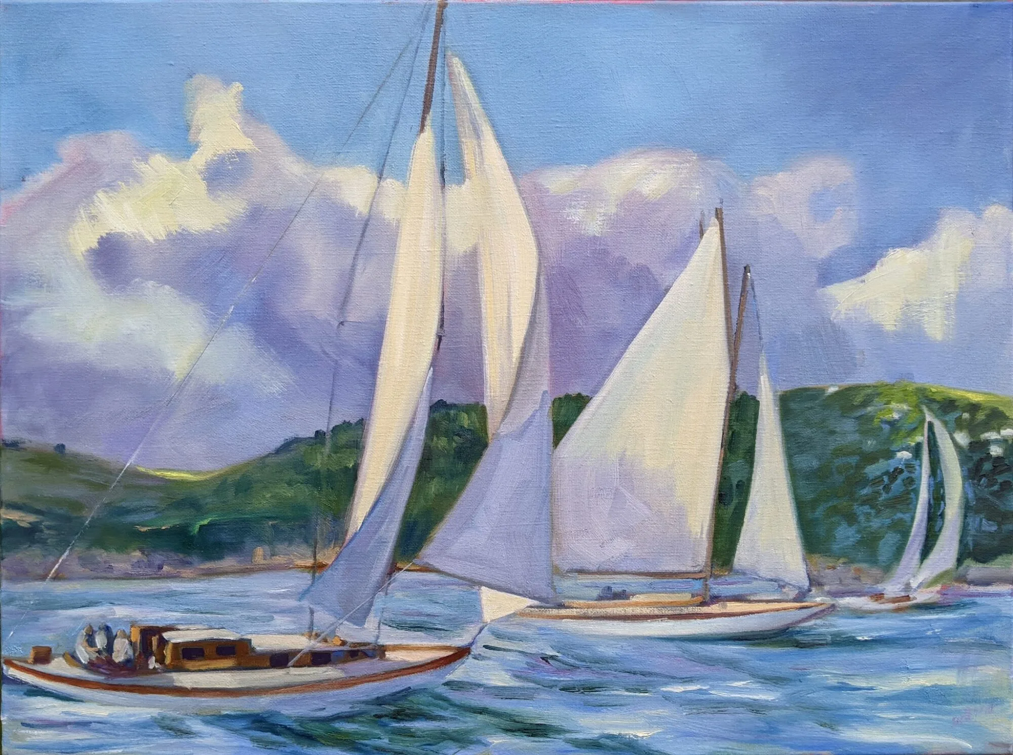
The sky, by convention, is blue, but it’s not an even sheet of blue like a recently-painted wall. On a clear day, it’s more turquoise at the horizon, more violet at the zenith. Except when a line of gold or pink sits offshore, or it’s full of moisture and a solid blue-grey. The sky, like the ocean, is big enough to do anything it wants.
Anyone who hangs around with kids has learned the scientific explanation of why the sky is blue. Our sun produces yellow light because its surface temperature is 5,500°C. Still, we don’t have a yellow sky, for the most part. Sunlight reaches Earth’s atmosphere and is scattered in all directions by the gases and particles in the air. Blue light is scattered more than the other colors because it travels as shorter, smaller waves. There’s a lot of that going on, which is a good thing, because it means our planet home is protecting us from deadly high-energy radiation. That’s a nice, pat explanation and it certainly satisfied me when I was little.
A prism refracting and reflecting an incoming beam of uniform white light, after Newton, courtesy Wikipedia. It’s violet, not blue, that’s at the bottom.
It wasn’t until recently that I noticed that this doesn’t match what Isaac Newton discovered about the visible light spectrum back in 1665. Blue is not the shortest wavelength in the visible spectrum; indigo and violet are shorter. So why isn’t our sky violet? For that matter, how do I know that it isn’t violet? Do I believe it is blue because people tell me that?
In reality, the spectrum of skylight, when analyzed, is about equal parts violet and blue. While daylight is actually a complex spectrum, it’s dominated by the color range that falls between 400 nanometers (violet) and 450 nanometers (blue). That falls neatly into the human eye’s response range, which is about 380 to 740 nanometers. So why have we all decided the sky is blue?
Off Ogunquit, by Carol L. Douglas
We have cones in our eyes for detecting color. There are three kinds. Long cones detect yellow at 570 nanometers, medium detect green at 543 nanometers, and short cones detect blue-violet at 570 nanometers. But we perceive up to 10 million colors, because these cones fire off in combination to distinguish the subtleties of color. (This is all happening in our eyeballs, not our brains, by the way.) Blue-plus-violet is perceived by the eye as blue plus an admixture of all colors, or pure white light.
Other animals must see the sky very differently from humans. Most of them only have two types of eye cones. Some birds and honeybees have receptors for ultraviolet light.
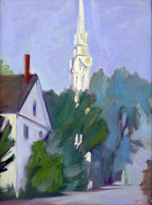
Sea Fog, by Carol L. Douglas
More importantly, humans do not always see colors the same. Beyond the obvious issues of colorblindness, some tend to see less blue altogether. But mostly, it’s a question of paying attention.
Next time you go out on a beautiful day, pay attention to how many different shades of blue there are in the sky, depending on where you look. If you don’t feel that violet thrum deep down in your soul, I’ll be surprised.

Monday Morning Art School: practice seeing values

Value is the most important dimension of color. Here’s an exercise to help you see it better.
On the left, color strips. On the right, monochrome approximations of those colors. Photo courtesy of Kyle Buckland.

This week’s exercise is brought to you by outstanding painter and teacher Kyle Buckland. He graciously allowed me to share it with my class and you.

A simple value scale.

Value in color theory is how light or dark something is on a scale of white to black (with white being the highest value and black being the lowest value). It’s the hardest dimension of color to match, but it’s also the most important. It’s what we register first when we look at a painting.

“You can never do enough of this type of training the eyes,” wrote Kyle. He’s right.
I made you this approximation of Kyle’s stripes, or you can paint your own.
Kyle ran a series of colors across a sheet of paper, as above. You can either copy his technique and make your own stripes, or you can print the image I made, above. A PDF is here.
I printed this on a color laser printer on card stock. If you have an inkjet printer, you may need to spray it with fixative to prevent the ink from bleeding into your greys.
You’re going to make a series of stripes on the right, matching the value of the color on the left as closely as you can get with grey paint. Use acrylic if you have it; gouache or oils otherwise. If all you have is watercolor, you’re going to have to make a separate card and set it next to this one. 
Kyle converted his photo to black and white to demonstrate his close matches. Photo courtesy of Kyle Buckland.
When you’re done with this exercise, I’d like you to photograph it with your cell phone and camera and delete the color information; i.e. turn it into black-and-white. (On my cell phone, I go to picture editing and a b/w filter pops up automatically.)
Cameras can be wrong in value assignments. Both the yellow and green are way off.
Compare your stripes. If you’re way off, repeat this exercise until you’re more accurate. However, this comes with a caveat. The human eye is subjective and not everyone sees value the same way. Software is also in some ways subjective, since it was programmed by humans. In the sample above, yellow is obviously the highest-value color on the wheel. But Photoshop perceives it as darker than orange. Your camera and your eye may disagree.
Why is value so important? It creates a structure for the painting to flow through. If there are dark values in an organized pattern, synchronized with mid-range and light passages, your finished piece will draw the viewer in.