Arbitrary distinctions

What is art? What is illustration? Does it matter?
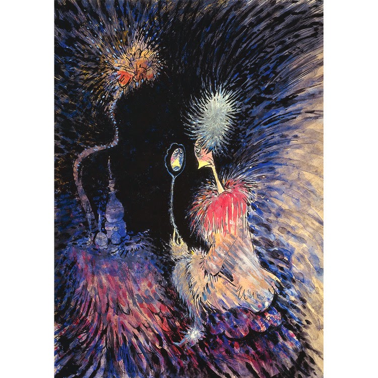
Trick-or-Treat! From my brief period illustrating; prints available (DM me).
“I am trying to understand the difference between a painter and an illustrator,” writes a reader.
Paint is a just a medium. You can use it to illustrate, or you can hurl it in meaningless patterns. Conversely, you can illustrate with any two-dimensional medium, including pencils, ink, photography or cut paper. The difference is in intent.
An illustration is usually a visual accompaniment to a text. However, that’s not always true. There are illustrated books (Albrecht DĂźrer’s Passions, for example) that do not need words at all. There are many children’s books with no words. In fact, one could argue that all of western religious art is illustration. The text (the Bible) was just not written down. Either the intended audience was illiterate or they all knew the story anyway.
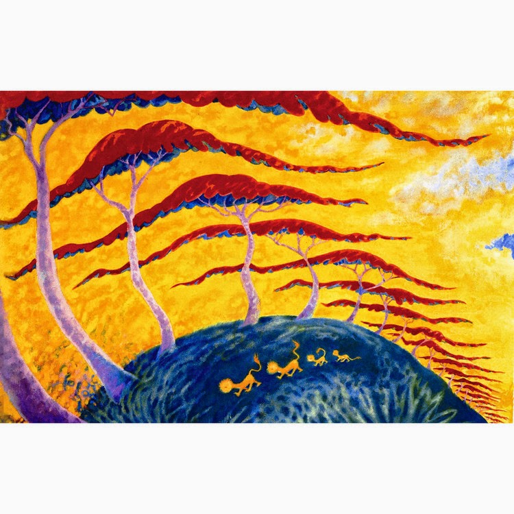
Gas Station, by Carol L. Douglas. From my brief period illustrating; prints available, DM me.
Illustrators are usually hired by writers or publishers. The work is limited in scope and concrete in character. Fine artists have no middleman between them and the market. They can be as obscure as they wish. But fine artists certainly work on commission, and illustrators often work on spec, so even that distinction is hazy.
There was a time when this question mattered to me. I was trying to make the jump between graphic design and painting full time. I did it by writing and illustrating two books. We are all born with an innate ability to imagine pictures, but I’d disciplined my artistic sensibilities to be subservient to the client. It took these stories for me to loosen up and find my focus. It’s never been a problem since.
Girl in Closet, by Carol L. Douglas. From my brief period illustrating; prints available, DM me.
But there’s an insidious way in which this question is sometimes asked. What’s implied is that fine art is somehow better than other forms of artistic expression.
Yes, illustration is a fine craft rather than a fine art. Like tapestry, jewelry, carving, etc., illustration has a practical purpose aside from beauty. Paintings have none, unless you’re using them to plug holes in the wall. If you want to know if you’re an artist or craftsman, ask yourself if your finished product has any tangible purpose. If it’s useless, you’ll know you’re an artist.
The problem lies in assuming that either one is more important than the other. Our modern viewpoint comes from the 19th century Cult of Genius, which mistakenly put fine artists in the category of intellectuals instead of tradesmen.
Kitchen Table, by Carol L. Douglas. From my brief period illustrating; prints available, DM me.
This is why plein air painting gets so little respect, by the way. It rejects the idea that fine art is primarily an intellectual activity. Instead of making great statements, plein air painting has a lowly and practical view of the world. It seeks to make pictures that make people happy.
There’s never been any distinction between fine art and illustration in terms of quality. If there ever was a gap, it was bridged long ago, starting with the unknown monks who illuminated books before the printing press was invented.
With the advent of industrialization, individuality and beauty was stripped from the objects we use every day. Brilliant craftsmen-artists like William MorrisCharles Rennie MackintoshMargaret Macdonald, and the Roycroft Movementclosed the gap between art and function once again. And who in this world would argue that N.C. Wyeth  and his peers of the Golden Age of Illustration are not among the world’s greatest artists?

How Winslow Homer transformed himself

Before he became Maine’s greatest painter, he needed to shed his sentimentality. He did that in part by taking up watercolor.

Five boys at the Shore, Gloucester, 1880, Winslow Homer

After working as an illustrator during the Civil War, Winslow Homer concentrated on two distinct oeuvres: postwar healing and homely, nostalgic paintings of American innocence. These were well-received by the public but not universally respected.

“We frankly confess that we detest his subjects… he has chosen the least pictorial range of scenery and civilization; he has resolutely treated them as if they were pictorial… and, to reward his audacity, he has incontestably succeeded,” said writer Henry James. Winslow Homer’s work in the late 1860s and ‘70s was done in paint, but it was still illustration. When he depicted children as symbols of the nation’s lost innocence, he was playing on a common, well-worn theme of the time.
To be fair, Homer was a young man, and he hadn’t had the advantage of an extensive art education. He was just 29 when the Civil War ended. Snap-the-Whip was finished when he was 36 years old. It was about this time that he was able to give up illustration to focus on painting. It was also around this time that he took up watercolor seriously.
Three Fisher Girls, Tynemouth, 1881, Winslow Homer, courtesy National Gallery of Art, Washington DC
By the middle of the 19th century, the influence of critic John Ruskin led to an interest in watercolor as a serious medium. The American Society of Painters in Watercolor, later to be the American Watercolor Society, was founded in 1866. In 1873, this group mounted an exhibition of nearly 600 paintings at the National Academy of Design.
Homer was living in New York at the time and almost certainly saw this show. It’s also probable that he was already familiar with watercolor painting. It was a genteel medium, widely used by ladies and children, but not respectable enough for galleries.
In 1873, Homer left for Gloucester, where he made his first professional watercolors. That summer he sketched and painted children playing on the waterfront. They clam, row, pick berries, play on cliffs and stare longingly out to sea. These paintings were a continuation of his interest in the lost innocence of America.
The Boatman, 1891, Winslow Homer, courtesy Brooklyn Museum
What was different was how he applied the paint. He drew in graphite, and then painted over his drawing. He didn’t wet his paper, which was common practice at the time. This made for a less-detailed, more sparkling finish. Critics were mixed about the results. Some admired the rawness; others hated it. “A child with an ink bottle could not have done worse,” wrote one.
By the end of that decade, Homer had come to two points in his personal life which would mark his mature work—a tendency to reclusiveness and a fascination with the sea. But before he could become Maine’s quintessential painter, he needed to shed his obsession with the American myth.
Casting, Number Two, 1894, Winslow Homer, courtesy National Gallery of Art, Washington DC
He spent 1881 and 1882 in the English coastal village of Cullercoats, where he focused on the men and women who made their living from the sea. His palette muted; his painting became more universal. And he made much of this transition in watercolor.
He had, by changing up both his medium and his locale, made himself a painter of an elemental truth—the relationship of man and the sea.
Between 1873 and 1905 Homer made nearly seven hundred watercolors, transforming the medium and his artistic achievement as a whole. “You will see,” he said, “in the future I will live by my watercolors.”

Who taught JRR Tolkien to draw and paint?

Rivendell, by JRR Tolkien  (Tolkien estate)
The other day, I found the above picture of Rivendell for a friend, and it struck me anew that J.R.R Tolkien was an accomplished illustrator. He could have worked as an artist had he not had an even greater facility with the written word. “Who taught him to paint?” I mused.
Turns out, it was his mother. After their father’s death in 1896, she moved young Ronald and Hillary to Sarehole, a hamlet that has now been absorbed into greater Birmingham. Mabel Suffield Tolkien was a capable artist and passionately interested in botany. “Ronald can match silk lining or any art shade like a true ‘Parisian Modiste,’” she wrote to her mother-in-law in 1903.
Those lessons ended tragically young, since Mabel died of diabetes when her young sons were 10 and 12. She entrusted his care to Fr. Francis Xavier Morgan of the Birmingham Oratory. This put him within visiting distance of one of the most important collections of Pre-Raphaelite Brotherhood painters, that in the Birmingham Museum.
Fangorn Forest by JRR Tolkien was originally done as a Silmarillion painting in the late 1920s, and reflects the current aesthetic. (Tolkien estate)
That the medieval fantasies of the Pre-Raphaelites would appeal to an adolescent of Tolkien’s temperament seems obvious, but we have a scholar’s word for it. Humphrey Carpenter, author of Tolkien’s authorized biography, wrote that Tolkien associated his childhood gang, the TCBS (Tea Club, Barrovian Society) with the Pre-Raphaelites, indicating that he and his pals were certainly aware of them.
Tolkien began to make visionary pictures after he went up to Oxford in 1911. These included scenes that would later be expressed in words. For his story Roverandom, conceived in 1925, Tolkien made at least five illustrations. In the late 1920s or early 1930s he produced a picture book, Mr. Bliss, in colored pencil and ink. These pictures and others, however, were for his own and his family’s amusement, not for print.
His illustrations for The Hobbit, however, were intended for publication. The first printing of this book, in 1937, contained eleven black-and-white illustrations and maps. Full-color plates were added to later editions.
Tolkien used drawing as a means of understanding the complex topography of his imaginary world. He made many sketches and drawings during the writing of The Lord of the Rings. These have subsequently been published, but his intention was not to illustrate the novel, but to aid in his writing.
Lamb’s Farm, Gedling, (c. 1914) represents a real farm, owned by Tolkien’s aunt. (Tolkien estate)
“In human art Fantasy is a thing best left to words, to true literature,” wrote Tolkien. “In painting, for instance, the visible presentation of the fantastic image is technically too easy; the hand tends to outrun the mind, even to overthrow it. Silliness or morbidity are frequent results.”
Tolkien continued to paint and draw all his life. His home was supplied with “paper and pencil and a wonderful range of coloured chalks, paintboxes and coloured inks. We knew as we got older that these things gave him particular pleasure, and they continued to do so right through his life,” his daughter Priscilla recollected.
His work was in the style of his times—realism with lashings of the Art Nouveau of his childhood and the Art Deco of his young manhood. 
To answer my initial question, Tolkien learned to paint from everybody and nobody. His initial instruction was that of a good, bright, home-schooled lad of his time. He then built on that as an autodidact, absorbing the architecture and art of the world around him. How he applied that to his own inner vision was, of course,  his own unique gift.

Your favorite artist you can’t remember

Cover art by Eloise Wilkin.

Cover art by Eloise Wilkin.
If you were raised in the United States, the odds are overwhelming that you had at least one Little Golden Book while growing up. These books were introduced in 1942 as a joint project of Simon & Shuster and Western Publishing. The idea was to do big runs of color pages so the books could be sold cheaply. They premiered with a cover price of a quarter, which rose to 29¢ in 1962. That was cheap enough for nearly everyone, which made them ubiquitous, and extremely important. With more than two billion sold, they have been “baby’s first book” for many American children.
Cover art by Eloise Wilkin.

Cover art by Eloise Wilkin.
Eloise Margaret Burns Wilkin has been called “the soul of Little Golden Books.” Born in 1904 in Rochester, Wilkin moved downstate at age 2. She returned to Rochester to attend the Rochester Athenaeum and Mechanics Institute, now known as Rochester Institute of Technology (RIT). This school has a long tradition of excellence in art instruction.
After earning an Art and Illustration degree in 1923, Wilkin opened a studio with her friend Joan Esley in Rochester. Struggling to find work, the pair moved to New York City. A week later, Wilkin was hired to illustrate The Shining Hours by Mary Meek Atkeson.
Cover art by Eloise Wilkin.

Cover art by Eloise Wilkin.
In 1930, Wilkin put her career on hold to marry. She, her husband and their four kids lived in Canandaigua, in the Finger Lakes region of New York. Her house there made cameo appearances in many of her books.
In 1944, Wilkin signed an exclusive contract with Simon & Shuster. This required her to illustrate three Little Golden Books each year. She had it all—wife, mother, career.
Cover art by Eloise Wilkin.

Cover art by Eloise Wilkin.
In an interview with RIT’s University News, Wilkin’s son Sidney recollected his mother working long, long days as she approached her deadline. “We would run in and out of the house by her studio and she would stop us, show us something and ask if we liked it.”
In 1974, Wilkin revised "My Little Golden Book about God" to reflect our multicultural reality

In 1974, Wilkin revised “My Little Golden Book about God” to reflect our multicultural reality
Eloise Wilkin will never be remembered as a great artist, but her warm, beautifully-rendered pencil drawings had a profound influence on generations of American children. If you pored over books as a child, she probably had a hand in shaping your visual aesthetic.
Cover art by Eloise Wilkin.

Cover art by Eloise Wilkin.
Wilkin illustrated more than 110 books, including 50 Little Golden Books. She died of cancer in Brighton, New York at the age of 83.

The Secret Life of Dr. Seuss

Hotel del Coronado records the view outside Geisel’s studio window.
I can’t imagine there’s an American alive who isn’t familiar with the works of Dr. Seuss (Theodor Geisel). Several generations of children have learned to read with his books and his drawings are ubiquitous.
Gosh! Do I Look as Old as All That! is part of an 11-painting series gently mocking La Jolla matrons.
The world as seen by Dr. Seuss is strange, but it might look a bit less odd to a native of San Diego. Geisel modeled his palms and acacias, brightly-plumed birds and bright landscapes on the Southern California scene.
Martini Bird, Theodor Geisel (Dr. Seuss)
Geisel lived in La Jolla, an upscale seaside neighborhood in San Diego, from 1953 until his death in 1991. There he wrote most of his classic children’s tales including The Cat in the Hat, Horton Hears a Who, How the Grinch Stole Christmas, Green Eggs and Ham, and The Lorax.
Raising Money for the Arts, Theodor Geisel (Dr. Seuss)
Like so many 20th-century book illustrators, he learned his craft through advertising, drawing for General Electric, NBC, Standard Oil, and other companies.
Cat Behind the Hat, Theodor Geisel (Dr Seuss)
Dr. Seuss liked to paint at night after he was done writing and illustrating during the day. Unlike most artists with a bifurcated work life, his personal paintings aren’t clearly different from his story books. This couldn’t have been because his life was smooth sailing: his first wife, Helen Palmer Geisel, committed suicide in despair over illness and her husband’s burgeoning affair with her close friend. Geisel served in the First Motion Picture Unit of the Army in the Second World War and lived through all of the epochal, cataclysmic events of the 20th century. But none of that shows in his work. It is unfailingly gentle and shallow, although marginally more adult.
Lion Stroll, Theodor Geisel (Dr. Seuss)
Ingenious! The World of Doctor Seuss is an exhibit of reproductions of his paintings and sculpture. (His widow refuses to allow any of his original work to be displayed.) It runs at the San Diego History Center until the end of 2015.
Oh, I’d Love to go to the Party, but I’m Absolutely Dead, Theodor Geisel (Dr. Seuss)
                                                                                                                                              

Let me know if you’re interested in painting with me on the Schoodic Peninsula in beautiful Acadia National Park in 2015 or Rochester at any time. Click here for more information on my Maine workshops! Download a brochure here.

Boy Genius

Illustration from Norman Rockwell’s second year as a professional artist. He was all of 19 years old.
Spending time in the Berkshires this week, I got to wondering what artist might be identified with this area.
Norman Rockwell is most famous for the cover illustrations he did for The Saturday Evening Post. Born in New York, he attended both the National Academy of Design and the Art Students League. By age 18, he had a published book illustration to his credit. That year he was hired as an illustrator for Boys’ Life. At 19, he was promoted to be their art editor, in which role he did his first cover illustrations.
It’s absurd to try to choose a favorite from his many illustrations for the Saturday Evening Post. Rockwell layered images rather than trying to create a full-dimension space; this is a great example of that technique.
At age 21, he submitted his first cover illustration to the Saturday Evening Post.He was published eight times total on the Post’s cover within that first year. Over his career, Rockwell did 323 original covers for the Saturday Evening Post.
Rockwell painted his most famous works, the Four Freedoms series, in 1943. It took him seven months. The series was inspired by a speech by President Roosevelt, in which he described four principles for universal rights.
When he wanted to create a fully realized space, however, he had the chops. Freedom from Want’s Puritanical white-on-white tablecloth brings the faces into focus, and they are an essay in optimism in the dark days of WWII. 
In 1953, Rockwell and his family moved to Stockbridge, Massachusetts. From 1961 until his death in 1978, Rockwell was a member of the Monday Evening Club, a men’s literary group based in Pittsfield, Massachusetts, which is where my daughter lives, and where I regularly stop on my trips back and forth to Maine.
Rockwell’s portrait of his adopted Stockbridge, MA, would do any landscape painter proud.
The early part of the 20th century is often called the Golden Age of Illustration. Why were so many fine 20thcentury illustrators able to do such fine work at such young ages? In part, there was an expectation that people in their late teens were fully formed adults, capable of bearing adult responsibilities. In part, the schools were teaching traditional drafting and drawing.
Message me if you want information about next year’s workshops.-*

Medicine’s Michelangelo

Watercolor of arteries of the human head shows Netter’s understanding of the humanity underneath the human anatomy.
Dr. Frank H. Netter was the illustrator of one of my favorite—and most well-thumbed books—the Atlas of Human Anatomy. His is a wonderful cautionary tale for those of you who think you can’t make a living in art.
A native New Yorker, Netter grew up wanting to be an artist. He studied at the National Academy and the Art Students League. It was the tail end of the Golden Age of Illustrating, and he was doing work for the Saturday Evening Post and the New York Times out of high school.
However, Netter’s parents were immigrants, and they had no truck with the idea of their son being an artist. Mama wanted him to get a real job, so he went to medical school.
The most-thumbed page in my copy is his painting of back muscles. It’s saved me from making dumb mistakes countless times.
“This was in 1933—the depths of the Depression—and there was no such thing as medical practice,” he recalled. “If a patient ever wandered into your office by mistake, he didn’t pay.” In a deliciously ironic twist, Netter was forced to fall back on art to supplement his income as a doctor. After an advertising executive paid him $7500 for a series of five illustrations—more than he could earn in a year of practicing—he gave up medicine.
In 1936, Netter did his first commercial work for the Swiss pharmaceutical company CIBA. This fold-up illustration of a heart (to promote digitalis) proved very popular, and grew into a series. Eventually they were distributed as cards wrapped in a folder with advertising content. This ultimately morphed into his Atlas of Human Anatomy.
But today I’m going in to have my digestive tract inspected… parts of it should look about like this, I imagine.
My edition of the Atlasincludes about 600 color plates. This is a fraction of the 4,000 illustrations he did over his lifetime. The bulk of these were owned by CIBA and its successor, Novartis.
Netter’s immigrant parents would have been astonished at the legacy left by their artist son. Wealthy during life, he is remembered today as one of the leading medical educators of his time. His book is faithfully revised by a team of medical experts, and you can now buy a subscription to it online.

While you’re reading this, I’m at Highland Hospital having a colonoscopy and an endoscopy. When I get the all-clear, I’m leaving for Maine. Come join me! I have two openings left for my 2014 workshop in Belfast, ME. Information is available here.

Making money the old-fashioned way

Saying Grace by Norman Rockwell, 1951
A Norman Rockwell painting sold at auction at Sotheby’s in Manhattan yesterday for $46 million. This was twice its pre-sale estimate of $15-20 million and a record for a Rockwell painting.
The painting, “Saying Grace”, was one of seven Rockwells in the auction. Two other Rockwell Saturday Evening Post covers, “The Gossips” and “Walking to Church,” sold for just under $8.5 million and a little over $3.2 million respectively.
These three paintings were formerly on long-term loan to the Norman Rockwell Museum in Stockbridge, Massachusetts. They were sold by descendants of Kenneth J. Stuart, the Evening Post art editor who worked with Rockwell for nearly 20 years. All three had been given to Stuart by Rockwell.*
Walking to Church by Norman Rockwell, 1952. You can buy a signed print of this for approximately what Rockwell was paid for painting it, or you could have gotten the original yesterday for about a thousand times his fee (not adjusted for inflation).
Rockwell was paid $3500 for “Saying Grace” in 1951. That translates to roughly $32,000 in today’s dollars. This would be tremendous money for any illustrator today, and shows how highly illustration was valued in mid-century America. However, even adjusted for inflation the sellers got around 1500 times the price Rockwell received for actually painting the thing.
Sadly, if you’re doing your job right as an artist, this is how it goes. This might seem counterintuitive when considering such a popular artist as Rockwell. But even during the Golden Age of Illustration, few people considered illustrators to be fine artists. It’s taken time and distance for us to see Rockwell, Howard Pyle, or N.C. Wyeth as the great artists they were. But consider John James Audubon, William Blake, or Albrecht Durer. Their work, too, has become more rarified by time, but they were also, fundamentally, illustrators.
The Gossips by Norman Rockwell, 1948
At any rate, the few hundreds or thousands you get for your work today will, if all goes as planned, translate into a fortune in some future swank showroom in, say, Abu Dhabi or Macau.
*Having done my share of illustration, this seems like a squishy provenance to me. It’s just as likely that the work got shoved behind a cabinet and forgotten, and Stuart had the good sense to take it home rather than let it be thrown away.

Let me know if you’re interested in painting with me in Maine in 2014 or Rochester at any time. Click here for more information on my Maine workshops!

Freedom from want

Freedom from Want, Norman Rockwell, 1943
This Thanksgiving Day the average American will consume more than 4500 calories, accordingto the Calorie Control Council. I’m all for eating right, but I think the capacity of our nation to throw an annual bash is an unequivocally good thing.
Thanksgiving is the most universal of American holidays—celebrated by people of all religions, by new immigrants, and by wanderers like my friend Martha in Edinburgh, who has located a 6 kg. turkey and a circle of friends to share her holiday.
Freedom of Worship, Norman Rockwell, 1943
Perhaps that’s why Norman Rockwell chose it to illustrate Freedom from Want in his Four Freedoms series. The painting celebrates family, love, and happiness. Critics who call it an illustration of American overconsumption perhaps don’t notice that there is almost no food on that table. There is no wine; there is only water in plain, clear glasses. The black suit and white table are almost Puritan in effect. What abundance there is comes straight from the hosts’ hands, and the joy around the table comes from each other.
Freedom of Speech, Norman Rockwell, 1943
The arresting composition may be why this painting is one of Rockwell’s enduring favorites. Many of his covers for the Saturday Evening Post were done as one-dimensional knock-outs, with no perspective to speak of. This view from the bottom of the table, with its luminous white-on-white table set starkly against Grandpa’s black suit, is a masterwork of composition. (Rockwell said that it was the easiest of the four paintings.)
Freedom from Fear, Norman Rockwell, 1943
Rockwell painted the Four Freedoms in seven months’ time, during which he lost 15 lbs. They were based on President Franklin Roosevelt’s Annual Message to Congress in 1941, which were dark days for those in opposition to Nazi Germany. As we take time from holiday preparations, it’s worth contemplating Roosevelt’s words:
In the future days, which we seek to make secure, we look forward to a world founded upon four essential human freedoms.

The first is freedom of speech and expression—everywhere in the world.

The second is freedom of every person to worship God in his own way—everywhere in the world.

The third is freedom from want—which, translated into world terms, means economic understandings which will secure to every nation a healthy peacetime life for its inhabitants—everywhere in the world.

The fourth is freedom from fear—which, translated into world terms, means a world-wide reduction of armaments to such a point and in such a thorough fashion that no nation will be in a position to commit an act of physical aggression against any neighbor—anywhere in the world.

That is no vision of a distant millennium. It is a definite basis for a kind of world attainable in our own time and generation. That kind of world is the very antithesis of the so-called new order of tyranny which the dictators seek to create with the crash of a bomb.
Let me know if you’re interested in painting with me in Maine in 2014 or Rochester at any time. Click here for more information on my Maine workshops!