Things I didnā€™t know, or canā€™t figure out

Some days I feel like the Oldest Living Member of this club; other days, Iā€™m shocked at the things I donā€™t know.

Home Farm, by Carol L. Douglas, is available through the Maine Farmland Trust Gallery.

Thereā€™s a rule for mixing acrylics and oils:  you can go over acrylic with oils, but you canā€™t go over oils with acrylics.

Acrylic paints and gesso have been available since the 1950s. In art-conservation terms, thatā€™s no time at all. However, thousands of oil paintings have been done over acrylic gesso and imprimatura. Since these bottom layers are separate, future conservators will be able to peel off the acrylic and reline the paintings.

Fog Bank, by Carol L. Douglas, is available through the Maine Farmland Trust Gallery.

Iā€™m more dubious about underpainting in acrylics and doing the top layers in oils. I used to see this in the last millennium but then it fell out of style. I was shocked to see a student doing it this summer. I think itā€™s bad practice on two counts:

  1. Good painting technique is intended to last for centuries. We donā€™t really know how those two paint systems will interact over the long haul.
  2. Thereā€™s no reason for it. Proper alla prima technique will give you good, clean, immediate color using conventional oil paints for all the layers.

But thatā€™s based on my gut, not on science. If anyone has a scientifically-based opinion, Iā€™d love to hear it.

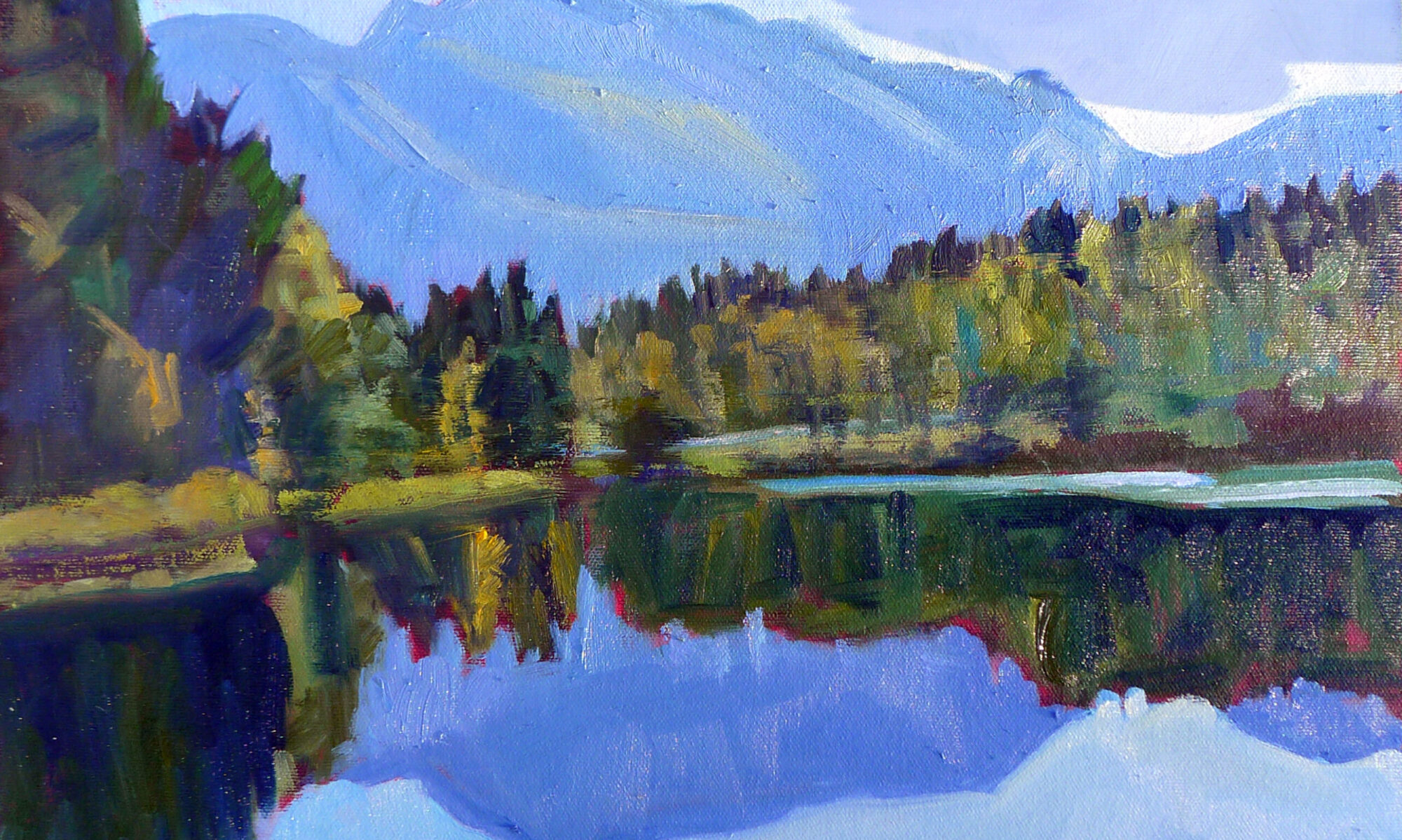
Beaver Dam, by Carol L. Douglas, is available through the Maine Farmland Trust Gallery.

Most of us paint on acrylic-primed canvas these days, but Centurion(and others) make excellent oil-primed canvases and boards. These must be toned with oils because of that no-acrylic-over-oil rule. This year, a student at my Schoodic workshop primed her boards with Gamblinnaphthol red. Luckily, she also brought other boards, because the oil-primed ones never dried in time. This week, she showed me that they were still tacky.

It wasnā€™t the weather; Maine has been in a drought all summer. And her paint application looked fine to me. An internet search gave me no clues. Readers, if you have any ideas, please share them.

Over the summer, two students pointed out that they canā€™t buy Prussian Blue in acrylics; itā€™s only available as a hue. I contacted Golden Paints. Their expert told me, ā€œPrussian Blue pigment is highly alkali-sensitive. Waterborne acrylics are alkaline by nature. So, this pigment is not stable in waterborne acrylic binders. This is why we make a Prussian Blue Hue in our acrylic lines. The same is true of Cobalt Violet.ā€ Since I eschew hues, I now recommend phthalo blue instead. Iā€™ve been painting for longer than Golden has existed, and I never noticed that.

On Monday, I challenged readers to a water-media exercise over the next 45 days. One of my oil-painting students asked me for recommendations for gouache. I use Turnergouaches, but never thought about why, since itā€™s not my primary medium. I texted a few painter friends for recommendations. Among their suggestions were M. Graham, Winsor & Newton and Holbein, but nobody was passionate about it. If you are, Iā€™d love to hear from you.

Sea Fog, by Carol L. Douglas, is available through Folly Cove Fine Art.

Meanwhile, I suggested a limited palette of colors and hog-bristle brushes. The beauty of gouache is that you can use it on almost any substrate. I just paint in my sketchbook.

Speaking of that challenge, several people asked where they should post their resulting paintings, so I created a group on Facebook. This is an open group and you donā€™t need to be my FB friend to join. I invite you to post your paintings and comment. We all learn from each other.

Jennifer Johnson (who started this) told my Tuesday Zoom class that she had been doing these exercises over the weekend. ā€œIā€™m already seeing a difference,ā€ she said. Her brushwork is freer, and she feels more confident about her colors. I knew it would make a difference!

I have one more workshop left this season: Find Your Authentic Voice in Plein Air in Tallahassee, Florida, November 9-13. There are enough students to go, but there are still openings, so Iā€™d be excited if you signed up.

From there on in, itā€™s all Zoom, Zoom, Zoom until the snow stops flying. My Tuesday morning class is sold out; there are still openings for Monday night Zoom classes.
Monday Morning Art School: Tone your canvases

Toning makes a difference in how you see lights and darks.

Bracken fern, by Carol L. Douglas. Available through Maine Farmland Trust, Portland, ME.

Imprimatura is the initial stain of pigment painted on a gesso ground. In indirect painting, this color is left open where possible, reflecting back up through the paint layers and creating a cohesive tonal structure.

We donā€™t paint indirectly in the field, so why do we still tone canvases? Toning is invaluable in the initial stages of work. Not only will a white canvas blind you on a sunny day, it changes how you perceive darks and lights. The tendency when painting on a white board is to start your darks too dark. A toned canvas helps the painter establish a pleasing value structure. We touched on this in our Monday Morning Art School lesson based on Josef Albers.

I use a clapped-out oil-painting brush, but a 2″ wall brush works just fine and is cheaper.

Traditionally, artists chose a warm earth tone like a sienna or ochre, diluted it half-and-half with turpentine, applied it on the canvas with an old brush, and then wiped the residue off with a rag. This is still the best way to tone, since it leaves a layer porous enough to grab the gesso, but in a light, sparkling manner.

With oil-primed canvas and boards, you absolutely must tone that way. While oil paint can be applied over acrylic, acrylic must never be applied over oils. It delaminates. There are some fine painting boards with oil primer, and itā€™s easy to confuse them with the more common acrylic-primed boards. Read the labels. 

If you’re painting in acrylics, you must use acrylic primer and you cannot use an oil-primed board.

A more traditional toning color, and a frankly bad application. I can say that; I did it.

There is no reason that oil painters canā€™t also tone acrylic panels with oils, however. It will give you a slightly smoother painting surface, and itā€™s a good use for leftover paint. However, to save time, we often tone acrylic-gesso boards with acrylic, treating the tone as an extension of the ground rather than as the first layer of the painting.*

Alla prima painters often let the board show through in some passages. What color you want to show depends on your own taste, so I recommend experimenting. Traditionally, painters used earth tonesā€”the ochres, umbers and siennas. I prefer 20th century pigments, so Iā€™ve tried red, lavender, orange, yellow, and blue. I think our predecessors had it right: warmer tones work better.

Birch board is sealed, not toned, allowing the wood color to shine through.

I toned with naphthol red for several decades. I got that idea from Steven Assael, who probably got it from someone else. Itā€™s a good counterpoint to green and blue, the dominant colors of our northeastern environment. Itā€™s energetic, which I aspire to be, and it makes me immediately think in terms of all the accidental colors in the environment.

However, Iā€™ve been experimenting with painting on plain birch panels for the past two seasons. These come naturally-toned, as long as one uses a clear sealant. That points out the basic character of imprimaturaā€”the hue doesnā€™t matter nearly as much as the value does.

Safety check, by Carol L. Douglas. Available.

Toning makes a terrific mess. Cover your work surfaces. Smooth application isnā€™t a priority. If youā€™re toning with acrylics, you donā€™t want to wipe out the excess so much as mix it to the proper consistency at the beginning, paint it on, and let it dry. In either case, donā€™t over-coat your canvas; you still want the luminosity of the board to show through.

Acrylic paint manufacturers say you shouldnā€™t dilute acrylic paint more than 50-50. Thatā€™s true even at the toning level. If itā€™s breaking down into droplets, itā€™s got too much water in it.

*I recently had a student underpainting in acrylics. I investigated this myself a long time ago and abandoned it for two reasons. The first is that it requires two full paint kits in the field. More importantly, the underpainting becomes part of the ground, rather than the painting. If these are separated for some reason (like relining), there goes the bottom layers of the painting. Far better to just learn to apply the underpainting properly in oils.

Toning canvases

I tone my canvases bright red because it works for me, but you can choose any warm color. The important thing is that you always do it.

I use a clapped-out oil-painting brush, but a 2″ wall brush works just fine and is cheaper.

Imprimatura is the initial stain of pigment painted on a gesso ground. In traditional indirect painting, this ground color is left open where possible, reflecting back up through the paint layers and creating a cohesive tonal structure. Imprimatura was used the Middle Ages but became standard practice during the Renaissance.

We donā€™t paint indirectly in the field, so why do we still tone canvases? Toning is useful in the initial stages of work, since it helps the painter establish a value structure. Not only will a white canvas practically blind you on a sunny day, it changes how you perceive darks and lights, which in turn mucks up your composition. We touched on this in our Monday Morning Art School lesson based on Josef Albers.
A more traditional toning color, and a frankly bad application. I can say that; I did it.
Traditionally, a painter would choose a warm earth tone like a sienna or ochre, dilute it half and half with turpentine, paint it on the canvas with an old 2ā€ wall brush, and then wipe the residue clear with a rag. This would leave a layer still porous enough to grab the gesso, but in a light, sparkling tone.
If youā€™re using oil-primed canvases or boards, youā€™d better tone exactly like that, or youā€™re creating an archival nightmare. Everything Iā€™m about to say applies only to acrylic-primed boards, which are the ones most commonly used in the field.
I use diluted naphthol red for a ground. This isnā€™t something I made up myself; I got it from Steven Assael, who probably got it from someone else. (In fact, I keep meaning to ask a conservator whether itā€™s the right red, or if thereā€™s an analog thatā€™s more migration-fast.)
I want enough pigment to be solid, but not enough to interfere with the tooth overmuch.
I like naphthol because the color is warm yet hot, unlike cadmium red, which tends to be dull. (Thatā€™s a great attribute for a painting red, just not for a ground.) Naphthol red is a good counterpoint to green and blue, the dominant colors of our northeastern environment. Itā€™s energetic, which I aspire to be, and it makes me immediately think in terms of all the accidental colors in the environment.
Beginning painters often make the mistake of being skimpy with the paint, especially if their earliest training was with watercolor. There is nothing more amateurish than watery paint on a white board. A toned ground encourages the use of proper amounts of paint, and it makes those first efforts look more cohesive.
So what color should you use? What are you going for in terms of mood and feel? The typical answer to this is the earth tonesā€”the ochres, umbers and siennas, either solo or in combination. I tend to like 20th century ā€˜hotā€™ pigments. Iā€™ve used lavender, orange and pink with success. Straight-up lemon yellow, however, was a dismal failure.
Spring Pruning, by Carol L. Douglas. Sometimes I let the ground show, as here.
Manufacturers say you shouldnā€™t dilute acrylic paint more than 50-50, and I think thatā€™s true even at the toning level. If itā€™s breaking down into droplets, itā€™s got too much water in it.
Toning makes a terrific mess. Work on the floor, the lawn, or cover your work surfaces. You can kill yourself to apply the paint smoothly, but I never bother. It doesnā€™t seem to make much difference in the finished product.
This afternoon I leave for Rochester, NY for my Color, Composition and Technique workshop. After that, thereā€™s a watercolor workshop aboard American Eagle, June 10-14, and my annual Sea & Sky workshop at Acadia National Park, August 5-10. Email me if you have any questions.