Monday Morning Art School: take a walk on the wild side

We’re products of our times, which are shifting rapidly. Why not cross the direct-indirect painting line and see if the other side speaks to you?

Bluebird and Cottonwoods, 1917, Charles E. Burchfield, is a direct water-media painting. Done with watercolor, gouache and graphite on joined paper mounted on board. Courtesy Burchfield-Penney Art Museum.

There is nothing inherently wrong with indirect painting; it’s how I initially learned. Indirect painting is useful in portraiture, still-life, or the big tableaux of Peter Paul Rubens. It’s less useful in plein air because it’s so slow. Moreover, the same dark shadows that are mesmerizing in Rembrandt’s self-portraits can be stultifying in landscape.

In every medium, the major division in technique is between direct and indirect painting, although that line is porous. Modern alla prima oil painters still lay out their paintings as a grisaille; we work thin in the underpainting, reserving thicker paint for the top layers. Except in plein air, few of us are fast enough to finish a painting entirely wet-on-wet. We sometimes glaze to correct color or deepen shadows. Conversely, masters of the Renaissance like Jan van Eyck  Rogier van der Weyden and Rembrandt used wet-on-wet passages in their paintings. Frans Hals worked almost entirely alla prima.

Study of clouds above a wide landscape, 1830, John Constable, is an example of a transparent watercolor. Courtesy Victoria and Albert Museum.

In direct painting, the artist attempts to hit the proper color (hue, saturation and value) on the first stroke. We sometimes call this alla prima or au premier coup. Regardless of the name, the goal is minimal modification and correction, leading to fresh, open brushwork. That’s true in oils, watercolor and acrylics.

Direct painting is largely the legacy of the 19th century, facilitated by a dizzying array of factors including paint tubes, railroads, modern chemistry, and the mindset of the Impressionists. Modern chemistry also brought us alkyd and acrylic paints. These are tailor-made for indirect painting, but the technique still sits on the sidelines. That’s largely because of our collective temperament.

Indirect painting is done with multiple thin layers of paint. Each subsequent layer is intended to modulate, rather than cover, what’s below. These layers usually dry between coats, but not always; you can achieve remarkable effects by painting into wet transparent passages with opaque paint. But in general, indirect oil painters start with a dark transparent layer, followed by a middle layer of opaque color. These are allowed to dry and the final modulation of color is done by glazing thin layers of color on top. At the very end, the artist will add highlights and opaque or semi-opaque scumbling in some passages. The contrast between opacity and transparency can be very beautiful.

Self portrait, 1659, Rembrandt, courtesy National Gallery of Art, is an example of indirect oil painting.

In watercolor, the order of operations is somewhat reversed: traditionally, watercolor starts with light glazes and then adds darks at the end. But watercolor need not be applied in a series of discreet glazes any more than oils must be.

Glazing, however, allows the artist to work thin, slowly, and thoughtfully. Indirect painting allows for meticulous detail that can never be achieved in direct painting.

Self-Portrait with Two Circles (detail), c.1665–1669, Rembrandt, courtesy Kenwood House. This shows the scumbling, impasto, and opaque painting that the best indirect painters used on their top layers.

A glaze is just a thin, transparent layer of paint. It gets thinned with medium (oil) in oil painting, with water in watercolors, and with a combination of water and medium in acrylics. It’s hardly worth taking a class to learn to do it, although I can certainly show you. Here are the general rules:

  1. The fat-over-lean rule is imperative in solid media. Scale up the amount of medium in each successive layer, and keep it as lean as you can;
  2. Glazing works best with transparent pigments;
  3. If you must glaze with white, use zinc white instead of titanium (and it’s the only application for zinc white in oil painting);
  4. Glazing over impasto gives you a very irregular finish. Unless that’s your goal, avoid it.

In good glazing, light is able to bounce back from whatever is below the surface—the substrate or opaque layer in oils and acrylics, or the paper in watercolor. That’s why opaque pigments—especially titanium white—don’t work well. What remains visible at the end is a combination of all the layers. The colors in all layers appear to mix, although they are, in fact, physically separate.

Stag at Sharkey’s, 1909, George Bellows, courtesy Cleveland Museum of Art, shows the immediacy and power of direct painting.

Mainstream oil painters have been painting directly for nearly 150 years. Mainstream watercolor painters, on the other hand, sometimes seem stuck in a sea of indirect glazes. We’re in a rapidly-shifting period in history. Why not experiment with the other side and see if it speaks to you?
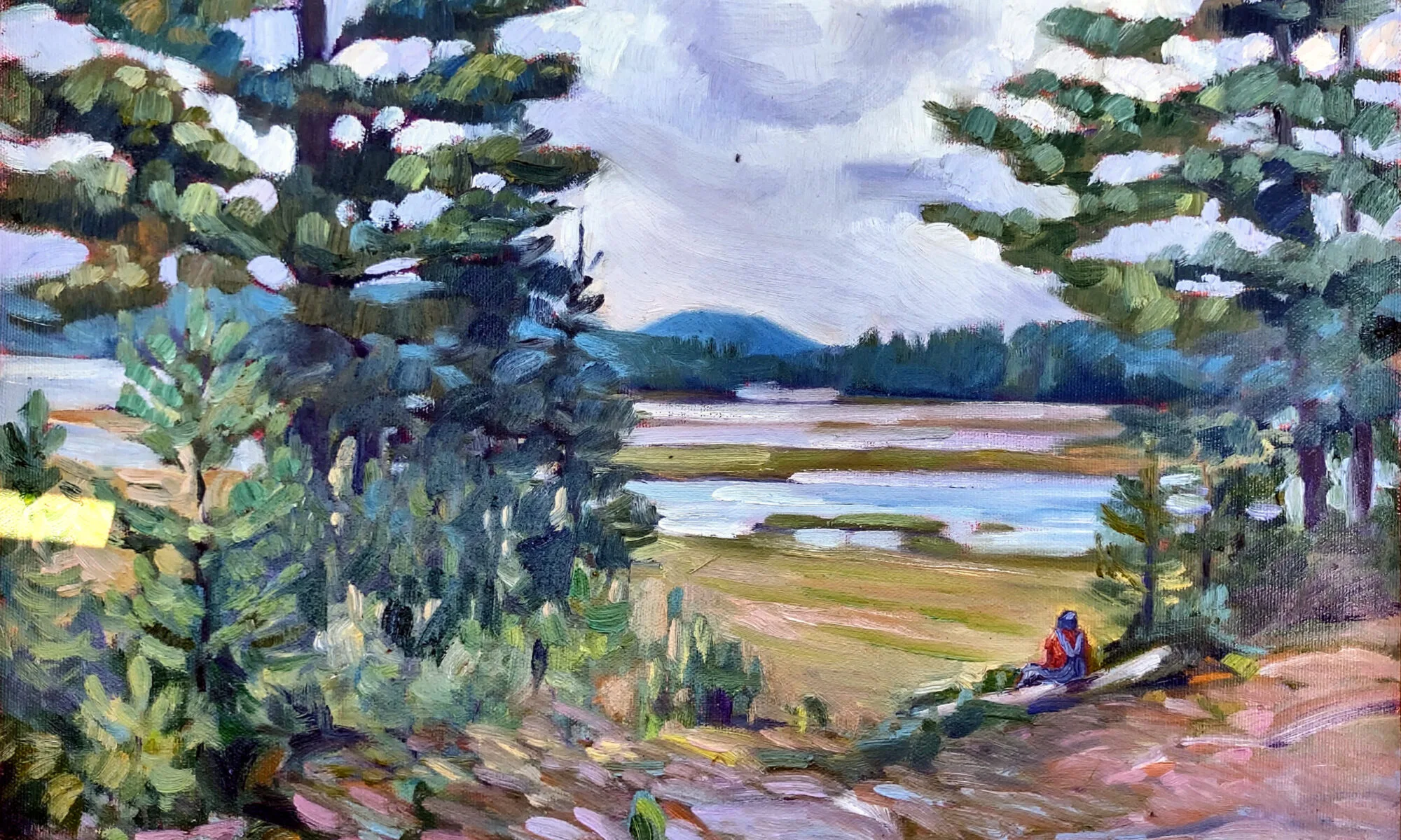
How do you get to Carnegie Hall?

Barnyard at G and S Orchards, by Carol L. Douglas. 9X12, oil on canvas, $450, framed.
During Saturday’s class at G and S Orchards, my goal was to solidify the lesson from the prior week about painting into a monochromatic grisaille. This was something I used to do but had abandoned until I painted with Jamie WilliamsGrossman earlier this month. Then I remembered how much I enjoyed it.
Step one is a very rude value study. This gets simplified and refined with brush and rag.
One student went from his drawing right to masses of solid color. Nothing wrong with that, but I was a bit frustrated that he was totally ignoring my instructions. Eventually I realized he’d missed last week’s class because he had to sit for his SATs. But it was too late to show him on his canvas.
Step two is the addition of thin masses of color.
I quickly set up a demo for him. It was a small class so I was able to do rounds, come back and paint a bit on my canvas, call my student over to discuss what I’d done, and then repeat—over and over. I like being very busy and this was energizing. We did run over (about an hour and a half) because of this but nobody appeared to mind.
Here is Nina Koski’s monochromatic painting. She was able to correct a composition problem very early on, rather than have it dogging her through the whole painting.
Meanwhile, Nina Koski had taken my instructions of last week very much to heart and was turning out quite a lovely painting of roses along the barnyard. I managed to get some intermediate photos of hers as well, so you can look at two different painters using the same technique.
Here Nina Koski is starting to add color.
Nina, by the way, painted a small plein air painting almost every day last week. She’s an exemplar of that old joke:
“Excuse me sir, but how do you get to Carnegie Hall?”
“Practice, practice, practice!”
And here is her finished painting. She’s only been painting a few months!
I have three openings left for my 2014 workshop in Belfast, ME. Information is available here.

What painting means, indirectly

I can’t imagine why running here makes us think about aesthetics. Since I’ll never paint from a photo, you can enjoy the reflections and shadows now.
Mary and I are running on the canal bank, discussing opening and delayed adverbs and adjectives. (I think middle school teachers invented them to torture students.) She gives an example: “Gracefully, Carol runs along the canal.” (Heh.)
I stop and stare at her—any excuse for a break. “Why would anyone teach a kid to write in such an antiquated manner?”
Mary’s a writer, and she’s in love with words. “It might be useful,” she protests. “Chiaroscuro might be obsolete, but there must be times you use it.”
I shudder involuntarily. “Never. It would never work with direct painting.”
This is from Gamblin’s very fine explanation of indirect painting, which you can find here. The monochromatic phase of an indirect painting is basically a value study.
Mary knows that as long as I’m talking about painting I keep running, so she asks me the difference between direct and indirect painting, and how Rembrandt and other classical painters built up their work. Huffing only slightly, I tell her that the artist started with an imprimatura, an earth tone base, and built up successive layers of transparent warm glazes. These were allowed to show through as dark tones in the final work. Opacity was added on the top, as light tones which glowed against the darks.
In the second phase, the artist has added lights, which are also opaques.
The Impressionists essentially invented an entirely new system of painting—direct painting—where a painting is done in opaque layers rather than built up from transparency. This radical technological shift was possible because modern chemistry was developing so many new pigments.
The finished work allows the imprimatura to show through (although in this example, the artist has muddied the darks and let it show through in the midtones).
 I tell her a bit of my own story: I learned to paint indirectly and was doing it until I went to the Art Students League to study. There, Cornelia Foss told me, “If this were 1950, I’d say ‘brava,’ but it’s not.” Tough words, but the best painting advice I ever got.
“But why is that?” Mary asks. “What about direct painting made it right for the 20th century?”
I speculate: indirect painting is more conducive to well-reasoned, planned paintings of academic or religious themes; direct painting is conducive to emotion expression. This puts it in sync with the overstimulated, nervous, energetic pulse of modern life.
“It’s kind of like the difference between a home-cooked and a restaurant meal,” Mary says.
I stop and stare again. Really, at times Mary boggles my mind.
“A home-cooked meal takes a long time to prepare. It is often, literally, a love offering,” she explains. “A restaurant meal—even the best of them—is quicker, and is more an expression of what the chef can do.”
Somehow, that goes right to the heart of the matter. Until the end of the 18th century, painters were looking outward—as missionaries of faith and social justice, or as teachers of classical myth and history. We may think those subjects are dated, but they show that the artist was primarily concerned with his audience. After the rise of the Cult of Genius, the artist’s personal vision became paramount.

So I think Mary’s metaphor is apt: indirect painting was a love offering, and direct painting is all about me.
Every day I do one task to prepare for my June workshop in Rockland, ME. Today’s was cleaning the Prius. Meanwhile, what are you doing to get ready for it? August and September are sold out for my workshop at Lakewatch Manor in Rockland, ME… and the other sessions are selling fast.  Join us in June, July and October, but please hurry! Check here for more information. 

In the end, it all comes down to footwear.

Practical for plein air painting as long as there aren’t deer ticks.

CT asks: I paint with water-soluble oils. I don’t know if this goes for regular oil paints, too, but I’m struck by the various textures and viscosities of different colors—from a cadmium yellow so thick it’s hard to get it out of the tube, to oily paints like the siennas. I know that you’re dealing with different pigments, so it takes different amount of oil to suspend them. But when you are trying to paint with them, how do you deal with the extremes? (Maybe you’ll tell me that that’s not a problem with “real” oil paint.)
Yes, water-miscible oils behave differently from regular oils. When severely thinned, water miscible paint tends to slip around like watercolor. When used straight from the tube, it tends to drag more than conventional oils. This means that the natural impact of viscosity range is somewhat exaggerated for you.
That range comes from the pigments themselves.  A paint’s opacity is directly related to its particle size (ergo its viscosity). The oldest pigments—the earths—tend to have large particles and be relatively heavy paints, since they’re basically just ground-up minerals. The 19th century pigments—most notably the cadmiums—tend to be moderately-large particles and so are moderately heavy. The 20th century transparent synthetic organic pigments generally tend to be high stain and more transparent.
There are a couple other factors involved. Making paint is an art in itself, and various manufacturers mill and mix pigments differently. Different brands of paint have radically different pigment loads, so the same color from two different makers may vary greatly in texture. Some paintmakers use driers, and sometimes paints sit for a long time before being sold, meaning you occasionally come up with a half-dried tube right from the store. Paints that stand (especially in high temperatures) can separate,  so the beginning of the tube is all oil and the end is stiff.
A sophisticated painter understands and works with the natural weights of pigments. This is especially crucial in watercolor, but it’s true for opaque media as well. This is, in fact, the fundamental trick of indirect painting, where a base painting of transparent earth tones is laid down and then painted into with opaque paints.
Cute, and about $8 from Old Navy, but ridiculous for plein air painting.


TG asks: “What kind of shoes do you recommend for plein airpainting?”
Next week I’ll be painting during a cocktail party fundraiser for the Association for the Blind and Visually Impaired.  I’m tentatively planning on wearing red patent-leather flats, a beaded skirt, silk blouse and pearls (with a smock, of course). But I admit that isn’t my typical painting garb.
There are two major issues with footwear: that you can tolerate being on your feet for several hours at a time, and that they be suitable for the environment in which you’re painting.
When working in an area without deer ticks, I favor sport sandals that can tolerate water. (I often find myself not just painting the river but slopping around in the river.)

But ticks (or black flies) mean you have to have a bug barrier of some kind, and the most effective one I know is clothing: long pants, socks and sneakers.
In the winter, I wear waterproof hiking boots and wool socks if I’m likely to get my shoes wet, or sneakers and wool socks if I’m not. Some painters carry a scrap of carpet on which to stand.
If you’re in an area with rough trails and you plan on backpacking your painting stuff up them, real hiking boots are in order. There is no agony like that of insufficient footwear on a rough trail, particularly if you’re packing any weight in a backpack.

August and September are sold out for my workshop at Lakewatch Manor in Rockland, ME.  Join us in June, July and October, but please hurry! Check here for more information.

Last chance! A week of instructed wilderness painting, only $775 inclusive!

September 30-October 5 2012


Paint in the unfettered splendor of nature with celebrated artist Carol L. Douglas, in the bewitching, boundless and historic Adirondack Park—a week of unparalleled instruction at some of the wildest, most scenic painting locations the nation has to offer. Your outdoor adventure will be balanced by the comfort of an all-inclusive accommodation package at the historic Irondequoit Inn.
Eric and Liz Davis
$775.00 inclusive!
¡         Basic package: includes 5 nights lodging and meals.
¡         Private non-smoking room with shared bath in either lodge or cabin accommodations
¡         15 meals served communally
¡         Breakfast: Monday-Friday
¡         Box Lunch for off-site painting sessions,
M-F
¡         Dinner: Sunday-Thursday
¡         Coffee and Tea Bar
¡         Sunday afternoon welcome reception
¡         Morning and afternoon instruction sessions,
¡         Monday-Thursday
¡         Group critique session, Thursday evening
¡         Available on request:
¡         Non-painting partner accommodations
¡         Private portfolio critique
¡         Private Room and Private Bath: add $125
¡         Suite with Private Bath and Kitchen: add $250
To register:
Call the Irondequoit Inn at 518-548-5500
For more information:
Eric and Liz Davis

Oh, my! What should I buy?

My basic palette in my pochade box. 

I am happy to share my plein air supply lists with both my own students and others:

¡         Watercolor supply list.
¡         Oil painting supply list.
¡         Pastel supply list.
I have friends who are tremendously efficient plein air packers. I freely admit I’m not up to their standard, but I do paint outdoors a lot, and successfully. Consider these lists not as gospels, but as starting points.
There is no one “best” palette for plein air (or any other kind of) painting. There are so many pigments available today that the artist is faced with—literally—millions of possible combinations. The medium you’re using, your own taste in color , what you want in opacity and drying time all affect your final choices.
And the exact same paints being used for figure painting.
A little knowledge of pigment development is helpful in whittling down selections. The newer the pigment, the more intense and more durable it will be. A palette of earth tones might have a hard time coping with the addition of dioxazine purple or phthalo blue, whereas a vivid 20th century palette will fail to notice a delicate Renaissance lake color.
This is not to say that you should choose only an “Old-Masters” or an “Impressionist” palette—my own palette has paints from every period. But you can avoid a lot of waste by avoiding obvious mismatches.
The earths and earliest synthesized colors:

The oldest pigments are the earth pigments: the ochres, siennas, umbers and carbon blacks. These have been in use more than 15,000 years. They are as solid and everlasting as dirt. Over time artists have been tremendously wily about expanding their narrow range.
The Egyptians created the first chemical pigment, Egyptian Blue, around 5000 years ago. They also pioneered the use of minerals as pigments with malachite, azurite and cinnabar, and devised a method of fixing dyes to solids (“lake making”) which is still in use today. The Chinese created vermilion and the Romans gave us lead white.
Renaissance alchemists must have been more focused on turning lead into gold, because although they made a few refinements to paints, they left the fundamental kit unchanged.
The industrial revolution:

The Industrial Revolution brought us a pigment revolution. Just a few examples are:
Cobalt Blue – 1802
Cerulean Blue – 1805
French Ultramarine – 1828
Zinc White – 1834
Cadmium Yellow – 1846  
Aureolin – 1862
Alizarin Crimson – 1868
Without the explosion of brilliant color in the 19thcentury, there could have been no Impressionism, no modern art.
Modern pigments:

The third tier of pigments are the highest-stain, most durable of colors, developed mainly for industry: “Hansa” yellows, titanium white, synthetic iron oxides (the “Mars” colors) phthalocyanines, quinacridones, perylenes, and pyrrols. Some have replaced 19thcentury colors that have proven to be fugitive (such as quinacridone violet to make “permanent” alizarin crimson). Some have an uneasy place on the palette because of their extremely high stain, such as phthalo blue.
My basic field kit.
References: “Bright Earth: Art and the Invention of Color,” by Phillip Ball. It is certainly the most fun book about color ever printed.

Gamblin Artist Colors has optional palettes here. (What is true for oils is generally true for acrylics.)
The most comprehensive guide to watercolor pigments I know of is here.
And my favorite resource for pastels is here.

Then there’s that matter of inspiration

Deer in my brother’s yard, an exercise done several years ago

This Sunday, I was doodling in church when a painting dropped full-blown into my head. That isn’t common, but is always exciting. And in this case, it was fortuitous since I just finished several weeks of flailing around on the previous piece.

Where does a fully-realized idea spring from? First, a thought: in this case, a dilemma that has bedeviled me for almost a year. Then, visual input that is usually jumbling around in one’s cranium solidifies into a concept. In this case:

  1. An email sent by my pal Garrett about how big wolves really are;
  2. A painting I did several years ago as an exercise for my class on how to paint the traps between trees;
  3. A photo taken by my friend Jamie of a waterfalls near her house;
  4. William Holman Hunt’s “Our English Coasts (Strayed Sheep),” which set the light tone for the uplands.

Bold

My sketch done in church last Sunday.

When I’m painting observationally, I follow the traditional rules of alla prima painting: dark before light, big masses divided into small masses, fat over lean. When I’m painting from an interior vision, I paint indirectly, starting with a color map, and then modulating with opaque paints.

My color map.

As far as I got today. Tomorrow, I’ll start looking at real reference.

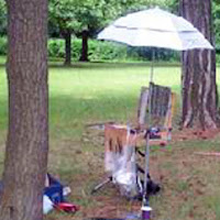
BTW, this is my current easel setup—electronic reference to the left, paper reference to the left.


Painting a small study using an indirect method

Note: I first posted this in April but managed to lose all the illustrations. Embarrassing for someone who prides herself on her computer literacy. I recently realized I was overworking the thing, and ought to just follow the software instead of trying to bend it to my will.

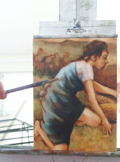
During Wednesday’s class I demonstrated a method of indirect painting where one starts with a monochromatic grisaille and then paints into it. I had so much fun with the demo that I decided to finish it, working with the monochromatic underpainting while still wet. (In true indirect painting, the grisaille is allowed to dry completely and then color is glazed into it in transparent layers. What I am doing is more properly called scumbling.)
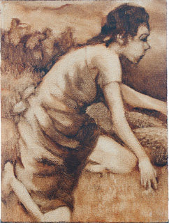
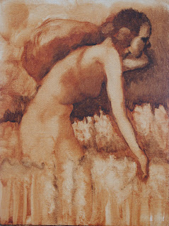
I am working on a 5X7 RayMar linen art board (so these images are actually quite small). I start with a mix of two earth pigments, Burnt Sienna and Burnt Umber, thinned with Turpenoid.

The advantages of cartooning in paint instead of drawing are numerous: you can wipe out what you don’t like, you’re inclined to work in masses instead of lines, your sketch is temperamentally closer to the final painting, and you concentrate more on your painting than your drawing skills. Rubens drew in paint, as did Rembrandt.

Those who were in Wednesday’s class know that my first sketch had two figures. But when I returned to it on Thursday, I could no longer remember where I was going with it, so I wiped it out. I decided (for no particular reason) to paint “Ruth amid the corn” for my subject.

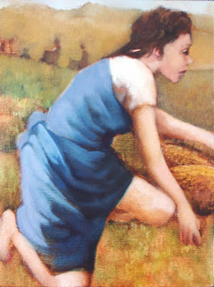
While the first drawing was a sensitive rendering, it is a static composition, completely in profile. So I wiped it out and redrew it. The second draft is a rather brutish woman, but I liked the pose.
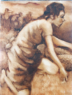
At this point I began to consider what I wished to say about Ruth. In the Bible story, she is starving, but remains beautiful enough to attract Boaz. She is an alien, but her story culminates in her being the great-grandmother of King David. She is both a poor woman and the ancestor of a King. The other women working in the field are separated from Ruth but aware of her. (The Book of Ruth can be read here.) I developed this stage by adding layers of paint and wiping it away where necessary. These layers were not completely dry as I was working over them, in contrast to a true grisaille, but I was able to add additional pigment without disturbing the lower layers. The goal at this point was to clearly develop the values (darks and lights) and begin to add texture. As I was not working with any reference (either a model or photos), the figure and face are unfortunately somewhat stylized.

I chose a transparent palette with mainly 20th century pigments: chromatic black, phthalo emerald, hansa yellow, Indian yellow, napthol red, quinacridone violet, ultramarine and phthalo blue. I chose this palette based on personal preference, because it certainly isn’t historically correct. Since the 20th century pigments were developed for direct painting, the end result is kind of quirky.
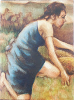
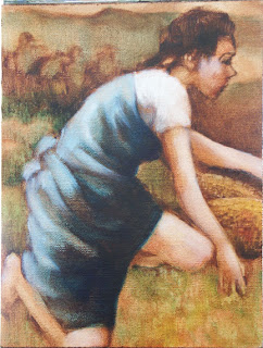
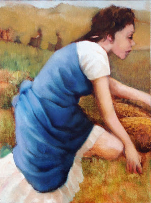
I glazed Ruth’s dress in blue as befits the ancester of a King (see representations of the Virgin). When the color was added, I noted a number of drafting errors—in the arm, in the basket, and in the placement of the eye. I could have corrected these in the transparency but didn’t feel like scrubbing them out on such a small canvas. Instead, I will correct them with opaque paint.

At this point I added two whites to my palette: zinc (for glazing) and titanium (for opaques). Zinc white tends to be warmer and more brittle than titanium white, which is extremely cool. It is important to begin using medium at this stage.


I began to experience the limitations of my brushes. I have been direct painting for so long that I no longer have sable or synthetic brushes. The hog bristle brushes I have are adequate but leave brushmarks unless you overwork the surface. I also have no tiny brushes, and I am working on a very small surface. Oh, well.


As I began adding white, I was also modeling chromatically. By underpainting in a warm tone, I have set up the painting so the light areas must be cool and the shadows warm. In these blues, I used a combination of violet and phthalo in the highlights, phthalo blue and emerald in the shadows, and ultramarine in the midtones.

I became aware of an annoying composition problem in the lower right corner, where the leg slices off a triangle. I could solve this by reducing the contrast and chroma in that corner, or by changing my drawing. I don’t like the bare leg that much anyway; it might contribute to a sense of motion, but is nonsensical for Biblical-era women’s dress.

I began to add the white to the flesh tones, which only emphasized the difficulties in the lower right corner. Note that scumbling the transparent (zinc) white over the wet transparent earth tones in the blouse results in warm and interesting shadows.

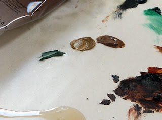
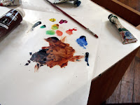
I realized I need to add some opaque colors in order to develop the skin tones and background. I choose yellow ochre, chromium oxide green, and raw sienna (modern earth pigments are more opaque than the historic ones). It’s a little picture, so I put out small amounts of paint.


The flesh is rather flat (I’m blaming my brushes), and my drafting errors have become more obvious. Note that I don’t strive for transparency in the skin tones at all. Rembrandt had a delightful way of painting solid faces into figures which were essentially transparencies (here, for example). I love it, even if I am not particularly good at it.

I decided to reduce the size of the figures in the background, and integrated a pale sky into the painting. Note that I was constantly refining the figure, the draperies, and the face with every iteration. In addition, I was reducing the contrast in the blue drape.

It was time to rid myself of that pesky leg. (I could have fixed the drafting, but that wasn’t the leg’s primary problem; its position was the issue.) Note that I used chromatic modeling on the white skirt even though the russet tones weren’t pulled up from the underpainting. Also, I was steadily reducing the contrast in the blue drapes while increasing the chromatic range.

One issue with using 20th century pigments was becoming apparent. Many of them (the phthalos in particular) are high-stain colors. With little provocation they will bleed or track into neighboring sections of the painting. The painter must take extra care to manage this.


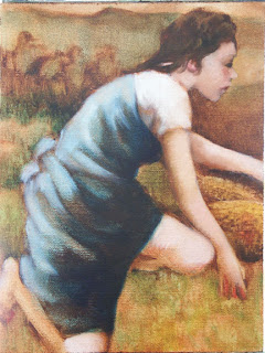
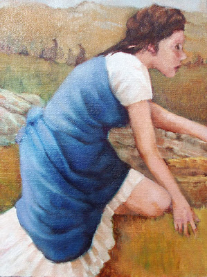
But—gack!—that eye! I’ve put up with it in the wrong place long enough. I had great fun introducing a stone wall and ruffles on the white skirt. It’s become somewhat more opaque than I intended but there are still passages which are transparent. Have developed the background figures as far as I want to… I think.

In that I have to teach tomorrow, I will let it dry thoroughly and then look at it again. There are shadows which need resetting, but perhaps I will take my friend Toby’s advice and work this up as a larger painting.

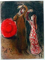
Just for fun, here are some other renderings of Ruth.

Marc Chagall, The Meeting of Ruth and Boaz

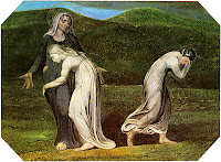
William Blake, Naomi entreating Ruth and Orpah

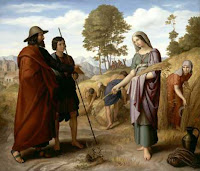
Julius Schnorr von Carolsfeld, Ruth im Feld des Boaz