“Rivers are elemental and ambivalent. They are frontiers and highways, destroyers and fertilisers, fishing grounds and spiritual metaphors, power-givers and flushers of poisons.” (Derek Turner)
 |
|
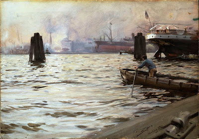
Port of Hamburg, Anders Zorn, watercolor, 1891, courtesy of Nationalmuseum, Sweden. Even in watercolor, Zorn goes for opacity and energy, not wispy translucency.
|
It’s been said that we never stand in the same river twice. It is equally true that we never paint water the same way twice. There are as many answers to the question “how do you paint water?” as there are moments in the day. Water is as changeable as the sky. But there are still some general steps you can follow.
 |
|
The purple noon’s transparent might, Arthur Streeton, 1896, courtesy National Gallery of Victoria. Streeton’s river is defined by value, and the depth of the painting by atmospheric perspective.
|
Start by noting the mechanics of the body of water in question. Is there a current? At what point is it in the tide cycle? What underwater obstacles are disrupting the surface? Is the surface smooth or choppy? Is the water silted or clear? What is it reflecting?
Water seeks a flat plane, but there are always light-and-dark contours. The wind makes patterns on the surface. In watery depths are dark tones. The splash and movement of foam and surf are light and energetic. On a rocky headland, these may appear to be constantly shifting, but in fact they follow rhythmic rules. In rivers, standing waves may appear oddly immutable.
 |
|
Hudson River, Logging; Winslow Homer, watercolor, 1891-92, courtesy National Gallery of Art. The water is blocked in solid shapes of different values.
|
Just as you seek the contours in a still life or portrait, find them in the moving water. Mark them out, dark to light. It’s easy to get repetitive in this phase. Only by careful observation will you avoid that.
|
The grand canal of Venice (Blue Venice), Edouard Manet, 1875, courtesy Shelbourne Museum. It takes keen observation to paint the pattern of water without being dully repetitive.
|
Reflections always line up vertically with the object being reflected, but the length of reflections varies. This is liberating: if you get the widths right, you can be creative with the lengths. Generally, the valuesin reflections will be somewhat compressed; lights will be slightly darker than what’s being reflected, and the darks slightly lighter. But that doesn’t mean the chroma will be necessarily reduced—reflections can often surprise with their purity of color. And there’s no rule that says the ocean will be lightest at the horizon. The ocean does anything it wants.
Depending on the surface of the water, a reflection can be mirror-like, or it can be in bands, or it can be almost lost in chop. But the overall scene won’t be a mirror image of what’s in the background. Mountains will appear farther away in the reflection. Observe what’s actually there, versus what you expect to see.
I usually block in reflections before I start worrying about the surface of the water. That lets me choose my markmaking at the last minute. It’s easy enough to build the reflections vertically and then drag a brush across them to give the sense of still water. But this is a party trick and can be overdone.
Instead, use brushwork to imply the vast energy of water. Long, fluent strokes can indicate ebb and flow. Short, energetic strokes will show chop. Opaque or impasto paint can indicate the dance and verve of crashing waves better than delicate transparency.
 |
|
Lake Ladoga, Arkhip Kuindzhi, 1871, courtesy Russian Museum. We can see the underwater rocks along the shore.
|
Shallow water, where you can see to the bottom, is difficult to paint. The ground influences the color of the water, and you must balance underwater details with surface reflections. Shallow water running over rocks in a river can be very erratic; to get the sense of that requires careful, slow observation.
Your assignment this week is to paint water. If you’re lucky enough to live where you can paint outdoors without breaking your lockdown rules, please—by all means—avail yourself of that opportunity. For the rest of us (and those of you who are still locked down in winter) a photo is another option.
I can’t wait to see what you do!


