Monday Morning Art School: avoid the Velvet Elvis

How do you paint the sunset without it looking like kitsch?

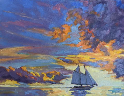
Sunset Sail, oil on canvas, Carol L. Douglas, available.

In class last week, a student said she’d painted the shadow areas of a sunset painting grey. “I wanted to avoid the Velvet Elvis look,” she said.

As with so many things in mid-century America, the popularity of velvet paintings in the 1970s was the result of one person’s mad ingenuity. Doyle Harden created a block-long factory in Ciudad JuĂĄrez, Mexico to mass-produce velvet paintings for the American market. “I never met many people who would even admit they would have them in their homes,” Harden said. “But I’ve sold more than $100 million worth of velvets, and to me it’s beautiful art.”

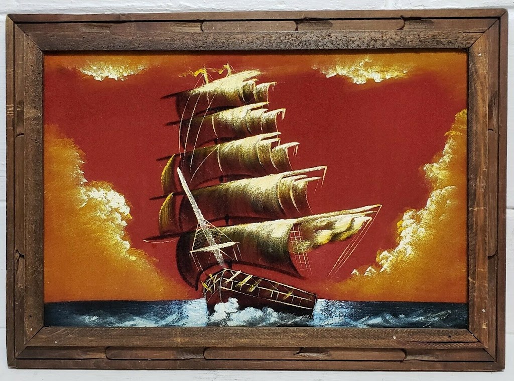
A mid-century velvet sunset painting.

(If you do have one, there’s a thriving secondary market on ebay. You may be able to recoup what Grandma paid for it.)

Black velvet painting, in fact, may be the reason that black paint fell out of favor at the end of the 20th century. What distinguishes black velvet painting is the inky blackness of the dark passages, created by the fabric itself. It’s a by-word for kitsch, and that’s what my student wanted to avoid.

But black is, in fact, what’s left optically in contrast to the sunset. Objects in relief in front of a sunset will read as dark neutrals or, at best, as inky indigo blue.

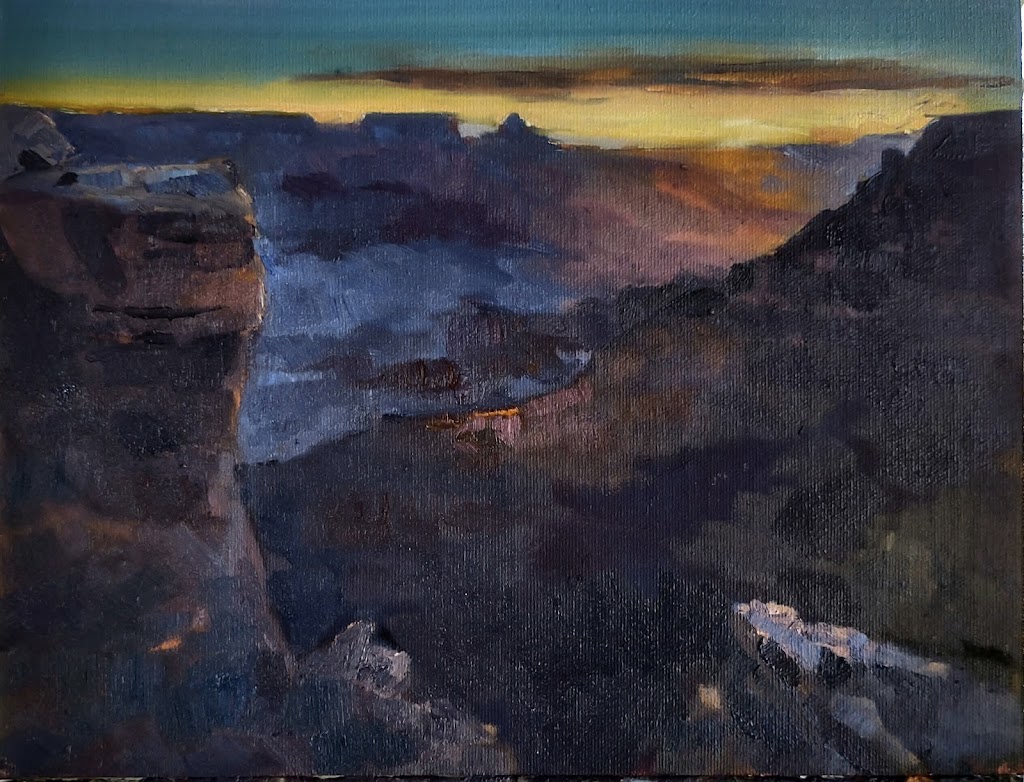
Grand Canyon at sunrise, Carol L. Douglas, available. One issue with extremely dark paintings is that they’re tough to photograph.

There will, however, be an aura of the sun’s light. It may be directly around the orb, as in the photo above, or it may reflect across a valley, as in my painting of the Grand Canyon at sunrise. Either way, everything in relief is not unremittingly black.

There will likely be shades of grey within that darkness. Here you can gain some relief by adding blues or even purples.

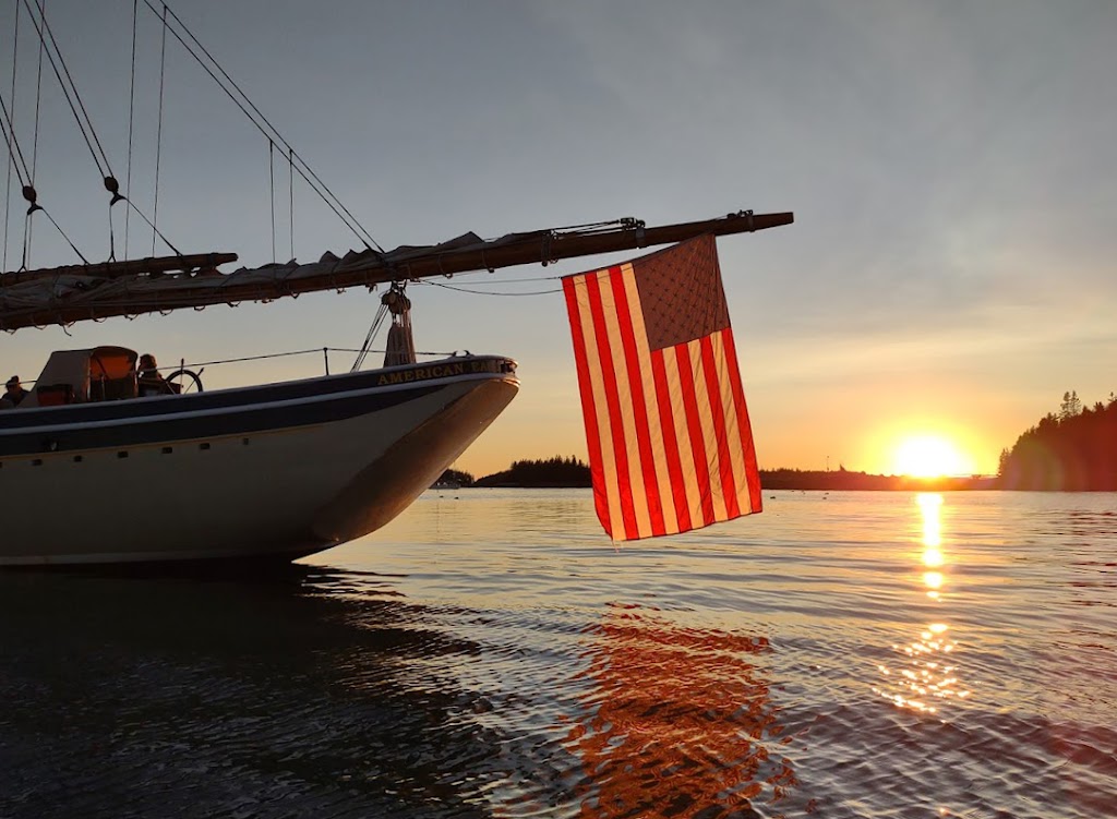
American Eagle at sunset, taken during my September Age of Sail workshop last year.

We have two kinds of color receptors in our eyes—rods and cones. Rods work better at night, but are less receptive to the red end of the spectrum. This is the Purkinje effect, and it leaves us perceiving things as deep blue—right before we lose any sense of color at all.

Some objects are partially illuminated by the sunset light streaming through them. The flag of American Eagle, above, is an extreme example, but there are others, including glass and water.

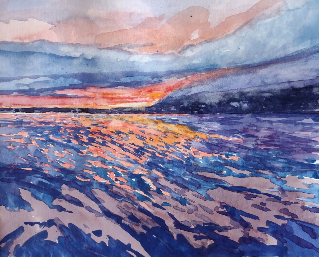
Watercolor sketch of sunset, Carol L. Douglas, NFS.

In addition, we can see some color in objects that are close to us. That’s because there’s still reflected light bouncing around us. However, a lot of that is remembered or implied color. For example, in the photo of American Eagle, we ‘see’ the name of the boat as gold, but sampling it in the photo tells you that it’s really a very desaturated greyish brown. A little color goes a long way in these dark passages.

But that’s optical perception, and on top of that you have to add emotional response. I ‘knew’ there were greens and reds in the Grand Canyon; I could just see the ghostly outlines of trees. Adding them into that stew of darkness was not a problem as long as I kept the value universally dark.

In watercolor, the problem is exacerbated by the fact that deep darkness is not always watercolor’s best look. One option is to run head-on into the darkness, as Bruce McMillan did here, to great effect.

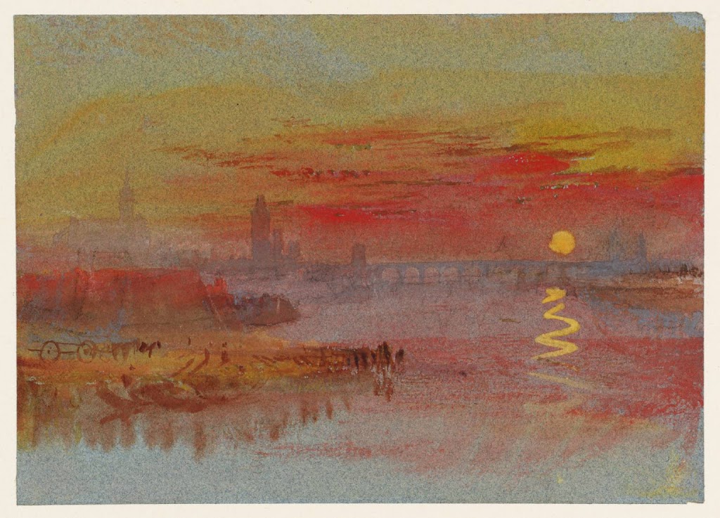
The Scarlet Sunset, c. 1830-40, watercolor and gouache, JMW Turner, courtesy the Tate.

Still, sunsets are overwhelmingly the province of oil painters, because of that darkness issue. The exception to the rule is Joseph Mallord William Turner, who painted them many times in watercolor and gouache. His solution is to lighten the dark passages considerably, letting them fade into inconsequence.

Reading (and writing) a painting

A good artist, like a good writer, controls how his painting is read.

Early November: North Greenland, 1932, oil on canvas, Rockwell Kent, courtesy the Hermitage

People are sometimes under the mistaken notion that I’m intellectual. In fact, my taste in books is decidedly low-brow. Luckily, there are as many different books out there as there are readers. The same is true of paintings.

Reading a painting is similar to reading a book. First, there’s an introduction. We enter every painting at some point, although the artist need not create a literal visual path in for us. It’s just as likely that there are a series of focal points that the reader notices and absorbs in order. These are supported by incidental matter that contributes tone and information. A good artist, like a good writer, doesn’t leave this to chance. It’s organized in the composition phase and then supported in the painting phase.
Whalers, c. 1845, oil on canvas, JMW Turner, courtesy Metropolitan Museum of Art. There are only three intelligible passages in this painting—the whale, the whalers in their dories, and the ship. The water might as well be a wheatfield for all the information we’re given.
That requires that you, the artist, understands the basics of composition. You control the motive line of your painting. You know how to use contrast and color to encourage the viewer to read your work in a specific order. You know how to make some passages subservient to these main themes.
You must understand the focal points of your painting, either overtly or subconsciously. These are not necessarily the subject. In Rockwell Kent’s Early November: North Greenland, 1932, our eyes go first to the iceberg in the foreground. Kent has made it the most luminous, warmest part of the scene, and set it off against the briny depths. Next we look at the hillside behind, which is almost as bright as the iceberg. Only after that does our eye travel to the human activity at the bottom. Here we’re arrested by an ageless story: man wrestling against the vast power of nature for his very survival. We spend a long time looking at these tiny fishermen, which we wouldn’t have done had they been what we noticed first.
The Census at Bethlehem, 1566, oil on wood panel, Pieter Bruegel the Elder, courtesy Royal Museums of Fine Arts. As with the gospels, all the action is in the most inconspicuous corner.
Kent has borrowed a technique first used by Pieter Bruegel the Elder four hundred years earlier. In his Census at Bethlehem, all the bustle and contrast of the midfield drive our eyes down to the least important part of the painting, the corner. There the scene is laid for the birth of Christ. Just as in the Bible story, this great event happens in an unimportant place.
We know that because we’re bringing our own understanding to the painting. In both literature and painting, prior knowledge plays a profound role in how we read the work. There are symbols we must decode, and experiences we relate to. The thematic thread tying together the three paintings above is the insignificance of man. Every one of us has felt that some time. That feeling transcends the specific narrative.
The Charioteer of Delphi, 478 or 474 BC, courtesy Delphi Museum. We may know nothing of this young man, but his beauty and concentration speak through the ages.
Some of the great art of the past has lost its narrative power today. We don’t know enough Greek mythology or Bible to fully decode them. But the greatest still have the power to transport us. They touch a common chord of experience and emotion.
In our digital culture, we don’t often take time to read artwork quietly. But that’s in the shopping phase. In the end, paintings will go home with someone, to be seen over long periods of time. To survive, they must have some story to tell, some depth of meaning, or they will be relegated to the attic. The work that compels the most on Instagram may be, sadly, the least successful in real life.

In pursuit of the picturesque

Scotland is a stew of genuine Medieval and Victorian architecture, ideas, myths and fables, with a dollop of pop culture thrown in.
Merlin’s Tomb, 1815, by Joseph Michael Gandy, is a fantasy based on Rosslyn Chapel.

The Scotland we imagine was largely the invention of the novelist Sir Walter Scott. It was he who made the legends of the Highlands fit reading for polite society. At the time, Scotland was moving into the modern world of capitalism and engineering. Meanwhile, the Highland Clearanceswere pushing people out of their tribal lands and off to the New World. Scott wrote at this pivotal time in Scottish history, and his stories drew a line between the romantic then and the pragmatic now.

There’s a monument to George IV in Edinburgh; it marks the first visit of a United Kingdom monarch to this city in two centuries. To be fair, much of that time Scotland was in rebellion.
Portrait of George IV of the United Kingdom, 1829, David Wilkie, courtesy of the Royal Collection. The king actually wore pink tights for his visit.
Scott stage-managed the king’s visit. He had just three weeks to plan the event, but succeeded in creating an affair that impressed both the ruler and his own countrymen. Tartan had been banned after the 1745 Jacobite rebellion, but Scott dressed the king up in it. Overnight, tartan became a potent symbol of Scottish national identity.
Rosslyn Castle, c. 1820, Joseph Mallord William Turner, courtesy Indianapolis Museum of Art
As Scotland went off the boil, many Englishmen visited. Among them was the painter JMW Turner. During his first trip in 1801, he sketched Rosslyn Castle. Later, he returned and painted the Castle for Scott’s serial, The Provincial Antiquities and Picturesque Scenery of Scotland. This teamed the United Kingdom’s greatest romantic writer with its greatest romantic artist. Turner continued to illustrate Scott’s books, becoming enough of chum to visit Scott at his vast country pile, Abbotsford, in 1831.
Edinburgh from Calton Hill, c. 1819, Joseph Mallord William Turner, courtesy National Galleries Scotland
The picturesque was a compromise between two Enlightenment ideals: beauty and sublimity. By the end of the 18th century, thinkers had come to the conclusion that these were not rational, but emotional states. The beautiful was sensual; the sublime provoked awe or terror. The picturesque combined them in a more easily-digested package.
Where better to experience this than in the Scottish Highlands? “The mountains are ecstatic,” wrote Thomas Gray in 1765. “None but those monstrous creatures of God know how to join so much beauty with so much horror.”
Nobody was more susceptible to the Scottish picturesque than Queen Victoria. In 1842, she and Prince Albert paid their first visit to Scotland. They were so struck by the Highlands that they returned regularly, ultimately purchasing the Balmoralestate in 1848.
View from the walk near the Dee in Balmoral Grounds, 1849, Queen Victoria, courtesy Royal Collection Trust
Victoria’s affection for Scotland was deep and abiding. The Royal Couple enthusiastically decorated Balmoral Castle in Balmoral tartan, stags’ heads, and other Scottish tchotchkes. This led to an international craze for all things Scottish.
The queen visited Rosslyn Chapel on her first trip north. It was then half-ruined and overgrown, and she noted that it deserved restoration. Work commenced in 1862, and the chapel was rededicated to worship that same year. Today, Rosslyn Chapel is a stew of Medieval and Victorian architecture, ideas, myths and fables, with a dollop of pop culture thrown in—much, in fact, like the myth of Scotland itself.

In the absence of volcanoes, learn to paint

In the absence of a world-class volcanic event, we can expect a typical, stunning coast-of-Maine summer. What better way to spend it than painting outdoors?


There’s been only one time in American history when summer failed to show up. That was 1816, and it was caused by the eruption of Mt. Tambora in the Dutch East Indies.  It was an event that had spectacular cultural repercussions.
In the northern hemisphere, grain crops failed. There was widespread famine for man and beast alike. Horses starved. That led to the invention of the velocipide, predecessor of the modern bicycle.
Here in the United States, famine spurred the westward expansion. Starving farmers in New England left for western New York and the Midwest, hoping for better weather and richer soil. The cataclysm sparked a religious fervor that created the Burned-Over Districtof New York. This in turn became a flashpoint for women’s suffrage and abolition.
Mount Vesuvius In Eruption, 1817, J.M.W. Turner
Among those who went west was the family of Joseph Smith, who relocated to sleepy Palmyra, NY with rather spectacular results. Both Smith and his mother were prone to religious visions. Was that God or ergotism from eating spoiled grain?
Particulates in the air led to extravagant sunsets. These in turn influenced the Romanticism of painters like J.M.W. Turner and Caspar David Friedrich.
Incessant rainfall kept Mary Shelley, her lover Percy Bysshe Shelley and their host Lord Byron inside during their Swiss holiday. Bored, they had a contest to see who could write the scariest story. The result was Frankenstein, or The Modern Prometheus, and the birth of science fiction.
In the absence of a world-class volcanic event, we’ll have to settle for a typical, stunning coast-of-Maine summer: fresh breezes, blue skies and the soft susurration of the surf on our great, grey granite coast.
My next session of weekly classes starts on May 30. We meet on Tuesdays from 10 AM until 1 PM, until July 11 (skipping neatly over Independence Day). There are two slots open for this session, so if you are interested in taking one, please let me know. The fee is $200 for the six-week session.
Neubrandenburg, 1816-17, Caspar David Friedrich
The goal is intensive, one-on-one instruction that you can take back to your studio to apply during the rest of the week. We’ll cover issues like design, composition, and paint handling. We will learn how to mix and paint with clean color, and how to get paint on the canvas with a minimum of fuss.
And, yes, we’ll talk about drawing. If you ever want to paint anything more complicated than marshes, you must know how to draw. As I’ve demonstrated before, any person of normal intelligence can draw; it’s a technique, not a talent. And it’s easy to learn, no matter what you’ve been led to believe.
Unless the weather is inclement, we’ll paint at outdoor locations in the Rockport-Camden-Rockland area. Painting outdoors, from life, is the most challenging and instructive exercise in all of art. It teaches you about light, color and composition.
That, of course, limits the media you work in to oils, watercolor, acrylics, or pastel, since they’re what is suitable to outdoor painting.
After that, I hit the road in earnest. My summer schedule includes events in Nova Scotia, Maine and New York. (As I tell my family, if you want to know my schedule, you can find it here.) 
For more information about my classes, see here, or email me here.

Masters of the northern skies

On a bitter spring day, a painter’s thoughts turn to clouds and how to paint them. It beats going outside.
Rainstorm over the Sea,  c.1824-28, John Constable
Yesterday, I asked Shary Cobb Fellows whether the Mary Day had hauled last year. “I think so,” she mused, “because these boats need their bottoms done every year.”
“Then how did I miss her?” I wondered. A few hours in the blistering, paint-peeling wind answered that question. It was probably too miserable to paint that week.
I wrapped myself in the blizzard blanket that’s still in my car. However, I could barely squeeze the paint out of my tubes. My easel was thrumming in the wind. I’ve got a good start and if the weather cooperates before the Mary Day moves out, I’ll be able to finish.
Easter Morning, 1835, Caspar David Friedrich
Most of the schooner fleet were originally coastal cargo or fishing boats, saved from ignominious decay in some shaded inlet by their conversion to the tourist trade. Mary Dayis different; she was purpose-built in the 1960s as a tourist boat. I chose a high angle, painting off an access road that leads down into the shipyard. It’s a pretty view, but it magnified the wind, and the sky was terribly gloomy.
Gloom has its purposes. Caspar David Friedrich used it to convey a world in mourning in his Easter Morning, above. 
The Thames above Waterloo Bridge, c. 1830-5 Joseph Mallord William Turner
Fog, too, can convey emotional moods as varied as that in Claude Monet’s Waterloo Bridge, Sunlight Effect to J. M. W. Turner’s The Thames above Waterloo Bridge. They were both painting the dangerous industrial pea soupers that plagued London until the Clean Air Act of 1956, and they handled the subject in very different ways.
The Maas at Dordrecht, c. 1650, Aelbert Cuyp
When the land is flat and low or the subject is the sea, clouds assume monumental importance. It is no surprise that the Dutch Golden Age Painters had a particular mastery of the sky in all its phases and seasons.
The Danish painter Christen Købke had a special affinity for the flat, low light of the far north, in those times when clouds barely permeate the overall gloom. A nationalist and a Romantic, he was determined to paint his nation’s delicate beauty on its own terms.
Roof Ridge Of Frederiksborg Castle, Christen Købke
John Constable did many field studies of clouds, which are startling in their modernity. “Skies must and always shall with me make an effectual part of the composition,” he wrote. “It will be difficult to name a class of landscape in which the sky is not the key note, the standard of scale and the chief organ of sentiment.”
The example I’ve shown is close to a modern gesture drawing, a quick capture of that moment when the clouds start dumping their load of water as they move in from the sea. It is not just a rainstorm, it is “an extraordinary force of emotion,” as critic Andrew Shirley observed.
An Teallach between Bristol and Mullagragh, James Morrison, University of Sterling Art Collection
The finest cloud painter working today is Scotland’s James Morrison. Born in Glasgow in 1932, he studied at the Glasgow School of Art and is an Academician of the Royal Scottish Academy. His paintings of the landscapes around his home in Angus and of Assynt in Sutherland are, in truth, mostly sky studies. He is a meticulous observer of the movement and development of clouds.
I have written about how to paint clouds here, using examples from my own work. It’s important to know the different types of clouds and how they move across space. Yes, you can paint clouds without being able to draw, but they’re not going to be as convincing as those that are carefully observed. As with everything, practice makes perfect. 

Heavy weather

Heavy Weather, underpainting, by Carol L. Douglas
For this painting, I am trying to envision a sailboat being hit broadside by a large wave, with the question of whether it will capsize or right itself left unanswered.
My own sailing has been seriously curtailed for decades. That means that if I have questions about what a boat might do under sail, I have to consult an expert. My go-to guy is my cousin Antony. Not only does he get to sail in the southern Indian Ocean, but he’s in a totally different time zone, so hopefully he will answer my questions while I sleep.
The Gulf Stream, 1899, by Winslow Homer.
This morning I was looking for photos of boats in heavy weather. I came across the following, by a blogger who identifies himself only as Joe:
Sometimes the sea can be a very scary place.

A very, very scary place.

Before you undertake a voyage to adventure, make sure you are well trained, have some real sailing experience, and know how to survive if things go wrong. Believe me things can go wrong. Thank God I have my Navy training.

Fishermen at Sea, 1796, J.M.W. Turner
Don’t assume that the guy sitting in his flight suit on the ready alert is going to come and rescue you. You might be out of range.

For God’s sake, learn how to read the weather!

For home work, I made my sailing students keep a notebook chronicling the daily weather. It had to have the forecast from the newspaper with their own observations.

The Fog Warning, 1885 by Winslow Homer
That might be a great idea for my painting students, too.

Let me know if you’re interested in painting with me in Maine in 2015 or Rochester at any time. Click here for more information on my Maine workshops! Download a brochure here.

Folk wisdom says

Red sky over the Duchy says I’ll have an opportunity to catch up on my studio work today.
Red sky at morning, sailors take warning;
Red sky at night, sailors’ delight.
Dawn this morning featured a lovely rose-colored sky. Since I trust the ancient couplet, above, as much as (or more than) I trust the Weather Channel, I’ll be teaching in the studio tonight.
How old is that couplet? It’s quoted in Matthew 16:2-3, making it at least two thousand years old:
[Jesus] answered them, “When it is evening, you say, ‘It will be fair weather, for the sky is red.’ And in the morning, ‘It will be stormy today, for the sky is red and threatening.’ You know how to interpret the appearance of the sky, but you cannot interpret the signs of the times.

For those who don’t read sky signs and don’t trust their arthritis, there is NOAA’s weather page, with its hourly graphs. They include sky cover, which makes them the plein air painter’s best tool for predicting sunsets.
Joseph Mallord William Turner had a great interest in painting atmospherics. Here is his Sunrise, with a Boat between Headlands, c. 1835-40.
This wisdom works where there are strong westerlies, which happen in the middle latitudes (in which both Jerusalem and Rochester fall). Of course, I also use NOAA’s website; their hour-by-hour weather graph is the plein air painter’s best friend.

I have three openings left for my 2014 workshop in Belfast, ME. Information is available here.