
We’re all proponents of loose-is-more, but there are times when you have to be able to hit it right.
 |
|
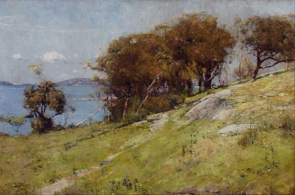
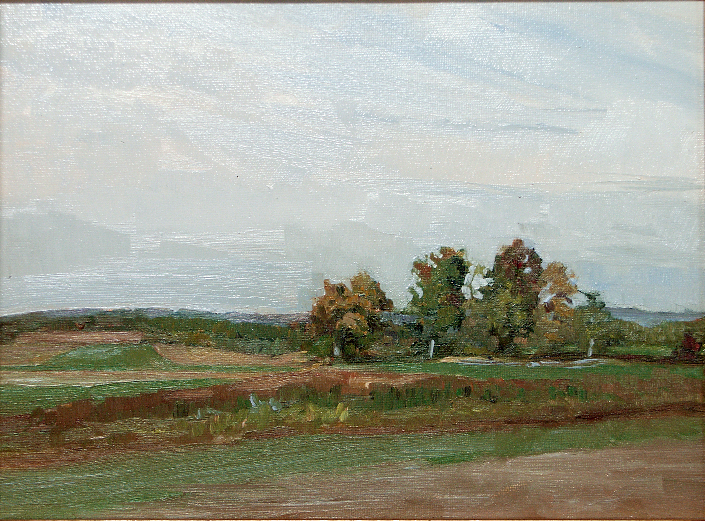
Cremorne Pastoral, 1895, Arthur Streeton, courtesy Art Gallery of New South Wales. There are few details, but the ones that are, are very accurately painted. |
Detail and precision are not in style right now. “The artist should fear to become the slave of detail,” wrote Albert Pinkham Ryder. “They should strive to express their thought and not the surface of it. What avails a storm cloud accurate in form and color if the storm is not therein?” We’re all proponents of this loose-is-more theory of painting.
However, this is a current trope, and not an artistic truth. There are contemporary figure and still life painters who focus on detail, and artists practicing modern trompe l’oeil. Even in plein air, there are fine painters who eschew looseness for careful attention to detail. Richard Sneary, Jay Brooks and Patrick McPhee come to mind.
 |
|
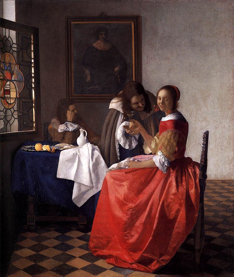
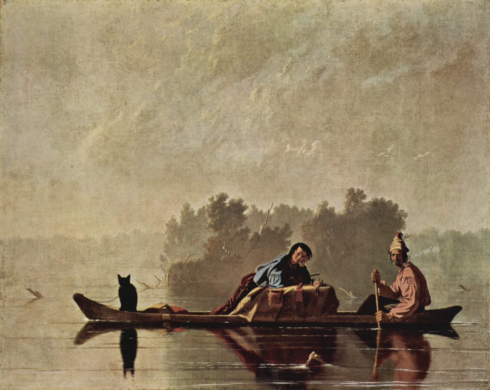
The Girl with the Wine Glass, c. 1659, Johannes Vermeer, courtesy Herzog Anton Ulrich Museum. We’re so focused on the clarity of Vermeer’s vision that we barely notice how empty the room is. |
Many people get caught up in the details before they get the big shapes right. That’s overwhelming. Before you ever get to the point of painting in blades of grass, the rhythm of light and dark must be researched and articulated properly. How do you do that? The same way as with an alla prima finish—through sketch and underpainting.
Even the exuberant Dutch Golden Ageartists left things to the imagination. We’re so busy looking at all the stuff they crammed into their canvases that we sometimes don’t notice what they’ve left out. Not every detail deserves the same attention.
 |
|
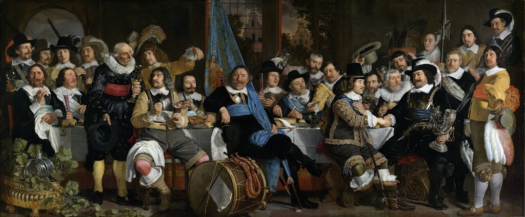
Banquet of the Amsterdam Civic Guard in Celebration of the Peace of Münster, 1648, Bartholomeus van der Helst. Courtesy Amsterdam Museum |
Great painters distill the visual noise, and then concentrate on the important parts. Consider the problems facing Bartholomeus van der Helst in his monumental commission, Banquet of the Amsterdam Civic Guard in Celebration of the Peace of Münster, above. It’s a portrait of 24 august gentlemen and one lady. (And wouldn’t you love to know why she was included?) None of the subjects would have been happy to be represented with a few Impressionistic brush strokes. There were symbols that needed to be included—pikestaff, drum, silver drinking horn and the paper on the side of the drum. In addition, the men were garbed in their very best frippery, and they meant to show that off.
Van der Helst pared away at the composition with ruthless efficiency. The background is muted. He let black hats and black garb sink wherever he could. Thank goodness for the fashion of ruffs and white linen collars—they allow the faces to stand out. The remaining textiles are held in a rigid pattern of gold, blue, and red. The color harmony is, in large part, holding the picture together.
It’s unlikely that an artist will ever paint a monumental commission like this again. It’s more likely that we’ll add a few details to a much looser painting. These details can fool the eye into thinking there’s more there than is actually present.
 |
|
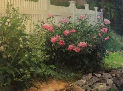
Out Back, Peter Yesis, courtesy of the artist. |
Peter Yesis is the best painter of flowers I know. In my mind’s eye, I see his paintings as detailed, but they’re actually very restrained. The focal points draw our eyes, allowing our minds to fill in the other areas. This engages our imagination, which is far more potent than anything on the canvas.
I wrote last week about pareidolia, our ability to see meaningful images in ambiguous visual patterns. Humans find this much more compelling than having things spelled out for them.
We’ve been using that technique since the Impressionists to engage viewers. But to do it, you need to be able to occasionally lay down a tight, accurate line.
Painting precisely is a matter of slowing down and exerting greater direct control over your brush. Smaller brushes can help, but a light hand is most important. (Most of us are slightly tremulous, and smaller brushes can result in shakier lines.) There’s no way to get there but to practice your fine motor control.


