Monday Morning Art School: applying to a plein air event

Judging art is very subjective. You canā€™t take the results personally, or the process will chew you up.
Tom Sawyer’s Fence, by Carol L. Douglas

This weekend, a reader asked for help in choosing slides to apply to her first plein air event. She recognizes that her favorites might not be a jurorā€™s favorites. Every artist feels like he or she could be better at this, including me. Iā€™ll share what Iā€™ve observed, but Iā€™d welcome your input.

Apply for shows that match your level of experience. Think of these events like applying to college: there are dream, target and safety schools. Later on, you can throw money away applying to dream schools, but for your first event, a safety or target school is a smarter choice. How can you tell what level the event is geared to? Look at the prize money. The bigger the prize money, the fiercer the competition to get in.
Look at last yearā€™s participants. Are they painting at a level you feel comfortable challenging? If not, find a different event to start with. There are many of them out there, and youā€™ll have a much better experience if youā€™re not thrown at the first hurdle.
Parrsboro Sunrise won a prize but I can’t seem to make it photograph well.
Take good photos of your work. One of my best paintings from 2018 wonā€™t be in my submissions because I donā€™t have a decent photo of itā€”it was gone before I got a color-balanced picture. Itā€™s very difficult to take a good photo of a very wet oil painting in the back of your car, but try your best. The photo should meet the minimum pixel requirements of  the application. If all you have is a low-res cell phone photo, send something else.
I did a few paintings in 2018 on very smooth boards, just to experiment. One of them won a prize at PIPAF, so the board has nothing to apologize for, but it has no tooth. That meant that my paintings have little impasto, and that in turn makes them look out-of-focus in photos. Itā€™s maddening, because theyā€™re beautiful in life, just not so nice in the digital world.
Jonathan Submarining apparently made me happier than it made anyone else (except Jonathan’s grandmother, who bought the painting).
Ask a trusted friend to look over your submissions. I have a painting from a few years ago that I adore, Jonathan Submarining. It was of a bunch of kids in a sailing lesson on a riotous day, and it was painted very fast, standing in the tide, with a fierce wind threatening to knock over my easel. But nobody scanning hundreds of photos will ever know what was involved in getting that painting right.
It took a disinterested friend to point that out to me. Sometimes, weā€™re the worst judges of our own work. We see the struggle instead of the finished product.
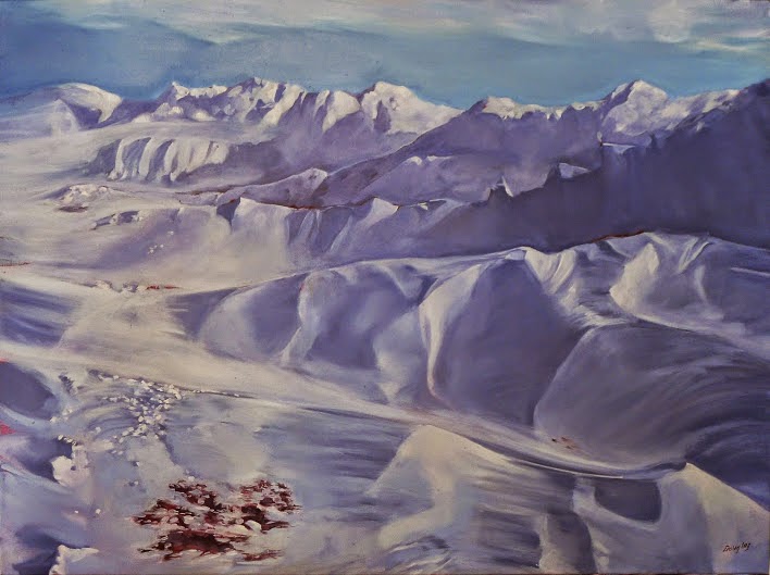
Santa Fe Sunset, by Carol L. Douglas.
Look at your work as thumbnails first. If a juror has a hundred applicants and has to look at five slides each, that may be all they ever see of your workā€”unless something about it really stands out to them.
Familiarize yourself with the entry juror, if that information is public. Iā€™m not saying you should paint like him, but you ought to understand whatā€™s important in his work. If every painting he does is carefully drafted and includes buildings and canyon walls, donā€™t send three structure-free marsh paintings and expect to be his favorite. If heā€™s a luminist, heā€™ll respond to light, and if heā€™s a brilliant compositor, heā€™ll respond to design.
Even so, I think itā€™s a mistake to pitch too closely to the entry juror. A lot of shows donā€™t identify the entry juror at all. Some use a committee. In any case, try to mix it up. If you can handle radically different subjects well, you demonstrate your versatility and your drawing chops.
Best Buds is a favorite from my 2018 season. While it was within the parameters of the show it was done in, it wasn’t actually done outdoors, so I won’t be using it for my slides.
Consider the order of your images. Online jurying systems allow you to define the order in which slides are viewed. If the entry juror is looking at your slides in sets, heā€™s going to read them left to right, just as he reads text. Make the first and last images particularly compellingā€”the first one to catch his interest and the last one so youā€™re remembered.
For heavenā€™s sake, donā€™t cheat. There are all kinds of carefully formulated ā€˜rulesā€™ about what constitutes plein air, and most of them are hot air. But if you didnā€™t do the painting outdoors, on location, donā€™t include it among your slides.
Donā€™t feel bad if you donā€™t get in, even if youā€™re a much better painter than some of the people who did. There are often factors involved in jurying that you donā€™t know about, such as a need to have more watercolorists, or geographical representation. Or, the juror just woke up hating sunsets that morning. Judging art is a very subjective experience and you canā€™t take the results personally, or the process will chew you up.

Is it still plein air?

When do your touch-ups cross a line and make your work a studio painting?
Autumn, by Carol L. Douglas
Earlier this season, a reader asked me what I do with work that doesnā€™t sell at plein air events. Most artists use this work to sell elsewhere. Occasionally, however, weā€™ll bring home stuff thatā€™s so site-specific it has no place in our current inventory.
Earlier this month, I painted a Moorish tent at Winterthur. It was one of about twenty garden follies theyā€™d set up for the season. The pink, orange and turquoise confection flapped proudly in front of a blazing panorama of trees. However, nobody else seemed as amused as me; the painting garnered nary a second look.
To make the change, I had to remove the brush marks from the folly. First, I carefully applied a small amount of mineral spirits, taking care that they didn’t run.
Yesterday, I excised the tent from the painting. I didnā€™t replace it with another focal point; I just let the landscape find its own structure.
It was necessary to get rid of the brushwork on the tent and the summerhouse so that they didnā€™t eventually appear in the surface as pentimenti. Because this painting is only a few weeks old, I was able to soften the paint with mineral spirits, and then carefully scrape down the top layer until it was flat. 
Gently, gently. You just want to take down the ridges.
It wasnā€™t necessary to remove all the paint, just the ridges. If you do this, be careful to confine the mineral spirits to the area you want to correct. It will soften both good and bad passages indiscriminately. And donā€™t press while scraping; youā€™ll distort the canvas.
Bye-bye, Moorish tent!
Then it was a matter of mixing some new green to fill in the area. If you arenā€™t careful at this point, youā€™ll end up repainting half your canvas trying to get the color right. You arenā€™t mixing a wall paint, so youā€™ll need to mix a few tightly-analogous colors. Then make sure you use a similar brush to the one you used originally.
This painting probably has about fifty added brushstrokes from the original. Is it still plein airfor the purposes of jurying? I used no additional reference, and the modification, although striking, was small. I think it counts, but Iā€™m interested in what other people have to say.
Penobscot, by Carol L. Douglas
The second painting I changed was one done in Santa Fe in April. At the time, I realized that a few brushstrokes would convert this to Penobscot Bay. It has been curing too long to open the surface and flatten it. It didn’t need that, in fact. It does not have one single bit of solid paint over the old painting; every change was made by glazing. Again, there was no reference used and very little paint. However, the subject has changed completely. Is it still plein air? I don’t think so because the finished work has no basis in reality.
Sunset, by Carol L. Douglas
The third painting I included because it has had absolutely nothing done to it. I painted it with Poppy Balser on a brilliant, cold evening at Rockport harbor last month and tossed it on the pile to be finished later. Pulling it out, I realized it needs nothing. Itā€™s bright and fresh and perfect as is.

The excruciating pain of choosing

What paintings make the final cut? How about choosing by committee?
El camino hacia el pueblo, by Carol L. Douglas

Keith Linwood Stover once asked me why artists seek criticism in the first place. ā€œWeā€™re not the best judges of our own work,ā€ I told him. (This is why gallerists and curators are such important players in the art process.) Thatā€™s especially true when youā€™ve just painted for a week in an alien environment. Whatever judgment you have goes to pieces.

Iā€™m not alone in finding this difficult. Last night I sat around the table at Jane Chapinā€™s house with a group of artists, debating what weā€™ll submit. Richard Abraham and I are in the same position: our strongest works are in a sense, redundant. Theyā€™re each of the same subject. This makes us both a little nervous.
Dry wash, by Carol L. Douglas
I looked at his three top contenders and gave an opinion; he looked at my three and gave an opinion, and it was unsettling, because he counted back in a painting (Dry Wash) that Iā€™d already eliminated. Men and women approach paintings differently, and understanding how the male mind works might be helpful in jurying.
My opinion is that any of Richardā€™s three contenders will win him a prize. His options are all good. That makes me wonder if Iā€™m dithering over equally inconsequential differences. Still, the choice of submissions is the most difficult job of the week, and it behooves us to take it seriously.
La casa de los abuelitos, by Carol L. Douglas
A painting should beā€”as the old saw goesā€”compelling at 300 feet, 30 feet, and three feet.  The first question, then, is what will draw someone from the other side of the room. To answer that definitively, Iā€™d have to be inside the head of the juror (Stephen Day) and Iā€™m not. Looking at his work only tells me so much. I canā€™t know what his goals are, how his day is going, or any of the other myriad thoughts that go into his decision.
Hoodoos in training, by Carol L. Douglas
Why do I distrust my judgment? Iā€™m always most intrigued by the paintings that are terrifically difficult to master. Thatā€™s why I love Jonathan Submarining, from Castine 2016. The viewer may just see a Castine Class sailing school bobbing around on the waves, but I see a tough painting done knee deep in the surf and executed well.
This is true too with Dry Wash. The only reason I might change my mind at the last minute is that the dappled light and rocks are well-executed. But the other two better meet the 300-feet challenge.
Castigando del caballo muerto, by Carol L. Douglas
That puts me in a quandary. Iā€™ve written before about who I trust to critique my work. I messaged images to two people yesterday: my husband and Bobbi Heath. Their opinion was consistent (and it matched, for the record, Jane Chapinā€™s).
But in the end the decision rests with me, and itā€™s no fun.

Judging watercolor sketchbooks and paintings

Grey is a beautiful color, but it doesnā€™t stand out in a crowd. Neither does weak design.
Jonathan Submarining is one of my all-time favorite paintings, but it didn’t impress jurors overmuch.

Iā€™ve promised several readers Iā€™d get back to them about my sketchbook choice for my Age of Sailworkshop. Iā€™m supplying the materials, so they must be good. I wanted to talk to Mary Byrom before I reported back. She teaches a sketchbook class in York, ME. Our technique is not the same; she works mainly in pen-and-wash; I prefer straight-up watercolor. But thereā€™s overlap, especially when the problem is keeping supplies contained for travel.

                                           
We agreed that the top sketchbook weā€™d tried was Strathmoreā€™s Series 400 watercolor journals. While I prefer ring bindings, this notebookā€™s soft backing made it possible to hold back pages with clips. Iā€™m a very wet watercolor painter, so if I can use it, nobody will have a problem.
And the winner is, the Strathmore 400 series watercolor journal and a clip.
That was the last fifteen minutes of a two-hour phone call. Most of it was spent on that eternal question: how to choose the best paintings to submit for jurying. My strategy has always been to put my top work from the prior year into a folder and look at it and whine.
Iā€™m drawn to the paintings in which I perceive a struggle. An example is Jonathan Submarining,which I painted at Castine Plein Air. This is one of my personal favorites. Poppy Balser and I had our feet in Penobscot Bay. The kids in their sailing class were rampaging about in a stiff wind. It was hard work to be accurate while capturing their excitement. Apparently, jurors did not share my enthusiasm. I didnā€™t get into many shows for which I used it.
Lobster Pound at Tenants Harbor is well-drafted and strong, but I don’t think its grey tones will work for jurying. (Courtesy the Kelpie Gallery)
All of us have emotional connection with our work. It distorts how we see things. To overcome this, I traded the final-pick task with Bobbi Heath. She reviews my submissions; I review hers.
Mary Byrom and I came up with another strategy. Next year, Iā€™ll create a folder containing my own best picks alongside paintings by artists with whom I will be competing to get in. (If you donā€™t know who these people are, you havenā€™t done your homework.) I did a snap search after our conversation. It was sobering.
Fish Beach, by Carol L. Douglas.
Itā€™s all about design and composition, which is why value sketches are such a necessary step in plein air. Aline Ordman said that a painting must compel at 300 feet, 30 feet and 3 feet. The 300-feet test is the same as the thumbnail-on-the-screen test. Depending on the popularity of the show to which youā€™re applying, the jurors may be looking at thousands of the little buggers. If your painting doesnā€™t stand out as a thumbnail, itā€™s not going to compel at any size.
Color matters, too. Grey just slumps back into my monitor. There are some paintings in my folder that are strong, but I wonā€™t be using them for future submissions. Nor will I design a composition around neutrals for an auction-based event, for the same reason. Lovely grey tones sell just fine; they just donā€™t stand out in the maelstrom.
It’s about time for you to consider your summer workshop plans. Join me on the American Eagle, at Acadia National Park, at Rye Art Center, or at Genesee Valley this summer.

When does it stop being plein air painting?

"The Three Graces," Carol L. Douglas

ā€œThe Three Graces,ā€ Carol L. Douglas
I have never been much for the debate over what constitutes plein air painting. What percentage needs to be done on location? Does painting from your car count? These questions mostly just annoy me. At every plein air event Iā€™ve done, painters continue to work at night after they leave their location. Years of painting give you excellent visual memory. Letting your eyes rest after a day of working in bright light is an important step.
Since the only requirement is that the work be finished within a certain period, itā€™s up to us to interpret what ā€œpainted en plein airā€ actually means. And the vast majority of artists, I find, are very strict about the rules they establish.
"The Three Graces" as it looked when I took down my easel.

ā€œThe Three Gracesā€ as it looked when I took down my easel.
In most cases, I can tell at a distance whether a work was done on location or not. The energy of plein air painting is not easily faked, although the lighting and brushwork may be indistinguishable from studio painting. In plein air painting, the whole scene is constantly subject to change. That lends a frisson of nerves to the process.
ā€œMy clients donā€™t care whether it was painted on location or not,ā€ Brad Marshall once said during one of these interminable discussions. ā€œTheyā€™re just interested in whether itā€™s a good painting.ā€
"Mercantile's anchor," Carol L. Douglas

ā€œMercantileā€™s anchor,ā€ Carol L. Douglas

Thatā€™s true, but it becomes an issue for painters when theyā€™re selecting paintings to apply for upcoming plein air events. At what point do after-the-fact edits disqualify a work from consideration?
I did the two paintings in this post during the same week. There was gorgeous weather and I painted almost non-stop on the floating docks at Camden. Of course there were interruptions, since wherever I go, thatā€™s where the partyā€™s at.
Had I gone back to my studio and made the same changes I made yesterday, Iā€™d have had no hesitation in calling them en plein air paintings. However, my husband flew home from Norway, and I didnā€™t get back to them until yesterday.
"Mercantile's anchor" as it looked when I took down my easel.

ā€œMercantileā€™s anchorā€ as it looked when I took down my easel. Because Iā€™d painted this boat in dry-dock, I know its black hull is underpainted in green.
I made no structural changes to either painting, because Iā€™m trying to make a point. (Otherwise, Iā€™d have moved that boom out of directly behind the anchor.) In neither case was a photo necessary to finish. But in both cases, the surface has been overpainted almost completely, and I had the luxury of time in which to finish them.
So, for the purpose of jurying, is this plein air painting? I donā€™t have a ready answer, and Iā€™m interested in your opinion.

Presence

Winter Lambing, 36X48, oil on canvas, by Carol L. Douglas
Itā€™s that season when artists gather up their slidesā€”by which I mean the JPGs on their desktopsā€”and send them off to be juried. Technology has advanced so that we now get the same kind of results with a point-and-shoot camera that we used to rely on professional photographers to achieve.
That can have its downside. Last week, I wrote about decentralizationof art images on the internet. Reader Victoria B. responded:
ā€œThe image of the spoon and the Chinese screen taking up the same amount of screen real estate reminded me of art history classes I took where the Mona Lisa slide was the same size as a room-sized Rubens. What a revelation to go the Louvre and see exactly how small and subtle Mona really is. I also remember when the Finger Lakes show was judged on the actual work, not on slides. Now the judging is on digital files submitted electronically, so the 5ā€ x 5ā€ small work and the 5ā€™ x 5ā€™ large work will be viewed at the same size on a monitor.
ā€œEquality is not always best when judging art work. I think the size of the painting (or sculpture) is part of the artistā€™s intent that we miss.”

Happy New Year, 6X8, by Carol L. Douglas. This is very small, but the distortion of the internet renders it the same size as the monumental painting above.
Victoria is talking about presence, and itā€™s a huge part of our subjective response to art. Paintings, drawings and prints stubbornly resist being scaled up or down; their fundamental character is tied to the size at which they were created.
Let me know if youā€™re interested in painting with me on the Schoodic Peninsula in beautiful Acadia National Park in 2015 or Rochester at any time. Click here for more information on my Maine workshops! Download a brochure here.