Monday Morning Art School: Precision

A good painting requires a good plan. What does that mean? 

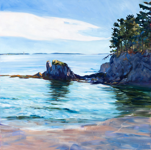
This last weekend I was painting in the 14thannual Paint for Preservation for the Cape Elizabeth Land Trust. This always involves a big canvas, and this year was no exception: I painted 30×40.

I always start with a drawing in my sketchbook; when I’m working this large, the drawing becomes paramount. To look at my canvas from a distance meant climbing down into a small ravine and back up the next finger of rock, so I didn’t do it often. Accuracy in that situation requires planning. I transfer the drawing faithfully to my canvas, gridding if necessary. Then the sketchbook lies at my feet so I can consult it for values if necessary.

Foghorn Symphony, 36×40, by Carol L. Douglas, will be available through the Cape Elizabeth Land Trust in late August.

“You write numbers on it?” said Ken DeWaard, who’d stopped by with his morning coffee.

“Numbers and colors,” I said. That’s not my idea; it’s one I stole from an old guy named Vincent van Gogh, who often wrote the colors alongside his sketches. The sun at dawn on Saturday was a lemony yellow, and it would have been easy to remember it as richer and deeper. That would have overridden the sense of a transient sea-fog in the distance, which was causing the five lighthouses of greater Portland to play a fog-horn symphony.

Plein air events like Paint for Preservation have no do-overs. We’re required to put out a good painting. There are two options. You can paint more than one, and choose the best. That seldom works for me, since I’m no judge of my own work in the thrust-and-flow of an event. It’s also a lot of work.

Zeb Cove, 40×40, was my 2020 painting for CELT’s Paint for Preservation.

.
I go with the second, which is to paint one good one from the start, using all the tools at my disposal. Since a painting always goes wrong in the planning stages, I make sure my plan is solid, and then I stick with it.

What makes a good plan?

Precision of drawing

This means proper perspective and measurement. You might think this is irrelevant when the subject is rocks and the sea, but it’s as important there as with architecture. Drawing is the only clue about the distances involved. There’s a contemporary Maine style, which involves fast, loose brushwork, but it rests on a foundation of perfect drafting. In fact, bad initial drawing is a great way to end up with a tight painting, since you’ll constantly have to redraw with your brush.

Four Ducks, 30×40, was my 2019 painting for CELT’s Paint for Preservation.

Precision of composition

This means understanding the motive line, energy, and value structure of your painting from the beginning. A 30×40 painting will take from 8-12 hours to finish. The tide will have gone through one full cycle, and the sun will beat its way across the sky as you’re painting. In order to retain the light structure you started with, you must lay it out in advance—and then you must stick with it.

Precision of color

Nothing makes for a muddier painting than constantly restating colors because you didn’t get them right on the first try. Make a grisaille, and check your mixed colors against it.

Rocky, 36×36, was my 2018 painting for CELT’s Paint for Preservation. I’m detecting a theme here.

To mix color properly, you must be absolutely conversant with the pigments on your own palette. This requires practice. The goal is au premier coup, or to nail it on the first strike. That goes not just the for darks, but every color in the picture. Even a painting with wonderful shadows and lights will have many middle tones, often closely related in value. These are actually the most difficult colors to mix accurately. If you have a painting that isn’t working, ask yourself if it has a full tonal range, or is it simply hitting the highs and lows. 

Monday Morning Art School: Basic elements of design

The artist’s job is to invite the viewer into his world. That doesn’t happen by accident.

I and the Village, 1911, Marc Chagall, courtesy MOMA. In this painting, line is a dominant design element, articulating the relationship between man, beast and place. However, proportion (relative size of the objects) is playing a part as well.

Line

In math, a line is straight, has no thickness and extends in both directions through space. Sometimes that’s what we mean by a line in art—for example, a horizon line.

More typically in art, a line is just a path through space. Wherever you have an edge, you also have a line. However, lines also refer to mark-making, so in that sense they can be fat, thin, punctuated, tapering, diffident, bold or whispering.

Diagonals and curves seem to keep us more engaged than unbroken verticals, as they’re more difficult for the eye to ‘solve.’

Interior of the Laurenskerk in Rotterdam, 1664-66, Cornelis de Man, courtesy Mauritshuis. The illusion of three-dimensional form is created with perspective and value.

Shape and form

Shape and form define objects in space. Shapes have two dimensions–height and width–and are bounded by lines. Forms are three-dimensional. The artist’s dilemma is to give the illusion of three-dimensional form in a two-dimensional painting.

Ploughing in the Nivernais, 1849, Rosa Bonheur, courtesy MusĂ©e d’Orsay. The vast sky and field create as much narrative as do the team of oxen.

Space

Space in the real world is three-dimensional. In art, the term refers to a sense of depth, or the artist’s use of the area within the picture plane. The illusion of three-dimensional space is created with perspective drawing, atmospherics, relative proportion (size), positioning, and defining volume through modeling.

Sometimes we refer to negative and positive space, which means the division between the primary object(s) and what we perceive as the background. Positive and negative space were a very big deal in much twentieth-century design, which often used the vast emptiness of the page as a counterweight to the primary object.

The Crucifixion of Saint Peter, 1601, Caravaggio, courtesy Cerasi Chapel. Chiaroscuro relies primarily on value to drive the eye.

Color

Color has three essential characteristics:

  • Hue—where it falls on the color wheel (red, blue, etc.),
  • Chroma—how brilliant or dull it is,
  • Value—how light or dark it is.

Color is also described as ‘warm’ or ‘cool,’ but these are useful artistic conventions and not measurable as fact.

Historically, value did much of the heavy lifting in painting, and it remains the most important characteristic in your painting. The Impressionists began using hue and chroma to define volume, and that is essentially how most alla prima painters work today.

Portrait of the Baronness James de Rothschild, 1848, by Jean-Auguste-Dominique Ingres, private collection. We see satin, lace, tulle, feathers and jewels primarily due to Ingres’ exquisite control of reflected light.

Texture

Texture refers to the surface quality of an object. Paintings have implied texture, conveyed by color, line and brushwork. They also have real texture in the form of smooth or impasto surfaces.

Ejiri in Suruga Province, 1830, Katsushika Hokusai, courtesy Metropolitan Museum of Art. Great winds have blown away the clouds on Mount Fuji, and they’re also blowing the travelers and their packs around. This movement is echoed and amplified by the brushstrokes.

Movement

Movement can be either suggested or depicted—as in the wind in the painting above—or implied by brushwork. Most paintings have a major thrust of energy, which I call its motive line.

Your assignment is to take one of your own paintings and subject it to formal analysis. Consider each of these elements of design in turn. How are you using them? How could you use them better?

(This post originally appeared in July, 2020.)

Monday Morning Art School: softly, softly

The edge is where everything is happening. There are many ways to control it.
Brad Marshall’s painting of coral in Maui (unfinished).

Edges are where one shape ends and another starts. This might mean a border between two things, or it might be a fold or shadow within an object. Either way, there are many ways to approach edges. One way to control the line is the lost and found edge.  Softness is another.

My friend Brad Marshall is working on a painting of a coral reef right now, and it’s a stellar example of keeping it soft. He graciously allowed me to use his work here.
Brad Marshall’s color block-in. He’s soft right from the start.
We’ve talked a lot about the importance of line in painting. Sharp edges with high contrast draw your attention. But to be effective, they require other passages where edges aren’t as crisp. In the case of this reef, Brad was seeking a special optical effect of being underwater, where things are blurry and greenish-blue.  
Looking at the screen on which you’re reading this, you’ll note items in the periphery of your vision. The screen is in focus, but the items on the edges are blurred. This is how our eyes work—we have a highly developed cone of vision, and some peripheral vision to keep us oriented. You can take that same principle into your painting, to direct the eye into looking at what you want it to notice.
“Painted midground coral (except for that little one in the crevice. Keeping edges on soft. A little lighter and darker to push it forward from the background,” said Brad.
Brad started his painting softly because of the subject. But it’s also important because the coral at the bottom of the canvas has the potential to be the strongest draw. It’s lighter in color, and it’s closer to the viewer. But Brad, being a pro, isn’t going to be suckered into that rookie mistake. By keeping the painting very soft at the beginning, he is able to control where and what he concentrates on.
This is a studio painting being built in layers. That gives Brad ample time to work with thin paint handled wet-on-wet. In addition to his brushwork, he developed softness by carefully controlling value and hue shifts. Even in his central motifs he started with an underlying natural blur.
“Here is a close-up detail. I wanted to give it a soft-focus look.”
In oil painting, soft edges can be made by dragging a brush from one color to another, or painting directly into another color. Oil paints are absolute champs at blending and softening. So too is watercolor: washes and wet paper will assure you that edges stay soft until you want them to be defined.
Gouache and acrylic (correctly applied and not just mimicking watercolor) are not nearly as useful for blending. However, you can achieve the same effect of softened edges by employing optical blending.
In fact, since the 19th century, many oil painters (myself included) have generally eschewed the broad range of blending that oil paints offer. We’ve been influenced by Impressionism. We use flat blocks of closely analogous color to get the effect of blending without the brushwork.
Cliff Rock, Appledore, 1903, Childe Hassam, courtesy Indianapolis Museum of Art
Consider the Childe Hassam painting, above. He used optical blending to create the effect of blurriness that Brad is getting with brushwork. Note that the top of the rock outcrop is the same value as the sea. Your eye doesn’t notice the edge any more than it would have had he blended the edges with a brush.
Hassam used a staggering array of brushwork in his painting to create a variety of edges. However, none of it was done with traditional blending. Looked at closely, each color is distinct from its fellows.

Monday Morning Art School: let’s talk about line

The motive line in a painting is the most powerful design tool you have at your disposal.
Lions painted in the Chauvet-Pont-d’Arc Cave, c. 30,000-28,000 BC. This is a replica; the cave is sealed from human visitation. 
If you had to isolate the fundamental element of art, across all media and forms of expression, it would be the humble line. By definition, a line is a connection between two points. In math, that’s an ideal, but in art, the line is a visceral reality. Lines can be broken or continuous, violent or serene, implied or obvious. But if you haven’t got a line, you probably don’t have much in the way of art.
Lines are also implicit, in their abstract form, in performing arts like dance and music.
In the drawing stage of a painting, I try to isolate the major line from which my compositions hang. This is the motive line, although it could also be called the kinetic line. It’s the motive force that drives the energy of the painting. It is frequently interrupted, as in the lost-and-found edge. But:
  • It is tied to the major area of focus;
  • It divides two areas of different values, creating a high-contrast edge;
  • It’s complex and carefully-drawn.

“The only stable thing is movement,” said Jean Tinguely, the sculpture who pioneered Kinetic Art. It is true in nature, and it has been true in art history since the Greeks, for whom contrapposto (counterpoise) represented a moment in motion (as I wrote earlier this month).
We think of Impressionism as a color movement, but it was also a great shift in how paintings were composed. Motion is suggested through a lack of equilibrium. Horses and people are off-balance in a way that suggests they must move to catch their balance.
Before the Race, 1882–84, Edgar Degas, oil on panel, courtesy The Walters Art Museum, Baltimore
That extends to the very balance of the paintings themselves. Consider Before the Race, by Edgar Degas, above. The strongest line in the painting is not the horizon, but the bottom edge of the horses. The complex up-and-down eddies of the horses’ legs breaks and softens as it moves to the right. The painting wouldn’t be nearly as compelling without that amazing see-saw of action.
The Artist’s Studio in an Afternoon Fog, 1894, Winslow Homer, courtesy Memorial Art Gallery, Rochester, NY
In Winslow Homer’s The Artist’s Studio in an Afternoon Fog, a line describes structure against sky. But the real motive force is created by the strong diagonal just below it, in counterpoint to the white froth of the sea. In fact, there is nothing to this painting but line. Drawing it is a good exercise in discovering the subtlety of powerful lines. Notice the subtle convergences; they are a hallmark of Homer paintings that give his work its incredible thrust.
Man and Pool, Florida, 1917, John Singer Sargent, courtesy Metropolitan Museum of Art
The motive line can be subtle as well. The value structure in John Singer Sargent’s watercolor, Man and Pool, Florida is choppy, to depict a brightly-lit ground. Still, the figure makes a diagonal leading down to the spot of light and contrasting, cool water. To support this, Sargent subtly scribed the outline of the leg in blue.
Your homework—should you choose to accept it—is to find and note the motive lines in nature, architecture, photos and paintings. They may be curved, straight, rough, smooth, intersecting, broken or complete. Each time you identify the strong linear element that holds together a scene, ask yourself what it might be like without that.

Monday Morning Art School: the basic elements of design

Design elements are there whether you’re conscious of them or not. Learn to use them.

I and the Village, 1911, Marc Chagall, courtesy MOMA. In this painting, line is a dominant design element, articulating the relationship between man, beast and place.

Line

In math, a line is straight, has no thickness and extends in both directions through space. Sometimes that’s what we mean by a line in art—for example, a horizon line.
More typically in art, a line is just a path through space. Wherever you have an edge, you also have a line. However, lines also refer to mark-making, so in that sense they can be fat, thin, punctuated, tapering, diffident, bold or whispering.
Diagonals and curves tend to keep us more engaged than unbroken verticals, as they’re more difficult for the eye to ‘solve.’
Interior of the Laurenskerk in Rotterdam, 1664-66, Cornelis de Man, courtesy Mauritshuis. The illusion of three-dimensional form is created with drawing and value.
Shape and form
Shape and form define objects in space. Shapes have two dimensions–height and width–and are usually bounded by lines. Forms are three-dimensional. The artist’s dilemma is to give the illusion of three-dimensional form in a two-dimensional painting.
Ploughing in the Nivernais, 1849, Rosa Bonheur, courtesy MusĂ©e d’Orsay. The vast sky and field create as much narrative as do the team of oxen.
Space
Space is, in the real world, three-dimensional. In art, the term refers to a sense of depth, or the artist’s use of the area within the picture plane. The illusion of three-dimensional space is created with perspective drawing, atmospherics, positioning, size, and defining volume through modeling.
Sometimes we refer to negative and positive space, which means the division between the primary object(s) and what we perceive as the background. Positive and negative space were a very big deal in much twentieth-century design, which often used the vast emptiness of the page as a counterweight to the primary object.
The Crucifixion of Saint Peter, 1601, Caravaggio, courtesy Cerasi Chapel. Chiaroscuro relies primarily on value to drive the eye.
Color has three essential characteristics:
  • Hue—where it falls on the color wheel (red, blue, etc.),
  • Chroma—how brilliant or dull it is,
  • Value—how light or dark it is.
Color is also described as ‘warm’ or ‘cool,’ but these are useful artistic conventions and not measurable as fact.
Historically, value did much of the heavy lifting in painting. The Impressionists began using hue and chroma to define volume, and that is essentially how most alla primapainters work today.
Portrait of the Baronness James de Rothschild, 1848, by Jean-Auguste-Dominique Ingres, private collection. We see satin, lace, tulle, feathers and jewels primarily due to Ingres’ exquisite control of reflected light.
Texture refers to the surface quality of an object. Paintings have implied texture, conveyed by color, line and brushwork. They also have real texture in the form of smooth or impasto surfaces.
Your assignment is to take one of your own paintings and subject it to formal analysis. Consider each of these elements of design in turn. How are you using them? How could you use them better?

Keeping the beat

What’s important in painting? Master the basics and the mark-making will take care of itself.


Mother of Pearl and Silver: The Andalusian, 1888–1900, James Abbott McNeill Whistler, National Gallery of Art, Washington, DC. This painting demonstrates the power of letting a single value dominate the composition. 

My husband has this thing he likes to tell young musicians: “Just do what you’re doing but do it in time.” That’s because they like to try things that are more complicated than their skill supports, and they end up losing the beat. He wants them to understand that the beat is what’s essential, not slick fingering.

Of course, young musicians are fascinated with ornamentation. For one thing, it’s actually easier than keeping the beat.
On Monday, I wrote, “I never bother much about my mark-making [in drawing]. It can take care of itself. I’m mostly interested in applying accurate values.” If it becomes your focus, mark-making can be the slick fingering that makes you lose the beat.
That’s not to say that mark-making isn’t important. But what’s essential in painting is:
Values: A good painting rests primarily on the framework of a good value structure. This means massed darks in a coherent pattern, simplified shapes, and a limited number of value steps. In a strong composition, one value generally takes precedence over the others. It in effect ‘sets the mood.’
Weymouth Bay, 1816, John Constable. This uses closely analogous colors to create cohesiveness in a painting of raw natural elements.
Color: Right now, we focus on color temperature, but that hasn’t always been the case. Every generation has had its own ideas about color unity, contrast, and cohesion. A good color structure has balance and a few points of brilliant contrast to drive the eye. It reuses colors in different passages to tie things together.
Movement: A good painter directs his audience to read his work in a specific order, by giving compositional priority to different elements. He uses contrast, line, shape and color to do this. If nothing’s moving, the painting will be boring.
Line: These are the edges between forms, rather than literal lines. These edges lead you through the painting. They might be broken (the “lost and found line”) or clear and sharp. Their character controls how we perceive the forms they outline.
Even the most linear of painters uses movement to direct the viewer in reading his work. The Grand Baigneuse, also called The Valpinçon Bather, 1808, Jean-Auguste-Dominique Ingres, the Louvre.
Form: Paintings are made of two-dimensional shapes, but they create the illusion of form. That is the sense that what we’re seeing exists in three dimension. While some abstract painting ignores form, a feeling of depth is critical in representational painting.
Texture: A work is called ‘painterly’ when brushstrokes and drawing are not completely controlled, as with Vincent van Gogh. A work is ‘linear’ when it relies on skillful drawing, shading, and controlled color, as with Jean-Auguste-Dominique Ingres.
Unity: Do all the parts of the picture feel as if they belong together, or does something feel like it was stuck there as an afterthought? In realism, it’s important that objects are proportional to each other. Last-ditch additions to salvage a bad composition usually just destroy a painting’s unity.
Loose brushwork does not mean lack of drawing or preparation. Vase of Sunflowers, 1898, Henri Matisse, Hermitage Museum, St. Petersburg, Russia.
Balance: While asymmetry is pleasing, any sense that a painting is heavily weighted to one side is disconcerting.
Focus: Most paintings have a main and then secondary focal points. A good artist directs you through them using movement, above.
Rhythm: An underlying rhythm of shapes and color supports that movement.
Content: I realize this is a dated concept, but it’s nice if a painting is more than just another pretty face, if it conveys some deeper truth to the viewer.
By the time you master these, scribing and mark-making will come naturally to you.