
There are many ways to soften an edge; the important thing is recognizing where you should do it.
 |
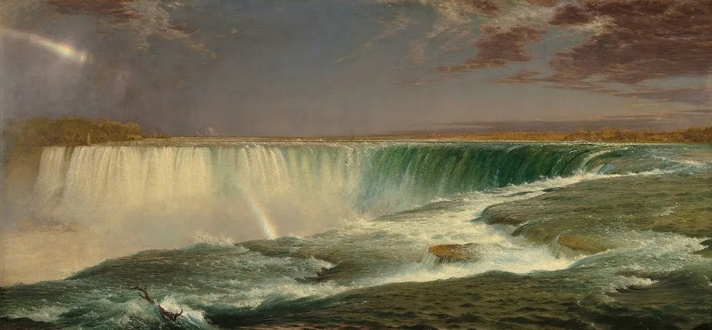
| Niagara, 1857, Frederic Edwin Church, courtesy Corcoran Gallery |
Almost every good painting is a combination of hard and soft edges. Edges may be lost through brushwork or they can be muted using contrast or color. A variety of edges not only adds interest to a painting, they support its composition and thus how the painting is ‘read’.
Broken brushwork, or broken color, means that the artist applies paint in small or skipping strokes but does not blend them. Colors blend optically rather than literally. Broken brushwork can take the form of small, intentional marks, scumbling, or palette-knife painting. The goal is to create tension, a vibration of color. Broken brushwork is an excellent way to lose the edge in painting.
 |
|
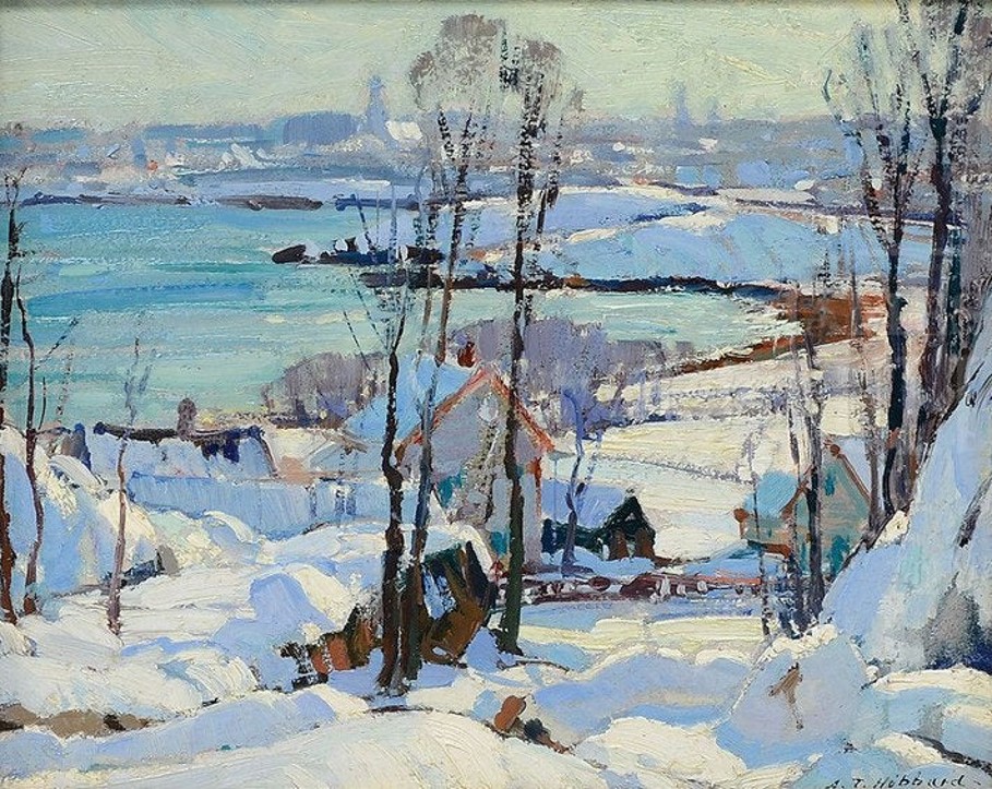
Winter Harbor Scene with City Views Beyond,Aldro T. Hibbard |
Another fine painter of New England winter was Aldro T. Hibbard. He too had a variety of tricks for painting the filigree of bare branches, including dry-brush scumbling, as shown in the example above. He played these soft shapes against the hard lines of positively-painted tree trunks to great effect.
Before there was broken brushwork, there was blending and softening. In Frederic Edwin Church’s Niagara, at top, the rim of the cataract veers between sharp and blurred edges. A long bright triangle, stabbing to the right, is accentuated by the soft colors of the mist. The far shore shimmers in the spray. It’s a tour de force of a type of painting we don’t see enough of these days.
 |
|
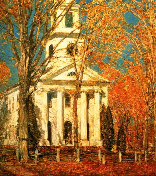
Church at Old Lyme, 1905, Childe Hassam, courtesy Albright-Knox Art Gallery |
There are indirect ways to make edges recede, too. In Church at Old Lyme, above, Childe Hassam makes the leaves and sky the exact same value. Even though their edges are sharp and the colors complements, they flow into each other, leaving no doubt that the subject of the painting is the white church.
 |
|
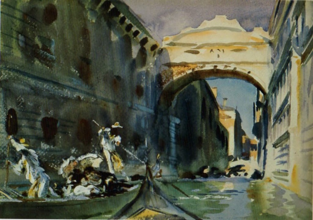
The Bridge of Sighs, c. 1903-04, John Singer Sargent |
John Singer Sargent’s watercolors of the Bridge of Sighs balance the hard edge where the sky meets the stone against the soft shadows. These are allowed to bleed into the muck of darkness, a great way to deemphasize too many hard edges. By the way, for those purists who hate white paint in watercolor, Sargent used it quite cheerfully.
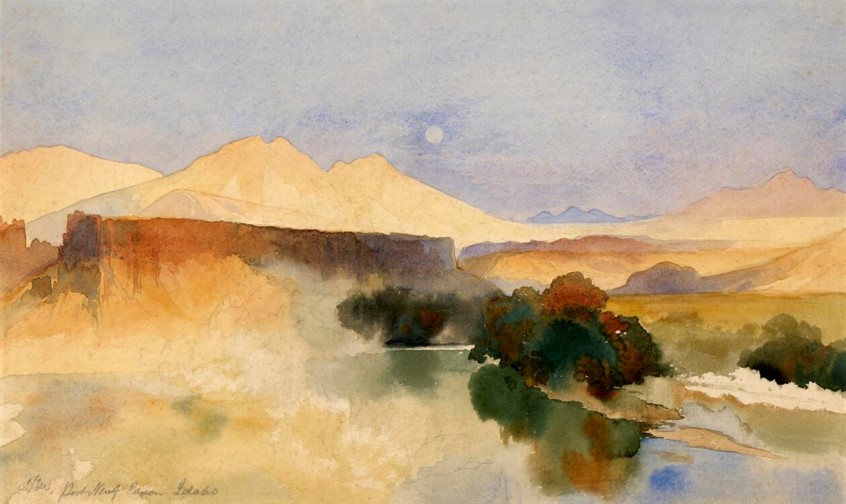 |
| Portneuf Canyon, Idaho,1879, Thomas Moran |
Reducing contrast reduces the perceived hardness of the edges, as Thomas Moran’s Portneuf Canyon, Idaho, above, demonstrates. That’s how we instinctively read the far distance as receding. And, of course, watercolorists can always wet an edge to soften it, or paint into wet paper.
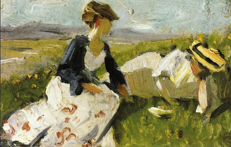 |
| Two Women on a Hillside, 1906, Franz Marc, courtesy Franz Marc Museum |
We know that value contrast can support or diminish a hard edge, but so also can hue. In Two Women on a Hillside, Franz Marc tied the women to their setting by reflecting the greens of the grass in their skin and garb.
The important thing isn’t necessarily the way you lose your edges, it’s knowing where and when it should be done. That’s best learned by looking at great paintings and analyzing the pas de deux between hard and soft edges.


