Analyzing your own work

Where do you fall in each of these scales? Where do you want to be?

The Calling of Saint Matthew, 1599–1600, by Caravaggio, courtesy Contarelli Chapel, Rome. This model of Baroque painting has an open structure, lighting unity and relative clarity.

I have written about painterliness here, and here. It’s an important concept in contemporary art that was first coined by the art historian Heinrich Wölfflin. He was trying to create an objective system for classifying styles of art in an age of raging Expressionism.  

Wölfflin was primarily concerned with the stylistic changes from the Classical to Baroque periods, but he was the first art historian to analyze paintings based on their internal, intrinsic values rather than just their place in social history. It’s too bad that his writing is so ponderous, because his pairs are useful tools for us to analyze our own work. Where do you fall in each of these scales? Where do you want to be? Remember, there’s no right or wrong answer, because each of these ideas has gone in and out of style many times in the history of painting.

Portrait of a Young Man with a Book, c 1540, Bronzino, courtesy Metropolitan Museum of Art, is a linear, rather than painterly, painting. That doesn’t make it any less brilliant.

Linearity vs. painterliness:

Linear paintings have clearly defined, distinct shapes. Painterly paintings blur edges and forms to create a more unified surface.

La danse (first version), 1909, Henri Matisse, courtesy of MoMA, is a single-plane painting.


Plane vs. recession:

This is the contrast between a painting that operates with a simple foreground-background (like Mona Lisa, for example) and one with multiple planes coming together to create a form.

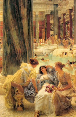
Nymphs and Satyr, 1873, William-Adolphe Bouguereau, courtesy Clark Art Institute, is a multiple-plane painting of the same subject. 


Closed vs. open:

Closed paintings are constructed using a structure of horizontal and vertical lines that contain them within the frame. Open paintings use diagonals, giving the feeling that there is an image continuing beyond the frame.

Annunciation, c. 1470, Benvenuto di Giovanni, is an example of clarity in lighting and a multiplicity of objects. Compare it to the Caravaggio above to see the amazing stylistic leap made in a century in Italian painting.

Multiplicity and unity:

Before the Baroque, paintings focused on detail. Individual items stood out independently, giving a sense of multiplicity. A united painting focuses on the whole and gives the sense of flow and motion. Unified light is a key element in making this possible.

Absolute vs. relative clarity:

In absolute paintings, the viewer can see everything that’s happening in the painting, and the subject is usually front-and-center. The light is even. In a relative structure, deep shadows draw and define our focus, which is unified across the whole painting.

Note: I have one opening in my Monday night class starting March 1. Additional information is here. If you’re interested, please let me know. 

The Opium Eater

This week’s figure class featured Gail Kellogg Hope modeling a Civil War era gown of her own devising, minus the ruffled hoop. (Readers interested in historic clothing can see Gail’s work here.) Because Gail’s hair was down and she was recumbent, I thought she looked charmingly like a 19th century laudanum addict.

I wanted to begin this essay on languid poses with an American painting, but I was unable to find an American Victorian example. I’m not sure such a painting exists—it would have been contrary to our national myth to see womanhood as anything other than industrious, thrifty, and alert.

“Baudelaire’s Mistress Reclining,” Edouard Manet, 1862, SzĂ©pmĂĽvĂ©szeti Museum, Budapest. http://cgfa.dotsrc.org/manet/p-manet35.htm

Off to decadent France, then. The portrait above is of Baudelaire’s mistress, Jeanne Duval, who was a native Haitian of mixed race. Thus her coloring is more realistic than one might first suppose, although the blackness of the painting is Manet at his rebellious and intellectual best, as is the iconography (you can read an incredibly tedious essay on the subject here, although it doesn’t answer what is to me the most interesting question: why the title—not Manet’s doing—doesn’t dignify her by name).

“Lady Agnew of Lochnaw,” 1892-93, oil on canvas, The National Gallery of Scotland http://www.nationalgalleries.org/collection/online_az/4:322/result/0/5396?initial=S&artistId=4829&artistName=John%20Singer%20Sargent&submit=1

The fin de siècle painters were much more comfortable with slouching. I’ve included this example by Sargent largely because the chair resembles the one in my studio—before a century of wear and grime and burst seams. Sargent’s lady reclines, but she is anything but debauched. Instead, the pose is one of aristocratic grace. Although Lady Agnew levels her gaze at the viewer with the same assurance as Jeanne Duval, her chin is down and demure. Notice the right arm culminating in a firm grip—it belies the rest of the pose and points to why Sargent’s portraits are never dull.

“The Baths of Caracalla,” Sir Lawrence Alma-Tadema, 1899, private collection http://www.artrenewal.org/asp/database/image.asp?id=610

Sir Lawrence Alma-Tadema was proof that not every Dutch painter was brilliant, although he gets my respect for being silly and exuberant. He was, of course, a fine technician. Although not strictly a Pre-Raphaelite painter, he shares with them the tendency to see women as sensual and emotional creatures. In this painting, his Roman matron sinks comfortably into a hard marble bench. Perhaps the background hints that these baths were built by Rome’s most psychotic emperor, but the matron’s couture, coiffure, coloring and companions are strikingly, calmly English.

“The Green Sash”, Henri Matisse, 1919, Art Institute of Chicago http://www.artic.edu/aic/collections/citi/object?id=59919&artist=Matisse&keyword=

After that, it is a relief to return to the ambiguity of Matisse. This painting is austere; in fact it has a lot in common with the Manet above. There is no “setting” per se. As in the Manet portrait, the gown has presence and meaning of its own.

Note that in the portrait of Lady Agnew, Sargent is using Matisse’s patterns while in this painting Matisse is using Sargent’s beloved black paint.

“#13 from the book, 41 Etchings Drypoints,” 1965, Richard Diebenkorn, Fine Arts Museums of San Francisco http://www.thinker.org/imagebase_zoom.asp?rec=6339304212900030

We recognize this last work immediately as a mid-century American drawing by the hemline and the hair. As cloying as that was with Alma-Tadema, it is a virtue in this etching by Richard Diebenkorn. Why is that?

With the hand resting on the abdomen, we have come full circle back to the photo of our model. There seems to be nothing strange about that pose to me, but will future viewers see it as an idiosyncrasy of our age?