To each their own, within limits of course…

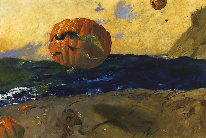
Look, Ma! No red! The red tones are made of quinacridone violet and  cadmium orange. (Finger Lakes marshes in autumn, 14X18, oil on canvasboard)

JG writes: What red do you like for plein air painting? Are there any substitutes for cadmium red that work as well but are cheaper?
Dear JG: I have pigments I like that others will find incomprehensible. That’s not just a question of personal taste; it is also a matter of where you live and the colors of the rocks, the soil, the foliage and the light.
I stopped using cadmium red many years ago because I could never use it up before the tubes hardened. It seems like a pricey paint to use as a modulator for greens. Where I live, there are few naturally-occurring true reds, even in the headiest autumn days, and cadmium red always seemed to obtrude unnecessarily. For a time I substituted naphthol red. It’s cheaper, tends to harden in the tube less quickly, and is less chalky when mixed with white. However, it tends (like cadmium red) to make muddy violets.
A few years ago, I stopped using red completely, and now I mix a combination of quinacridone violet and cadmium orange as an approximate substitute for red in the landscape. (I still use cadmium red for figure painting.) That gives me the weight of cadmium red, but it’s slightly less glaring, and the quinacridone violet permits me to mix to the blue-violet side without muddiness.
And while we’re on the subject, there are no greens in this painting, either.  (Catskill waterfall, 11X14, oil on canvas)

CB writes: I bought a paint labeled “Cerulean Blue Hue” that was a lot cheaper than the Cerulean Blue. What’s the difference?
Dear CB: A paint that is called a “hue,” such as “cadmium red hue,” is made of a blend of less-expensive pigments. There is nothing inherently wrong with these pigments, but they don’t behave the same as the more expensive ones, and you should at least know what you’re buying.
Every tube of paint made by a reputable manufacturer has a Color Index Name in really tiny type. This—rather than the seductive and often romanticized paint name—is what you should pay attention to. It’s a simple code, and no chemistry knowledge is necessary.
The vast majority of paints start with the letter P, which means it’s a pigment. Following that is a letter that indicates the basic hue family: R for red, O for orange, Y for yellow, G for green, B for blue, V for violet, Br for brown, W for white, Bk for black. Then there’s a number referring to the specific pigment itself. This is the best chart I know for paint pigments; it was designed for watercolor, but the pigment characteristics are the same through all media.
Generally speaking, there’s little to be gained by buying a hue mimicking a more expensive pigment. If you are comfortable painting with Cerulean Blue’s proximate, then it behooves you to learn what’s in it and mix it yourself, since you always have the greatest flexibility by working with pure pigments (rather than mixes) out of the tube.
If you’re interested in joining me for a fantastic time in mid-Coast Maine this summer, check here for more information.

Painting at the Lilac Festival with my young friends

Lilac Festival, Highland Park, 11X14, oil on canvas, by little ol’ me.

My Jewish neighbors are celebrating Shavuot, which commemorates the day God gave the Torah to the nation of Israel. We Christians will observe Pentecostthis coming Sunday, when we will commemorate the descent of the Holy Spirit upon the Church. The two holidays are closely related, and they are both based on the idea of gifts from God.

We are often so quick to throw away God’s blessings. A friend told me that she was advised to stop eating tomatoes for health reasons. “But Galicia has the best tomatoes in the world,” she said. “I can’t not eat them. It would be a sin.”
Sam spent most of his time talking to curious passers-by.
For some unfathomable reason, the human animal loves making rules by which he denies himself pleasure. The first and deepest of these revolve around food. Whether we are talking about the dietary restrictions of religion or the modern rules guiding the “worried well,” the end result is the same: self-denial that purports to make us better on physical, moral, or spiritual planes.
One of the “delicacies” of the Lilac Festival is deep-fried turkey legs. I will not embarrass the young person who actually attempted to eat one. I hope he survives.
Last Saturday, I made a tentative date to paint at the Lilac Festival today with Bella, Sam, and Jake. Today dawned with that delicate, airy beauty that is unique to spring in the Northeast. But I have a lot of non-painting work to do, and I felt torn—should I be “responsible,” or should I go paint with my young friends. But I realized that I couldn’t knowingly toss out this gift of a beautiful day, given me to enjoy by a God who loves me. And it was wonderful, and it was a joy, and an old geezer stopped by and told me a great joke:
 â€śWhat is difference between a professional artist and a Domino’s pizza?
“The pizza can feed a family of four.”
Bella struggling to keep her easel upright.
There are still spots open in our mid-coast Maine plein air workshops! Check here for more information.

I’m honored to have been selected to participate in the 2013 Castine Plein Air Festival

The first year I did Rye’s Painters on Location, I painted a lovely, long, low sailboat from a spot overlooking Mamaroneck Harbor. Living as I do in the Great Lakes basin, I’ve drawn and painted boats frequently enough. What I had overlooked was the tide, which confused me with constant angle changes.
My last painting for Rye’s Painters on Location. Mamaroneck Harbor, 18X24, oil on canvas. 
Mercifully, the boat’s owner was among the bidders that night and I escaped with my pride intact. The last few years I painted in that event, I worked in the same harbor, but from floating docks. This was much easier from a drafting standpoint but tough on the legs after two days.
Penobscot view, February 2013. Not Castine proper but close enough. How much more beautiful this will be come summer!
Such are the vicissitudes of painting in a plein air event. You can think you understand the subject, but still be confused at the point when your brush hits the canvas.
Last February, I took my family on an odd little pilgrimage up Castine way, looking for the West Brooksville childhood home of one of my chums. It was unutterably beautiful in February; imagine how lovely it will be in July!
Off-roading in Holbrook Island Sanctuary State Park, in my little Prius. Take that, you 4-wheel-drive vehicles!
Every inch of the coast of Maine is simply beautiful. One would be hard-pressed to come up with a favorite stretch of rock-bound coastline. And even within particular regions, there are so many choices! What will I paint? My pal recommended Our Lady of Holy Hope on Perkins Street, or sunrise at the Tidal Pool, or the Main Square. Any other suggestions?
At any rate, come watch me paint in Castine on July 27, and be sure to say hi when you see me. Or take my Maine painting workshops in the Rockland area—once a month through the summer months (check herefor more info, or email me). 

Ice Tsunamis? Seriously?

It is almost this cold in Rochester right now…

There has been a bitter wind blowing from the west for the last several days. It snow-squalled lightly in Western New York this weekend and it is flurrying in Saranac Laketoday. But at least we’re not experiencing ice tsunamislike those in Minnesota and Manitoba.
How does the plein airpainter facing a Little Ice Age (or floods, drought, hail, or locusts) prepare? I am a fan of the National Weather Service’s Hourly Weather Graph.
Another of my favorite things… the National Weather Service’s Hourly Weather Graph. It tells me everything I need to know.
Above I’ve posted a screenshot of this afternoon’s graph for my neck of the woods. The most pressing issue is that the temperature will rise and the wind will drop this week…not just for us outdoor painters, but also for the organizers of Rochester’s Lilac Festival. And it’s certainly useful to know that the rain is done for a while.
But I could get that information from the newspaper. What the graph gives me that I don’t find elsewhere is the Sky Coverage forecast. This evening and tomorrow evening, the cloud cover should diminish at dusk, giving us the potential for beautiful sunsets. I can set my schedule accordingly.
Of course, different parts of the graph will be more useful in different parts of the country. We’re seldom overheated up here in the far north, but if I were in Arizona, I’d care a great deal about the Heat Index.
This year, I’ve been watching the weather in two places: Rochester, NY and Rockland, ME. Maine tends to be warmer in winter and cooler in summer than we are here inland. Makes for good painting, so if you’re interested in joining us for a fantastic time in mid-Coast Maine this summer, check here for more information.

That finely-tuned, whole-body drawing machine

Bella and Jake practice standing in counterpose.

Yesterday, I stepped up to Jake’s easel to demonstrate stealth gesture drawing. Our subject was Bella, who was deeply absorbed in drawing tiny redbud blossoms. Bella, who is athletic and graceful, was standing like a column in front of her easel, a perfect plumb-line from her head to her pressed-together high-tops. “How do you even do that?” I asked her. “I would fall over.”

What is perfect for gymnastics or dancing may not be perfect for drawing. Nobody would ever accuse me of perfect posture. Nevertheless, I work standing at an easel for hours at a time.
I pondered my own stance while drawing. My non-dominant (right) leg was bearing my weight. My left foot was turned so the outside of my toe-box was touching the ground. This provided a pivot point to control my position, allowing my spine to move in concert with my drawing arm. Not that I stand like this all the time, or that any two successful artists do it the same way, but a good drawing stance is dynamic.
The Peplos Kore, c 530 BC, was clearly drawing (ahem). She’s also standing in counterpose (contrapposto). Although she’s using her left hand, her weight is on her left leg. (Acropolis Museum, Athens)
“Bella,” I said, “try standing on one foot and see if it changes your drawing style.” The difference was significant. Her mark-making was immediately lighter and more controlled.

Jake didn’t just stand around in counterpose… he also drew this house.

We all know that painting while seated yields different results from painting while standing. (The former gives better control; the latter yields freer expression.) So it stands to reason that standing differently gives different results as well. The human body is a wonderful, finely-tuned machine. Change one parameter, and everything else adjusts to fit. 

(On that note, did you know there is not one but many arches to the foot, and they act as springs? Awesome design, that!)
We have a good time in the studio, on the street, and in the park.  And if you’re interested in joining us for a fantastic time in mid-Coast Maine this summer, check here for more information.

Take off your clothes for fun and profit

A post-manifesto painting, and it ended up being my favorite of Michelle ever.

“There are pictures of nude women everywhere, and nobody seems to care,” my son-in-law once said of my home. He’s right. I’m passionate about the subject of subjugation, so there  are paintings of women leaning on every available space: women commodified, bent, begging, enslaved, wrapped in plastic, suspended, dancing, resting, exhausted… and then a few recent post-manifesto ones where I stopped thinking and caught something delicate, introspective and sweet.
For the vast majority of these paintings, my model has been Michelle Long. I want something more from my model than simple presence. “If the situation calls for it, I register some emotion, but by default I am being myself. I try to be neutral but not by wiping myself as a totally clean slate,” Michelle told me.

Why would anyone—especially a very smart and capable young woman—decide on a career of stripping off her clothing and sitting utterly still in front of others? While I was starting to work out my feminist manifesto, Michelle was (unbeknownst to me) on a parallel track. “When I was in my mid-twenties, I was thinking about how society has become so sexualized. My naked body had to be about sex. I wanted to take control of this by physically doing something about it. My life isn’t defined solely by my sexuality. It isn’t the whole of who I am.” But that, she says, is not relevant anymore; she’s worked it out.

Some days it’s a ukulele, some days it’s dancing. That’s why it’s called “a break.”
Given a choice, Michelle prefers working one-on-one with professional artists, or in small groups. For her the most stressful situation is “when artists don’t treat me professionally, or don’t take themselves professionally.” She likes to be able to collaborate with artists, rather than present a tabula rasa on which artists record their own impressions.
The model’s eye view.
That is probably a reflection of her keen and restless mind. She’s been a serious and dedicated swing dancer for 15 years and sings with Gregory Kunde Chorale. She manages two bands: Gorden Webster in New York and Roc City Stompers in Rochester. 
In her spare time, she loves listening to live music and playing Eurogames, whatever the heck they are. “They’re very social and there are multiple ways to win,” chimed in her partner, Tyler Gagnon. She’s learning to play the ukulele, and added, “I love drinking gin.”
Want to join us for figure painting? Contact me here. And I’d be hard-pressed to figure out how to include a figure model in this summer’s Maine workshops, but if you’re interested in joining us for a fantastic time in mid-Coast Maine, check here for more information.

Painting by Numbers

That’s not a lighthouse, but the Summerville Coast Guard Station in Rochester. And it sold fast, so maybe they know what they’re talking about with this blue.

Maine lighthouses are among the most iconic of images. Does that mean that painting them is a good idea?

It depends on what you’re after and how you execute your work. Thomas Kinkade made a fortune painting lighthouses. Still, he died unhappy, and he’s unlikely to be remembered as a seminal figure in American art.
The problem with Thomas Kinkade isn’t that he couldn’t paint, and it isn’t that he spent too much time reading Komar and Melamid… it’s that all his buildings look like they are on fire. (Split Rock Light by Thomas Kinkade.)
Nevertheless, it’s perfectly possible to paint a sensitive, honest lighthouse or lobster boat. They are iconic for a reason: they speak to us of labor, of man’s relationship to nature, and of the sea.
Surf in Maine. Not iconic at all, and the size of a paperback novel. Oops. Oh, well… I still like it.
In Painting by Numbers: Komar and Melamid’s Scientific Guide to Art, the authors—who are themselves artists—set out to determine what were the “most wanted” and “least wanted” paintings in various countries. Most of the book describes, laboriously, the methodology of their polling process. It’s so absurd it’s funny.

America’s least-favorite painting is:

·         Paperback book size;
·         Thick, textured surfaces;
·         Geometric patterns;
·         Darker shades;
·         Sharp angles and bold stark designs;
·         Colors kept distinctly separate;
·         Gold, orange, peach and/or teal.
America’s most-favorite painting is:

·         Dishwasher-size;
·         “Realistic-looking;”
·         Outdoor scenes;
·         More vibrant shades;
·         Wild animals in their natural settings;
·         Persons in group, fully clothed and at leisure;
·         Fall scene;
·         Soft curves and playful, whimsical designs;
·         Colors blended;
·         Visible brush strokes;
·         Blue.
OK, that’s a lighthouse, and I personally like it. Well, I painted it, so I ought to. Whole lotta blue.
It turns out that lots of people like landscapes, and they also like blue. If that’s true, and if they’re also satisfying to paint, why turn our noses up at them?
Whether you want to paint an iconic view of Maine or something more individual, there’s still room in this summer’s Maine painting workshops. Check here for more information.

Where the Sea Meets the Sky: Painting Maine in the footsteps of Winslow Homer, George Bellows, Rockwell Kent, and the Wyeths

See here for more information.

See a brochure here.

“Sunset at Marshall’s Point” oil on canvas, 8X6

“This was the best painting instruction I have ever had. Carol’s advice in color mixing was particularly eye-opening. Her explanations are clear and easy to understand. She is very approachable and supportive. I would take this course again in a heartbeat.” (Carol T., prior workshop participant)

Mañana Island view from Monhegan (courtesy of Carolyn Mrazek)

 Last fall I was invited to go to Maine to scout out painting locations for a series of workshops this summer. (The managers had observed me teaching at another workshop and liked what they saw.)

I’ve painted on two different trips in the Rockland-Rockport area, once by myself and once with my pal Kristin. However, painting for—and by—oneself is different from planning a painting program for others.
One of the many lovely places we’ll be painting.
Painting is a process of exploration; guiding other painters is largely a process of elucidation. When planning a workshop, I endlessly crisscross the region, painting and reconnoitering. (My old atlases have now been replaced by GPS, but the principle of look, paint, and take notes remains the same.) There are practical considerations as well; to me, the most important is to locate comfort stations and coffee.
A good plein air teacher is more than just a decent painter. She has to be a bushwacker, with a decent sense of direction and common sense. She has to meet each of her students at the level at which they’re working.  And above all, she must resist the temptation to create a bunch of mini-mes, but rather watch for and nurture each individual “voice” in her class.
Countless fantastic views.
A good venue makes teaching that much easier. There should be room for rainy-day painting and a place to clean brushes. There should be comfortable public space to chat and drink wine after a day of hard work. There should be other activities available—hiking, shopping, dining, etc. Lakewatch Manor meets all those criteria.
Plus they are offering a fantastic added attraction: a day painting on Monhegan Island. Twelve miles offshore, Monhegan is a Maine treasure, dotted with hiking trails and artists’ studios. We’ll have painting time and lunch at a private property which adjoins Rockwell Kent’s home—now owned by Jamie Wyeth. From it, we can paint Mañana Island, or we can move off elsewhere on the island for its other iconic views.
One other detail: if you haven’t visited the Farnsworth in Rockland, or the very high-end galleries that have sprung up around it, you’re in for a treat. It’s an extraordinary art scene, and I’m a fairly jaded customer in that respect, having regular access to Manhattan.
Sun, Mañana, Monhegan by Rockwell Kent, 1907. Lousy image of a great painting,
and we will get to paint this exact view.

Memories of Maine…

When I was in Maine I was interviewed by a reported from the PenBay Pilot… and here is the story. I’ll be teaching workshops in this area next summer; I can’t wait to get back!

One Morning in Maine

With apologies to Robert McCloskey

“Sunset at Marshall Point,” 8X6, oil on canvasboard, private collection
People say, “Paint what you know,” but I’m more for knowing what I paint. That said, my knowledge of Maine has until now been surface deep. I’ve painted in Eastport and Lubec and the mid-coast region, but not in the last few years, and never with the kind of intense concentration that you get from being in the same place day after day.  I freely admit that I don’t understand the Maine landscape with the same intensity that I understand Keuka, but that doesn’t mean I can’t learn.
Sunset over Penobscot Bay.
I’ve been invited to teach plein air in mid-coast Maine next summer. The only way from here to there is to pull out my brushes and paint there, intensively, day after day. Most sane people do NOT do that in November, but I believe in striking while the iron is, er, stone cold.
Cold it is during the two weeks leading up to Thanksgiving, no matter where in the Northeast you’re painting. One morning I was painting on a commercial wharf and thought it was warming up enough to doff the gloves, until I reached for a baby wipe and found it frozen solid to the ground. (An aside: the good news about painting all day in that kind of cold is that you sleep like a baby.)
“Pine trees at sunset near Owl’s Head, ME,” 8X6, oil on canvasboard, private collection.

Maine is iconic, and there are subjects which are almost verboten because they are clichés—lighthouses, lobster boats, surf, lobster traps, and buoys. Yet those things are also integral to what Maine is, and in the hands of good painters, are both transformed and transformative. Maine resonates with many of us precisely because it is a place whose hard work is on display. We Americans revere and respect work. To ignore that would be almost as clichéd as the worst lighthouse painting.
“Surf,” 8X6, oil on canvasboard, available.
I frequently fall into two compositional traps when painting the ocean, something I never worked out satisfactorily before this trip. The first is getting caught in the perfect ellipse of the shore, and the second is the triangle formed by ocean silhouetted by land. After ten days or so of fighting this, I drove two hours to see a wonderful show, “Weatherbeaten: Winslow Homer and Maine,” at the Portland Museum of Art. As one entered, one first saw “The Artist’s Studio in an Afternoon Fog,” which is owned by Rochester’s own Memorial Art Gallery. This painting is an old friend, and one I frequently use to teach composition.

Homer used two devices to organize his Maine paintings: a strong dark diagonal, and vast simplification. I use that diagonal in figure-painting all the time; why did it never occur to me as a solution here?

Maine in November bears little resemblance to the traffic jam that is US 1 in July. The plein air painter has to know two things—how to get off the beaten path, and where to find toilets and coffee. I spent much of my two weeks figuring out these details. Much of my painting was, therefore, less about painting than about planning to paint. But then I would see seals gamboling in the ocean, and it was about the joy of God’s creation and my grateful heart.
My wee little paint kit on a cold day in Belfast, ME.
The Farnsworth in Rockland has to be flat-out the best museum in a city of its size (7,297 people, I kid you not), anywhere. When I visited, they were simultaneously featuring Louise Nevelson and Frank Benson, which was a stretch for my limited brain. I was most moved and surprised by the Jamie Wyeth-Rockwell Kent show. I am a big fan of surrealism in literature, but in painting it generally leaves me cold. Wyeth has an iteration of this painting (in oil) which is simply the best surrealist painting I have ever seen. I was also quite taken by his The Seven Deadly Sins as expressed through seagulls.
Near Port Clyde, ME.
I am about the same age as Jamie Wyeth and like him was taught to paint by my father. (There, obviously, the similarity ends.) I was rather surprised to find in his mature work such a strong resonance with his grandfather, the great narrative painter NC Wyeth. All those Wyeths are story-tellers, but there’s a romanticism that skips from grandfather to grandson.
In my wanderings, I met Robin Seymour, gallery manager for Eric Hopkins, who is a joyful, lyrical and yet very intellectual painter. Robin is a true art historian, worlds away from the typical gallerista, and I got a tremendous kick out of talking to her. I also met Hopkins himself, who demonstrated looking at things upside down by lying on his back on his credenza; it’s a sign of the Mainer’s resilience that he was able to get back up. Robin introduced me to her neighbor, Yvette Torres, who in turn introduced me to the fantastic work of Winslow Myers. Later that week, painter Alison Hillof Monhegan took me along to her weekly figure session, which was in Yvette Torres’ gallery. When life moves in circles like this, it’s simply wonderful.
“Marshall’s Point,” 12X16, oil on canvasboard, available.
To say I’m looking forward to teaching there next year is to vastly understate the case. Watch this spot.