Nocturnes, fear and longing

Now the outsider is us, alone in the dark, excluded from whatever is going on in that beautiful spot of light.

Nocturne in Grey and Gold: Chelsea Snow, 1896, James McNeill Whistler, courtesy Fogg Art Museum

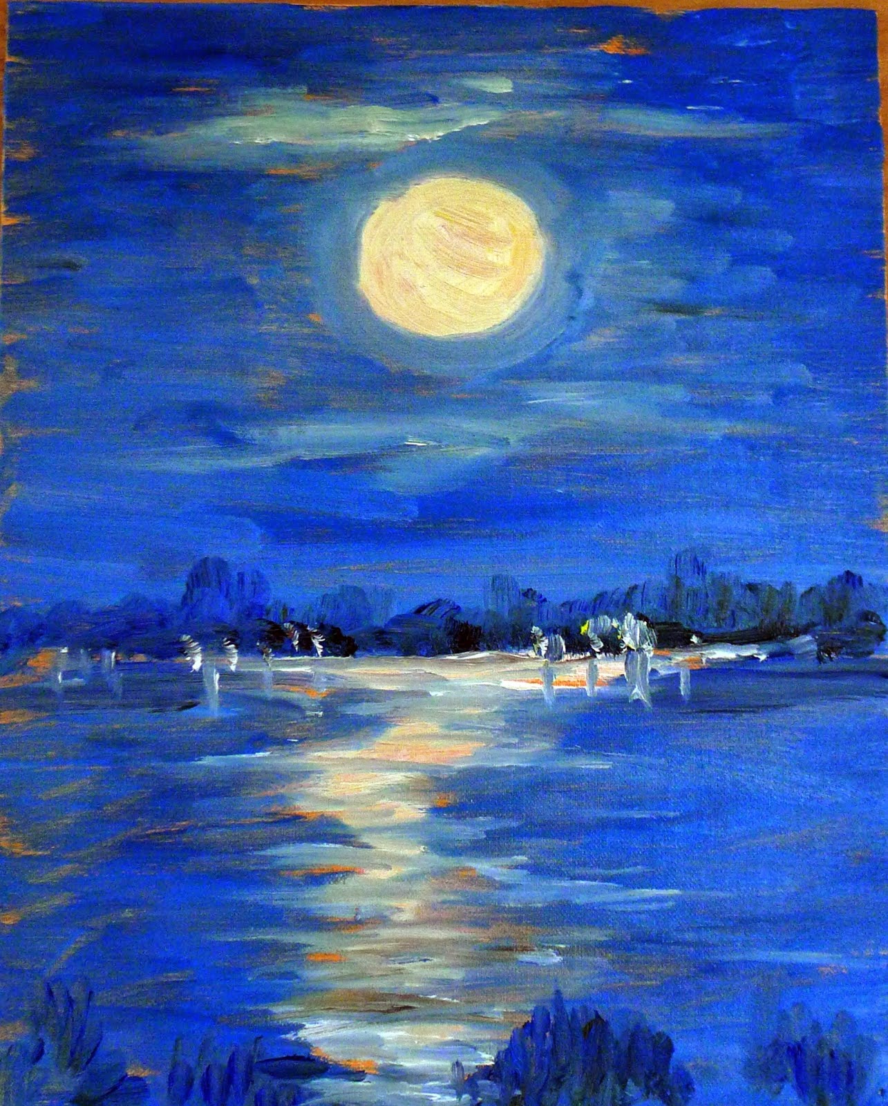
Last week my husband was studying a beautiful nocturne by the Taos painter Oscar E. Berninghaus. The dim light is a soft greenish-blue, and he wondered why. Berninghaus didn’t have the advantage of ‘knowing’ what the night sky looks like through color photography. That gave him the liberty to paint what he felt and saw.

The human eye can’t make the adjustment between gloom and brilliance very fast. Because of this, modern photography and lighting have changed how we paint nocturnes, as I wrote here. The change is technological but it also reflects our changing worldview. Nocturnes are about fear and longing as much as they are about design.
Nocturne: Blue and Silver: Chelsea, 1871, James McNeill Whistler, courtesy Tate Museum
Night-painting evolved into its own discipline in the 19thcentury, about the same time as the first gas lights were invented. This corresponds to the Industrial Revolution and urbanization in Europe and America. Suddenly, people were out of their beds and working and playing until all hours.
James McNeill Whistler, more than anyone else, made the nocturne an important subject for painting. His nocturnes are reticent, diffuse and spare. They resolutely refuse to tell any stories. “I care nothing for the past, present, or future of the black figure, placed there because the black was wanted at that spot,” he said of Nocturne in Grey and Gold: Chelsea Snow.
Whistler is credited for ushering in modern art with these nocturnes. “By using the word ‘nocturne’ I wished to indicate an artistic interest alone, divesting the picture of any outside anecdotal interest which might have been otherwise attached to it. A nocturne is an arrangement of line, form and colour first,” he wrote.
Apache Scouts Listening, 1908, Frederic Remington, courtesy National Gallery of Art
His peer in nocturne painting was Frederic Remington. He didn’t particularly like Whistler’s arty-farty attitude to painting, or his nocturnes. “Whistler’s talk was light as air and the bottom of a cook stove was like his painting,” he wrote in his diary. Remington, trained as an illustrator, was primarily a storyteller.
He painted his nocturnes late in his short life, as he tried to find a transitional path between illustration and fine painting. The dark, wavering light of night provided a relief from excessive observation. “Cut down and out—do your hardest work outside the picture and let your audience take away something to think about—to imagine,” he wrote in 1903.
The End of the Day, c.1904, Frederic Remington, courtesy Frederic Remington Art Museum
What was ‘outside the picture’ was often the most important element. Consider Apache Scouts Listening (1908). There’s a fantastic diagonal composition that draws us to the wavering black tree line in the distance. Shadows are cast by unseen trees in the foreground. The crouching scouts listen to some sound we can’t hear, as does the trooper. Even the horses are on edge.
Whistler and Remington had even less photographic color reference than did Berninghaus. That’s why their night skies are so fascinating—they could be any color or texture. The contrast is low, and the unlit night sky is brighter and more varied than we see today.
Rooms for Tourists, 1945, Edward Hopper, courtesy Yale University
Set their nocturnes against those of later artists like Edward Hopper or contemporary painter Linden Frederick. Their skies are inky blue or black, thrown into utter darkness by the ever-present electric lights.
Likewise, the narrative has been completely set on its head. Now, what’s ‘outside the picture’ is us. We’re alone in the dark, excluded from whatever human activity is going on inside.

Night rambling

Intrepid nighttime painters in last year’s workshop.
Robert F. Bukaty is a photojournalist in Freeport, Maine. He recently wrote about a series of nighttime photos he did in Acadia using his red headlamp (similar to a photographic darkroom safe light) as a paintbrush. The images he created are lovely, and you can see them here.
Nocturne, by Nancy Woogen, painted in Rockland in 2013.
“The dim red light is just bright enough to let you see what you’re doing without ruining your night vision,” Bukaty wrote, which fascinated me. I have a basketful of headlamps, both the kind that strap on and the kind that clip to your visor. They are an uneasy compromise. They were intended for nighttime hiking, walking, or running, and they’re awfully bright for painting. Bukaty’s got me wondering if there is some way to tone them down. The red lamp Bukaty used wouldn’t work, because it would obscure hues, but there might be something in that idea.
Maine has a million night skies, sunsets, and sunrises to inspire.
Inevitably, Maine draws us into painting the night sky. Most of us come from the populous bands of the Northeast, where our night views are seriously corrupted by light pollution. That great big bowl of the night sky, brimming with stars, is arresting every time we see it anew.
Night sky near Belfast, ME.
Bukaty goes to Acadia for his stargazing because there is little light pollution there. My 2015 painting workshop will be at the Schoodic Institute in Acadia, which means we will have ample opportunity to see the unpolluted night sky.
Pack your headlamp!
Lovely watercolor nocturne by Bernard Zeller, painted in Belfast in 2014.

Remember, you’ve got until December 31 to get an early-bird discount for next year’s Acadia workshop. Read all about it here, or download a brochure here

Atmospheric perspective

Atmospheric enough for you?
Today was damp and drizzly—a perfect opportunity to consider atmospheric perspective. We did so at Glen Cove in Rockport, where on a clear day we can see islands in the far distance. Today was not a clear day; it became steadily less clear as we went on.
Matt’s view of the above scene. Yes, those are water droplets on his canvas.
Atmospheric (or aerial) perspective is the tendency of objects far away to have less contrast and chroma than objects nearby. In painting, we create the illusion of depth by depicting more distant objects as lighter and less-detailed than closer objects.
Pamela chose a long view of a boat at anchor. By the time she finished, the scene was monochromatic.
That’s not just a painterly convention. Solar radiation approaches the Earth in a direct beam, but is then scattered around in our atmosphere. That’s what gives us blue skies, pink sunsets and atmospheric perspective. On a clear day, there’s more of it bouncing around between you and that distant hill than between you and your coffee cup, so the distant hill looks bluer.
Nancy chose the same view, and experienced the same change in conditions.
Of course, when fog comes into play, it is water droplets that obscure that distant hill. However, the effect is the same. The easiest way to execute it is to just add some of the sky color—whether that’s blue, or grey, or violet—into the greens of the distant hills. The more distant the object, the more sky color should be added to it.
Sue chose the beach view.
At about 2 PM, the atmospherics had gotten a bit too thick to see much of anything at all, so we had a cup of hot tea and proceeded to the Farnsworth.  There we saw, among many fantastic paintings, Fitz Henry Lane’s Shipping in Down East Waters (1854) which is a luminous painting of boats in fog. Nothing like seeing how a master did it!
Sue hard at work.

And if these days weren’t enough, my intrepid students went out last night and painted the full moon over Chickawaukie Lake:
Matt’s view across Chickawaukie Lake.

Pamela’s view across Chickawaukie Lake showed the sinuous ripples that were there.
Matt’s second view across Chickawaukie Lake.
Nancy’s view across Chickawaukie Lake.

Pamela’s second view across Chickawaukie Lake.
The second of my Maine workshops started today. August and September are sold out , but there are openings in October! Check here for more information.