Monday Morning Art School: the nocturne

Forget the fairy-lights; a good nocturne follows the same rules as any good painting.

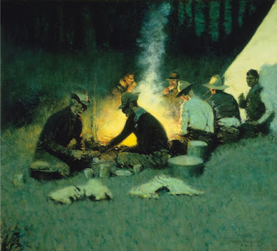
Hunter’s Supper, c. 1909, Frederic Remington, courtesy National Cowboy and Western Heritage Museum
Nocturne is a term appropriated by James Abbott McNeill Whistler from music. Whistler used it to title works that evoked the sensation of nighttime or twilight. It didn’t mean just any painting done at night. The difference was whether the absence of light plays a role in the painting’s construction and meaning.

Prior to the Industrial Revolution, the night was a more powerful force than it is today. It’s no surprise that nocturnes have always had a place in art. Giotto’s The Kiss of Judas (c. 1304) is an early example. By the 15thcentury it was a tradition to set the Nativity and Annunciation to the Shepherds as night scenes, pitting the Light of the World against darkness for dramatic effect.

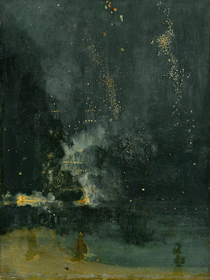
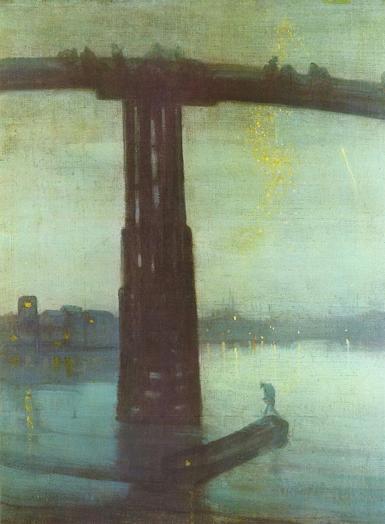
Nocturne in Black and Gold – The Falling Rocket, 1874, James Abbott McNeill Whistler, courtesy Detroit Institute of Art

The 17th century brought us chiaroscuro, tenebrism and three great interpreters of darkness: Rembrandt van Rijn, Georges de La Tour, and Caravaggio. In modern terms, most of their paintings aren’t considered nocturnes, because they’re set indoors. But they are nocturnes in spirit. Darkness is palpable and part of the message; it sits in counterpoint to the main theme.

It wasn’t until landscape painting came into its own that we started to see the development of true nocturnes under Whistler’s definition. Ironically, artificial light played a big part in this; it made it possible to paint at night.

Nocturnes are particularly associated with Tonalism, which eschewed the bright colors of Impressionism and Post-Impressionismin favor of neutral colors, diffused light, and soft outlines, all of which naturally suggest low-light situations.

Frederic Remington did about 70 paintings which we might properly call nocturnes before his premature death at age 48. He was very scientific and technical in his approach, which is no surprise for an artist who started as an illustrator.

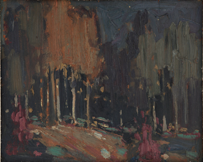
Nocturne, c. 1914, Tom Thomson, courtesy Art Gallery of Windsor

Remington’s nocturnes are filled with color and light. Their composition is complex, often involving a foreground figure in silhouette, setting off the light source. He experimented with electric lighting and flash photography to make his paintings. That’s ironic in that they’re an elegy for the rapidly-disappearing pre-technological way of life. If you’re interested in the nocturne, the National Gallery’s The Color of Night is an excellent reference book.

Study Remington’s compositions; they’re energetic and well-realized. Too many nocturnes rest on the time-worn device of reflected light. These can be part of a great painting but they won’t carry the whole construction. A good nocturne follows the same rules as any good painting: it rests on a solid composition, it has an integrated color scheme, and its brushwork engages the viewer. If you don’t have those three things, go back to the drawing board.

Painting nocturnes en plein air requires a light. I have a cheap battery-operated book light; other artists use head lamps. The level of illumination should be kept as low as possible so that you don’t blind yourself to what you’re seeing.

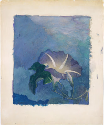
Nocturne, c. 1885, watercolor, John La Farge, courtesy Metropolitan Museum of Art

Plein air nocturnes are especially difficult in watercolor. Night air is damp, so paper doesn’t dry well (or at all). Watercolor is simply not designed for large masses of opaque darkness. Sometimes artists use ink instead of watercolor in the darkest passages; I’ve tried it and find it deadens the painting. In general, I’d suggest the watercolor artist start by drawing and move over to paint in the studio.

However, the above painting by John LaFarge suggests a workaround. He uses a medium blue in the place of black, and the viewer’s mind makes the substitution. It’s transparent enough that it would dry in the night air. A nocturne need not always be about the dead of night; it can be of twilight and dawn, too.

Regular readers know that I’m no longer taking beginning students, except in my boat workshops. Bobbi Heath is offering classes to new students in oils, and Cassie Sano has started her first session with watercolor (to rave reviews, I might add)

Bobbi’s classes are pre-recorded so students can go at their own pace. I am intimately familiar with her teaching style and material and know that you will be ready to paint with me when you’ve finished her program.

You can learn more here.

Granite State Gallery: New Hampshire Art and Artists through the Years will look at the history of New Hampshire’s native painters and visitors. It’s tonight at 6 PM, which means I can’t watch it live, so I sure hope they record it.

Night prowlers

The greatest obstacle to painting nocturnes is convincing yourself that you want to go back out after supper.

Linda DeLorey painting a nocturne at Rockefeller Hall. (Photo courtesy of Jennifer Johnson)

I’ve been teaching at Schoodic Institute for a long time. Every year, I check the moonrise schedule and determine whether we’ll get a full moon for a nocturne. It seldom seems to work. The last time our schedule aligned, the moonrise over Arey Cove was brilliant, but the mosquitoes were ferocious. We were driven off long before our canvases were covered.

(Before I taught Sea & Sky at Schoodic, I taught it in Rockland and then Belfast. This is before we all had cell phones with flashlights. One year, Sandy Quang got lost and fell over a bluff. Luckily there was beach below.)

A late-night critique session with Rebecca Bense and Jennifer Johnson.

We’ve always done this workshop in August, when the days are long. This year, it’s in October, because Maine’s COVID-19 regulations made it impossible for out-of-staters to come in without quarantine in August. That means it’s dark by 6:30. Walking back from the Commons in the dark, we realized that Rockefeller Hall would make for smashing nocturnes, with or without moonlight. It’s a very safe location, since the offices are closed at night.

The greatest obstacle to painting nocturnes is convincing yourself that you want to go back out after supper. It sounds like a brilliant plan at breakfast. After you’ve already painted for eight hours, and maybe had a glass of wine, the idea of dragging your stuff back out in the dark sounds awful. Of course, there are more opportunities for mishaps. Brushes drop into the grass and roll silently away. Nocturnes are unfair to watercolorists, who fight the night mist that keeps their paper saturated.

My students are used to starting with value studies, so painting at night isn’t such a shock to them.

For me, it’s easier to get up at 2 AM and paint. Even so, you then have the challenge of leaving your warm bed at an unnatural hour. Either way, if you persist through your own resistance, you’re in for a treat. The air is fresh and cool; the commonplace becomes beautiful and mysterious.

I’ve given up using a headlamp for nocturnes; I find they blind me as they flicker back and forth. Instead, I brought enough rechargeable book lights to share with my students. My students have been endlessly schooled in value studies, so they took to the limited color range of nocturne paintings immediately. In general, there’s no color in the night sky except inky blackness and the color of any lights. Under a door lamp or inside a window, you will sometimes see a short burst of color, but it’s passing and brief.

Most of my intrepid band of painters, less Jennifer Johnson, who took the photo. That’s Beth Car, me, Jean Cole, Ann Clowe, Rebecca Bense, Carrie O’Brien, and Linda DeLorey.

“Prepare for the worst and hope for the best,” my monitor Jennifer Johnson says. This year all my students are from the northeast, so they know what extensive array of clothing is suitable to October. It can be sunny and beautiful one day and sleeting (or worse) the next. I’m, as usual, far less judicious, since I don’t really believe in winter. I capitulated to the point where I brought long pants, but I haven’t needed them. I’m still in capris, sandals and a linen painting smock.

Me, demoing. (Photo courtesy of Ann Clowe)

October is always the most beautiful month in the northeast and the weather has been fine. It’s foggy in the morning, because the sea is warmer than the air. “I’d love a demonstration on painting fog,” Ann Clowe told me. I love painting fog, so I enthusiastically set up to comply. Unfortunately, the fog burned off too soon, and we had another pristine autumn morning, surrounded by the myriad colors of Autumn on every side. It’s cooler here than it is in August, but most importantly, the ever-present madding crowds are mostly absent.

I’m teaching my annual Sea & Sky workshop in Acadia National Park this week. After that, there’s Find Your Authentic Voice in Plein Air in Tallahassee, Florida, in early November, and a few more plein air classes in Rockport, ME. From there on in, it’s all Zoom, Zoom, Zoom until the snow stops flying.

Why should my students have all the fun?

What to do when you don’t know what to do.
Underpainting. The schooner is just a placeholder. I vowed to not paint nonsense from my head anymore. That lasted about ten minutes.  
This week, my painting class worked on skies. Not the one outside, which was crabby, but the ones in their imaginations. It was a small class, which sometimes allows time for my mind to wander.
I idly swooped some bright orange lines across a large, dull canvas I’ve been noodling to death. “That helps!” Jennifer Johnson said. The lines were ridiculous, but they pointed to a solution to my problem: the night has no color.
If you look at Winslow Homer’s Sleigh Ride or Edward Hopper’s Room for Tourists, you’ll see that they get around that problem by simply lying about what can be seen in the dark. I admire that, but I haven’t figured out yet how to do it convincingly. This canvas is the battleground on which I fight with myself over it.
Dawn sail out of Camden, so unfinished and a terrible photograph.
When class ended, I left the orange lines, intending to come back later. Before I knew it, it was bedtime.
One of our kids is studying fundraising. “The antidote to fear is a plan,” she said. “One of the biggest challenges in life is deciding what to do when you don’t know what to do.” I decided to mix some colors I want to see in this painting and then figure out where to add them. I had the orange-to-red already on my palette, so I mixed some reds-to-purples and let it rip.
How can I toss these colors in a nocturne?
I spent much of the day painting dreck and then scraping it out. But I think, in the end, I figured something out. The orange is still there, in all its original places, but subdued and modulated. When I get home from Scotland, this phase will be thoroughly dry. I’ll finish the water, tighten up the edges of the sails, and add the rigging. Then it will be done, for good or ill.
Canvases that never resolve are torture, but fertile ground for self-discovery. It’s taken time to understand what isn’t working chromatically, but it’s a lesson I’ll carry with me forever.
“Spare me from painting with no reference,” I muttered. But what to do with all those garish sunrise colors on my palette? Why, underpaint something new, of course. That will be dry when I get home too, and I can start to build another fantastical schooner painting. My resolution to avoid painting from my head lasted about ten minutes.
Fuel dock, by Carol L. Douglas
I was on a roll of sorts, so I picked up the plein air piece I hated last week. A few brush strokes and I’d lightened the wall’s reflection in the water and added a fictitious highlight to the boat. Would it still qualify as plein airfor purposes of judging? I think so, but no matter; it’s not good enough. But it’s less horrible than I thought.
I’m not going to paint the island tanker Capt Ray O’Neillagain any time soon, I vowed. It’s the second time I’ve tried and come up short. That resolution is probably as good as the one about painting without reference.
Sleeping model, by Carol L. Douglas
All too soon, it was time for life drawing, where I focused on a portrait of our sleeping model. This is familiar territory for me, so it went just fine. Now I can head to Scotland feeling as if my finer drawing skills have been buffed up.

Nocturnes, fear and longing

Now the outsider is us, alone in the dark, excluded from whatever is going on in that beautiful spot of light.

Nocturne in Grey and Gold: Chelsea Snow, 1896, James McNeill Whistler, courtesy Fogg Art Museum

Last week my husband was studying a beautiful nocturne by the Taos painter Oscar E. Berninghaus. The dim light is a soft greenish-blue, and he wondered why. Berninghaus didn’t have the advantage of ‘knowing’ what the night sky looks like through color photography. That gave him the liberty to paint what he felt and saw.

The human eye can’t make the adjustment between gloom and brilliance very fast. Because of this, modern photography and lighting have changed how we paint nocturnes, as I wrote here. The change is technological but it also reflects our changing worldview. Nocturnes are about fear and longing as much as they are about design.
Nocturne: Blue and Silver: Chelsea, 1871, James McNeill Whistler, courtesy Tate Museum
Night-painting evolved into its own discipline in the 19thcentury, about the same time as the first gas lights were invented. This corresponds to the Industrial Revolution and urbanization in Europe and America. Suddenly, people were out of their beds and working and playing until all hours.
James McNeill Whistler, more than anyone else, made the nocturne an important subject for painting. His nocturnes are reticent, diffuse and spare. They resolutely refuse to tell any stories. “I care nothing for the past, present, or future of the black figure, placed there because the black was wanted at that spot,” he said of Nocturne in Grey and Gold: Chelsea Snow.
Whistler is credited for ushering in modern art with these nocturnes. “By using the word ‘nocturne’ I wished to indicate an artistic interest alone, divesting the picture of any outside anecdotal interest which might have been otherwise attached to it. A nocturne is an arrangement of line, form and colour first,” he wrote.
Apache Scouts Listening, 1908, Frederic Remington, courtesy National Gallery of Art
His peer in nocturne painting was Frederic Remington. He didn’t particularly like Whistler’s arty-farty attitude to painting, or his nocturnes. “Whistler’s talk was light as air and the bottom of a cook stove was like his painting,” he wrote in his diary. Remington, trained as an illustrator, was primarily a storyteller.
He painted his nocturnes late in his short life, as he tried to find a transitional path between illustration and fine painting. The dark, wavering light of night provided a relief from excessive observation. “Cut down and out—do your hardest work outside the picture and let your audience take away something to think about—to imagine,” he wrote in 1903.
The End of the Day, c.1904, Frederic Remington, courtesy Frederic Remington Art Museum
What was ‘outside the picture’ was often the most important element. Consider Apache Scouts Listening (1908). There’s a fantastic diagonal composition that draws us to the wavering black tree line in the distance. Shadows are cast by unseen trees in the foreground. The crouching scouts listen to some sound we can’t hear, as does the trooper. Even the horses are on edge.
Whistler and Remington had even less photographic color reference than did Berninghaus. That’s why their night skies are so fascinating—they could be any color or texture. The contrast is low, and the unlit night sky is brighter and more varied than we see today.
Rooms for Tourists, 1945, Edward Hopper, courtesy Yale University
Set their nocturnes against those of later artists like Edward Hopper or contemporary painter Linden Frederick. Their skies are inky blue or black, thrown into utter darkness by the ever-present electric lights.
Likewise, the narrative has been completely set on its head. Now, what’s ‘outside the picture’ is us. We’re alone in the dark, excluded from whatever human activity is going on inside.

Fears and doubts

To go where no man has gone before, you have to give up the safety net.
Keuka Lake Farm, by Carol L. Douglas. In honor of my friends painting at Finger Lakes Plein Air this week, I give you some work from that region.

 A reader yesterday sent me a long, thoughtful response to my post on leisure. “I, too, beat myself up for contemplation time,” she concluded, “but then I have learned that I do better work if I give myself over to it. What I do battle with most is the belief that I am a complete hack, so contemplation can’t go on for very long. My enemy, anymore, is being riddled with doubt.”

The painting world is as fashion-driven as any other human endeavor. There are always themes which get a response and are relentlessly copied. (Today’s landscape motif, for what it’s worth, seems to be birches. Last year it was nocturnes.)
Autumn in the Finger Lakes, by Carol L. Douglas
This is not to be confused with the major developments of an art period. These are driven by technology and the zeitgeist, and the painter is wise to understand his own place within them. Our own time, for example, values intensity, immediacy, and direct painting. That’s in part because we have the tools to make those things possible, and in part because we live in a culture with immediate, nerve-racking stimulus. We can appreciate the painting of our Renaissance forebearers, but any attempt to paint like them is doomed to be a curiosity.
But that’s not a fashion question. Catching the wave of fashion is a good way to gain public approval and sell work. It’s not a great way to think radically outside the box. Push it far enough and you’ve turned yourself into a mass-market commodity as did Thomas Kinkade. He created an empire, but it made him so miserable that he died at 54 of acute intoxication.
Finger Lakes Farm, by Carol L. Douglas
We say we want artists to be visionaries, but the ease with which we sell birches and the difficulty in finding a market for paintings of abuse tells us just how commodified art is. In the end, people want something to hang on their wall that makes them happy. There’s nothing wrong with that, as long as you understand where you’re standing.
More commonly, we’re straddling the line. On the one hand, I’m painting landscapes. On the other, I’m not painting them in a way that makes them terrifically accessible. We should always be going places that make us nervous.
Bloomfield Farm, by Carol L. Douglas
Writing this blog often requires me to look at my work going back several decades. I always notice:

  • It’s better than I remember;
  • The work which I like the best now is often the work I hated when I did it.
  • The work I loved then sometimes seems very conventional in retrospect.

Even if you don’t write a blog, you can take time to review your past successes. It’s the best way I know to calm my own internal doubts. On a road with no signposts, the only way you know where you’re going is to remember where you’ve been.
Keuka Lake, by Carol L. Douglas
If you are sometimes paralyzed with the doubt, frustration, and creative blocks of making art, read Art & Fear: Observations On the Perils (and Rewards) of Artmaking, by David Bayles and Ted Orland. If nothing else, you’ll realize you’re not alone.
I leave Sunday night to teach my watercolor workshop aboard American Eagle. There’s no internet (and darn little cell phone service) out in Penobscot Bay. I’ll pre-publish Monday Morning Art School, but after that my blog will probably go dark for the week. Don’t be alarmed!

The trouble with nocturnes

Modern nocturnes document only the contrast between bright lights and the void. There are so many other cool things that go bump in the night.

Nocturne in Blue and Gold: Old Battersea Bridge, c. 1872-1875, James Abbott McNeill Whistler

Yesterday, a student was describing a late-evening sky she had seen, with the objects bathed in an unusual warm light. “I’m sick of nocturnes always being done in Prussian blue fading to black,” she complained. Since she has an MA in art history and works in a gallery, she’s not talking through her hat.

“We always paint nocturnes wearing headlamps,” said another student. “The human eye takes about 25 minutes to fully adapt from bright sunlight to complete darkness, and the headlamp continuously interrupts that. Cameras lie, too, about what darkness looks like.”
The Polish Rider, 1655, Rembrandt van Rijn 
She had just explained the technical problem with painting nocturnes in a nutshell. They are driven by our current technology—headlamps and easel lights—just as the high contrast of Frederic Remington’s nocturnes were driven by camera technology of his day. Headlamps and easel lights exaggerate the contrast between dark and light because they’re constantly stimulating our eyes to stay in a photopic(daylight) state.
Winter, Midnight, 1894, Childe Hassam
Human night vision is limited to discriminating between different values of black and white, and the resolution and contrast are poorer. But there are many steps between light and true darkness, and most nocturnes are in fact painted using mesopicvision, which we use when we’re faced with a combination of lighting.
Moonlight, Ralph Albert Blakelock
When we transition from day to night, our eyes create photopigments in the cones and rods to increase sensitivity. The adaptation period is different for rod and cone cells. Cone cells can do this in about ten minutes of darkness, but rods require between 30-45 minutes. There are, of course, differences in how fast each of us can make the adaptation. Old age, as with so many other things, slows us down.
Snow in New York, 1902, Robert Henri
The transition from dark to light happens much more quickly. It takes about five minutes for the eyes to bleach out the photopigments they created to see in the dark.
The Call for Help, Frederic Remington
Humans are color-blind in true low-light situations. However, at twilight, when most nocturnes were painted, we suffer from something called the Purkinje shift. During the daytime, people are most sensitive to light that is greenish-yellow. At night, people are more sensitive to greenish-blue light.
The Tornado, 1835, Thomas Cole
The rods in our eyes (which are more light-sensitive and thus more important in low-light situations) respond best to green-blue light. The cones in the retina, which respond to colors, don’t work well in lower-light situations. As the light gets lower, our ability to see reds falls off.
Moonrise, 1894, David Davies
Scientists and tinkerers have long understood that red lights don’t trigger our eyes into photopic vision. That’s why they’re used in control rooms or the nocturnal animal displays at the zoo.  
Starry Night Over the Rhône, 1888, Vincent Van Gogh
Historically, nocturnes were about solitude, or sometimes, bad behavior. In our jazzed, electric world, they’re more likely to focus on lighting and energy. The modern nocturne is always a description of civilization overtaking nature. It is a brightly-lit subject set against an empty field of blackness. By definition, that’s urban, and it contrasts our desires against our fears. The best modern nocturnes create a place to go to escape encroaching darkness. I’d say there’s more to that than just how our eyes work, but our vision certainly plays a part.
Nocturnes are very popular right now, both with painters and with buyers. I don’t paint them often, because I’m not a night person, but several of my friends do, and do it well.
Hiawatha, 1870, Thomas Eakins
Today’s post is absurdly larded with illustrations, but I wanted to show you the many ways in which people painted nocturnes before we had headlamps.

Linden Frederick: Night Stories

What happens when you create the illustration first and ask a writer to craft the story?
50 Percent, 2016, oil on linen, by Linden Frederick. This painting inspired the short story, Vital Signs, by Lois Lowry. (Forum Gallery.)

Last week my pal Pamela took me to Rockland to see Linden Frederick: Night Stories at the Center for Maine Contemporary Art (CMCA). Pamela is an avid reader of contemporary fiction. She was interested in the short stories accompanying the paintings. These are by some of the most renowned fiction writers in modern America. As usual, I just looked at the pictures.

Nocturnes are experiencing a wave of popularity right now, but Frederick is probably more cause than follower; this show was eight years in the making. The premise was to invert the relationship between words and illustration. Frederick offered fifteen contemporary writers a finished painting and asked them to create a written narrative inspired by it.
Frederick is a native of Amsterdam, NY. While he currently lives in Belfast, ME, the paintings in this series represent more of the stunted economy of the Mohawk Valley than the hip regeneration of Belfast. Offramp, 2016, is not the split between Routes 1 and 3; it’s the Governor Thomas E. Dewey Thruway in New York. Vacant might as well be the street where my husband grew up. In fact, it could be in any town in New York north of Westchester County. (One of the writers in this series is Richard Russo, also a native of the Mohawk Valley, also expatriated to Maine.)
Vacant, 2016 oil on linen, by Linden Frederick. This painting inspired the short story, Constellation, by Ann Patchett. (Forum Gallery.)
That these paintings are physically situated in upstate New York doesn’t mean that their story isn’t universal. Maine certainly has its share of struggling small towns.
Although we associate the Dust Bowl and Great Depression with flight to the cities, it was not until the 2010 census that rural America officially lost population for the first time. This shows up in odd ways, such as a lack of medical care outside of cities. “About a fifth of Americans live in rural areas, but barely a tenth of physicians practice there,” reported the Atlantic in 2014, and the situation hasn’t improved since then.
I once calculated that I’ve driven more than a million miles. Much of it has been on rural roads in the Northeast. I found Frederick’s paintings happily evocative of many late nights behind the wheel. Another person in our party, also a native New Yorker, pronounced the paintings ‘depressing.’ In both cases, we were bringing our own story to the work. There was no need to superimpose another story on them. Pamela, of course, felt differently.
Offramp, 2016, oil on linen, by Linden Frederick. This painting inspired the short story, Offramp, by Dennis Lehane. (Forum Gallery.)
The book can be purchased at CMCA’s gift shop or on Amazon. The featured writers are Anthony Doerr, Andre Dubus III, Louise Erdrich, Joshua Ferris, Tess Gerritsen, Lawrence Kasdan, Lily King, Dennis Lehane, Lois Lowry, Ann Patchett, Luanne Rice, Richard Russo, Elizabeth Strout, Ted Tally, and Daniel Woodrell.
The show is on until November 5, at CMCA, 21 Winter Street, Rockland. If you’re in coastal Maine, it’s worth the visit. If you’re not, autumn is a beautiful time to come here, friend. 

What is romanticism?

The next time I need to paint a nocturne, I’m going to a Ford dealership and painting F-150s.

Spruces and pines on the Barnum Brook Trail, by Carol L. Douglas.

Nocturnes are very popular right now, but I suspect I’m not romantic enough for them. I can’t exactly put my finger on what romance in painting means, but I think it involves thinking sensually vs. analytically. Anders Zorn is a romantic painter. Winslow Homeris not (even though he painted some brilliant nocturnes).

I’m not talking about the artistic movement of the 19thcentury here, but rather the response of the soul to paint. This isn’t a technical distinction or a matter of subject. It’s a question of how we see the world. My old pal Kari Ganoung Ruiz is a wonderful painter of nocturnes. She’s also a very romantic soul. I just keep thinking about how early I must get up in the morning.
Perhaps what I’ve been talking about, above, is sentimentality. Romanticism may be just a question of what we really love. The lonely light in the darkness is a painting of longing. It reminds me of Jay Gatsby staring at the green light at the end of Tom and Daisy’s dock. I’ve read it twice, and I still hate that book.
Young trees, by Carol L. Douglas
Earlier, I’d painted with Lisa Burger-Lentz and John Slivjakat Paul Smith’s VIC. They, like many other painters here at Adirondack Plein Air, are from the greater Philadelphia area. I started a large canvas of rocks, pines and spruces along the Barnum Brook trail. This is a very popular scene, but it’s not my favorite trail in the VIC. I’m usually drawn to the Boreal Life Trail, which runs through a bog. 
Vallkulla, 1908, by Anders Zorn (courtesy Wikiart)
I’ve been drawn to baby pines and spruces ever since seeing Anders Zorn: Sweden’s Master Painter in 2014. Zorn treats infant trees with the respect we usually give their towering elders. Tiny trees are everywhere in the forest. They are more than just punctuation marks. Without them, there would be no green at our eye level, because the canopy is far above our heads. Plus, baby trees are cute.
I edited reality to feature two eastern white pines in the foreground where two baby spruces were growing. It didn’t go well, so I stopped and did a small study of young trees. This helped enough that I could go back to my original painting. As in so many things, nature knows best. Spruces worked better there than the white pines, so I put them back where they belonged.
Unfinished, by Carol L. Douglas
As dusk fell, I drove to the local ice cream stand to do the small nocturne, above. This is a terrible photo of a half-finished painting, which possibly needs cropping with a radial arm saw. I hope to set up somewhere today where I have access to my car, so that I can finish it. Really, however, I’m more interested in the pines.

How do people stay awake to paint nocturnes?

At their best, nocturnes strip away all extraneous detail, leaving us with powerful impressions and nothing more.
Nocturne in Gray and Gold, Westminster Bridge, c. 1871-1874, James Abbott McNeill Whistler. Courtesy Glasgow Museums.

I’m preparing for my workshop at Schoodic Institute, which starts on August 6. There will be a full moon on August 7. According to the Farmer’s Almanac, this is known as the “Sturgeon Moon” because Native Americans fished for these big brutes at that time. Why they wanted sturgeon in the first place is not explained. Perhaps they fed it to their enemies.

If the weather cooperates, we’ll be painting a nocturne one night that week. We haven’t had that opportunity for several years. The jack pines and thundering surf should make excellent foils for the moon over the water.
The Artist’s Studio in an Afternoon Fog, 1894, Winslow Homer, courtesy Memorial Art Gallery of Rochester
As delicious as this sounds—and I’m quite looking forward to it—it’s also the most worrisome part of the workshop for me. I’m the antithesis of a night owl. By 8:30 PM I’m yawning uncontrollably. Luckily for me the moonrise is going to be at 7:49 PM. I ought to manage a few brushstrokes before I’m fast asleep.
It’s a pity, because I love nocturnes. They’re mysterious, edgy, moody. In fact, I’m working on one right now—on the easel in my studio, where I can look at it in the full light of day.
The Polish Rider, c. 1655, Rembrandt van Rijn, courtesy Frick Collection.
“Nocturne” started out as a musical term; it was introduced to painting by James Abbott McNeill Whistler. His nocturnes are reductions to value studies and focus on composition.
Whistler did not invent night painting. It’s integral to chiaroscuro, meaning that it was used by everyone from Caravaggioon. Rembrandt famously used it in The Night Watch, (1642).
Moonlight Wolf c. 1909, Frederic Remington, courtesy Addison Gallery of American Art.
Frederic Remington started his career as an illustrator, gradually moving to fine painting and sculpture. Around 1900 he started a series of paintings focusing on the color of the night. By his death in 1909, he had painted more than seventy nocturnes. They are filled with color, but they also shroud his illustrative temperament in mystery.
One of my favorite paintings of Maine, Rooms for Tourists by Edward Hopper, wasn’t painted in Maine at all. It’s 142 Bradford Street, Provincetown, MA. While it exists today, it’s awfully swank compared to its 1945 incarnation.
Rooms for Tourists, 1945, Edward Hopper. Courtesy Yale University Art Gallery. 
At the time he painted it, it was a private residence. By cloaking it in darkness, Hopper could strip away all extraneous details, leaving only a coastal boarding house.
The Artist’s Studio in an Afternoon Fog (1894) features Winslow Homer’s trademark diagonal composition, but is pared down to its essential form. We must imagine the rocks, sea, and the color of fog.
Moonrise, 1894, David Davies, courtesy National Gallery of Victoria, Melbourne
Historically, nocturnes were about solitude. In our jazzed, electric world, they’re more likely to focus on lighting and energy. Contemporary painter Anthony Watkins is particularly good at nocturnes. He painted a brace of them at Ocean Park and sold them all in a whirl. I love them; I just can’t see how he can stay up all night painting.