Monday Morning Art School: don’t buy ‘hues’

The imperfection of paint is what gives it its liveliness and depth, but it also makes mixing colors tricky.
Autumn, by Carol L. Douglas. This painting contains no reds. The red tones are a combination of cadmium orange and quinacridone magenta.

A “hue,” is made a blend of less-expensive pigments that mimics more expensive ones. There is nothing inherently wrong with these pigments, but they don’t behave the same as the more expensive ones, and you should at least know what you’re buying.
Generally speaking, there’s little to be gained by buying a hue mimicking a more expensive pigment. If you are comfortable painting with a hue, then learn what’s in it and mix it yourself. You always have the greatest flexibility by working with pure pigments (rather than mixes) out of the tube.
How do you know if something is a hue, not a true pigment? First, ‘hue’ is often in the name, as in ‘cadmium yellow hue’. But you should learn to read the paint tubes, too. I’ve spelled that out in How to read a paint tube. It’s information every painter should know.
Three blues that look similar out of the tube, but behave very differently. The ‘glaze’ on the left is the undertone. Courtesy Gamblin paints
A mass tone is the color a pigment is straight out of the tube, dense and unmixed with another color. No real-world pigment is a pure color. While two pigments may look the same to the naked eye, their behavior when mixed can be radically different.
Undertone is the color revealed when a paint is spread thin enough that light bounces back up from the substrate. Some pigments are fairly consistent when moving from mass tone to undertone. Others have significant color shifts. This is where painting with hues can lead to muddy mixes, because they will not behave the same way as the original pigment.
Ultramarine, Prussian and phthalo blue are colors that shift radically from mass tone to undertone. They’re all so dark out of the tube that their differences aren’t apparent to the naked eye. But dilute them, and you’ll find a wide range of blues. Luckily, they’re all inexpensive pigments, so they’re never mimicked.
But they can be used to make hues of other colors—particularly phthalo, which is often found in viridian hue. Real viridian green (PG18) is a moderately staining, moderately dark and moderately dull blueish green. Viridian hue is terrifically staining and powerfully bright, because of its phthalo component.
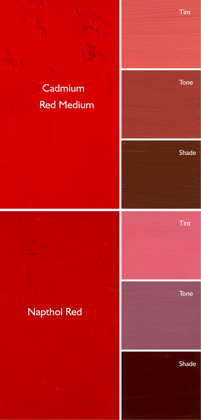
Cadmium Red Hue is usually made with napthol red and a little white. They mix very differently, which is why the hue is a bad substitute for the real pigment. Courtesy Gamblin paints.
Cadmium red hue is usually a naphthol red with a small amount of white added. Out of the tube, the two paints are very similar, but they mix very differently. There’s nothing wrong with naphthol red; it’s my red of choice, but it doesn’t behave much like its cadmium cousin.
Even paints with the same pigments can have different undertones depending on the manufacturer. That comes back to the imperfectability of pigments and their essential complexity.
A drawdown test showing a paint’s undertone. Courtesy Utrecht paints.
If you’re considering two different pigments, or thinking about switching brands, you can test them. It’s fast and easy. To see their mass tone, put a small dab of paint on a smooth white board or glass palette and draw it down with a knife, creating a uniform, solid stripe that completely obscures the painting surface.
To see the undertone, draw the samples down again so they are translucent. You should be able to see minute variations in the color, and in the covering power.
This old paint chart from my childhood explains tints, shades and tones. It’s so old, it’s from before they banned black. 😉
But to understand the behavior of each more fully, you need to make tints, tones and shades of each sample.
  • A tint is a color plus white.
  • A shade is a color plus black.
  • A tone is a color plus black and white.
Even when the mass tone appears quite similar, two close colors will act very differently when mixed. Their unique qualities of tinting strength, chroma, undertone and color temperature come into play here. But mixing paint with white or black immediately adds another layer of complexity. Different blacks and whites have their own undertones. Titanium white is cool. Zinc white is warmer, but it’s also brittle and thin, making it a bad choice for general painting. Ivory black is slightly warm.

Monday Morning Art School: how to read a paint tube

Knowing how to buy colors will save your time and money in the long run.

Pigments for sale on market stall, 2005, by Dan Brady. Thank heavens we don’t have to buy pigments in this form in America. It’s dangerous and inconsistent.

Modern painters expect to open a new tube of paint and squeeze out something recognizable. A tube of ultramarine blue made by any reputable manufacturer will have approximately the same amount of oil, and dry in about the same time to about the same gloss and transparency. The differences in binder and pigment load are subtle compared to the products available before the twentieth century.
That’s not by accident. Paint manufacturers subscribe to voluntary associations of quality control. One of these is Colour Index International (CII), a database dating back to 1925. It contains over 27,000 individual products sold under 13,000 different product names. This standard classification system ignores historic, proprietary, and generic names and gives you ‘just the facts, ma’am.’
Just as Benjamin Moore uses names like “Yukon Sky” to peddle grey paint, art paints are often marketed with evocative names. These names appeal to our sense of tradition, even when the old paint has no relationship to its namesake. For example, Indian Yellow no longer has anything to do with the urine of cattle which were fed mango leaves. Today it is made from lightfast diarylide yellow (PY83). If you buy Naples Yellow thinking you’re buying an historic pigment, think again: the modern paint is a convenience mix replacing the historic lead antimonate, which would do you and your painting no good.
The basic information on a tube of acrylic paint. If you’re not seeing this on the tube or display, proceed with caution.
Expect to find, at minimum, the following information on the label of your paint tube:
  • Manufacturer’s name or common name for the color.
  • The CII number and, sometimes, the name of the pigment(s).
  • The manufacturer’s lightfastness or permanence rating.

The CII code consists of two letters and some numbers. Most paints start with a “P” which means it’s a pigment, not a dye. The next letter is the color family:  PR is red, PY is yellow, etc. The number is the specific pigment included in the tube.
Save this link somewhere accessible from your phone: https://www.handprint.com/HP/WCL/waterfs.html
You’ll need it when you shop. This is Bruce MacEvoy’s Handprint pigment guide. It was built for watercolors but is generally true across all media. (Watercolor is the canary in the coalmine of pigments). All painters should understand lightfastness, transparency, and color shift. Granulation, bloom and diffusion, however, are watercolor-specific issues. 
Handprint doesn’t rate pigments for toxicity but comments on it in the notes. Most modern pigments are safe for the painters. For the manufacturers (who may be children in a third-world country) it’s another story.
Beautiful tube, evocative name, but it’s just a blend of PB 29 and PV 19 (Ultramarine Blue and Quinacridone Rose) which you already have on your palette. Many manufacturers offer the same mix under different names.
When you find two colors from different manufacturers that look the same, check their CIIs. Chances are that they contain radically different pigments.
A “hue,” is made of a blend of less-expensive pigments. There is nothing inherently wrong with these pigments, but they don’t behave the same as the more expensive ones, and you should at least know what you’re buying.
Generally speaking, there’s little to be gained by buying a hue mimicking a more expensive pigment. If you are comfortable painting with a hue, then learn what’s in it and mix it yourself. You always have the greatest flexibility by working with pure pigments (rather than mixes) out of the tube.
Most manufacturers include their own lightfastness ratings on the tube. This is a measure of how fast the color fades. If it’s not listed, look it up.
The series number tells you the price. Why are some paints more expensive than others? That’s based on the raw pigments and what they cost the maker. Are pricier pigments better? Not by a long shot. Twentieth-century manufacturing gave us a new world of inexpensive pigments, which tend to be less toxic, higher in chroma and lightfast.
It’s about time for you to consider your summer workshop plans. Join me on the American Eagle, at Acadia National Park, at Rye Art Center, or at Genesee Valley this summer.