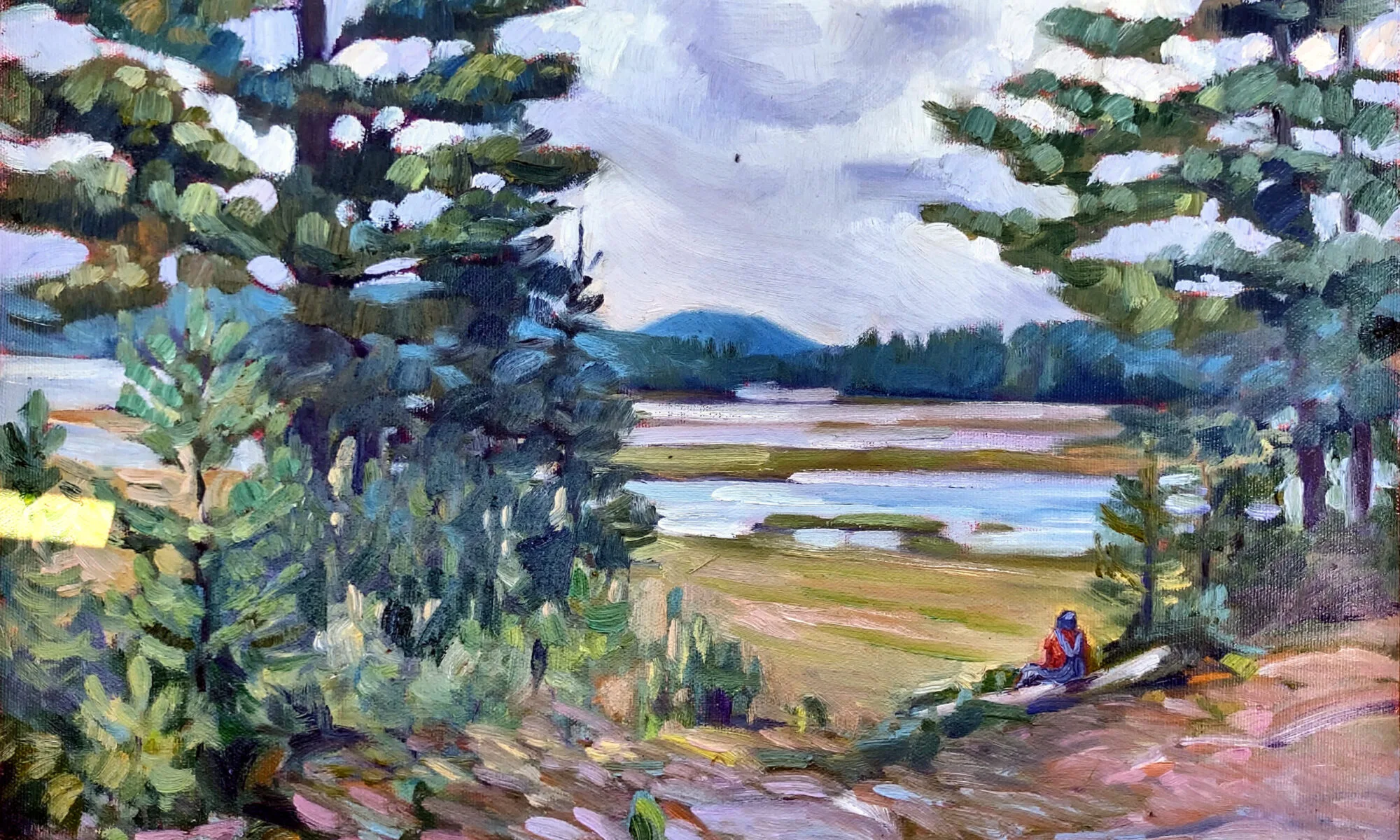
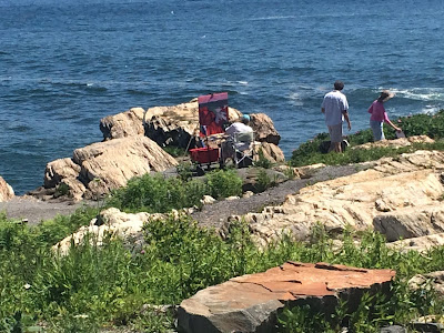
If you paint in your studio, you miss some marvelous conversations—with animals as well as people.
| Working Dock, oil on canvas, by Carol L. Douglas. |
I’m using this residency to explore ideas I might otherwise skip over, because they’re not particularly marketable. Yesterday, for example, I managed to channel David Hockney’speculiar perspective and flat planes onto a grey working lobster dock in Maine. I was surprised when a lobsterman asked me how much I wanted for the painting.
I don’t want to sell any of this work before I’ve shown it as a series. But I looked up my price and told him how much it will eventually be.
He repeated it back to me awestruck, and asked, “Are you famous?”
 |
| A lobster pound at Tenants Harbor, by Carol L. Douglas, courtesy the Kelpie Gallery. Working docks are fascinating to paint. |
Well, not unfamous. But that’s not really the point. It’s like lobstering, I said. Both lobstermen and plein air artists have high operating costs and significant business risk. (We also work outside in all kinds of weather, but their job is far more dangerous than mine.)
“It’s a lot more than lobster,” he laughed. Well, if you price it by the pound, yeah.
My intention for this residency has been to do each locale first in oils and then in watercolor, but that’s been shaken up some by the recent rain. Today’s painting is the mate to Monday’s watercolor. I hope I get it straight before I head home at the end of next week.
| Little Giant, by Carol L. Douglas, courtesy of Camden Falls Gallery. |
The other day, Bobbi Heath and I were hit on—very politely, mind you. Bobbi and I are both, erm, grandmotherly, and neither of us were remotely chic. Heck, I never even combed my hair that morning. Then again, I never do.
“Are either of you ladies single?” he asked. Bobbi thought that line needed work, but we were polite in kind.
Later, he came back and asked me, “But are you happily married?”
| Pilings, by Carol L. Douglas. |
A couple from Pennsylvania stopped to chat. A ruckus erupted in front of us.
“A kingfisher!” the husband exclaimed. After a moment his face fell. “A chipmunk.” Chipmunks are my most steadfast painting companions. They’re always chattering at me.
I’ve seen so many turkeys this year that I’m almost inspired to them (in my studio, in the winter). I’ve also seen a lot of deer mice in unnatural poses. They like to visit the pantry at the end of summer, and they pay for it with their lives.
I’ve met a lot of surprising creatures over the years. I’m basically silent, except for the swish-swish of my brush, and animals get curious. Here in Jefferson, it’s been the usual woodland creatures. A few days ago, I had to stamp my feet at a squirrel who was coming too close. “I’ll make a brush out of your tail!” I told him.
| Working Dock in its Hockney phase. There are elements of this abstraction that I’d like to recapture. |
Working Dock, above, spent a long time looking as if the far wharf had erupted in flames. I wanted to maintain a separation between the trees. Passers-by avoided it when it was in that stage, particularly the guys who work on the dock. Perhaps they know something they’re not telling.
A studio painter told me that when he paints outside, he’s thrown by the public commentary. I understand how that can happen, particularly if you’re not confident in your skills. But most people are kind, even to the rawest, newest student. They genuinely like what they see: the miracle of that scene over there being translated into this picture, right here.
If you work in a studio, or you work outside with headphones on, you miss some wonderful interactions. Yes, the public can be a distraction, but they’re also a joy.


