A painting to match the couch

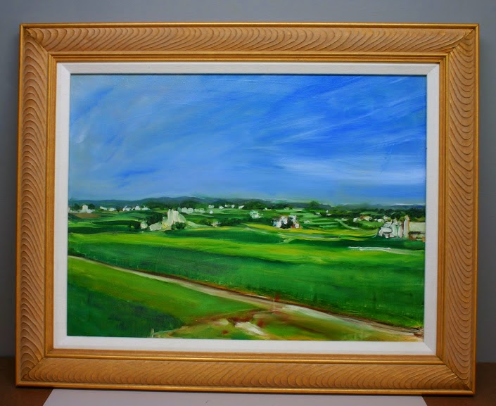
Lancaster County, PA, 18X24, by Carol L. Douglas. It’s moving from my own bedroom to our guestroom, where it will better match the pale blue walls and furniture.
Artists kvetch about people who buy paintings to match their sofas, but it is a real consideration. A mismatch will never be to the painting’s or the room’s advantage.
I’ve been putting away work from my Black Friday sale. It’s been an opportunity to rearrange some of the artwork in my house (and, yes, to vacuum). It’s interesting how some paintings look grand against some walls and bland against others.
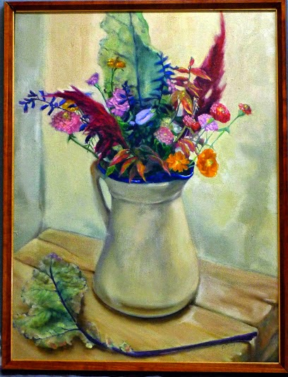
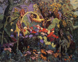
Autumn floral, 16X20, by Carol L. Douglas. I think I’m going to see what this looks like in my dining room.
I had a mid-century street scene done by a cousin in Tennessee hanging in my living room.  It’s a very accomplished painting, but it never looked good against the pale-turquoise-and-red dĂ©cor. To keep it safe during the sale, I slid it on a hook in my bedroom, which has navy walls and warm accents. Here in a room with fruitwood furniture and a related color scheme, the painting glows.
Where then, to put the high-chroma but abstract landscape that previously was in that spot? With its pale frame and cool colors, it looks far better in our guest room, which has pale blue walls and pale furniture.
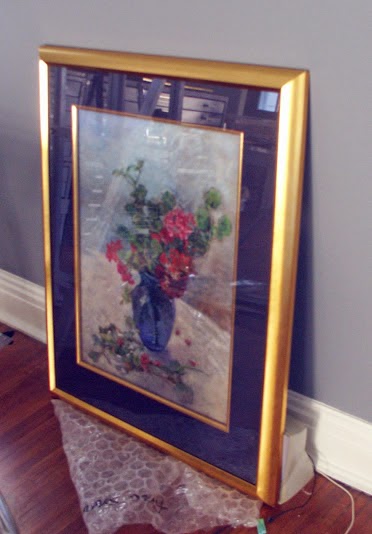
And this pastel of geraniums has already relocated to the living room.
Most artists I know own too many paintings, of our own and others. We usually just plop new work on hooks wherever we can. This exercise has been a good reminder that a painting’s inherent value can be obscured by bad interior design.

I will be teaching in Acadia National Park next August. Read all about it here, or download a brochure here


Three paintings gone to good homes

Adirondack Path, 14X18, by Carol L. Douglas
This weekend as I sorted and labeled paintings for what is likely to be my first, last and only Black Friday Sale, I kept an eye open for a painting suitable for a friend and colleague from North Carolina. I’ve known her for more than 25 years. Although we haven’t lived in the same city for a few decades, through the miracle of social media I’ve watched her take up painting and develop into a skilled artist in her own right.
Hudson sunset, 12X16, by Carol L. Douglas
One painting kept speaking to me as being appropriate for her: a sunset over the Hudson. This very rarely happens to me; I usually stay out of the process of selection anyway. I sent her a photo, she likes it. I know she’ll love the finished work, and it will be wending its way south this afternoon.
My brother and his three kids just arrived for Thanksgiving. This complicates my sorting-and-labeling project, since it has to be confined to my studio.
Evening squall at 12 Corners, oil on canvas, by Carol L. Douglas
Still, there was (barely) enough room for another couple to sort through the unframed works on my table and find two that they liked. The first—a picture of a snowsquall in downtown Brighton—was just on my blog last week. It is a reminder of all the times I’ve spent waiting for my kids in the loop at 12 Corners Middle School. The other was a reverie painted in the Adirondacks.
Today and tomorrow, I’ll concentrate on getting images of the work in this sale up in an online folder. Yes, I’m happy to ship them, but if you’re able to stop by on Friday afternoon, that would be even better. As I may have mentioned, there will be wine.

The holiday un-sale is from 2-9 on Friday, November 29, 2014, at 410 Oakdale Drive, Rochester, NY 14618. It includes plein air and studio work, framed and unframed, along with prints and notecards—everything 25-50% off.

I will be teaching in Acadia National Park next August. Read all about it here, or download a brochure here

Last week to see these paintings

 Final week! It’s been a good show and well-received, but it comes down November 1. If you want to see it, I’ll happily meet you there.
Address
Gallery Salon & Spa
780 University Ave
Rochester, NY 14607
Hours
Tuesday-Thursday 11am-8pm
Friday 11am-7pm
Saturday 9am-3pm

Some Days, You Just Can’t Get Rid of a Bomb

“Loren’s farm,” oil on canvasboard, 12X16

 At our last painting session, Marilyn whipped out her grayscale markers (making me instantly regret that I hadn’t brought mine along). The forest was remarkably dark and moody this week, and the spring foliage far less advanced than down on the lake plains, and I was finding it difficult to find a range of values.

Marilyn Fairman sketching in grayscale markers.
A tonal drawing immediately reveals the strengths and weaknesses of one’s composition—if it doesn’t work in the simplified view, it isn’t going to work after you’ve invested hours painting, either. In fact, the painting I did in that last session ended up mired in a compositional issue that would have been immediately apparent had I done some fundamental drawing before starting, but I was tired and cutting corners. 
“Canoes at Irondequoit Inn,” oil sketch
To me, the difference between an adequate painter and an excellent painter is the amount of time said artist spends drawing. I wrote earlier this week about watercolor sketching, and have written frequently about drawing with a plain, ordinary graphite pencil.
“Breakwater at Irondequoit Bay,” oil sketch
In the field, however, I most often sketch with oils on small canvases. Here is a sketch I did of the canoes at the Irondequoit Inn, and another of the breakwater at Irondequoit Bay.* They took about as long as a graphite or watercolor sketch would have, but their purpose is somewhat different: they are simplified and monumental in the same way as the tonal grayscale marker (which is by far the fastest way of sketching). 

And the painters home from the hill…
I did three other paintings in the Adirondacks. One was a complete bomb (despite having spent a long time drawing and an equally long time painting).  I followed that up by inadvertently discharging the battery of my car outside of cell-phone range, leaving me stranded with a dead car with its keys stuck in the ignition. Marilyn set off on foot to get help while I dug out the battery—not as obvious as you might think, since it’s stowed in the side of the trunk. But a bad painting and a dead battery did nothing to dampen my high good spirits.

I’m struggling with something, which is by no means uncomfortable when you’re not fixated on the results. I have been working for the past few years on patterning my paint-handling in a more abstract way, but in the process I’ve lost some of the depth that a more traditional landscape approach gives. Now that has to be reintroduced.

“Mountain meadow,” oil on canvasboard, 12X16
But my hermitage (which became less hermit-like as the week went on) is over and I’m happy to be back in Rochester, in my studio, surrounded by my family, friends, and students.
*An alert reader will note that the Irondequoit Inn and Irondequoit Bay are about 200 miles apart. I leave that mystery to you to decipher.

Talking about paintings in class

We are currently analyzing paintings in class. This week, Gwendolyn brought Franz Marc’s “The Yellow Cow,” 1911, Guggenheim—NYC.


Franz Marc, Yellow Cow (Gelbe Kuh), 1911. Oil on canvas, Solomon R. Guggenheim Museum, NY, NY.(http://www.guggenheimcollection.org/site/artist_work_lg_98_5.html)

Franz Marc is hard for me to peg. On the one hand his painting clearly evokes the anxiety of Europe at the beginning of a century of world war (the artist died on the battlefield in March, 1916, near Verdun-sur-Meuse, France). On the other hand, there is something Chagall-like in his delight in these animals, which is very appealing.

Opinion in class on Marc’s cow was decidedly mixed. While some responded positively to the color, others found the palette and angular cubism disturbing.

Marilyn brought J.E.H. MacDonald’s “The Tangled Garden,” 1915, National Gallery of Canada—Ottawa.


The Tangled Garden, 1915, Oil on Cardboard, National Gallery of Canada—Ottawa) (http://en.wikipedia.org/wiki/Image:JEH_MacDonald_-_Tangled_Garden.jpg#filelinks)

“The Tangled Garden” shares some traits with impressionism, in its color handling, wet-on-wet painting, and rich impasto. (The delightful color shifts are not as apparent in this high-contrast reproduction.) However, it is a very carefully drawn and mapped painting, and MacDonald makes no attempt to mask his draftsmanship.

J.E.H. MacDonald is one of Canada’s Group of Seven painters. We share a lot of landscape features with the Great White North so I think it will be interesting over the next weeks to consider more work by the Group of Seven painters and their associates. (See McMichael Canadian Art Collection and National Gallery of Canada for more information on the Group of Seven.)